
- Latest SAPUI Version 1.124
- SAPUI5 Version 1.122
- SAPUI5 Version 1.120
- SAPUI5 Version 1.118
- SAPUI5 Version 1.116
- SAPUI5 Version 1.114
- SAPUI5 Version 1.112
- SAPUI5 Version 1.110
- SAPUI5 Version 1.108
- SAPUI5 Version 1.106
- SAPUI5 Version 1.104
- SAPUI5 Version 1.102
- SAPUI5 Version 1.100
- SAPUI5 Version 1.98
- SAPUI5 Version 1.96
- SAPUI5 Version 1.94
- SAPUI5 Version 1.92
- SAPUI5 Version 1.90
- SAPUI5 Version 1.86
- SAPUI5 Version 1.84
- SAPUI5 Version 1.82
- SAPUI5 Version 1.80
- SAPUI5 Version 1.78
- SAPUI5 Version 1.76
- SAPUI5 Version 1.74
- SAPUI5 Version 1.72
- SAPUI5 Version 1.70
- SAPUI5 Version 1.68
- SAPUI5 Version 1.66
- SAPUI5 Version 1.64
- SAPUI5 Version 1.62
- SAPUI5 Version 1.60
- SAPUI5 Version 1.58
- SAPUI5 Version 1.56
- SAPUI5 Version 1.54
- SAPUI5 Version 1.52
- SAPUI5 Version 1.50
- SAPUI5 Version 1.48
- SAPUI5 Version 1.46
- SAPUI5 Version 1.44
- SAPUI5 Version 1.42
- SAPUI5 Version 1.40
- SAPUI5 Version 1.38
- SAPUI5 Version 1.36
- SAPUI5 Version 1.34
- SAPUI5 Version 1.32
- SAPUI5 Version 1.30
- SAPUI5 Version 1.28
- SAPUI5 Version 1.26
- Latest SAPUI Version 1.124
- SAPUI5 Version 1.122
- SAPUI5 Version 1.120
- SAPUI5 Version 1.118
- SAPUI5 Version 1.116
- SAPUI5 Version 1.114
- SAPUI5 Version 1.112
- SAPUI5 Version 1.110
- SAPUI5 Version 1.108
- SAPUI5 Version 1.106
- SAPUI5 Version 1.104
- SAPUI5 Version 1.102
- SAPUI5 Version 1.100
- SAPUI5 Version 1.98
- SAPUI5 Version 1.96
- SAPUI5 Version 1.94
- SAPUI5 Version 1.92
- SAPUI5 Version 1.90
- SAPUI5 Version 1.88
- SAPUI5 Version 1.86
- SAPUI5 Version 1.84
- SAPUI5 Version 1.82
- SAPUI5 Version 1.80
- SAPUI5 Version 1.78
- SAPUI5 Version 1.76
- SAPUI5 Version 1.74
- SAPUI5 Version 1.72
- SAPUI5 Version 1.70
- SAPUI5 Version 1.68
- SAPUI5 Version 1.66
- SAPUI5 Version 1.64
- SAPUI5 Version 1.62
- SAPUI5 Version 1.60
- SAPUI5 Version 1.58
- SAPUI5 Version 1.56
- SAPUI5 Version 1.54
- SAPUI5 Version 1.52
- SAPUI5 Version 1.50
- SAPUI5 Version 1.48
- SAPUI5 Version 1.46
- SAPUI5 Version 1.44
- SAPUI5 Version 1.42
- SAPUI5 Version 1.40
- SAPUI5 Version 1.38
- SAPUI5 Version 1.36
- SAPUI5 Version 1.34
- SAPUI5 Version 1.32
- SAPUI5 Version 1.30
- SAPUI5 Version 1.28
- SAPUI5 Version 1.26
Iconography
Intro
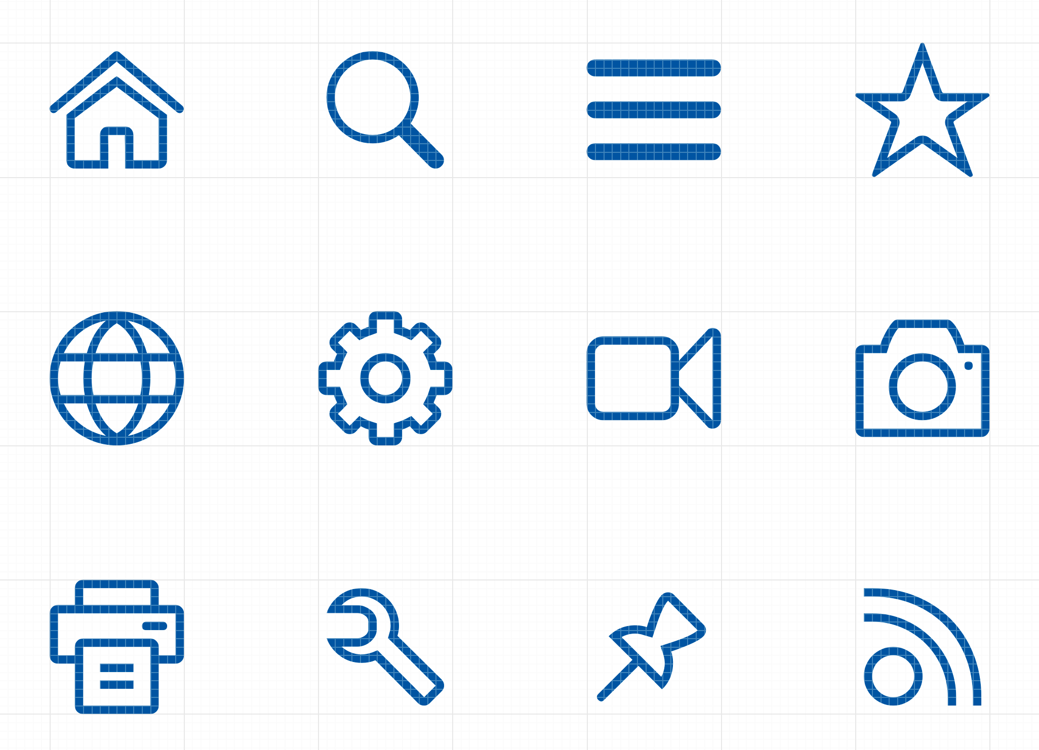
SAP icons have been created with a friendly, yet elegant style that is consistent in terms of size, stroke and balance. The icons are tailored for simple and direct user interaction, using metaphors that are easy to understand. Each icon has been hand-crafted, hand-hinted, and aligned in font format. The icons are essentially vector graphics that can be resized easily without compromising their appearance.
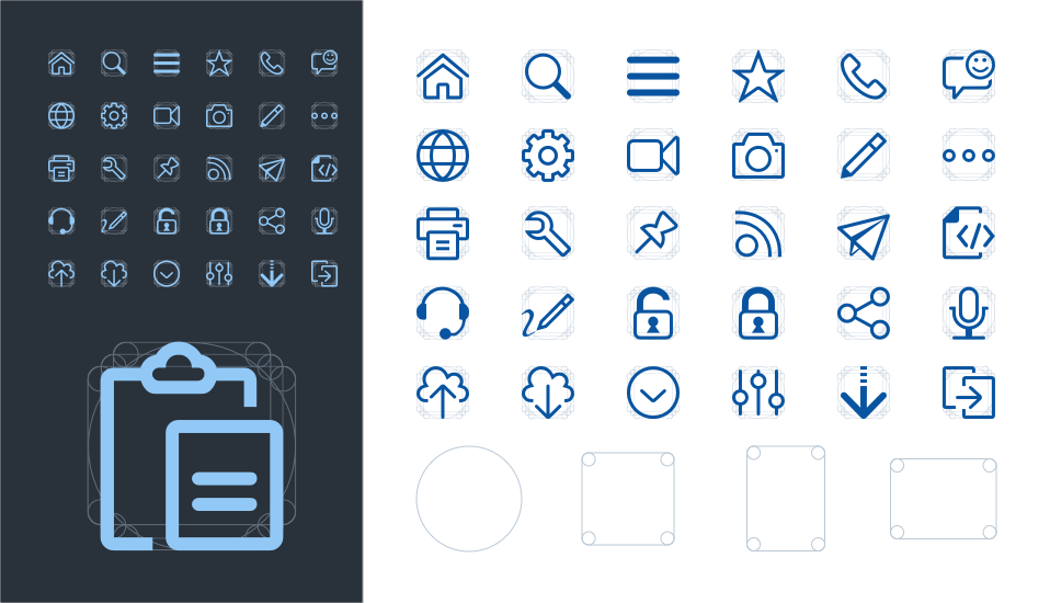
Vector based icons drawn with a flexible geometric grid system
Design Language
The design language for icons used within SAP products is created to work across all supported browsers, devices and operating systems. The style can be described as:
- Simple
- Fresh
- Serious
- Neutral
This approach is meant to communicate the simplicity, sophistication, and integrity represented by SAP solutions. The style integrates basic geometric shapes in order to give a more prominent appearance.
Icon Formats
Icons can be supported in multiple file formats. However, SAP delivers icons as font format by default. The SAP icon font contains multiple icons in one file with small file size and allows the convenience of updates that can be delivered with each SAP product release. Custom icons can even replace the SAP icon font if an alternative format or style is desired. Additional icon font files can also be added to the SAPUI5 icon pool.
For more information on custom icons, see the development documentation.
SAP icons are also part of the theming base content, which is available for all SAP-supported technologies.
Icon Semantics
Icon semantics are used to define a set of visual elements that indicate functions, objects, and states for iconographic communication.
Finding the right visual semantic to indicate a consistent meaning to the user is based on the following essentials:
- Taking inspiration from the real world.
An icon should be easily recognized by a user. (Note that this does not imply skeuomorphism.) - Making use of context.
The context of an icon contributes to its meaning.
A semantic element can have different meanings for the user depending on where it’s located, such as within different labels. - Using clear, simple, and recognizable shapes.
For accessibility reasons, visual elements should be drawn as clear shapes and should not rely upon colors or other means in order to be recognized. - Adhering to interaction design standards throughout the graphical user interface.
Simple and recognizable metaphor
The Geometric Icon Grid System
The simple geometric icon grid was created as the foundational anatomy of the icons. This ensures visual balance concerning circles and squares and brings the needed consistency and stability of the shapes that form the structure of the icon metaphors.
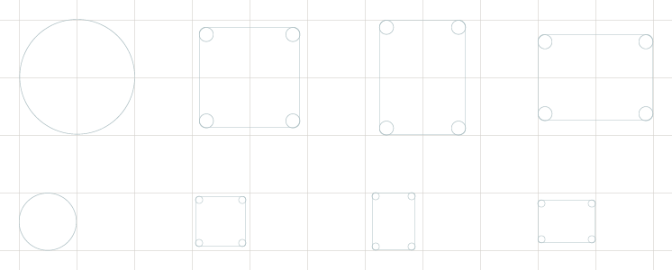
The anatomy of the geometric icon grid system
A Closer Look at 16px Icons
Here is a closer look at how icons are designed using the grid system:
- Circles: 16x16px.
- Squares: 14x14px within a 16px grid.
- Vertical Rectangles: 16x12px within a 16px grid.
- Horizontal Rectangles: 12x16px within a 16px grid.
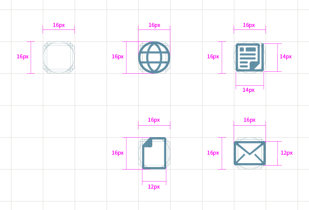
Details of 16px icons based on the icon grid system
A Closer Look at 32px Icons
If the icons are scaled up to 32px, the measurements and details will look as following:
- Circles: 32x32px.
- Squares: 28x28px within a 32px grid.
- Vertical Rectangles: 32x24px within a 32px grid.
- Horizontal Rectangles: 24x32px within a 32px grid.
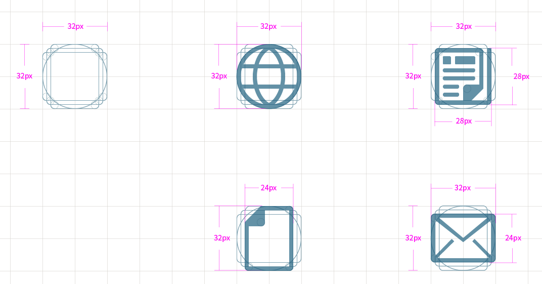
Details of 32px icons based on the icon grid system.
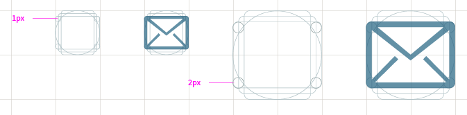
Line Thickness and Border Radius
In general, the base vector size created for SAP icons is 16px for icons used in most UI controls. Other listed sizes depend on individual control specifications.
At 16px, the main line thickness is 1px. This scales up to 2px at size 32px.
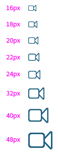
Example of supported (actual) sizes that are manually aligned within icon font formats.
Arrow Styles – Thin
Arrows have been aligned throughout the icon-set to be lighter and a little rounder to remove the roughness from the user-interface controls.
Examples of thin arrows include: dropdown arrow, refresh, sort, and more.
Thin arrows are drawn with 1px line thickness at 16px with a 1px border radius.
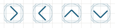
Thin arrow style
Arrow Styles – Emphasized
This is an emphasized arrow style that caters for additional affordance in the user interface and adheres to the simple clean style.
Examples of arrows include: navigation, expand, move, and more.
Emphasized arrows are drawn with 2px line thickness at 16px with a 1px border radius.
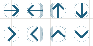
Emphasized arrow style
Border Radius – Regular
The subtle border radius helps to reduce rough edges and gives a friendly appearance.
A border radius that is 1px at size 16px will naturally scale up to 2px at size 32px.
Line thickness and border radius
Border Radius – Emphasized
Comment or notification style icons and speech bubbles have an emphasized border radius to help distinguish them.
The overall style is consistent with all other icons, However, a small distinguishing feature such as a border radius increase can help a subset of symbols to stand out from the rest. The change in border radius impacts the grid system structure. This is an example of how flexible the grid system can be.
A border radius that is 2px at size 16px will scale up to 4px at size 32px.
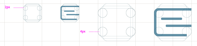
Emphasized border radius achieved with a flexible grid system
SAP Icon Font
To ensure availability of SAP icons for all SAP-supported technologies, the icons are part of the theming base content and also as part of OpenUI5. The SAP icon font is made available under the Apache 2.0 license.
Related Links
Follow the links below to find out more about iconography.
OpenUI5 Icon Explorer
Explore icons in SAP Fiori with OpenUI5.
OpenUI5 Icons and Icon Pool
Find out more about using icons, adding icons, or replacing them with custom icons in OpenUI5 documentation.
Icon Font Files
Download SAP icon font files.
 Your feedback has been sent to the SAP Fiori design team.