
- Latest SAPUI Version 1.124
- SAPUI5 Version 1.122
- SAPUI5 Version 1.120
- SAPUI5 Version 1.118
- SAPUI5 Version 1.116
- SAPUI5 Version 1.114
- SAPUI5 Version 1.112
- SAPUI5 Version 1.110
- SAPUI5 Version 1.108
- SAPUI5 Version 1.106
- SAPUI5 Version 1.104
- SAPUI5 Version 1.102
- SAPUI5 Version 1.100
- SAPUI5 Version 1.98
- SAPUI5 Version 1.96
- SAPUI5 Version 1.94
- SAPUI5 Version 1.92
- SAPUI5 Version 1.90
- SAPUI5 Version 1.86
- SAPUI5 Version 1.84
- SAPUI5 Version 1.82
- SAPUI5 Version 1.80
- SAPUI5 Version 1.78
- SAPUI5 Version 1.76
- SAPUI5 Version 1.74
- SAPUI5 Version 1.72
- SAPUI5 Version 1.70
- SAPUI5 Version 1.68
- SAPUI5 Version 1.66
- SAPUI5 Version 1.64
- SAPUI5 Version 1.62
- SAPUI5 Version 1.60
- SAPUI5 Version 1.58
- SAPUI5 Version 1.56
- SAPUI5 Version 1.54
- SAPUI5 Version 1.52
- SAPUI5 Version 1.50
- SAPUI5 Version 1.48
- SAPUI5 Version 1.46
- SAPUI5 Version 1.44
- SAPUI5 Version 1.42
- SAPUI5 Version 1.40
- SAPUI5 Version 1.38
- SAPUI5 Version 1.36
- SAPUI5 Version 1.34
- SAPUI5 Version 1.32
- SAPUI5 Version 1.30
- SAPUI5 Version 1.28
- SAPUI5 Version 1.26
- Latest SAPUI Version 1.124
- SAPUI5 Version 1.122
- SAPUI5 Version 1.120
- SAPUI5 Version 1.118
- SAPUI5 Version 1.116
- SAPUI5 Version 1.114
- SAPUI5 Version 1.112
- SAPUI5 Version 1.110
- SAPUI5 Version 1.108
- SAPUI5 Version 1.106
- SAPUI5 Version 1.104
- SAPUI5 Version 1.102
- SAPUI5 Version 1.100
- SAPUI5 Version 1.98
- SAPUI5 Version 1.96
- SAPUI5 Version 1.94
- SAPUI5 Version 1.92
- SAPUI5 Version 1.90
- SAPUI5 Version 1.88
- SAPUI5 Version 1.86
- SAPUI5 Version 1.84
- SAPUI5 Version 1.82
- SAPUI5 Version 1.80
- SAPUI5 Version 1.78
- SAPUI5 Version 1.76
- SAPUI5 Version 1.74
- SAPUI5 Version 1.72
- SAPUI5 Version 1.70
- SAPUI5 Version 1.68
- SAPUI5 Version 1.66
- SAPUI5 Version 1.64
- SAPUI5 Version 1.62
- SAPUI5 Version 1.60
- SAPUI5 Version 1.58
- SAPUI5 Version 1.56
- SAPUI5 Version 1.54
- SAPUI5 Version 1.52
- SAPUI5 Version 1.50
- SAPUI5 Version 1.48
- SAPUI5 Version 1.46
- SAPUI5 Version 1.44
- SAPUI5 Version 1.42
- SAPUI5 Version 1.40
- SAPUI5 Version 1.38
- SAPUI5 Version 1.36
- SAPUI5 Version 1.34
- SAPUI5 Version 1.32
- SAPUI5 Version 1.30
- SAPUI5 Version 1.28
- SAPUI5 Version 1.26
Theming
Intro
The default theme for SAP Fiori is called SAP Quartz Light. In addition, SAP provides alternative themes: SAP Quartz Dark, SAP Belize, SAP Belize Deep, and the accessibility themes SAP High-Contrast Black (HCB) and SAP High-Contrast White (HCW).
SAP Fiori Themes
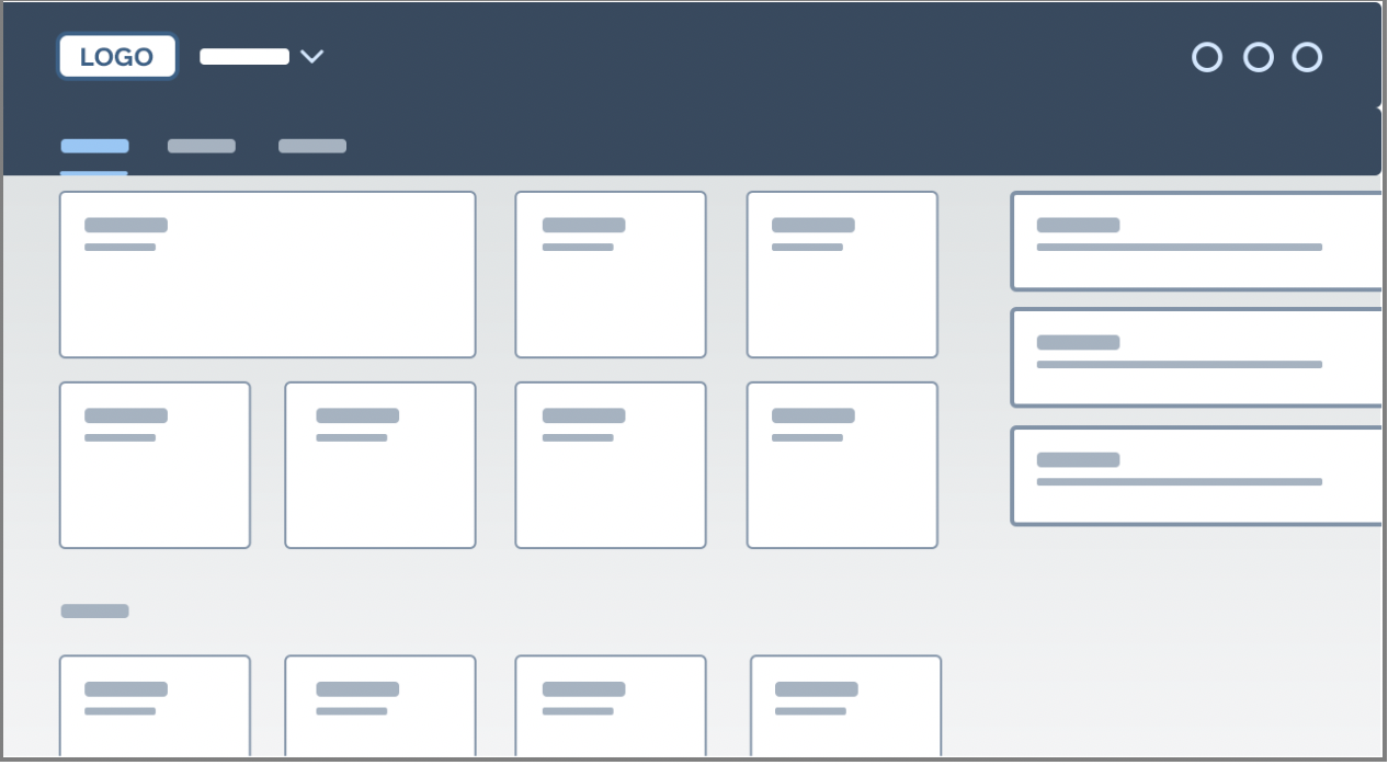
SAP Quartz Light theme (default)
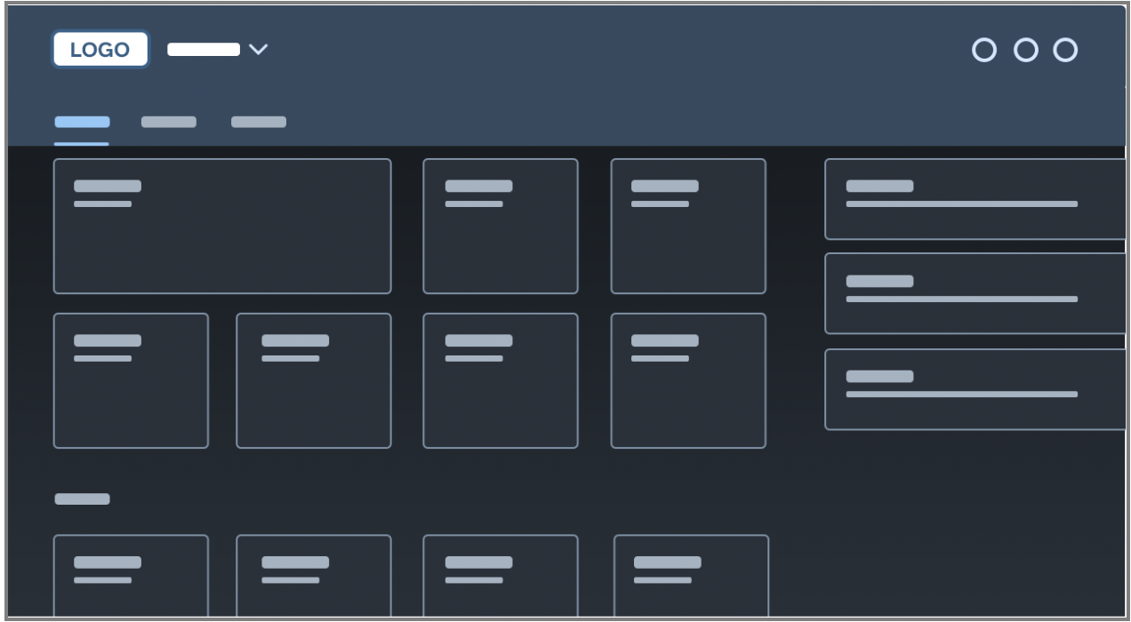
SAP Quartz Dark theme
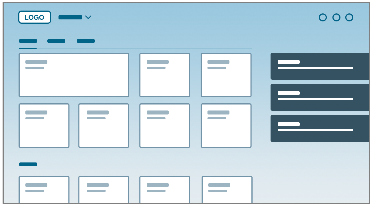
SAP Belize theme
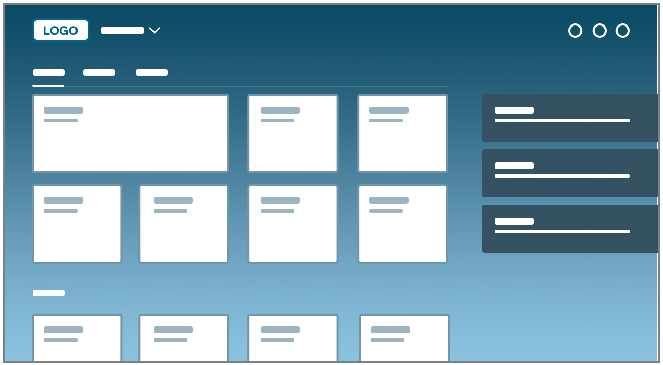
SAP Belize Deep theme (dark flavor)
SAP Fiori High Contrast Themes
SAP High-Contrast Black theme
SAP High-Contrast White theme
All the controls are styled using CSS, and the LESS-based theme parameters come in the form of CSS variables, SASS and JSON. This enables customers to apply their own brand identity to the user interface using the UI theme designer, which works across all SAP UI technologies. It allows customers to easily change a few basic colors (quick theming) as well individual control colors (detailed theming). We recommend using SAP Quartz Light as a basis for altering the colors as the minimalist design serves as an ideal starting point.
Concept
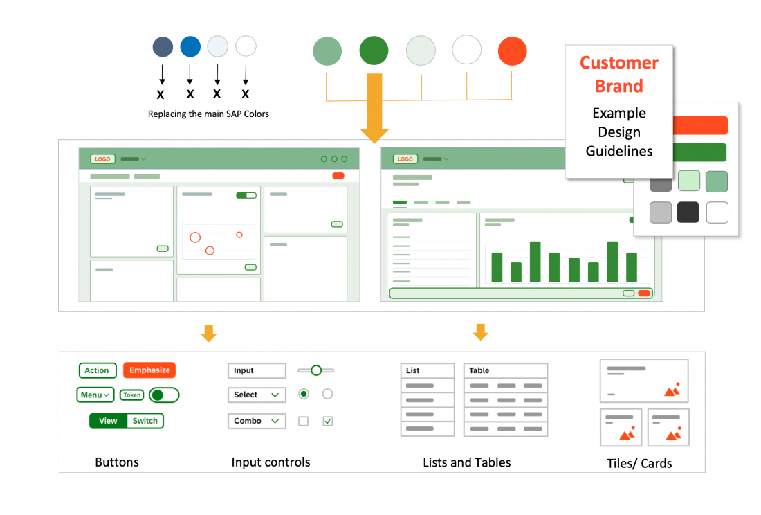
Customers can apply their own branding by adapting the standard SAP Fiori theme. Some customers will simply replace the logo or change the main branding colors of the UI by replacing the default brand and base colors of the theme. Other customers want more control to change the colors of the UI controls. Some companies even create multiple themes to reflect the various sub-brands of their different divisions.
From Quick Theming to Detailed Control Theming
Theming is driven by customer requirements and works using a top down approach, from quick to detailed UI control adaptations:
- Quick theming: replacing logo and main brand colors
- Detailed theming: replacing detailed color values of specific UI controls
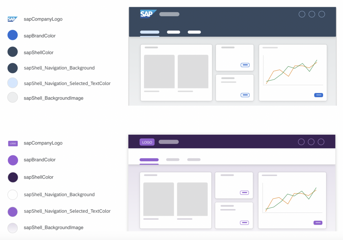
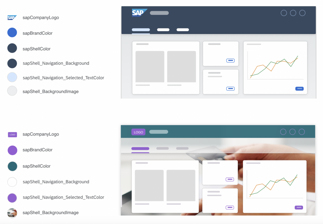
Example: Before and After Customer Branding
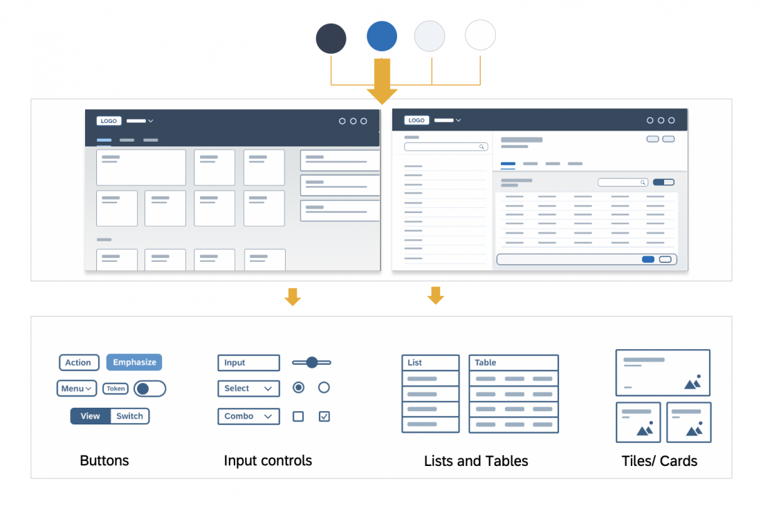
Quick Theming
Customers can easily change the logo and a few colors in the UI by replacing the colors in the UI theme designer. This automatically creates a recalculated tonal color palette that is applied to various UI elements, creating a harmonious look and feel.
One of the main parts of a corporate branding guide is a set of primary and secondary branding colors. When creating a custom theme, these colors can simply be added to the custom palette of the UI theme designer, making it easy to replace the default SAP Fiori colors.
The following example shows a combination of quick theming changes with some detailed parameter adaptations to the shell header and background image and gradient.
Detailed Theming
All of the main brand colors used for quick theming are also interlinked within the controls. Quick theming parameters like the brand color are connected to individual control parameters, such as emphasized and standard button and icon texts. They can even be connected to interaction states, such as the selected and active state colors. Other quick theming parameters like the base color are connected to cards, lists, and table backgrounds.
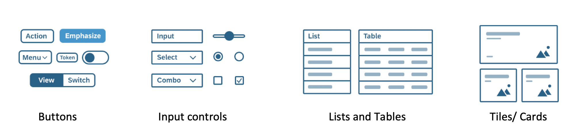
Groups of controls
The concept of semantic theming is to organize connected control parameters into groups, determined by what they affect and how they are related to each other. This makes it easier to choose the parameter responsible for a desired outcome and better gauge the results of changing it. Users are not simply changing colors in the UI, but rather are determining how specific colors are used. For example, all of the theme parameters for input controls (input field, radio button, checkbox, and so on) have been grouped together and contain the word “field“. Similarly, all the color parameters for all types of buttons, menus, and tokens (background, borders, and so on) have been grouped together and contain the word “button“.
Theme parameters are set for each semantically named part of the control. These control parameters remain stable and do not change from theme to theme. Each theme has specific color values that are linked into these control parameters.
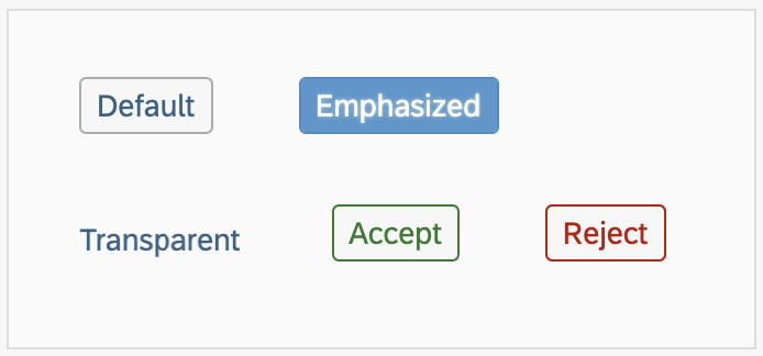
Button Example
The image below only shows a selection of button control examples. You can preview and modify all the detailed control parameters with the UI theme designer.
SAP Quartz Light
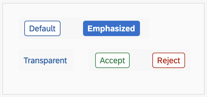
Quartz Light button control example
sapButton_Background:#ffffff
sapButton_BorderColor: #0854a0
sapButton_TextColor: #0854a0
sapButton_Emphasized_Background: #0a6ed1
sapButton_Accept_BorderColor: #107e3e
sapButton_Reject_BorderColor: #bb0000
SAP Belize
Belize button control example
sapButton_Background: #ffffff
sapButton_BorderColor: #ababab
sapButton_TextColor: #346187
sapButton_Emphasized_Background: #5496cd
sapButton_Accept_BorderColor: #2b7d2b
sapButton_Reject_BorderColor: #bb0000
SAP High Contrast Black
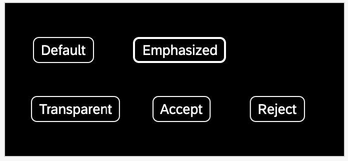
HCB button control example
sapButton_Background:#000000
sapButton_BorderColor:#ffffff
sapButton_TextColor:#ffffff
sapButton_Emphasized_Background:#000000
sapButton_Accept_BorderColor:#ffffff
sapButton_Reject_BorderColor:#ffffff
SAP High Contrast White

HCW button control example
sapButton_Background:#ffffff
sapButton_BorderColor:#000000
sapButton_TextColor: #000000
sapButton_Emphasized_Background:#ffffff
sapButton_Accept_BorderColor:#000000
sapButton_Reject_BorderColor:#000000
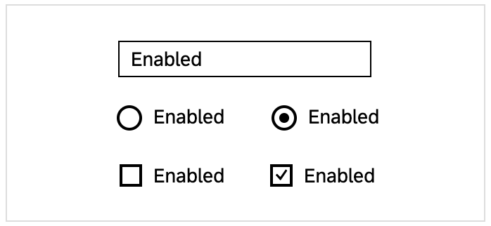
“Field” Control Examples
Field parameters apply to several input controls, such as input fields, combo boxes, and so on. Changing any of these parameters can affect many or all of these controls.
The image below only shows a selection of input control examples. You can preview and modify all the detailed control parameters with the UI theme designer.
SAP Quartz Light
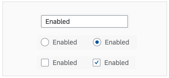
Quartz Light input control example
sapField_Background: #ffffff
sapField_BorderColor: #89919a
sapField_TextColor: #32363a
SAP Belize

Belize input control example
sapField_Background: #ffffff
sapField_BorderColor: #bfbfbf
sapField_TextColor: #333333
SAP High Contrast Black
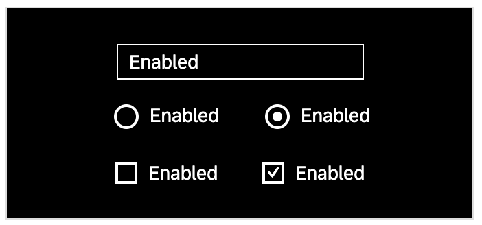
HCB input control example
sapField_Background: #000000
sapField_BorderColor: #ffffff
sapField_TextColor: #ffffff
SAP High Contrast White
HCW input control example
sapField_Background: #ffffff
sapField_BorderColor: #000000
sapField_TextColor: #000000
Resources
Implementation
- UI Theme Designer Community
Learn more about the UI theme designer. - SAP Theming Base Content
The GitHub repository of SAP themes. - Documentation
Learn more on SAP Help Portal.
 Your feedback has been sent to the SAP Fiori design team.