
- Latest SAPUI Version 1.124
- SAPUI5 Version 1.122
- SAPUI5 Version 1.120
- SAPUI5 Version 1.118
- SAPUI5 Version 1.116
- SAPUI5 Version 1.114
- SAPUI5 Version 1.112
- SAPUI5 Version 1.110
- SAPUI5 Version 1.108
- SAPUI5 Version 1.106
- SAPUI5 Version 1.104
- SAPUI5 Version 1.102
- SAPUI5 Version 1.100
- SAPUI5 Version 1.98
- SAPUI5 Version 1.96
- SAPUI5 Version 1.94
- SAPUI5 Version 1.92
- SAPUI5 Version 1.90
- SAPUI5 Version 1.88
- SAPUI5 Version 1.86
- SAPUI5 Version 1.84
- SAPUI5 Version 1.82
- SAPUI5 Version 1.80
- SAPUI5 Version 1.78
- SAPUI5 Version 1.76
- SAPUI5 Version 1.74
- SAPUI5 Version 1.72
- SAPUI5 Version 1.70
- SAPUI5 Version 1.68
- SAPUI5 Version 1.66
- SAPUI5 Version 1.64
- SAPUI5 Version 1.62
- SAPUI5 Version 1.60
- SAPUI5 Version 1.58
- SAPUI5 Version 1.56
- SAPUI5 Version 1.54
- SAPUI5 Version 1.52
- SAPUI5 Version 1.50
- SAPUI5 Version 1.48
- SAPUI5 Version 1.46
- SAPUI5 Version 1.44
- SAPUI5 Version 1.42
- SAPUI5 Version 1.38
- SAPUI5 Version 1.36
- SAPUI5 Version 1.34
- SAPUI5 Version 1.32
- SAPUI5 Version 1.30
- SAPUI5 Version 1.28
- SAPUI5 Version 1.26
- Latest SAPUI Version 1.124
- SAPUI5 Version 1.122
- SAPUI5 Version 1.120
- SAPUI5 Version 1.118
- SAPUI5 Version 1.116
- SAPUI5 Version 1.114
- SAPUI5 Version 1.112
- SAPUI5 Version 1.110
- SAPUI5 Version 1.108
- SAPUI5 Version 1.106
- SAPUI5 Version 1.104
- SAPUI5 Version 1.102
- SAPUI5 Version 1.100
- SAPUI5 Version 1.98
- SAPUI5 Version 1.96
- SAPUI5 Version 1.94
- SAPUI5 Version 1.92
- SAPUI5 Version 1.90
- SAPUI5 Version 1.88
- SAPUI5 Version 1.86
- SAPUI5 Version 1.84
- SAPUI5 Version 1.82
- SAPUI5 Version 1.80
- SAPUI5 Version 1.78
- SAPUI5 Version 1.76
- SAPUI5 Version 1.74
- SAPUI5 Version 1.72
- SAPUI5 Version 1.70
- SAPUI5 Version 1.68
- SAPUI5 Version 1.66
- SAPUI5 Version 1.64
- SAPUI5 Version 1.62
- SAPUI5 Version 1.60
- SAPUI5 Version 1.58
- SAPUI5 Version 1.56
- SAPUI5 Version 1.54
- SAPUI5 Version 1.52
- SAPUI5 Version 1.50
- SAPUI5 Version 1.48
- SAPUI5 Version 1.46
- SAPUI5 Version 1.44
- SAPUI5 Version 1.42
- SAPUI5 Version 1.40
- SAPUI5 Version 1.38
- SAPUI5 Version 1.36
- SAPUI5 Version 1.34
- SAPUI5 Version 1.32
- SAPUI5 Version 1.30
- SAPUI5 Version 1.28
- SAPUI5 Version 1.26
Block Layout
sap.ui.layout.BlockLayout
Intro
The block layout is used to display texts in a section-based manner. It features horizontal and vertical subdivisions and full-width banners seen frequently in contemporary Web design. Background colors are attached directly to these “areas” of the layout. Special full-width sections of the block layout allow horizontal scrolling through a set of areas.
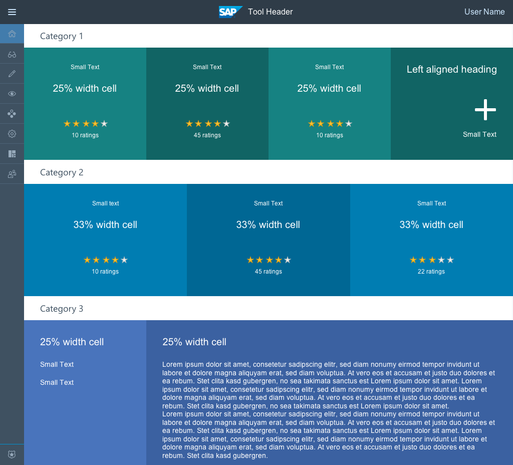
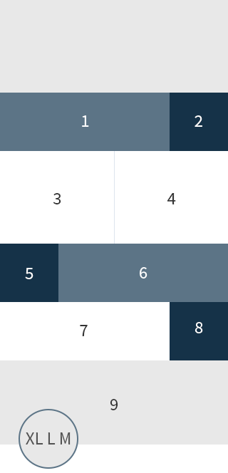
General page structure of a tool using the Block Layout
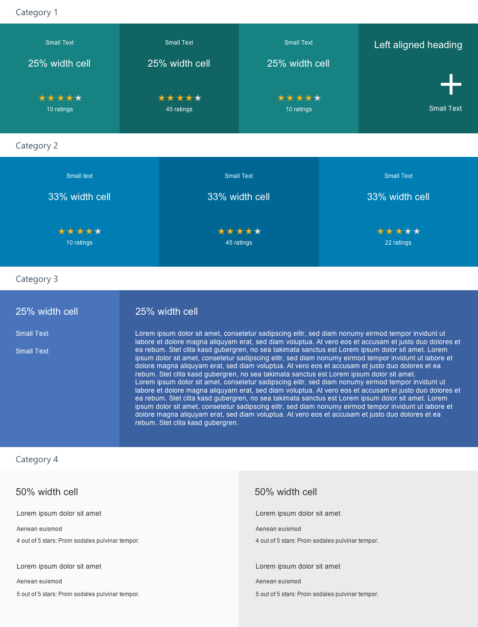
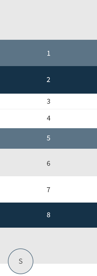
Block Layout standalone
Usage
Example use cases are SAP HANA Cloud Integration and the SAPUI5 Demo Kit. In SAP HANA Cloud Integration, the block layout serves as a banner-like presentation of illustrative icons with associated text. By placing pictorial and textual elements side by side in different areas, a relation of content is established. In the SAPUI5 Demo Kit, the block layout serves as a flexible container for diverging content, such as headings, explanatory texts, code snippets, remarks, and examples.
The block layout comes in three types: Layout only (default), Bright, and Mixed background colors.
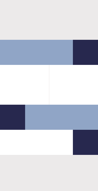
Schematic block layout
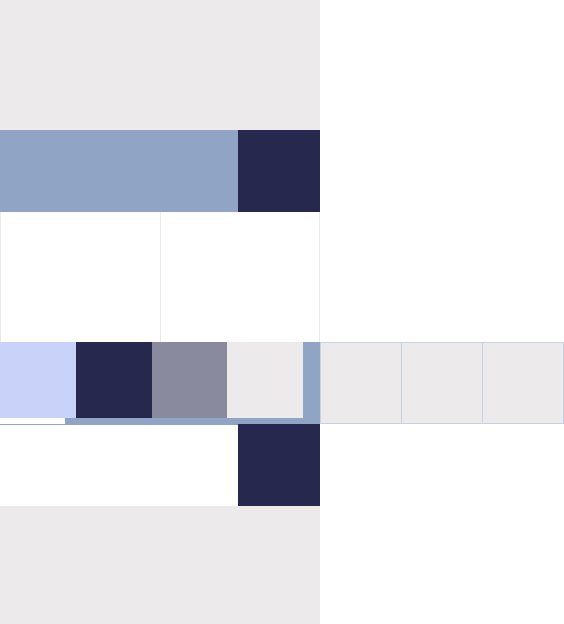
Schematic block layout with a section scrolling horizontally
When to use
Use the block layout to display section-based text and information. By placing elements next to each other, a relation of content between these can be established.
When not to use
Do not use the block layout to display properties or features of one content item. In that case, use the Object Page instead. Use the tile for KPI-based representations, statuses, and representations of applications. Also do not navigate inside the block layout or allow controls to update areas except their own block container.
Layout
The block layout is subdivided vertically into sections. These sections take on the full width of the available screen real estate and a height derived from the content placed inside them (thus avoiding vertical scrolling). Sections can be further subdivided horizontally into areas with predefined ratios.
Possible widths of areas (in device context L) are:
- 1 block: 100%
- 2 blocks: 75% and 25% / 25% and 75%
- 2 blocks: 50% and 50%
- 3 blocks: 2 × 25% and 50% / 50% and 2 × 25% / 25% and 50% and 25%
- 4 blocks: 4 × 25%
Horizontal scrolling sections always have a width of 100%.
Responsiveness & Adaptiveness
The block layout offers a responsive behavior. There are three break points which results in four supported sizes: XL, L, M and S. As with the Grid, another generic layout control, these break points can be either the break points of the Page or the ones of the block layout. In contrast to the page’s break points which react to the screen width, the break points of the block layout react to the width of the control itself.
Ratios of areas in different device contexts:
| Blocks per section | XL, L, M | S |
| 1 | 100% | 100% |
| 2 | 75% and 25% 25% and 75% |
100% each* 100% each* |
| 2 | 50% and 50% | 100% each* |
| 3 | 2 × 25% and 50% 50% and 2 × 25% 25% and 50% and 25% |
100% each* 100% each* 100% each* |
| 4 | 4 × 25% | 100% each* |
*Blocks wrap and display underneath each other
Responsive behavior of sections and areas
Responsive behavior of sections and areas
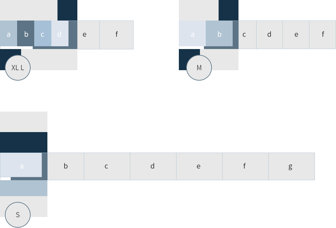
Responsive behavior of a section with horizontal scrolling
Horizontal scrolling areas width in different device contexts:
| XL, L | M | S |
| 22.5% or 40% depending on the number of areas 3 to 5 areas: 40% 6 to 10 areas: 22.5% |
40% | 90% |
Types
There are three types of block layouts:
- Default: Layout only
- Bright: Layout with bright background colors (for the current set of controls)
- Mixed: Layout with bright and dark background colors (additionally for the dark controls introduced after Wave 12)
Note: To use the latter two types, set the background parameter to either “bright” or “mixed”.
Components
The block layout comprises sections containing areas. Each section can have one to four areas.
Three to ten areas can be placed inside a section for horizontal scrolling. Each of its areas takes on the same width.
The following UI elements can be placed in all areas:
- Header and floating text (see description below)
- Other text elements; including dedicated text display containers like object number, object status, etc.
- Image
- Link
- Maps
These UI elements can be placed inside the areas of 40% width or wider (size L):
- Table
- Forms
- Text input controls, e.g. input field, text area
- Selection controls, e.g. select, combo box, date picker, radio button, check box, etc.
- Rating indicator
- Switch and slider
These UI elements can be placed inside the narrower areas only:
- Micro charts
- Icons
- Text input controls, e.g. input field, text area
- Selection controls, e.g. select, combo box, date picker, radio button, check box, etc.
- Rating indicator
- Switch and slider
Styles
Colors
First Type: Layout Only
The first type of layout does not use background colors.
Second Type: Bright Background Colors
In the second type, areas have a set of predefined colors stemming from the SAP Fiori visual design language. These colors are used successively in the layout. If there are more than four areas, the background colors start over from the first color.
Third Type: Mixed Background Colors
In this type, areas of 25% (size L) can have a dark background color. In each section, one area can be dark. Two colors are derived from the dark base color of the SAP Fiori 2.0 visual design language and are used alternately.
Default controls must always be placed on bright backgrounds, while inverted controls must be used for areas with background colors.
Information: Implementation of inverted controls is planned for Wave 12. Until these are available, usage of Type 1 and 2 is allowed. Type 3 will be rolled out when inverted controls are available.
Note: Of course, custom colors can also be used for the backgrounds of the block layout. For example, accent colors fulfill the standard contrast ratio and thus are accessible against white text. Nevertheless, use custom colors carefully and do not combine them with controls using semantic colors.
Spacing
Blocks inside the layout have an inner spacing of 2 rem on their sides and 1 rem at the top and bottom in device contexts XL, L, and M.
In device context S, the inner spacing is 1 rem.
This default spacing can be customized by means of the SAPUI5 CSS classes for spacing. For example, the class .sapUiSmallMargin adds 1 rem, while .sapUiMediumMargin adds 2 rem on the inside of areas when attached to controls.
Resources
Want to dive deeper? Follow the links below to find out more about related controls, the SAPUI5 implementation, and the visual design.
Implementation
- Block Layout (SAPUI5 samples)
- Block Layout (SAPUI5 API reference)
- Form (SAPUI5 API reference)
- Form (SAPUI5 samples)
 Your feedback has been sent to the SAP Fiori design team.