
- SAPUI5 Version 1.122
- SAPUI5 Version 1.120
- SAPUI5 Version 1.118
- SAPUI5 Version 1.116
- SAPUI5 Version 1.114
- SAPUI5 Version 1.112
- SAPUI5 Version 1.110
- SAPUI5 Version 1.108
- SAPUI5 Version 1.106
- SAPUI5 Version 1.104
- SAPUI5 Version 1.102
- SAPUI5 Version 1.100
- SAPUI5 Version 1.98
- SAPUI5 Version 1.96
- SAPUI5 Version 1.94
- SAPUI5 Version 1.92
- SAPUI5 Version 1.90
- SAPUI5 Version 1.88
- SAPUI5 Version 1.86
- SAPUI5 Version 1.84
- SAPUI5 Version 1.82
- SAPUI5 Version 1.80
- SAPUI5 Version 1.78
- SAPUI5 Version 1.76
- SAPUI5 Version 1.74
- SAPUI5 Version 1.72
- SAPUI5 Version 1.70
- SAPUI5 Version 1.68
- SAPUI5 Version 1.66
- SAPUI5 Version 1.64
- SAPUI5 Version 1.62
- SAPUI5 Version 1.60
- SAPUI5 Version 1.58
- SAPUI5 Version 1.56
- SAPUI5 Version 1.54
- SAPUI5 Version 1.52
- SAPUI5 Version 1.50
- SAPUI5 Version 1.48
- SAPUI5 Version 1.46
- SAPUI5 Version 1.44
- SAPUI5 Version 1.42
- SAPUI5 Version 1.40
- SAPUI5 Version 1.38
- SAPUI5 Version 1.36
- SAPUI5 Version 1.34
- SAPUI5 Version 1.32
- SAPUI5 Version 1.30
- SAPUI5 Version 1.28
- SAPUI5 Version 1.26
- Latest SAPUI Version 1.124
- SAPUI5 Version 1.122
- SAPUI5 Version 1.120
- SAPUI5 Version 1.118
- SAPUI5 Version 1.116
- SAPUI5 Version 1.114
- SAPUI5 Version 1.112
- SAPUI5 Version 1.110
- SAPUI5 Version 1.108
- SAPUI5 Version 1.106
- SAPUI5 Version 1.104
- SAPUI5 Version 1.102
- SAPUI5 Version 1.100
- SAPUI5 Version 1.98
- SAPUI5 Version 1.96
- SAPUI5 Version 1.94
- SAPUI5 Version 1.92
- SAPUI5 Version 1.90
- SAPUI5 Version 1.88
- SAPUI5 Version 1.86
- SAPUI5 Version 1.84
- SAPUI5 Version 1.82
- SAPUI5 Version 1.80
- SAPUI5 Version 1.78
- SAPUI5 Version 1.76
- SAPUI5 Version 1.74
- SAPUI5 Version 1.72
- SAPUI5 Version 1.70
- SAPUI5 Version 1.68
- SAPUI5 Version 1.66
- SAPUI5 Version 1.64
- SAPUI5 Version 1.62
- SAPUI5 Version 1.60
- SAPUI5 Version 1.58
- SAPUI5 Version 1.56
- SAPUI5 Version 1.54
- SAPUI5 Version 1.52
- SAPUI5 Version 1.50
- SAPUI5 Version 1.48
- SAPUI5 Version 1.46
- SAPUI5 Version 1.44
- SAPUI5 Version 1.42
- SAPUI5 Version 1.40
- SAPUI5 Version 1.38
- SAPUI5 Version 1.36
- SAPUI5 Version 1.34
- SAPUI5 Version 1.32
- SAPUI5 Version 1.30
- SAPUI5 Version 1.28
- SAPUI5 Version 1.26
Block Layout
sap.ui.layout.BlockLayout
Intro
The block layout is used to display content in a section-based manner. It features horizontal and vertical subdivisions and full-width banners seen frequently in contemporary web design. Background colors are attached directly to these areas within the layout. Also, special full-width sections of the block layout enable horizontal scrolling through a set of areas.
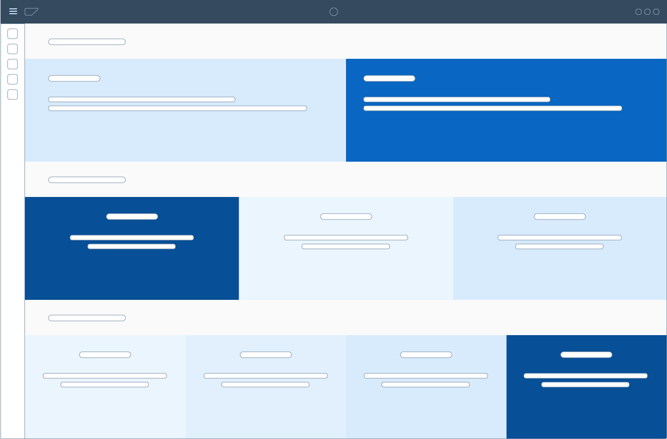
General page structure of a tool using the block layout
Usage
Use the block layout if:
- You want to display section-based content. Place elements next to each other to indicate a content relationship.
Do not use the block layout if:
- You want to display properties or features of one content item. Use the object page floorplan instead.
- You want to display KPIs in the dashboard-variant. Use the overview page or a layout using cards instead.
Block layout case examples include landing pages and catalog-like pages.
In landing pages, the block layout may serve as a banner-like presentation of illustrative icons with associated text. By placing pictorial and textual elements side by side in different areas, a content relationship is established. In catalog-like layouts, the block layout serves as a flexible container for diverging content, such as headings, explanatory texts, code snippets, remarks, and examples.
It is also possible to have clickable blocks with their own hover and pressed states.
Layout
The block layout is divided into horizontal sections, which take on the full width of the available screen real estate. Their screen height is determined by their inner content, which prevents vertical scrolling.
If needed, the width of sections can also be set to the following predefined ratios (for the sizes XL, L and M):
- 1 block: 100%
- 2 blocks:
- 50% and 50% or
- 75% and 25% or
- 25% and 75%
- 3 blocks:
- 3 × 33% or
- 2 × 25% and 50% or
- 50% and 2 × 25% or
- 25% and 50% and 25%
- 4 blocks: 4 × 25%
Block layouts can also contain sections that allow horizontal scrolling. These sections always have a width of 100%.

Schematic block layout

Schematic block layout with a section scrolling horizontally
Components
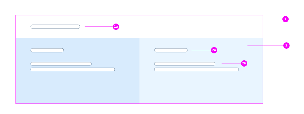
Block layout components
1 – Section
1a – Section Title
2 – Block
2a – Block Title – can be text or a link.
2b – Block Body – can contain text or other controls.
Types
There are four types of block layouts:
- Default: This layout does not use any background colors.
- Dashboard: This layout type uses white blocks with spacing around them, making each block look like a card.
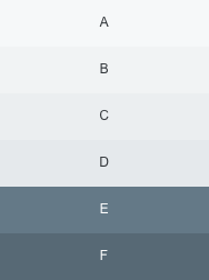
- Light: Areas use predefined colors found in the SAP Fiori 3 Quartz Light theme. These colors follow a specific order that is defined in the control. If there are more than six areas, the background colors start over beginning with the initial color.
- Accent: Each row contains a range of colors derived from one accent color, and these colors are used alternately. If required by the control, you can display multiple gray blocks: the different shades of gray will then be displayed alternately, beginning with the initial color.
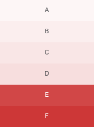
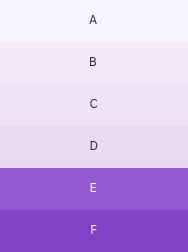
Light Color Set
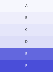
For the Light variant, use colors as follows:
- block color A for the section title block.
- block colors B, C, D, E, F and G for the blocks, one after another.
- block color H for the footer.
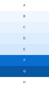
Color set for the "Light" block layout type
Accent Color Sets
Row (Section) Color Sets
For the Accent variant of the block layout, you can use a different color set for each row (sap.ui.layout.BlockLayoutRow, property:rowColorSet). This enables different starting colors for the row coloring, and prevents color coalescence in the responsive behavior of the block layout.
Cell (Block) Colors
There are 10 predefined color sets that you can use as accent variants, each with 6 different shades.
To change the background of a particular block, set the desired color set (sap.ui.layout.BlockLayoutCell, property: backgroundColorSet) and color shade (sap.ui.layout.BlockLayoutCell, property: backgroundColorShade) accordingly.
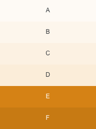
Color set 1, with shades A to F
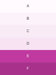
Color set 4, with shades A to F
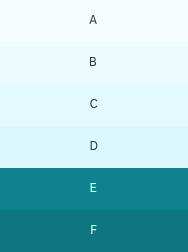
Color set 7, with shades A to F
Color set 10, with shades A to F
Color set 2, with shades A to F
Color set 5, with shades A to F
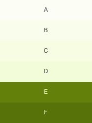
Color set 8, with shades A to F
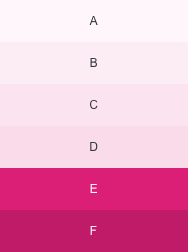
Color set 3, with shades A to F
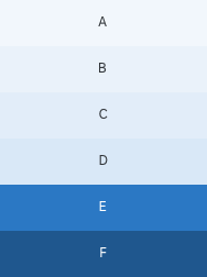
Color set 6, with shades A to F
Color set 9, with shades A to F
Images
Images may be placed as background images within one block. The predefined paddings do not apply to blocks with images; images fill out the entire block.
If needed, the title control may be placed on top of the images.
Responsiveness
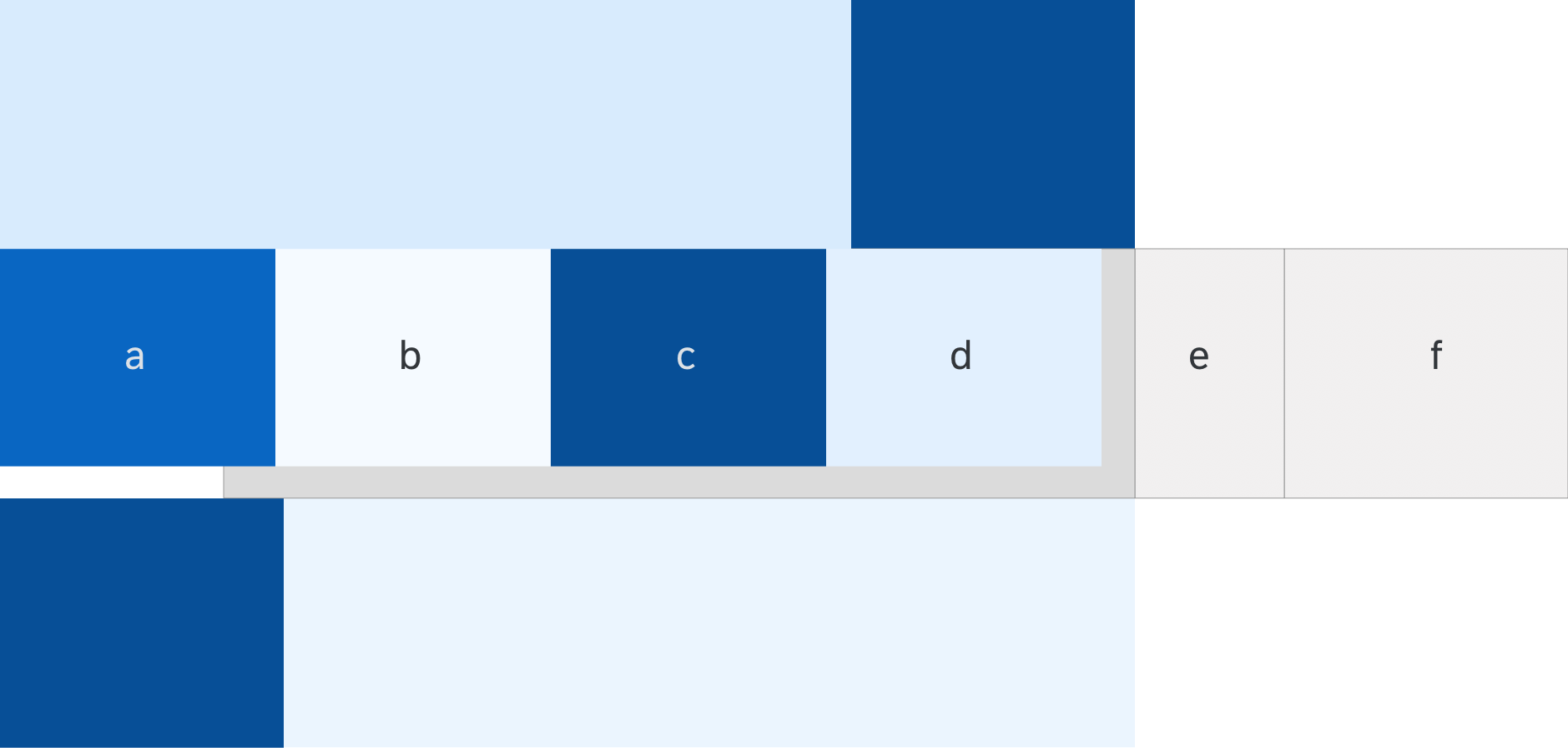
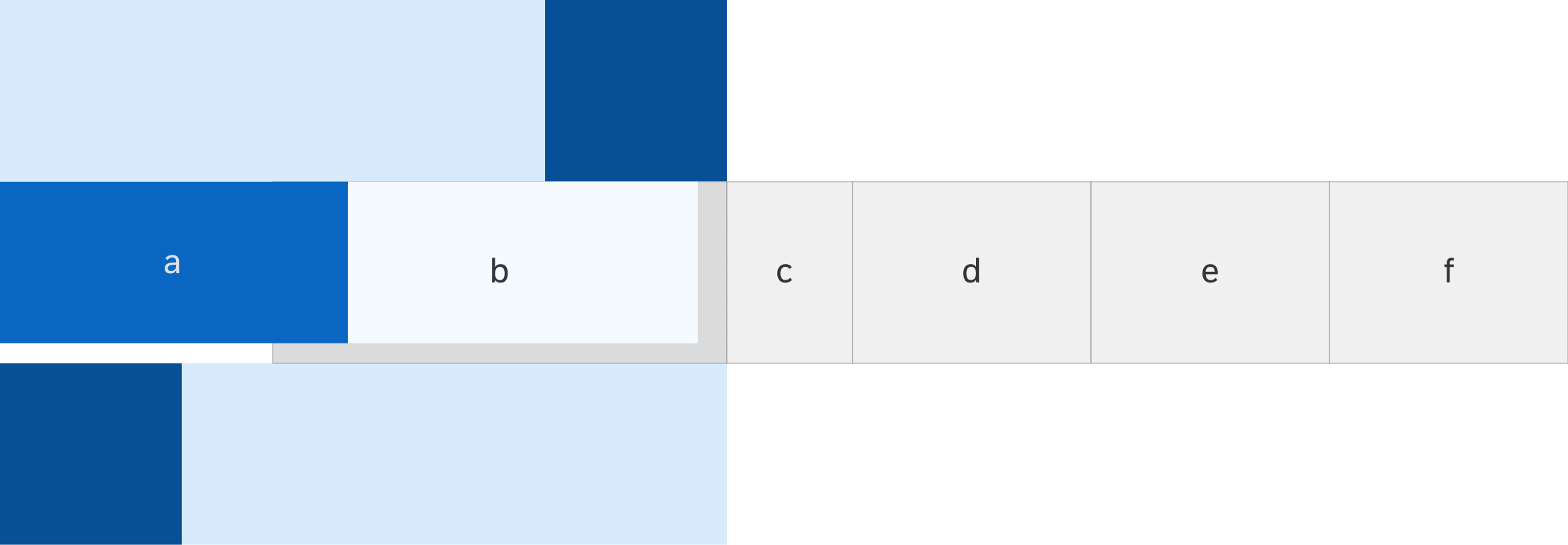
The block layout offers responsive behavior. There are three breakpoints, which results in four supported sizes: XL, L, M, and S. As with the responsive grid (another generic layout control), these breakpoints apply both to the page and block layout. However, the page layout’s breakpoints react to screen width, whereas the breakpoints of the block layout react to the width of the control itself.
Ratios of areas in different contexts
| Blocks per section | XL, L | M | S |
| 1
(Block 1) |
100% | 100% | 100% |
| 2
(Blocks 2-3) |
75% and 25% or 25% and 75% |
75% and 25% or 25% and 75% |
100% each* 100% each* |
| 2
(Blocks 4-5) |
50% and 50% | 50% and 50% | 100% each* |
| 3
(Blocks 6-8) |
3 × 33% | 3 × 33% | 100% each* |
| 3
(Blocks 9-11) |
2 × 25% and 1 × 50% or 1 × 50% and 2 × 25% or 1 × 25%, 1 × 50% and 1 × 25% |
2 × 50% and 1 × 100% over two rows or 1 × 100% and 2 × 50% over two rows |
100% each* 100% each* 100% each* |
| 4
(Blocks 12-15) |
4 × 25% | 2 × 50% over two rows | 100% each* |
*Blocks wrap and are displayed underneath each other
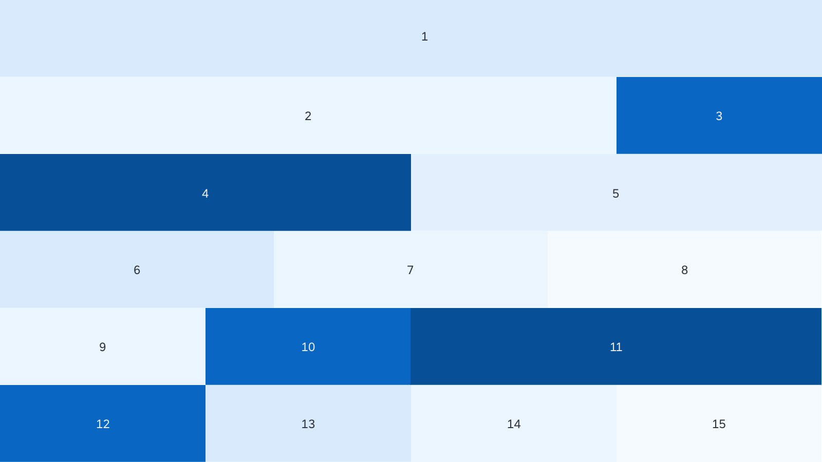
Responsive behavior - Size XL
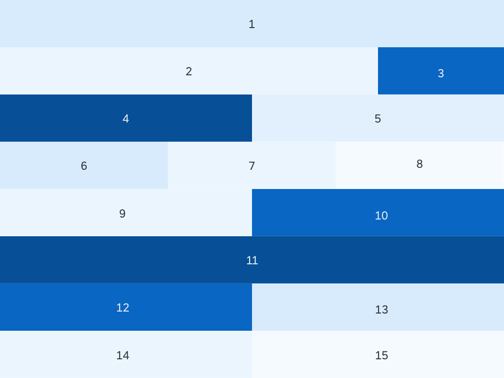
Responsive behavior - Size M
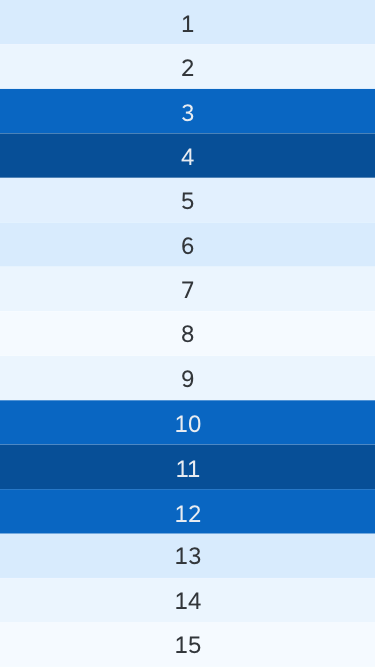
Responsive behavior - Size S
Sections with Horizontal Scrolling
The width of the horizontal scrolling area in different device contexts:
| Blocks per section | XL, L | M | S |
| 3 – 5 | 40% | 40% | 90% |
| 6 – 10 | 22.5% | 40% | 90% |
Responsive behavior of a section with horizontal scrolling - Size L
Responsive behavior of a section with horizontal scrolling - Size M

Responsive behavior of a section with horizontal scrolling - Size S
Resources
Want to dive deeper? Follow the links below to find out more about related controls, the SAPUI5 implementation, and the visual design.
Implementation
- Block Layout (SAPUI5 samples)
- Block Layout (SAPUI5 API reference)
- Form (SAPUI5 API reference)
- Form (SAPUI5 samples)
 Your feedback has been sent to the SAP Fiori design team.