
- Latest SAPUI Version 1.124
- SAPUI5 Version 1.122
- SAPUI5 Version 1.120
- SAPUI5 Version 1.118
- SAPUI5 Version 1.116
- SAPUI5 Version 1.114
- SAPUI5 Version 1.112
- SAPUI5 Version 1.110
- SAPUI5 Version 1.108
- SAPUI5 Version 1.106
- SAPUI5 Version 1.104
- SAPUI5 Version 1.102
- SAPUI5 Version 1.100
- SAPUI5 Version 1.98
- SAPUI5 Version 1.96
- SAPUI5 Version 1.94
- SAPUI5 Version 1.92
- SAPUI5 Version 1.90
- SAPUI5 Version 1.88
- SAPUI5 Version 1.86
- SAPUI5 Version 1.84
- SAPUI5 Version 1.82
- SAPUI5 Version 1.80
- SAPUI5 Version 1.78
- SAPUI5 Version 1.76
- SAPUI5 Version 1.74
- SAPUI5 Version 1.72
- SAPUI5 Version 1.70
- SAPUI5 Version 1.68
- SAPUI5 Version 1.66
- SAPUI5 Version 1.64
- SAPUI5 Version 1.62
- SAPUI5 Version 1.60
- SAPUI5 Version 1.58
- SAPUI5 Version 1.56
- SAPUI5 Version 1.54
- SAPUI5 Version 1.52
- SAPUI5 Version 1.50
- SAPUI5 Version 1.48
- SAPUI5 Version 1.46
- SAPUI5 Version 1.44
- SAPUI5 Version 1.42
- SAPUI5 Version 1.38
- SAPUI5 Version 1.36
- SAPUI5 Version 1.34
- SAPUI5 Version 1.32
- SAPUI5 Version 1.30
- SAPUI5 Version 1.28
- SAPUI5 Version 1.26
- Latest SAPUI Version 1.124
- SAPUI5 Version 1.122
- SAPUI5 Version 1.120
- SAPUI5 Version 1.118
- SAPUI5 Version 1.116
- SAPUI5 Version 1.114
- SAPUI5 Version 1.112
- SAPUI5 Version 1.110
- SAPUI5 Version 1.108
- SAPUI5 Version 1.106
- SAPUI5 Version 1.104
- SAPUI5 Version 1.102
- SAPUI5 Version 1.100
- SAPUI5 Version 1.98
- SAPUI5 Version 1.96
- SAPUI5 Version 1.94
- SAPUI5 Version 1.92
- SAPUI5 Version 1.90
- SAPUI5 Version 1.88
- SAPUI5 Version 1.86
- SAPUI5 Version 1.84
- SAPUI5 Version 1.82
- SAPUI5 Version 1.80
- SAPUI5 Version 1.78
- SAPUI5 Version 1.76
- SAPUI5 Version 1.74
- SAPUI5 Version 1.72
- SAPUI5 Version 1.70
- SAPUI5 Version 1.68
- SAPUI5 Version 1.66
- SAPUI5 Version 1.64
- SAPUI5 Version 1.62
- SAPUI5 Version 1.60
- SAPUI5 Version 1.58
- SAPUI5 Version 1.56
- SAPUI5 Version 1.54
- SAPUI5 Version 1.52
- SAPUI5 Version 1.50
- SAPUI5 Version 1.48
- SAPUI5 Version 1.46
- SAPUI5 Version 1.44
- SAPUI5 Version 1.42
- SAPUI5 Version 1.40
- SAPUI5 Version 1.38
- SAPUI5 Version 1.36
- SAPUI5 Version 1.34
- SAPUI5 Version 1.32
- SAPUI5 Version 1.30
- SAPUI5 Version 1.28
- SAPUI5 Version 1.26
Smart Filter Bar Annotations
Intro
The smart filter bar is a wrapper that analyzes a given OData service and renders a filter bar based on the content defined by the service. For example, the OData service determines whether a field is visible on the filter bar, and whether it supports type-ahead and value help. To configure more settings or overwrite the settings from the OData service, the developer can set additional annotations in an external document (metadata.xml).
Developers can use annotation properties in the classes [external_only]ControlConfiguration and GroupConfiguration to adapt the filter bar for the purposes of the app.
These annotations let you:
- Determine the type of control (for example, whether a field is shown as a multi-input field or as a date picker)
- Enable the autocomplete suggestions feature
- Enable the value help dialog
- Overwrite settings from the OData service
- Set custom filter groups
- Add custom fields
- Access all settings for the underlying filter bar
You can also use all the configuration options described here in the smart filter bar for the list report (SAP Fiori Elements).
Usage
Use the smart filter bar if:
- An OData service is available.
- You want to develop quickly and efficiently.
Do not use the smart filter bar if:
- You need to make extensive changes to the filter bar.
Components
You can use the annotation properties listed below to influence how filters are rendered in the expanded filter bar and in the filter dialog.

Smart filter bar - Properties for the expanded filter bar
defaultFilterValues.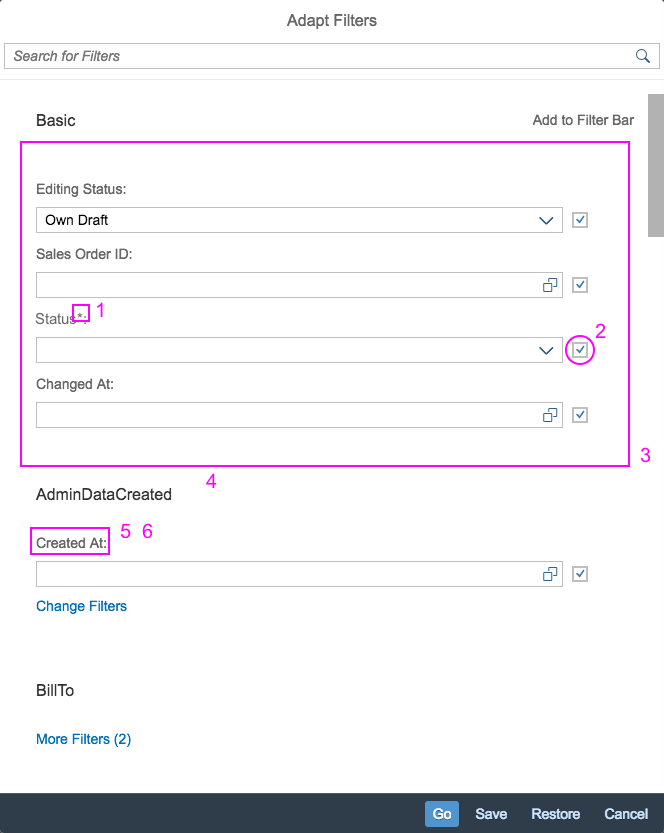
SmartFilterBar Properties on the Filter Dialog
The smart filter bar analyzes and interprets the metadata provided by the OData service. This allows you to create complex UI entities, and to automatically add fields offered by the OData service to the filter bar as editable input fields. (Note that only fields marked with sap:filterable are added automatically.)
The tables below tell you which input controls are used for the key data types.
General Data Types
| DataType | ODataMetadata | Additional Configuration | Edit type | Display type | Notes |
| * | * | Input | Text | ||
| DateTime | – | sap:display-format=”Date” | DatePicker | Text | |
| Decimal | – | Precision=”3″ Scale=”0″ | Input | Text | |
| All | – | Input (with VHD) | Text | If a matching ValueList annotation is found, the ValueHelp for the Input is enabled. A ValueHelp Dialog is created automatically, based on the data in the ValueList annotation. |
|
| All | – | sap:semantics=”fixed-values” on the ValueList entity |
ComboBox | Text | If a matching ValueList annotation is found, and the ValueList entity has the semantics=”fixed-values”, a dropdown list is shown. |
Filter Bar-Specific Data Types
| Input Type | sap:filter-restriction | display-format | hasValueHelpDialog | controlType | Resulting Control Type |
| * | * | controlType/filterType is specified | As specified in additional configuration | ||
| DateTime | “interval” | “Date” | NA | Date Range Selection | |
| DateTime | “anything other than interval” or empty | “Date” | NA | Date Picker | |
| String | “single-value” | “true” / none | Input Field With Value Help Dialog (with typeAhead according to hasTypeAhead flag) |
||
| String | “single-value” | “false” | not specified/input | Input Field (with typeAhead according to hasTypeAhead flag) |
|
| String | “single-value” | “false” | dropDownList; hasTypeAhead is not considered here | ComboBox | |
| * | “single-value” | Input Field | |||
| String | empty or no filter-restriction | “true” / none | Multi Input Field with Value Help Dialog | ||
| String | “multi-value” | “true” / none | If no VL Annotation is found – only show the range selection part | ||
| String | “multi-value” / empty | “false” | If no VL Annotation is found – hide the ValueHelpDialog icon | ||
| String | “multi-value” / empty | “false” | dropDownList | MultiComboBox | |
| * | “multi-value” | Input Field | |||
| * | “interval” | NA | A single Input Field that allows the “-” shortcut notation for intervals |
Properties
FilterBar
Filter Bar Properties
persistencyKey
Data type: string
Key used to access personalization data.
advancedMode
Data type: boolean
The advanced mode overwrites the standard behavior and is used in the value help scenario.
Default value is false.
expandAdvancedArea
Data type: boolean
Defines whether the advanced area is expanded when the filter bar is used within the value help dialog.
Default value is false.
searchEnabled
Data type: boolean
Enables/disables the Search button in advanced mode.
Default value is true.
filterBarExpanded
Data type: boolean
Shows/hides the expanded filter bar.
Default value is true.
considerGroupTitle
Data type: boolean
If this property is set, the label for filters is prefixed with the group title.
Default value is false.
showClearButton
Data type: boolean
Handles visibility of the Clear button on the Filters dialog.
Default value is false.
showRestoreButton
Data type: boolean
Handles visibility of the Restore button on the Filters dialog.
Default value is true.
showGoOnFB
Data type: boolean
Handles visibility of the Go button on the filter bar.
Default value is true.
showRestoreOnFB
Data type: boolean
Handles visibility of the Restore button on the filter bar.
Default value is false.
showClearOnFB
Data type: boolean
Handles visibility of the Clear button on the filter bar.
Default value is false.
showGoButton
Data type: boolean
Handles visibility of the Go button on the filter bar.
deltaVariantMode
Data type: boolean
Stores the delta as compared to the standard variant.
Default value is true.
filterContainerWidth
Data type: string
Sets the width of the filter container.
Default value is 12rem.
useToolbar
Data type: boolean
Determines what design should be used. Default is the design with the toolbar. In mobile scenarios this property is ignored – the design with the toolbar is always used.
Default value is true.
header
Data type: string
Specifies the header text that is shown in the toolbar on the first position. This property is ignored, when useToolbar is set to false.
showFilterConfiguration
Data type: boolean
Handles visibility of the Filters button on the filter bar.
Default value is true.
Smart Filter Bar
Smart Filter Bar Properties
entitySet
Data type: string
The OData entity set whose metadata is used to create the SmartFilterBar. Note: Changing this value after the SmartFilterBar is initialized (initialize event was fired) has no effect.
basicSearchFieldName
Data type: string
Name of the field that has to be the focus of the basic search. This is only relevant for SmartFilterBar in combination with ValueHelpDialog.
enableBasicSearch
Data type: boolean
Enables the basic search field in the SmartFilterBar control. This must only be enabled for entities that support such search behavior.
Default value is false.
liveMode
Data type: boolean
Defines the live mode. The live mode only operates on non-phone scenarios.
Default value is false.
showMessages
Data type: boolean
If set to false, any errors that occur during the search will not be displayed in a message box.
Default value is true.
considerAnalyticalParameters
Data type: boolean
Indicates if the analytical parameters (SelectionVariant) must be taken into consideration.
Default value is false.
Smart Filter Bar Annotations
FilterRestrictions/NonFilterableProperties
Defines whether a Property can be used for filtering data.
FieldGroup
Defines a group for a filter field.
TextArrangement
Describes the arrangement of a code value and its text.
FieldControlType/Hidden
Defines whether the filter is visible.
ValueList
Contains annotations that provide information for rendering a ValueHelpList that has been set for a Property.
Label
A short, human-readable text for the filter name.
LineItem/Label
A short, human-readable text suitable for the filter name.
FilterRestrictions/RequiredProperties
Defines the filter field as mandatory filter.
FilterExpressionType/MultiValue
Defines whether multiple values can be used in a single filter.
FilterExpressionType/SingleValue
Restricts the filter to allow only one value entry.
FilterExpressionType/SingleInterval
Restricts the filter to a specified interval, such as a date interval.
SelectionFields
Defines whether certain fields should be initially visible in the SmartFilterBar control.
Control Configuration
Control Configuration Properties
key
The key property corresponds to the field name from the OData service metadata document.
Default value is string
groupId
The groupId can be used to move a field from one group to another. The groupId corresponds to the EntityName from the OData metadata. It is also possible to move a field from the advanced area to the basic area by specifying the groupId _BASIC.
Default value is string
label
You can use this property to overwrite the label of a filter field in the SmartFilterBar.
Default value is string
visible
Data type: boolean
You can use this flag to hide fields from the OData metadata.
Default value is true
hasValueHelpDialog
Data type: boolean
Specifies whether a value help dialog is available or not.
Default value is true
controlType
Data type: sap.ui.comp.smartfilterbar.ControlType
The SmartFilterBar calculates which kind of control will be used for a filter field, based on multiple OData attributes and annotations. You can use this property to overwrite the OData metadata.
Default value is auto
filterType
Data type: sap.ui.comp.smartfilterbar.FilterType
The filter type specifies whether the filter field is for a single value, multiple values, or an interval. The filter type calculated by the SmartFilterBar is based on the OData metadata. You can use this property to configure the filter type manually.
Default value is auto
index
Data type: int
You can use the zero-based index to specify the initial order of fields (without any variants).
Default value is -1
Control Configuration Properties
hasTypeAhead
Data type: boolean
You can use this property to enable the TypeAhead service. Note that TypeAhead does not work with all controls (for example, it is not supported for the DropDownListbox).
Default value is true
mandatory
Data type: sap.ui.comp.smartfilterbar.MandatoryType
You can use this property to overwrite the mandatory state of a filter field. This property can only be set during initialization. Changes at runtime will be ignored.
Default value is auto
width
Default value is string
The width of the filter field in a CSS compatible format. The width can be set only once during initialization. Changes at runtime will not be reflected. The width is not applied to custom controls.
visibleInAdvancedArea
Data type: boolean
If set to true, this field will be added to the advanced area (aka. Dynamic Selection) by default.
Default value is false
preventInitialDataFetchInValueHelpDialog
Data type: boolean
If value help annotations are available for this filter field, you can prevent the the table in the value help dialog for this field from being filled with the initial data fetch.
Default value is true
displayBehaviour
Data type: sap.ui.comp.smartfilterbar.DisplayBehaviour
The displayBehaviour specifies how to display the content on certain controls. For example: DescriptionOnly for Combobox (DropDown text), Description and ID for MultiInput (token text)
Default value is auto
conditionType
Data type: any
The condition Type class name to use for this filter item. Implementation should derive from sap.ui.comp.config.condition.Type.
Group Configuration
Group Configuration Properties
key
Data type: string
The key property shall correspond to the name EntityTypeName from the OData service $metadata document.
index
Data type: any
Zero-based integer index. The index can be used to specify the order of groups. If no index is specified, the order defined by the OData metadata will be used.
Default value is undefined
label
Data type: any
You can use this property to overwrite the label of a group in the advanced area of the SmartFilterBar.
Default value is undefined
Resources
Want to dive deeper? Follow the links below to find out more about related controls, the SAPUI5 implementation, and the visual design.
Implementation
- Smart Filter Bar (SAPUI5 samples)
- Smart Filter Bar (SAPUI5 API reference)
- UI Development Toolkit (SAPUI5 samples)
 Your feedback has been sent to the SAP Fiori design team.