
- Latest SAPUI Version 1.124
- SAPUI5 Version 1.122
- SAPUI5 Version 1.120
- SAPUI5 Version 1.118
- SAPUI5 Version 1.116
- SAPUI5 Version 1.114
- SAPUI5 Version 1.112
- SAPUI5 Version 1.110
- SAPUI5 Version 1.108
- SAPUI5 Version 1.104
- SAPUI5 Version 1.102
- SAPUI5 Version 1.100
- SAPUI5 Version 1.98
- SAPUI5 Version 1.96
- SAPUI5 Version 1.94
- SAPUI5 Version 1.92
- SAPUI5 Version 1.90
- SAPUI5 Version 1.88
- SAPUI5 Version 1.86
- SAPUI5 Version 1.84
- SAPUI5 Version 1.82
- SAPUI5 Version 1.80
- SAPUI5 Version 1.78
- SAPUI5 Version 1.76
- SAPUI5 Version 1.74
- SAPUI5 Version 1.72
- SAPUI5 Version 1.70
- SAPUI5 Version 1.68
- SAPUI5 Version 1.66
- SAPUI5 Version 1.64
- SAPUI5 Version 1.62
- SAPUI5 Version 1.60
- SAPUI5 Version 1.58
- SAPUI5 Version 1.56
- SAPUI5 Version 1.54
- SAPUI5 Version 1.52
- SAPUI5 Version 1.50
- SAPUI5 Version 1.48
- SAPUI5 Version 1.46
- SAPUI5 Version 1.44
- SAPUI5 Version 1.42
- SAPUI5 Version 1.40
- SAPUI5 Version 1.38
- SAPUI5 Version 1.36
- SAPUI5 Version 1.34
- SAPUI5 Version 1.32
- SAPUI5 Version 1.30
- SAPUI5 Version 1.28
- SAPUI5 Version 1.26
- Latest SAPUI Version 1.124
- SAPUI5 Version 1.122
- SAPUI5 Version 1.120
- SAPUI5 Version 1.118
- SAPUI5 Version 1.116
- SAPUI5 Version 1.114
- SAPUI5 Version 1.112
- SAPUI5 Version 1.110
- SAPUI5 Version 1.108
- SAPUI5 Version 1.106
- SAPUI5 Version 1.104
- SAPUI5 Version 1.102
- SAPUI5 Version 1.100
- SAPUI5 Version 1.98
- SAPUI5 Version 1.96
- SAPUI5 Version 1.94
- SAPUI5 Version 1.92
- SAPUI5 Version 1.90
- SAPUI5 Version 1.88
- SAPUI5 Version 1.86
- SAPUI5 Version 1.84
- SAPUI5 Version 1.82
- SAPUI5 Version 1.80
- SAPUI5 Version 1.78
- SAPUI5 Version 1.76
- SAPUI5 Version 1.74
- SAPUI5 Version 1.72
- SAPUI5 Version 1.70
- SAPUI5 Version 1.68
- SAPUI5 Version 1.66
- SAPUI5 Version 1.64
- SAPUI5 Version 1.62
- SAPUI5 Version 1.60
- SAPUI5 Version 1.58
- SAPUI5 Version 1.56
- SAPUI5 Version 1.54
- SAPUI5 Version 1.52
- SAPUI5 Version 1.50
- SAPUI5 Version 1.48
- SAPUI5 Version 1.46
- SAPUI5 Version 1.44
- SAPUI5 Version 1.42
- SAPUI5 Version 1.40
- SAPUI5 Version 1.38
- SAPUI5 Version 1.36
- SAPUI5 Version 1.34
- SAPUI5 Version 1.32
- SAPUI5 Version 1.30
- SAPUI5 Version 1.28
- SAPUI5 Version 1.26
Smart Filter Bar
Intro
The smart filter bar uses annotations to create a filter bar. It’s a wrapper that analyzes a given OData service and renders a filter bar based on the content defined by the service. For example, the OData service determines whether a field is visible on the filter bar, and whether it supports type-ahead and value help. To configure more settings or overwrite the settings from the OData service, the developer can set additional annotations in an external document (metadata.xml).
The developer can use annotation properties in the classes ControlConfiguration and GroupConfiguration to adapt the filter bar for the purposes of the app.
These annotations let you:
- Determine the type of control (for example, whether a field is shown as a multi-input field or as a date picker)
- Enable the autocomplete suggestions feature
- Enable the value help dialog
- Overwrite settings from the OData service
- Set custom filter groups
- Add custom fields
- Access all settings for the underlying filter bar
You can also use all the configuration options described here in the smart filter bar for the list report SAP Fiori element.
Usage
Use the smart filter bar if:
- An OData service is available.
- You want to develop quickly and efficiently.
Do not use the smart filter bar if:
- You need to make extensive changes to the filter bar.
Components
You can use the annotation properties listed below to influence how filters are rendered in the expanded filter bar and in the filter dialog.

Properties of the expanded filter bar
1 enableBasicSearch
Defines whether the filter bar includes a basic search. By default, the basic search is not included.
2 FilterRestrictions/NonFilterableProperties
Defines whether a property is available as a filter criterion.
3 FilterRestrictions/RequiredProperties
Defines the filter field as a mandatory filter. Mandatory filters are marked by an asterisk (*).
4 ValueList
Contains annotations that provide information for rendering a value help list that has been set for a property.
5 FilterExpressionType/MultiValue
Defines whether multiple values can be used in a single filter.
6 FilterExpressionType/SingleValue
Restricts the filter to allow only one value entry.
7 LineItem/Label
A short, human-readable text for the filter name.
8 DynamicDateRange
The dynamic date range supports different operators, such as “Today -X / +Y days”. X and Y also support negative values (thus ranges in the past of future can be selected).
8 insertDefaultFilterValue
Inserts a default filter value into the aggregation defaultFilterValues.
9 liveMode
Defines whether the expanded filter bar is shown in live mode (no Go button) or in manual mode. By default, the filter bar is shown in manual mode.
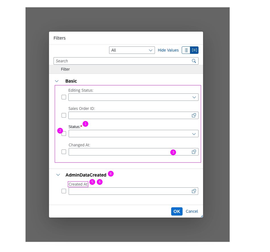
Properties of the filter dialog
1 FilterRestrictions/RequiredProperties
Defines the filter field as a mandatory filter. Mandatory filters are marked by an asterisk (*).
2 FieldControlType/Hidden
Defines whether the filter is initially visible on the expanded filter bar.
3 SelectionFields
Defines whether a filter belongs to the basic group. All filters in the basic group are initially visible on the expanded filter bar.
4 FieldGroup
Defines whether a filter field is initially shown on the filter dialog, and which group it belongs to.
5 FilterRestrictions/NonFilterableProperties
Defines whether a property is available as a filter criterion.
6 LineItem/Label
A short, human-readable text for the filter name.
Fiscal Annotations
As an example, the smart filter bar supports fiscal annotations, like i.e. for fiscal period / data / time information. Such annotations guarantee the correct rendering of such values.
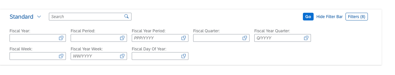
Smart filter bar with filters based on fiscal annotations
Recently Used Values
The smart filter bar provides a history of the most recent values entered in smart filter fields.
- When the user focuses on a field, the app can display a small number of recently used values. They are shown below the recommended items, which can appear at the same time.
- When the dropdown list is opened, all values are shown. When the user starts to type, the recently used values are filtered accordingly.
IN / OUT Parameter
In the smart filter bar, a dropdown or suggestion list can only contain a sub-set of items in case a dependent filter is set (IN parameter). It is also possible that selecting a value in a dropdown or suggestion list fills the current plus additional filter fields (OUT parameter).
The smart filter bar analyzes and interprets the metadata provided by the OData service. This allows you to create complex UI entities, and to automatically add fields offered by the OData service to the filter bar as editable input fields. (Note that only fields marked with sap:filterable are added automatically.)
The tables below tell you which input controls are used for the key data types.
General Data Types
| DataType | ODataMetadata | Additional Configuration | Edit type | Display type | Notes |
| * | * | Input | Text | ||
| DateTime | – | sap:display-format=”Date” | DatePicker | Text | |
| Decimal | – | Precision=”3″ Scale=”0″ | Input | Text | |
| All | – | Input (with VHD) | Text | If a matching ValueList annotation is found, the ValueHelp for the Input is enabled. A ValueHelp Dialog is created automatically, based on the data in the ValueList annotation. |
|
| All | – | sap:semantics=”fixed-values” on the ValueList entity |
ComboBox | Text | If a matching ValueList annotation is found, and the ValueList entity has the semantics=”fixed-values”, a dropdown list is shown. |
Filter Bar-Specific Data Types
| Input Type | sap:filter-restriction | display-format | hasValueHelpDialog | controlType | Resulting Control Type |
| * | * | controlType/filterType is specified | As specified in additional configuration | ||
| DateTime | “interval” | “Date” | NA | Date Range Selection | |
| DateTime | “anything other than interval” or empty | “Date” | NA | Date Picker | |
| String | “single-value” | “true” / none | Input Field With Value Help Dialog (with typeAhead according to hasTypeAhead flag) |
||
| String | “single-value” | “false” | not specified/input | Input Field (with typeAhead according to hasTypeAhead flag) |
|
| String | “single-value” | “false” | dropDownList; hasTypeAhead is not considered here | ComboBox | |
| * | “single-value” | Input Field | |||
| String | empty or no filter-restriction | “true” / none | Multi Input Field with Value Help Dialog | ||
| String | “multi-value” | “true” / none | If no VL Annotation is found – only show the range selection part | ||
| String | “multi-value” / empty | “false” | If no VL Annotation is found – hide the ValueHelpDialog icon | ||
| String | “multi-value” / empty | “false” | dropDownList | MultiComboBox | |
| * | “multi-value” | Input Field | |||
| * | “interval” | NA | A single Input Field that allows the “-” shortcut notation for intervals |
Guidelines
Reduced set of table columns for the tabular suggestion
You have the option to define different columns in the table of the Value Help Dialog and the suggestion list of the Smart Filter Bar.
In the value list annotation, each parameter can be statically annotated as important using the <code>Importance</code> annotation with EnumMember set to High:
<Annotation Term="com.sap.vocabularies.UI.v1.Importance"
EnumMember="com.sap.vocabularies.UI.v1.ImportanceType/High" />
In the suggestion list only the important parameters are displayed as columns, while in the table of the Value Help Dialog all of the parameters are displayed.
The Importance annotation is optional – if omitted all of the parameters are displayed in both table of the Value Help Dialog and the suggestion list of the Smart Filter Bar.
Formatting option for negative numbers
The OData type “NumericText” together with display-format=”NonNegative” interprets and displays all values containing only “0” (e.g. “0”, “000”) as empty.
Resources
Want to dive deeper? Follow the links below to find out more about related controls, the SAPUI5 implementation, and the visual design.
Implementation
- Smart Filter Bar (SAPUI5 samples)
- Smart Filter Bar (SAPUI5 API reference)
- Smart Filter Bar Annotations (SAPUI5 API reference)
- Filter Bar (SAPUI5 samples)
- Filter Bar (SAPUI5 API reference)
- UI Development Toolkit (SAPUI5 samples)
 Your feedback has been sent to the SAP Fiori design team.