
- Latest SAPUI Version 1.124
- SAPUI5 Version 1.122
- SAPUI5 Version 1.120
- SAPUI5 Version 1.118
- SAPUI5 Version 1.116
- SAPUI5 Version 1.114
- SAPUI5 Version 1.112
- SAPUI5 Version 1.110
- SAPUI5 Version 1.108
- SAPUI5 Version 1.106
- SAPUI5 Version 1.104
- SAPUI5 Version 1.102
- SAPUI5 Version 1.100
- SAPUI5 Version 1.98
- SAPUI5 Version 1.96
- SAPUI5 Version 1.94
- SAPUI5 Version 1.92
- SAPUI5 Version 1.90
- SAPUI5 Version 1.88
- SAPUI5 Version 1.86
- SAPUI5 Version 1.84
- SAPUI5 Version 1.82
- SAPUI5 Version 1.80
- SAPUI5 Version 1.78
- SAPUI5 Version 1.76
- SAPUI5 Version 1.74
- SAPUI5 Version 1.72
- SAPUI5 Version 1.70
- SAPUI5 Version 1.68
- SAPUI5 Version 1.66
- SAPUI5 Version 1.64
- SAPUI5 Version 1.62
- SAPUI5 Version 1.60
- SAPUI5 Version 1.58
- SAPUI5 Version 1.56
- SAPUI5 Version 1.54
- SAPUI5 Version 1.52
- SAPUI5 Version 1.50
- SAPUI5 Version 1.48
- SAPUI5 Version 1.46
- SAPUI5 Version 1.42
- SAPUI5 Version 1.40
- SAPUI5 Version 1.38
- SAPUI5 Version 1.36
- SAPUI5 Version 1.34
- SAPUI5 Version 1.32
- SAPUI5 Version 1.30
- SAPUI5 Version 1.28
- SAPUI5 Version 1.26
- Latest SAPUI Version 1.124
- SAPUI5 Version 1.122
- SAPUI5 Version 1.120
- SAPUI5 Version 1.118
- SAPUI5 Version 1.116
- SAPUI5 Version 1.114
- SAPUI5 Version 1.112
- SAPUI5 Version 1.110
- SAPUI5 Version 1.108
- SAPUI5 Version 1.106
- SAPUI5 Version 1.104
- SAPUI5 Version 1.102
- SAPUI5 Version 1.100
- SAPUI5 Version 1.98
- SAPUI5 Version 1.96
- SAPUI5 Version 1.94
- SAPUI5 Version 1.92
- SAPUI5 Version 1.90
- SAPUI5 Version 1.88
- SAPUI5 Version 1.86
- SAPUI5 Version 1.84
- SAPUI5 Version 1.82
- SAPUI5 Version 1.80
- SAPUI5 Version 1.78
- SAPUI5 Version 1.76
- SAPUI5 Version 1.74
- SAPUI5 Version 1.72
- SAPUI5 Version 1.70
- SAPUI5 Version 1.68
- SAPUI5 Version 1.66
- SAPUI5 Version 1.64
- SAPUI5 Version 1.62
- SAPUI5 Version 1.60
- SAPUI5 Version 1.58
- SAPUI5 Version 1.56
- SAPUI5 Version 1.54
- SAPUI5 Version 1.52
- SAPUI5 Version 1.50
- SAPUI5 Version 1.48
- SAPUI5 Version 1.46
- SAPUI5 Version 1.44
- SAPUI5 Version 1.42
- SAPUI5 Version 1.40
- SAPUI5 Version 1.38
- SAPUI5 Version 1.36
- SAPUI5 Version 1.34
- SAPUI5 Version 1.32
- SAPUI5 Version 1.30
- SAPUI5 Version 1.28
- SAPUI5 Version 1.26
Chart – Comparison
Intro
This page will help you choose the correct chart when you want to compare items that do not need to be displayed in a particular order. This type of comparison is also called nominal comparison, category comparison, or structure analysis. These chart types can be used to compare items such as revenues in a list of products, or transaction volumes in a list of banks.
If the items you want to compare have an intrinsic order such as dates, age, or time periods, please see the Chart – Variation through Time page.
One Set of Values
If you want to compare items based on one type of value, we recommend using a bar chart as shown in the example below.
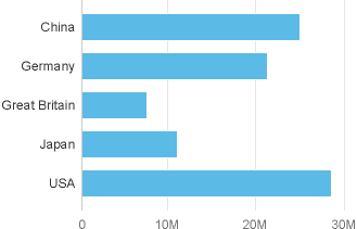
You can make it easy to compare items by ranking them in order of the largest value to the smallest value as illustrated below, or vice versa if you wish. Learn more about ranking on the Chart – Ranking page.
Countries ranked by value
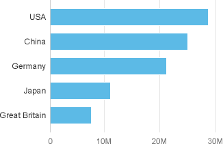
Why we recommend using a bar chart instead of a column chart
It’s worth noting that you can use a column chart or a bar chart, but if you use a bar chart you will avoid the undesirable effects that come as a result of displaying the category labels at 45°, making them hard to read and frequently leading to truncation of text.
Column chart with truncated labels at 45°
Hierarchical Categories
You can compare items within groups of the hierarchy.
In the example below, the countries are ranked inside their respective continents which makes it easy to compare each continent and each country within each continent.
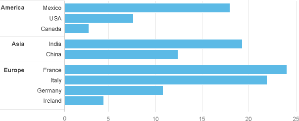
Items grouped in hierarchical categories, with items ranked within each category
Multiple Sets of Values
Compare Values Individually
We recommend using a bar chart to compare values within item categories. If one of the values acts as a point of reference, please refer to the section below on comparison with a point of reference.
The chart below compares the revenues of USA and Germany for nine product lines.
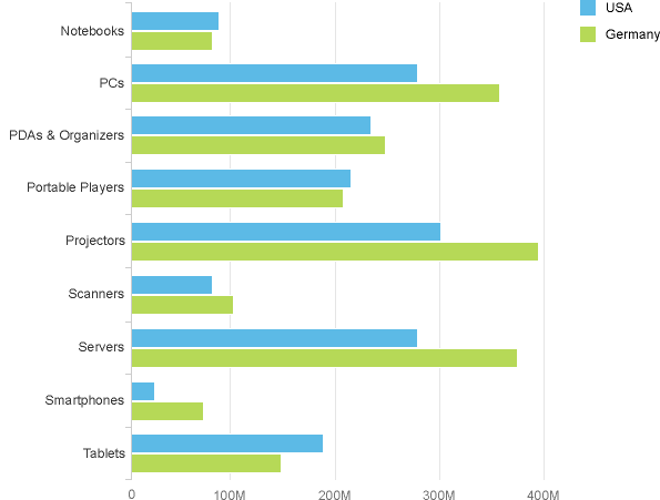
Two sets of values compared in a bar chart
As previously stated, you can make it easy to compare items by ranking them in order of the largest value to the smallest value as illustrated below, or vice versa if you wish.
In the example below, the ranking allows us to clearly see that the top three products in USA are also the top three products in Germany.
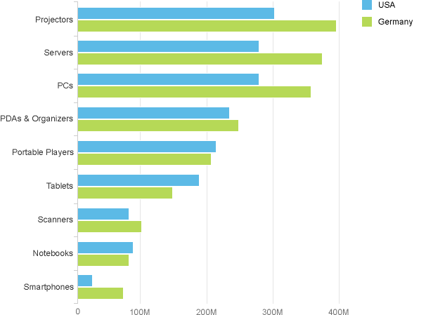
Two sets of values in a bar chart, ranked by value
Comparing with a Reference Point
Sometimes you might want to see how close a value is to reaching or exceeding a reference point. Typical examples of reference points are target, plan and budget. A benchmark or a value from the previous year can also be considered as reference points.
The chart below compares actual and planned costs for four lines of business.
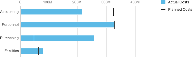
Actual and planned costs displayed in a bullet chart
Comparing Two Entire Sets of Values
If you need to compare two entire sets of values, we recommend using two bar charts side by side. You can order the items in one of the datasets in order to better highlight the differences between the two datasets.
In the example below, we can easily see that the margin for ‘Servers’ is much higher than other product lines that have a similar revenue.
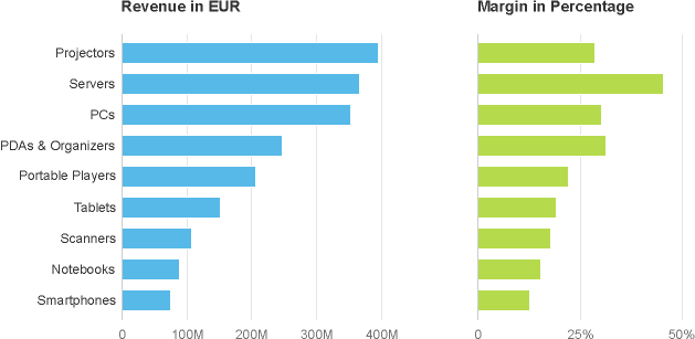
Comparison between two sets of values in bar chart
If there are many items within categories, you could also use a scatter plot or a bubble chart which are designed to illustrate correlation between datasets.
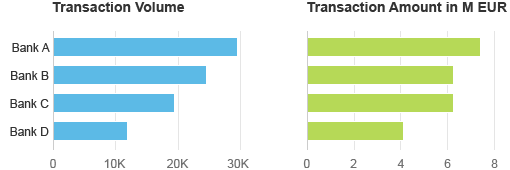
Comparing Values that have Different Units
If the values being compared have different units, you can either convert the values to a common unit such as the percentage, or you can use multiple charts side by side.
The example below displays two sets of values, the transaction volume and the transaction amount for four banks. With this type of visualization, it’s easy to spot that Bank C is the odd one out when comparing the bars.
Good example of comparison between two sets of values with different units
What Not to do: Take a look at the chart below. It contains the same information as the two charts above, but with a dual axis. It looks like the Transaction Amounts for Bank C and Bank D are bigger than their Transaction Volumes, but this is meaningless because the axes use completely different scales.
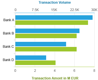
Bad example of comparison between two sets of values with different units
Comparing Sum of Values (Stacked Bars)
The following section illustrates how to visualize the sum of values inside and across different category items using a stacked chart. In the example below the number of ‘imported successfully’ bank accounts are stacked on top of number of ‘imported with errors’ bank accounts. However, please notice that this approach does not make it easy to compare the number of ‘Imported with Errors’.
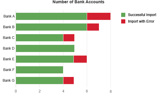
Comparison chart showing sum of values in a stacked bar
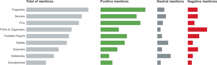
The chart below is used in the Analyze Sentiments app which enables product managers to view sentiment information for multiple products by analyzing the number of mentions in social media broken down by how positive, neutral and negative they were. You can see how the sum of the positive, negative and neutral mentions provides a good indication of the “buzz” around each product, independently of how good or bad it was.
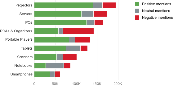
Chart comparing sum of values in a stacked bar
If you want to see which products received the most mentions overall, as well as the most positive, negative, and neutral mentions, then an ideal solution would be to split this information into four separate charts. However, you need to make sure that the four charts use the same horizontal scale.
In the example below, you can easily see that the product line ‘PDAs & Organizers’ received a lot of mentions, although a large percentage of them were actually negative.
Sum of multiple sets of values - bar chart side by side
An alternative solution would be to use a table with bars inside each column.
Two Categories
You can use bar charts placed side by side if you want to compare values across two categories, such as revenue by products and by country. You do not need to repeat the list of category items on the vertical axis. However, you must make sure that all the charts use the same horizontal scale!
Please be aware that this layout only works well:
- for a limited number of charts (between 2 and 5),
- when vertical scrolling is not required,
- on large screens.
The chart below shows the revenue of each product line for three different countries. You can easily see that the revenue for ‘computer system accessories’ is exceptional high in Asia and you can easily compare values within each business area, although you cannot easily compare values between different business areas.
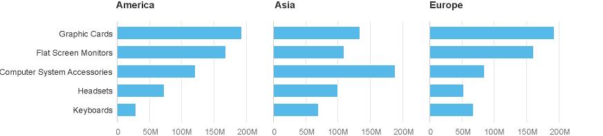
This chart compares values among two categories and uses few category items
Two Categories Containing Many Items
You can use a heatmap if the categories you’re comparing contain many items, and you’re just interested in showing approximate values. The heatmap is a two-dimensional representation of data where values are represented just by color. The heatmap below visualises gross sales of products items by month.
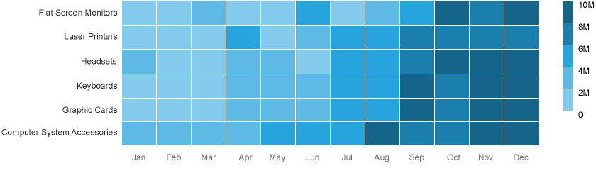
Heatmap with sequential colors ranked by value
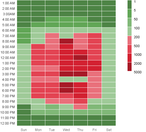
In the example below, a heatmap is used by an IT department to visualize response times in ms throughout the weekdays and working hours using semantic colors to differentiate between response times.
Heatmap with sequential colors ranked by value
If you have a lot of categories, be aware that the heatmap might not render correctly on small devices. This is because all content on the screen will be resized proportionally and the category labels may by hidden due to lack of space.
Three Categories
If you want to compare three categories such as product, region and quarter, we recommend displaying multiple charts in a matrix. All you need to do is make sure the charts all use the same scale.
Be aware that this layout only works well:
- with a limited number of charts,
- on large screens
The chart below shows the percentage deviation of actual revenue versus target revenue, by country and product line, for the last four quarters. It’s immediately obvious that the first quarters have frequently fallen below target, and that ‘graphic cards’ did not perform well in all the countries.
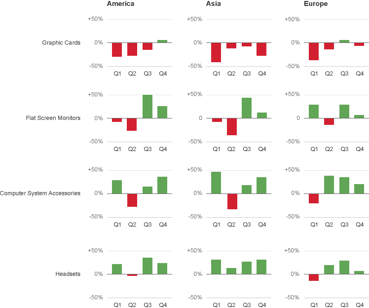
Matrix comparing 3 categories
Resources
Want to dive deeper? Follow the links below to find out more about related controls, the SAPUI5 implementation, and the visual design.
Implementation
- No links.
 Your feedback has been sent to the SAP Fiori design team.