
- Latest SAPUI Version 1.124
- SAPUI5 Version 1.122
- SAPUI5 Version 1.120
- SAPUI5 Version 1.118
- SAPUI5 Version 1.116
- SAPUI5 Version 1.114
- SAPUI5 Version 1.112
- SAPUI5 Version 1.110
- SAPUI5 Version 1.108
- SAPUI5 Version 1.106
- SAPUI5 Version 1.104
- SAPUI5 Version 1.102
- SAPUI5 Version 1.100
- SAPUI5 Version 1.98
- SAPUI5 Version 1.96
- SAPUI5 Version 1.94
- SAPUI5 Version 1.92
- SAPUI5 Version 1.90
- SAPUI5 Version 1.88
- SAPUI5 Version 1.86
- SAPUI5 Version 1.84
- SAPUI5 Version 1.82
- SAPUI5 Version 1.80
- SAPUI5 Version 1.78
- SAPUI5 Version 1.76
- SAPUI5 Version 1.74
- SAPUI5 Version 1.72
- SAPUI5 Version 1.70
- SAPUI5 Version 1.68
- SAPUI5 Version 1.66
- SAPUI5 Version 1.64
- SAPUI5 Version 1.62
- SAPUI5 Version 1.60
- SAPUI5 Version 1.58
- SAPUI5 Version 1.56
- SAPUI5 Version 1.54
- SAPUI5 Version 1.52
- SAPUI5 Version 1.50
- SAPUI5 Version 1.48
- SAPUI5 Version 1.46
- SAPUI5 Version 1.42
- SAPUI5 Version 1.40
- SAPUI5 Version 1.38
- SAPUI5 Version 1.36
- SAPUI5 Version 1.34
- SAPUI5 Version 1.32
- SAPUI5 Version 1.30
- SAPUI5 Version 1.28
- SAPUI5 Version 1.26
- Latest SAPUI Version 1.124
- SAPUI5 Version 1.122
- SAPUI5 Version 1.120
- SAPUI5 Version 1.118
- SAPUI5 Version 1.116
- SAPUI5 Version 1.114
- SAPUI5 Version 1.112
- SAPUI5 Version 1.110
- SAPUI5 Version 1.108
- SAPUI5 Version 1.106
- SAPUI5 Version 1.104
- SAPUI5 Version 1.102
- SAPUI5 Version 1.100
- SAPUI5 Version 1.98
- SAPUI5 Version 1.96
- SAPUI5 Version 1.94
- SAPUI5 Version 1.92
- SAPUI5 Version 1.90
- SAPUI5 Version 1.88
- SAPUI5 Version 1.86
- SAPUI5 Version 1.84
- SAPUI5 Version 1.82
- SAPUI5 Version 1.80
- SAPUI5 Version 1.78
- SAPUI5 Version 1.76
- SAPUI5 Version 1.74
- SAPUI5 Version 1.72
- SAPUI5 Version 1.70
- SAPUI5 Version 1.68
- SAPUI5 Version 1.66
- SAPUI5 Version 1.64
- SAPUI5 Version 1.62
- SAPUI5 Version 1.60
- SAPUI5 Version 1.58
- SAPUI5 Version 1.56
- SAPUI5 Version 1.54
- SAPUI5 Version 1.52
- SAPUI5 Version 1.50
- SAPUI5 Version 1.48
- SAPUI5 Version 1.46
- SAPUI5 Version 1.44
- SAPUI5 Version 1.42
- SAPUI5 Version 1.40
- SAPUI5 Version 1.38
- SAPUI5 Version 1.36
- SAPUI5 Version 1.34
- SAPUI5 Version 1.32
- SAPUI5 Version 1.30
- SAPUI5 Version 1.28
- SAPUI5 Version 1.26
Bullet Chart – Color Use for Primary Values
Intro
This article provides guidelines for using color to indicate primary values in bullet charts.
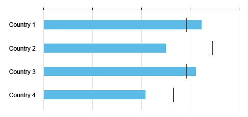
Primary Value Only
By default, the chart will automatically assign the first color of the qualitative palette to all the bars.
If the colors have no semantic meaning, but are just used to distinguish between categories, use the qualitative palette.
Use the colors from the qualitative palette in the prescribed order (blue first, green next, and so on), unless you have a good reason to defer from the default sequence.
In the example, “Country 2” is set to green to highlight this category.
Primary value - Qualitative palette

Primary values only with different colors by category - Qualitative palette
Primary and Additional Values
By default, use the qualitative palette. Use the first color on the palette for the primary value and the second color for the additional value.
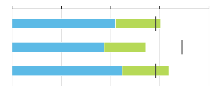
Primary value and additional value - Qualitative palette
If you need another color for the additional value, you can assign it manually.
If the additional value represents something less important that doesn’t need to be clearly visible at first glance, you can use a lighter shade from the sequential palette to represent the additional value.
For more information about shades, see color palettes.
| Primary value | sapUiChartPaletteSequentialHue1 |
| Additional value | sapUiChartPaletteSequentialHue1Light2 |
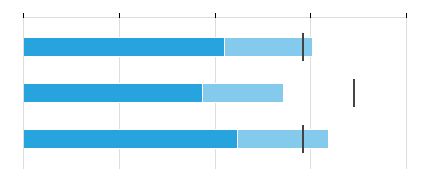
Primary value and additional value - Sequential palette
If the sum of the primary value and the additional value is the most important information, then use the qualitative palette. Use the first color for the primary value and the second color for the additional value.
For more information about shades, see color palettes.
Primary value and additional value - Qualitative palette
Semantic colors can be used to show how the primary value compares in regards to the comparison value.
| Primary value | sapUiChartPaletteSemanticBad / sapUiChartPaletteSemanticGood |
| Additional value | sapUiChartPaletteSemanticNeutralLight2 |
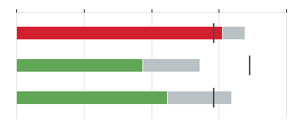
Primary value (semantic color) and additional value (neutral color) - Semantic palette
Semantic colors can also be used to show how the sum of the values (primary plus additional value) compares in regards to the comparison value.
In order to do so, use a dark color for the primary value and a light color for the additional value.
| Primary value | sapUiChartPaletteSemanticBad / sapUiChartPaletteSemanticGood |
| Additional value | sapUiChartPaletteSemanticBadLight2 / sapUiChartPaletteSemanticGoodLight2 |
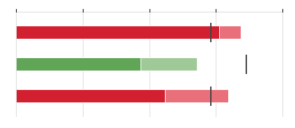
Primary value (semantic color) and additional value (semantic color) - Semantic palette
Avoid using semantic colors for the additional value only. This is misleading in the context of a bullet chart where the main focus should be the comparison with the comparison value.
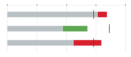
Primary value (neutral color) and additional value (semantic color) - Semantic palette
Resources
Want to dive deeper? Follow the links below to find out more about related controls, the SAPUI5 implementation, and the visual design.
Elements and Controls
- Chart (guidelines)
- Bullet Chart (guidelines)
- Chart – Color Palettes (guidelines)
Implementation
- No links.
 Your feedback has been sent to the SAP Fiori design team.