
- Latest SAPUI Version 1.124
- SAPUI5 Version 1.122
- SAPUI5 Version 1.120
- SAPUI5 Version 1.118
- SAPUI5 Version 1.116
- SAPUI5 Version 1.114
- SAPUI5 Version 1.112
- SAPUI5 Version 1.110
- SAPUI5 Version 1.108
- SAPUI5 Version 1.104
- SAPUI5 Version 1.102
- SAPUI5 Version 1.100
- SAPUI5 Version 1.98
- SAPUI5 Version 1.96
- SAPUI5 Version 1.94
- SAPUI5 Version 1.92
- SAPUI5 Version 1.90
- SAPUI5 Version 1.88
- SAPUI5 Version 1.86
- SAPUI5 Version 1.84
- SAPUI5 Version 1.82
- SAPUI5 Version 1.80
- SAPUI5 Version 1.78
- SAPUI5 Version 1.76
- SAPUI5 Version 1.74
- SAPUI5 Version 1.72
- SAPUI5 Version 1.70
- SAPUI5 Version 1.68
- SAPUI5 Version 1.66
- SAPUI5 Version 1.64
- SAPUI5 Version 1.62
- SAPUI5 Version 1.60
- SAPUI5 Version 1.58
- SAPUI5 Version 1.56
- SAPUI5 Version 1.54
- SAPUI5 Version 1.52
- SAPUI5 Version 1.50
- SAPUI5 Version 1.48
- SAPUI5 Version 1.46
- SAPUI5 Version 1.44
- SAPUI5 Version 1.42
- SAPUI5 Version 1.40
- SAPUI5 Version 1.38
- SAPUI5 Version 1.36
- SAPUI5 Version 1.34
- SAPUI5 Version 1.32
- SAPUI5 Version 1.30
- SAPUI5 Version 1.28
- SAPUI5 Version 1.26
- Latest SAPUI Version 1.124
- SAPUI5 Version 1.122
- SAPUI5 Version 1.120
- SAPUI5 Version 1.118
- SAPUI5 Version 1.116
- SAPUI5 Version 1.114
- SAPUI5 Version 1.112
- SAPUI5 Version 1.110
- SAPUI5 Version 1.108
- SAPUI5 Version 1.106
- SAPUI5 Version 1.104
- SAPUI5 Version 1.102
- SAPUI5 Version 1.100
- SAPUI5 Version 1.98
- SAPUI5 Version 1.96
- SAPUI5 Version 1.94
- SAPUI5 Version 1.92
- SAPUI5 Version 1.90
- SAPUI5 Version 1.88
- SAPUI5 Version 1.86
- SAPUI5 Version 1.84
- SAPUI5 Version 1.82
- SAPUI5 Version 1.80
- SAPUI5 Version 1.78
- SAPUI5 Version 1.76
- SAPUI5 Version 1.74
- SAPUI5 Version 1.72
- SAPUI5 Version 1.70
- SAPUI5 Version 1.68
- SAPUI5 Version 1.66
- SAPUI5 Version 1.64
- SAPUI5 Version 1.62
- SAPUI5 Version 1.60
- SAPUI5 Version 1.58
- SAPUI5 Version 1.56
- SAPUI5 Version 1.54
- SAPUI5 Version 1.52
- SAPUI5 Version 1.50
- SAPUI5 Version 1.48
- SAPUI5 Version 1.46
- SAPUI5 Version 1.44
- SAPUI5 Version 1.42
- SAPUI5 Version 1.40
- SAPUI5 Version 1.38
- SAPUI5 Version 1.36
- SAPUI5 Version 1.34
- SAPUI5 Version 1.32
- SAPUI5 Version 1.30
- SAPUI5 Version 1.28
- SAPUI5 Version 1.26
Status Indicator
sap.suite.ui.commons.StatusIndicator
Intro
The status indicator uses a filled shape to visualize a single value. Unlike the progress indicator or the radial micro chart, the indicator provides the user with a meaningful association through its use of icons. You can embed the status indicator in other controls.
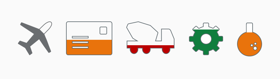
Selection of status indicators
Usage
Use the status indicator if:
- You need to display a single value with an icon that describes its context.
- You need to display a single value that can be updated in real time without reloading the page.
Do not use the status indicator if:
- You need to display a single value within a table. Use the progress indicator or radial micro chart instead.
- You need to show a rating. Use the rating indicator instead.
- The status indicator does not provide the user with any meaningful information and would be for decoration only.
Responsiveness
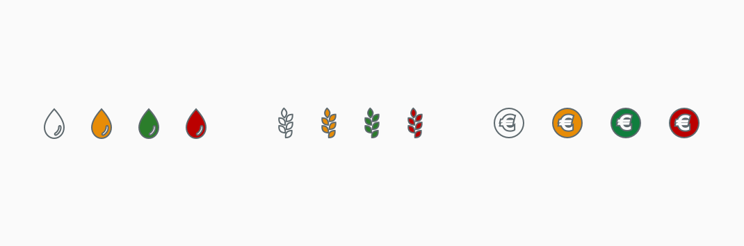
The status indicator provides four different sizes: small (size S), medium (size M), large (size L), and extra-large (size XL).
For the small size, the partial fill is replaced by a fully-filled shape that can only indicate the semantic per threshold reached.
Predefined Sizes of the Status Indicator (S, M, L, XL)


Layout
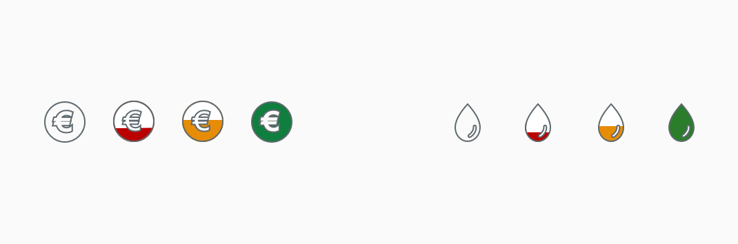
A status indicator can consist of a scalable vector graphics (SVG) shape and additional information, such as a label. The status indicator can be configured as a shape only (default), or as a shape with a fixed label.
Shape Only
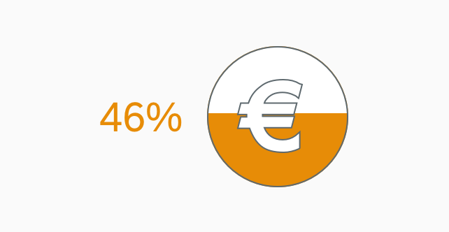
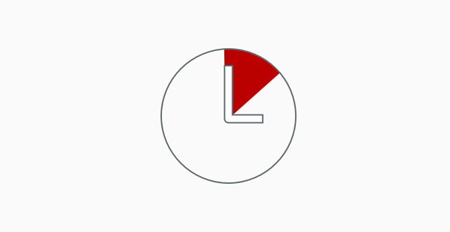
By default, the status indicator consists of a single shape. We recommend using this type of status indicator when you need to display a fraction of a value, rather than a specific value.
Status indicator - Shape only
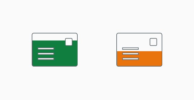
Shape with a Fixed Label
This type of status indicator includes not only a shape, but also a label that uses semantic colors defined for the the value thresholds of the status indicator. In addition, you can switch between different alignment options, such as left, right, top, or bottom. We recommended using this type of status indicator when the user needs to see the exact value.
Status indicator - Shape and label
Types
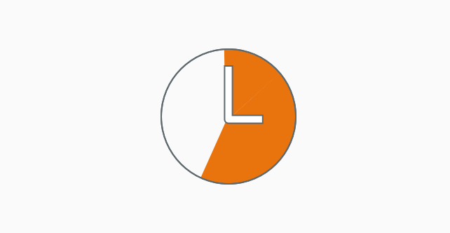
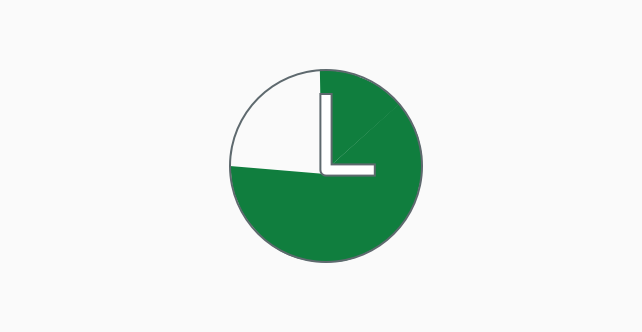
Linear Fill
Most shapes can be filled linearly. You can set the shape to be filled from the left, right, top, or bottom, or define a specific angle for filling.
Status indicator with linear fill
Circular Fill
For round shapes, you can use the circular fill.
Status indicator with circular fill
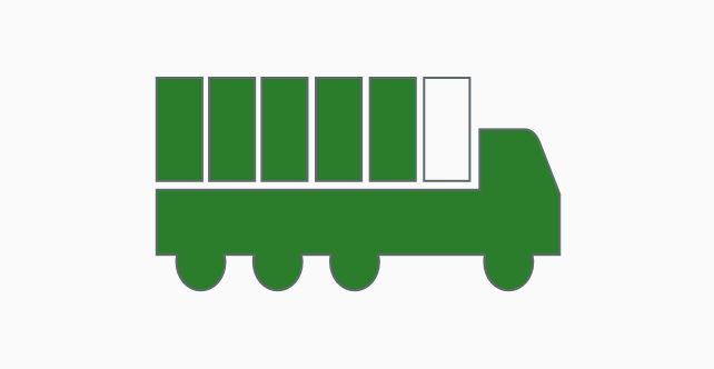
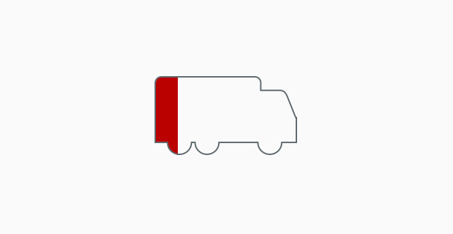
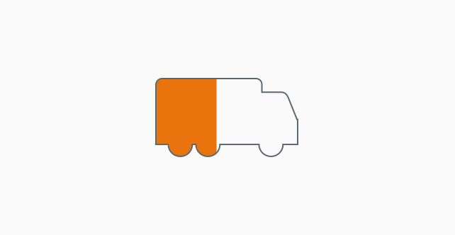
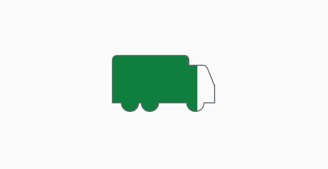
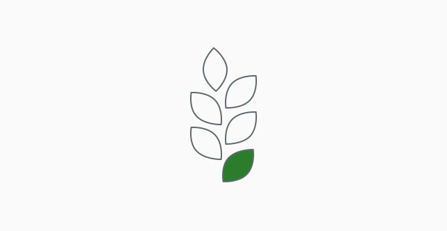
Filling Sequence
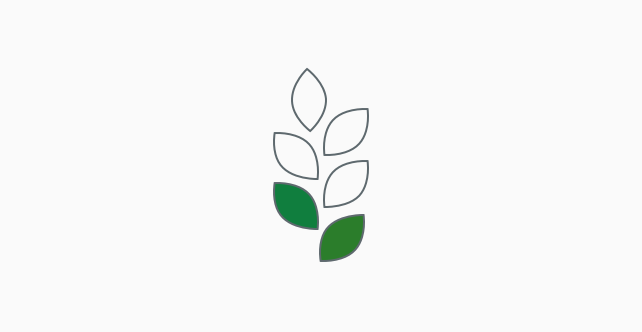
The sequential fill option is useful when the shape consists of multiple parts. You can fill the parts sequentially one by one, or set your own filling order.
Status indicator with filling sequence
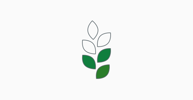

Grouping
You can group several shapes together and decide how the filling should be orchestrated among the shapes in this group.
Status indicator grouping
Thresholds
You can set one or more thresholds for each status indicator and assign a color to each threshold. The color changes when a threshold has been exceeded. Only use thresholds and semantic colors if they are meaningful to the user. Do not use them for decoration.
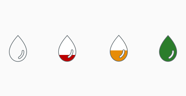
Status indicator tresholds
Behavior and Interaction
You can define a click event for the status indicator. If the status indicators are grouped, you can define a click event for each status indicator or for the entire group.
Guidelines
Shape Definition
You can download the predefined shapes or create your own custom shapes. For more information on how to create custom shapes correctly, see the API documentation.
Animation Duration
Shape animation follows the motion design principles, with a maximum duration of 250 ms (small moves).
Examples
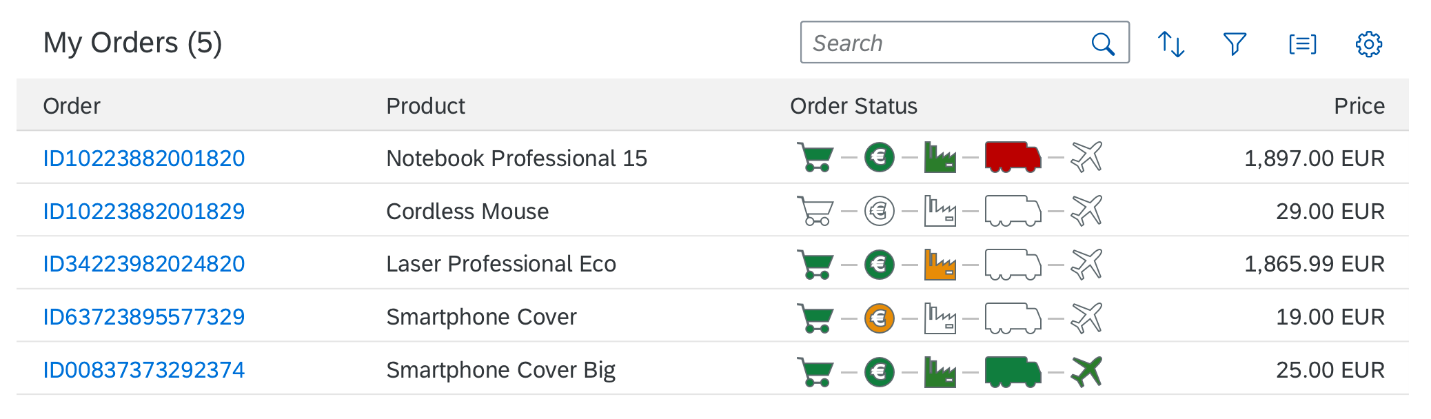
Status indicator in micro process flow
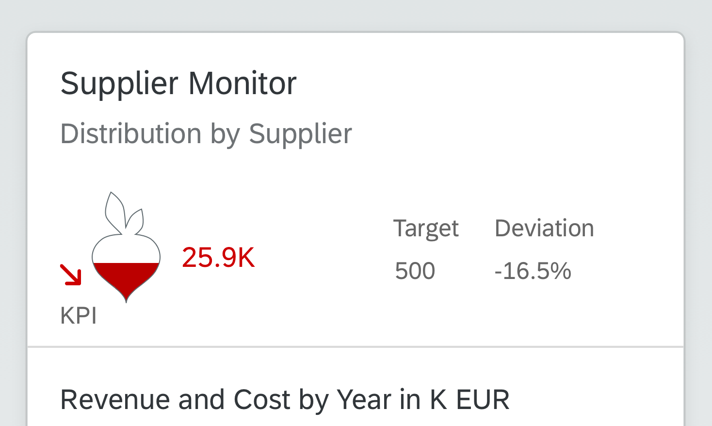
Status indicator in custom overview page card
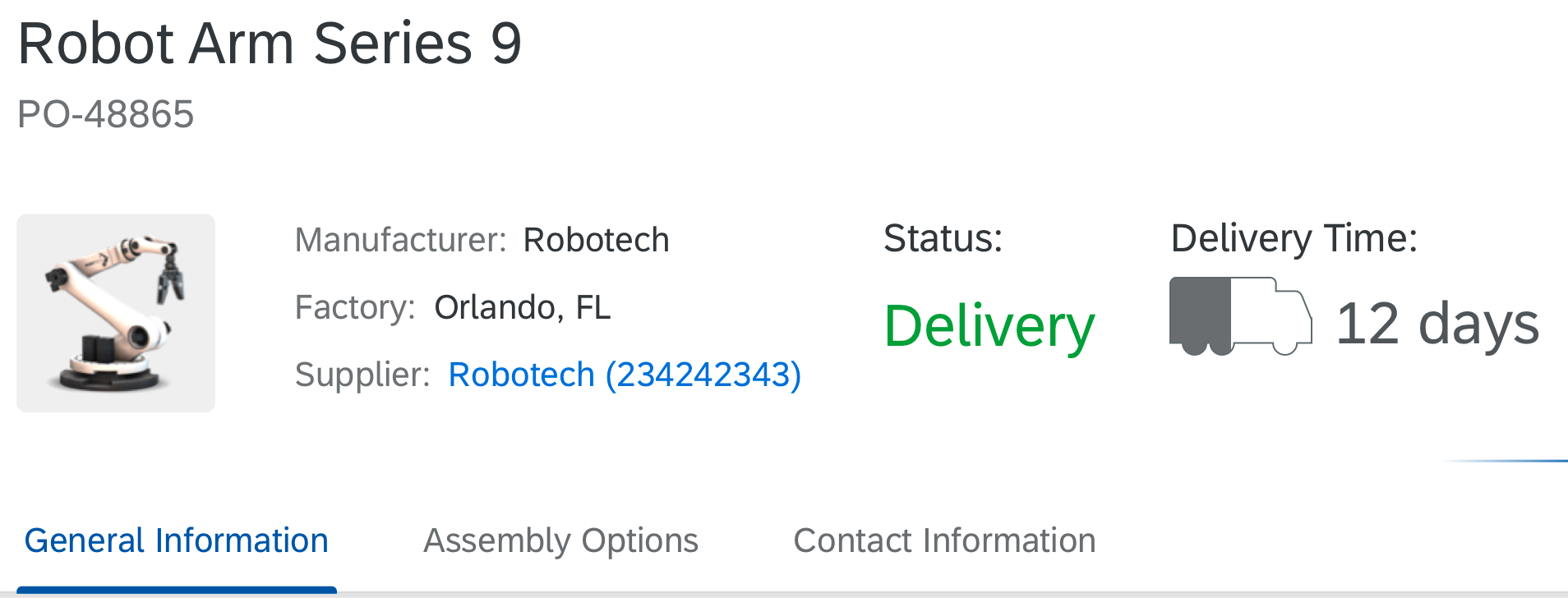
Status indicator in object page header
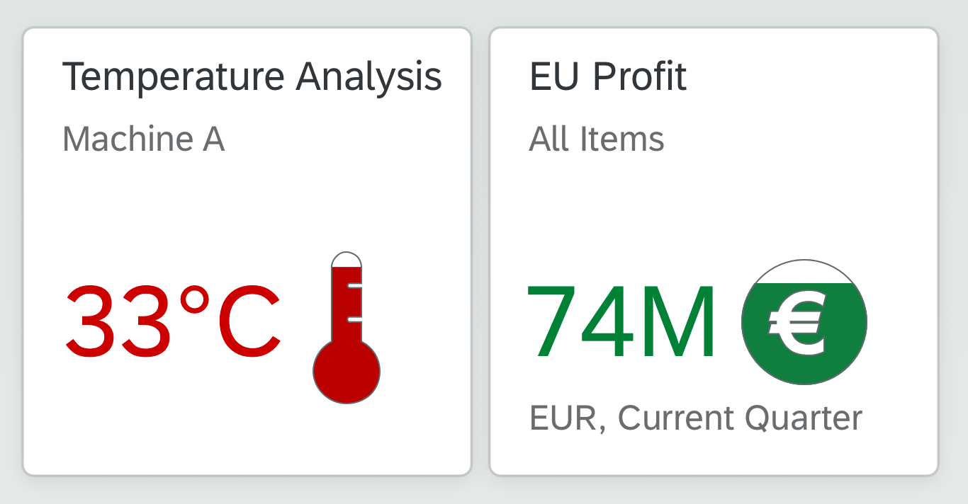
Status indicator in tiles
Resources
Want to dive deeper? Follow the links below to find out more about related controls, the SAPUI5 implementation, and the visual design.
Elements and Controls
- Radial Micro Chart (guidelines)
- Progress Indicator (guidelines)
- Micro Process Flow (guidelines)
- Motion Design (guidelines)
Implementation
- Status Indicator (SAPUI5 sample)
- Status Indicator (SAPUI5 API reference)
- Download Predefined Shapes (ZIP file)
 Your feedback has been sent to the SAP Fiori design team.