Updated: November 29, 2021
Latest Version 2.20
Menu Selection
Intro
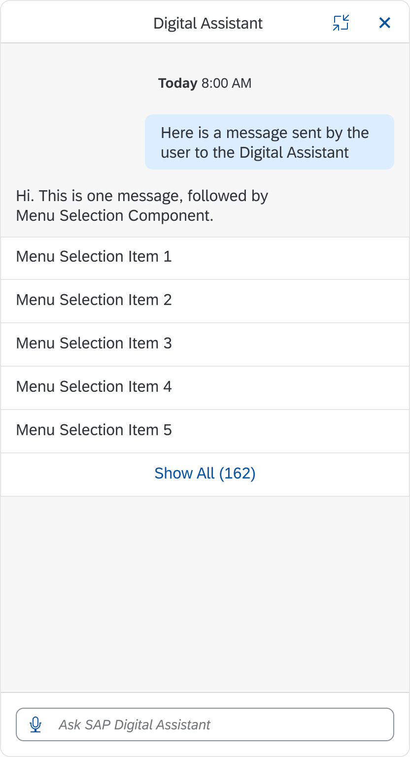
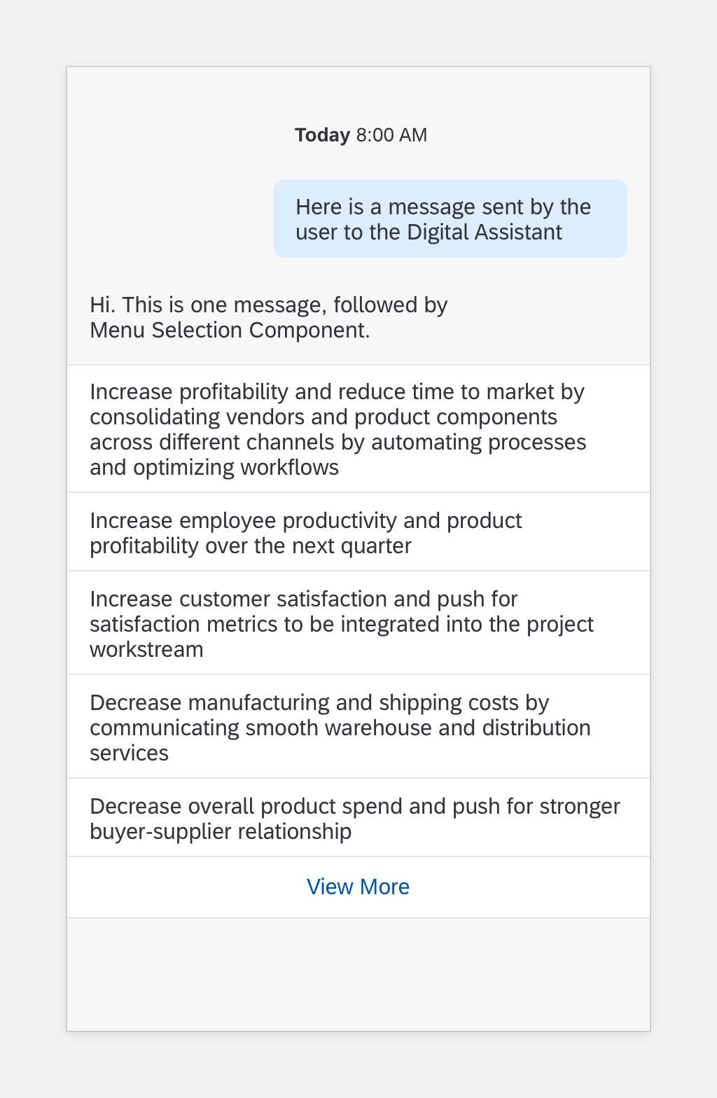
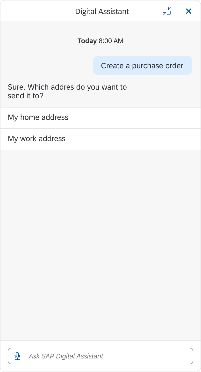
The menu selection component includes a list of options that users can select to help them complete an action. These actions let users to give a specific answer to the digital assistant from a list of preset options.
Usage
Dos
- Do use menu selection to identify the framework of the task.
Don’ts
- Don’t use quick reply buttons to display actions specific to slot filling.
Structure
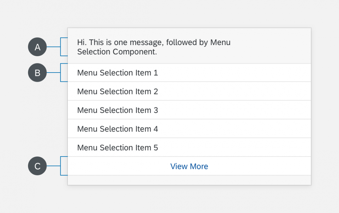
The menu selection component can display up to five relevant options to avoid a long list of options.
A. Header Text
The header text includes a response from the digital assistant and introduces the user to the menu options.
B. List Item
The list item displays options that the user can select.
C. “View More” Button
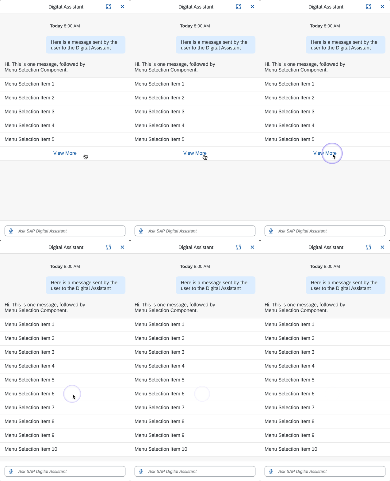
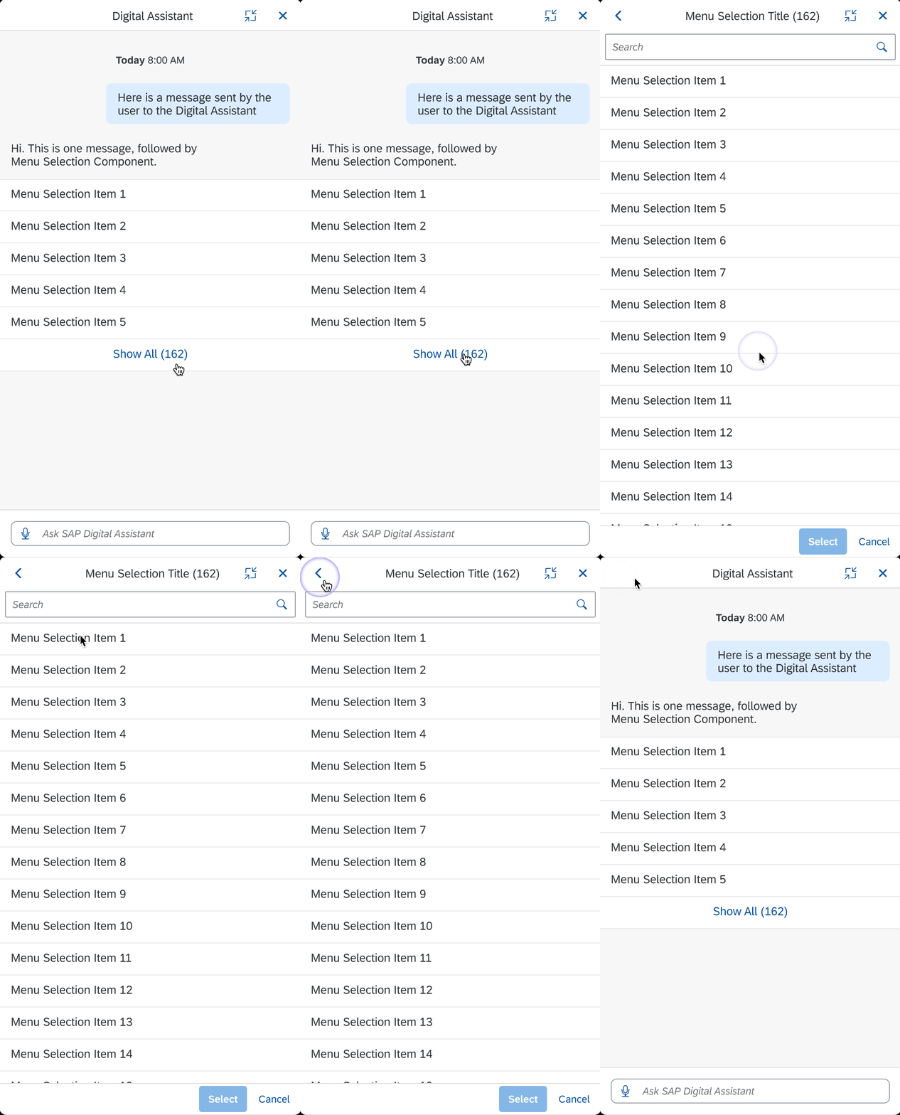
The “View More” button lets the user to expand the menu and see additional options.
Behavior and Interaction
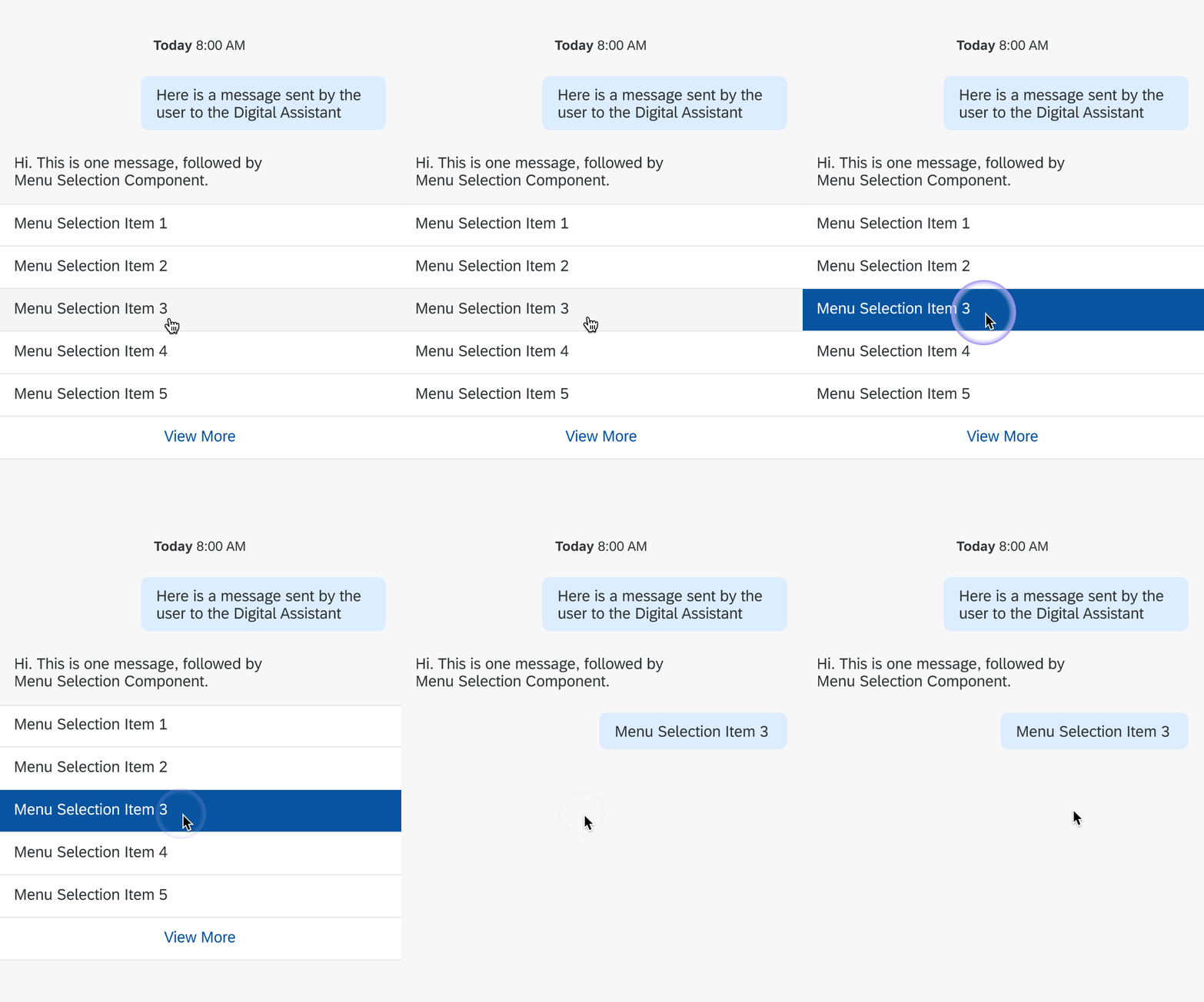
Users can select one of the options in the menu selection component. After the user selects an option from the menu selection, slot filling starts can begin. When the user selects an option, that option disappears and a a text message displays. After the user dismisses the menu selection, no additional navigation is available.
Specifications
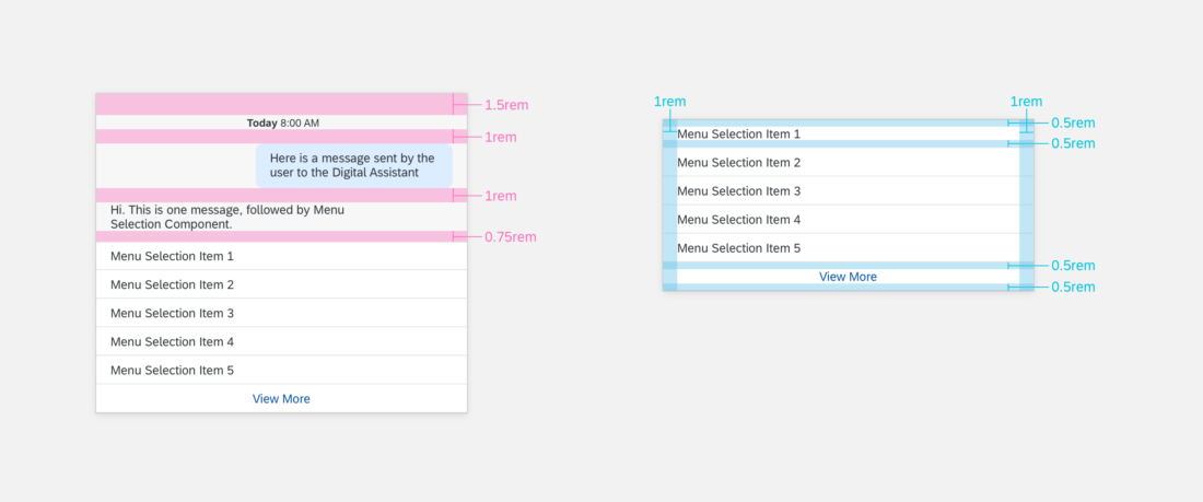
These visual design specifications apply to menu selection style and spacing.
Colors
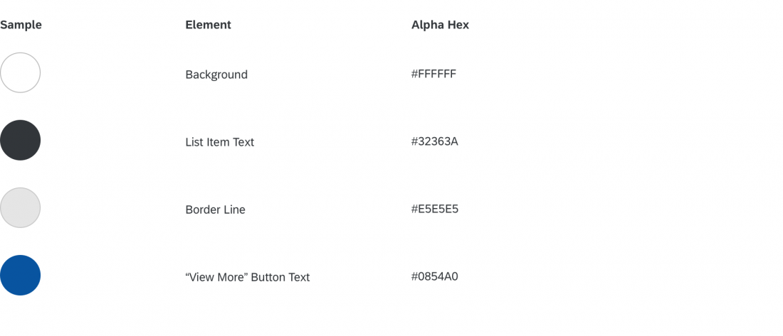
These color specifications apply to the menu selection component.

