
- Latest SAPUI Version 1.124
- SAPUI5 Version 1.122
- SAPUI5 Version 1.120
- SAPUI5 Version 1.118
- SAPUI5 Version 1.116
- SAPUI5 Version 1.114
- SAPUI5 Version 1.112
- SAPUI5 Version 1.110
- SAPUI5 Version 1.108
- SAPUI5 Version 1.106
- SAPUI5 Version 1.104
- SAPUI5 Version 1.102
- SAPUI5 Version 1.100
- SAPUI5 Version 1.98
- SAPUI5 Version 1.96
- SAPUI5 Version 1.94
- SAPUI5 Version 1.92
- SAPUI5 Version 1.90
- SAPUI5 Version 1.88
- SAPUI5 Version 1.86
- SAPUI5 Version 1.84
- SAPUI5 Version 1.82
- SAPUI5 Version 1.80
- SAPUI5 Version 1.78
- SAPUI5 Version 1.76
- SAPUI5 Version 1.74
- SAPUI5 Version 1.72
- SAPUI5 Version 1.70
- SAPUI5 Version 1.68
- SAPUI5 Version 1.66
- SAPUI5 Version 1.64
- SAPUI5 Version 1.62
- SAPUI5 Version 1.60
- SAPUI5 Version 1.58
- SAPUI5 Version 1.56
- SAPUI5 Version 1.54
- SAPUI5 Version 1.52
- SAPUI5 Version 1.48
- SAPUI5 Version 1.46
- SAPUI5 Version 1.44
- SAPUI5 Version 1.42
- SAPUI5 Version 1.40
- SAPUI5 Version 1.38
- SAPUI5 Version 1.36
- SAPUI5 Version 1.34
- SAPUI5 Version 1.32
- SAPUI5 Version 1.30
- SAPUI5 Version 1.28
- SAPUI5 Version 1.26
- Latest SAPUI Version 1.124
- SAPUI5 Version 1.122
- SAPUI5 Version 1.120
- SAPUI5 Version 1.118
- SAPUI5 Version 1.116
- SAPUI5 Version 1.114
- SAPUI5 Version 1.112
- SAPUI5 Version 1.110
- SAPUI5 Version 1.108
- SAPUI5 Version 1.106
- SAPUI5 Version 1.104
- SAPUI5 Version 1.102
- SAPUI5 Version 1.100
- SAPUI5 Version 1.98
- SAPUI5 Version 1.96
- SAPUI5 Version 1.94
- SAPUI5 Version 1.92
- SAPUI5 Version 1.90
- SAPUI5 Version 1.88
- SAPUI5 Version 1.86
- SAPUI5 Version 1.84
- SAPUI5 Version 1.82
- SAPUI5 Version 1.80
- SAPUI5 Version 1.78
- SAPUI5 Version 1.76
- SAPUI5 Version 1.74
- SAPUI5 Version 1.72
- SAPUI5 Version 1.70
- SAPUI5 Version 1.68
- SAPUI5 Version 1.66
- SAPUI5 Version 1.64
- SAPUI5 Version 1.62
- SAPUI5 Version 1.60
- SAPUI5 Version 1.58
- SAPUI5 Version 1.56
- SAPUI5 Version 1.54
- SAPUI5 Version 1.52
- SAPUI5 Version 1.50
- SAPUI5 Version 1.48
- SAPUI5 Version 1.46
- SAPUI5 Version 1.44
- SAPUI5 Version 1.42
- SAPUI5 Version 1.40
- SAPUI5 Version 1.38
- SAPUI5 Version 1.36
- SAPUI5 Version 1.34
- SAPUI5 Version 1.32
- SAPUI5 Version 1.30
- SAPUI5 Version 1.28
- SAPUI5 Version 1.26
View Settings Dialog
sap.m.ViewSettingsDialog
Intro
The view settings dialog helps the user to sort, filter, or group data within a (master) list or a table. The dialog is triggered by icon buttons in the table toolbar. Each button shows a dropdown list icon.
Usage
Use the view settings dialog if:
- You need to allow the user to sort line items in a manageable list or table (up to about 20 columns).
- You need to offer custom filter settings in a manageable list or table (up to about 20 columns).
- You need to allow the user to group line items in a manageable list or table (up to about 20 columns).
Do not use the view settings dialog if:
- You have complex tables (more than about 20 columns).
- You need to rearrange columns within your table. Use the table personalization dialog instead.
- You need very specific sort, filter, or column sorting options within complex tables. Use the P13n dialog instead.
Button Placement
If the app does not offer all three sorting, filtering, and grouping functionalities, but only one of these (such as sort), we recommend placing the icon button directly in the toolbar.
Do not place sort, filter, or group buttons in the footer toolbar if they refer to a table.
Place group, sort, and filter buttons in the footer toolbar if they refer to a master list.
For detailed information about where to place the sort, filter, and group buttons, see “Sort, Filter, Group (Generic)” in the Behavior and Interaction section of the table toolbar article.
Sort, Group, and Filter a List
You can also offer the view setting features for a list.
Responsiveness
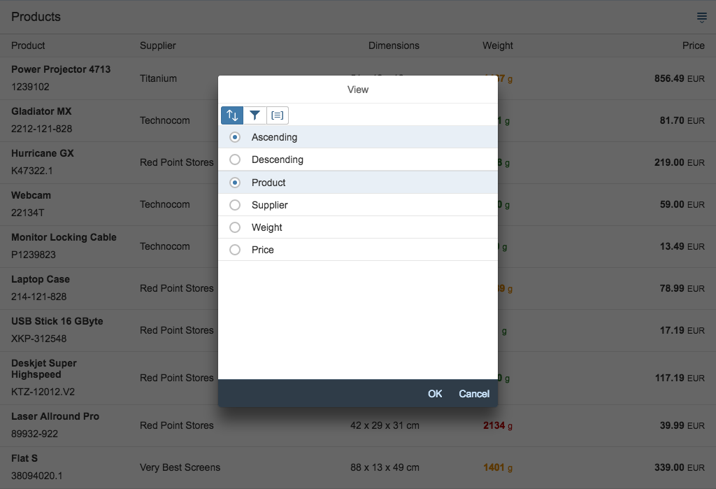
The popover dialog appears as a modal window on desktop and tablet screen sizes, but full screen on smartphones.
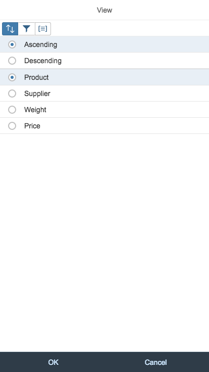
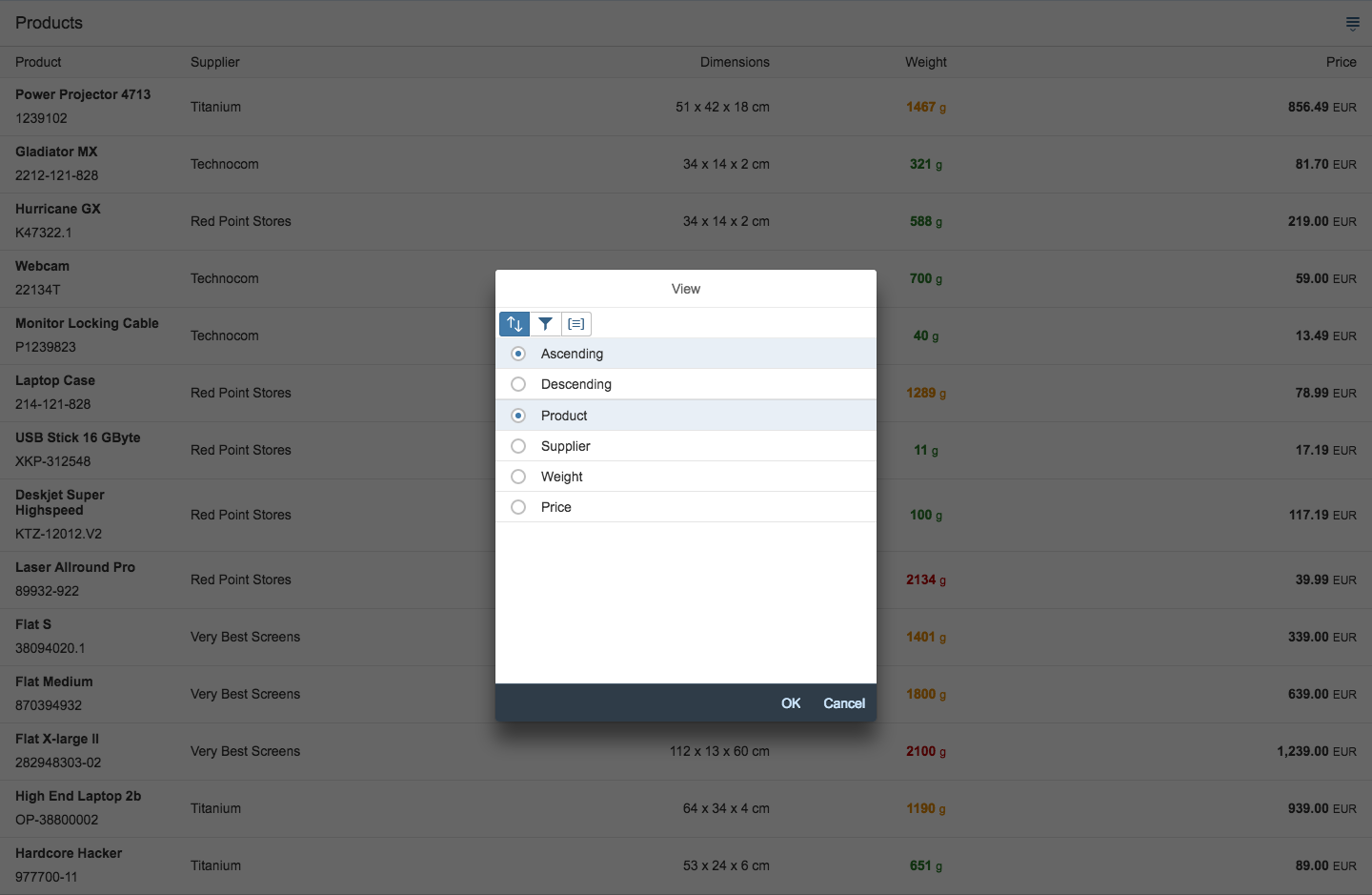
The view settings dialog is a composite control that consists of a modal dialog with a maximum of three tabs with lists of attributes. Each helps the user to either sort, filter, or group a table or list. If the use case requires,only a sort feature, for example, you can hide the filter and group tabs.
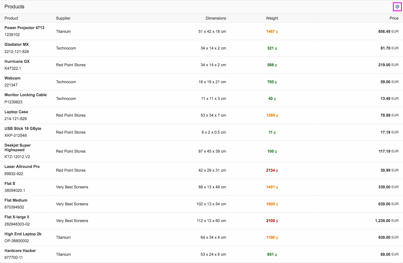
The dialog is triggered by the dropdown list icon button in the table header
View settings dialog on a smartphone (size S)
View settings dialog on a tablet (size M)
View settings dialog on a desktop (size L)
Behavior and Interaction
The sort, filter, and group features can all be applied to a table simultaneously.
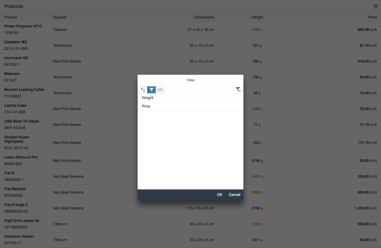
Sort
The first tab in the view settings dialog is the sort feature. The tab shows a standard sort icon with two arrows – one pointing up, and one pointing down (see image above).
The sort dialog shows two groups of sort settings. The first group offers general Ascending and Descending sort options. The second group offers attributes that fit the use case, such as Product, Supplier, Weight, or Price. The attributes can match the table columns, but because a table column can also contain several data points, such as “Name” and “Surname”, the attributes allow an attribute to be shown for each data point.
The user select attributes using the radio buttons. Clicking or tapping OK closes the dialog and shows the table items in the selected order.
Filter
The second tab in the view settings dialog is the filter feature. The tab shows a filter, which is the standard filter icon. The filter tab can offer a single filter selection list, a multi-filter selection list, or a category list. The category list provides an overview, and leads the user to detailed filter selection lists via drilldown.
The dialog for choosing a category from the filter tab drills down to the filter settings.
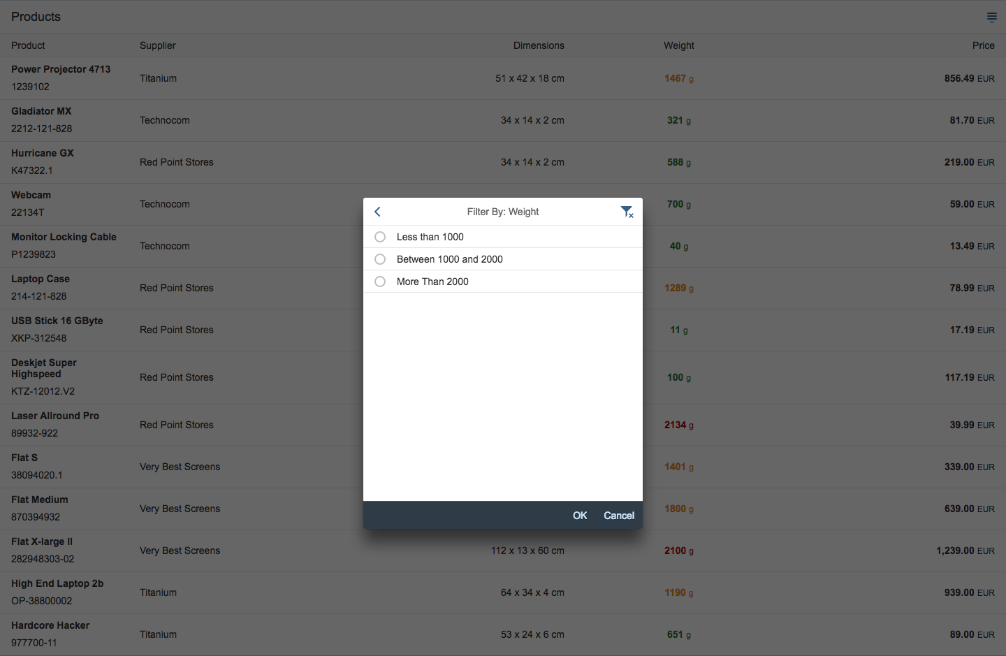
The dialog after choosing a general filter category (here: Weight). You can refine the filter further by selecting subcategories.

A table view filtered by Price – the info bar shows the filter setting.
Filter Selection List – Single Selection
The dialog offers one single-selection list with radio buttons to select a filter. This list is useful for offering a list of preconfigured filters for a specific use, such as “Products with numbers ‘starting between 100 and 200’ with status ‘in stock’ and color ‘green’”.
Filter Selection List – Multi-Selection
You can also offer a filter selection list as a multi-selection list. In this case, the user can choose, for example, all “green” and “red” products.
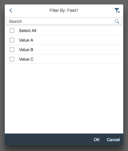
Selection of multiple filters
Category List
The filter dialog shows a single list of general filter categories depending on the use case, like Price or Height. The user chooses a category by clicking or tapping the list item, such as Price. As this is a simple drilldown, these categories do not offer radio buttons. The dialog shows a list of filter settings in the Price category. Optional filters here, such as Less than 100, depend on the use case. The user chooses a filter setting by selecting one of the radio buttons offered in this list. Clicking or tapping OK closes the dialog and shows the table items filtered by the selected attribute. The info bar shows which filter has been set.
Free-Form Apps
You can also customize your own filter UIs, for example, to support date picking.
Filter Values
Filters can correspond to single values as well as groups, such as “<100.00 EUR”.
Filter Reset
The refresh button on the filter tab resets all filter settings.
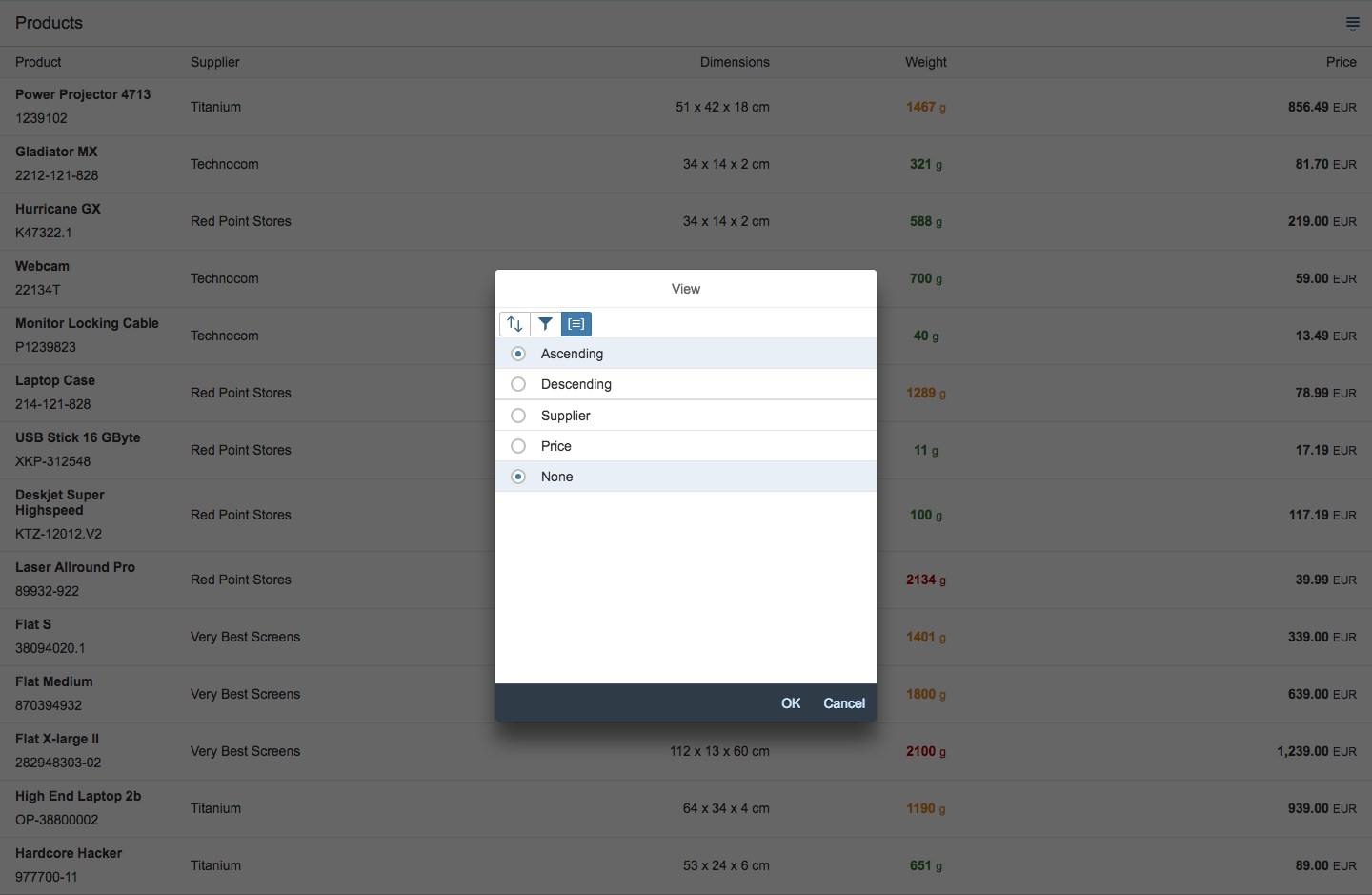
Group
The third tab in the view settings dialog is the group feature. The tab shows an icon with lines in square brackets, which is the standard group icon.
The group dialog shows two groups of attributes. The first group offers a general Ascending or Descending order, which allows the user to select the order in which the defined groups appear. The second group offers attributes that fit the use case, such as Type or Supplier.
You can also offer an attribute like Price to group data in a table.
The user uses the radio buttons or selects checkboxes to choose attributes. Clicking or tapping OK closes the dialog and shows the table with items grouped below headers.
Removing Filters
Be sure to offer an entry such as None in a single-selection list which removes a set filter.
The dialog for choosing an attribute from the group tab.

A table view grouped by suppliers – group headers divide the list.
Naming Group Headers
Be sure to name the group headers as follows: Category Name: Value/Range. For example, Category: Accessories, or Supplier: Red Point Stores.
Resources
Want to dive deeper? Follow the links below to find out more about related controls, the SAPUI5 implementation, and the visual design.
Elements and Controls
- Table Overview (guidelines)
- Table Toolbar (guidelines)
- Table Personalization (guidelines)
- P13n Dialog (guidelines)
 Your feedback has been sent to the SAP Fiori design team.