
- Latest SAPUI Version 1.124
- SAPUI5 Version 1.122
- SAPUI5 Version 1.120
- SAPUI5 Version 1.118
- SAPUI5 Version 1.116
- SAPUI5 Version 1.114
- SAPUI5 Version 1.112
- SAPUI5 Version 1.110
- SAPUI5 Version 1.108
- SAPUI5 Version 1.106
- SAPUI5 Version 1.104
- SAPUI5 Version 1.102
- SAPUI5 Version 1.100
- SAPUI5 Version 1.98
- SAPUI5 Version 1.96
- SAPUI5 Version 1.94
- SAPUI5 Version 1.92
- SAPUI5 Version 1.90
- SAPUI5 Version 1.86
- SAPUI5 Version 1.84
- SAPUI5 Version 1.82
- SAPUI5 Version 1.80
- SAPUI5 Version 1.78
- SAPUI5 Version 1.76
- SAPUI5 Version 1.74
- SAPUI5 Version 1.72
- SAPUI5 Version 1.70
- SAPUI5 Version 1.68
- SAPUI5 Version 1.66
- SAPUI5 Version 1.64
- SAPUI5 Version 1.62
- SAPUI5 Version 1.60
- SAPUI5 Version 1.58
- SAPUI5 Version 1.56
- SAPUI5 Version 1.54
- SAPUI5 Version 1.52
- SAPUI5 Version 1.50
- SAPUI5 Version 1.48
- SAPUI5 Version 1.46
- SAPUI5 Version 1.44
- SAPUI5 Version 1.42
- SAPUI5 Version 1.40
- SAPUI5 Version 1.38
- SAPUI5 Version 1.36
- SAPUI5 Version 1.34
- SAPUI5 Version 1.32
- SAPUI5 Version 1.30
- SAPUI5 Version 1.28
- SAPUI5 Version 1.26
- Latest SAPUI Version 1.124
- SAPUI5 Version 1.122
- SAPUI5 Version 1.120
- SAPUI5 Version 1.118
- SAPUI5 Version 1.116
- SAPUI5 Version 1.114
- SAPUI5 Version 1.112
- SAPUI5 Version 1.110
- SAPUI5 Version 1.108
- SAPUI5 Version 1.106
- SAPUI5 Version 1.104
- SAPUI5 Version 1.102
- SAPUI5 Version 1.100
- SAPUI5 Version 1.98
- SAPUI5 Version 1.96
- SAPUI5 Version 1.94
- SAPUI5 Version 1.92
- SAPUI5 Version 1.90
- SAPUI5 Version 1.88
- SAPUI5 Version 1.86
- SAPUI5 Version 1.84
- SAPUI5 Version 1.82
- SAPUI5 Version 1.80
- SAPUI5 Version 1.78
- SAPUI5 Version 1.76
- SAPUI5 Version 1.74
- SAPUI5 Version 1.72
- SAPUI5 Version 1.70
- SAPUI5 Version 1.68
- SAPUI5 Version 1.66
- SAPUI5 Version 1.64
- SAPUI5 Version 1.62
- SAPUI5 Version 1.60
- SAPUI5 Version 1.58
- SAPUI5 Version 1.56
- SAPUI5 Version 1.54
- SAPUI5 Version 1.52
- SAPUI5 Version 1.50
- SAPUI5 Version 1.48
- SAPUI5 Version 1.46
- SAPUI5 Version 1.44
- SAPUI5 Version 1.42
- SAPUI5 Version 1.40
- SAPUI5 Version 1.38
- SAPUI5 Version 1.36
- SAPUI5 Version 1.34
- SAPUI5 Version 1.32
- SAPUI5 Version 1.30
- SAPUI5 Version 1.28
- SAPUI5 Version 1.26
View Settings Dialog
sap.m.ViewSettingsDialog
Intro
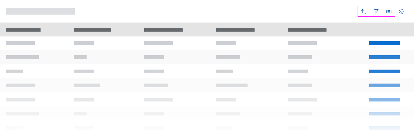
The view settings dialog helps users to sort, filter, or group data within a (master) list or a table. The dialog is triggered by icon buttons in the table toolbar.
Usage
We recommend making each feature (sort, filter, group) available as a separate button in the table toolbar (see Button Placement below). Each button then triggers a separate dialog. If specifically required, you can combine the dialogs into one with a segmented button acting as tabs to switch between the sort, filter and group options. Note: In a combined dialog, the Reset button resets all tabs.
Use the view settings dialog if:
- Users need to sort line items in a manageable list or table (up to about 20 columns).
- You need to offer custom filter settings in a manageable list or table (up to about 20 columns).
- Users need to group line items in a manageable list or table (up to about 20 columns).
Do not use the view settings dialog if:
- You have complex tables (more than about 20 columns).
- Users need to rearrange columns within the table. Use the table personalization dialog instead.
- Users need very specific sort, filter, or column sorting options within complex tables. Use the P13n dialog instead.
Button Placement
Use distinct icon buttons for the sort, filter, and group settings. Place the icons in the following order: (Sort), (Filter), (Group).
Do not place Sort, Filter, or Group buttons in the footer toolbar if they refer to a table.
For more information about the button placement, see Sort, Filter, Group (Generic) in the table toolbar article.
Sort, Group, and Filter a List
You can also offer the view setting features for a list.
Responsiveness
The popover dialog appears as a modal window on desktop and tablet screen sizes, but uses the full screen on smartphones.
The view settings dialog is a composite control that consists of a modal dialog with a maximum of three tabs with lists of attributes. Each helps the user to either sort, filter, or group a table or list. If the use case requires only a sort feature, for example, you can hide the filter and group tabs.
The dialog is triggered by one of the icon buttons in the table header
View settings dialog - Size S
View settings dialog - Size M
View settings dialog - Size L
Behavior and Interaction
The sort, filter, and group features can all be applied to a table simultaneously.
Sort
The sort dialog shows two groups of sort settings. The first group offers general Ascending and Descending sort options. The second group offers attributes that fit the use case, such as Product, Supplier, Weight, or Price. The attributes can match the table columns, but because a table column can also contain several data points, such as “Name” and “Surname”, the attributes allow an attribute to be shown for each data point.
Users can select attributes using the radio buttons. Clicking OK closes the dialog and shows the table items in the selected order.
If a combined dialog is used, the first tab is the sort feature.
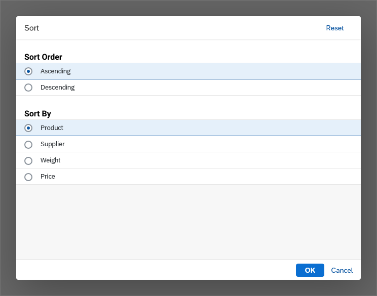
View settings dialog - Sort
Filter
The filter dialog can offer a single filter selection list, a multi-filter selection list, or a category list. The category list provides an overview, and allows the user to drill down to detailed filter selection lists.
In a combined view settings dialog, filtering is on the second tab.
Filter Selection List – Single Selection
The dialog offers one selection list with radio buttons to select a filter. This list is useful for offering a list of preconfigured filters for a specific use, such as “Products with numbers ‘starting between 100 and 200’ with status ‘in stock’ and color ‘green’”.
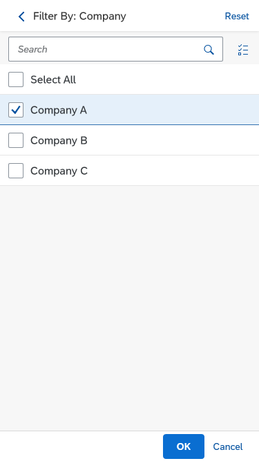
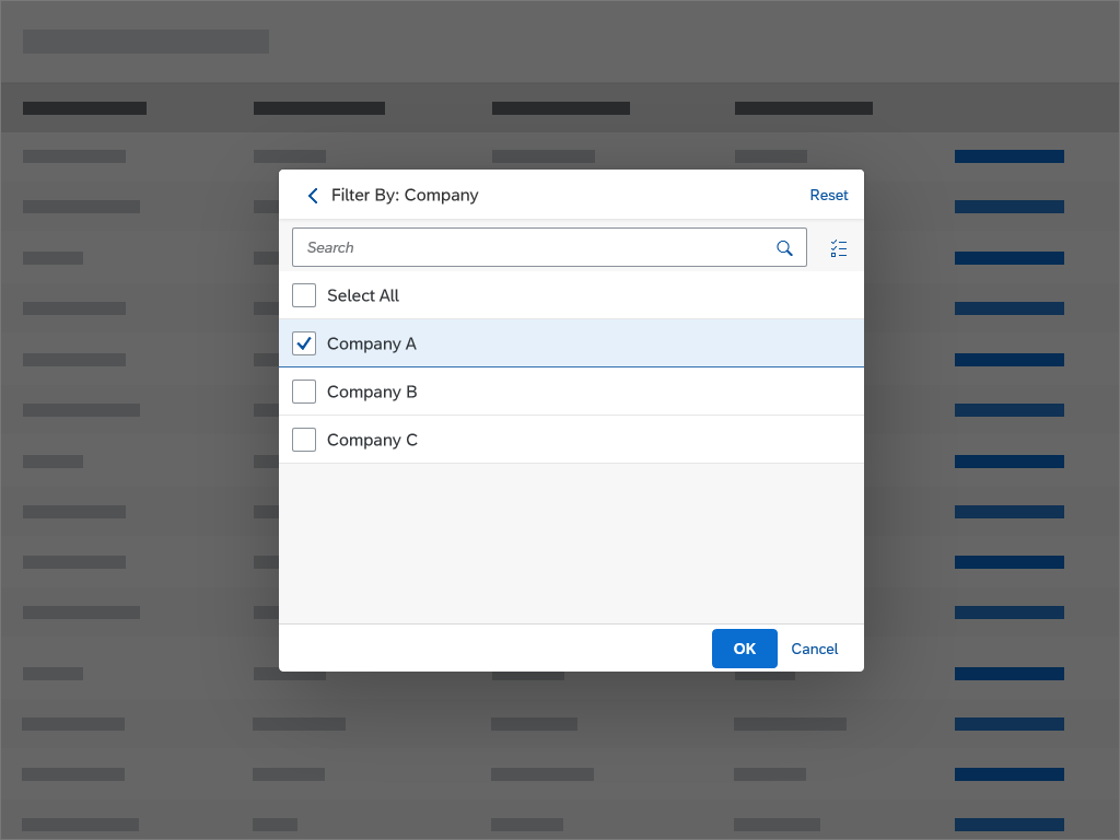
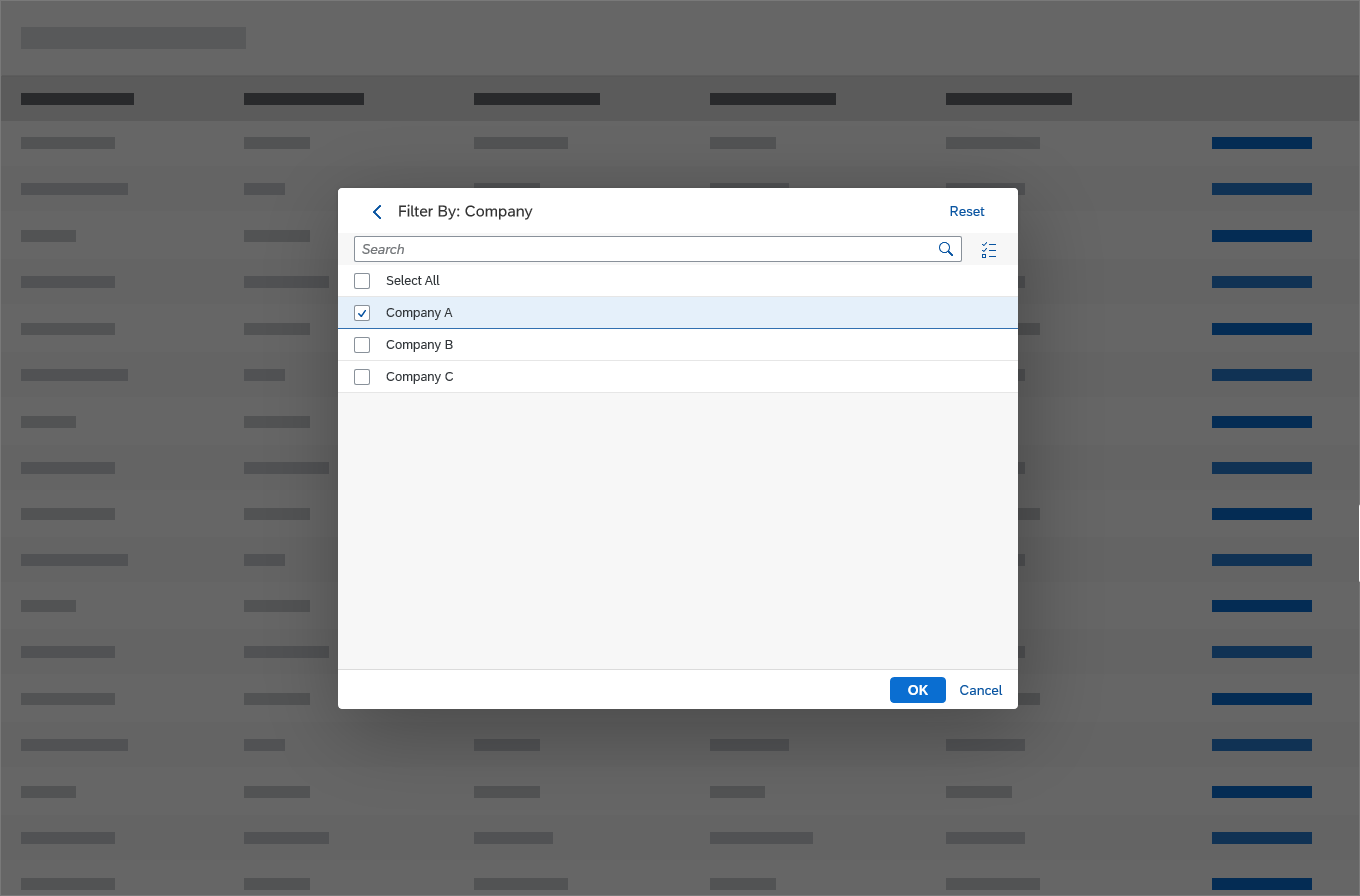
Filter Selection List – Multi-Selection
You can also offer a multi-selection list. For example, a user might want to show all open items for both “Company A” and “Company D”.
Show Selected Only
If the user clicks the button (Show Selected Only), only the selected filters are shown (for example, “Company A” and “Company D”). Clicking the button again shows all of the available filter values.
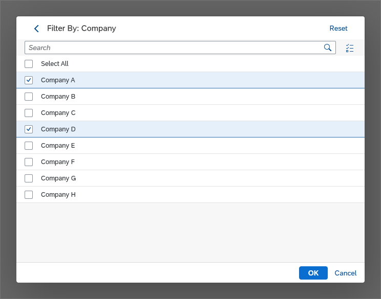
Multiple filters selected
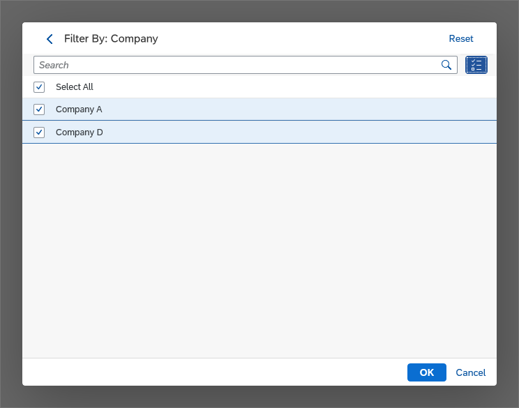
Multiple filters with 'Show Selected Only' option active - only selected filters are shown
Category List
The filter dialog shows a single list of general filter categories depending on the use case, like Price or Height. The user chooses a category by clicking the list item, such as Price. As this is a simple drilldown, these categories do not have radio buttons. The follow-on dialog shows a list of optional filter settings in the Price category. These filters, such as Less than 100, depend on the use case. The user chooses a specific filter setting by selecting one of the radio buttons offered in this list. Clicking OK closes the dialog and shows the table items filtered by the selected attribute. The infobar shows which filter has been set.
Example: Filter Dialog with Category List
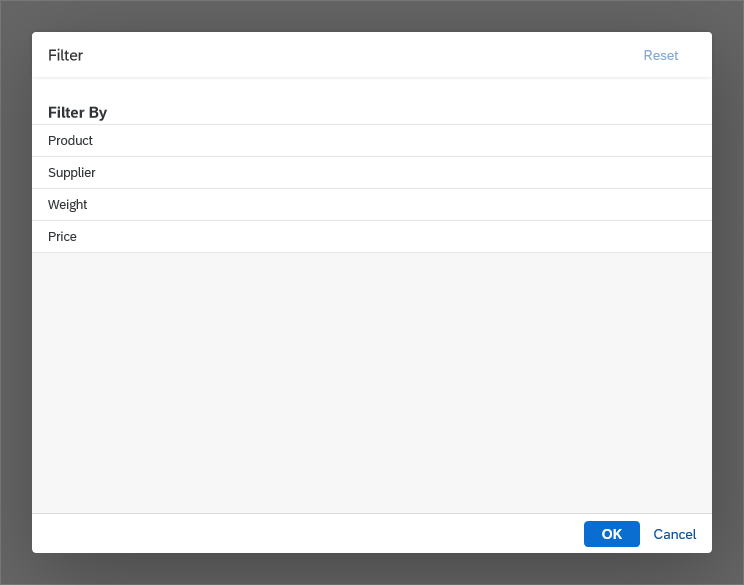
1) Select a category
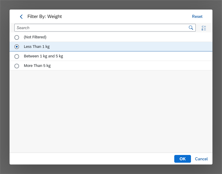
2) Option to refine filters for the selected category (here: 'Weight')
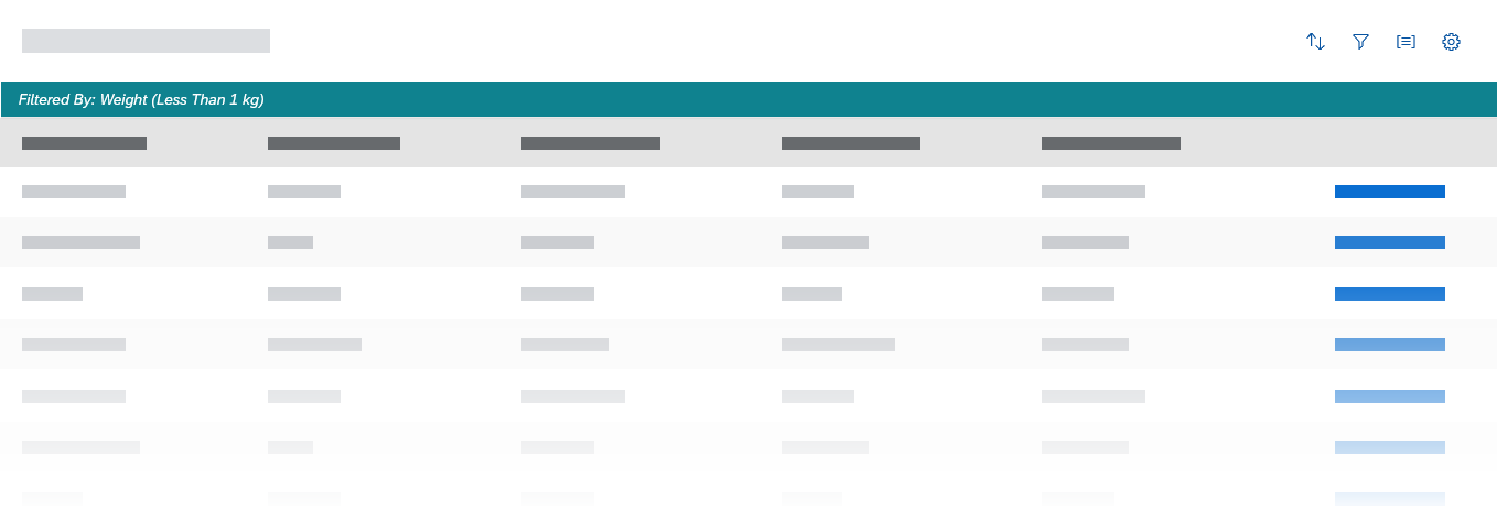
3) Infobar showing the filter setting for a table view filtered by 'Weight'
Free-Form Apps
You can also customize your own filter UIs, for example, to support date picking.
Filter Values
Filters can correspond to single values as well as groups, such as “<100.00 EUR”.
Filter Reset
The Reset button on the filter tab resets all filter settings.
Removing Filters
In single selection lists, offer a Not Filtered option. This enables users to remove existing filters.
Group
The group dialog shows two groups of attributes. The first group offers a general Ascending or Descending order, which allows the user to select the order in which the defined groups appear. The second group offers attributes that fit the use case, such as Type or Supplier.
You can also offer an attribute like Price to group data in a table.
Users can choose attributes using radio buttons or checkboxes. Clicking OK closes the dialog and shows the table with items grouped below headers.
In a combined view settings dialog, the group feature is the third tab.
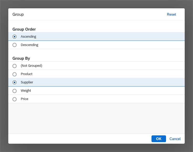
Dialog for choosing an attribute from the group tab
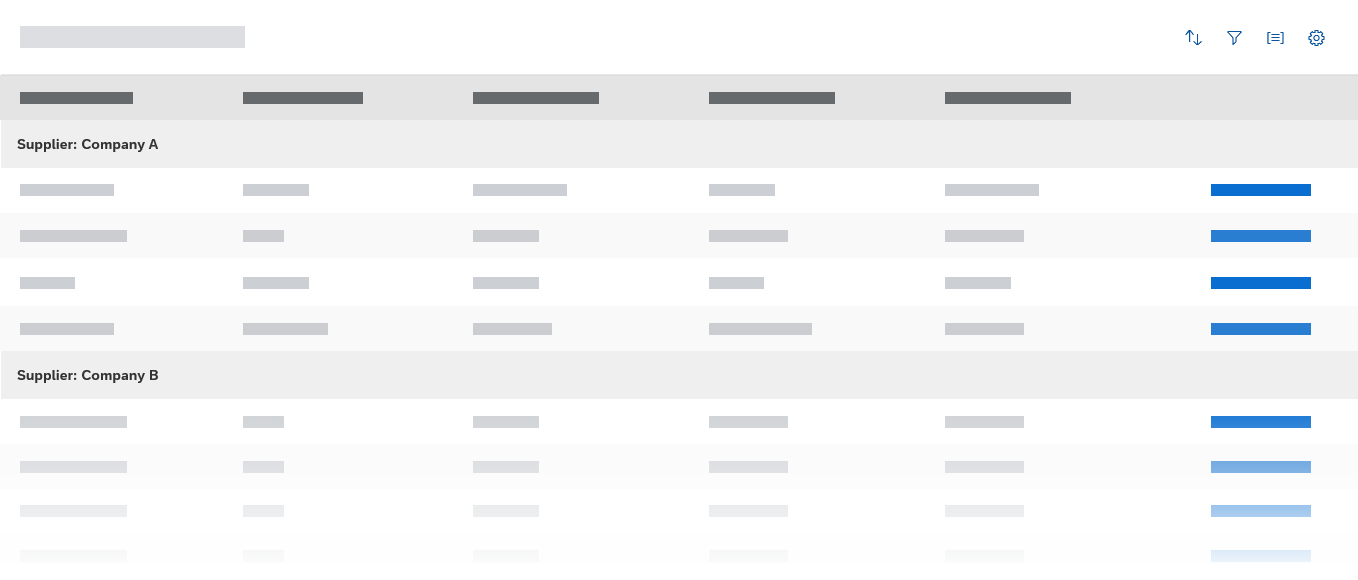
Table view grouped by supplier – Group headers divide the list
Naming Group Headers
Be sure to name the group headers as follows: <Category Name>: <Value/Range>
Examples:
- Category: Accessories
- Supplier: Red Point Stores.
Guidelines
On the table toolbar, use different buttons for each function (sort, filter, group). With each button, open the View Settings dialog with just the corresponding tab.
If possible, give users the option not to filter or group. For sorting, this is only necessary if the use case calls for an unsorted list. In all three cases, show this option as the first entry in the list of criteria (remember to include the brackets):
- (Not Sorted)
- (Not Filtered)
- (Not Grouped)
Resources
Want to dive deeper? Follow the links below to find out more about related controls, the SAPUI5 implementation, and the visual design.
Elements and Controls
- Table Overview (guidelines)
- Table Toolbar (guidelines)
- Table Personalization (guidelines)
- P13n Dialog (guidelines)
 Your feedback has been sent to the SAP Fiori design team.