
- Latest SAPUI Version 1.124
- SAPUI5 Version 1.122
- SAPUI5 Version 1.120
- SAPUI5 Version 1.118
- SAPUI5 Version 1.116
- SAPUI5 Version 1.114
- SAPUI5 Version 1.112
- SAPUI5 Version 1.110
- SAPUI5 Version 1.108
- SAPUI5 Version 1.106
- SAPUI5 Version 1.104
- SAPUI5 Version 1.102
- SAPUI5 Version 1.100
- SAPUI5 Version 1.98
- SAPUI5 Version 1.96
- SAPUI5 Version 1.94
- SAPUI5 Version 1.92
- SAPUI5 Version 1.90
- SAPUI5 Version 1.88
- SAPUI5 Version 1.86
- SAPUI5 Version 1.84
- SAPUI5 Version 1.82
- SAPUI5 Version 1.80
- SAPUI5 Version 1.78
- SAPUI5 Version 1.76
- SAPUI5 Version 1.74
- SAPUI5 Version 1.72
- SAPUI5 Version 1.70
- SAPUI5 Version 1.68
- SAPUI5 Version 1.66
- SAPUI5 Version 1.64
- SAPUI5 Version 1.62
- SAPUI5 Version 1.60
- SAPUI5 Version 1.58
- SAPUI5 Version 1.56
- SAPUI5 Version 1.54
- SAPUI5 Version 1.52
- SAPUI5 Version 1.48
- SAPUI5 Version 1.46
- SAPUI5 Version 1.44
- SAPUI5 Version 1.42
- SAPUI5 Version 1.40
- SAPUI5 Version 1.38
- SAPUI5 Version 1.36
- SAPUI5 Version 1.34
- SAPUI5 Version 1.32
- SAPUI5 Version 1.30
- SAPUI5 Version 1.28
- SAPUI5 Version 1.26
- Latest SAPUI Version 1.124
- SAPUI5 Version 1.122
- SAPUI5 Version 1.120
- SAPUI5 Version 1.118
- SAPUI5 Version 1.116
- SAPUI5 Version 1.114
- SAPUI5 Version 1.112
- SAPUI5 Version 1.110
- SAPUI5 Version 1.108
- SAPUI5 Version 1.106
- SAPUI5 Version 1.104
- SAPUI5 Version 1.102
- SAPUI5 Version 1.100
- SAPUI5 Version 1.98
- SAPUI5 Version 1.96
- SAPUI5 Version 1.94
- SAPUI5 Version 1.92
- SAPUI5 Version 1.90
- SAPUI5 Version 1.88
- SAPUI5 Version 1.86
- SAPUI5 Version 1.84
- SAPUI5 Version 1.82
- SAPUI5 Version 1.80
- SAPUI5 Version 1.78
- SAPUI5 Version 1.76
- SAPUI5 Version 1.74
- SAPUI5 Version 1.72
- SAPUI5 Version 1.70
- SAPUI5 Version 1.68
- SAPUI5 Version 1.66
- SAPUI5 Version 1.64
- SAPUI5 Version 1.62
- SAPUI5 Version 1.60
- SAPUI5 Version 1.58
- SAPUI5 Version 1.56
- SAPUI5 Version 1.54
- SAPUI5 Version 1.52
- SAPUI5 Version 1.50
- SAPUI5 Version 1.48
- SAPUI5 Version 1.46
- SAPUI5 Version 1.44
- SAPUI5 Version 1.42
- SAPUI5 Version 1.40
- SAPUI5 Version 1.38
- SAPUI5 Version 1.36
- SAPUI5 Version 1.34
- SAPUI5 Version 1.32
- SAPUI5 Version 1.30
- SAPUI5 Version 1.28
- SAPUI5 Version 1.26
Cumulation (Waterfall Chart)
Intro
Waterfall charts are used to analyze a cumulative value. They show how the cumulative value changes from an initial state to a final state by representing the accumulation of successive values.
Examples
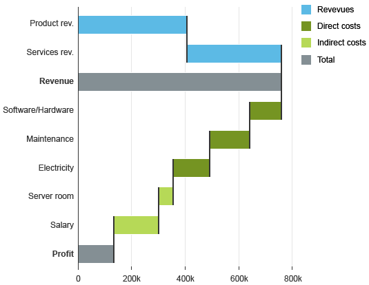
Profit and Loss
The margin is a cumulative value equal to the sum of all revenues (positive) and all costs (negative).
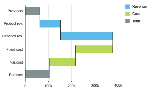
Profit and loss waterfall chart
Inventory over Time
The stock level is equal to the sum of all incoming stocks (positive) and outgoing stocks (negative).
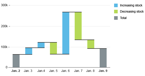
Stock level over time waterfall chart
Chart Types
The orientation of the waterfall chart (horizontal or vertical) should follow best practices of the business area from which the application is designed.
Waterfall Chart Without Time Dimension
If the chart does not represent changes over time, use a horizontal waterfall chart with horizontal bars. This way, you will avoid unnecessarily truncating the category labels.
Horizontal waterfall chart
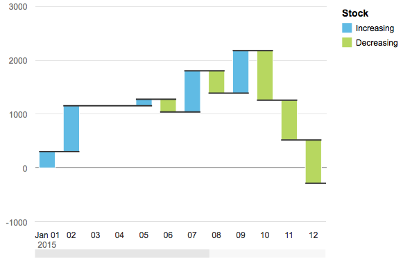
Waterfall Chart with Time Dimension
If the chart represents the change of a cumulative value over time, use a vertical waterfall chart with vertical bars, with the horizontal axis representing the temporal dimension.
For the horizontal axis, you can choose between a categorical axis or a time axis:
- Choose a categorical axis if you need to display the total and subtotal. But be aware that the dates might be displayed at a 45° angle in the categorical axis, and that you must manage the localization of the date and time by yourself.
Horizontal waterfall chart with categorical time axis
- Choose the time axis if you do not need to display the total and subtotal. With the time axis, the dates will be correctly displayed in the horizontal axis and correctly localized. Also, with the time axis, the physical spacing between your data points accurately respects the time scale being displayed, as opposed to just rendering all your data points equidistantly.
Waterfall chart with time axis
- With the time axis, you can also display multiple measures in the so-called “periodic waterfall chart”. In the periodic waterfall chart, all measures are cumulated for each period.
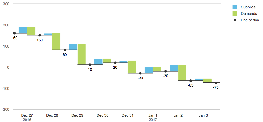
Periodic waterfall chart
Total and Subtotal
The initial and the final values are usually represented by an entire column starting from the zero axis. An intermediate total can be added.
Waterfall chart with an intermediate total
You can also add intermediate subtotals that are the sum of previous values.
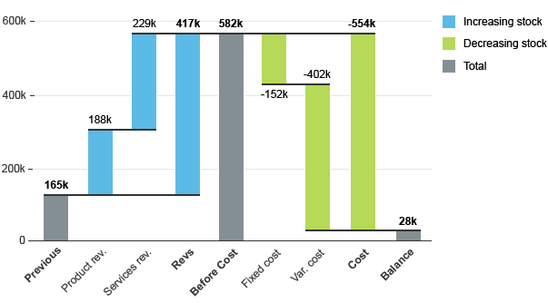
Waterfall chart with an intermediate subtotal
Colors
Default Colors
- Positive values use a color defined by the property: plotArea.dataPoint.color.positive.
- Negative values use a color defined by the property: plotArea.dataPoint.color.negative
- Totals use a color defined by the property: plotArea.dataPoint.color.total
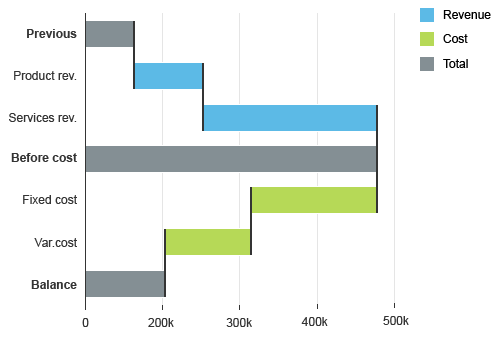
- Blue (@sapUiChartPaletteSequentialHue1Light1)
- Green (@sapUiChartPaletteSequentialHue2Light1)
- Gray (@sapUiChartPaletteSequentialNeutral)
These colors are defined by the sequential palette, but can be customized.
Waterfall chart with default colors
Custom Colors
- Change the colors, or
- Use your own rules.
Changing Colors
The colors color.positive, color.negative and color.total can be changed to any color from the chart palette. The chart will use these three colors based on the rules defined above.
Example: Positive and negative are blue, and total by gray.
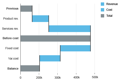
Waterfall chart with custom colors
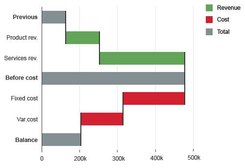
Waterfall chart with semantic colors
Using your Own Rules
You can set any color to any bar based on your own rules. To define the rules, use the property dataPointStyle:rules.
Use dataPointStyle:others to define the colors for all data points that are not covered by the rules. If the color of a data point is not defined, the data point will be displayed with a black color to indicate that no color has been defined.
Waterfall chart with colors based on business rules
Resources
Want to dive deeper? Follow the links below to find out the SAPUI5 implementation.
Elements and Controls
- Chart (guidelines)
- Chart – Color Palettes (guidelines)
- Chart – Time Axis (guidelines)
Implementation
- Horizontal Waterfall Chart (SAPUI5 samples)
- Vertical Waterfall Chart (SAPUI5 samples)
- Charts with Time Axis (SAPUI5 samples)
 Your feedback has been sent to the SAP Fiori design team.