
Updated: November 20, 2016
Table: Grid Table
Intro
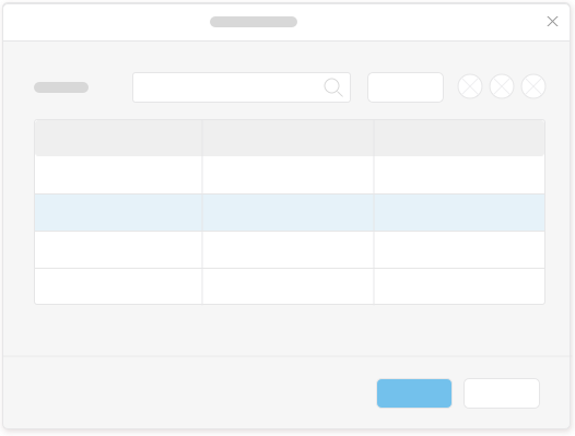
A grid table contains a set of data that is structured in rows and columns.
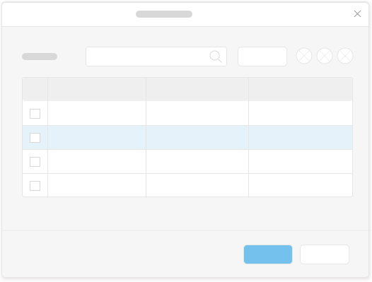
The first column in the table is a selection column. The user can select a row by clicking on a cell in that column.
The next columns display data. Each cell in these columns can be one of the following controls: text (read-only), text input field, date picker, select, combo box, multi combo box, check box, link, or an icon.
Users can resize a column by dragging the separator in the table header on the right side of the column. A double click on the separator resizes the column according to the longest text in that column.
Users can reorder columns by dragging and dropping the corresponding column headers.
Do
- Provide only the most important columns and as few columns as possible to avoid horizontal scrolling.
- When columns are irrelevant at a specific time, in a specific situation, or for some users, hide those columns and enable users to show these hidden columns from the Settings icon.
- Provide a search control to enable users to filter the table, and make sure that the search looks for strings from all columns.
- Provide initial column sizes in pixels to make sure that a scroll bar is added if the table is too wide, and to avoid truncated text.
- For multiple selection, provide check boxes in the selection cells and a check box to support Select All in the column header of the selection column.
Don’t
- Don’t use a grid table if data needs to be structured in a hierarchical manner. In this case use a tree table instead.
- Don’t add a filter control for table filtering.
- Don’t provide initial column sizes in percentages because then reducing the browser window size will truncate the text in the cells.