Updated: September 20, 2016
Message Box
Intro
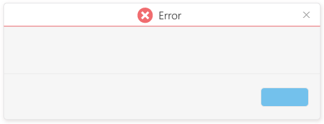
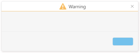
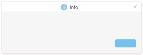
The message box is a small window that pops up to inform users about a general error or notification. It pops up in the center of the screen, in a modal window on top of a black overlay to get the user’s attention. The user can’t work as long as the message box is displayed. The visual design of the message is automatically updated when you define the window title, for example, Error, Info, and Warning.
Do
- Use a message box if you want to interrupt users in order to display a non-field-related error, warning, confirmation, or information message.
- Use a message box if you want the user to take action, such as selecting what to do next, confirming a triggered action, etc.
- If you want users to confirm deletion, use the title “Delete” and the dialog text will be added automatically, or inform the user what exactly is going to be deleted without asking questions, for example, “The configuration “Web App” will be deleted”.
- If you want users to confirm an action that they triggered, other than deletion, such as leaving a form without saving, use the same action name in both the window title and the action button.
- If you want to inform the user about a system error, tell the user how to solve the problem in addition to the problem description. Speak the user’s language as if the user is speaking to a call center, and avoid system or configuration details.
- When displaying an information message, make sure that the message is critical enough to interrupt users.
- If you want to warn users about potential issues, such as unintended data loss, without letting them change their mind, only provide an OK button or an action button, such as “Leave Page”.
- If you want to warn users about potential issues and let them change their mind, provide a Cancel button in addition to the OK button or action button.
- Avoid multiple-step solutions because users may forget the steps after closing the message box.
- Avoid phrasing that blames the user or implies that the user made a mistake.
Don’t
- Don’t use a message box to inform the user about a successful action or non-critical message. In this case use the notification area.
- Don’t use a message box to display an error, warning, confirmation, or information message about a specific field. In this case use the relevant status of that field.
- Don’t use technical terms, unless you’re sure that the users understand them.
- Don’t ask the user “Are you sure you want to….?”. Instead, only explain the potential issue, for example, “Closing the layout editor without saving will cancel all your changes”.
- Don’t phrase messages as questions and provide Yes | No buttons. Use imperative verbs for buttons so users know which button to click without reading the message, for example, Delete, Save, Don’t Save.
- If users triggered a dialog box and immediately closed it without making changes, don’t pop up a confirmation dialog.


