
Updated: November 20, 2016
Table Toolbar
Intro
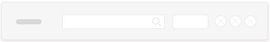
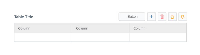
The table toolbar enables the user to trigger an action, such as adding rows, or change the view settings (e.g., filter). It can also contain a title. The toolbar appears above the table and has a transparent background.
Do
- Use the toolbar to provide the user with key actions that impact the table content or view.
- Provide a title for the table on the table toolbar.
- Provide action buttons with icons or text.
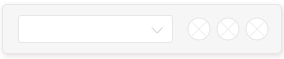
- Provide filters to enable user to switching content using a select control or a segmented button.
- When using text in button, use as short a text as possible, preferably a single-word. Use self-explanatory text that clearly describes the action that the button performs, preferably a verb, and explain it in more detail in a tooltip with a hot key.
- When using icons in a button, provide the button name in a tooltip with some explanation and/or a hot key.
- Order buttons according to usage: most frequently-used action on the left and the most seldom-used action on the right. This ensures that the most important buttons are the last to be moved into the overflow menu.
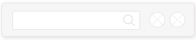
- Use Web IDE icons for the following generic actions: add, remove, reorder (up, down), sort, filter, and search.
- Align buttons to the right edge of the toolbar.
- Don’t combine icons and text in a button.
- Don’t only show the button name in the button tooltip.
- If the table is the only control inside a panel with title, don’t add a title in the table toolbar to avoid repetition.