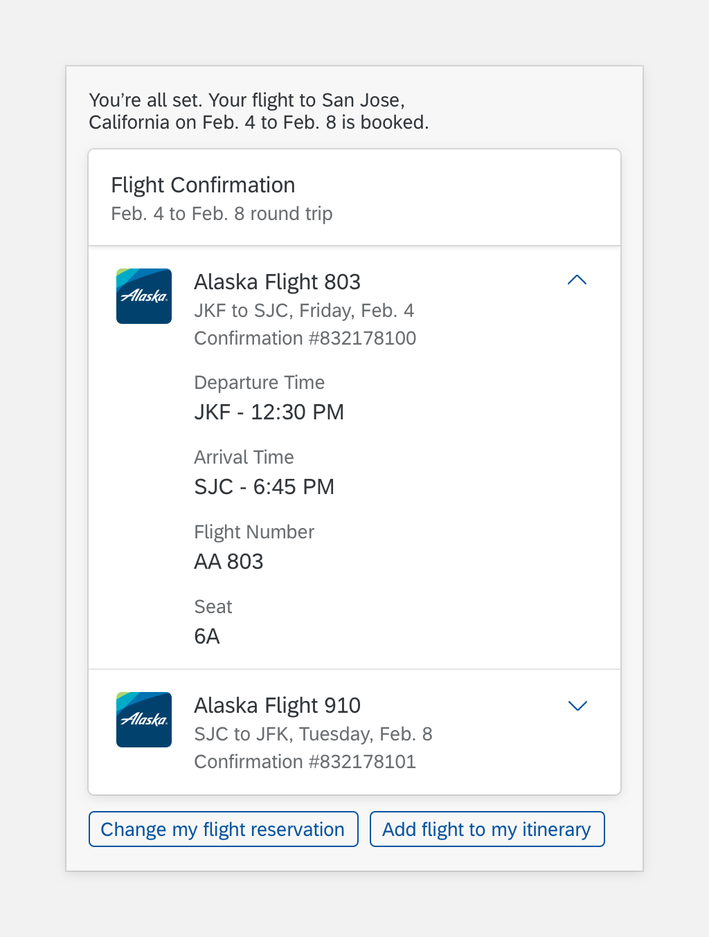
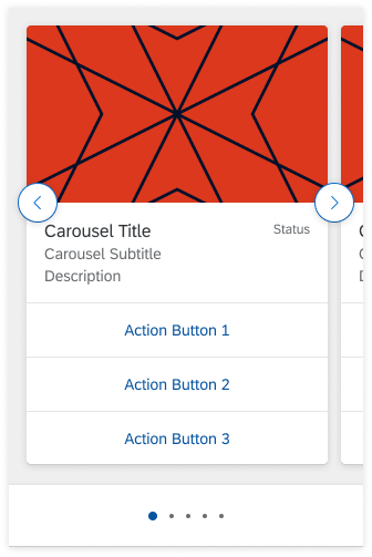
Panel
The panel is a container for grouping and displaying information to the user.
Panel
Usage
These are some best practices when using the panel foundation with the digital assistant.
Dos
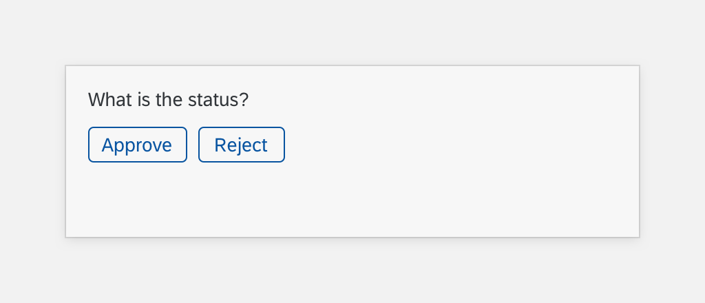
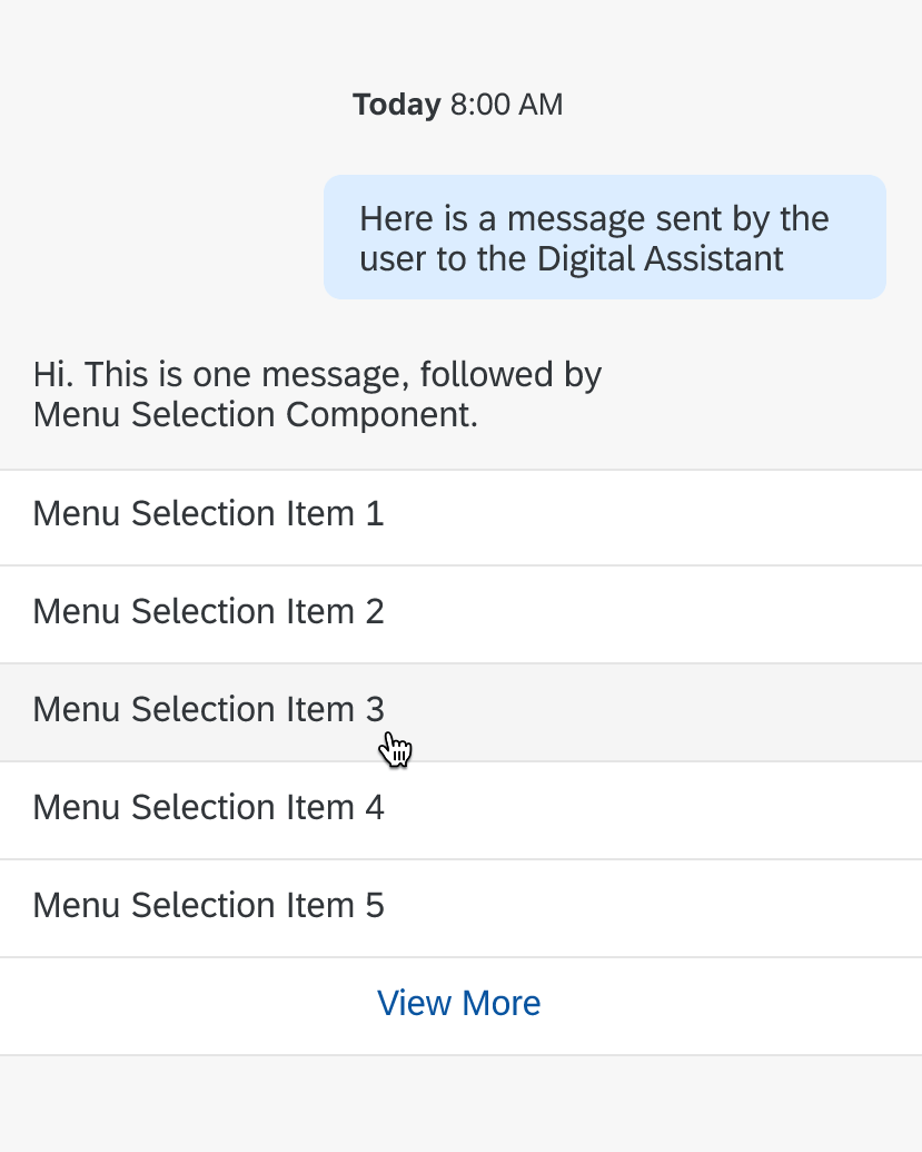
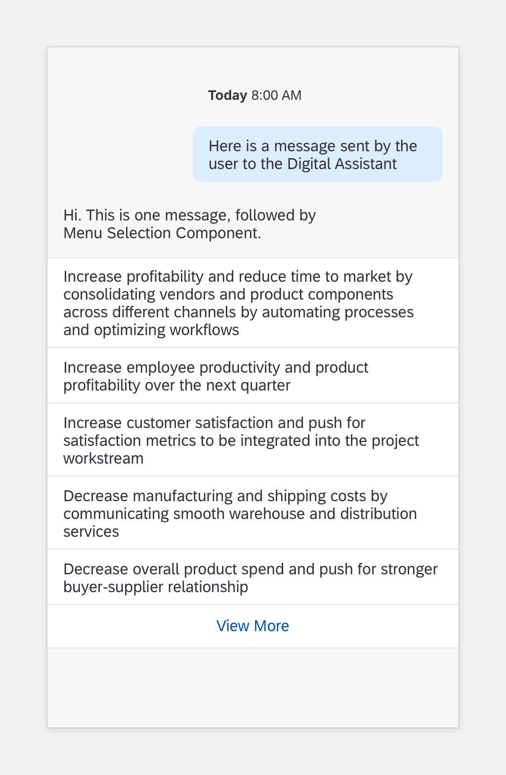
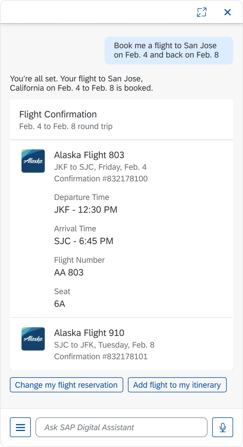
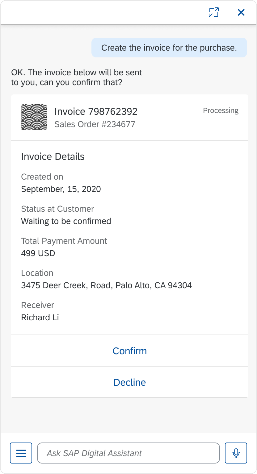
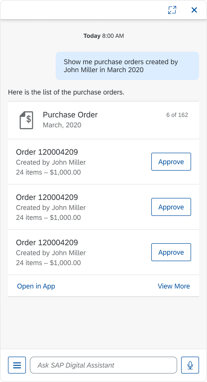
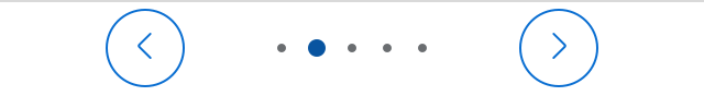
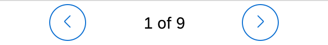
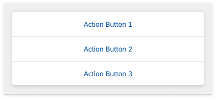
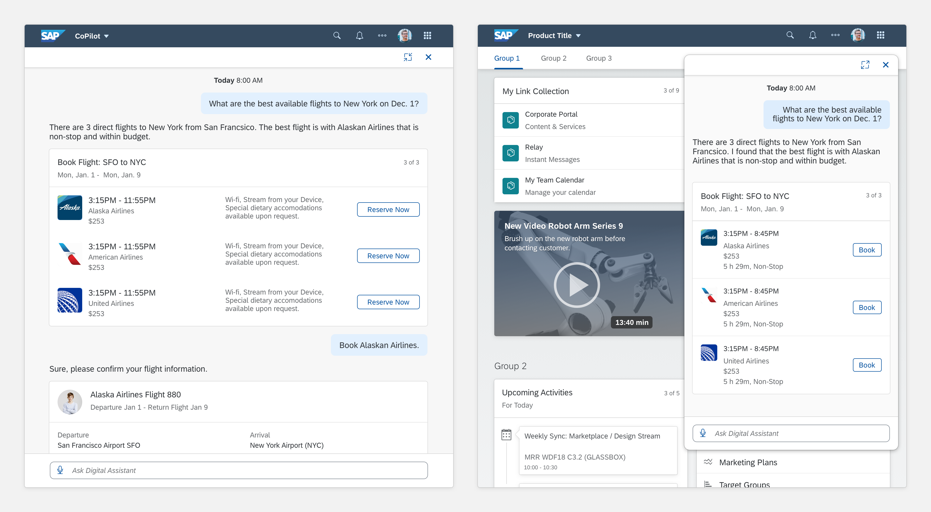
- Do use panel to create a seamless conversational experience. You can nest chat elements in the panel.
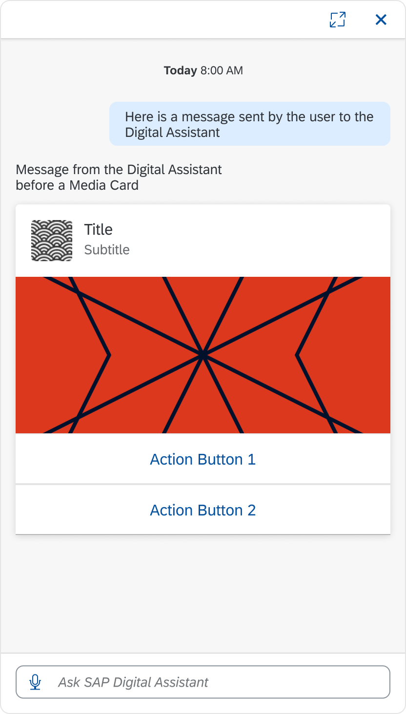
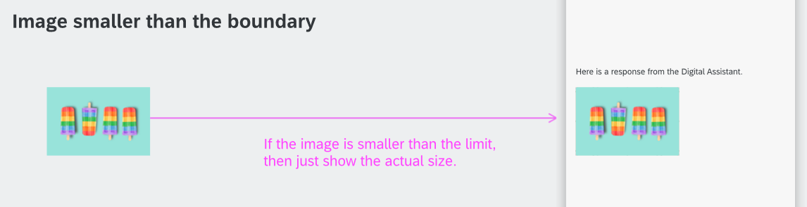
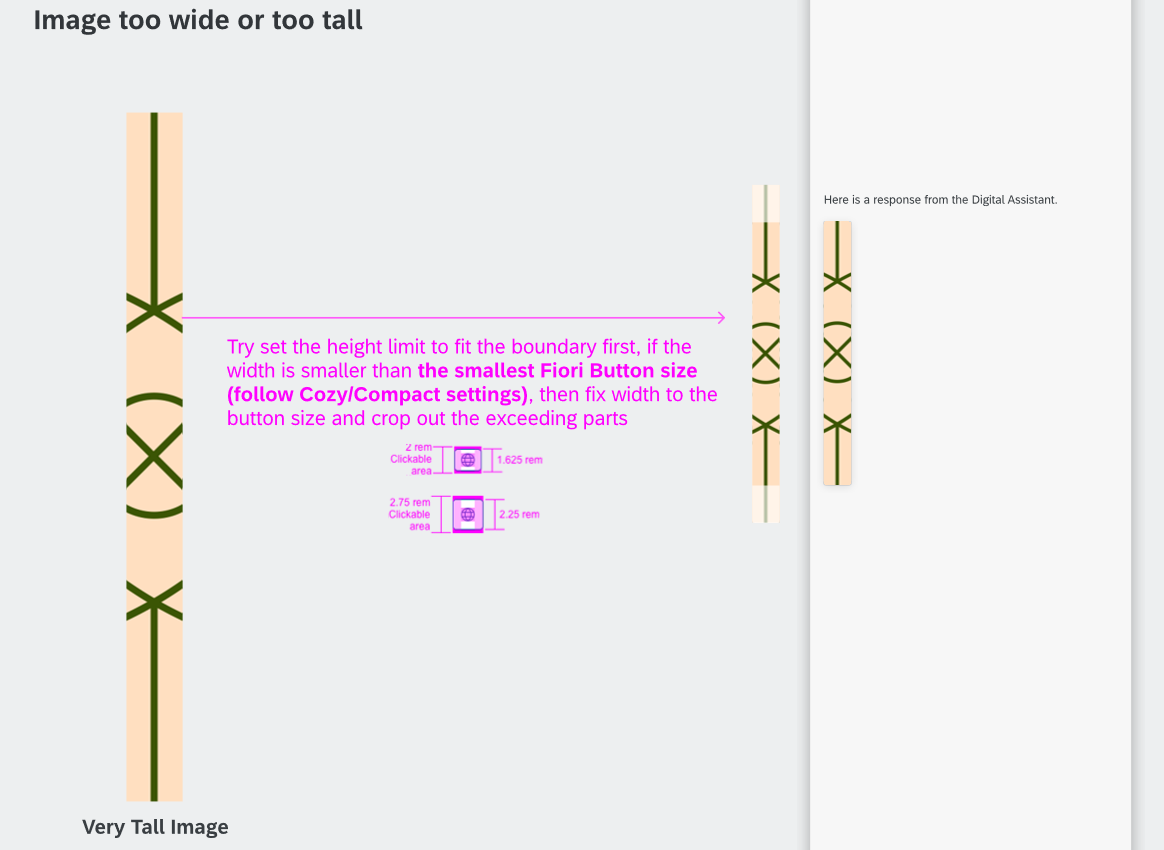
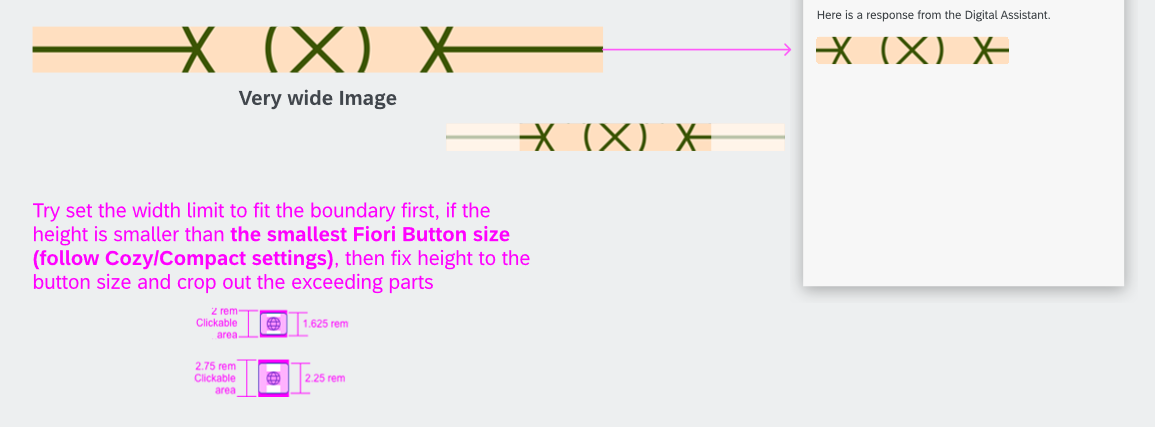
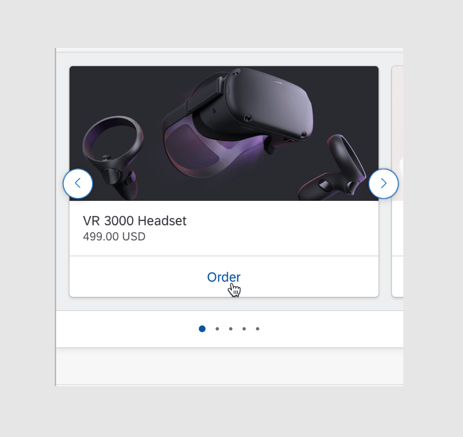
- Do use the floating panel to give users more space on the screen to multitask.
Don’ts
- Don’t put conversational elements outside of a panel.
- Don’t use floating panel if the user’s main action is to engage with the conversation.
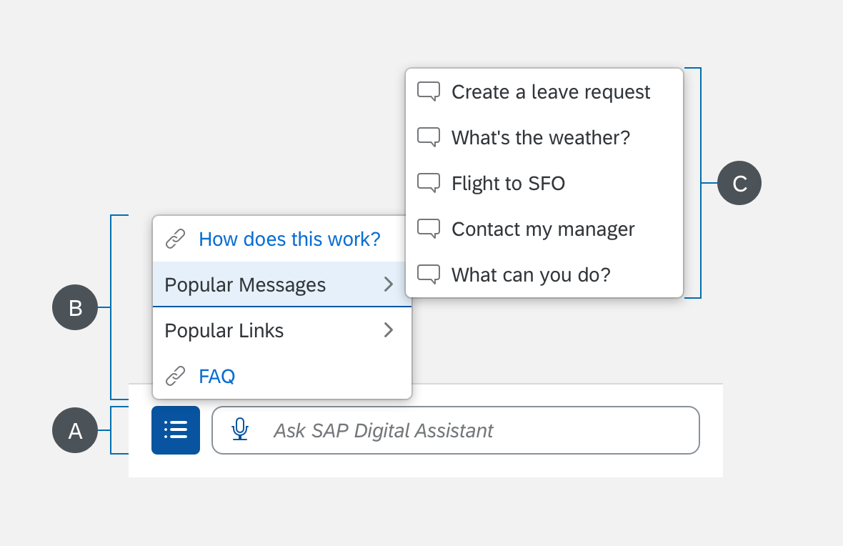
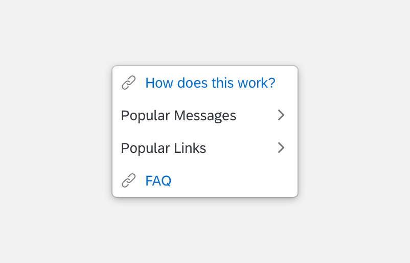
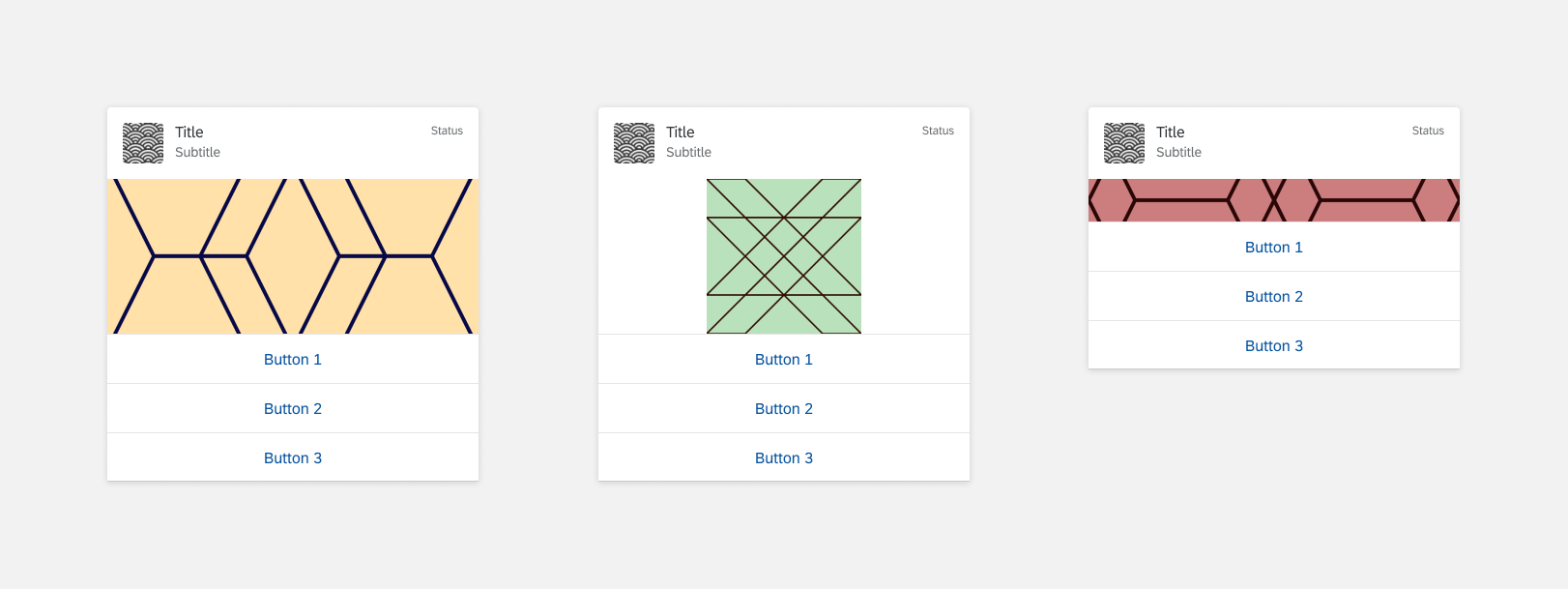
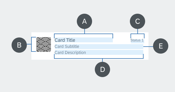
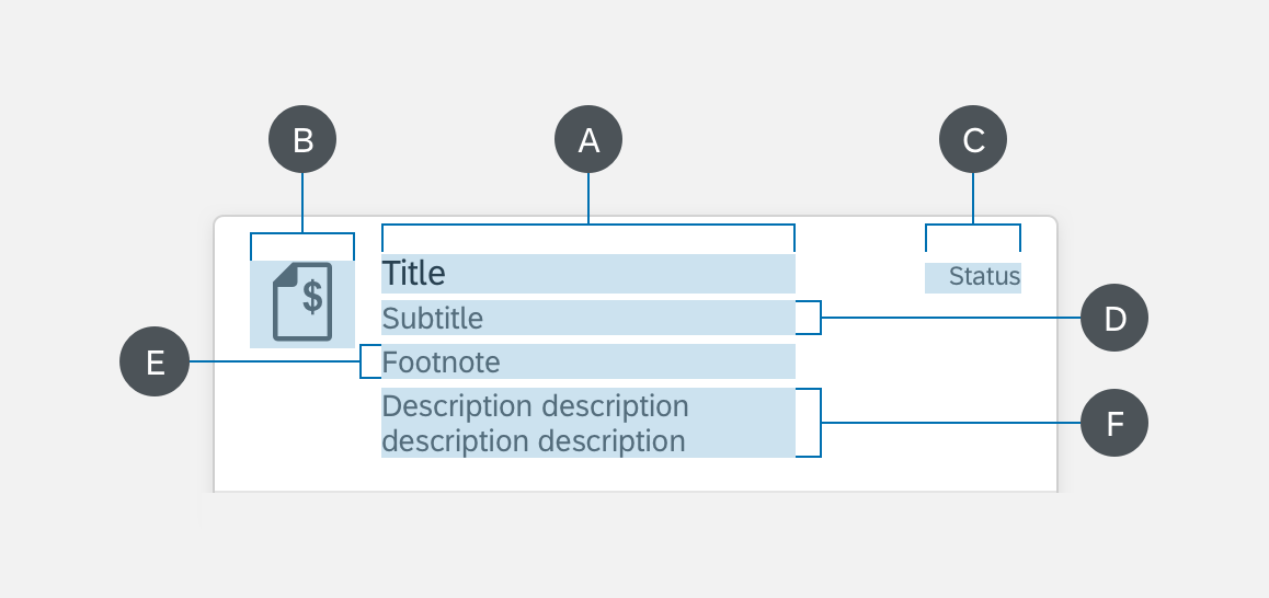
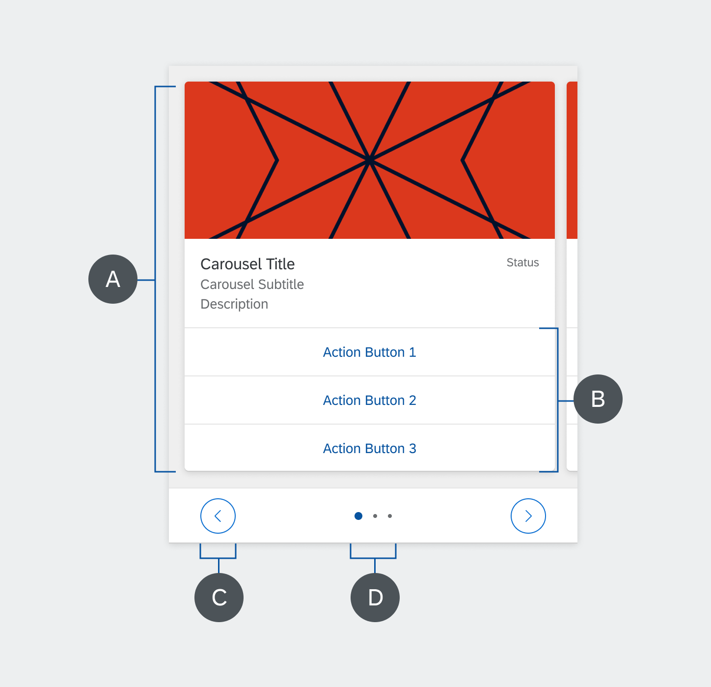
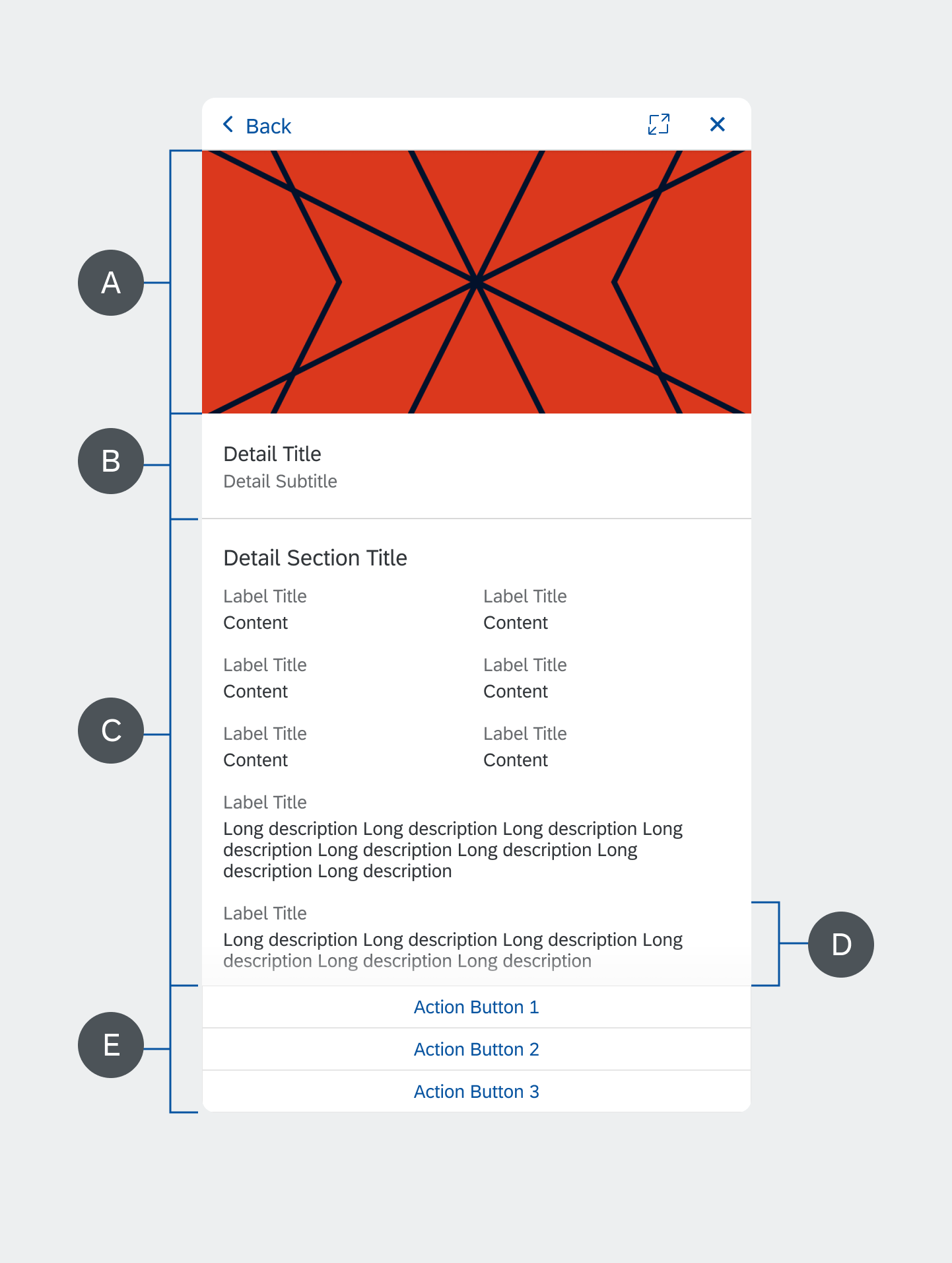
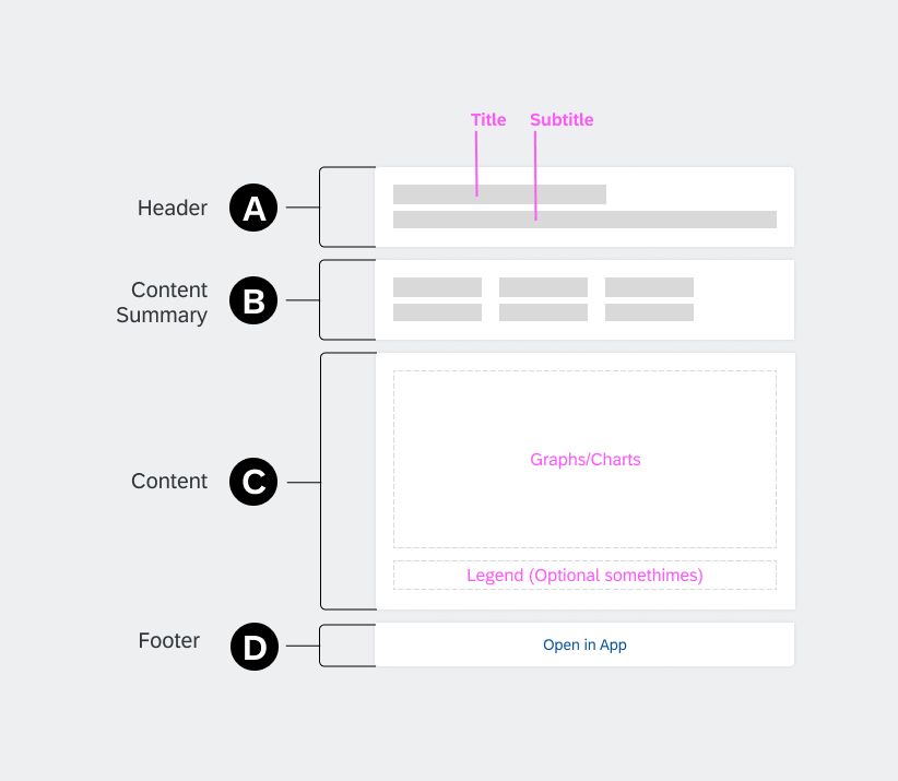
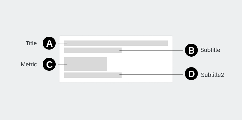
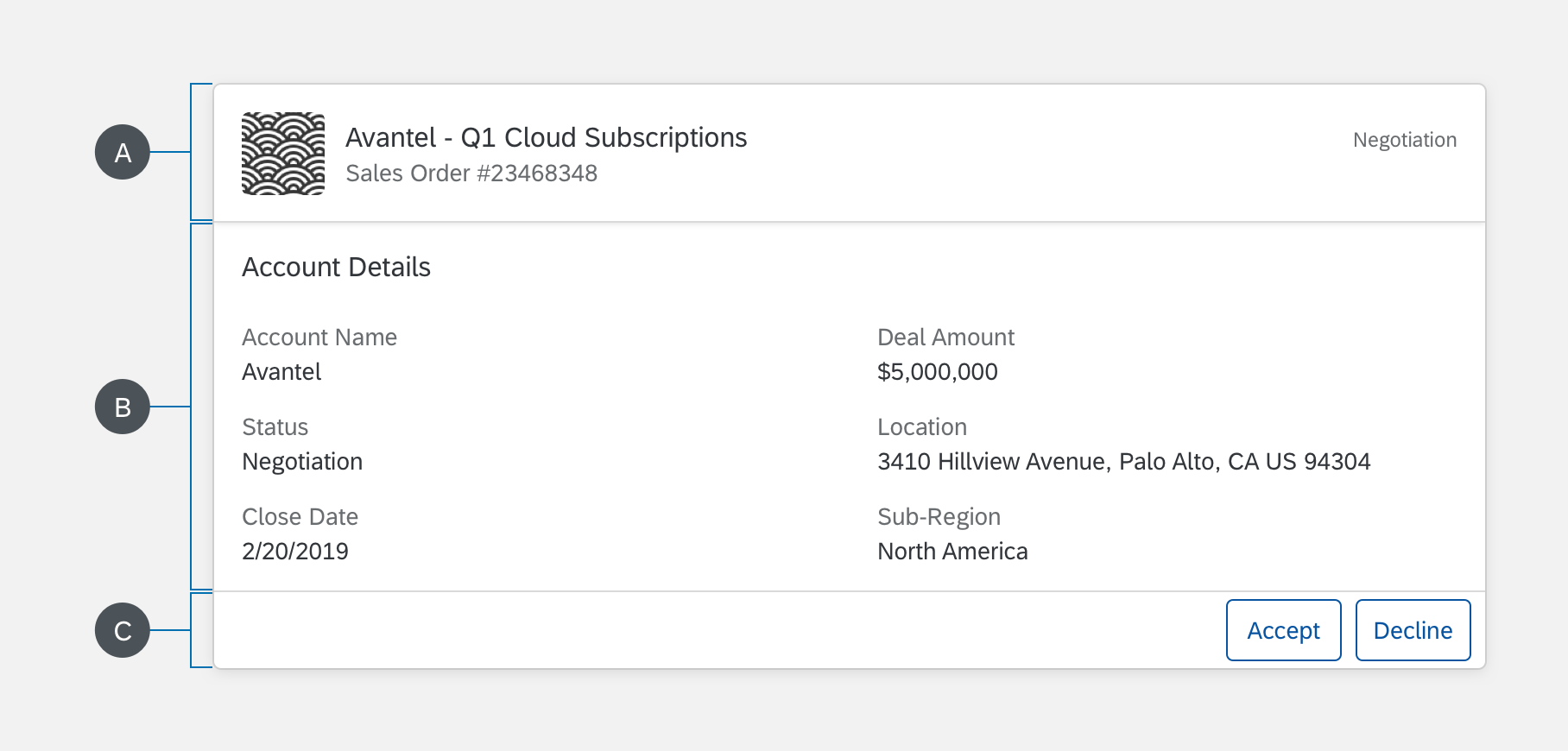
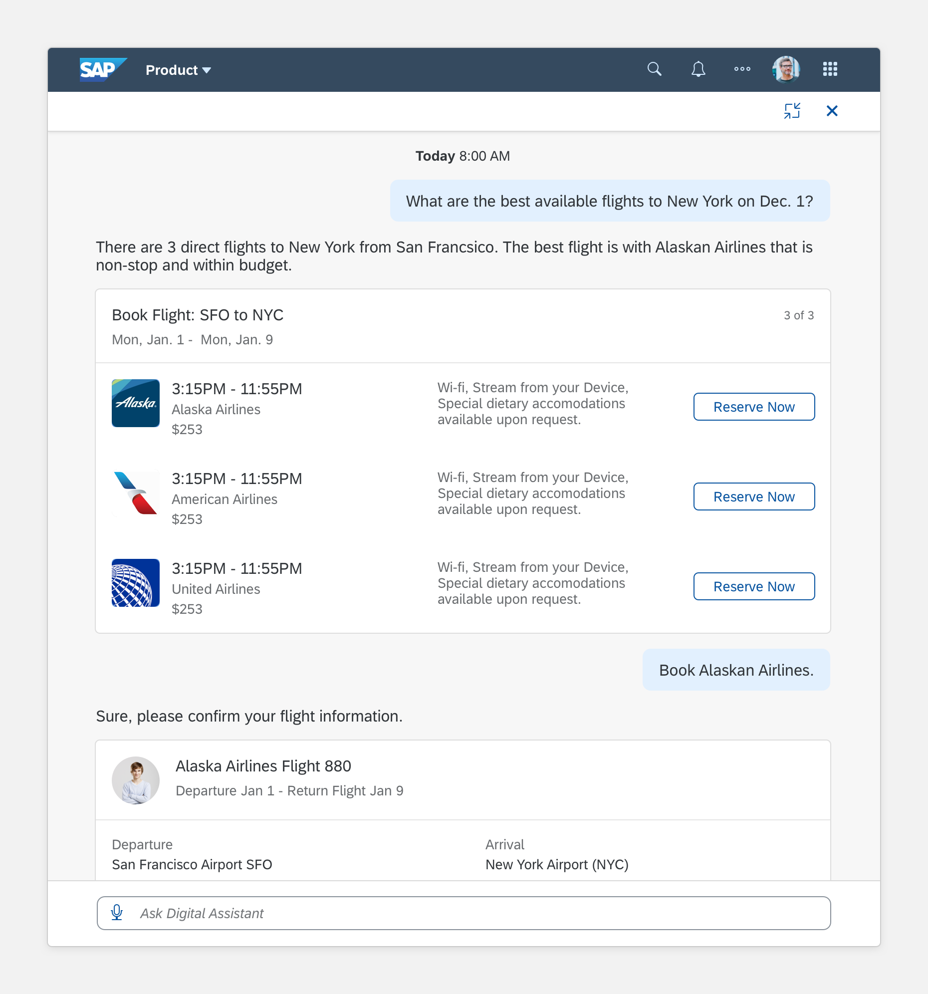
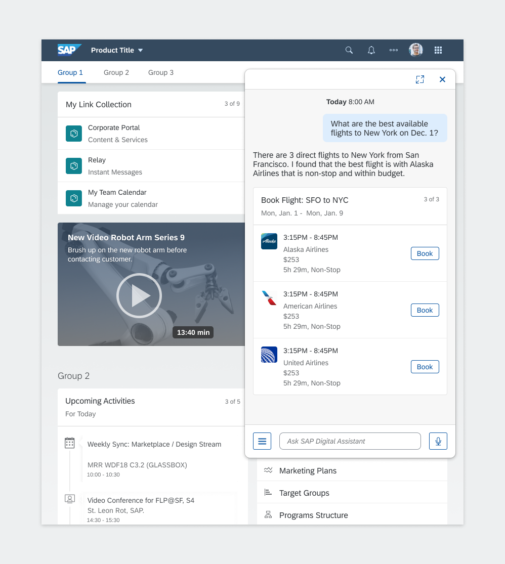
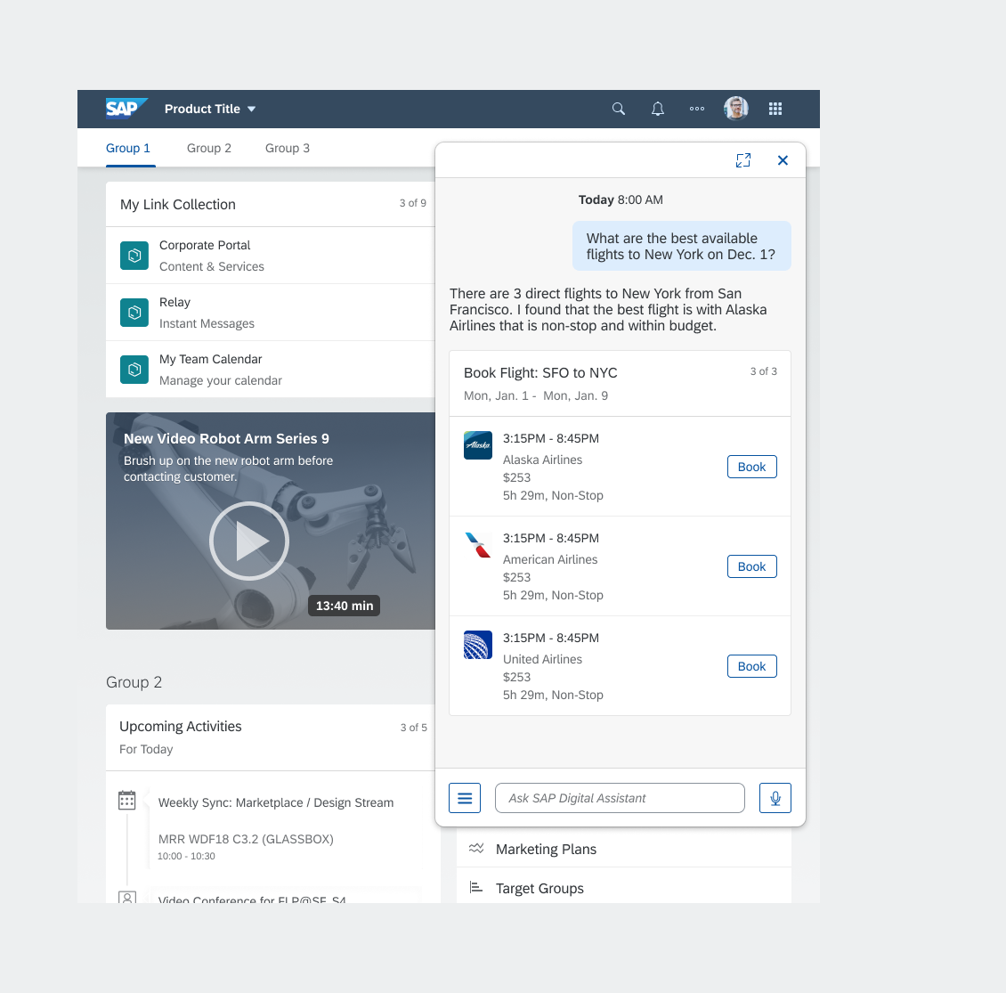
Structure
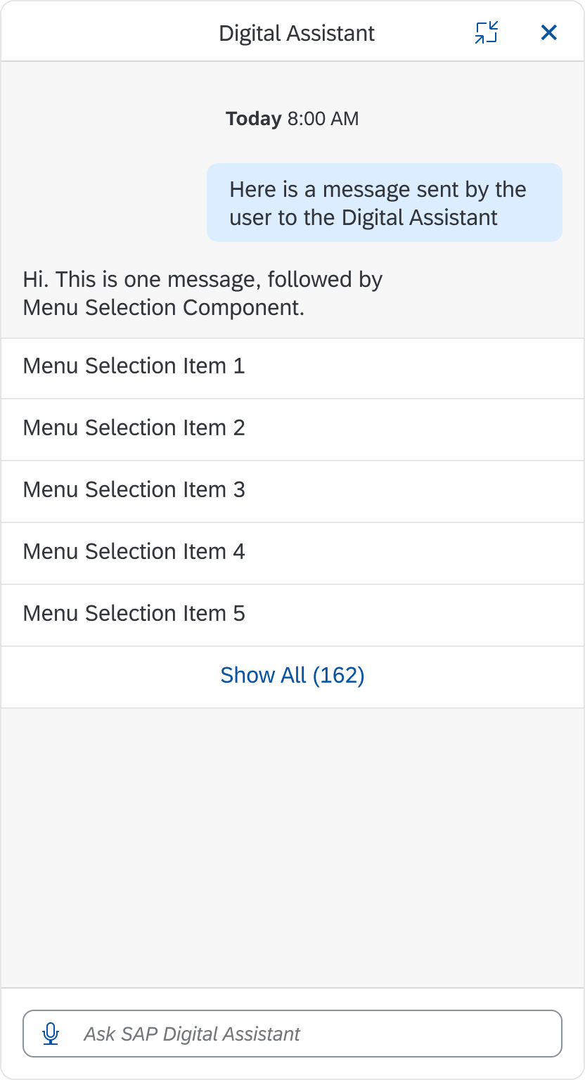
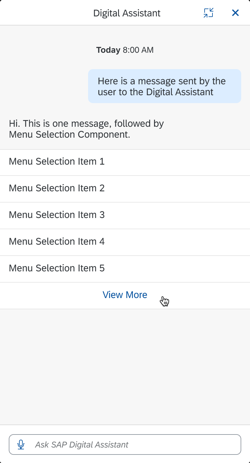
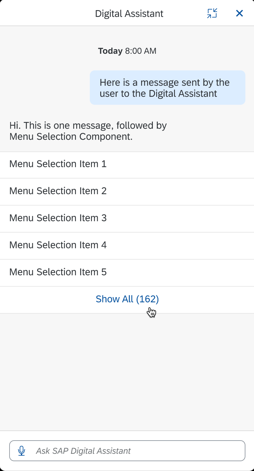
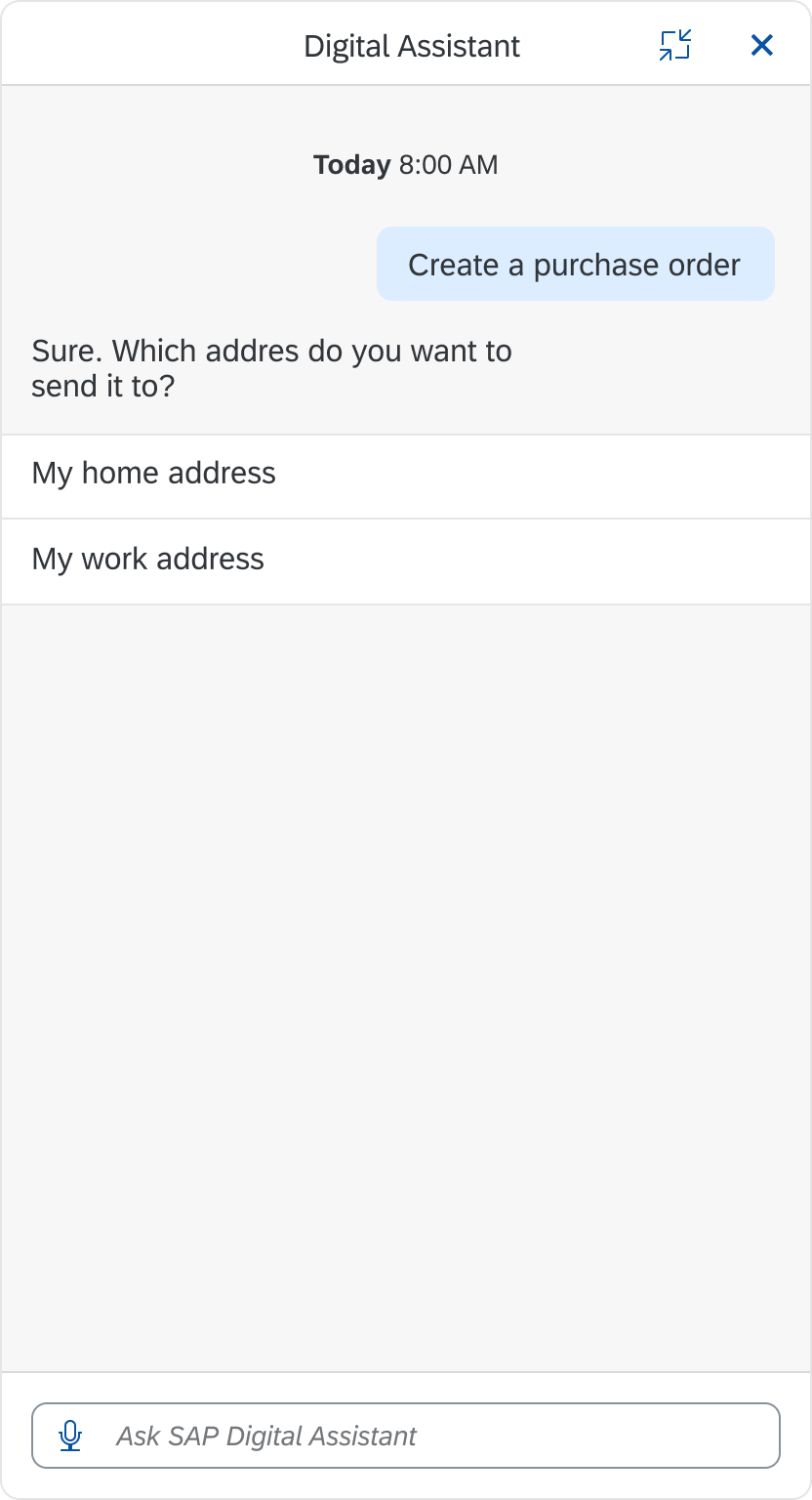
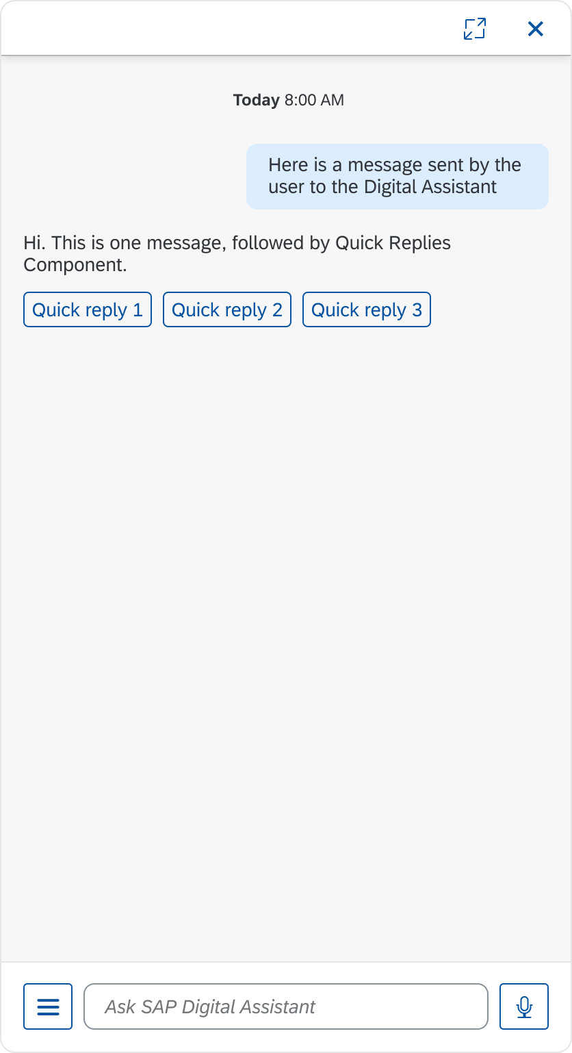
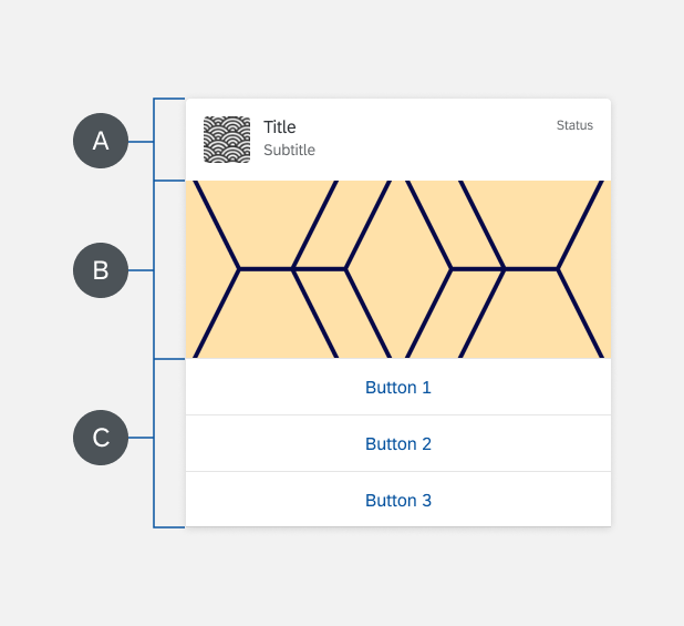
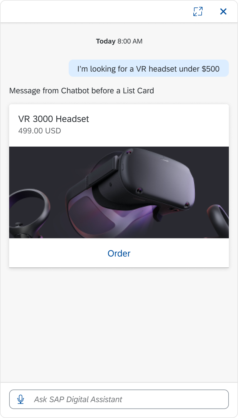
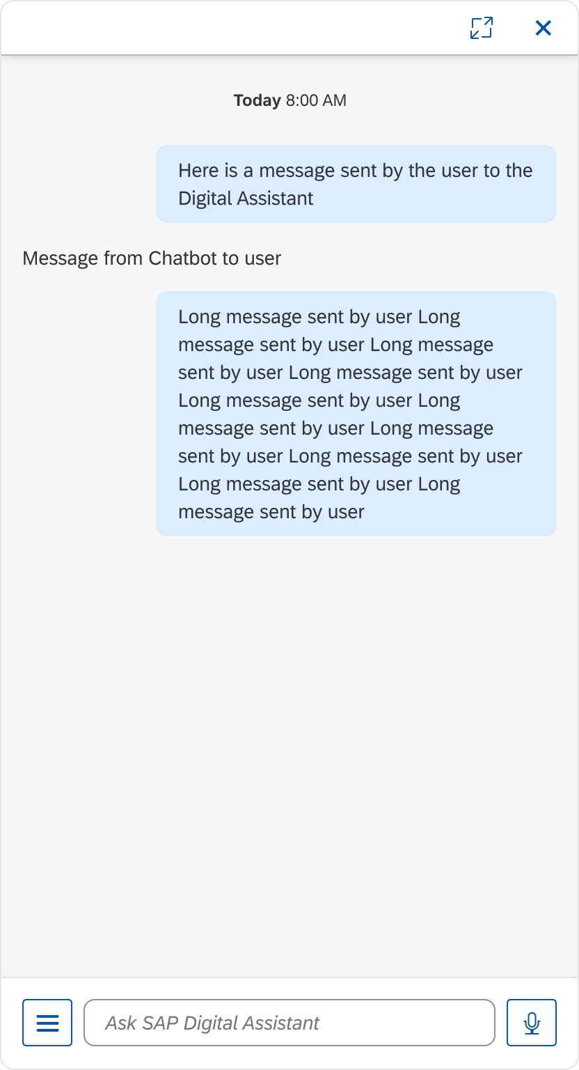
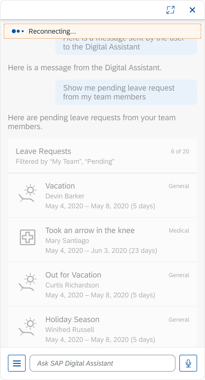
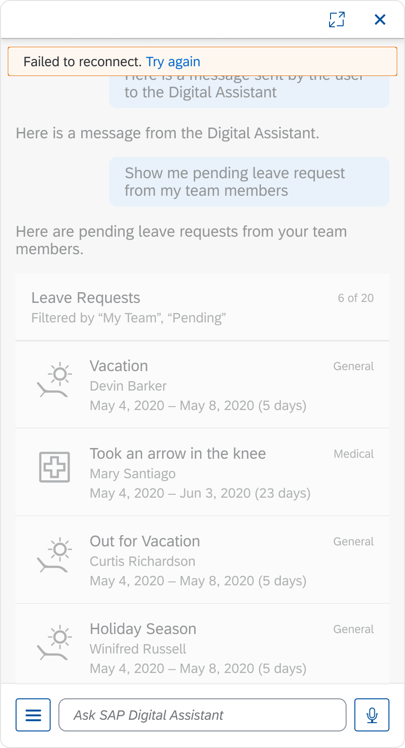
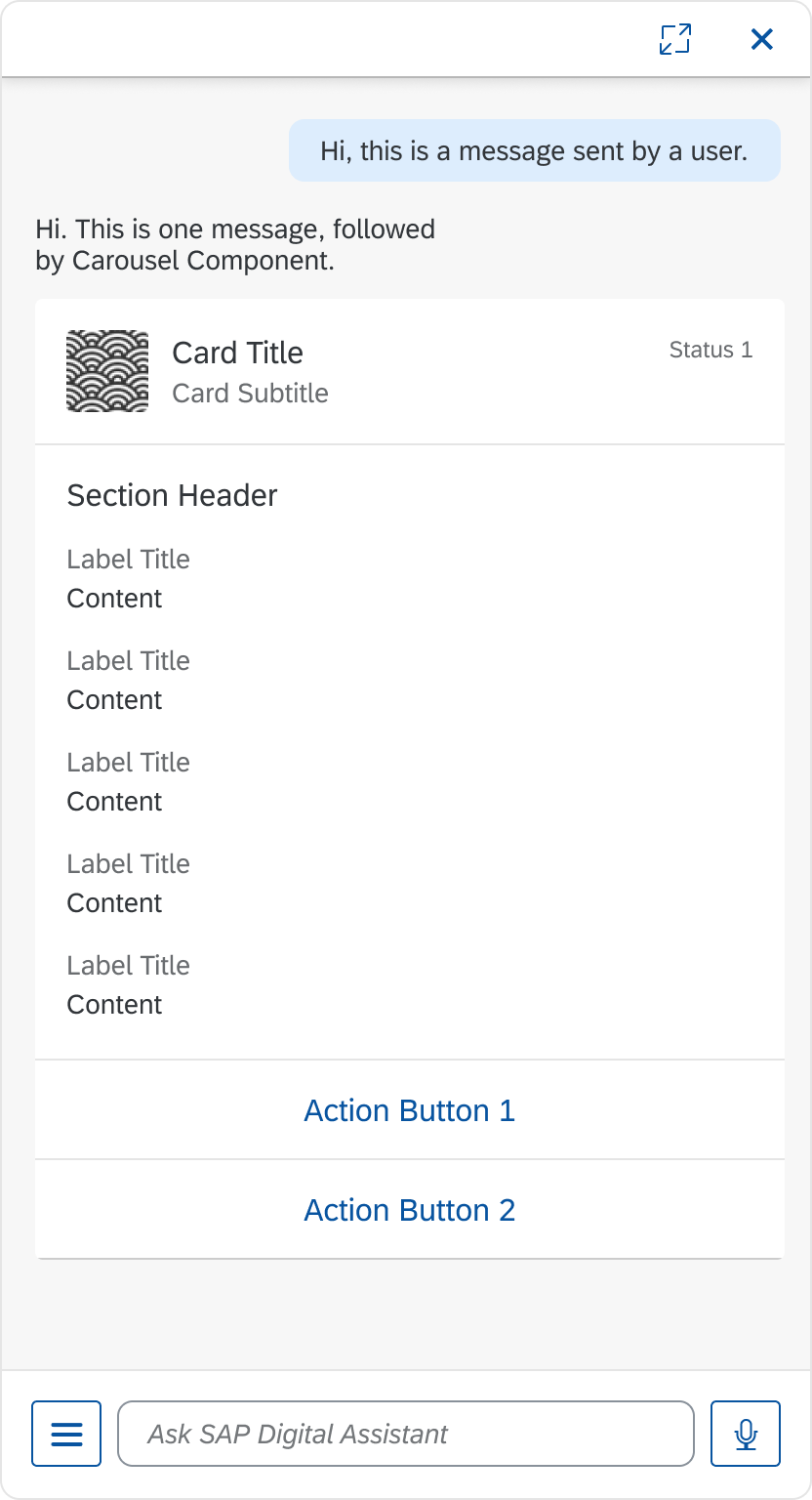
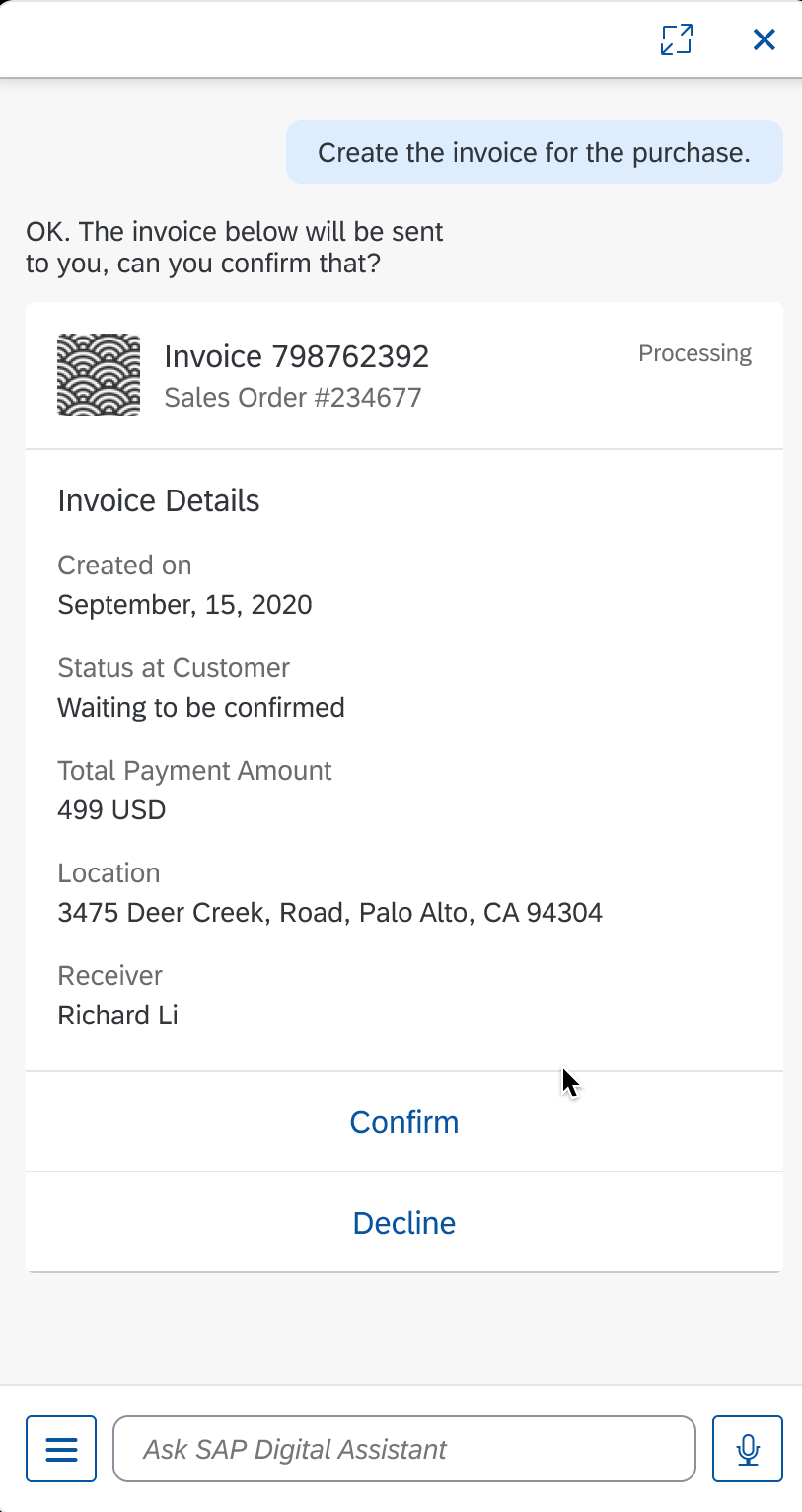
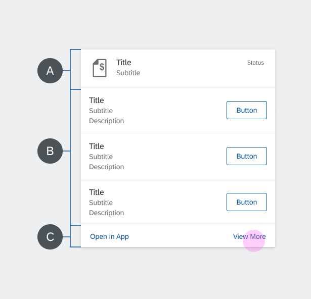
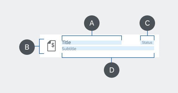
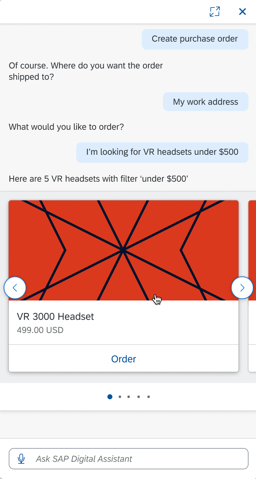
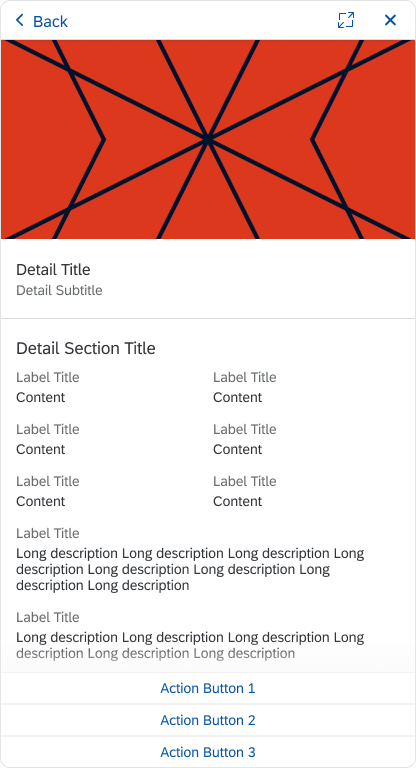
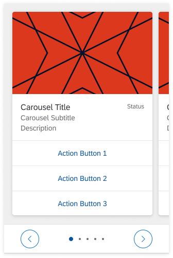
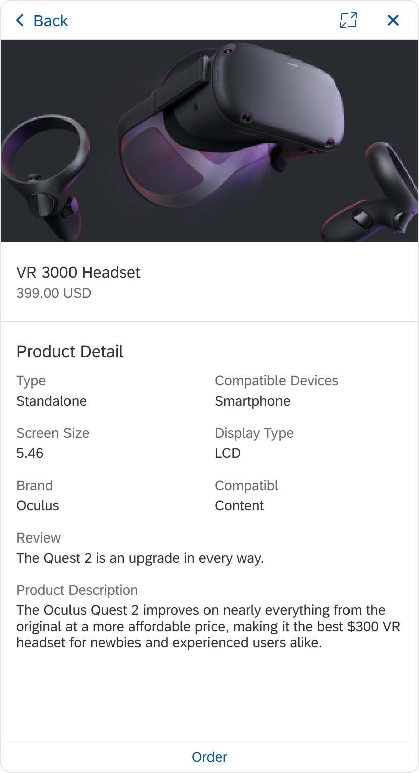
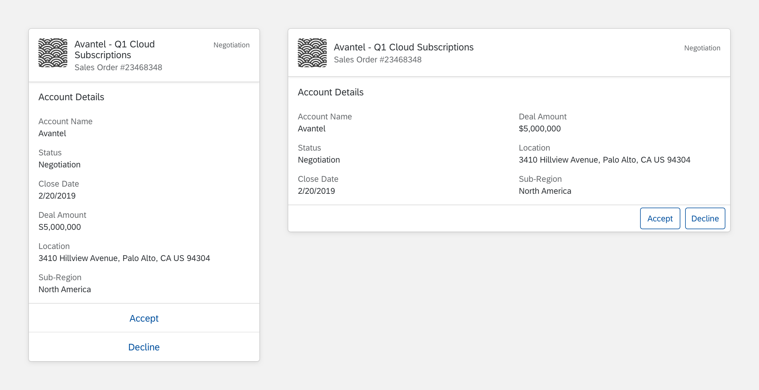
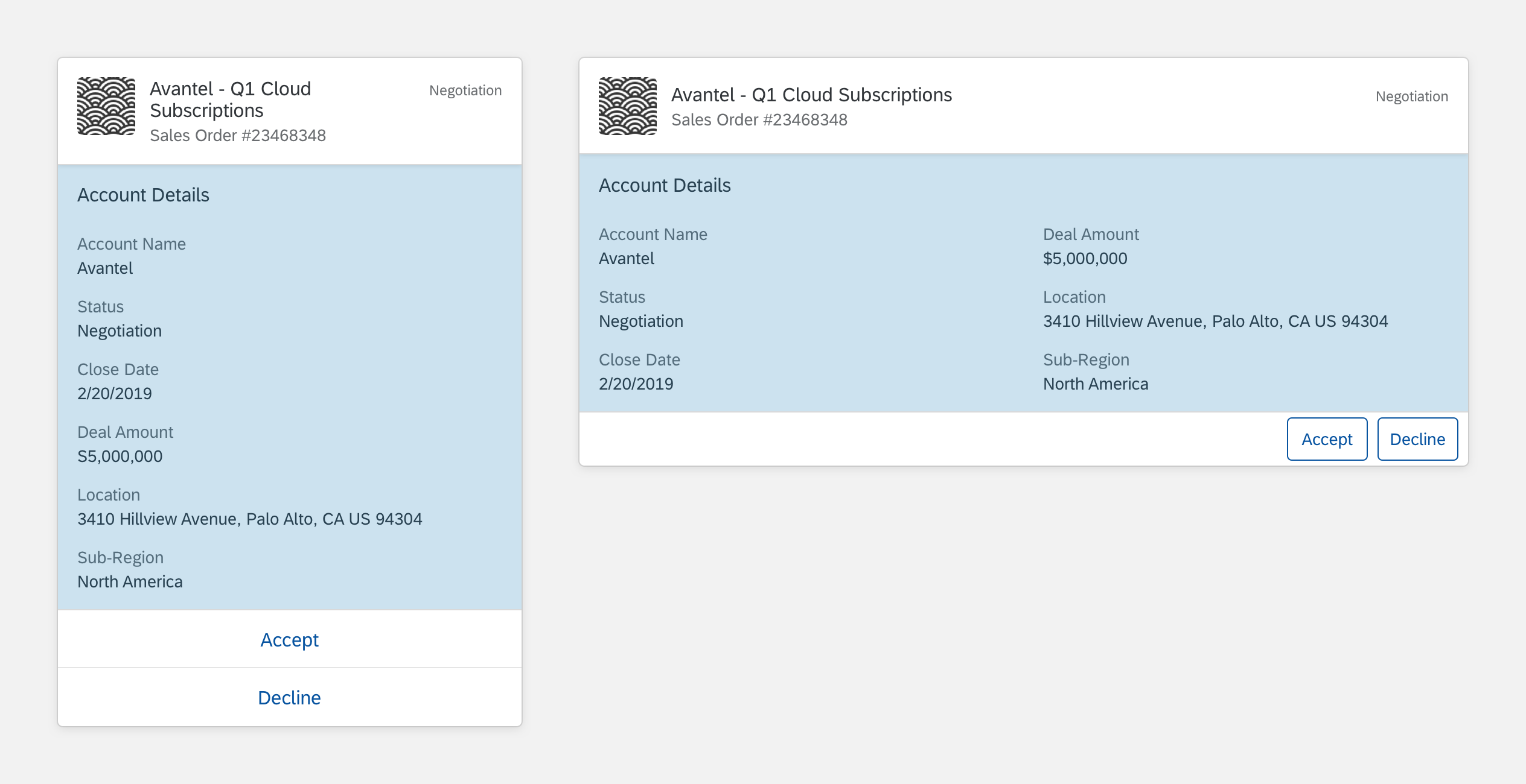
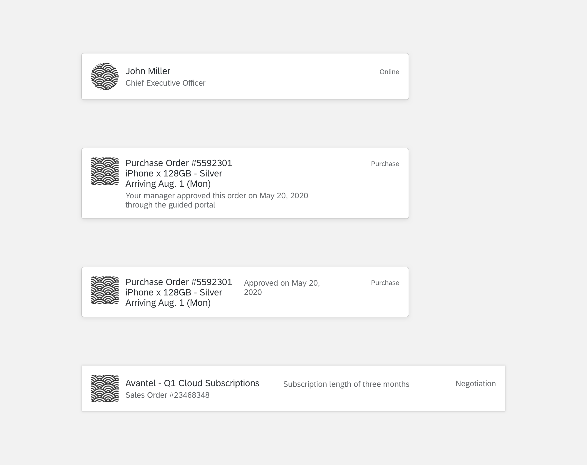
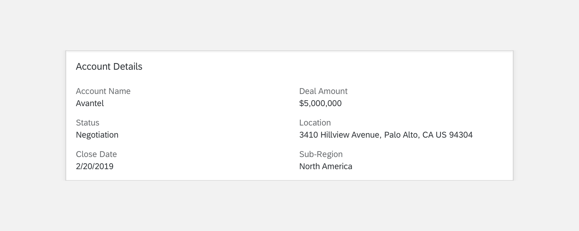
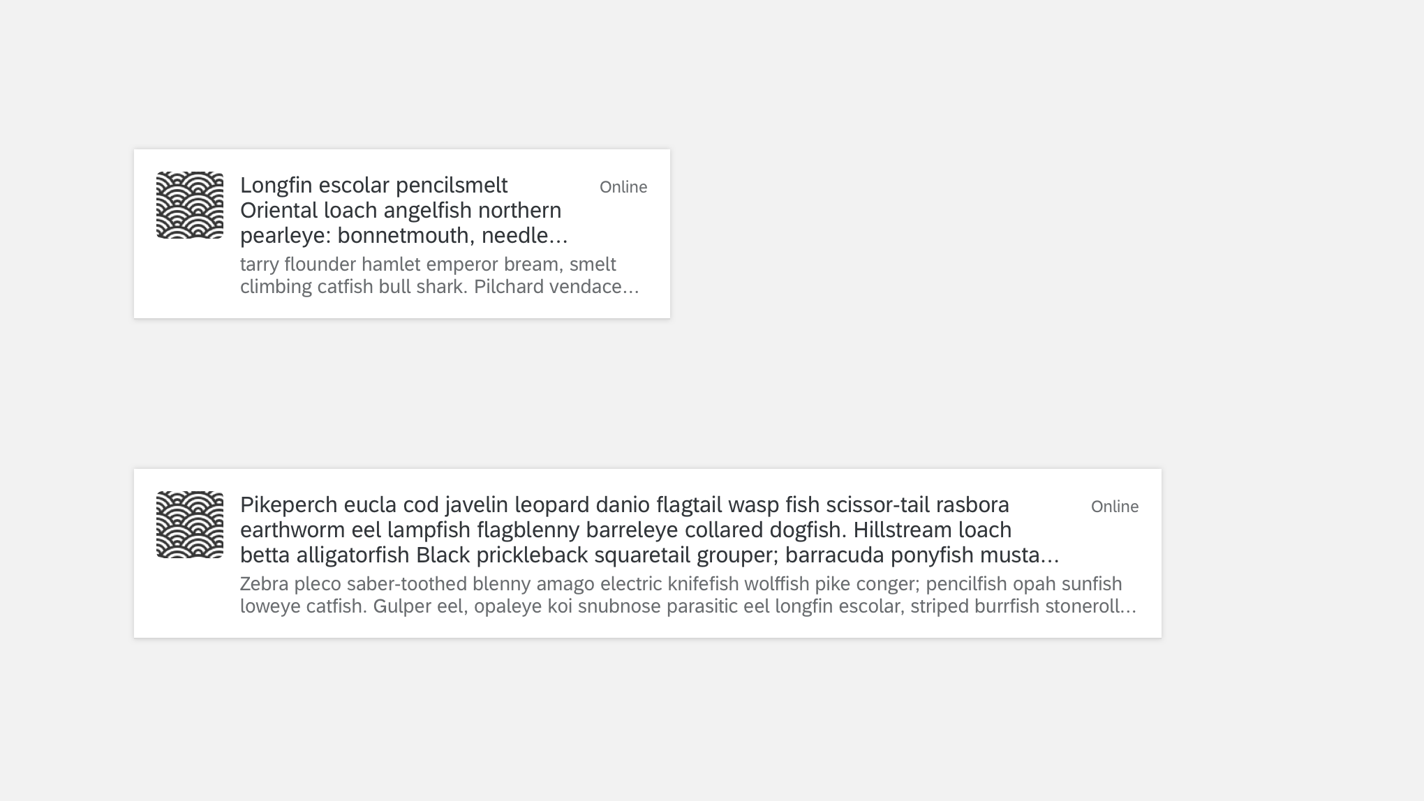
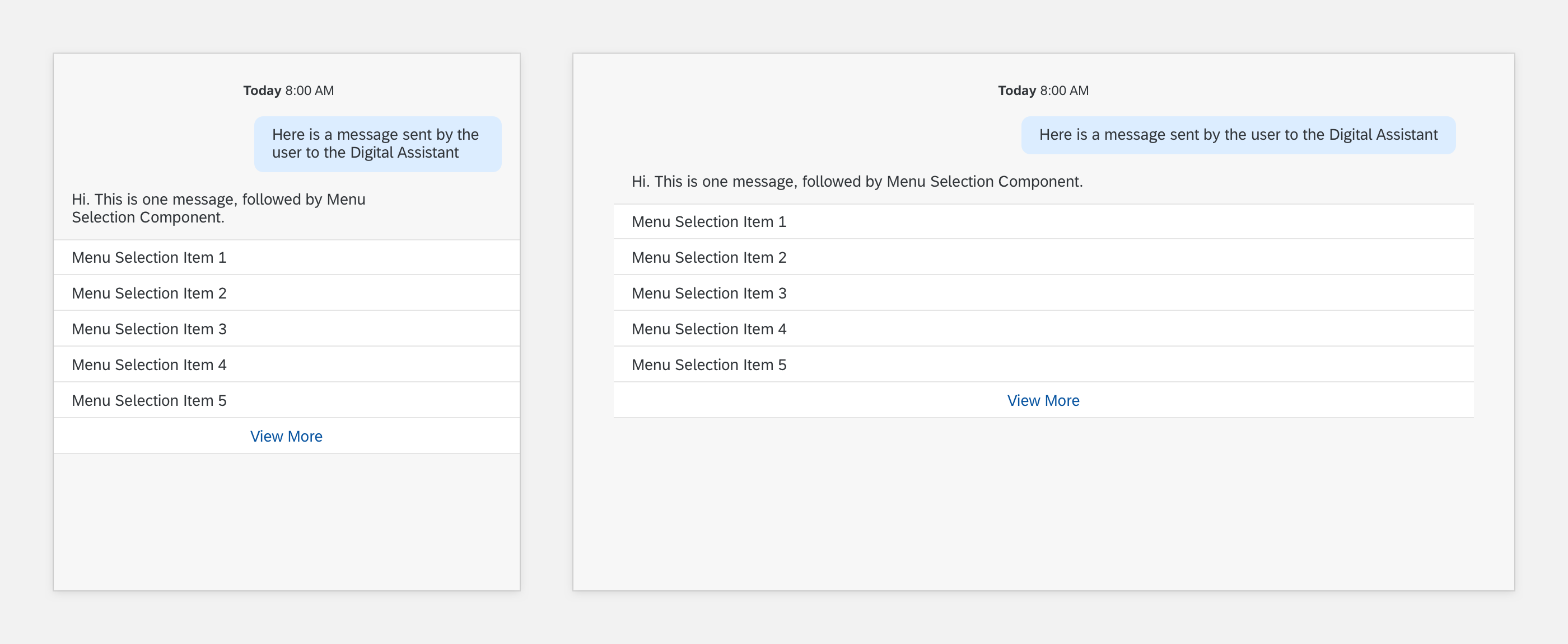
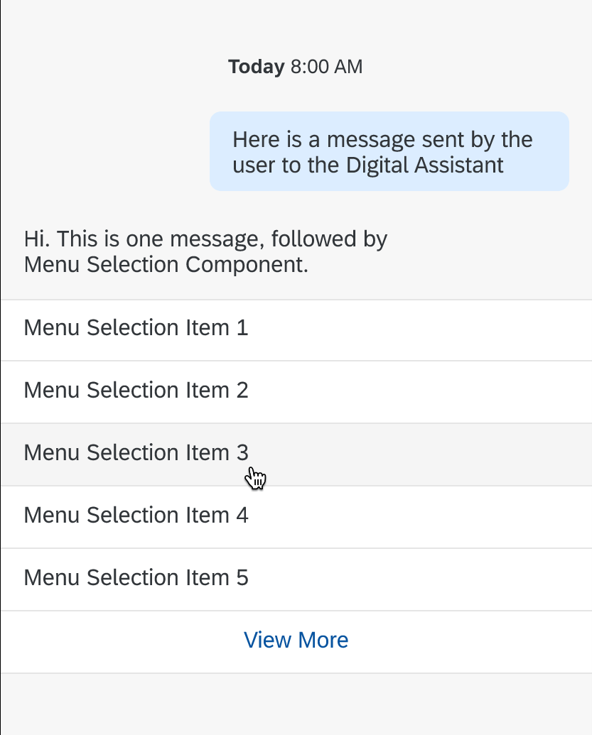
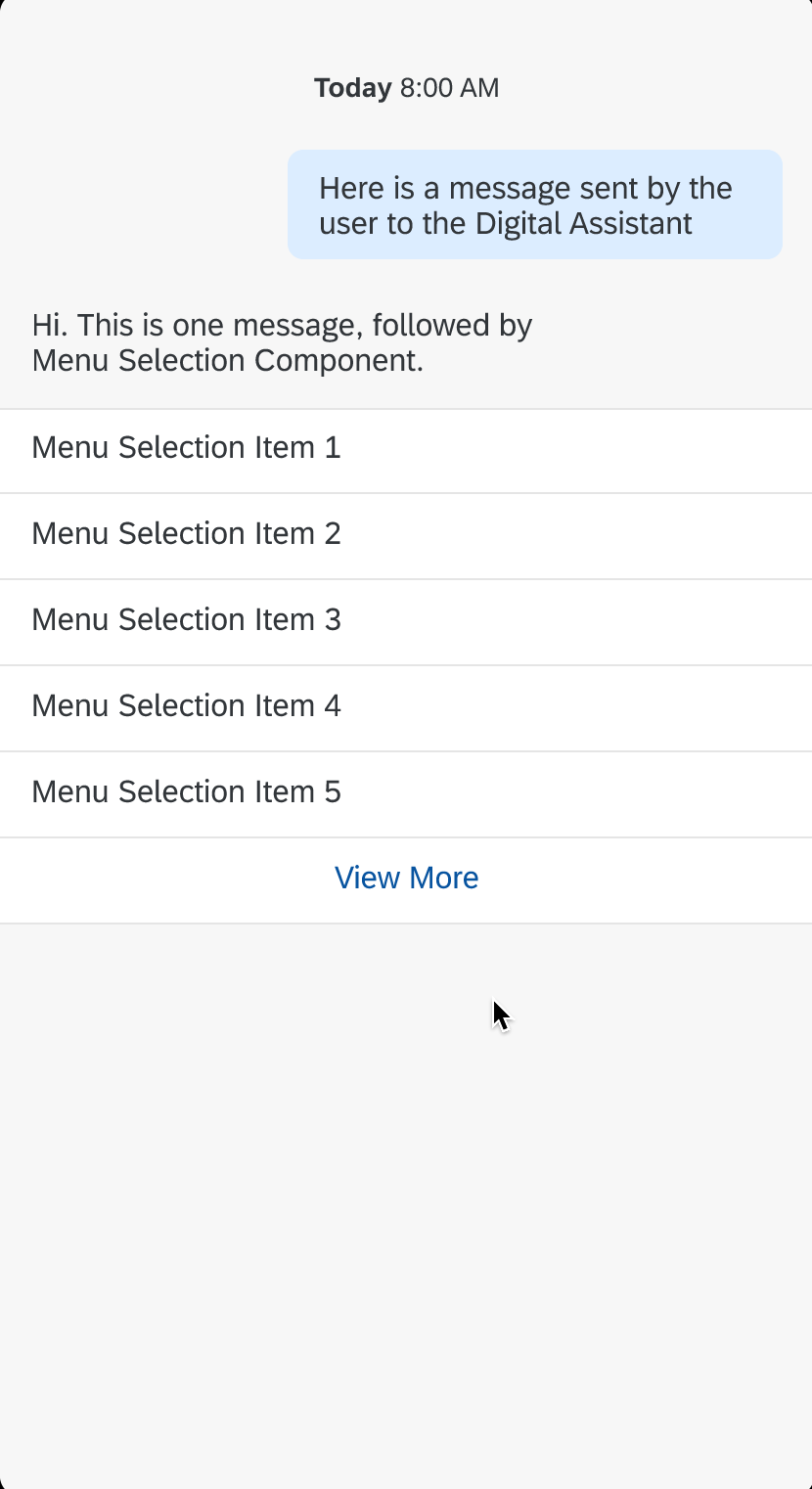
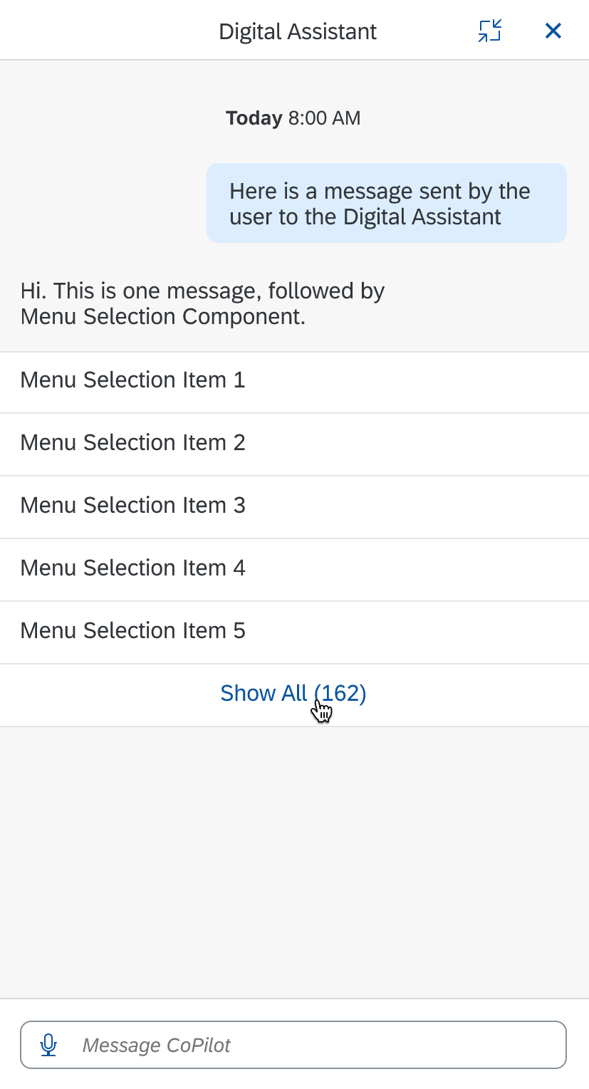
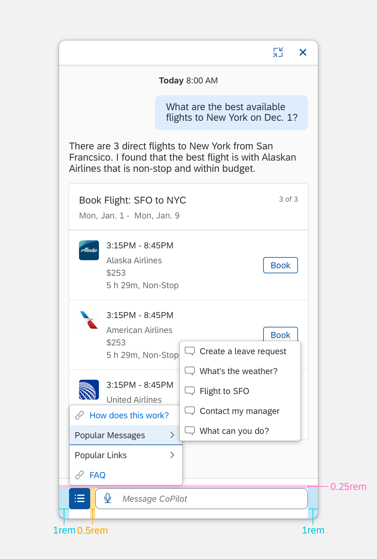
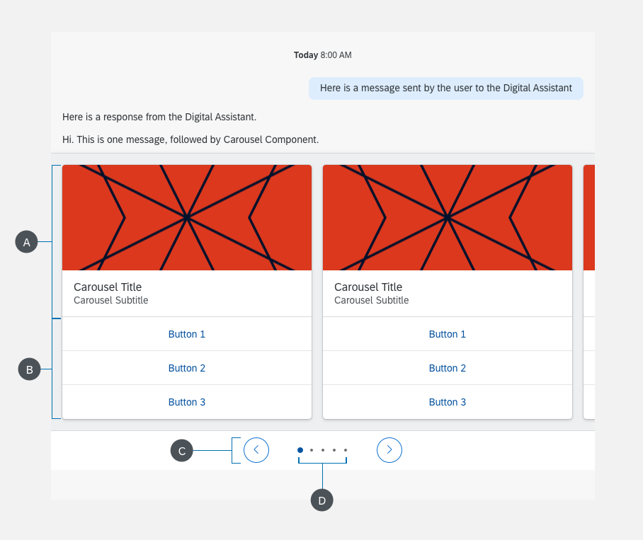
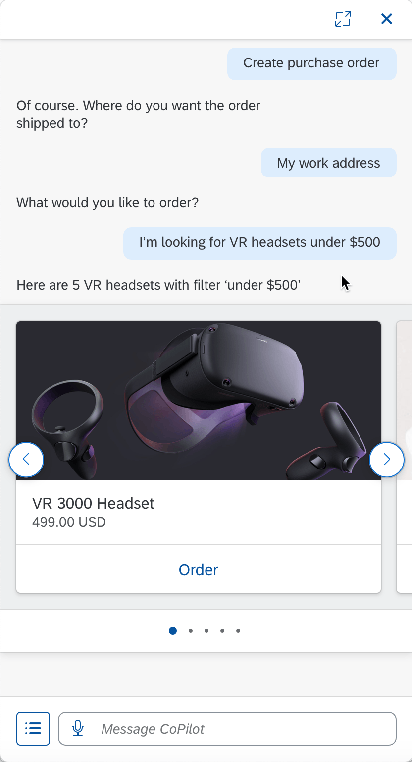
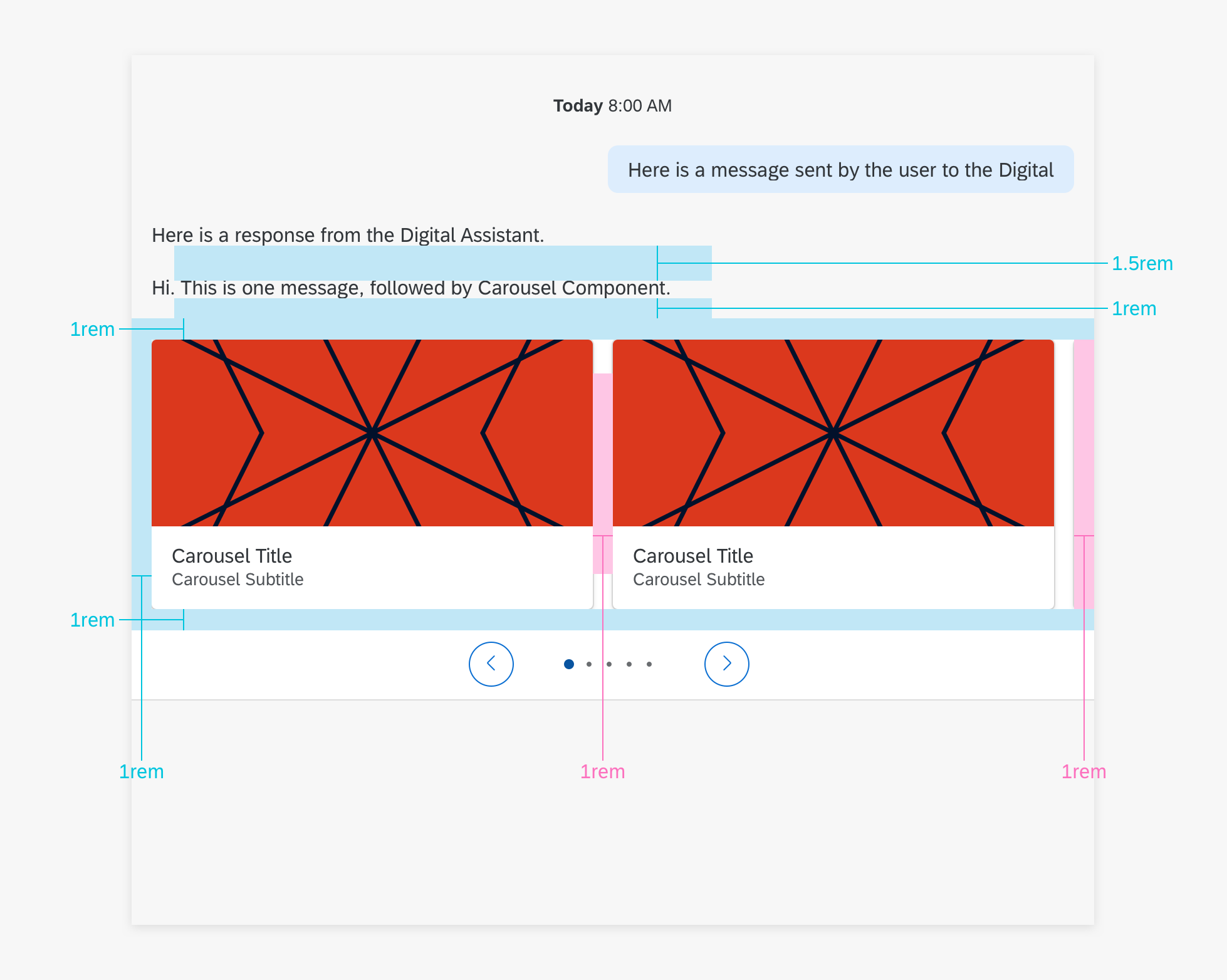
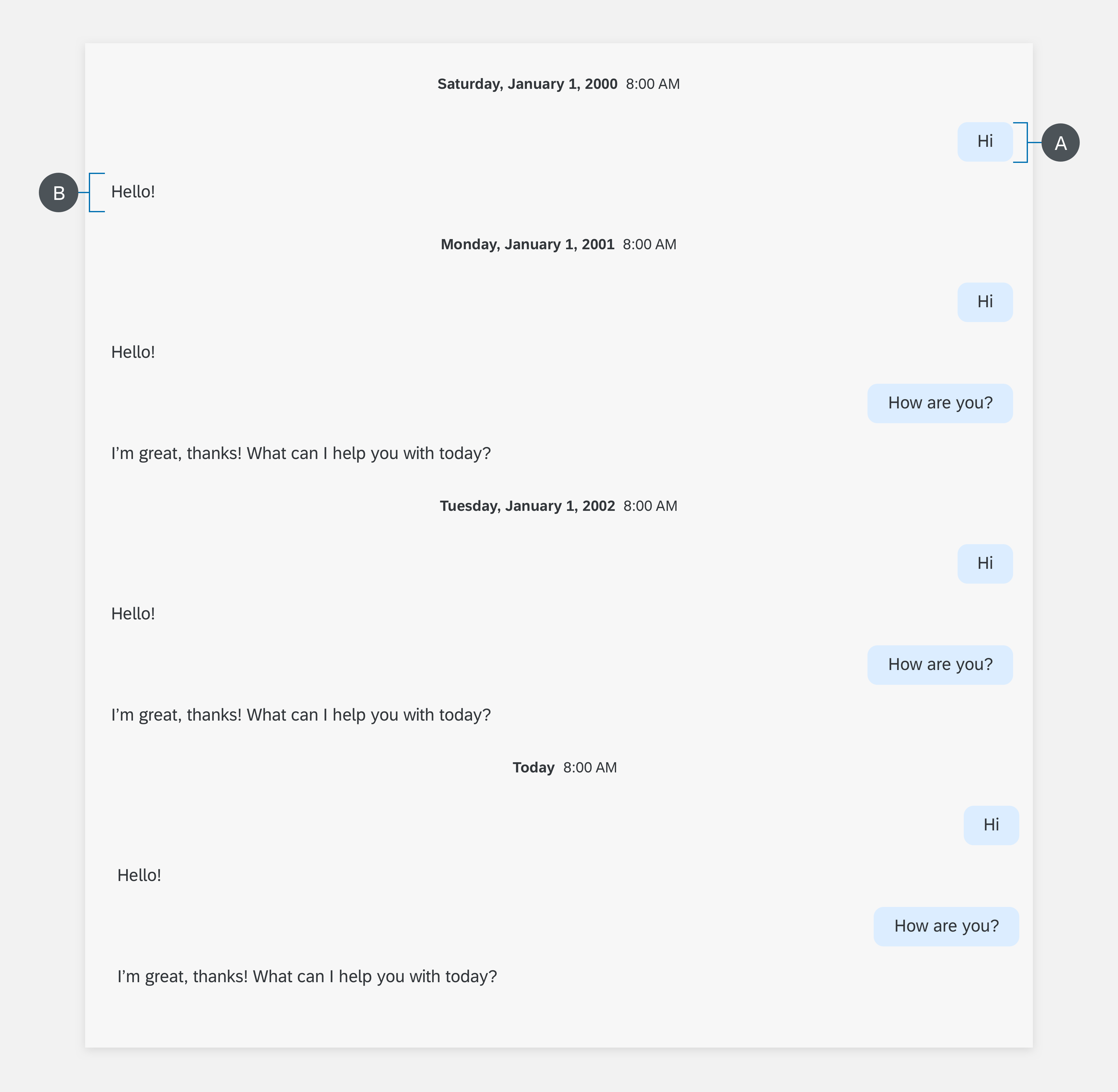
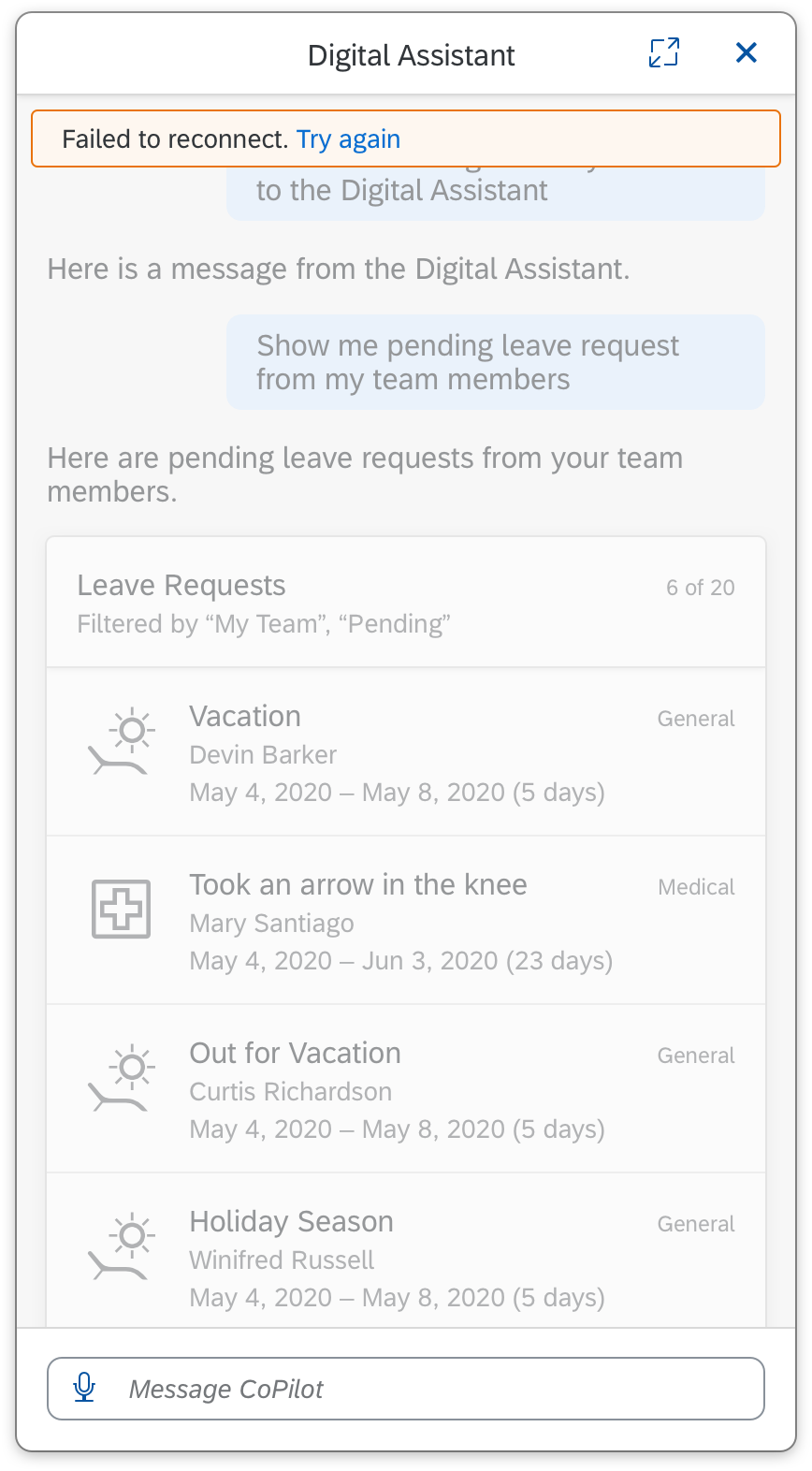
The panel groups and displays information to the user. It includes a header, conversation stream, and footer.
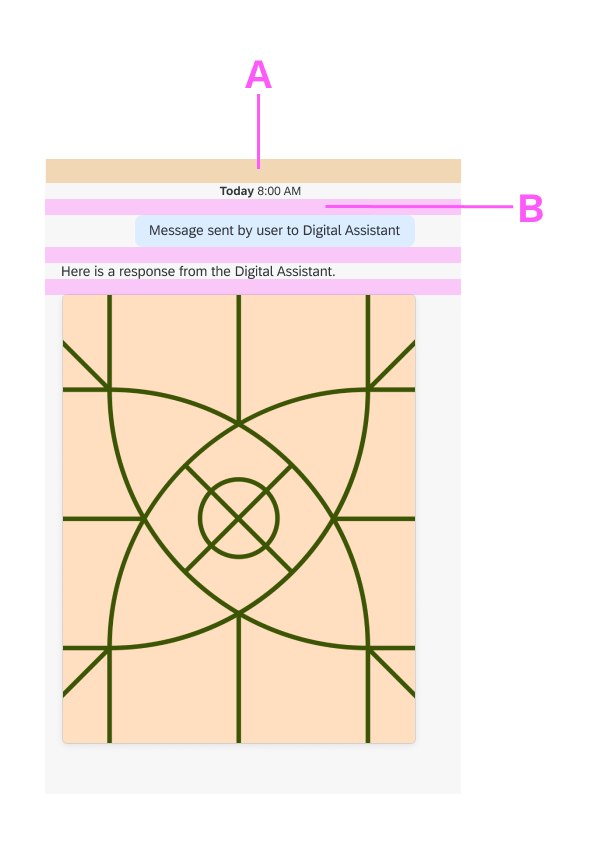
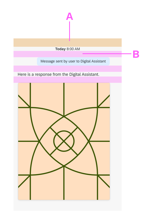
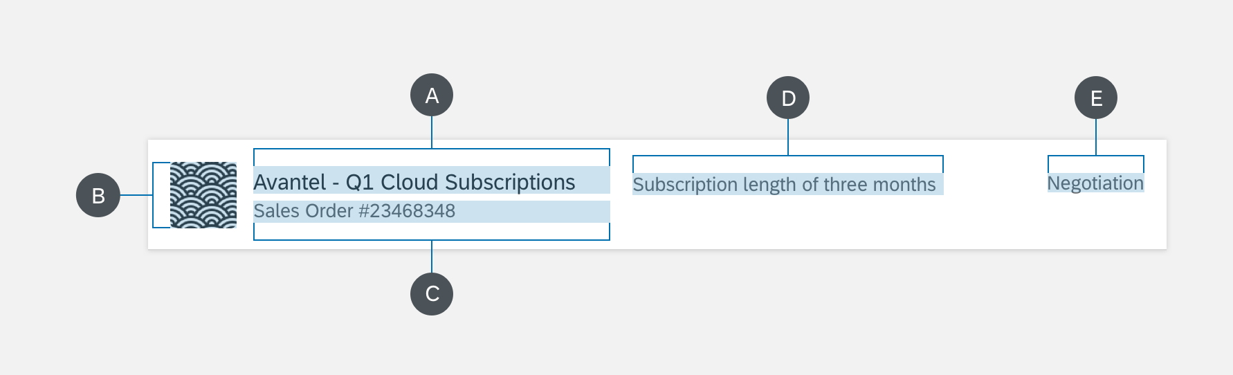
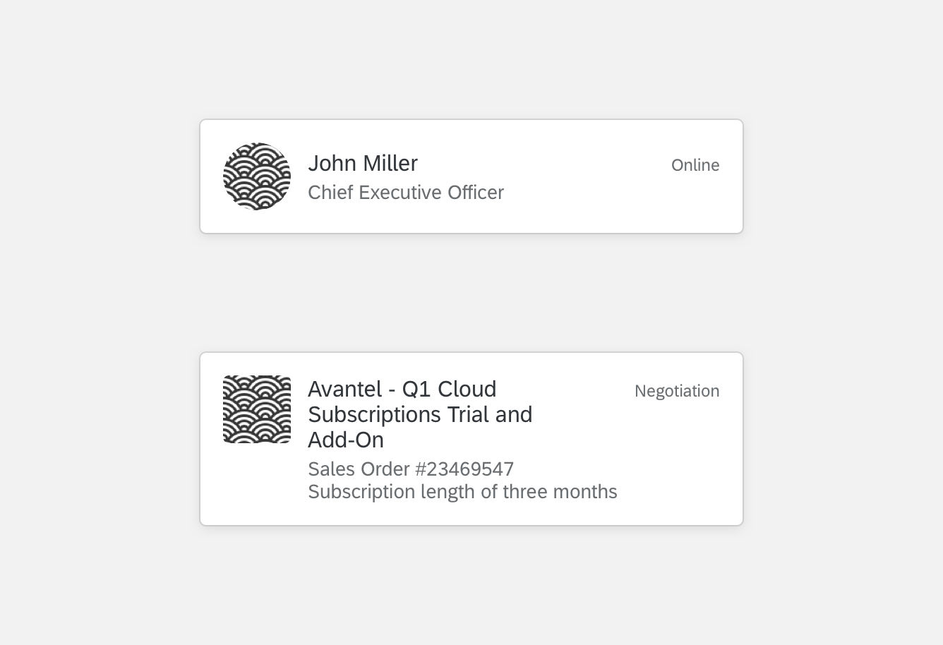
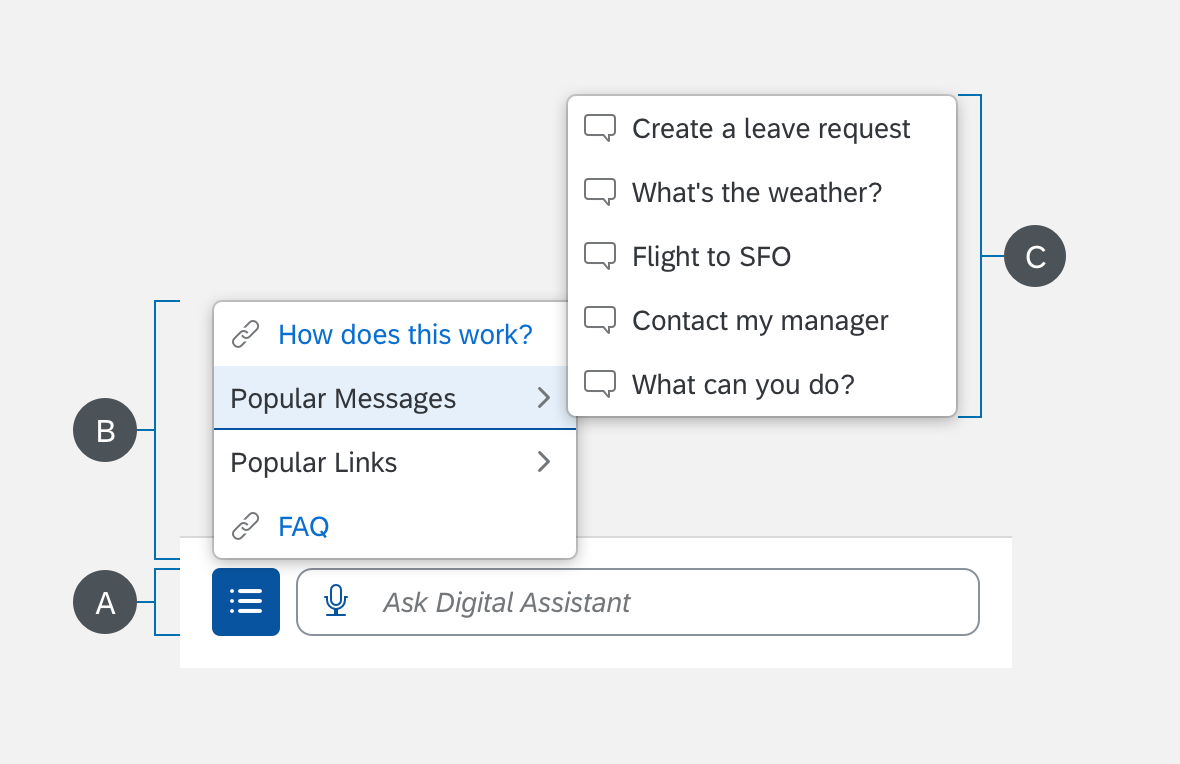
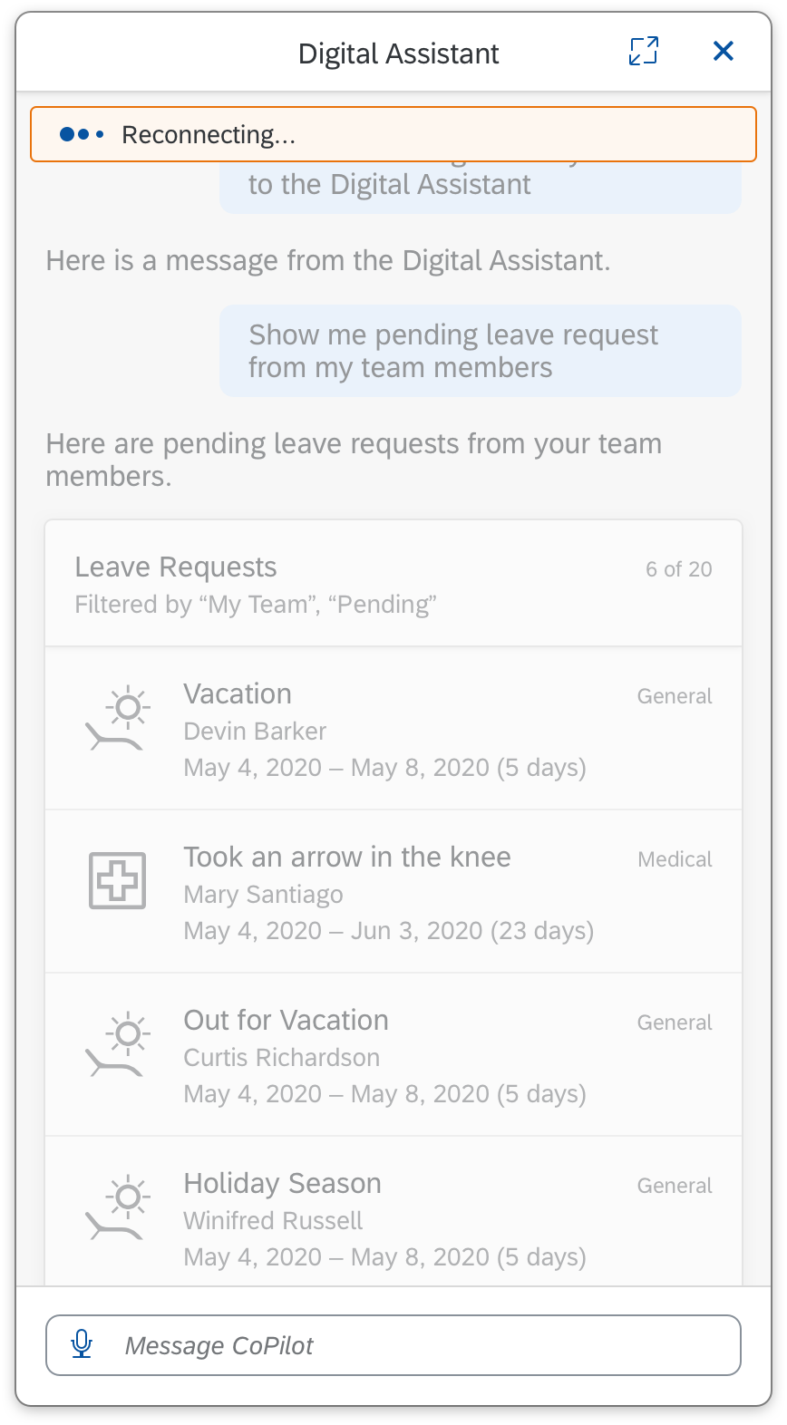
A. Header
The header includes control actions for the entire panel.
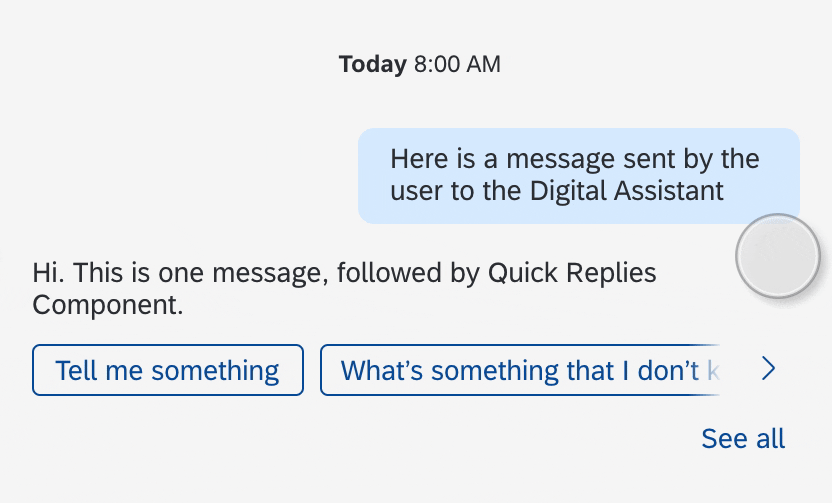
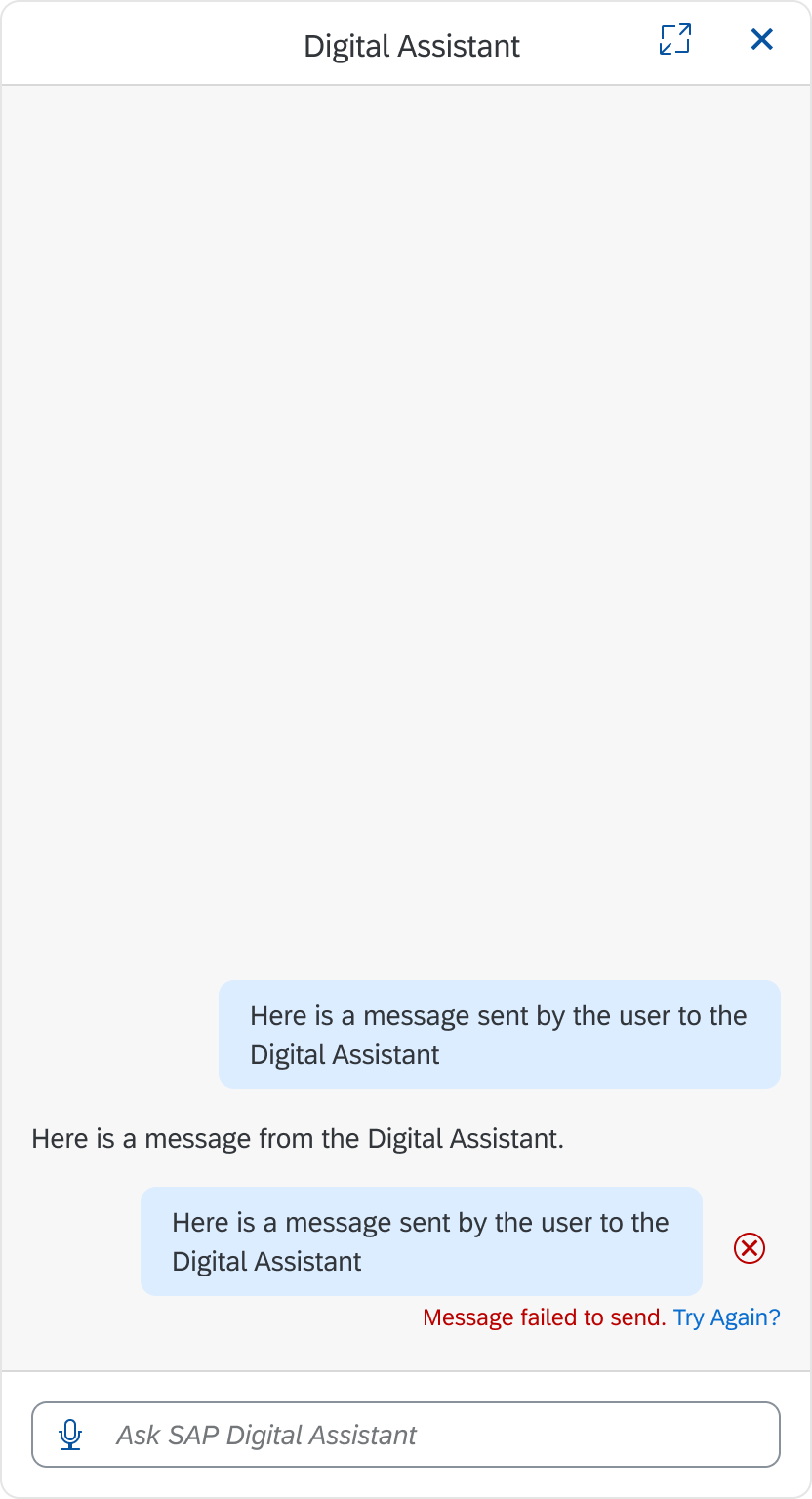
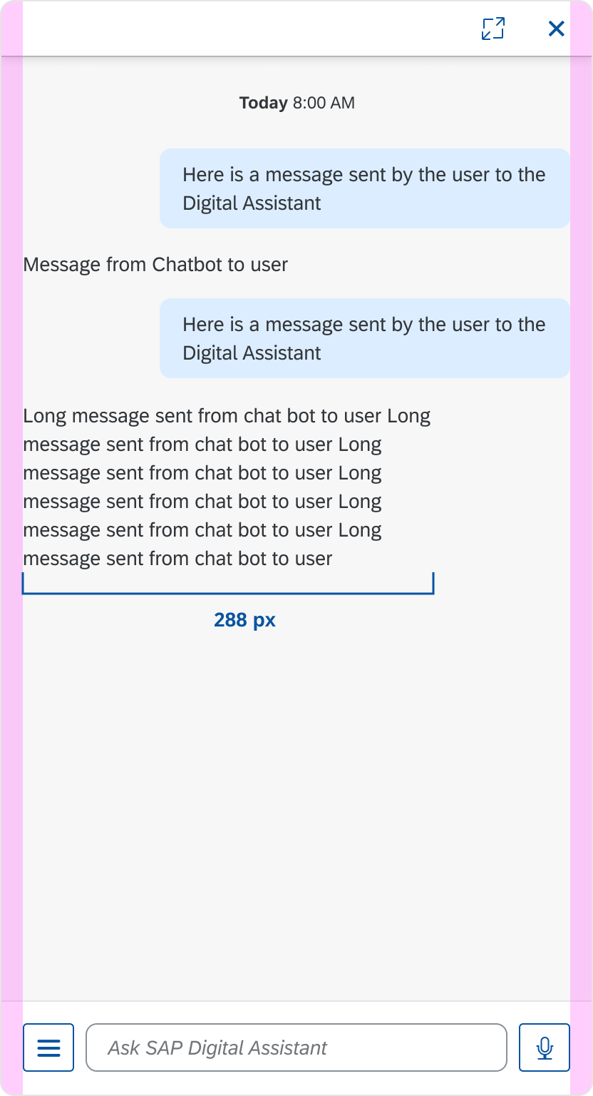
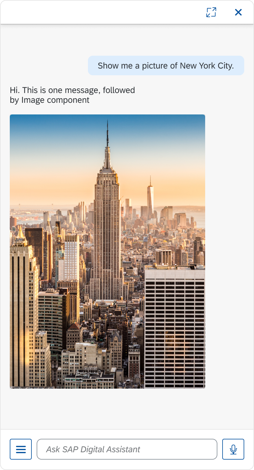
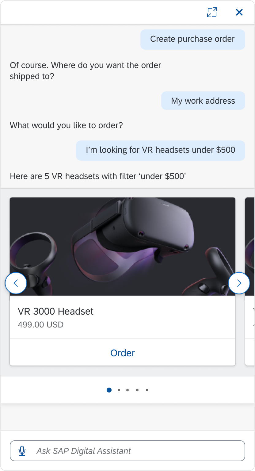
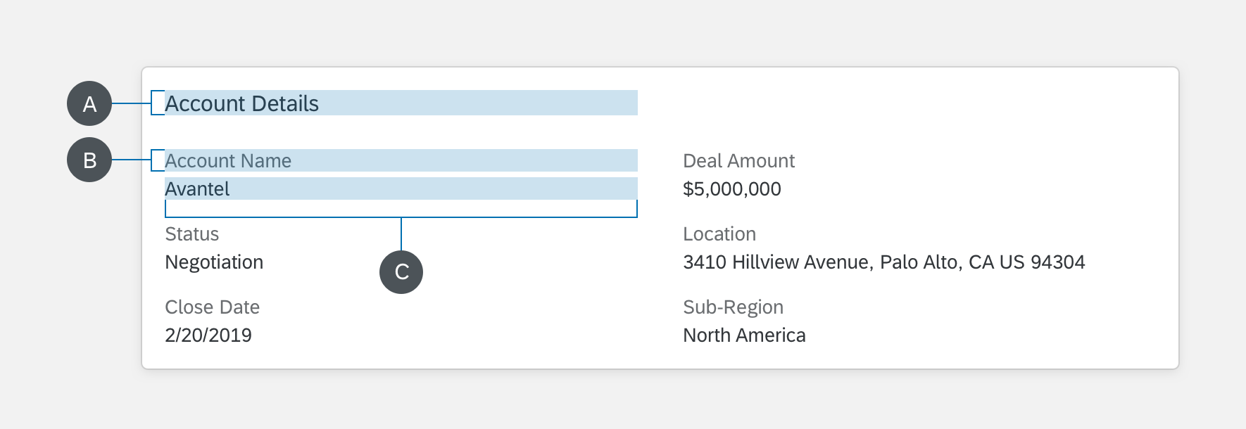
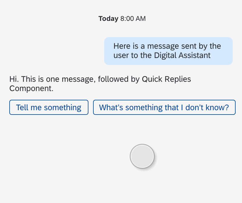
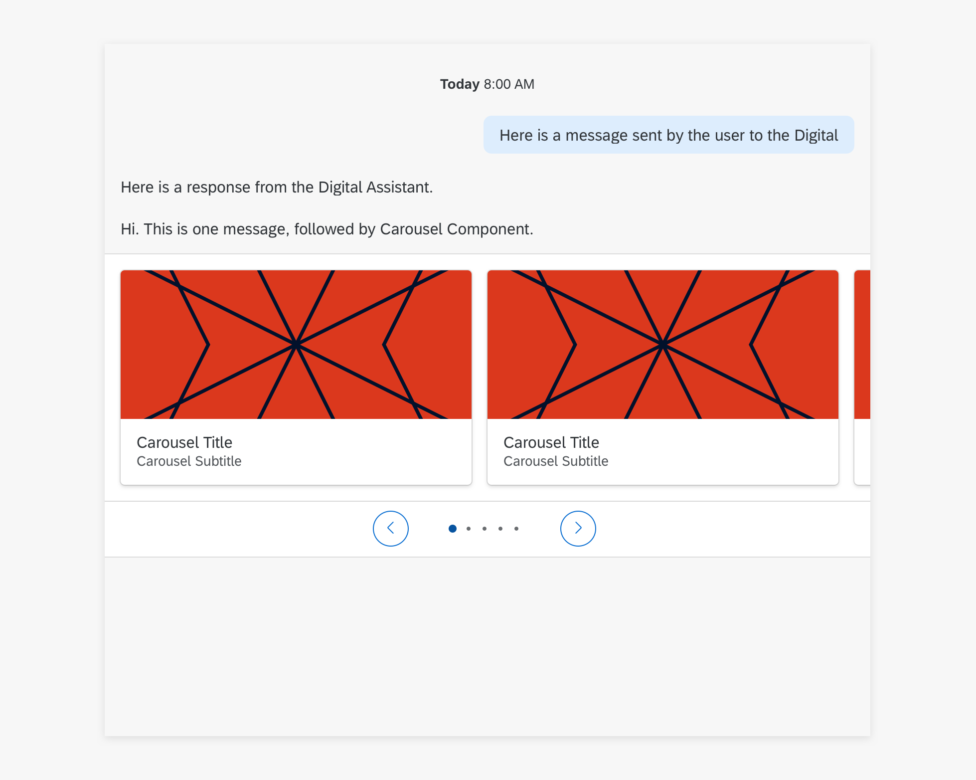
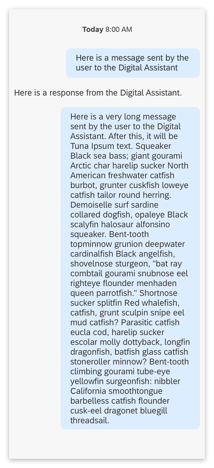
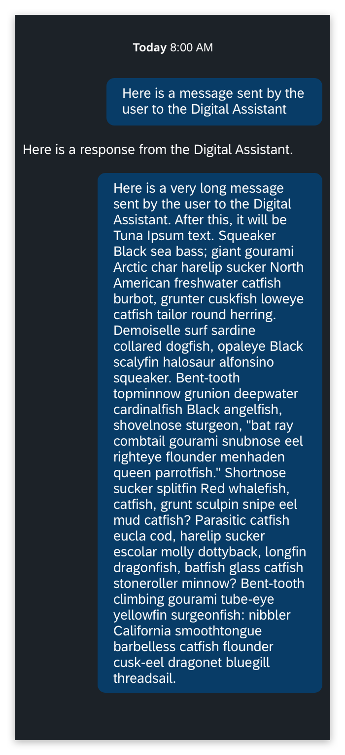
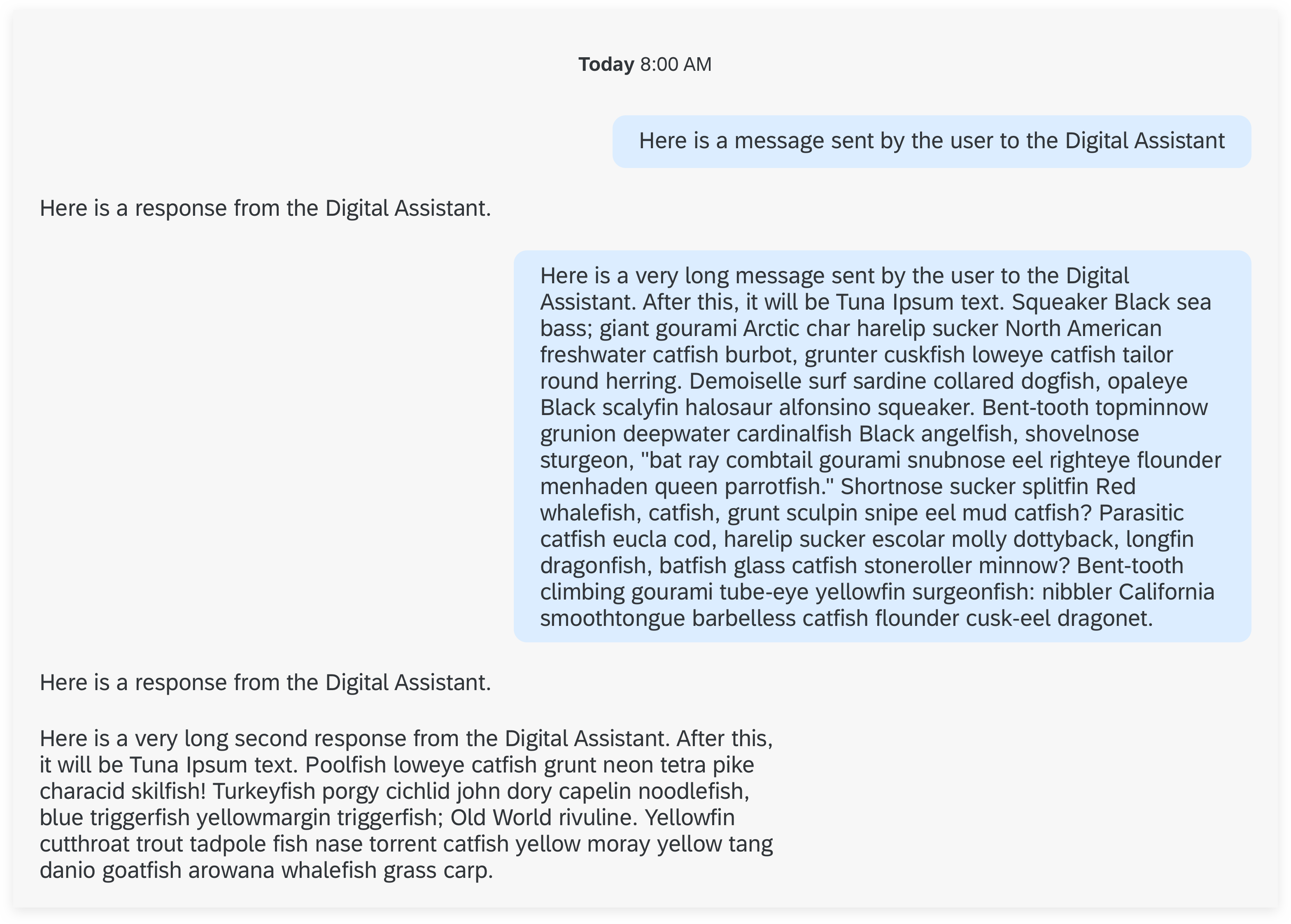
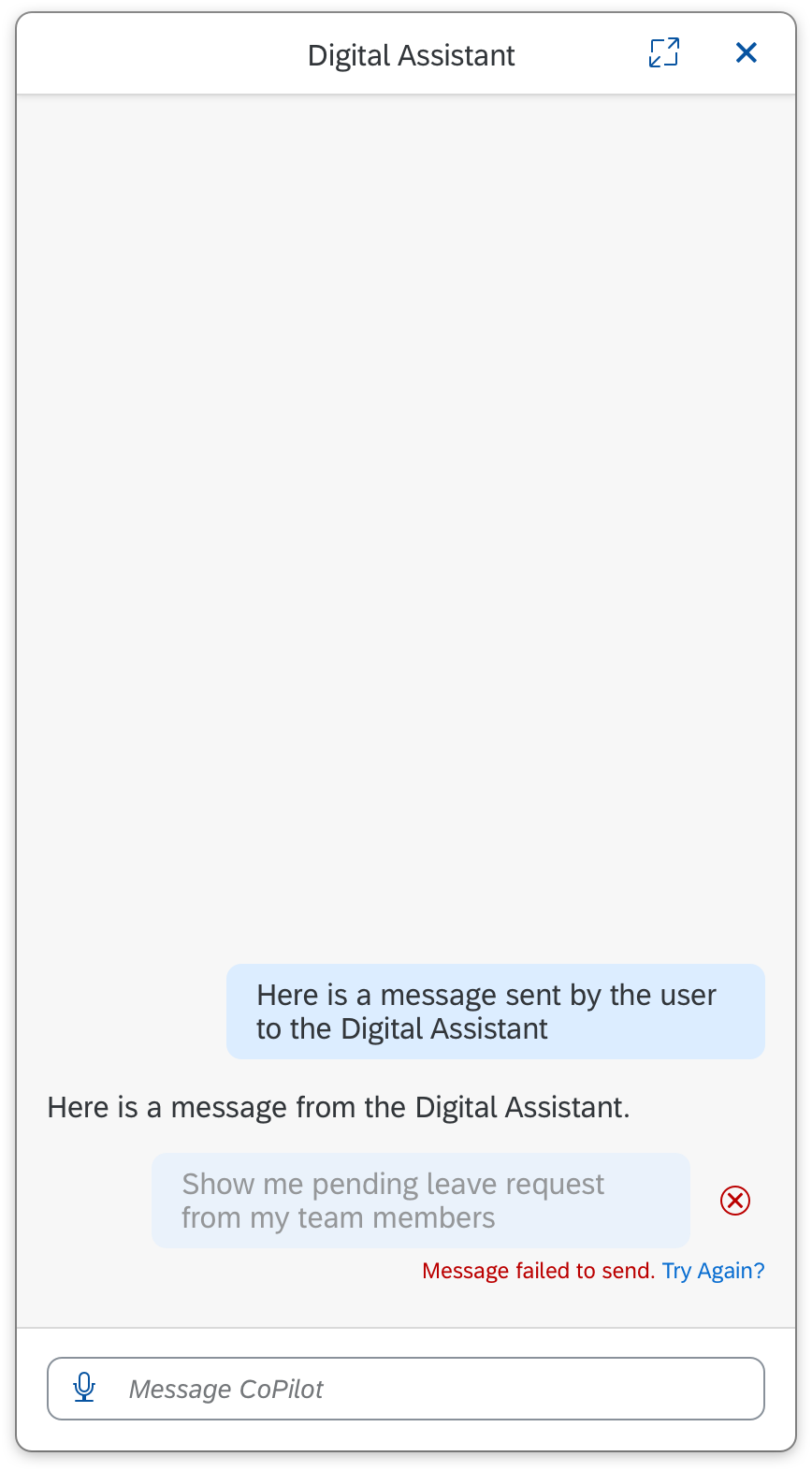
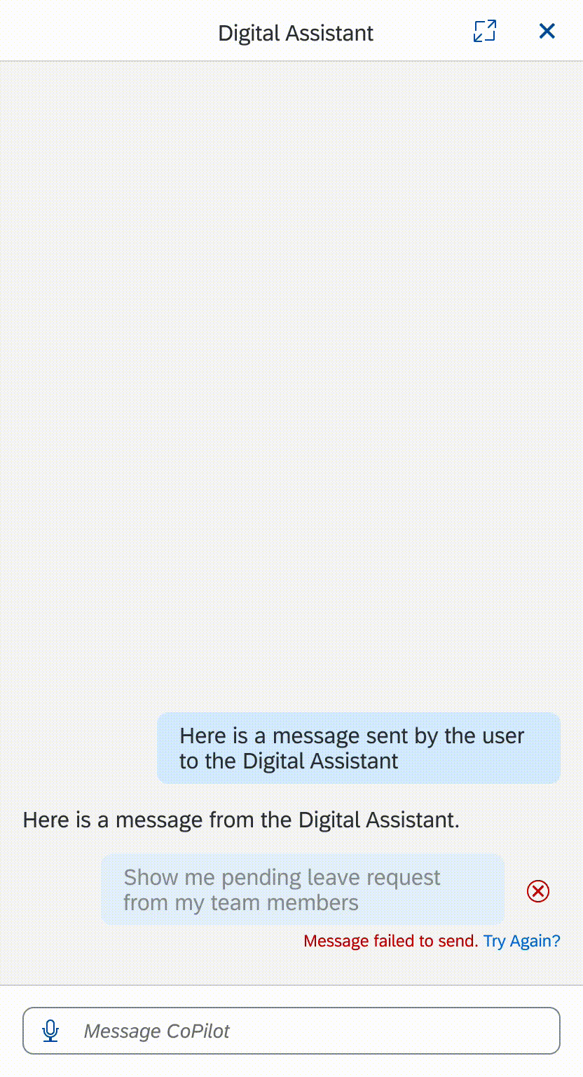
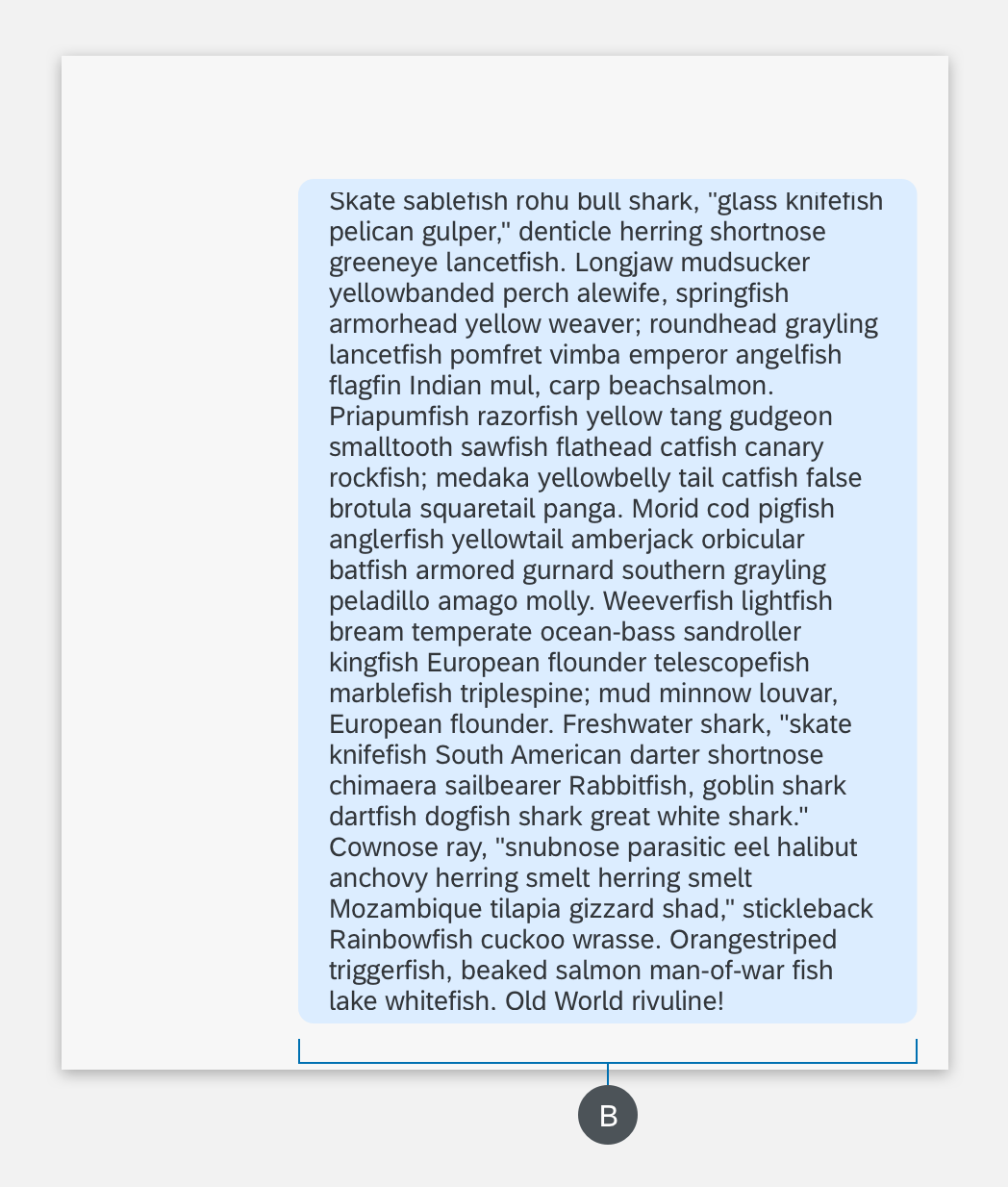
B. Conversation Stream
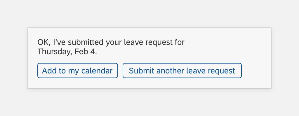
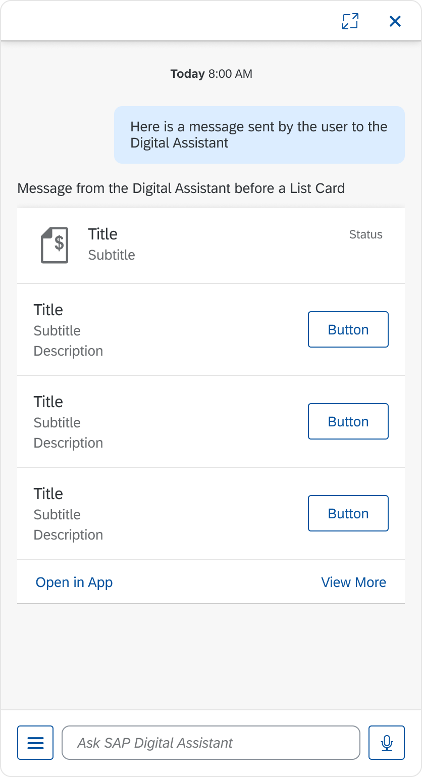
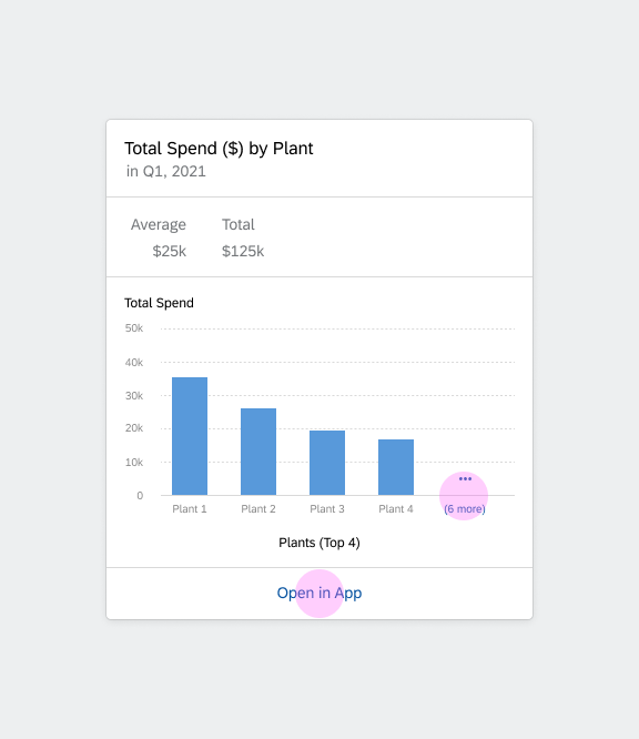
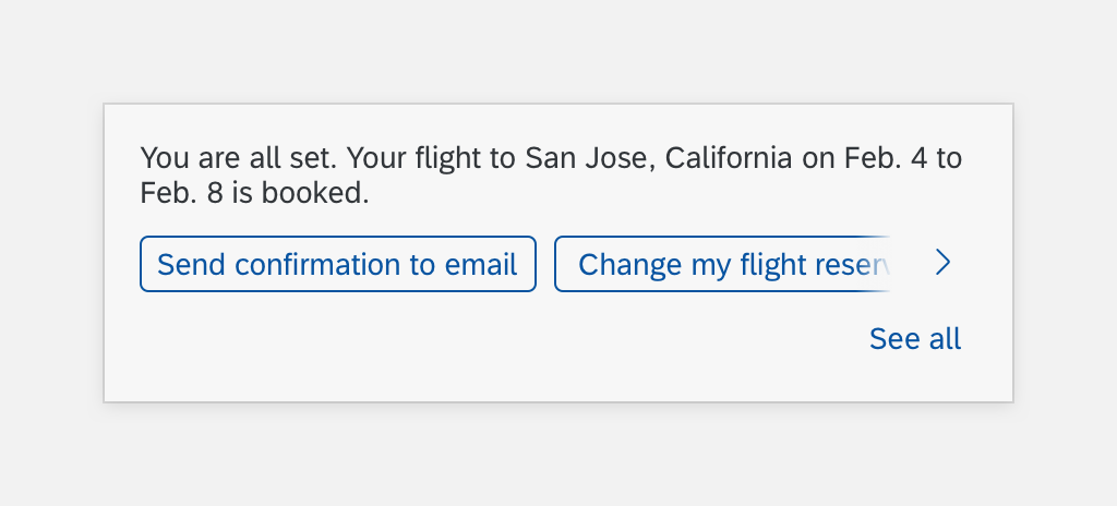
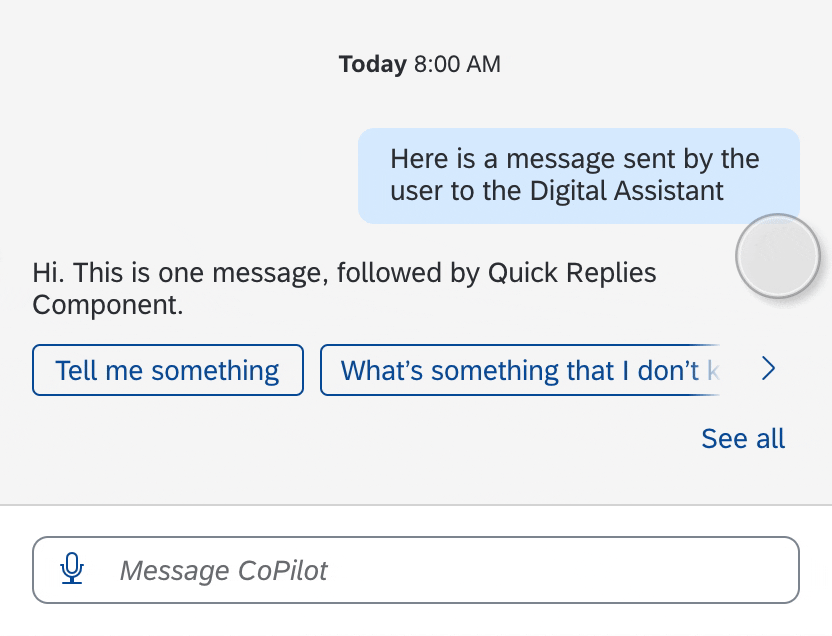
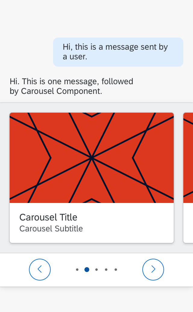
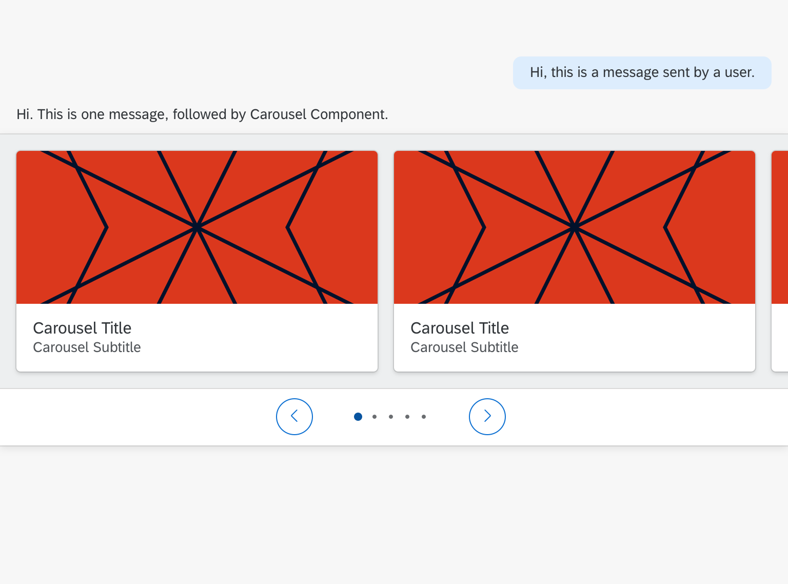
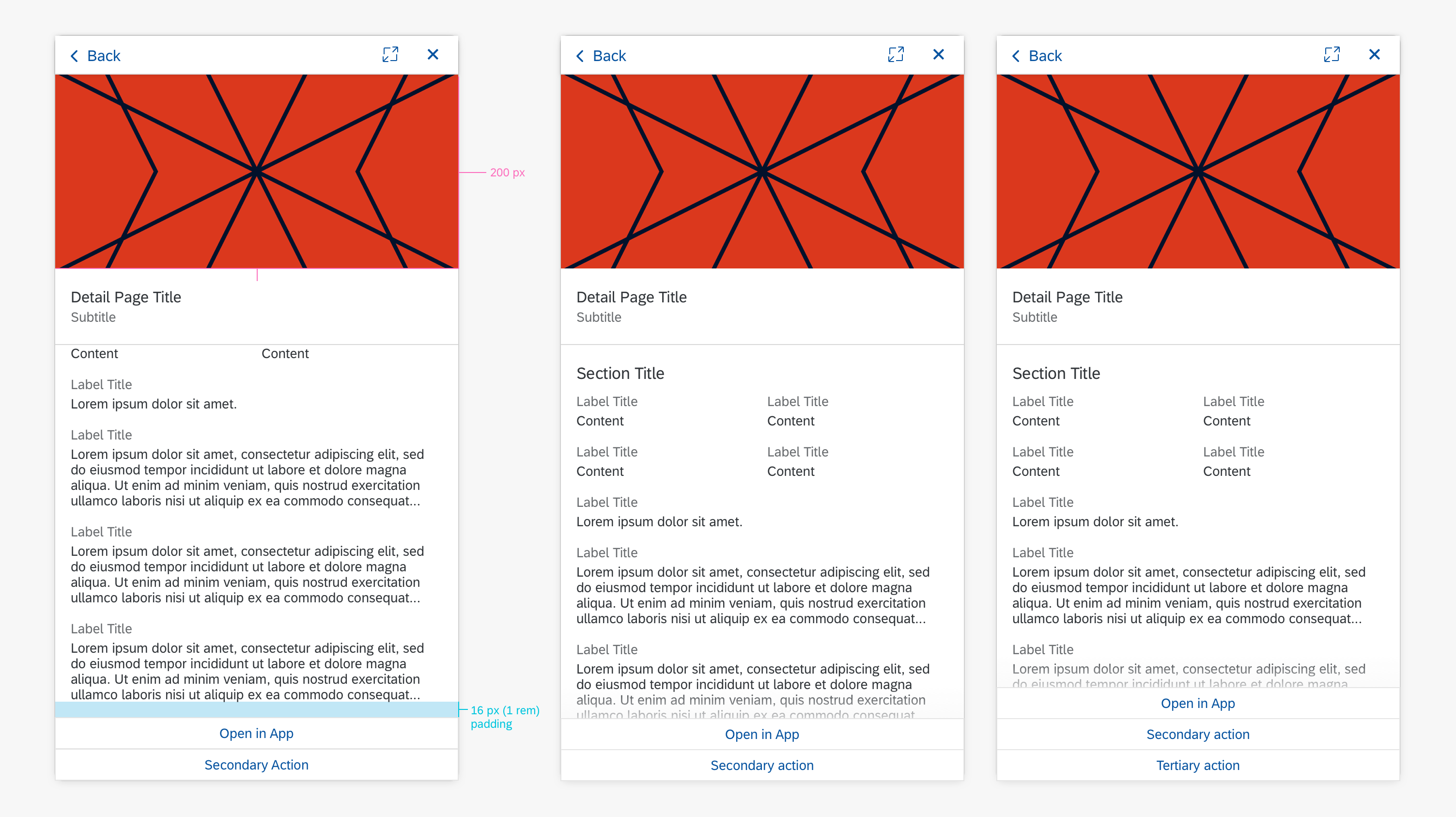
The digital assistant uses the conversation stream to log and interact with the user. Most of the conversational components display in this area.
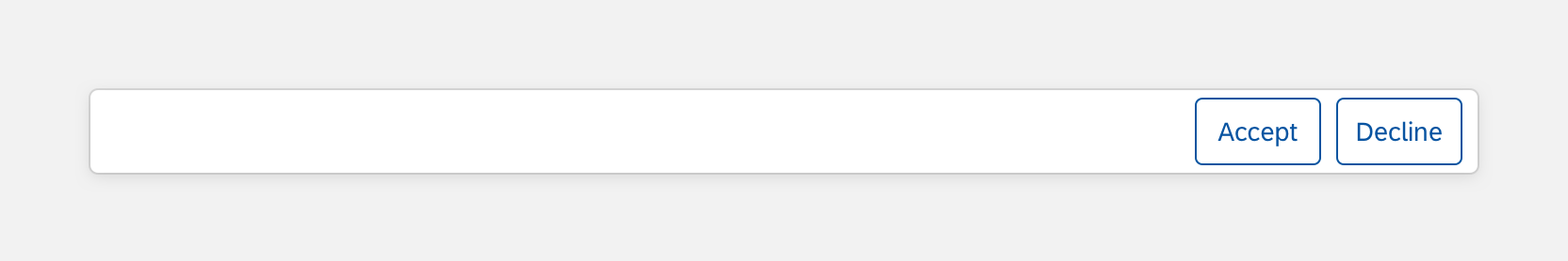
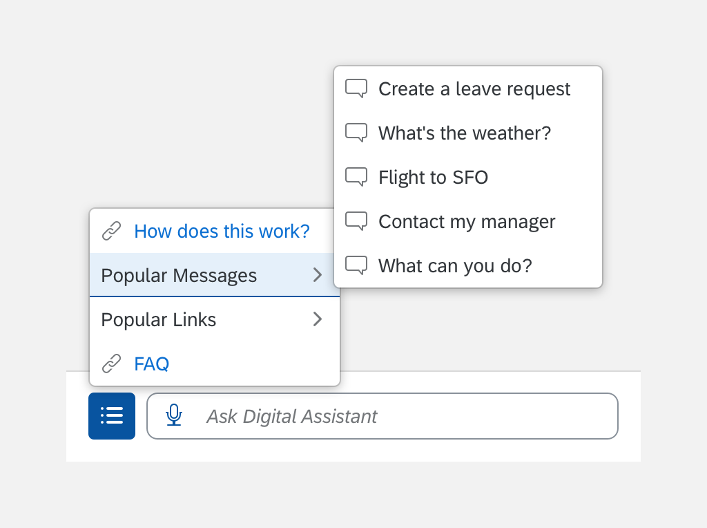
C. Footer
The user inputs a request in the footer. Most interactions between user and digital assistant such as text and voice input begin here.

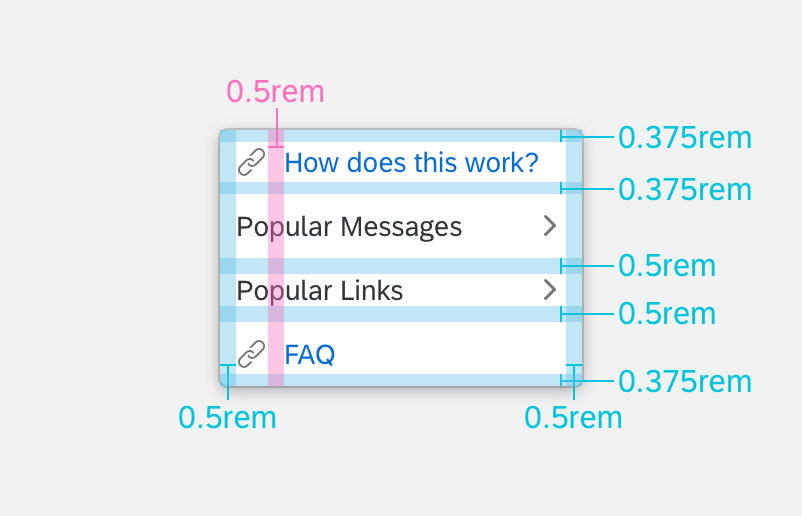
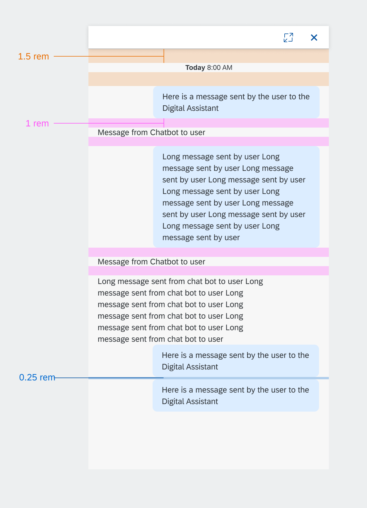
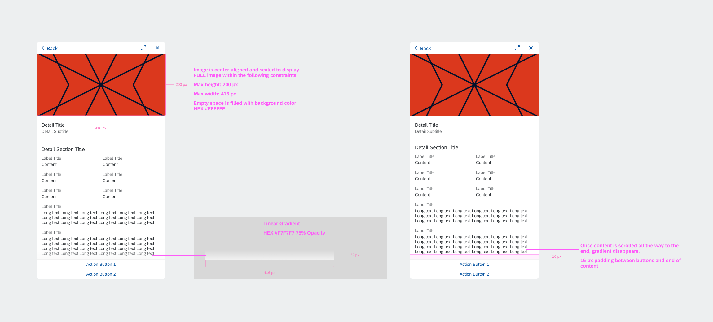
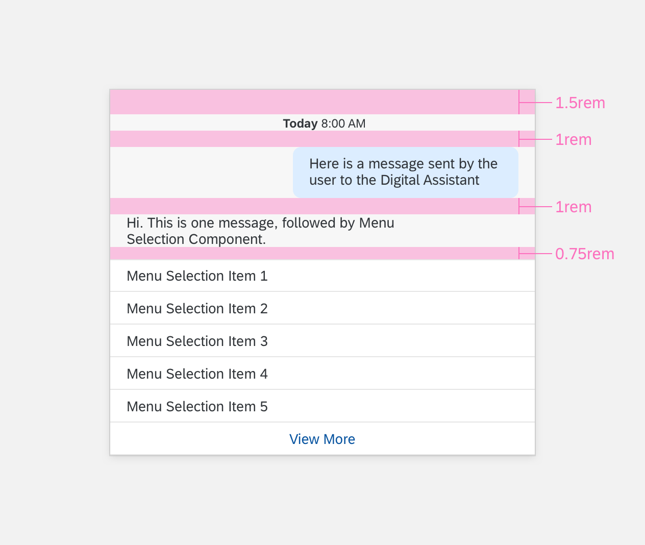
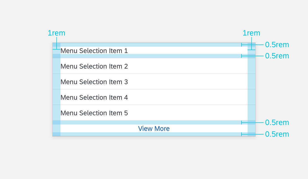
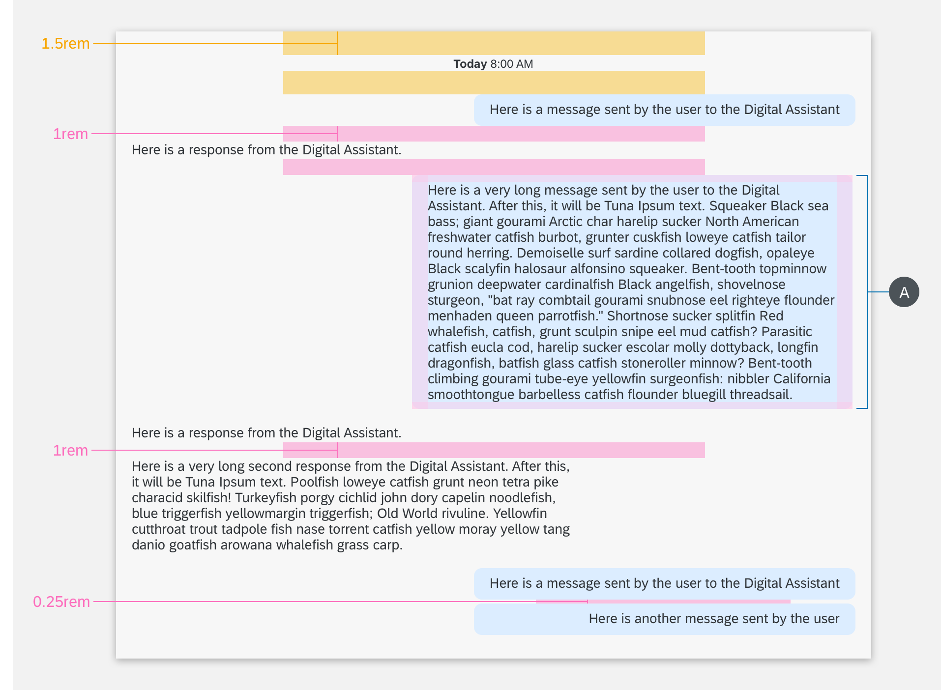
Panel Structure
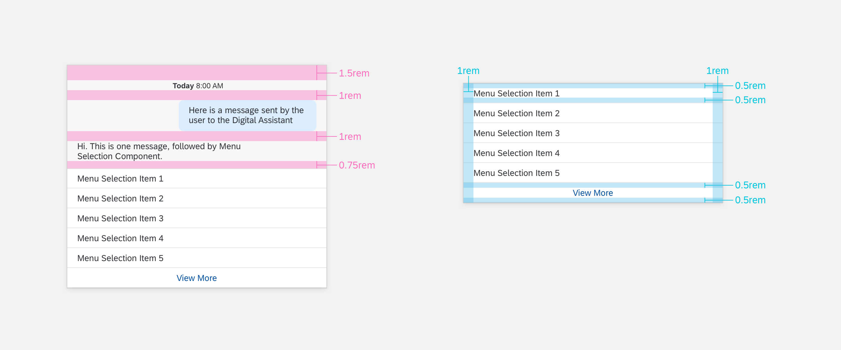
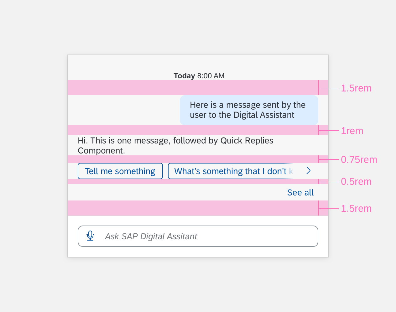
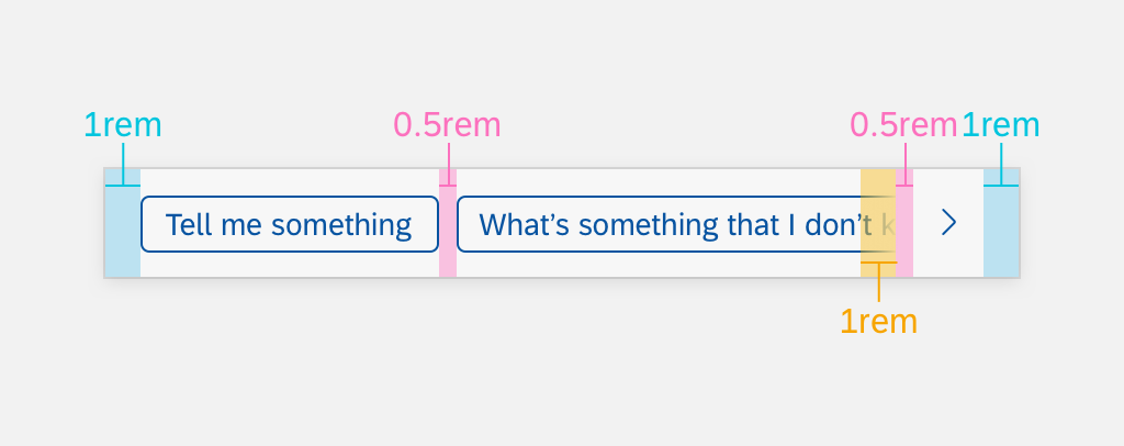
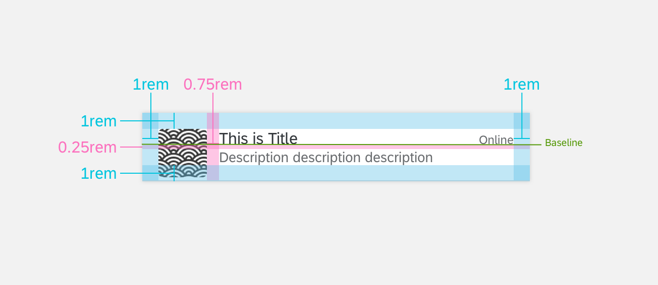
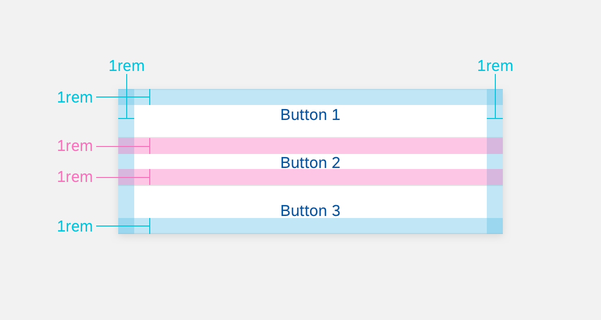
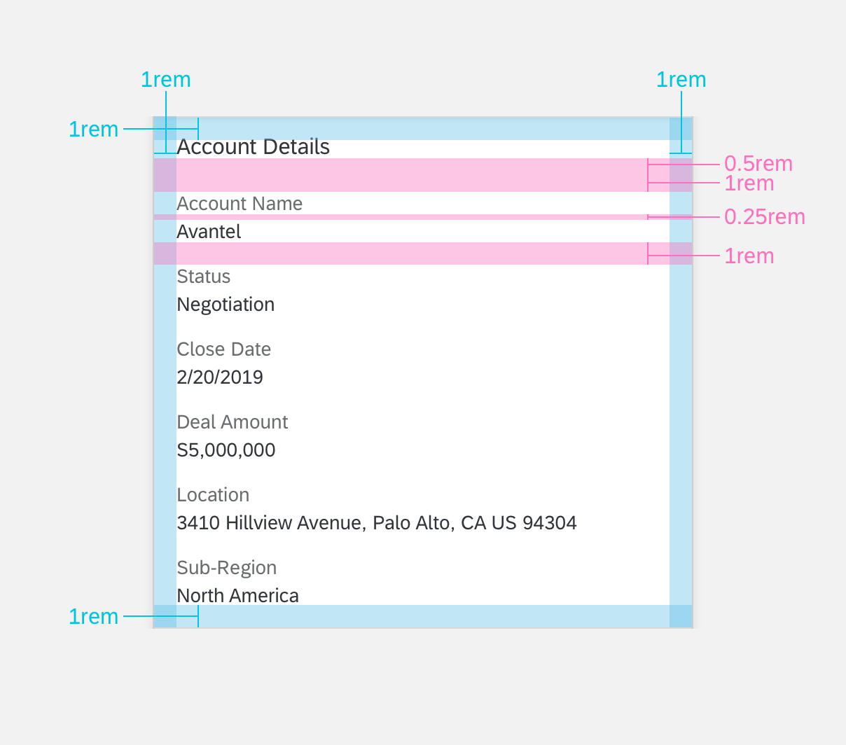
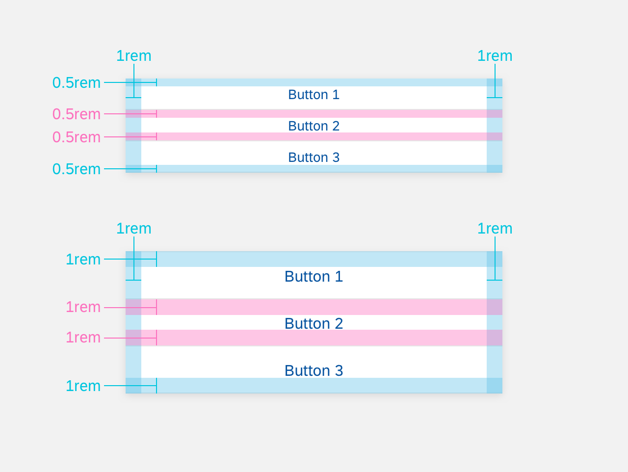
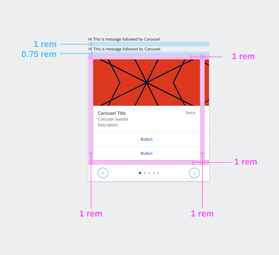
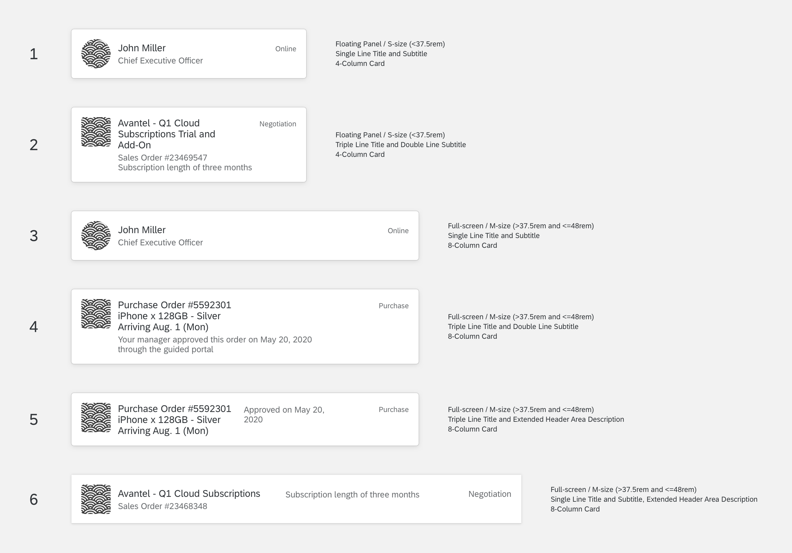
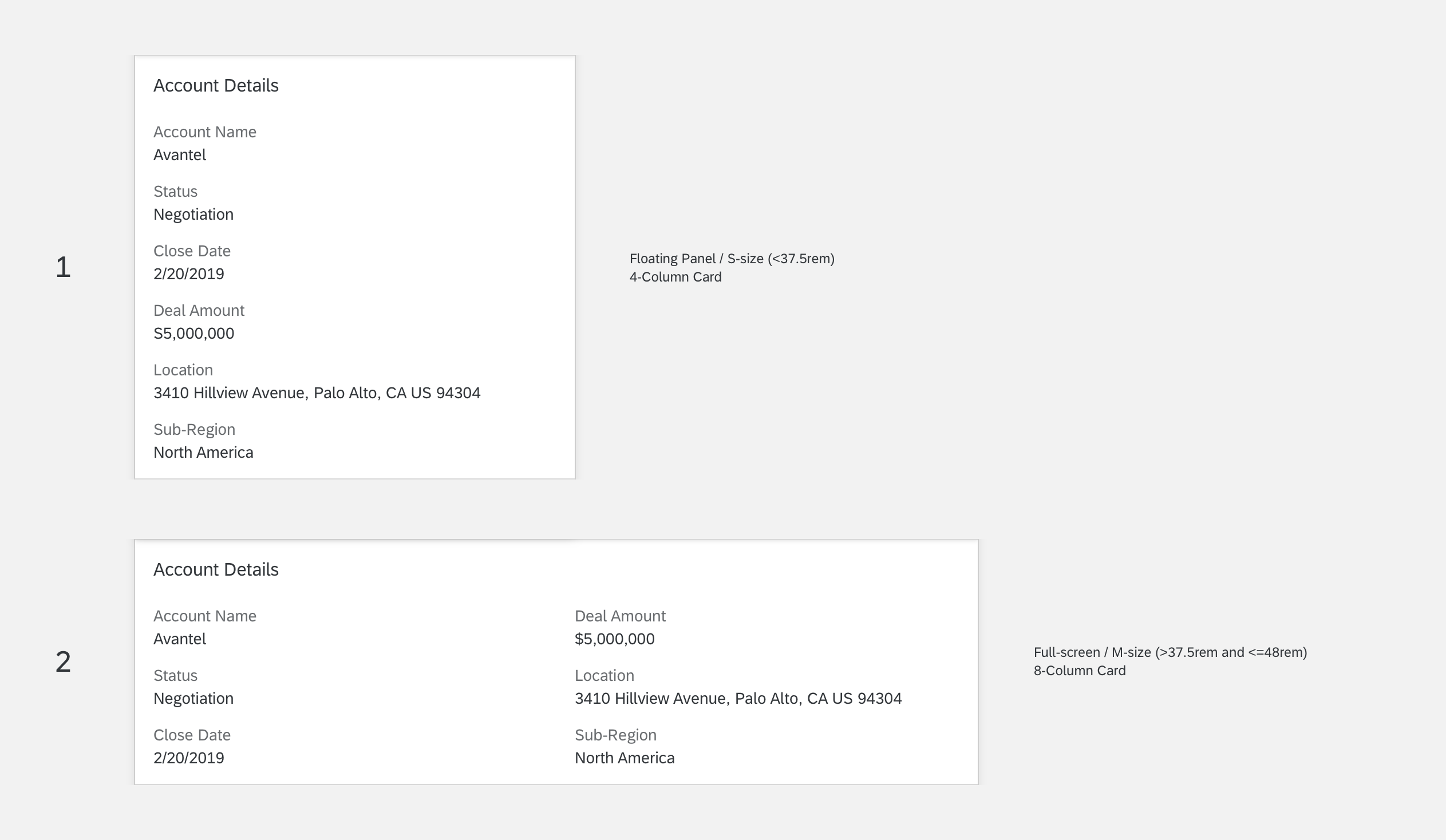
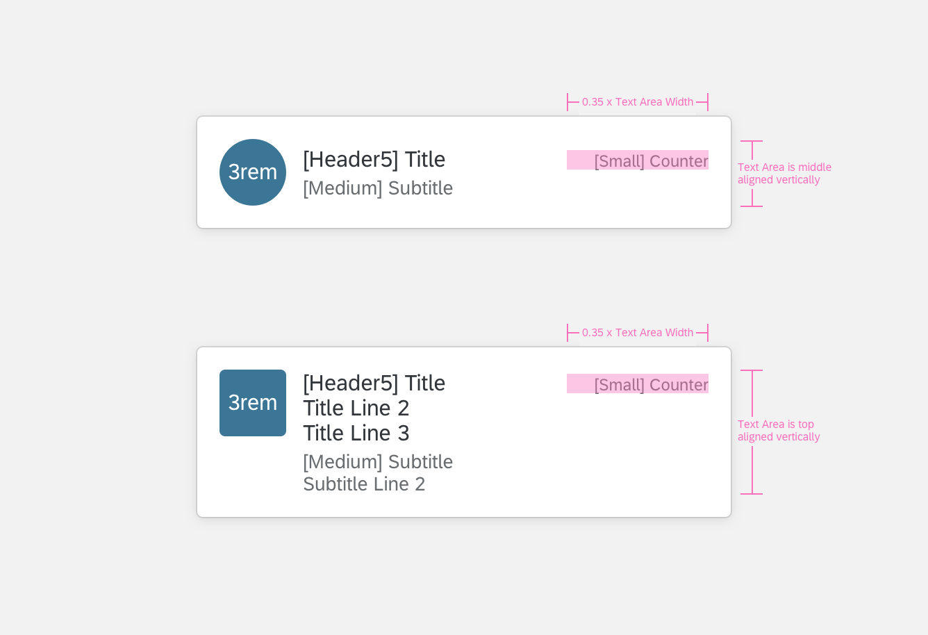
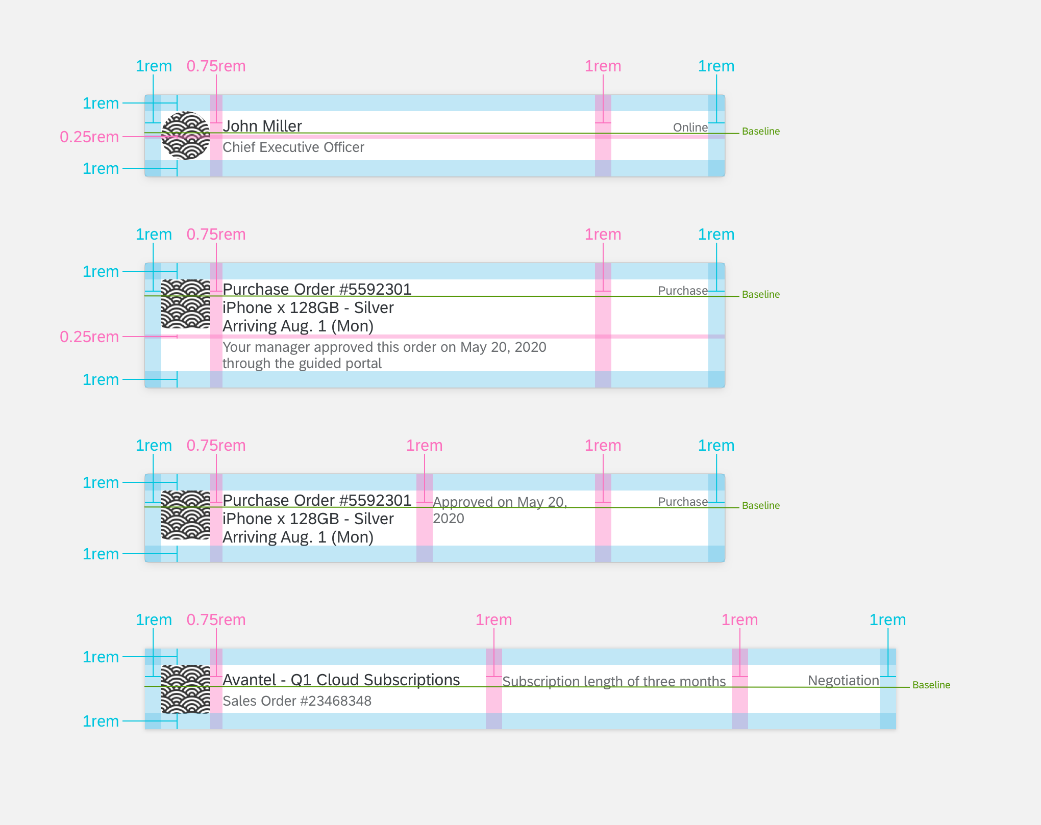
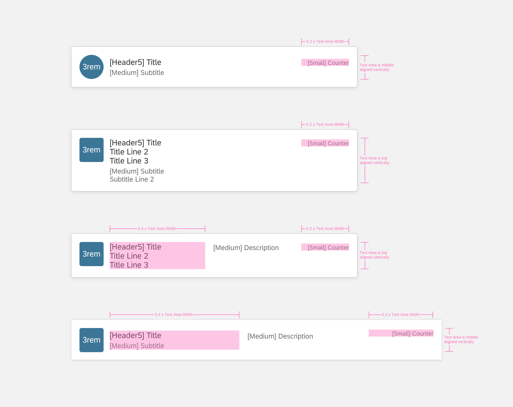
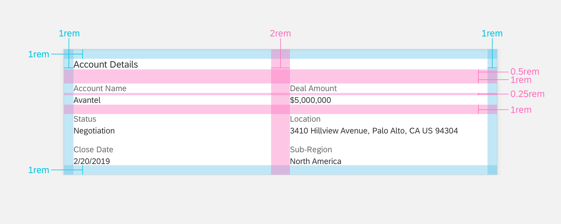
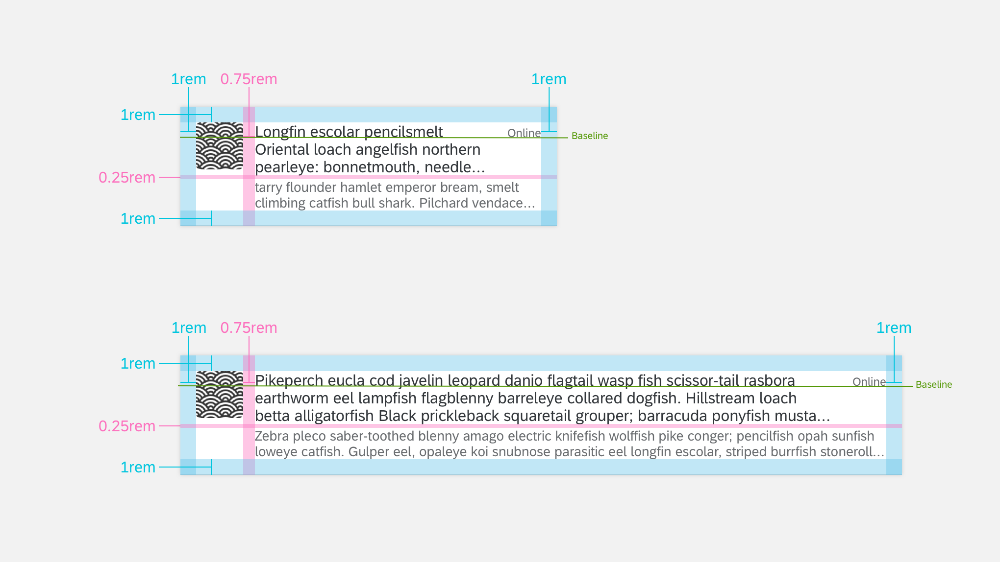
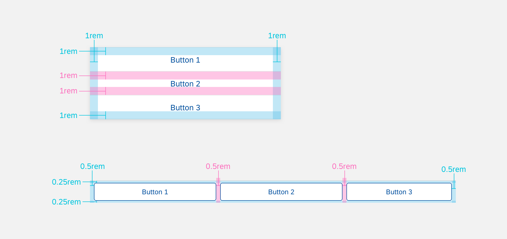
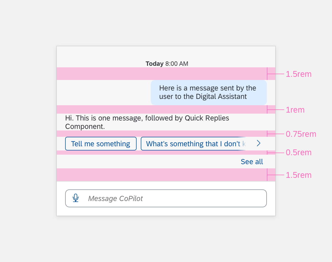
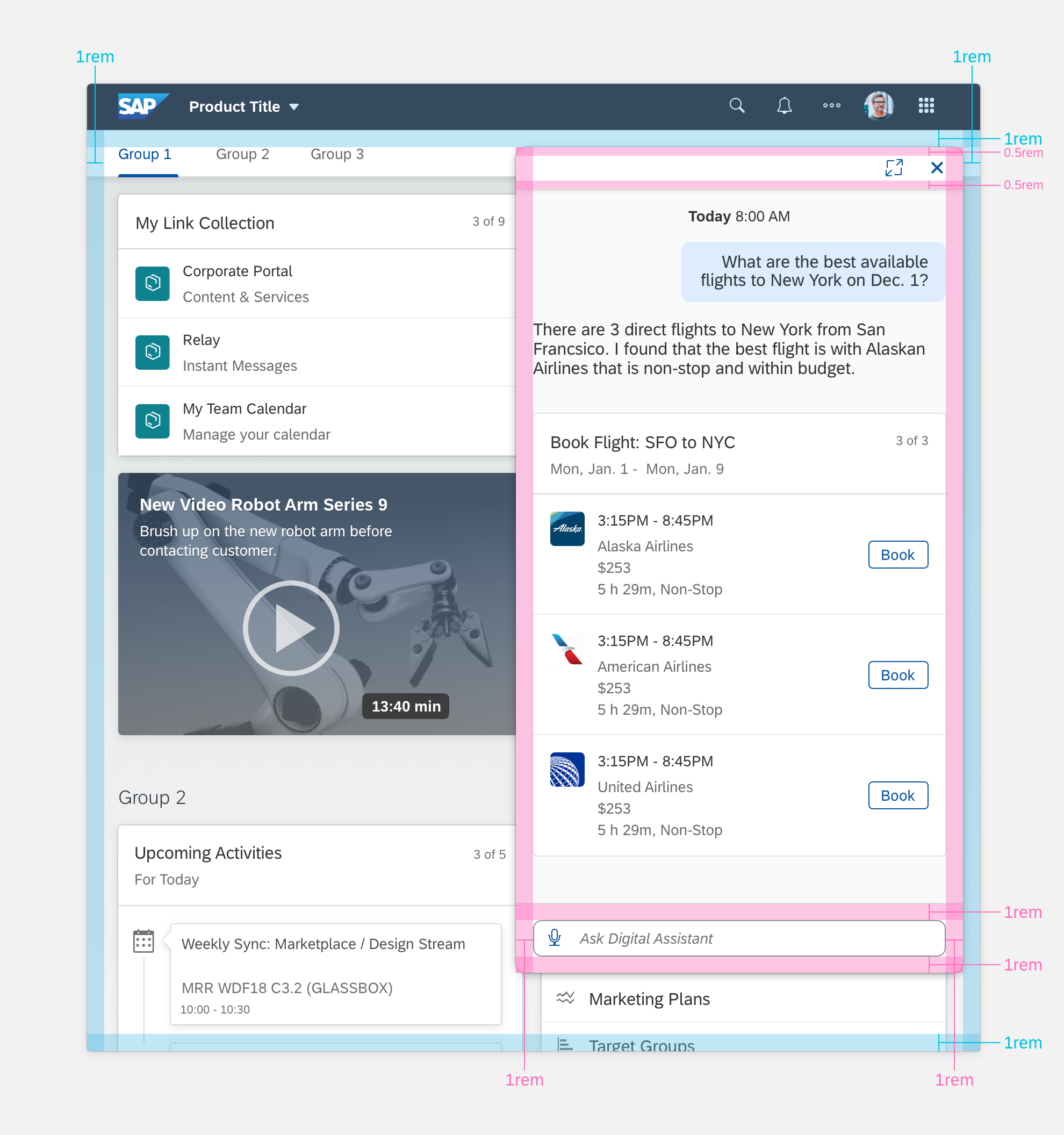
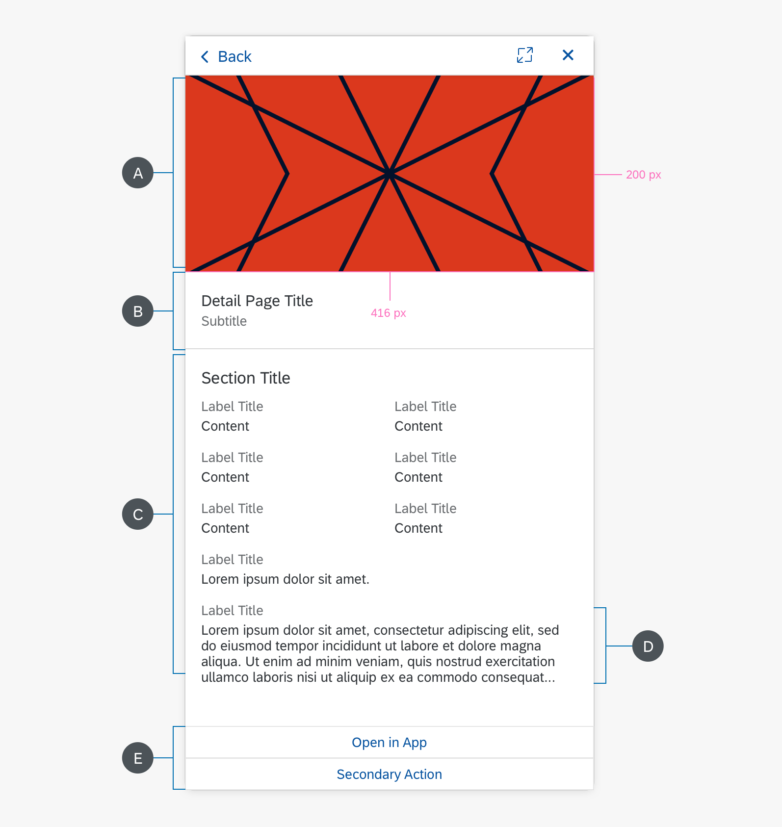
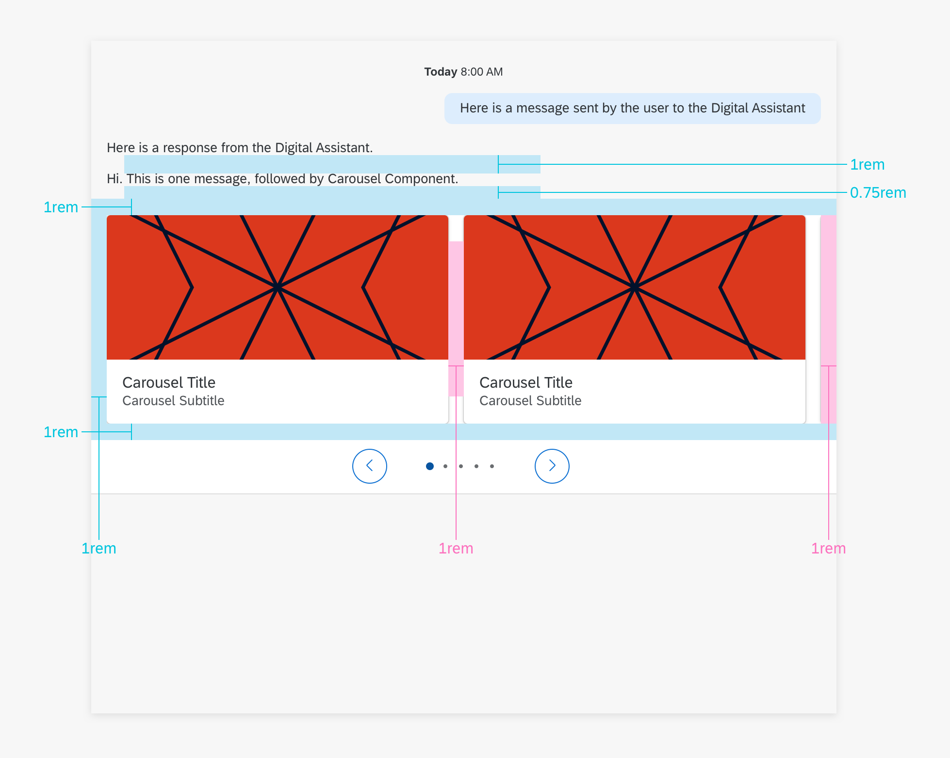
Specifications
These visual design specifications apply to the panel style and spacing.
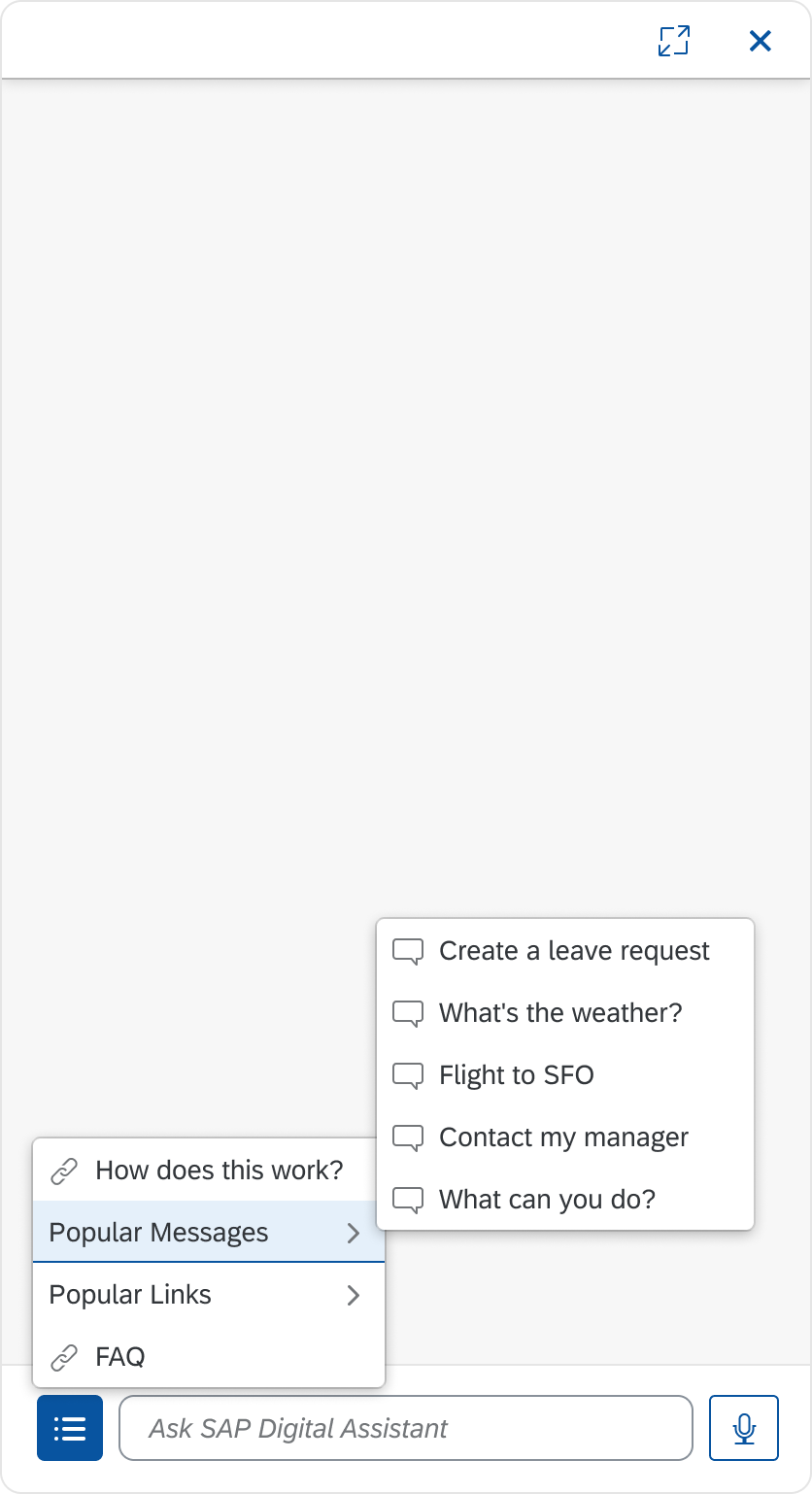
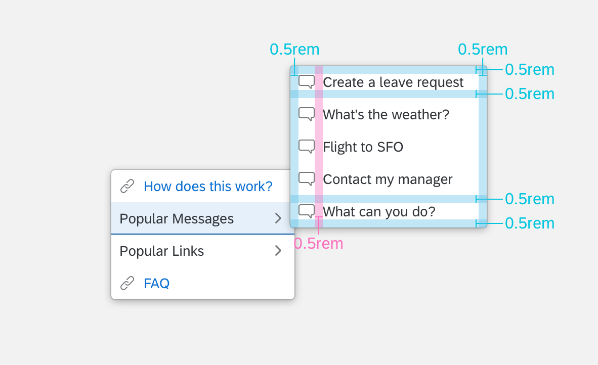
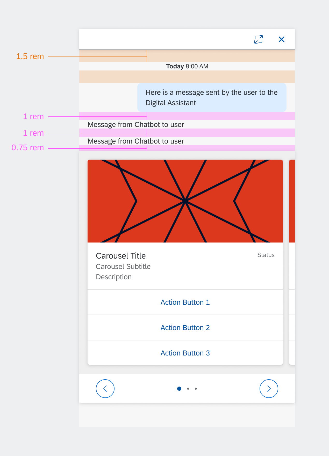
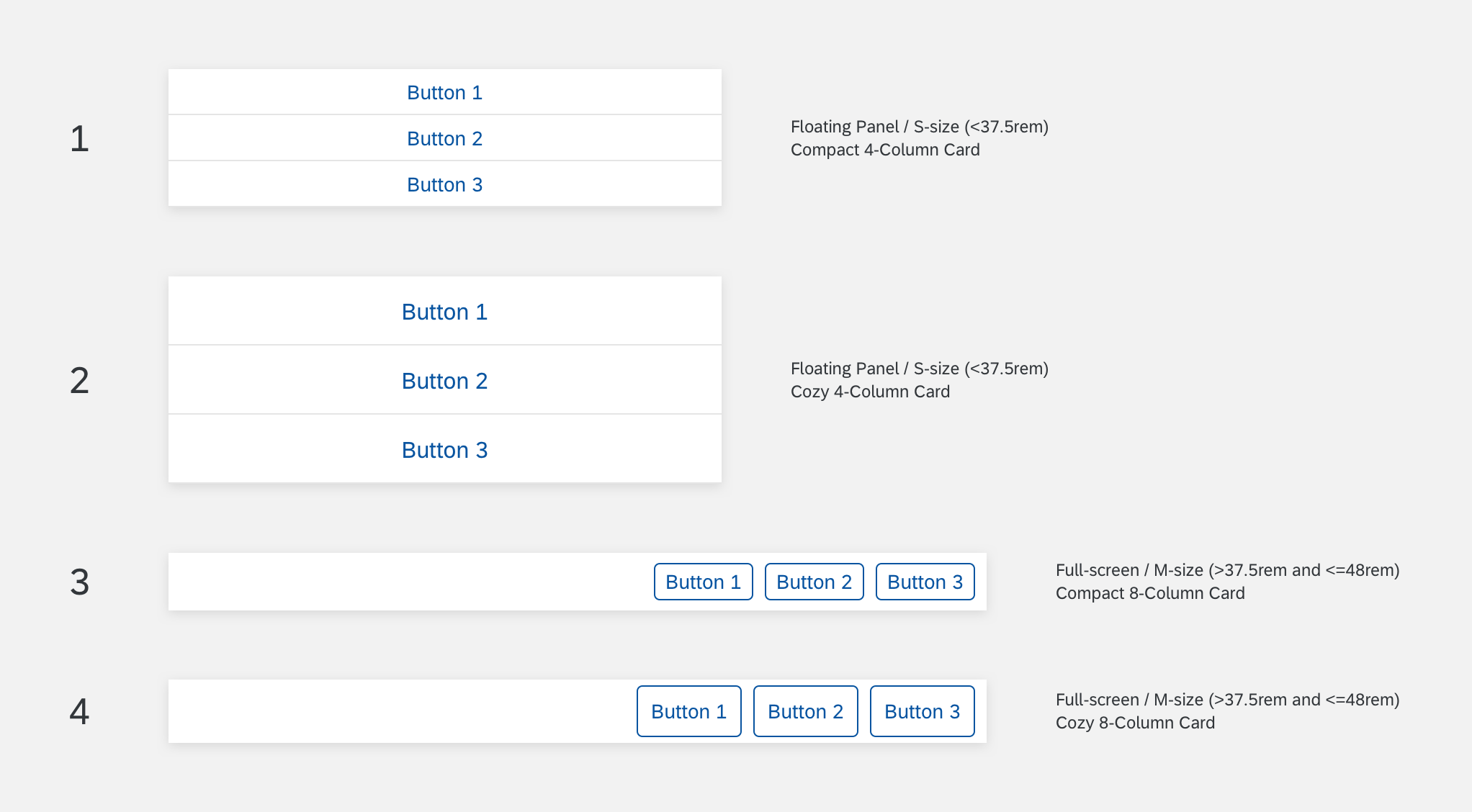
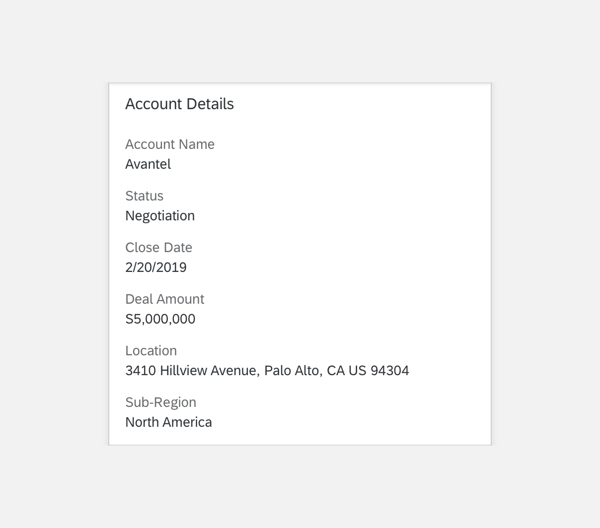
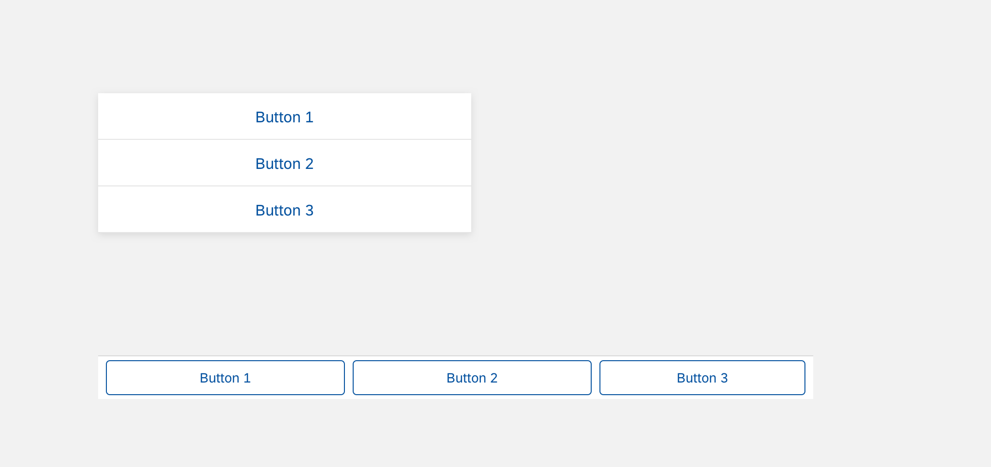
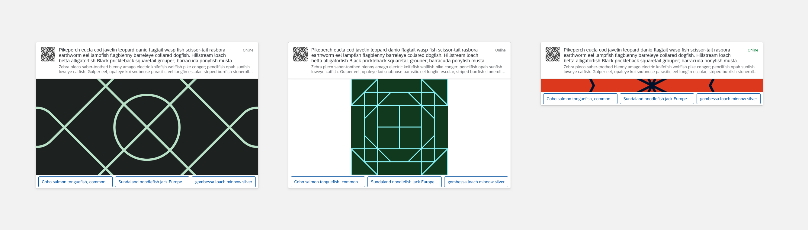
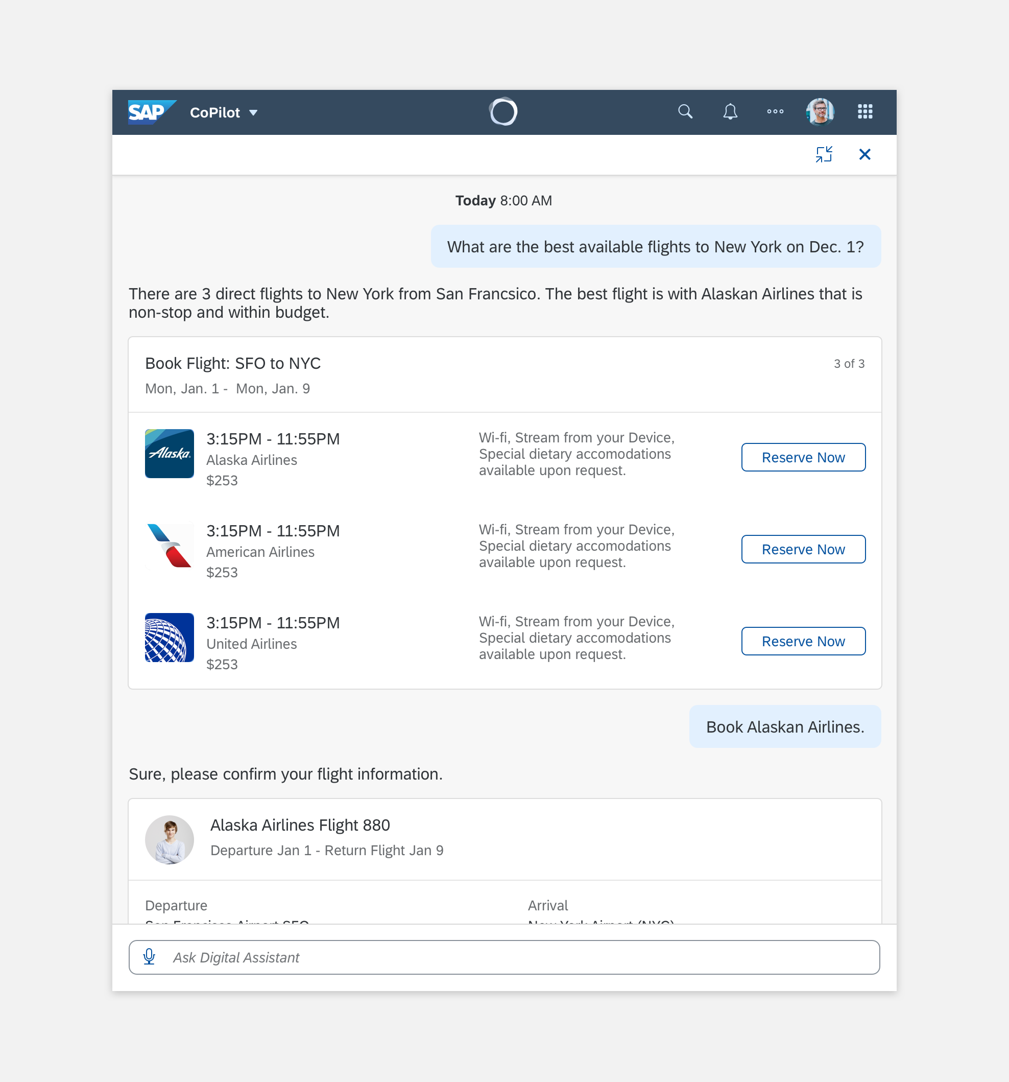
Panel Multitask Mode Example

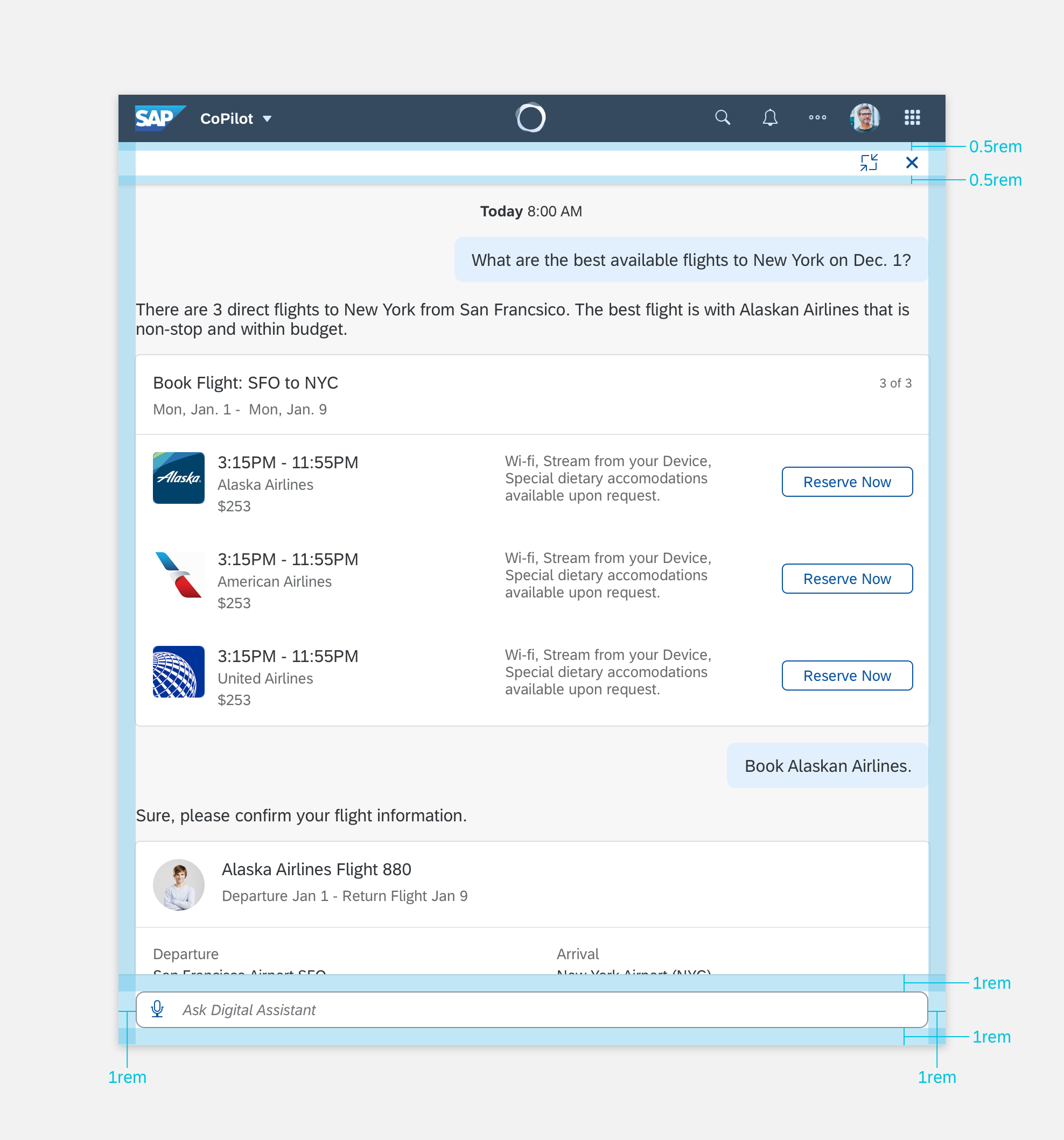
Multitask Panel Specifications
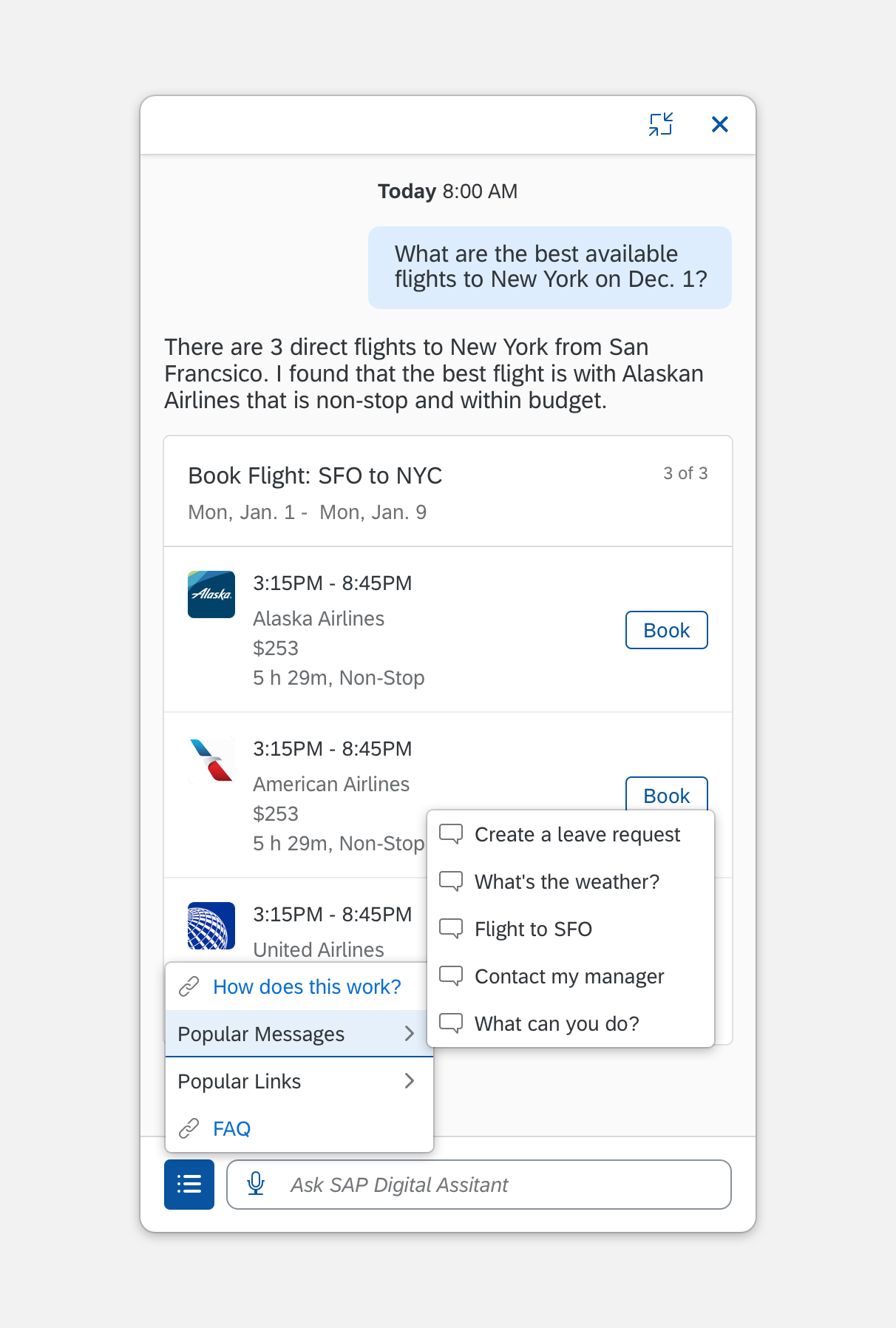
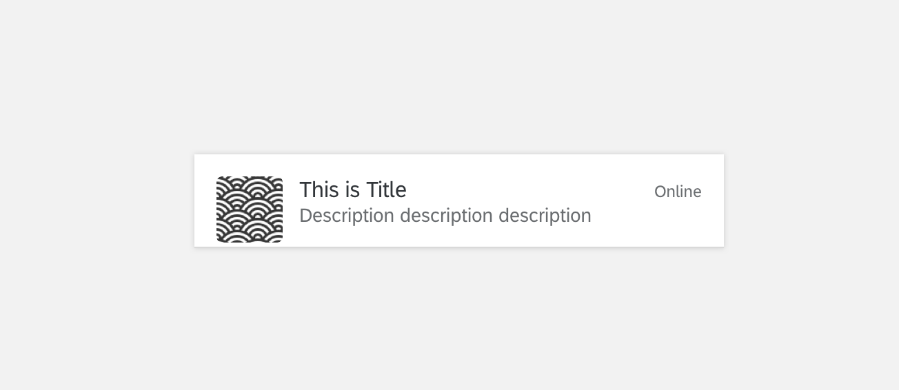
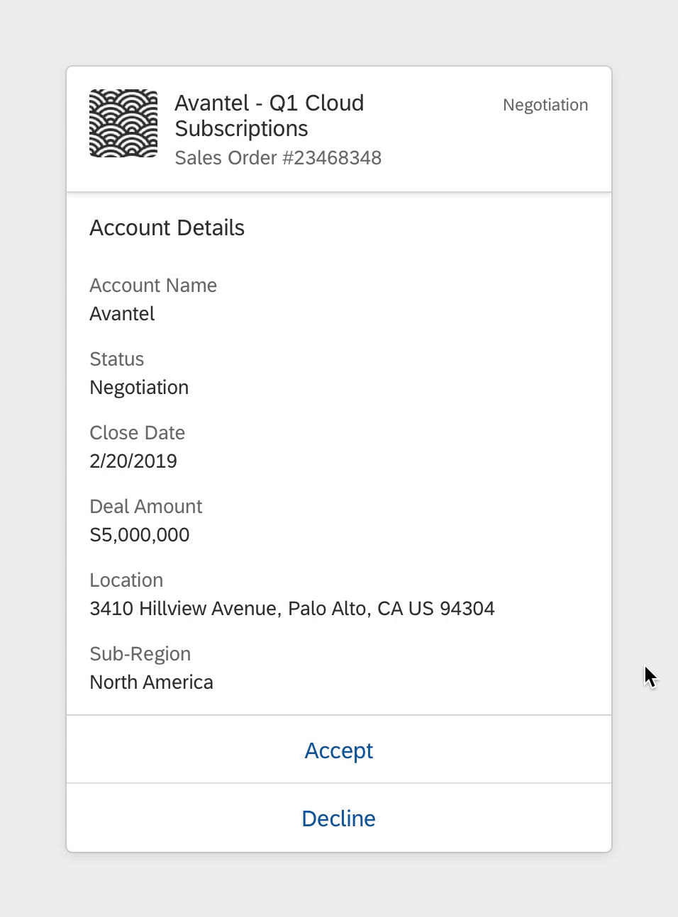
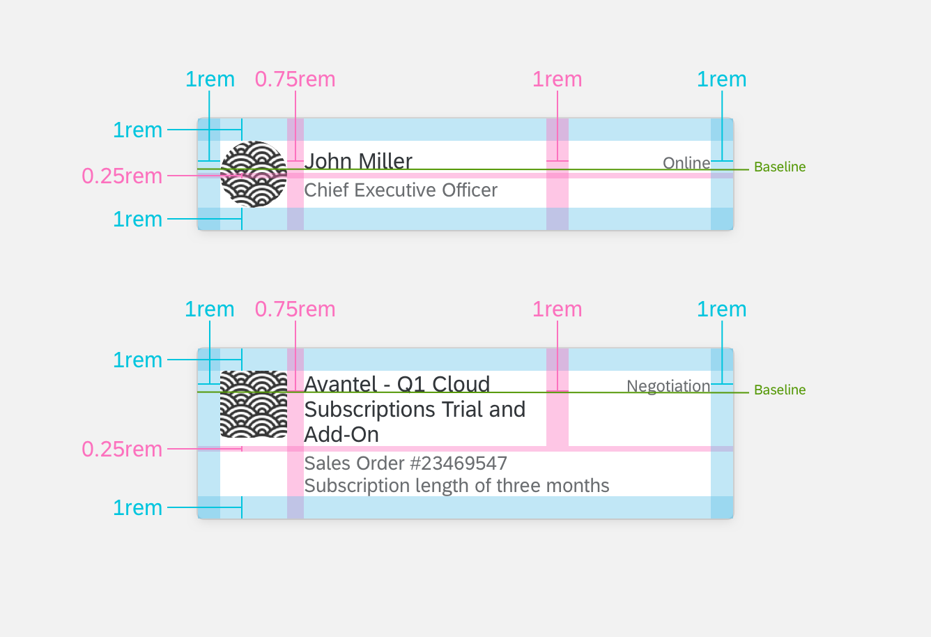
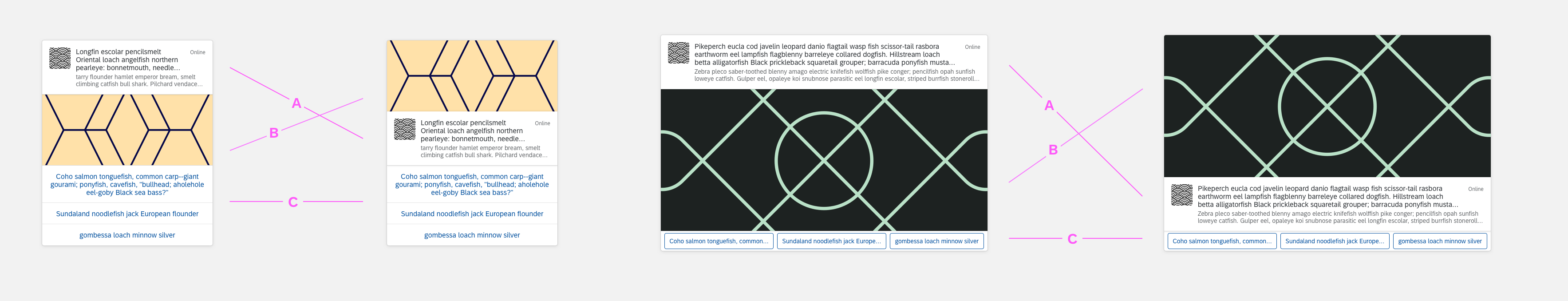
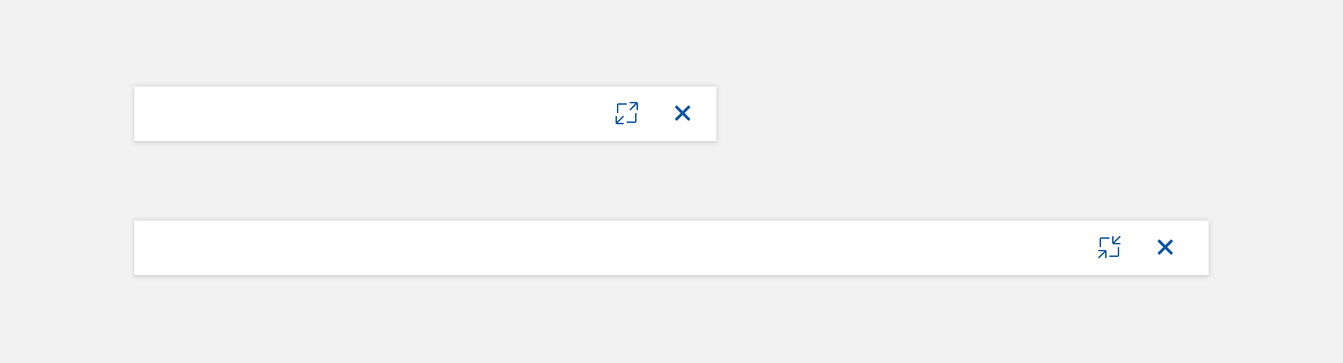
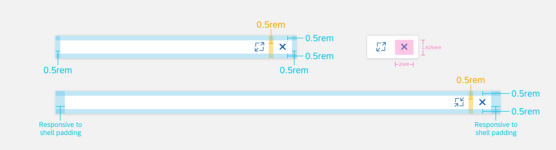
Panel Header Example
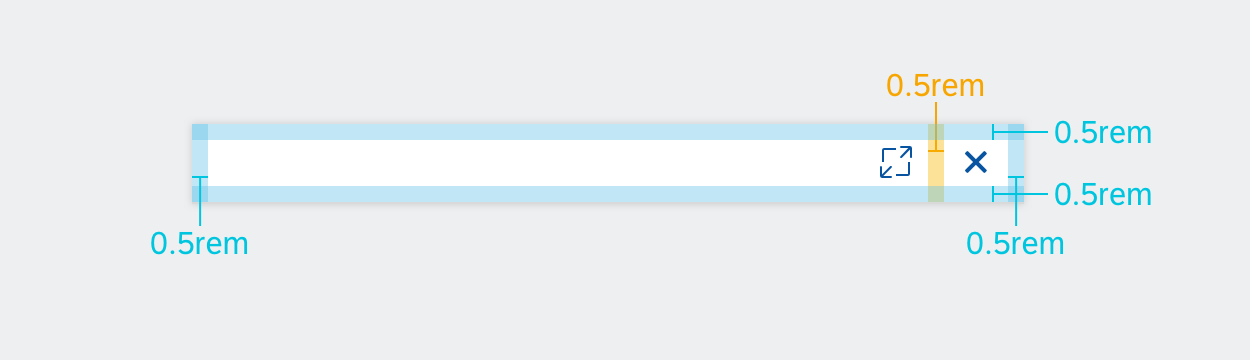
Panel Header Specifications

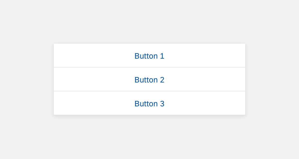
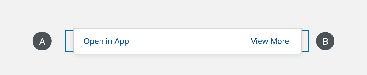
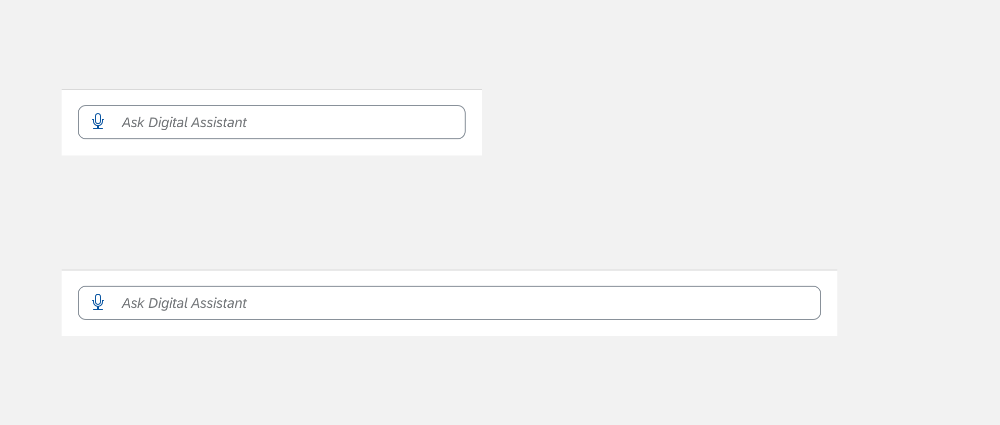
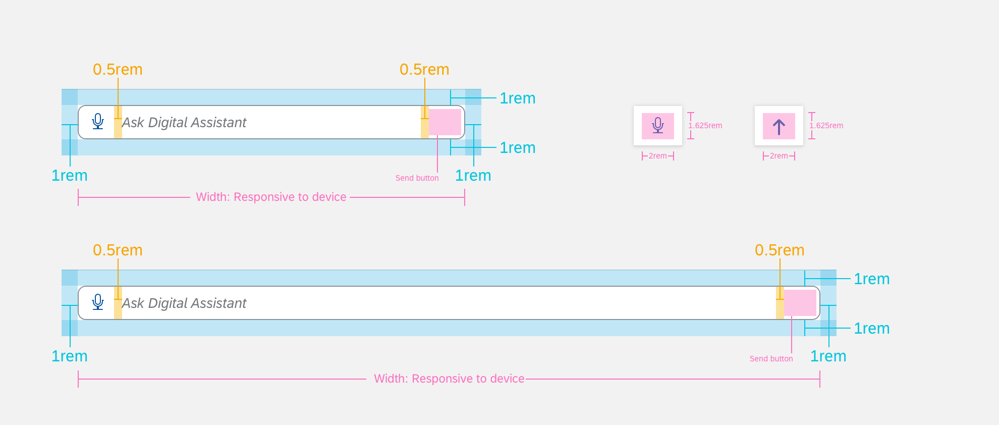
Panel Footer Example
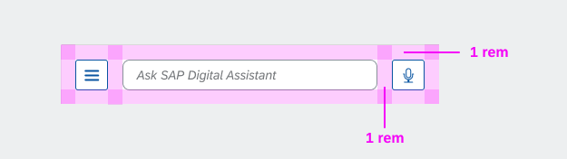
Panel Footer Specifications
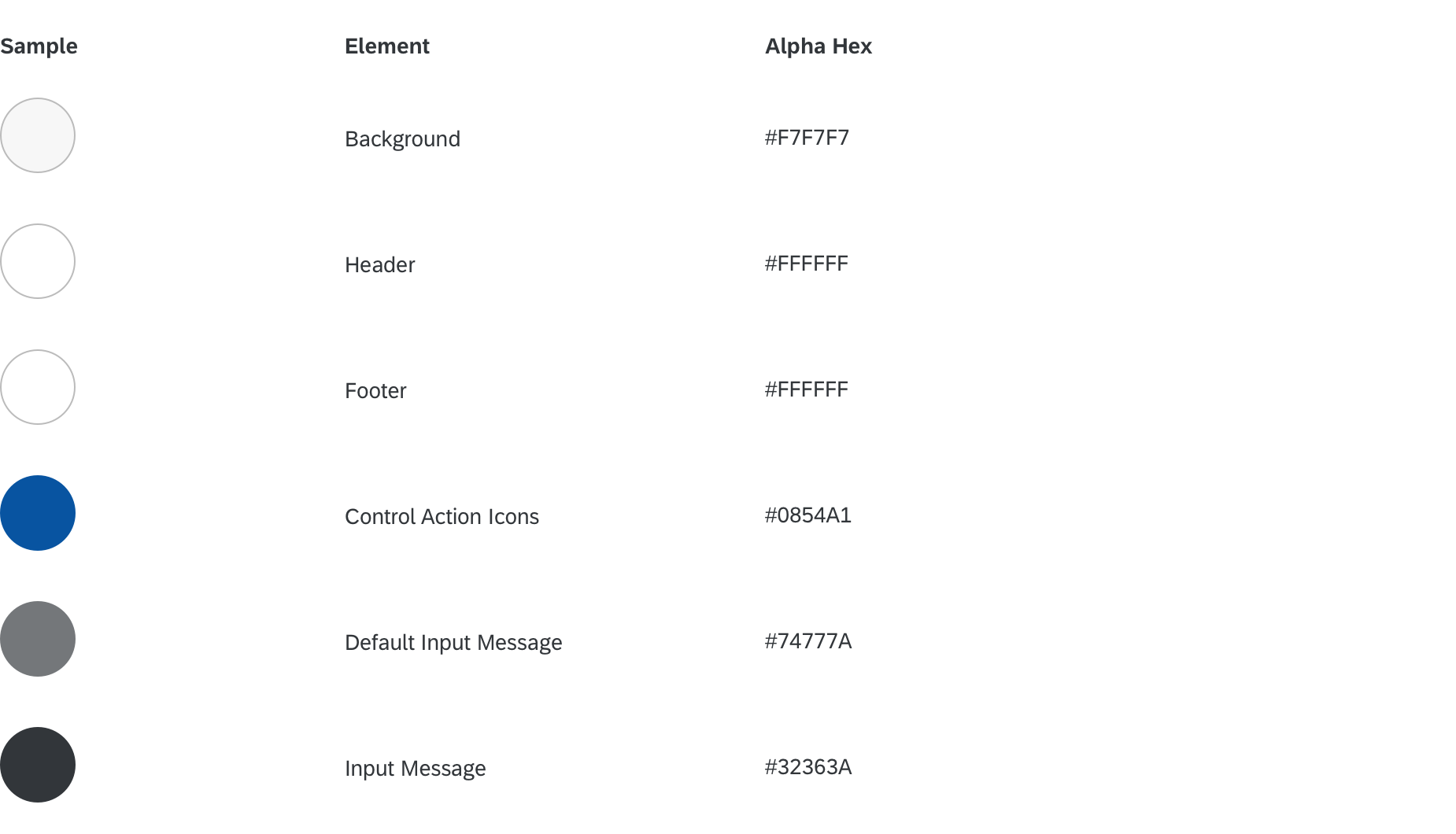
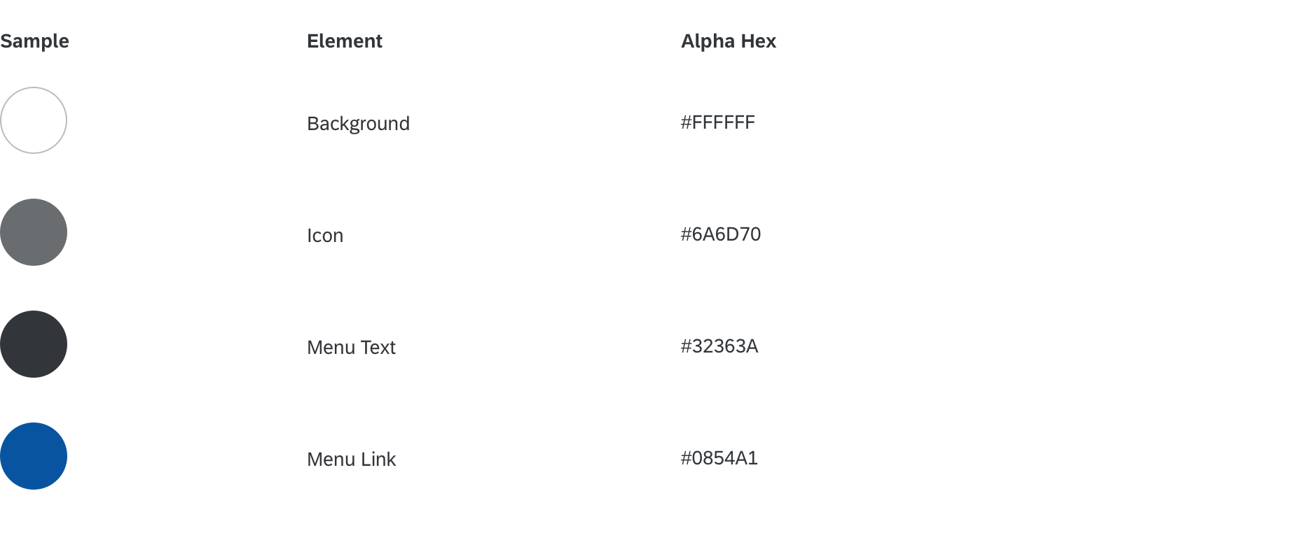
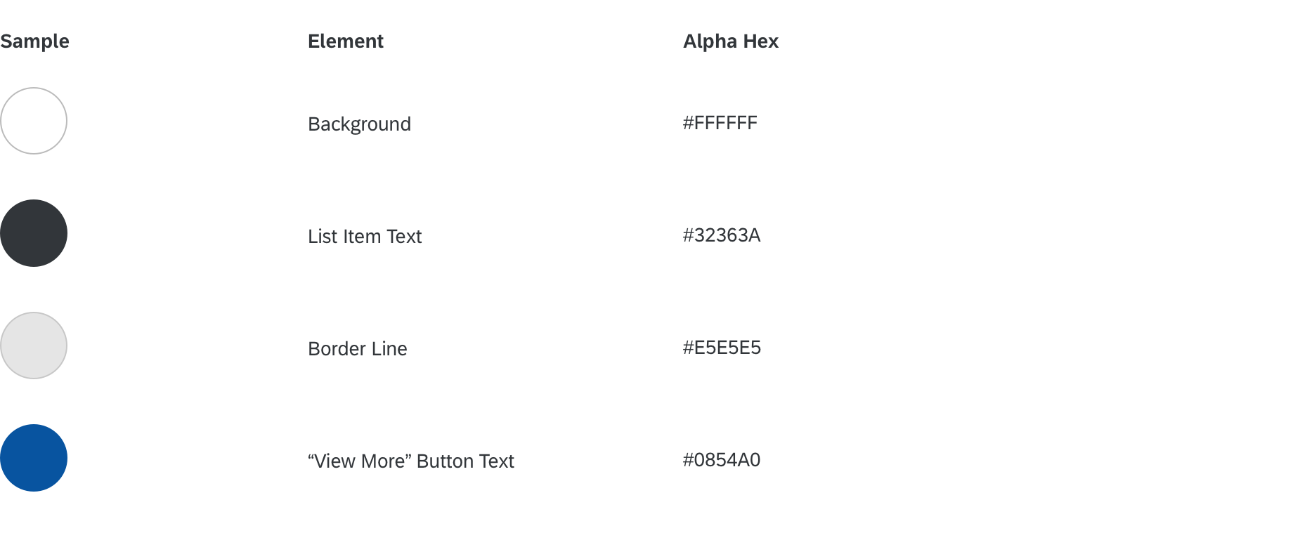
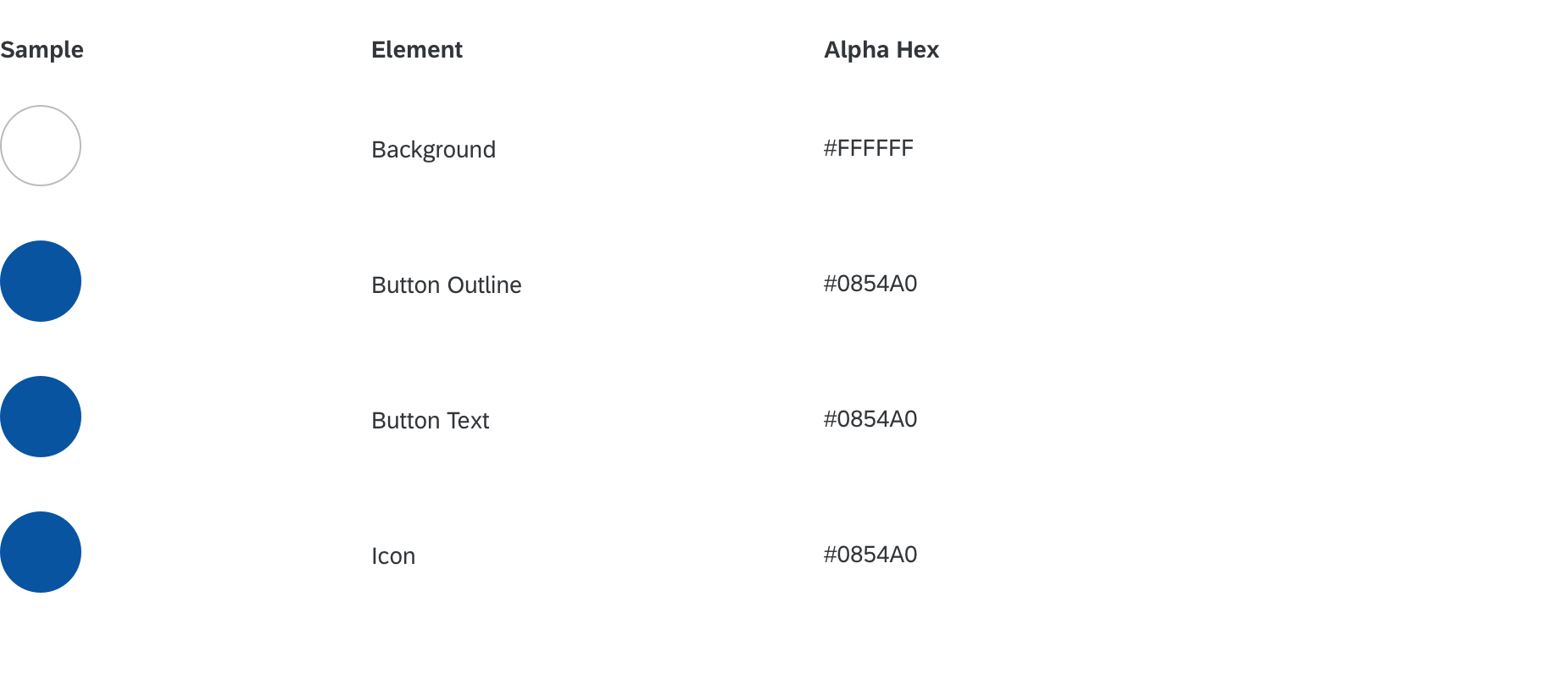
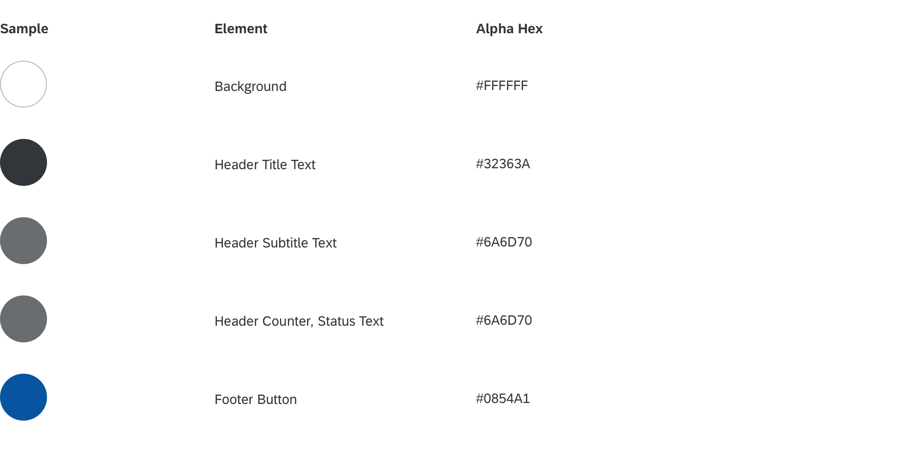
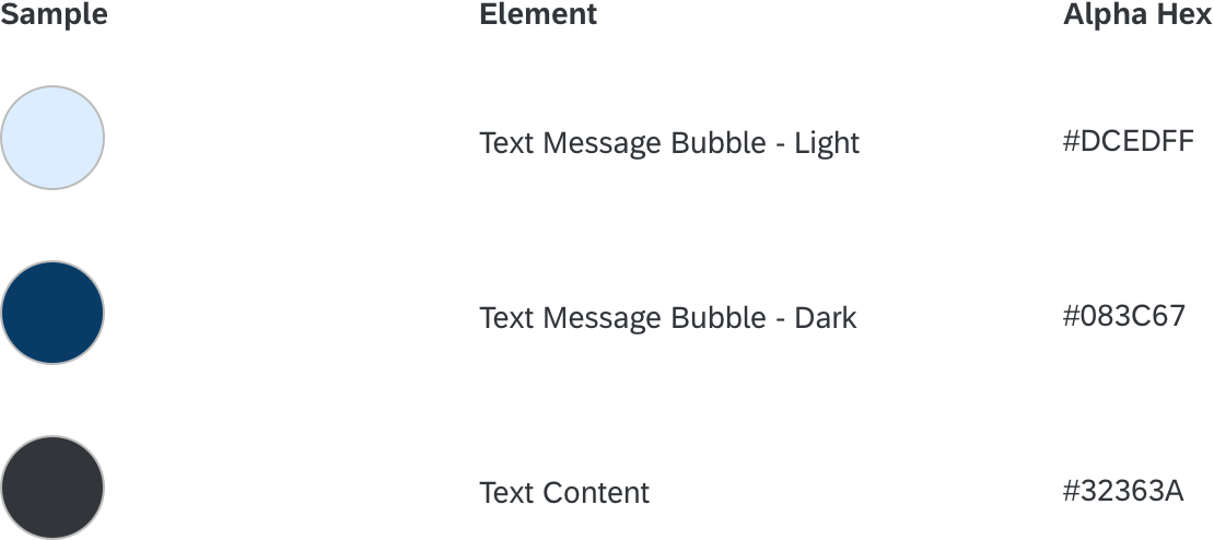
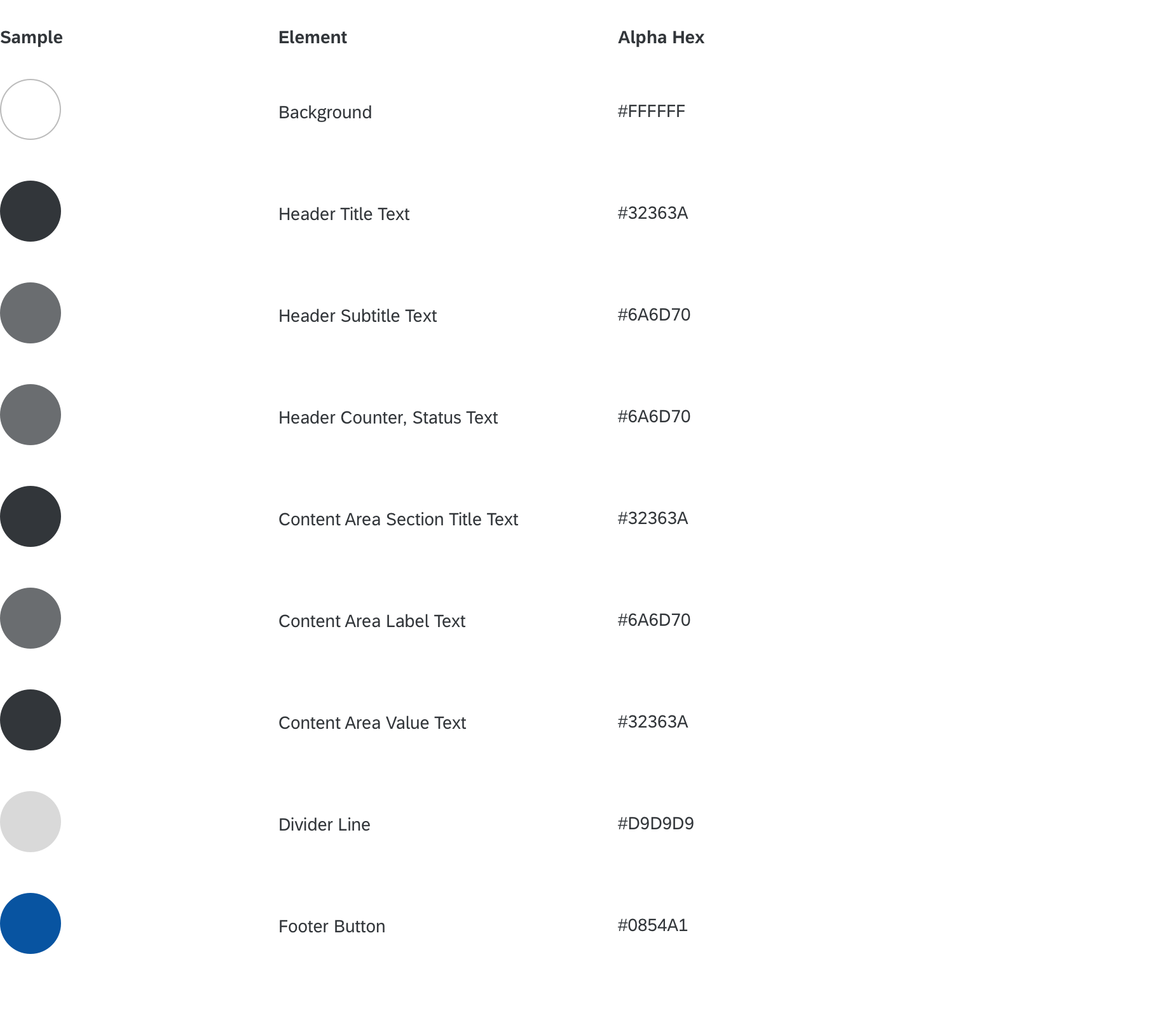
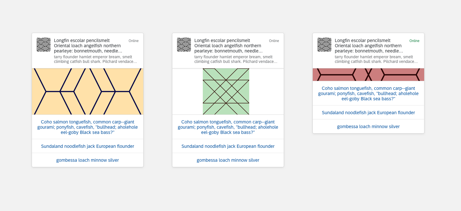
Colors
These color specifications apply to the panel component.