
Checkboxes
CheckBox
Intro
A checkbox lets the user set a binary value on the option associated with the control. When the user taps the checkbox, it toggles between checked and unchecked. Checked means that the state described by the checkbox text applies, or that the item has been chosen. Within a group of checkboxes, each checkbox can be checked or unchecked. This allows users to select multiple options from one group.
Usage
- Use checkboxes for multi-select. Each option in the group can be selected independently of each other
- Use checkboxes when only one option can be selected or deselected, for example, to accept terms of use. Use it only if the meaning is obvious (single checkbox).
- Use checkboxes to display all available options directly to users.
- Don’t use checkboxes for single selection. Use radio buttons instead.
- Don’t use checkboxes if you want to offer two options for a “yes/no” or “on/off” type of decision. Use a switch control instead.
Anatomy
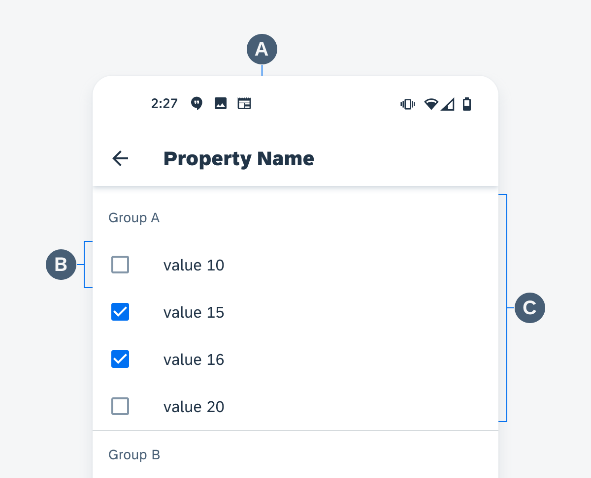
A. Property Name
A set of checkboxes is used to show all available values for a certain property. The property name should be displayed at the top. If the whole page is used to display available values, display the property name as the title in the app bar.
B. Checkbox Cell
A checkbox followed by a text value forms one checkbox cell. Each available option has its own cell. Display the checkbox cells in a meaningful sequence, for example, alphabetical sequence for names.
C. Cell Group
Checkbox cells can be grouped into categories. Each category has a header showing the name of the group.
Anatomy of checkboxes
Behavior and Interaction
The user taps a checkbox to toggle the state of the checkbox between checked and unchecked. Each checkbox cell is one touch target. When a specific option is disabled, apply 50% opacity to that checkbox cell. Disabled options are not interactive.
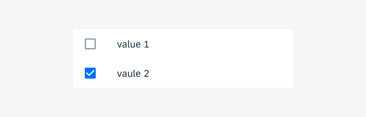
Enabled checkbox cells
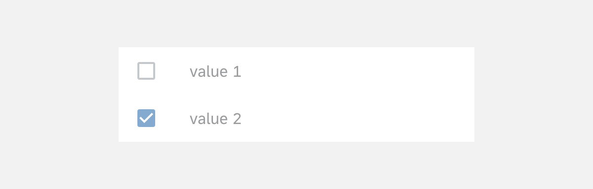
Disabled checkbox cells
Resources
Development: CheckBox, MaterialCheckBox
Material Design: Checkboxes
 Your feedback has been sent to the SAP Fiori design team.