
Iconography
Intro
SAP icon library
SAP icons have been redesigned for the Horizon visual theme with a fresh, friendly, and bold style. The new icons maintain consistency of size, stroke, and visual balance and are tailored for simple and direct user interaction, using metaphors that are easy to understand in an enterprise setting.
Usage
- Use the SAP icon library.
- Use icons to highlight important actions for users.
- Use icons to indicate navigation actions to other screens.
- Use icons that are clear to the user
- Don’t use different-sized icons.
- Don’t use third-party icons.
- Don’t use icons that are ambiguous.
Design Language
The SAP icon library communicates the following SAP Design principles:
- Simple
- Fresh
- Neutral
- Modern
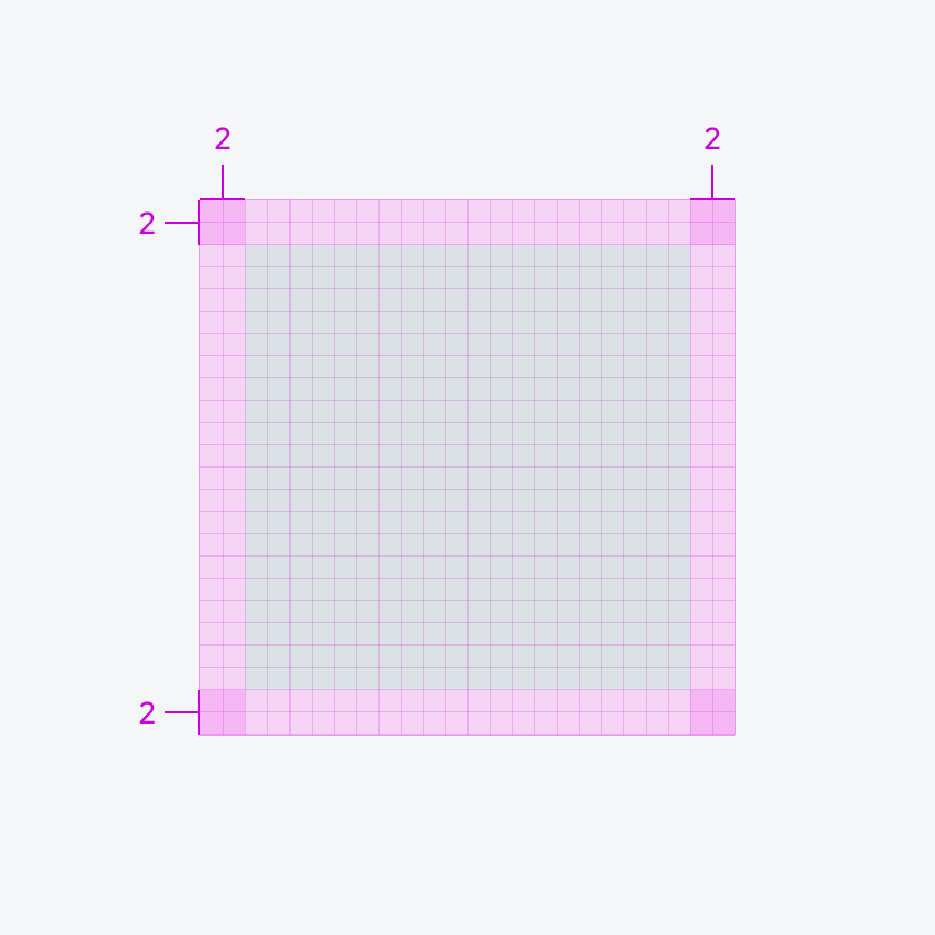
Icon Grid
The standard size of SAP Icons is based on a 24dp grid. This grid size is used to design SAP icon used within our components and is based on the increment system. The 24dp area serves as a container where the actual icon graphic sits.
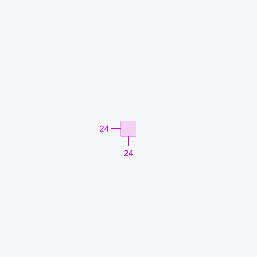
24 x 24 grid (1X scale)
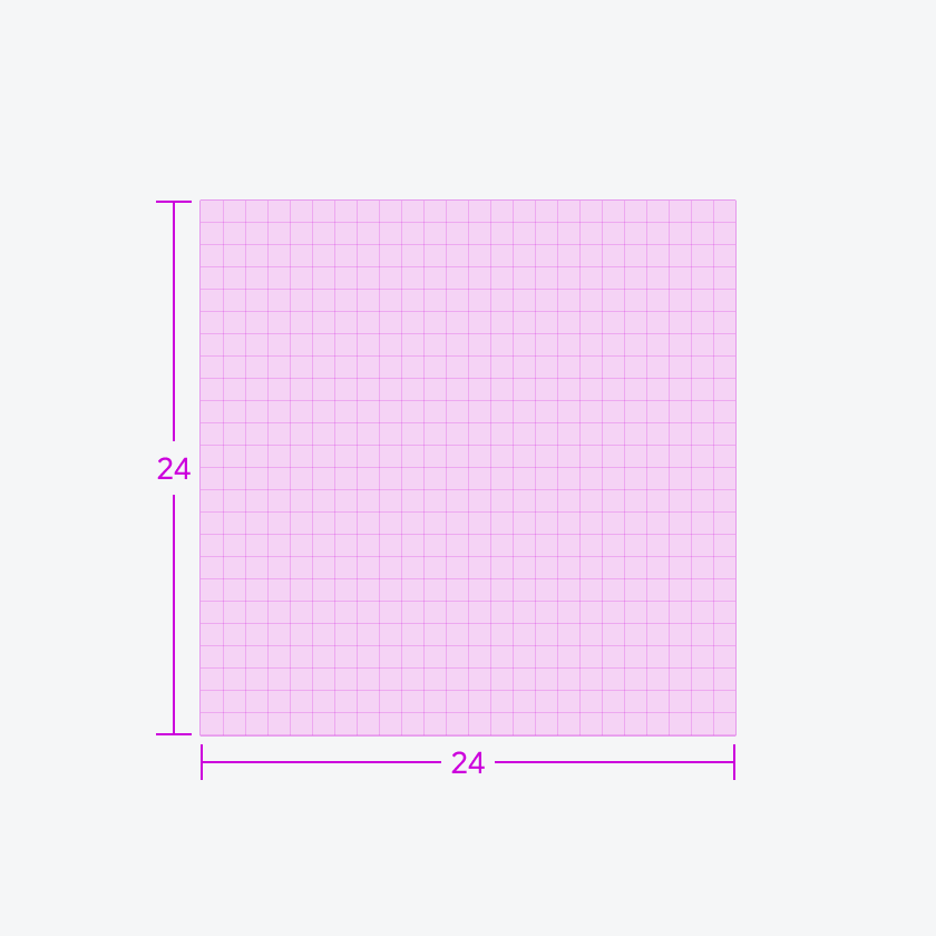
24 x 24 grid (10X scale)
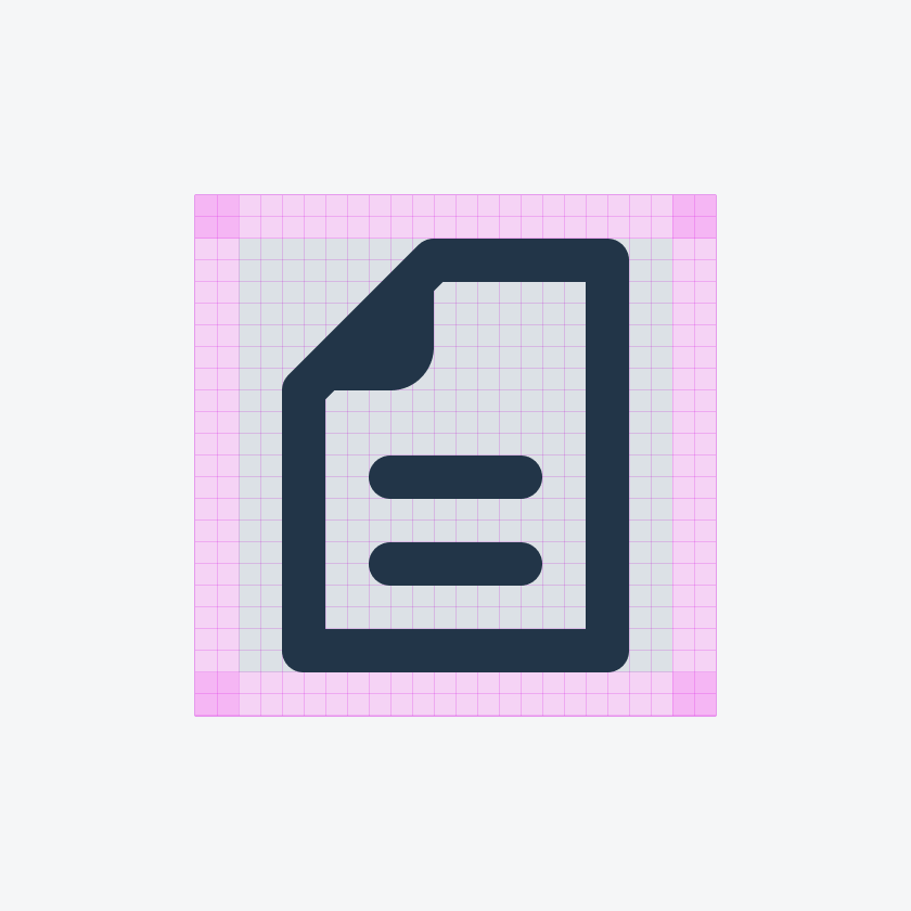
Live Area
SAP icons are designed within a 20dp x 20dp live area. This means that the icon has top and bottom paddings within the icon itself and ensures a sense of break between icon and any other UI elements.
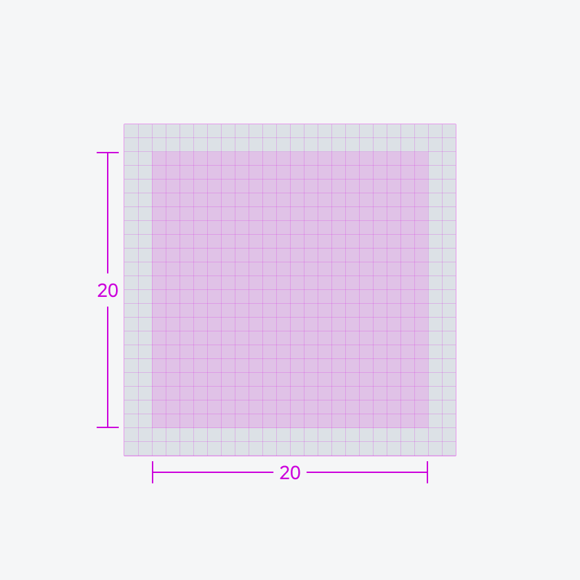
Live area, designated space for your icon
Padding space, to provide ample space around your icon
Pixel Alignment
When designing custom icons, ensure that icons use full pixels. This means they should have whole number units, with no decimals to maintain clarity on screens with high pixel density.
Aligned icon showing crisp edges
Use full pixel units when designing custom icons. This means pixels should have whole number units, with no decimals to maintain clarity on screens with high pixel density.
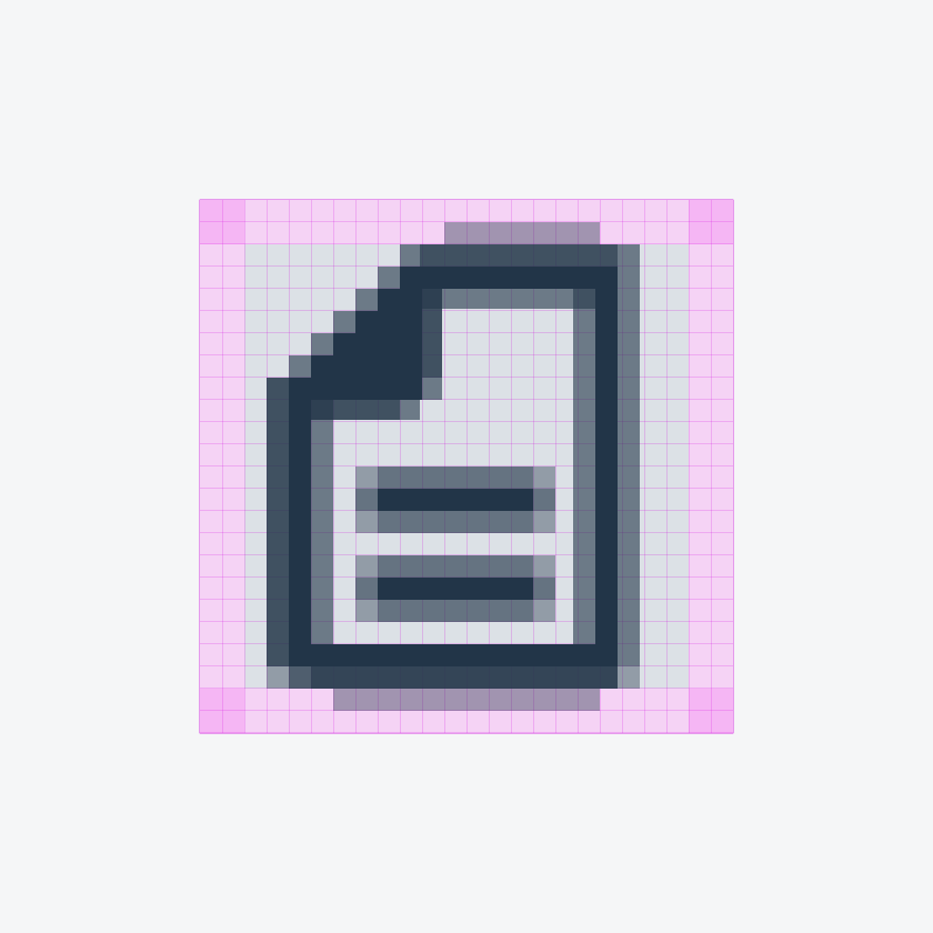
Misaligned icon showing blurred edges
Don’t design custom icons where pixel units fall in between pixels, these are called half pixels. Half-pixeled units will look blurry on screens with high pixel density.
 Your feedback has been sent to the SAP Fiori design team.