
Profile Header
Fiori: ProfileHeader
Intro
The profile header gives a quick intro of a person to the user. It also includes methods to contact that person quickly without needing to access a different area of the profile page.
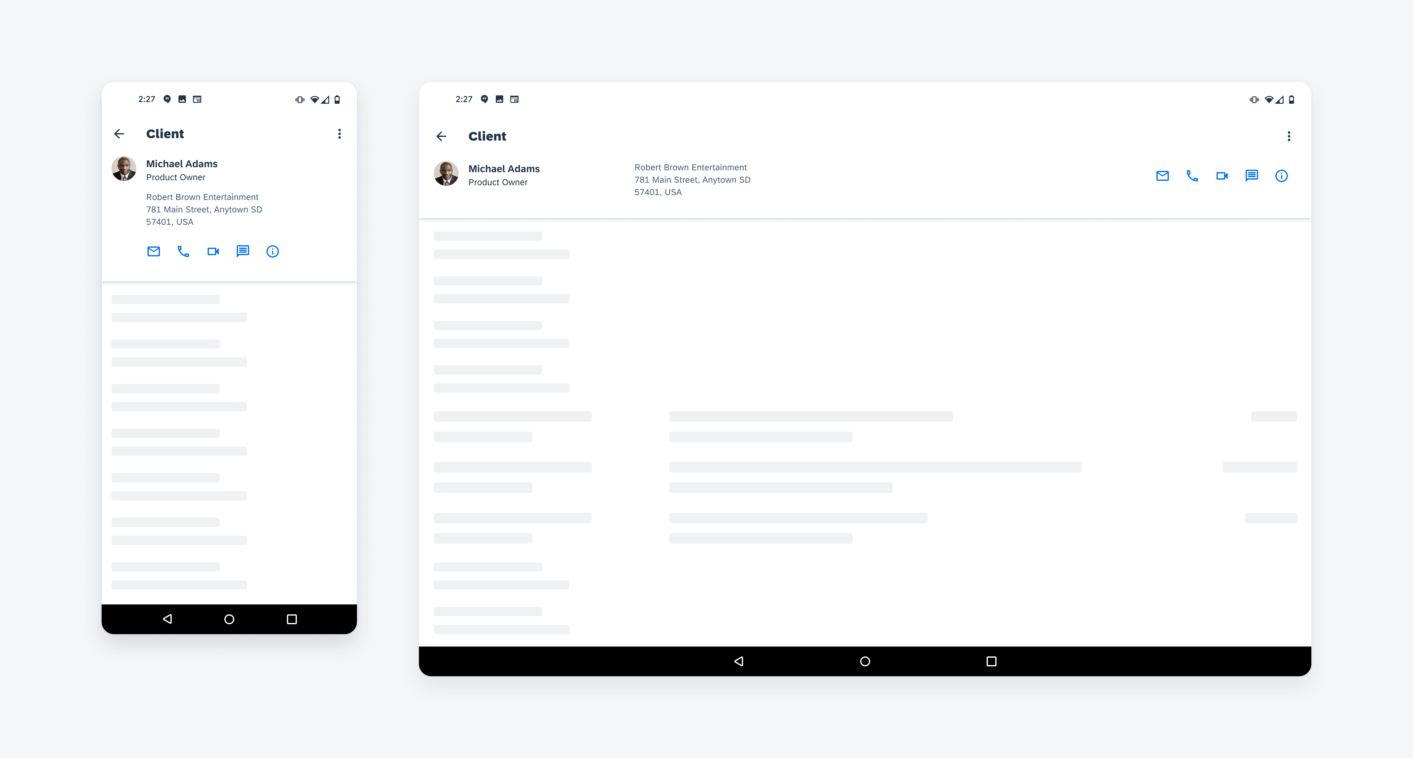
Profile header on mobile (left) and on tablet (right)
Usage
Use the profile header on a user profile or an object detail page.
Do not include lengthy information. It should be a short summary for that person.
Anatomy
The profile header can accommodate different types of content depending on what information is provided. The types of content are one image, name, title, description, and action buttons (one to five). The name is required, but all other content types are optional, although we strongly recommend including them to provide more information.
A. Top App Bar
Since the profile header will appear on what is considered a detail page, the app bar should have a navigation icon to either take the user back to the previous screen or if this profile behaves more like a full-screen dialog, then use a close icon. After the navigation icon, the profile title can describe the general page that encompasses all profiles of a similar kind, such as an internal employee, a client, a member, a particular team, and so on. At the end, if there are extra functions such as downloading contact information or sharing, then it can live in a menu that is accessed by the menu icon. For more information about menus, see Menus.
B. Image (Optional)
We recommend using an image so that the user can quickly identify and see the person the profile is about. Images of people should always be in a circle.
C. Name
The name must include the first and last name of the person.
D. Subheading (Optional)
The subheading is optional and can be secondary information about the person, such as their job title or location.
E. Description (Optional)
The description may include three-lines of text. If it requires more than three lines, consider moving it to the top of the content area below the profile header.
F. Action Buttons (Optional)
There can be one to five action items in the profile header. If there is only one action button, you can put it in the top app bar. However, due to space limitations, it’s recommended that the action items use an icon button rather than text button. If it must be a text button, we recommend only up to two text buttons. Due to these limitations, only use frequently used actions in the context of the current screen.
These actions are buttons so they must follow the same behaviors and interactions as buttons, which means that they must have different states. For more details on how buttons are designed and how they behave, see Buttons.
If a certain action is not available, the action should use the disabled state, which is set to 50% opacity.
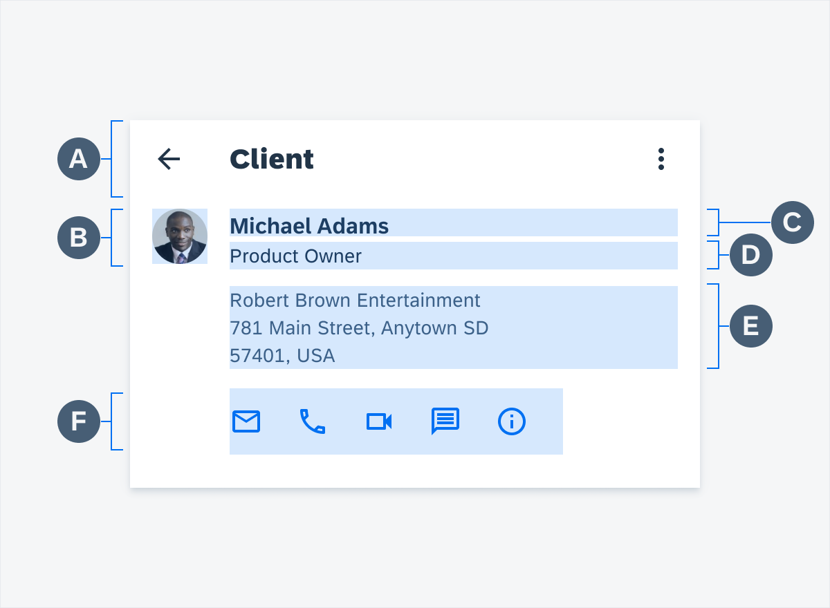
Profile header anatomy
Behavior and Interaction
Scrolling
Due to the nature of the prominent top app bar, if the user scrolls down the screen, the profile header gets condensed to the app bar in which it only shows the navigation icon, object title, and any other button in the app bar. If the user scrolls back up, then the full object header slides out again. This behavior occurs on all devices.
User interaction with profile header
Adaptive Design
The profile header is available on both compact and regular width.
Profile header compact width (left) and regular width (right)
Variations
Profile Header with Action Icons
When including action items, there can be a minimum of two and a maximum of five, though having this many is not recommended. Only present icons that are frequently used in the current context. Apply a gray color to the action icon when it is disabled.
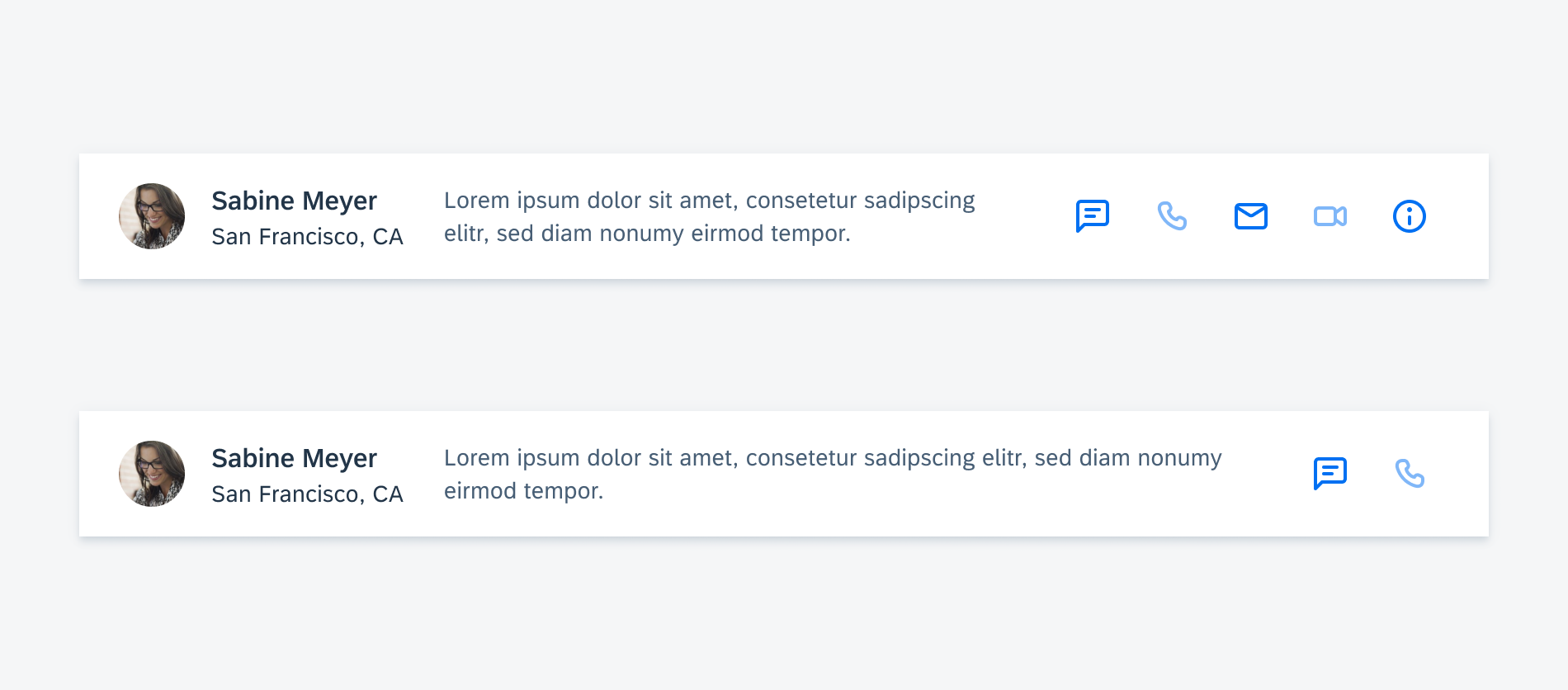
Profile header with five actions (top) and two actions (bottom)
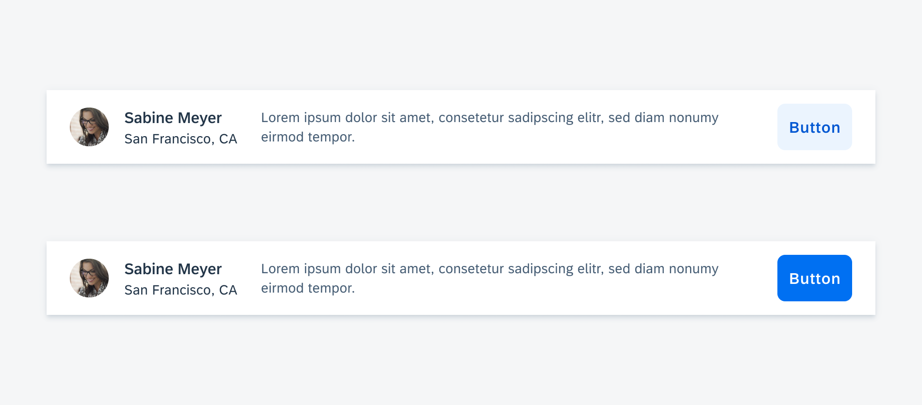
Profile Header with Action Button
As the name implies, an action button allows the user to perform an action on the current object. Common actions include adding an object to a list, starting an event with an object, or otherwise marking an object.
When an action button is tapped, it should adopt an active state; when it is tapped again, it should return to its inactive state. Button text should clearly communicate to the user what will happen when the button is tapped.
Please note that icons are also a recommended way to provide actions within the header.
 Your feedback has been sent to the SAP Fiori design team.