
Key Value Cell
FioriKeyvalueCell
Intro
The key value cell is a table view cell that fits inside the table view container. It is ideal for displaying sets of data that also need to display their labels.
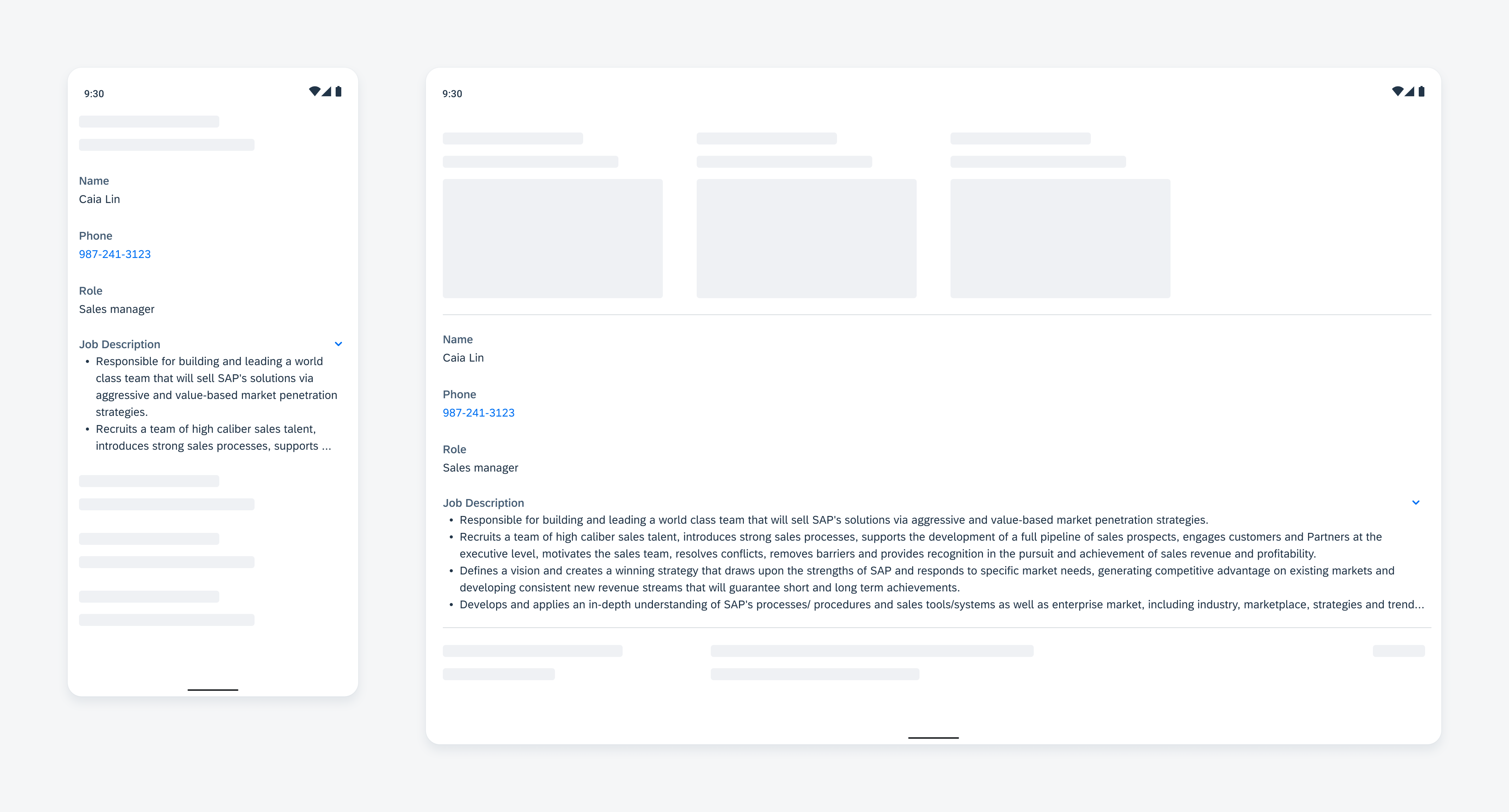
Key value cell on mobile (left) and on tablet (right)
Usage
Use a key value cell to display a piece of information with its label.
- Don’t use the key value cell to display an image.
- Don’t use the key value cell to display text content that is not related to a property.
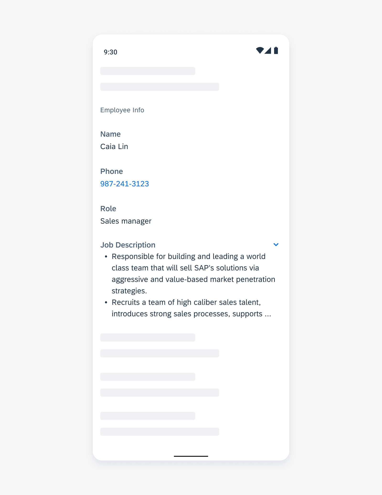
Anatomy
A. Key Label
This is the property name that identifies what the value is representing.
B. Value
Value is used to show the data for a property. This could be pre-defined values or input created by users. If there is a specific action associated with it, for example, phone number or email address, the value should be a button color.
C. Expand/Collapse Icon
When the value text exceeds six lines, it’s truncated at the end of the sixth line, and an expand icon shows up. Users can tap the expand icon to view the rest of the value text. When the cell is expanded, a collapse icon replaces the expand icon.
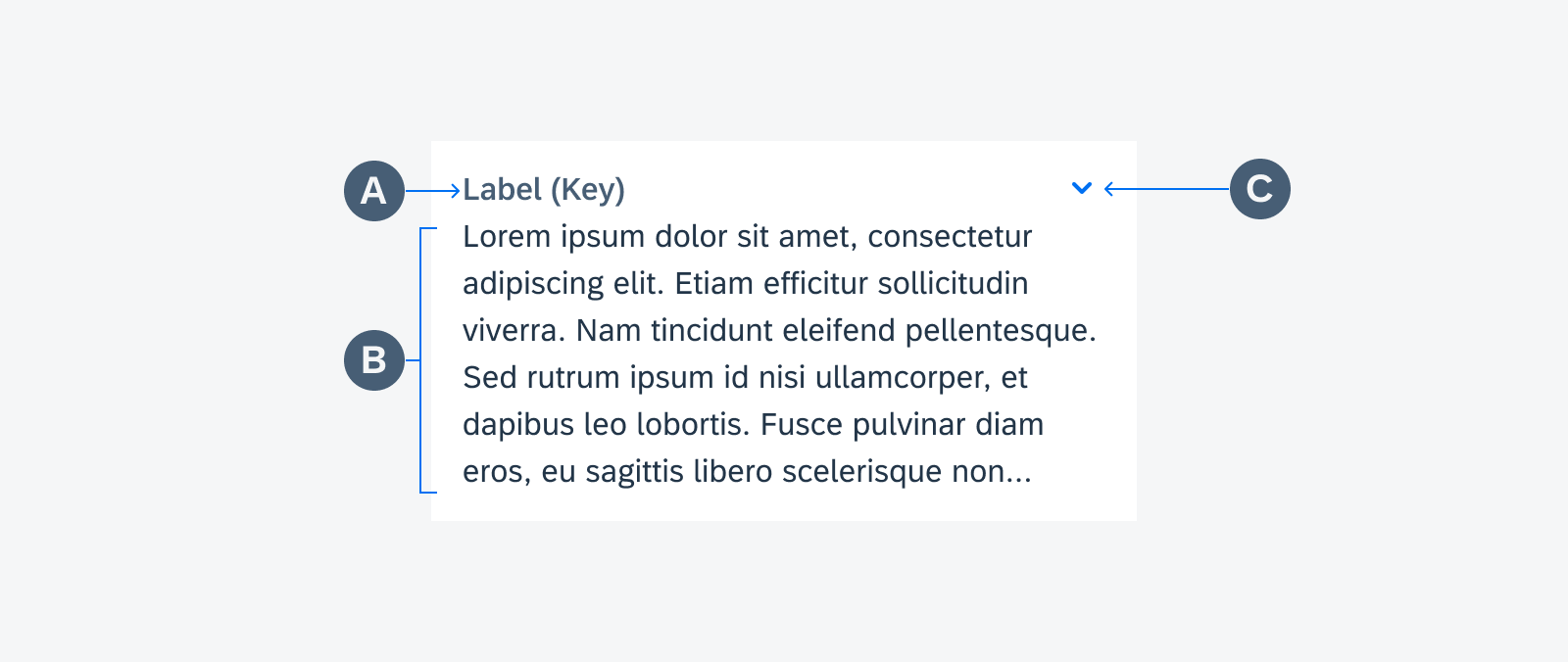
Key value cell anatomy
Variations
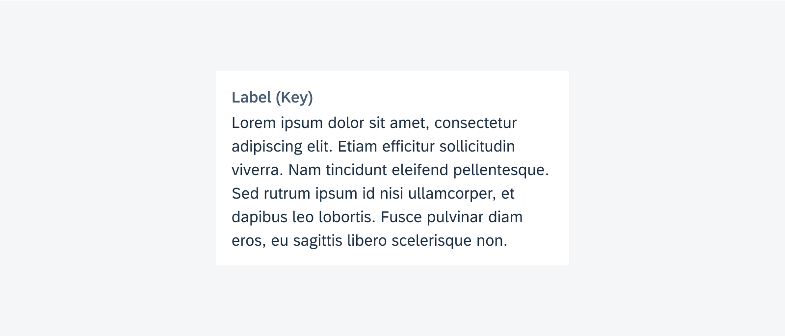
Key Value Cell – Plain Text
Use this variant if the value is plain text within six lines.
Key Value Cell – Collapse/Expand
Key value cells have a maximum height of six lines of value text. If the content is more than six lines, it is truncated at the end of the sixth line and an expand icon appears on the top right corner of the cell. Users can tap to expand/collapse the cell to view all the text.
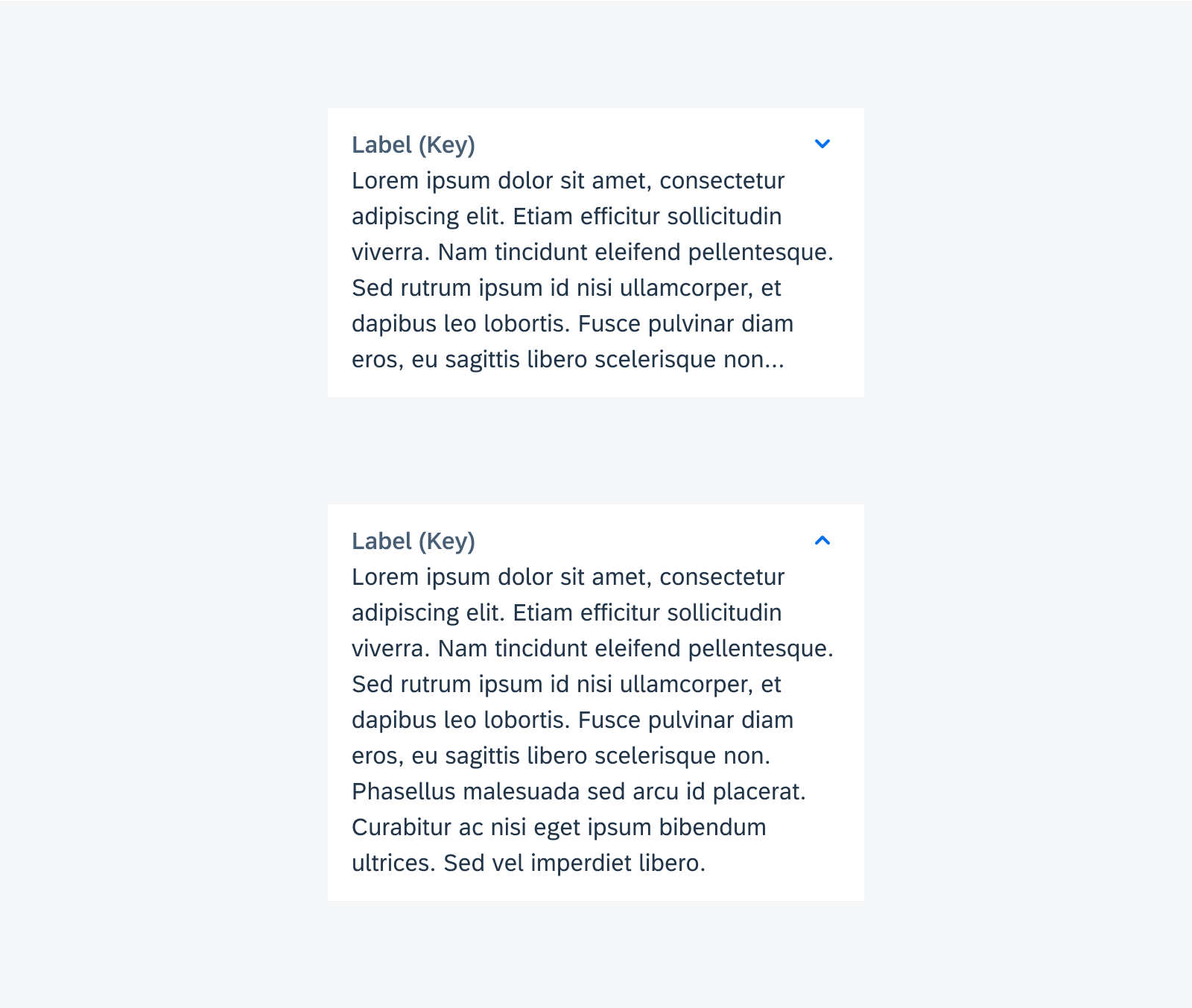
Expand and collapse behavior
Key Value Cell – Actionable Text
In general, the key value cell is for display only. Tap to drill down is possible, though it depends on the context. If the value displayed has a specific action associated with it, for example, phone number or email address, tapping on the cell would trigger that action, for example, call that phone number or send an email to that address.

Blue text indicates an actionable item
Adaptive Design
Mobile
On mobile, always display the key value cell as one full-width column.
A list of key value cells on phone
Tablet
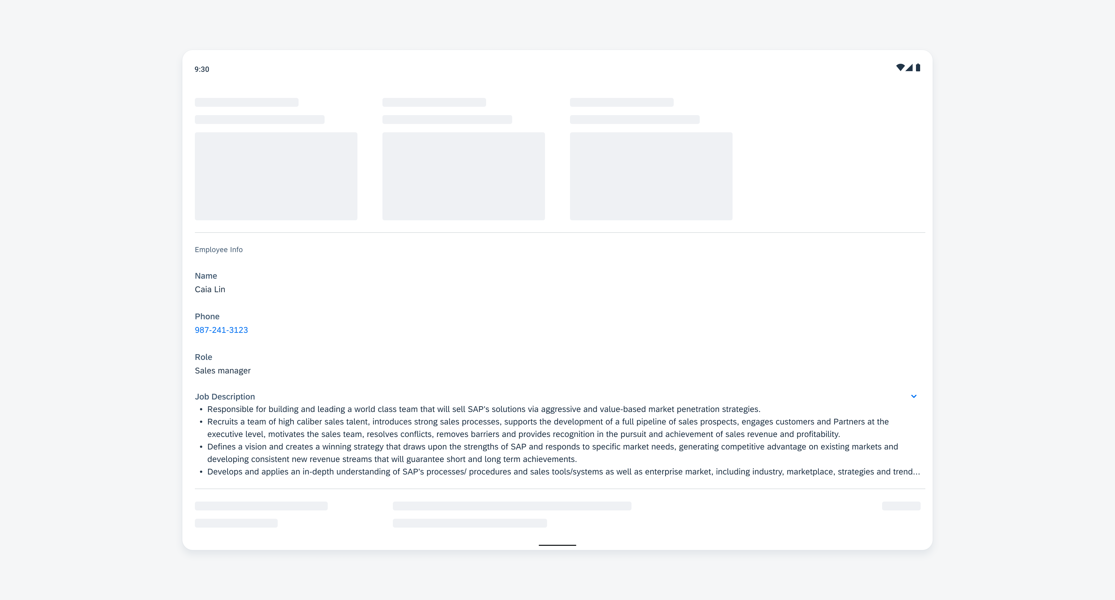
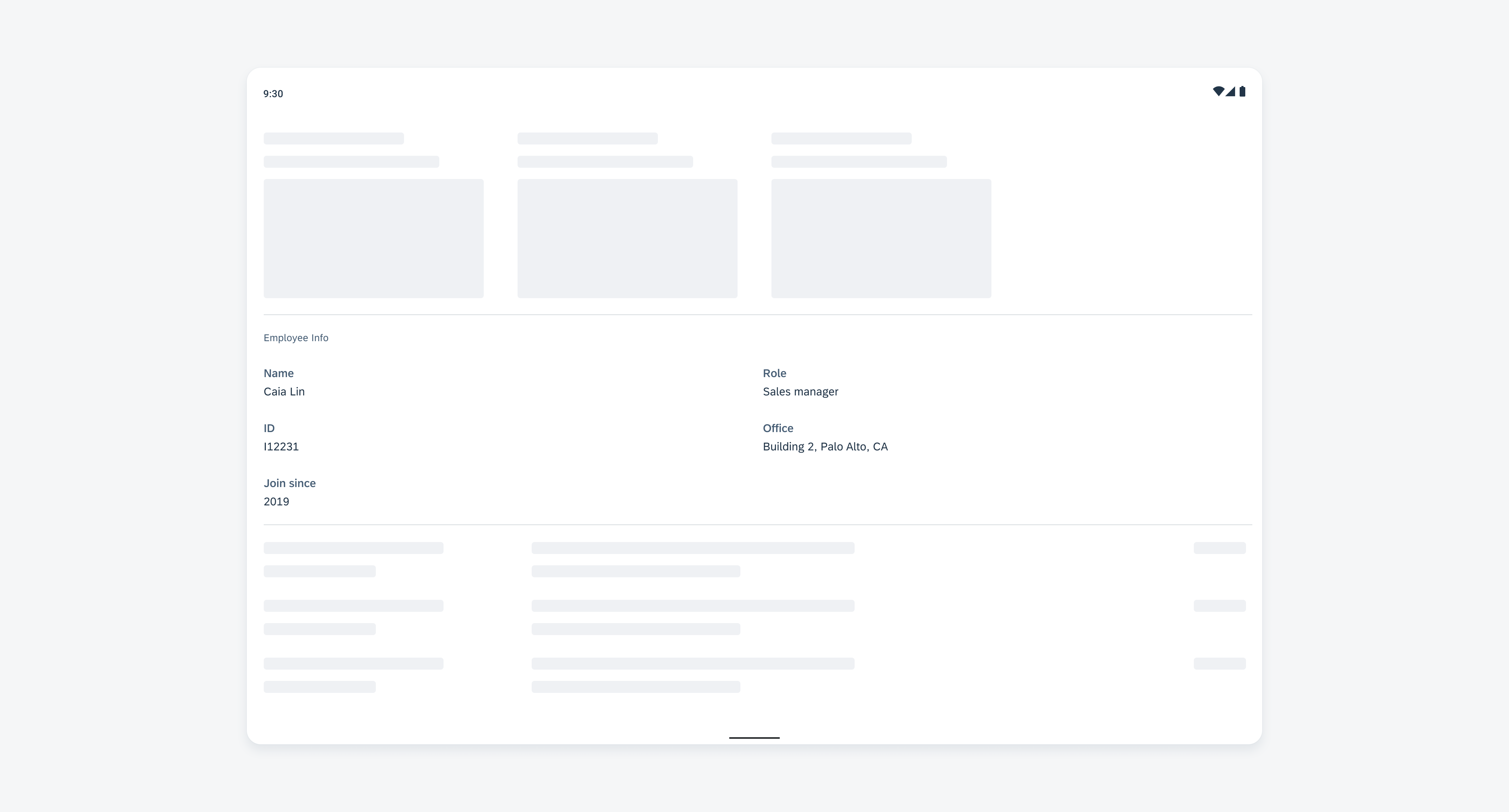
On tablet, key value cells can be displayed as one or two columns.
One-Column Layout
A list of key value cells on tablet
Two-Column Layout
Key value cells can be displayed in a two-column layout on tablet devices to take advantage of screen space. Only use the two-column layout when the cells in this group have relatively consistent height among all the rows. This layout is only recommended for a group of items with short value text. Avoid having expandable key value cells in a two-column layout.
 Your feedback has been sent to the SAP Fiori design team.