
Updated: May 22, 2023
Version 0.2
Menus
DropdownMenu
Intro
A menu displays a list of relevant options for the user that can be triggered from a button.
Menu
Usage
A menu pops up when users interact with a button, an action, or another control. Menus allow users to select from a list of options.
Do
Use a menu when the number of actions exceeds the component’s action limit.
Don't
- Don’t use a menu for a single action.
- Don’t hide important actions.
Behavior and Interaction
Dropdown Menu
A dropdown menu is a list of options that a user can act on. It appears after a user taps on an icon or a button or performs a specific action.
A dropdown menu normally appears below the element that generates it.
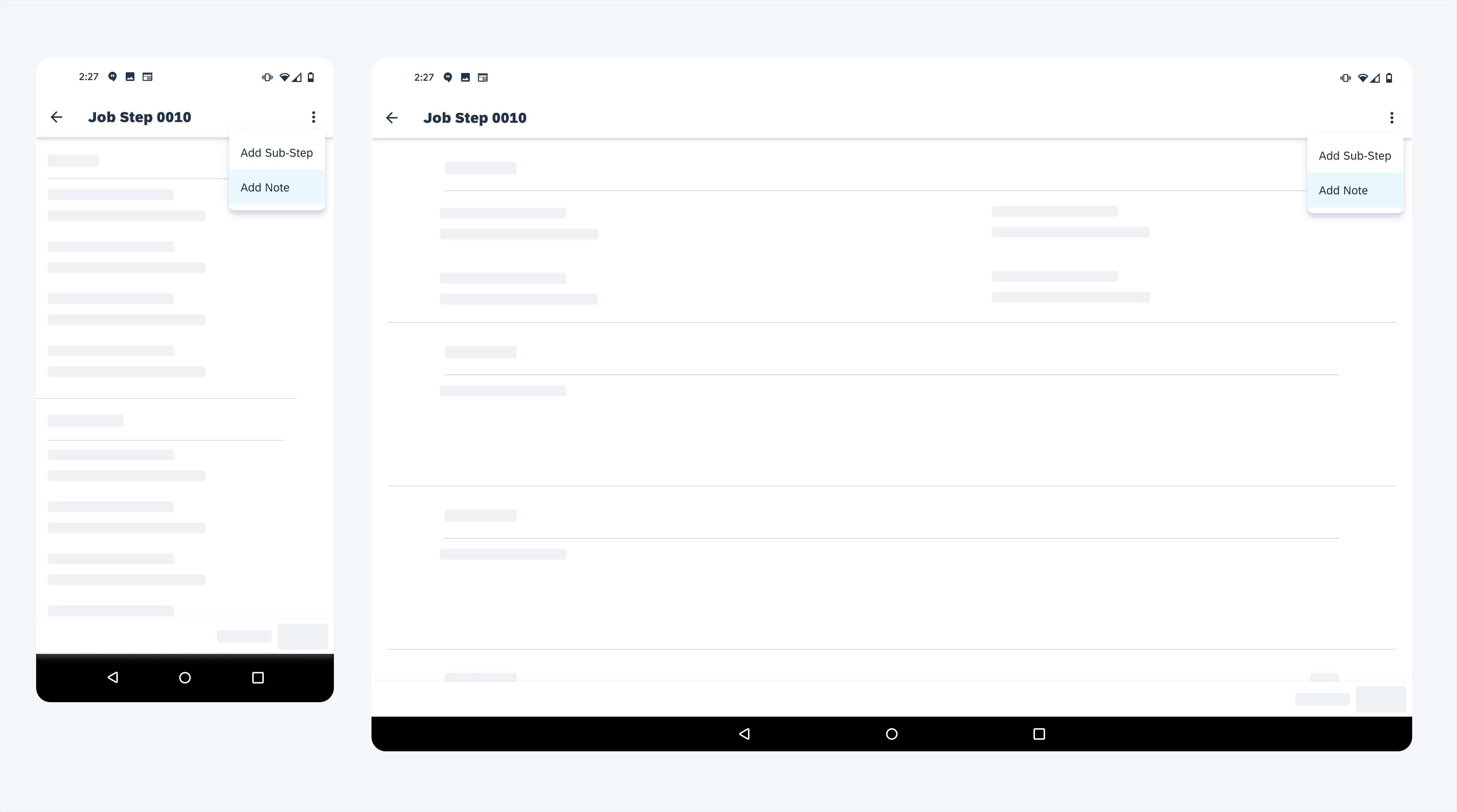
Menu on mobile (left) and tablet (right)
Variations
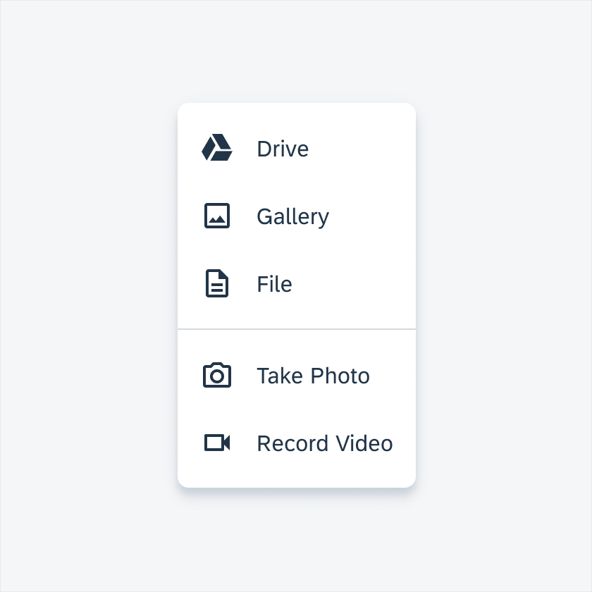
Menus display lists of related options (options may be grouped together with a divider) as well as unrelated options. They can contain a scrollbar and icons.
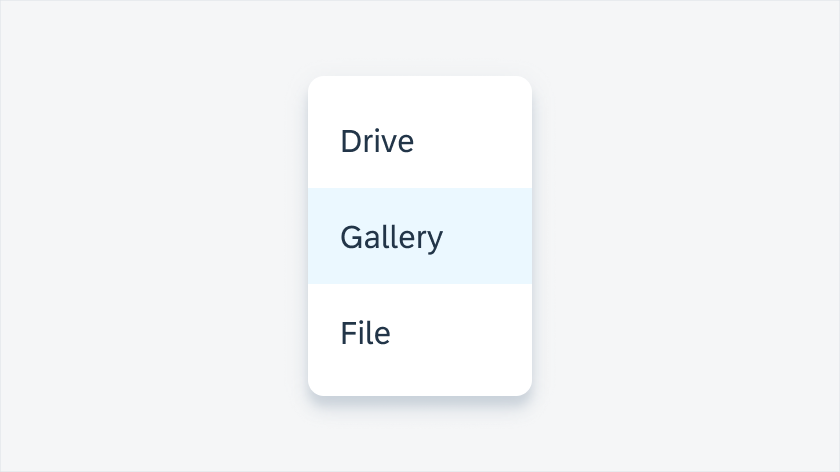
Menu with a Scrollbar
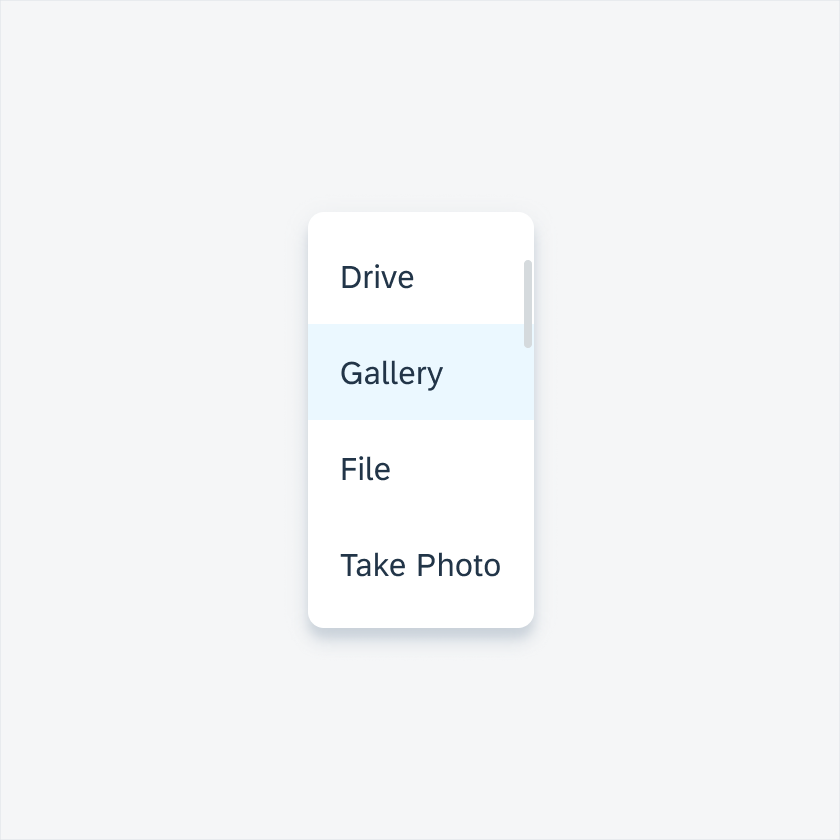
Menu with a selected item and a scrollbar
Menu With Icons
 Your feedback has been sent to the SAP Fiori design team.