
Layout
Intro
Layout utilizes several spatial practices, such as increments, paddings, vertical spacings, and window size classes. SAP Fiori for Android applies these practices to keep content aligned, organized, and accessible.
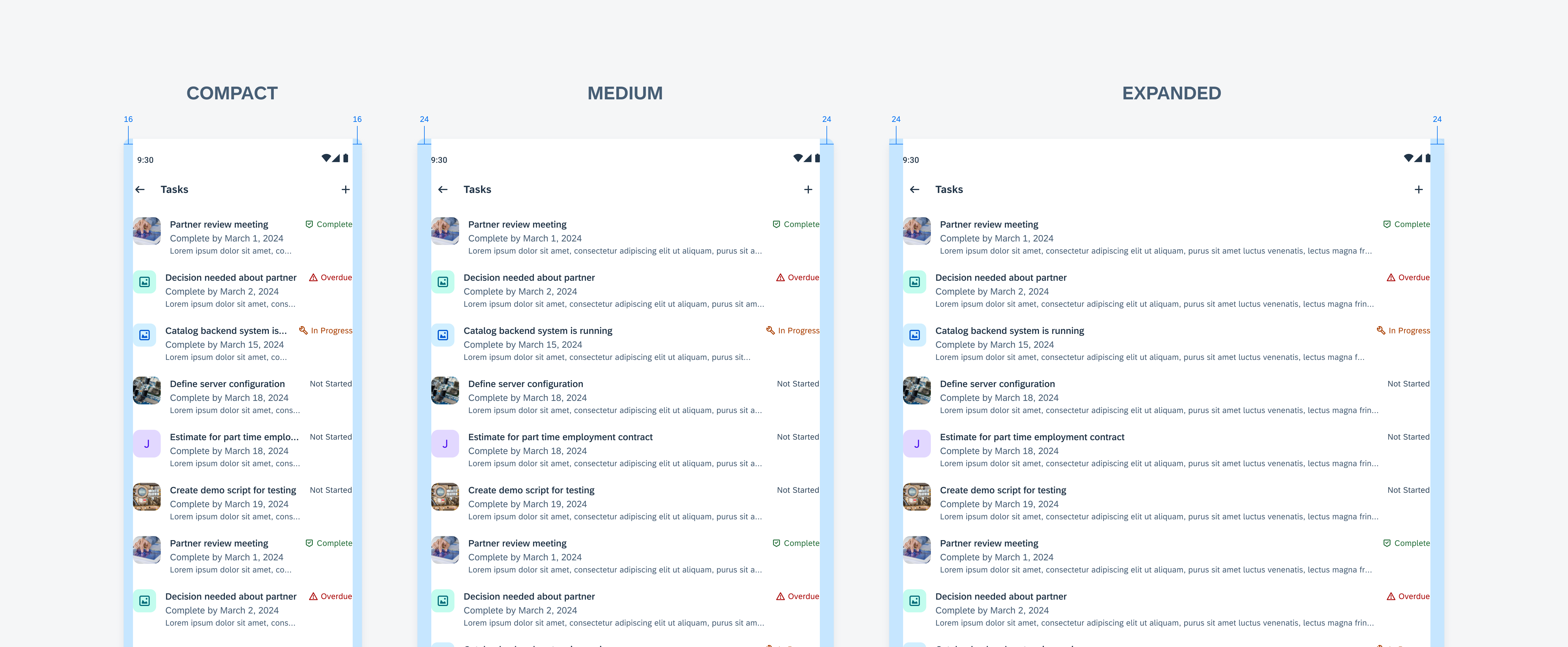
The same design for different layouts: compact (left), medium (middle) and expanded (right)
Density-Independent Pixels (dp)
SAP Fiori for Android uses a system of pixel units (dp) that allows for a design to scale to screens with different pixel densities. The UI therefore adapts to various device displays regardless of pixel density.
Increment System
SAP Fiori for Android layouts are designed in increments of 4dp and 8dp for smaller elements for scalability purposes. Using an incremental system allows for all measurements in a design to be predictable and easier to scale when designing on multiple devices.
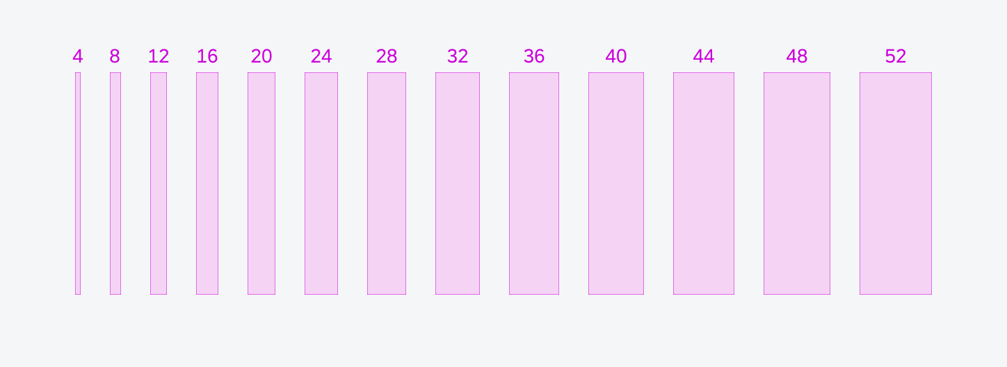
The 4dp/8dp incremental system enables a variety of spacing options from 4dp to 52dp.
Spacing
Margins
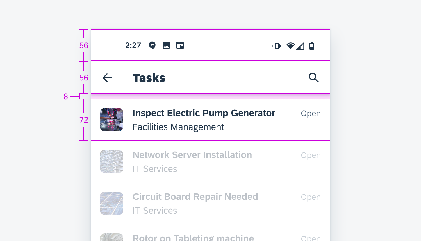
Margins are the spaces between the left/right window edge and the component. They are usually 16dp or 24dp depending on the window size.
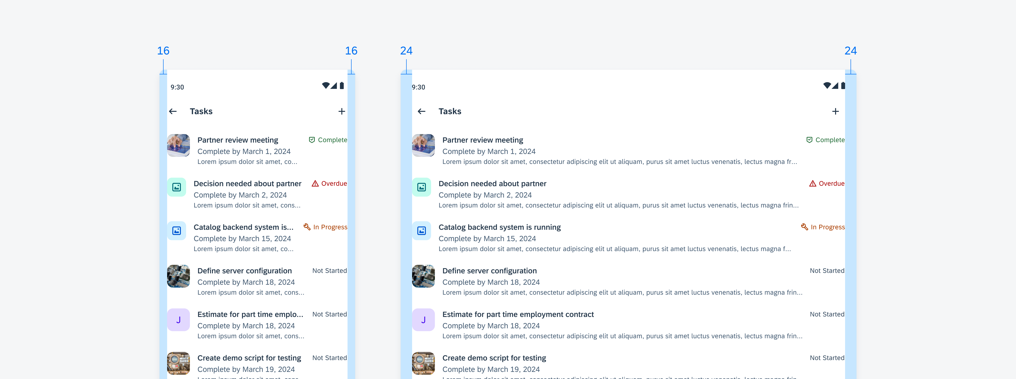
Compact app screens with 16dp margins (left) and medium/expanded app screens with 24dp margins (right)
Padding
Padding is the horizontal or vertical space between elements inside a component. Padding maintains consistency and allows for ease of scalability.
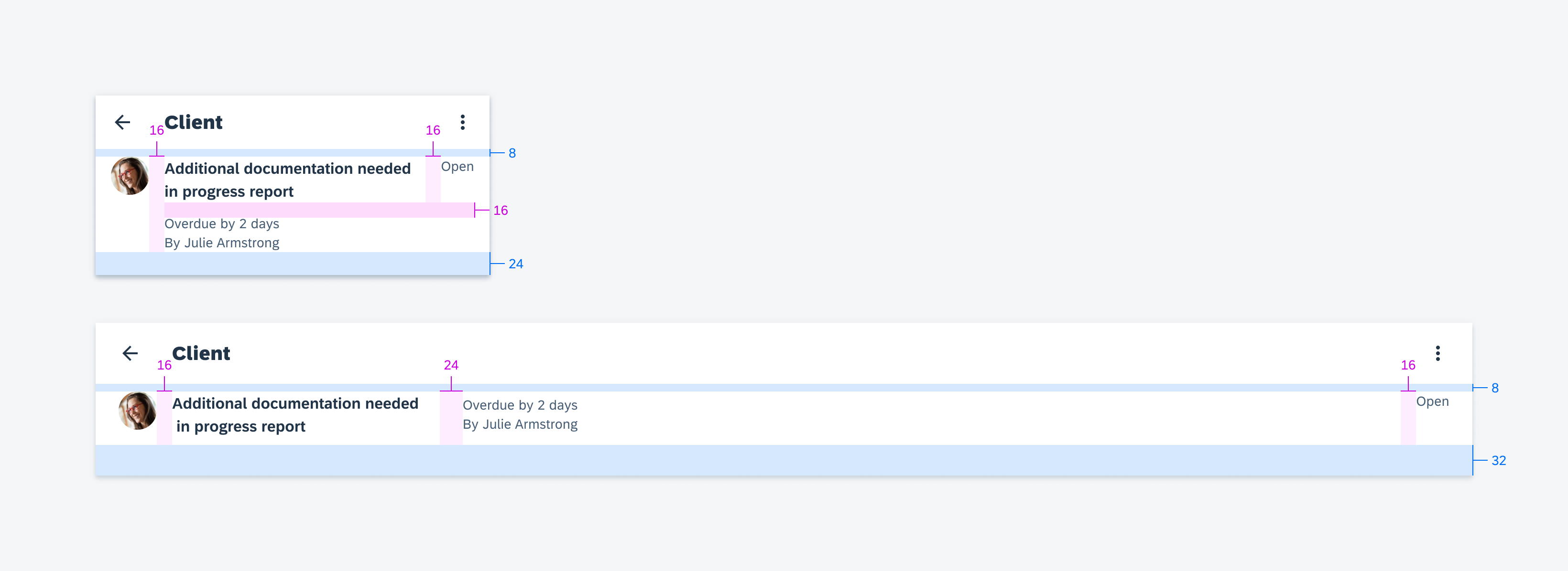
Specifications on compact (top) and medium/expanded screens (bottom)
Height
The height and spacing between the elements within a component should add up to an increment of 4dp. This height influences the overall vertical layout.
Component heights in increments of 4dp
Window Size Classes
Window size classes are recommended breakpoints that provide universal responsiveness regardless of the device types and sizes. The primary window size classes are based on the window width. Usually, these are the only variations for the responsive layouts.
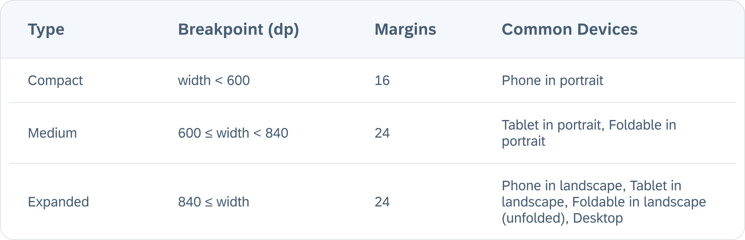
Breakpoints of window size classes based on the window width
The window margins are based on the window width. The compact class uses 16dp margins, while the medium and the expanded classes use 24dp margins.
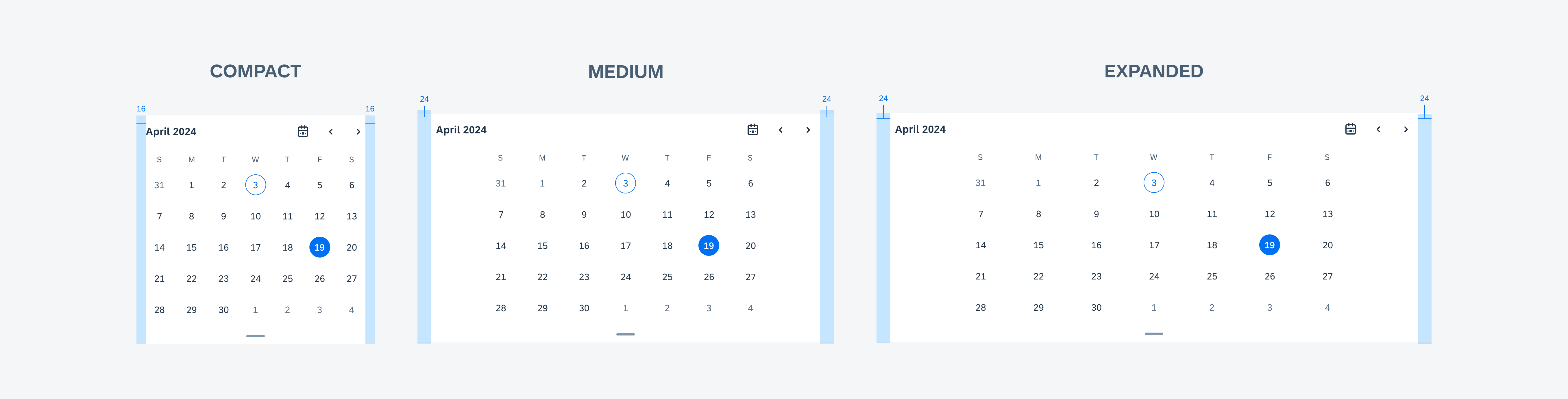
Window size classes based on width: calendar in compact (left), medium (middle), and expanded (right) size classes
In some rare cases when the component has constraints on both width and height, the secondary size classes based on the window height are introduced for more tailored experience.
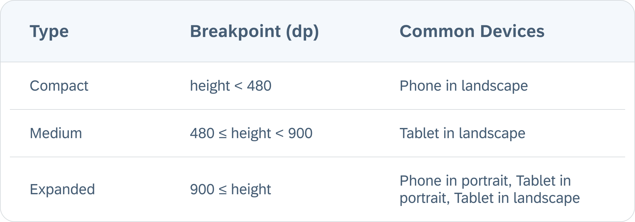
Breakpoints of window size classes based on the window height
For example, in medium/expanded window size class, the Sort & Filter pattern is displayed as a regular dialog, whereas in a compact height window, this regular dialog is translated to a full-page dialog to ensure enough space to scroll through the contents.
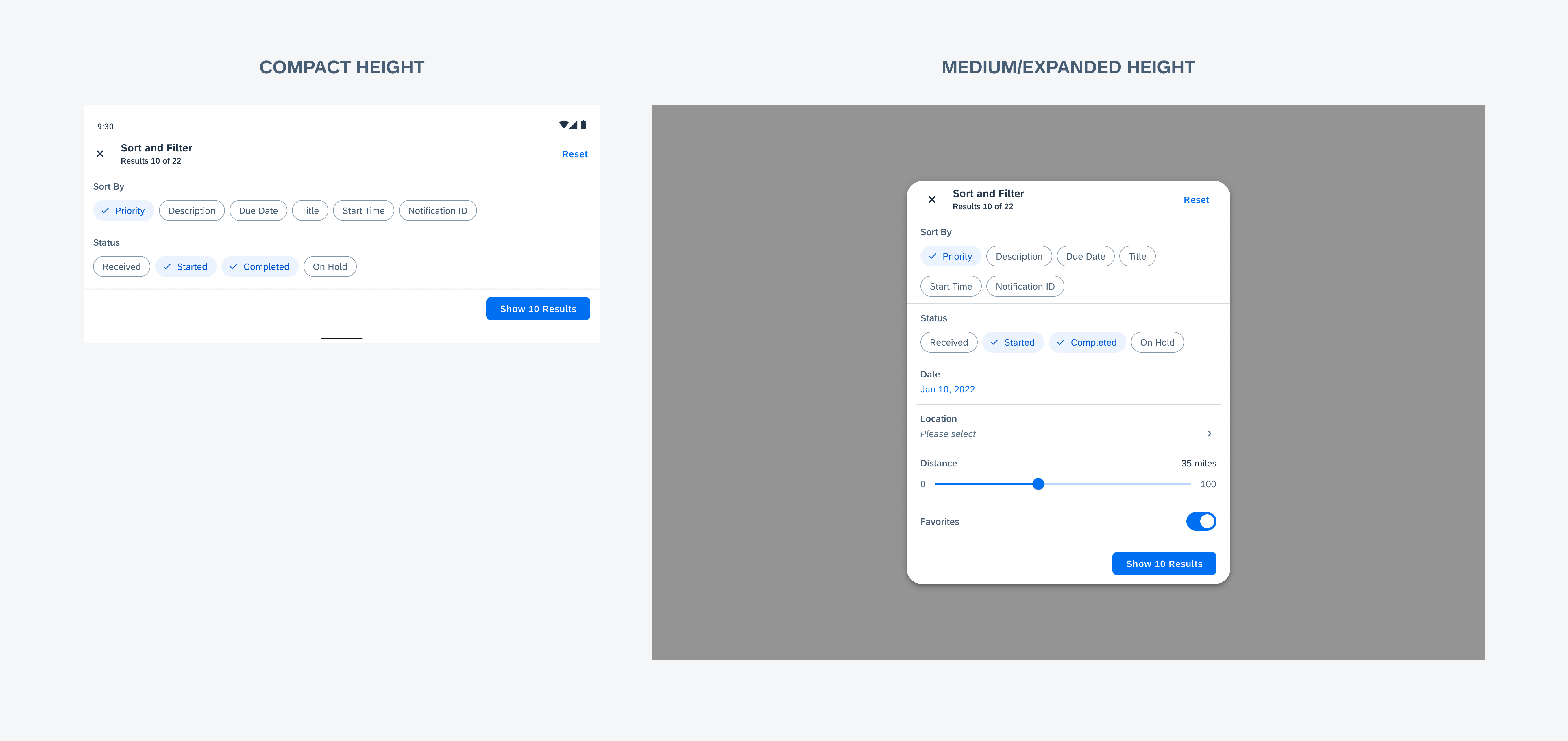
Window size classes based on the window height: sort & filter in compact (left), medium/expanded (right)
Touch Target
Consider accessibility when designing the spacing of interactive elements. Provide ample space to place elements and consider a minimum of 48dp x 48dp touch target with 8dp padding between multiple touch targets.
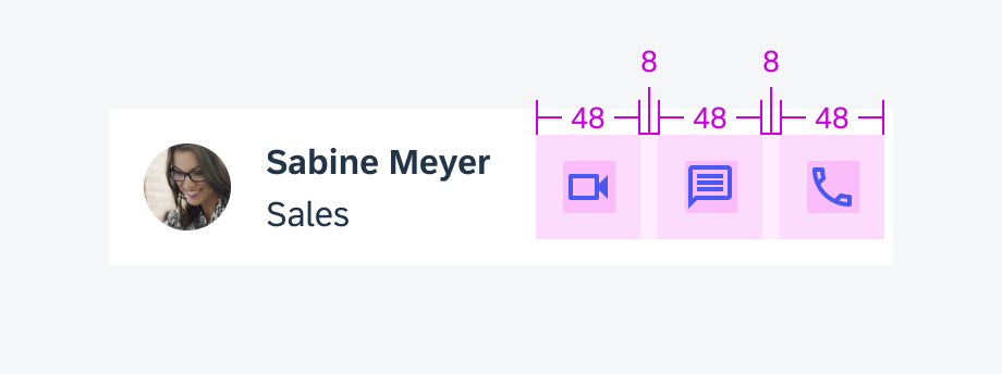
48dp x 48dp touch targets
Resources
Material Design 3: Understanding Layout, Applying Layout
 Your feedback has been sent to the SAP Fiori design team.