
Attachment Form Cell
Fiori: AttachmentFormCell
Intro
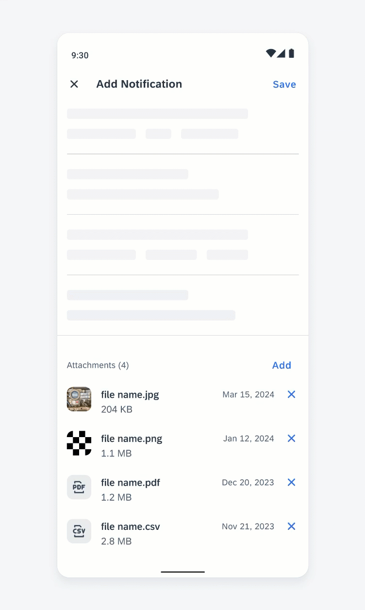
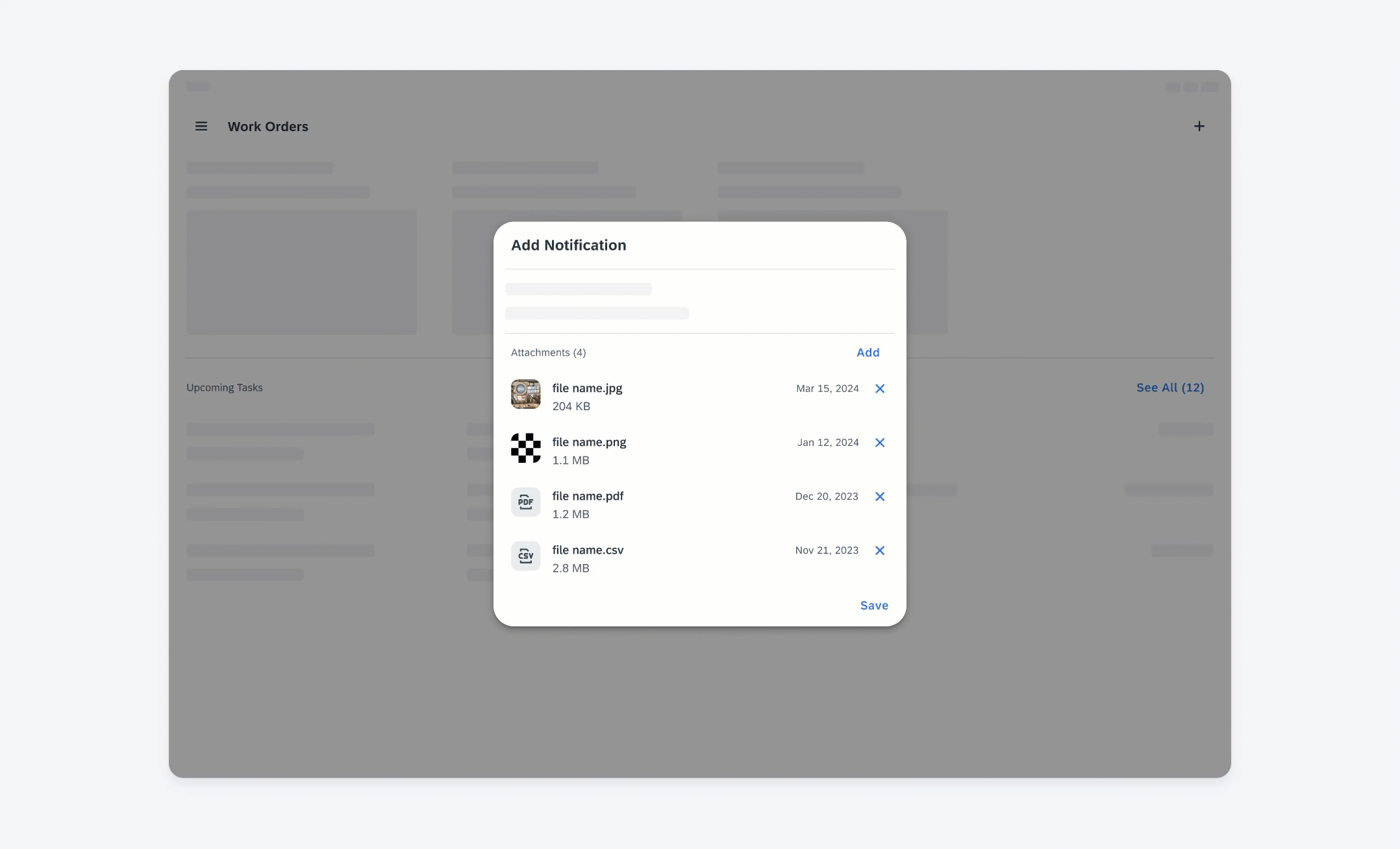
The attachment form cell is usually part of the create or editing work flow, located at the end of the form. All the attached files should be associated with a certain business object.
In general, users can only add/delete attachments in edit mode. After the changes have been saved, users can view the attached files in view mode, but can’t make any changes. This prevents users from accidentally making changes to attachments. It can also be used to give role-based access, as some users may not be allowed to edit.
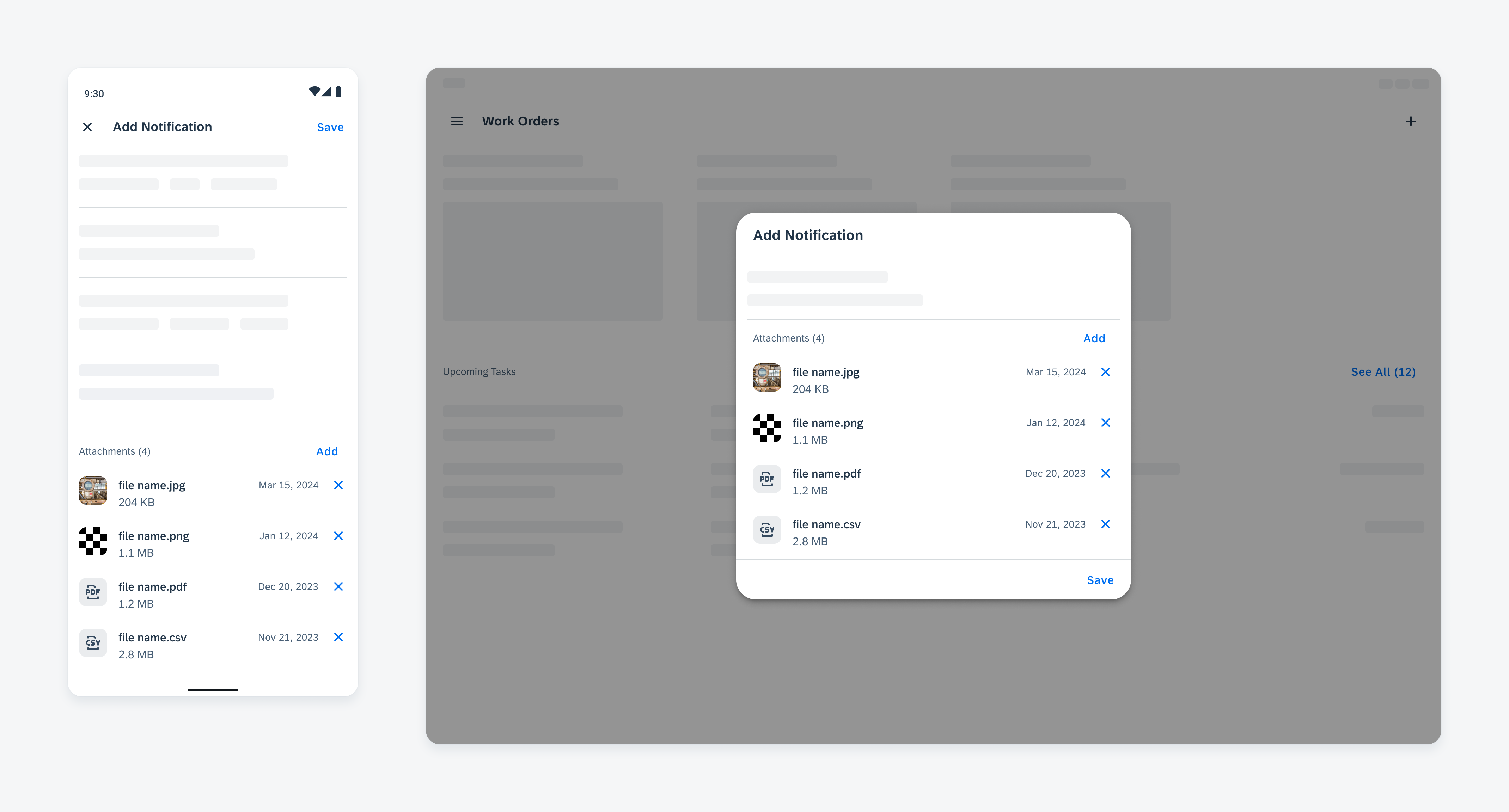
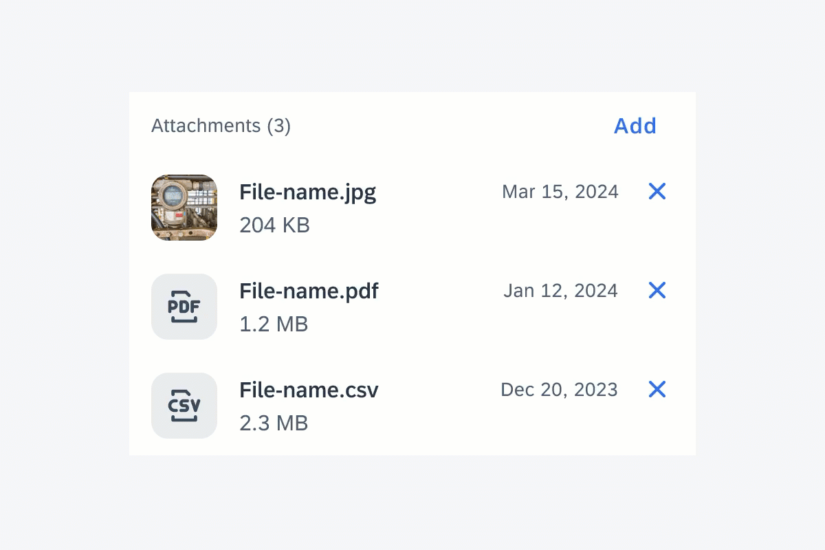
Adding attachments on compact (left) and medium and expanded screens (right)
Anatomy
Edit Mode
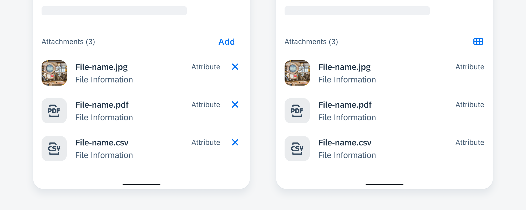
In edit mode, the attachment form cell consists of an attachment header and list of attached files
Attachment Header
A. Text Label
Text label shows the name of this section. Use “Attachments” as the default label. The label can be customized based on context. For example, in the process of creating an expense report, the attachment section can be labeled as “Receipts”.
B. Counter
This shows the number of attachments
C. “Add” Button
Tapping the “Add” button triggers the workflow of adding an attachment.
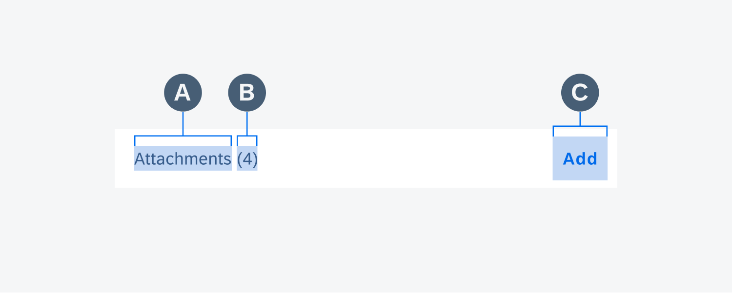
Anatomy of attachment headers in edit mode
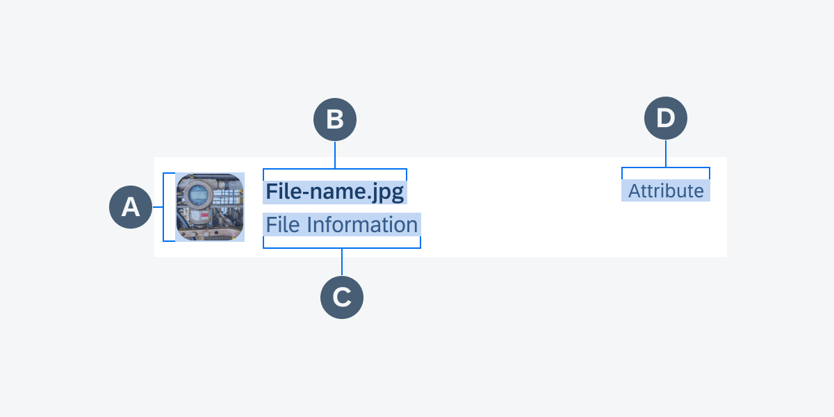
Attachment List
The attachment list shows the basic information of each attached item. Each list item consists of:
A. Thumbnail
Provides a preview image of the attached file when available; otherwise, display the icon for that file type.
B. File Name
A text string displays the file name with file type extension. The file name can wrap to two lines. If the name is longer than the allocated space, truncate it in the middle to keep the file type visible.
C. File Information (Optional)
The subheading can be used to display additional information such as file size or description.
D. Attribute (Optional)
The attribute can be used to display short bits of information such as a timestamp or file size.
Delete Icon
Tapping the “Delete” icon deletes the item directly.
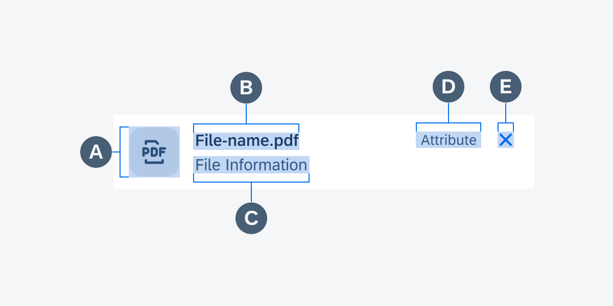
Anatomy of attachment lists in edit mode
View Mode
In view mode, attachments can be displayed in list view or grid view.
Attachment Header
The attachment header in view mode has the same structure as in edit mode, except replacing the “Add” button with view switcher icons.
A. Text Label
Text label shows the name of this section. Use “Attachments” as the default label. The label can be customized based on context. For example, in the process of creating an expense report, the attachment section can be labeled as “Receipts”.
B. Counter
The counter shows the number of attachments.
C. View Switcher Icon
This icon allows users to switch between the two type of views. Use the grid view icon when attachments are displayed in list view. Use the list view icon when attachments are displayed in grid view.
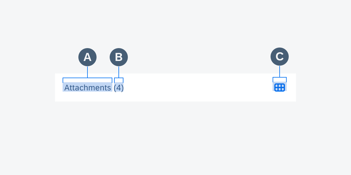
Anatomy of attachment headers in view mode
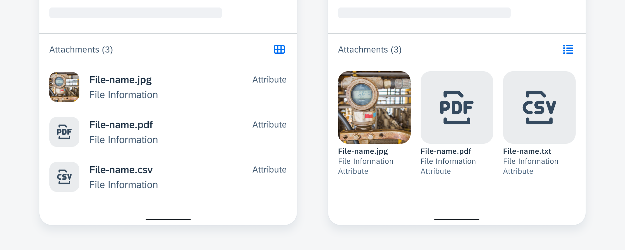
List View
In list view, each attached file is displayed as an object cell with:
A. Thumbnail
Provides a preview image of the attached file when available; otherwise, display the icon for that file type.
B. File Name
A text string displays file name with file type extension. The file name can wrap to two lines. If the name is longer than the allocated space, truncate it in the middle to keep the file type visible.
C. File Information (Optional)
The subheading can be used to display additional information such as file size or description.
D. Attribute (Optional)
The attribute can be used to display short bits of information such as a timestamp or file size.
Anatomy of attachment lists in view mode
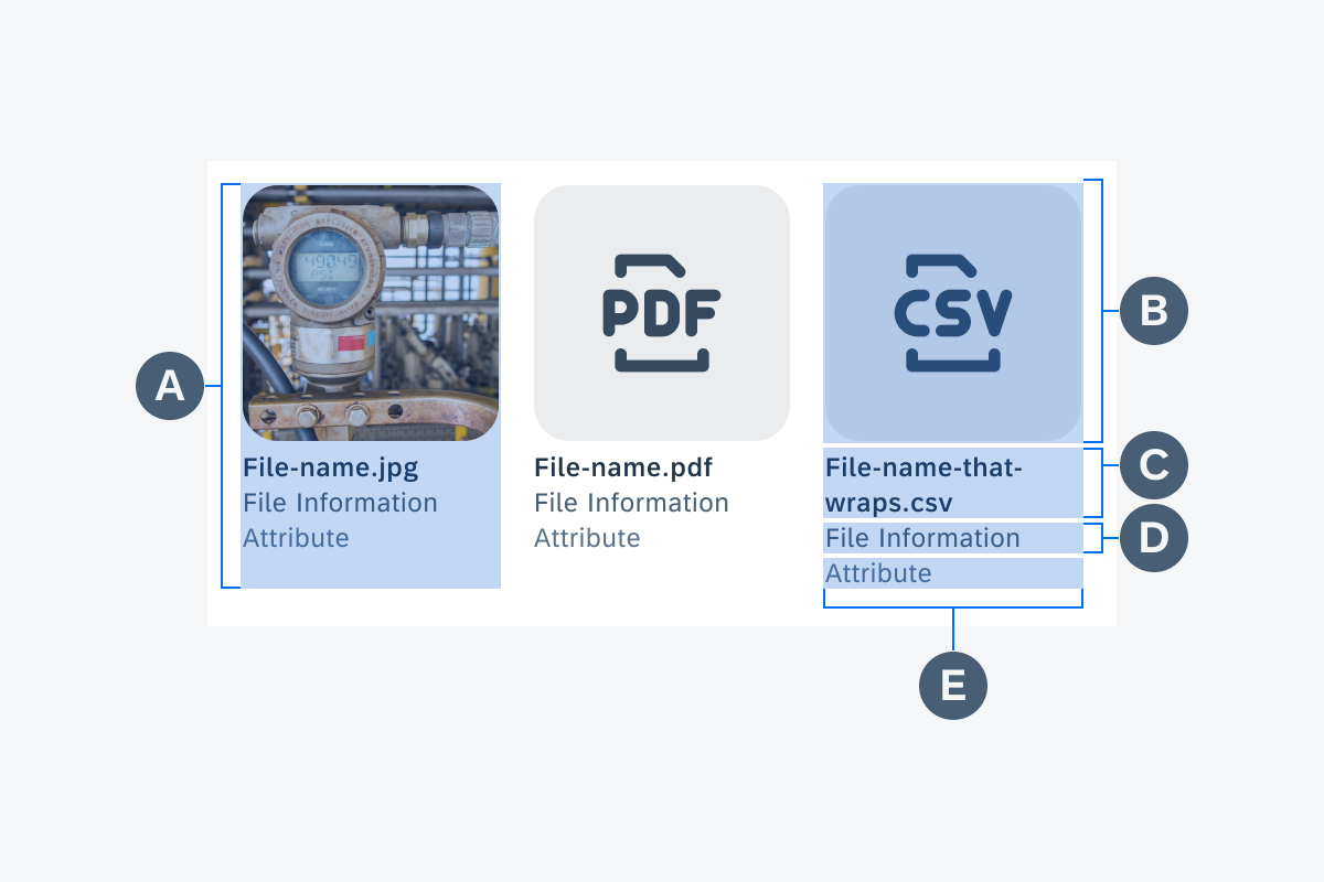
Grid View
In grid view, each attached file is displayed as an image cell:
A. Container
The attachment container defines the size and boundary of each cell and is scaling based on the screen size. All attachment items have the same width and height within an attachment form cell.
B. Thumbnail
Provides a preview image of the attached file when available; otherwise, display the icon for that file type.
C. File Name
The file name helps users identify the file. A text string displays the file name with file type extension. The file name can wrap to two lines.
D. File Information (Optional)
The subheading can be used to display additional information such as file size or description. One line is allocated for the file information, after which the text truncates.
E. Attribute (Optional)
The attribute can be used to display short bits of information such as a timestamp or file size.
Anatomy of attachments in grid view
Behavior and Interaction
To add an attachment, users have to tap on the “Add” button.
On compact screens, this triggers a bottom sheet, listing out all the possible ways to add a file supported by this app.
Opening a bottom sheet on a compact screen
On medium and expanded screens, a menu is used instead of bottom sheet.
Opening a menu on an expanded screen
Users select from the menu based on the location or type of file they want to add. The file selection process is powered by Android system’s default features. From here, users would be led to other apps, such as the camera app if they select “Take Photo”. The details of this process might differ based on device brand and system version.
After users confirm their selection, they are led back to the page where the add action was triggered. The newly added item is shown at the bottom of the list, and the number of attachments is updated.
Each cell has two touch targets: the “Delete” button, and outside the delete button. Users can directly delete one item by tapping the “Delete” button. Users can view the file by tapping outside the “Delete” button. The preview of the file is not handled inside the SAP Fiori app. It is handled by the Android system. Apps that support this file type would be launched to view the file.
Deleting an attachment from the list
When users have finished adding files and save the changes, the attachment section or the whole page switches to view mode. In general, there is a “Save” button for all objects in the edit/create workflow. In cases where the object is editable by default and changes are autosaved, the attachment component stays in editing mode all the time.
Edit mode (left) and view mode (right)
Based on the floorplan used in the app, the attachment list expands full-width within the content area.
Attachments are displayed in list view by default, users can use the grid view icon to switch to grid view. In certain contexts, the majority of attached files has preview images, such as attached photos, so consider making grid view the default view. No matter what the default view or what view the user is currently looking at, it becomes a list in edit mode.
 Your feedback has been sent to the SAP Fiori design team.