
Object Cell
FioriObjectCell
Intro
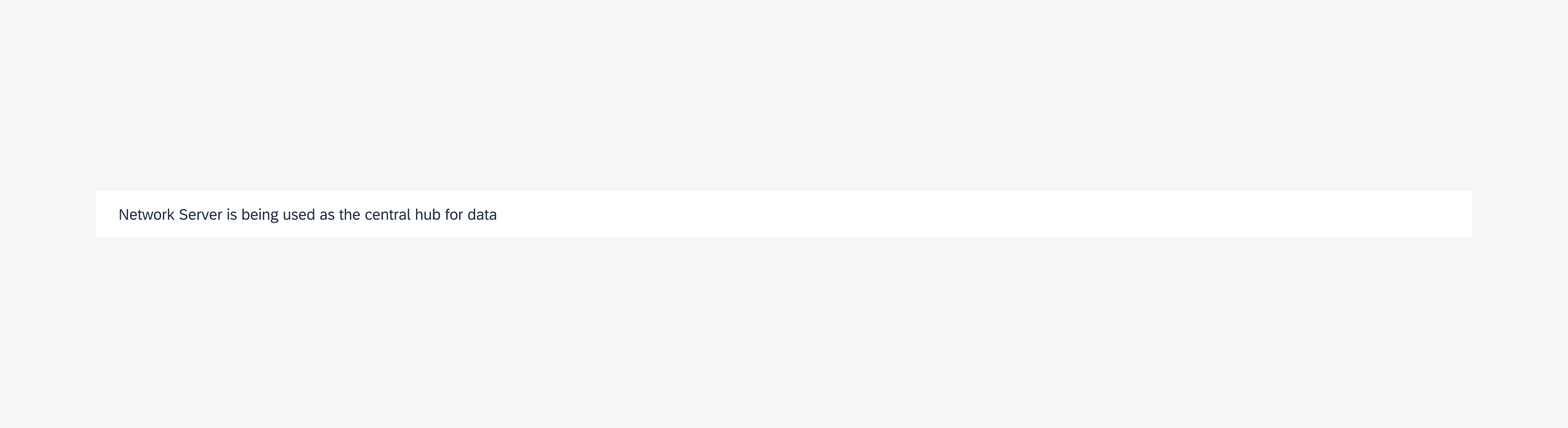
Object cells are made up of text, images, or icons. They can be configured in many ways to accommodate a wide variety of use cases.
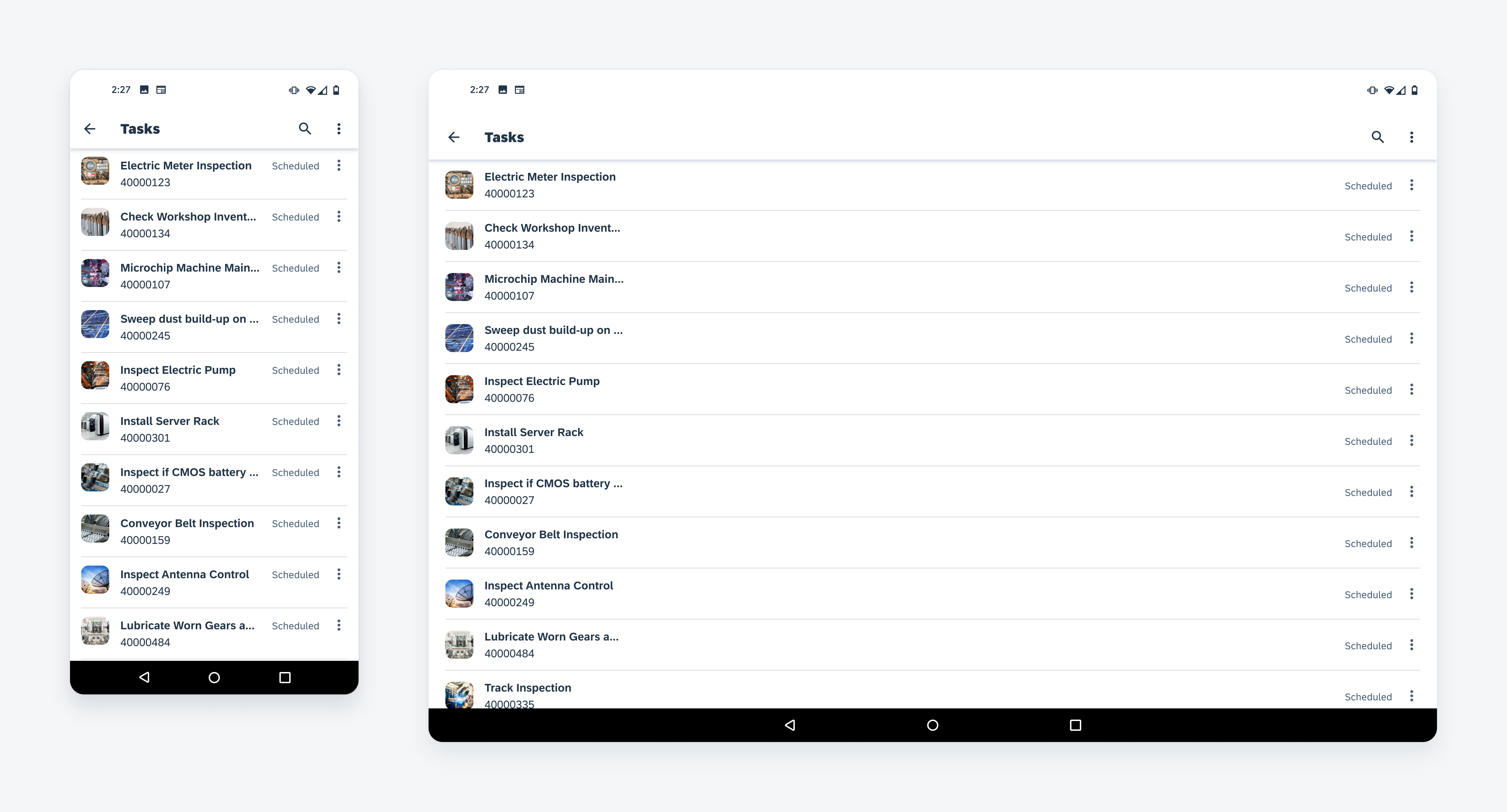
Object cell on mobile (left) and tablet (right)
Usage
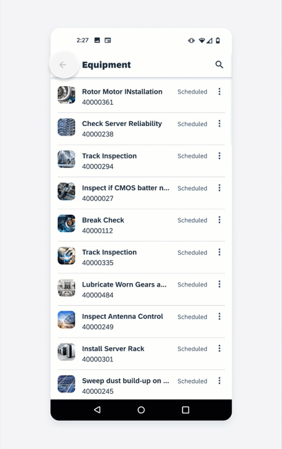
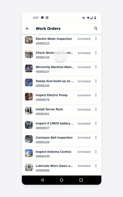
Use an object cell to preview information about an item in a list format.
Don’t use an object cell to compare attributes from different list items. Use a data table instead.
Anatomy
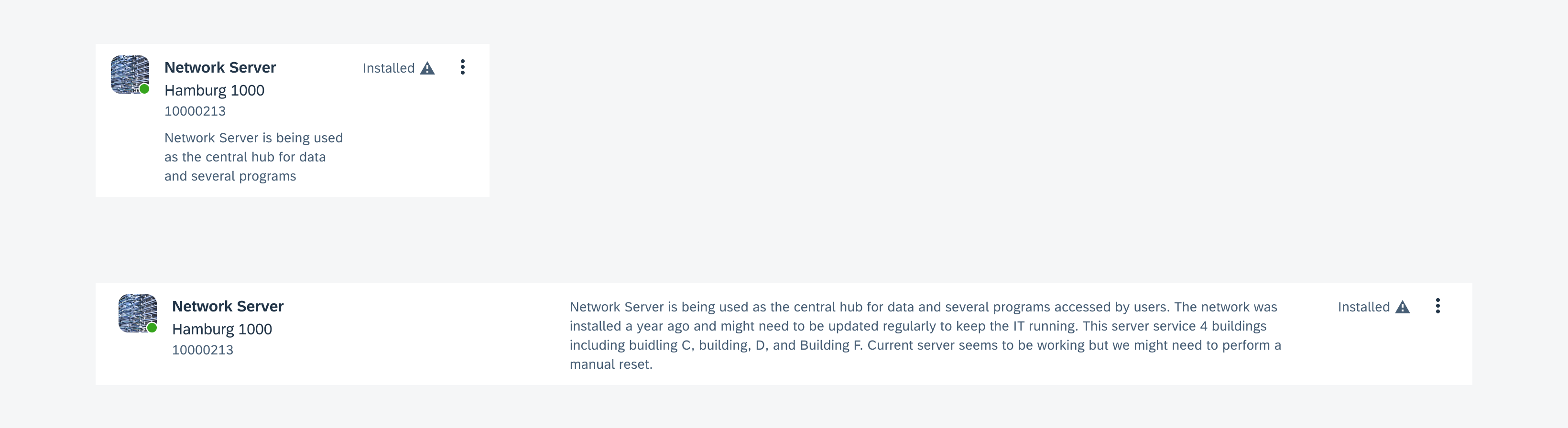
An object cell may contain text labels, images, or icons each with a specific purpose. These content types are structured in the following way and can be reconfigured, added or removed:
A. Container
The container holds all content types. The container height depends on the height of the tallest vertical element while the container width is defined by the view.
B. Numeric Label (Optional)
The numeric label is used to represent object cells in a numerical sequence. If used, the numeric label should display on all object cells within a list. The numeric label may also display icons below the numeric label. These icons may be used to indicate various aspects of the object.
C. Image (Optional)
An image provides a visual representation of the object within a 40dp frame. The image may have a square or circular frame depending on the type of object that the object cell represents. If the object cell represents a user, use a circular frame. If the object cell represents an object, use a squared frame.
D. Title Area
The title area is used to place the main text content related to the object. The title area is limited to three lines of text, (title, subtitle, and caption) and is the only mandatory content for the object cell.
E. Tags (Optional)
Tags are identifiers that can be added to objects such as categories, groupings, or categorizations. Tags should be concise. When using tags, maintain wording to a maximum of two words.
F. Avatar Row (Optional)
An avatar row is a collection of inline user images that indicate a group of users associated with the object. Use an avatar row to indicate users in a meeting, users assigned to a task, or users in a message thread.
G. Description (Optional)
A description is used to provide supplementary information relating to the object. The description label can wrap up to three lines and will truncate after that.
H. Attribute (Optional)
An attribute is a vertically stacked arrangement consisting of labels and/or icon types that are displayed towards the right. The icons or labels can be used to indicate a condition of the item such as its priority or status.
I. Actions Area (Optional)
An actions area is used to place secondary actions in addition to the primary act of drilling down. Secondary actions include but are not limited to Information disclosure, Download, or a More menu.
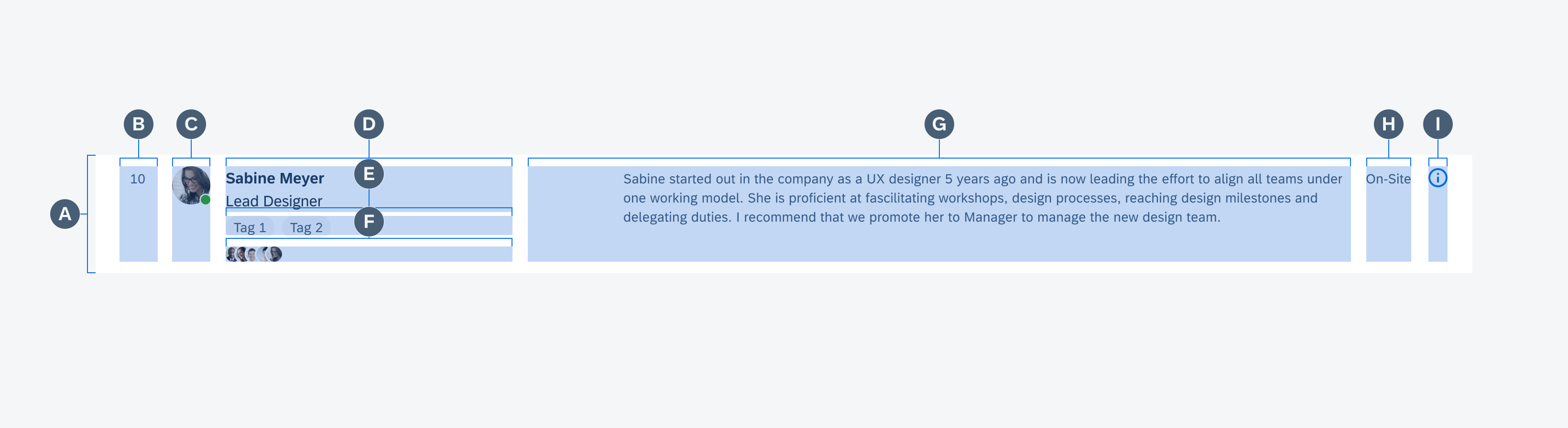
Anatomy of the object cell
Behavior and Interaction
The following are behaviors found throughout all object cells. These behaviors can be enabled or disabled depending on the app’s needs.
Drill-Down
As the most basic interaction model, the object cell uses drill down to navigate to another page.
Navigating to another page using drill down
Selection Mode
The selection mode is activated via the edit icon and allows users to select multiple or all object cells within a list. When in selection mode, a checkbox control will transition from the left side of the screen while the default app bar actions transform into actions relevant to the user’s task.

Selecting items within a list
Swipe
Secondary actions can also be hidden and are activated by either swiping left or right. Different types of actions can be determined by an app’s needs such as delete, mark as favorite, pin, or archive.
Deleting an item with a swipe action
Adaptive Design
The object cell is supported in both mobile and tablet devices. All content types are supported in both device sizes (i.e. Description is now supported in mobile).
Object cell on mobile (left) and tablet (right)
Variations
Different variations of the object cell can be created by reconfiguring different content types. Moving in this modular approach allows it to cover simple as well as complex requirements.
Navigation
As the most basic configuration, this variation’s primary function is to navigate to a specific page. This variation consists only of the container and the title area.
Single-line object cell used to navigate to a specific page
Preview
The most common variation is used to preview information of an object and navigate to view the entirety of the object, usually as an object page. This variation consists of but is not limited to a container, image, title area, and description.
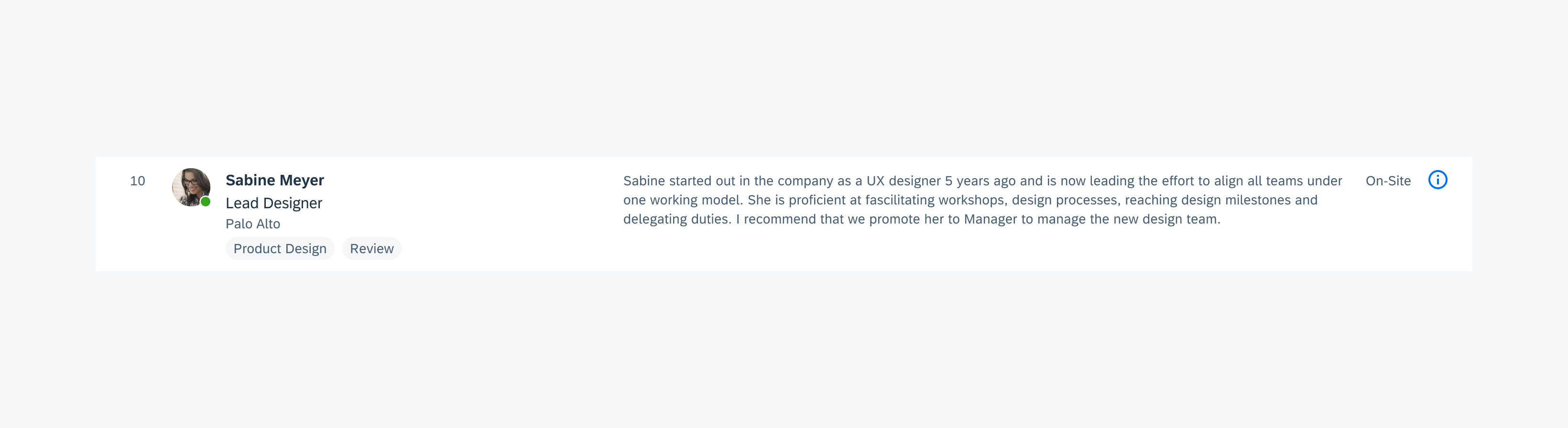
Three-line object cell used to surface an object's detail
Contact
The contact variation is similar to the preview variation but provides quick access to various methods of communicating with a contact. This variation consists of but is not limited to a container, image, title area, and actions.
See Contact Cell for more information.
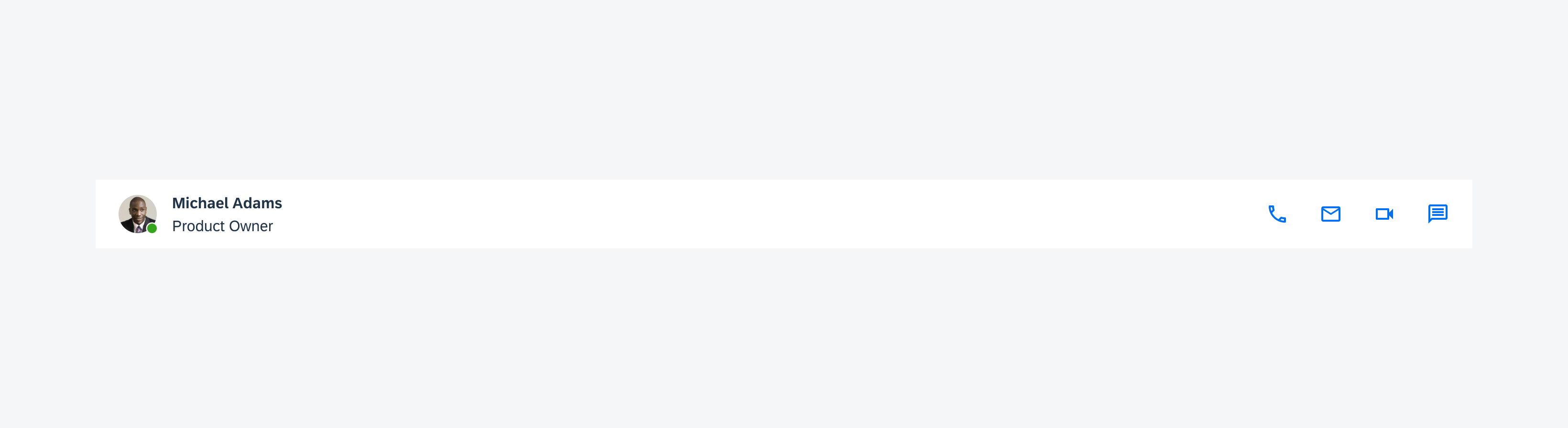
A two-line object cell with multiple inline actions on the right
Control
The control variation displays information and controls. This variation consists of a container, text area, and control. The controls that can be used in this variation are a radio button and a checkbox.
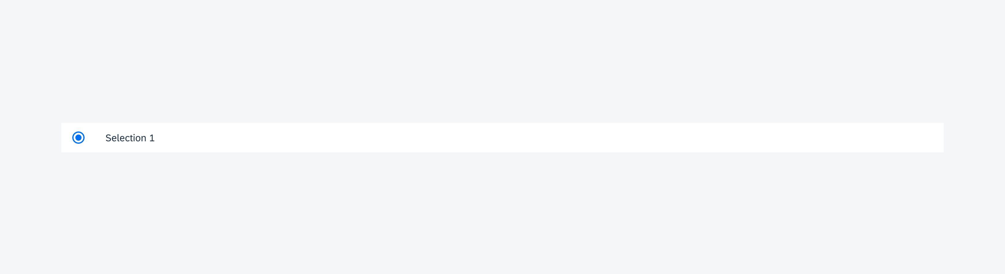
A single-line object cell with a radio button on the left
Resources
Development: FioriObjectCell, ObjectCell, GridObjectCell, GridTableRow, ContactCell
SAP Fiori for iOS: Object Cell
Material Design: Lists
Related Components/Patterns: Checkbox, Radio Button, Card Cell
 Your feedback has been sent to the SAP Fiori design team.