
Colors
Intro
Color sets the visual balance of SAP Fiori for Android apps. On screen, color is used to define the visual hierarchy of UI elements and to direct the user’s attention to complete their tasks.
Horizon Theme Color Palette
The Horizon color palette introduces a unified color palette that brings our brand and products together to achieve a cohesive experience across all SAP touchpoints. The Horizon color palette is designed to provide bold and vibrant color while remaining accessible in instances with complex UIs.
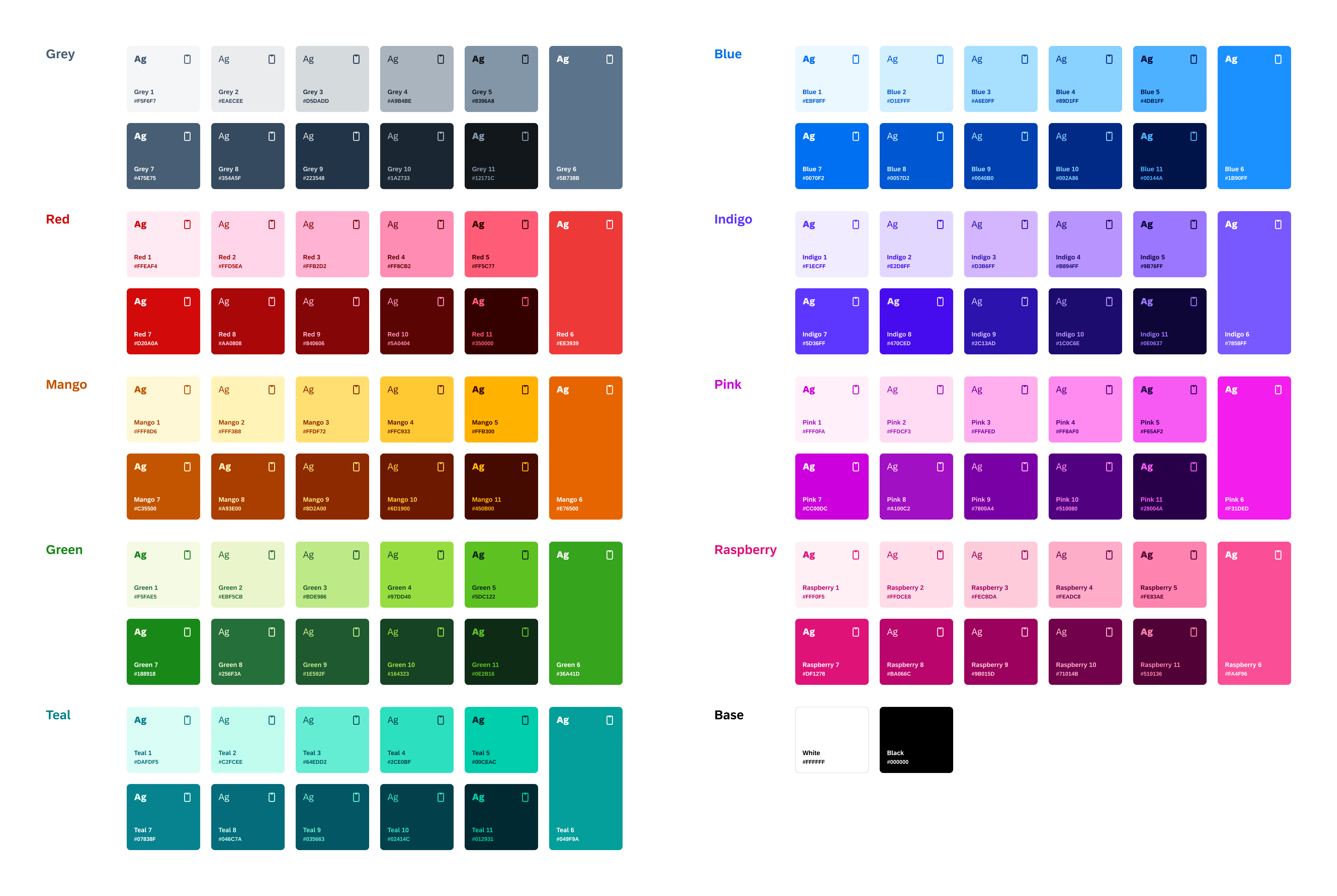
Horizon color palette
UI Colors
UI colors are colors that are grouped based on their role or usage within the UI. This additional level of abstraction allows product teams to swap out the default Horizon theme with their own product colors. UI colors are grouped into the following color groups:
- Surface colors
- Text colors
- Borders colors
- Semantic colors
- Accent colors
Surface Colors
Surface colors are colors applied to the background of all components. These colors contrast with all foreground colors and are the basis for the overall theme. Surface colors are identified by the letter S followed by a number sequence (e.g., S1, S2, S3) in our UI Kit.
| Light Mode | Dark Mode | Name | Usage | ||
|
Base White
#FFFFFF |
Base Dark
#14171A |
S0-Background | Base Background (0dp) |
Base White
#FFFFFF |
Base Dark with Overlay
Overlay: #7198BF |
S1-Primary | Elevated Surfaces (1dp-24dp) |
|
Blue 7
#0070F2 |
Blue 5
#4DB1FF |
S2-Secondary | Call-to-Action Elements | ||
|
Grey 11
#12171C |
Base White
#FFFFFF |
S3-Tertiary | Snackbar Background | ||
|
Grey 1
#F5F6F7 |
Grey 6
#5B738B, 20% |
S4-Quarternary | Muted Backgrounds | ||
|
Blue 7
#0070F2, 8% |
Blue 5
#4DB1FF, 20% |
S5-Selected Surface | Selected Backgrounds | ||
|
Base White
#FFFFFF |
Base Dark with Overlay
Overlay: #7198BF |
S6-Header | Header Background | ||
|
Grey 6
#5B738B |
Grey 4
#A9B4BE |
S7-Switch | Idle Switch Backgrounds | ||
|
Grey 7
#475E75 |
Grey 3
#D5DADD |
S8-Switch Selected | Selected Switch Backgrounds | ||
Text Colors
Text colors are colors applied to the text and icons of all components. These colors range from neutral grey colors to interactive brand colors applied to text and icons. Text colors are identified by the letter T followed by a number sequence (e.g., T1, T2, T3).
| Light Mode | Dark Mode | Name | Usage | ||||
|
Grey 9
#223548 |
Grey 1
#F5F6F7 |
T1-Main on Primary | Titles, Subtitles |
Grey 7
#475E75 |
Grey 3
#D5DADD |
T2-Support on Primary | Body Text, Caption |
|
Grey 6
#5B738B |
Grey 4
#A9B4BE |
T3-Minor on Primary | Muted Text, Placeholder Text | ||||
|
Blue 7
#0070F2 |
Blue 5
#4DB1FF |
T4-CTA on Primary | Tinted Text, Links, Interactive Icons | ||||
|
Base White
#FFFFFF |
Grey 11
#12171C |
T5-Main on Secondary | Text on S2-Secondary | ||||
|
Blue 5
#4DB1FF |
Blue 7
#0070F2 |
T6-Main on Tertiary | Text on S3-Tertiary | ||||
|
Blue 8
#0057D2 |
Blue 4
#89D1FF |
T7-Selected Text | Selected Text on S5-Selected Surface | ||||
|
Grey 9
#223548 |
Grey 1
#F5F6F7 |
T8-Main on Header | Titles, Subtitles on Header | ||||
|
Grey 7
#475E75 |
Grey 3
#D5DADD |
T9-Secondary on Header | Body Text, Caption on Header | ||||
|
Grey 6
#5B738B |
Grey 4
#A9B4BE |
T10-Tertiary on Header | Muted Text, Placeholder Text on Header | ||||
|
Blue 7
#0070F2 |
Blue 5
#4DB1FF |
T11 - CTA on Header | Tinted Text, Links, Interactive Icons on Header | ||||
Border Colors
Border colors are applied to any linear elements such as dividers or graphical elements used to define any areas within components. These colors range from neutral grey colors to interactive brand colors often used to communicate the state of a certain part of a component. Border colors are identified by the letter B followed by a number sequence (e.g., B1, B2, B3).
| Light Mode | Dark Mode | Name | Usage | ||
|
Grey 3
#D5DADD |
Grey 6
#5B738B 50% |
B1-Section Divider | Divider Lines |
Grey 5
#8396A8 |
Grey 5
#8396A8 |
B2-Default Border | Text Field Borders |
|
Blue 7
#0070F2 |
Blue 5
#4DB1FF |
B3-Selected Border | Selected Text Field Borders | ||
|
Blue 7
#0070F2, 28% |
Blue 5
#4DB1FF, 36% |
B4-Light Selected Border | Transparent Selected Borders | ||
|
Grey 6
#5B738B |
Grey 4
#A9B4BE |
B5-Border Switch | Idle Switch Borders | ||
Semantic Colors
Semantic colors are applied to any foreground or background elements such as text, icons, or backgrounds to communicate a component’s status, state, or level of priority. These colors are bright in hue to direct the user’s attention to a certain component or part of the UI. Semantic colors are identified by the following naming (e.g., negative label, critical label, positive label, and neutral label).
| Light Mode | Dark Mode | Name | Usage | ||
|
Red 7
#D20A0A |
Red 5
#FF5C77 |
Negative Label | Semantic Label |
Mango 7
#C35500 |
Mango 5
#FFB300 |
Critical Label | Semantic Label |
|
Green 7
#188918 |
Green 5
#5DC122 |
Positive Label | Semantic Label | ||
|
Blue 7
#0070F2 |
Blue 5
#4DB1FF |
Informative Label | Semantic Label | ||
|
Grey 7
#5B738B |
Grey 5
#A9B4BE |
Neutral Label | Semantic Label | ||
|
Red 6
#EE3939, 8% |
Red 6
#EE3939, 12% |
Negative Background | Semantic Background | ||
|
Mango 6
#E76500, 8% |
Mango 6
#E76500, 12% |
Critical Background | Semantic Background | ||
|
Green 6
#36A41D, 8% |
Green 6
#36A41D, 12% |
Positive Background | Semantic Background | ||
|
Blue 6
#1B90FF, 8% |
Blue 6
#1B90FF, 12% |
Informational Background | Semantic Background | ||
|
Grey 6
#5B738B, 8% |
Grey 6
#5B738B, 12% |
Neutral Background | Semantic Background | ||
Accent Colors
Accent colors provide an additional level of color luminance and are used to accent areas of the UI such as avatars, icons, and decorative areas. These colors are bright in hue and provide visual variety to the UI. Accent colors are identified by the word “Accent” followed by a number sequence (e.g., Accent 1, Accent 2, Accent 3).
| Light Mode | Dark Mode | Name | |||
|
Mango 8
#A93E00 |
Mango 3
#FFDF72 |
Accent Label 1 | |||
|
Red 8
#AA0808 |
Red 3
#FFB2D2 |
Accent Label 2 | |||
|
Raspberry 8
#BA066C |
Raspberry 3
#FECBDA |
Accent Label 3 | |||
|
Pink 8
#A100C2 |
Pink 3
#FFAFED |
Accent Label 4 | |||
|
Indigo 8
#470CED |
Indigo 3
#D3B6FF |
Accent Label 5 | |||
|
Blue 8
#0057D2 |
Blue 3
#A6E0FF |
Accent Label 6 | |||
|
Teal 8
#046C7A |
Teal 3
#64EDD2 |
Accent Label 7 | |||
|
Green 8
#256F3A |
Green 3
#BDE986 |
Accent Label 8 | |||
|
Grey 8
#354A5F |
Grey 3
#D5DADD |
Accent Label 9 | |||
|
Mango 2
#FFF3B8 |
Mango 9
#8D2A00 |
Accent Background 1 | |||
|
Red 2
#FFD5EA |
Red 4
#840606 |
Accent Background 2 | |||
|
Raspberry 2
#FFDCE8 |
Raspberry 3
#9B015D |
Accent Background 3 | |||
|
Pink 2
#FFDCF3 |
Pink 3
#7800A4 |
Accent Background 4 | |||
|
Indigo 2
#E2D8FF |
Indigo 3
#2C13AD |
Accent Background 5 | |||
|
Blue 2
#D1EFFF |
Blue 2
#0040B0 |
Accent Background 6 | |||
|
Teal 2
#C2FCEE |
Teal 3
#035663 |
Accent Background 7 | |||
|
Green 2
#EBF5CB |
Green 3
#1E592F |
Accent Background 8 | |||
|
Grey 2
#EAECEE |
Grey 3
#223548 |
Accent Background 9 | |||
Accessibility
The Horizon theme color palette offers color mapping logic that is easy to understand. It introduces eleven tonal values across nine color hues of vibrant and bold color. Our Horizon theme color palette ensures that color combinations comply with WCAG accessibility standards.
For more information, see Accessibility.
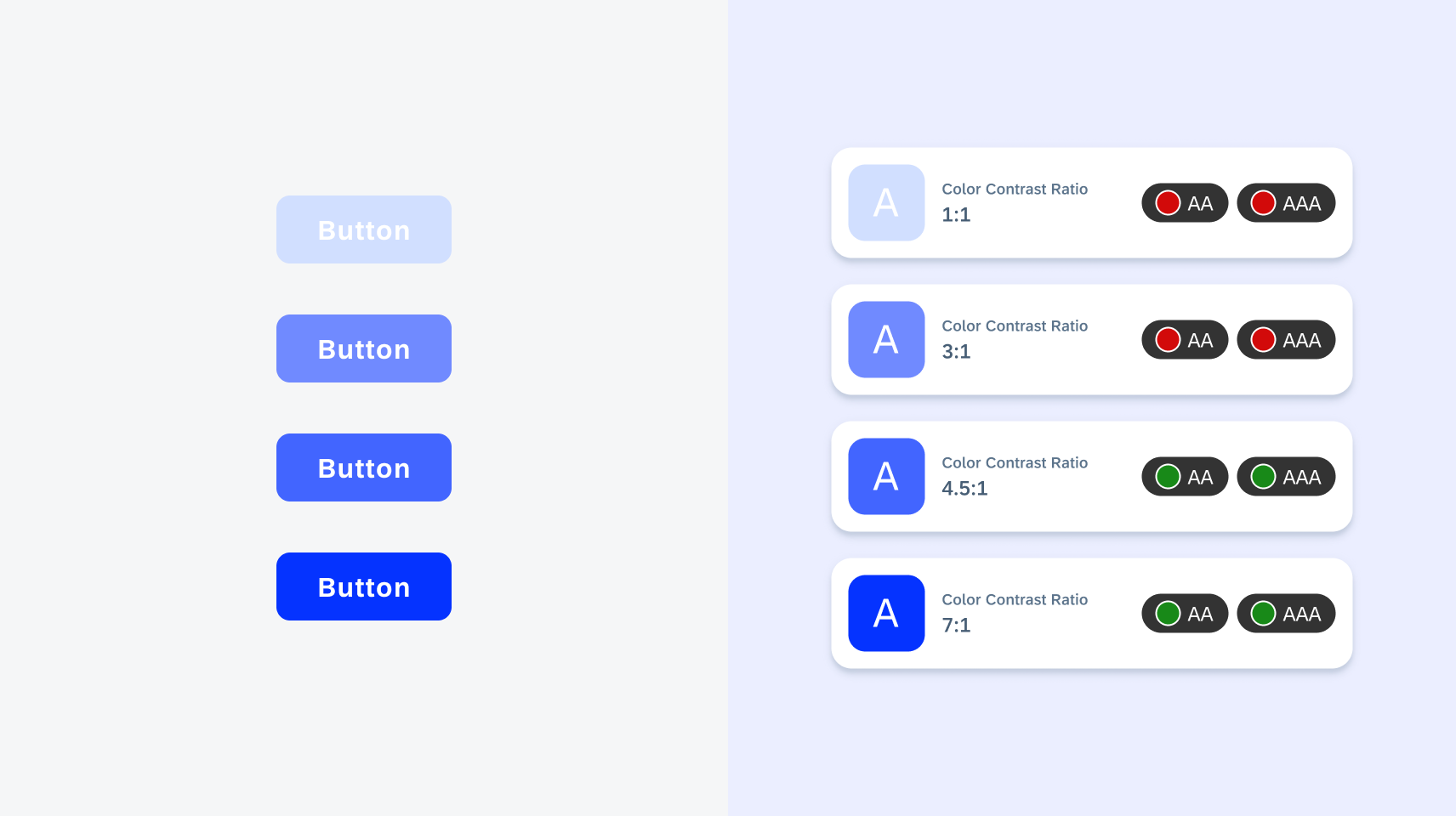
Color contrast ratio scale
Elevation
Elevation plays a key role in the Horizon theme color palette. In light mode, the drop shadow represents the elevation of the components. However, in dark mode, elevated components are differentiated by changes in tone to mimic a range of depth. At lower elevations, the surface tone is darker, while at higher elevations the tone is lighter. Refer to the following table to understand elevation.
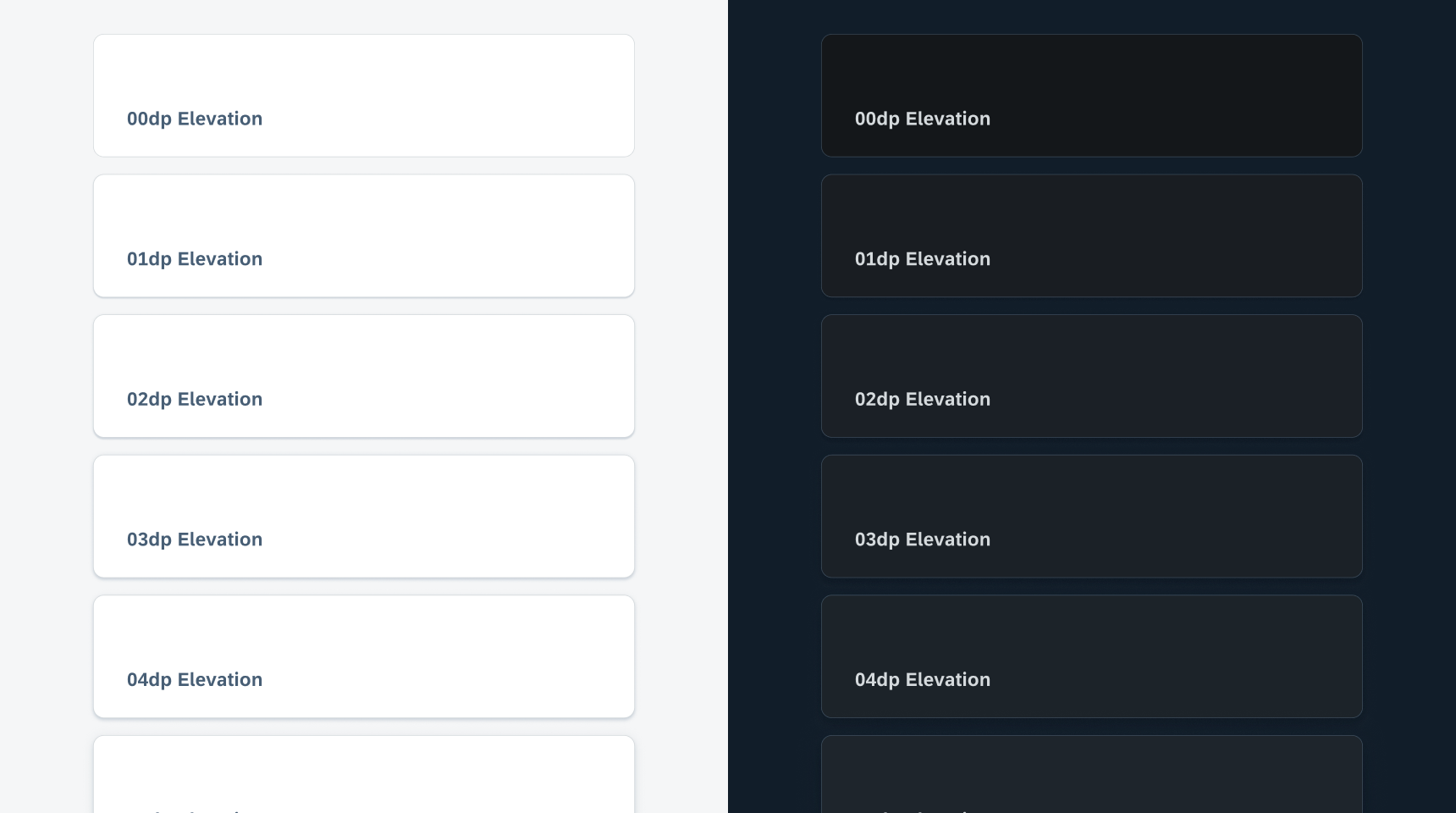
Light and dark theme elevation scale
Themes
The Android design system includes systemwide appearance settings for light and dark modes which use color consistently and sparingly.
Light Mode
Light mode is the default mode for the Android design system. Light mode is a bright UI that displays dark grey foreground elements and saturated accent colors against light surfaces. In light mode, neutral colors are used to make content readable, and accent colors are used sparingly to call attention to important information or show the relationship between parts of the interface. Lastly, light mode is best used in bright environments where battery life isn’t an issue.
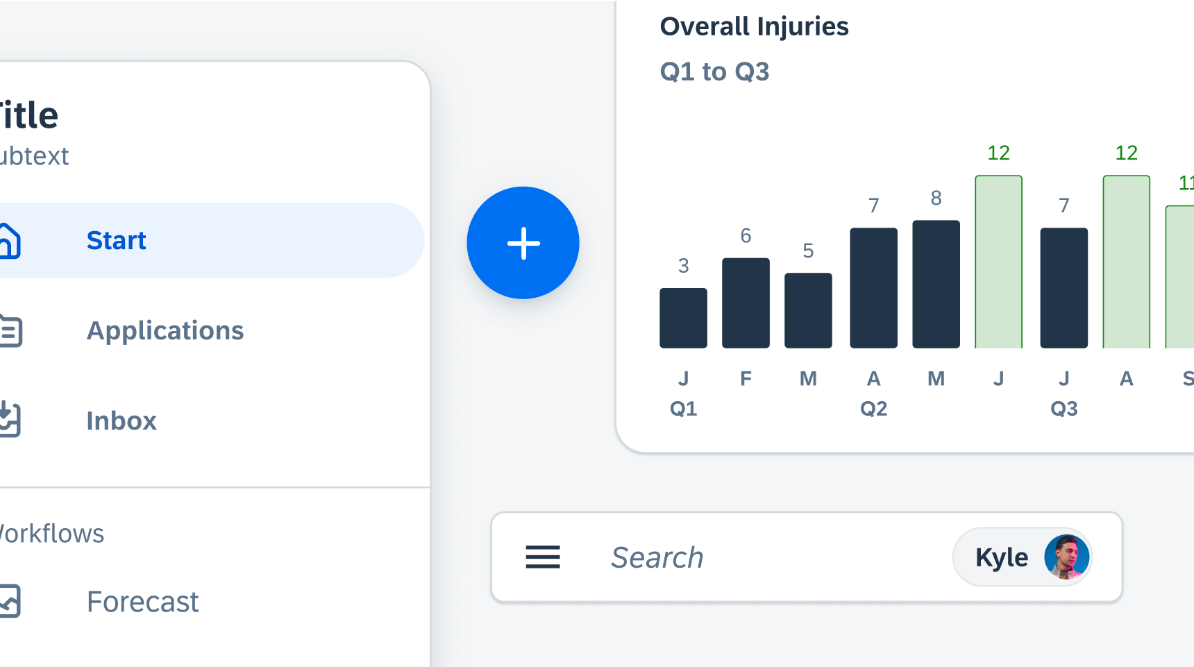
Light mode example
Dark Mode
Dark mode is the secondary mode for the Android design system. Dark mode is a dim UI that displays white foreground elements and desaturated accent colors against dark surfaces. In dark mode, all component surfaces and backgrounds are dark grey in color with tonal variations depending on a component’s elevation. Lastly, dark mode preserves battery life (especially on OLED screens) by reducing the usage of light pixels, helpful in scenarios where the user needs to reduce battery consumption.
Dark mode example
Resources
Development: Theming and Styling
SAP Fiori for iOS: Colors
Related Components/Patterns: Accessibility
 Your feedback has been sent to the SAP Fiori design team.