
Sliders
FioriSlider
Intro
A slider is a control that enables the user to adjust single values within a specified numerical range.
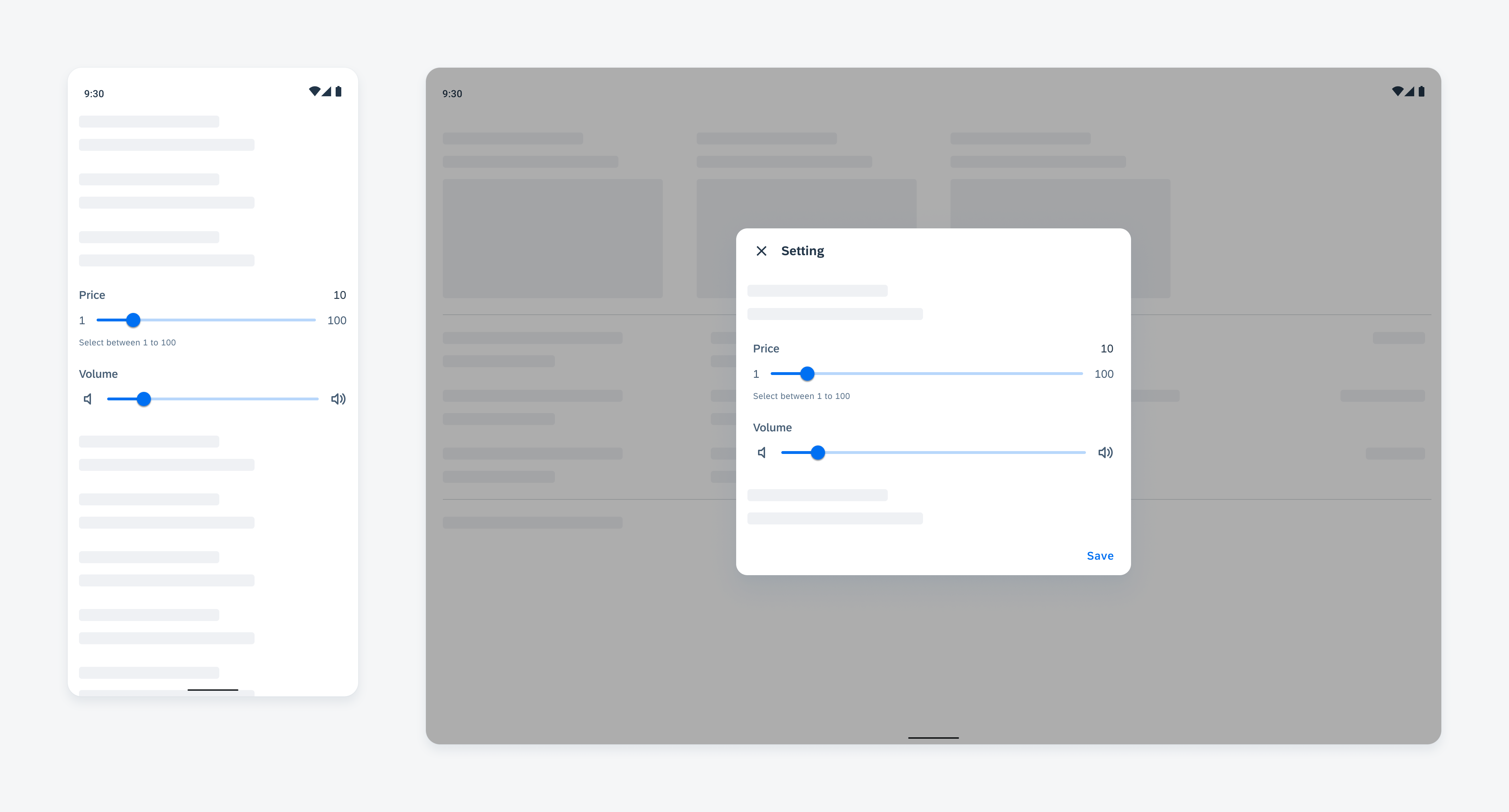
Sliders on mobile (left) and on tablet (right)
Anatomy
Slider Control
A. Container
A slider control always stays in a container with reserved paddings to provide enough touch area for users to operate the slider.
B. Track
A slider controls has a track representing the selectable range. The part of track on the left side of the thumb is selected. The part of track on the right side of the thumb is unselected.
C. Thumb
Thumb indicates the selected value on the track. Users can drag the thumb along the track to adjust their selection.

Anatomy of slider control
Slider Form Cell
A. Property Name
Property name is a label text that identifies the purpose of the slider.
B. Selected Value
selected value is a text string that reflects the value being selected.
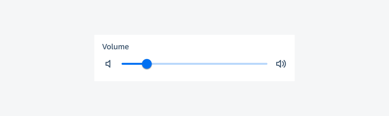
C. Slider
A slider is the control for users to select the value. By default, the minimum value is displayed at the left of the slider control, and maximum value on the right. This minimum and maximum value labels can be changed to icons or other labels that best represent the type of value this slider is controlling.
D. Helper Text
Provides additional information about the form cell.
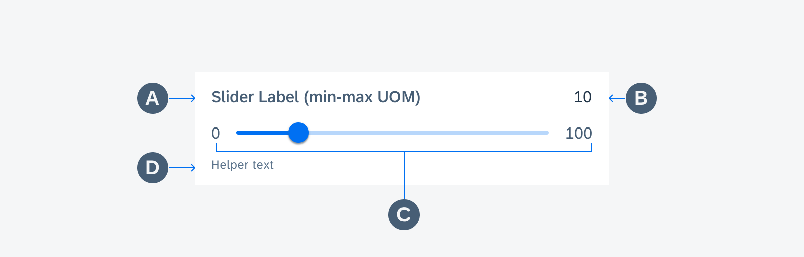
Anatomy of slider form cell
Variations
Depending on the use case, different content can be shown/hidden in a slider form cell.
Please choose the format that best serves the use case. Below are some examples.
Non-Editable Slider Form Cell
When the label text and value text can fit in one row with at least 16dp horizontal padding in between, display them in one line to save vertical screen space.
When the label text and value text can’t fit on the same line, the selected value is moved to the next line.
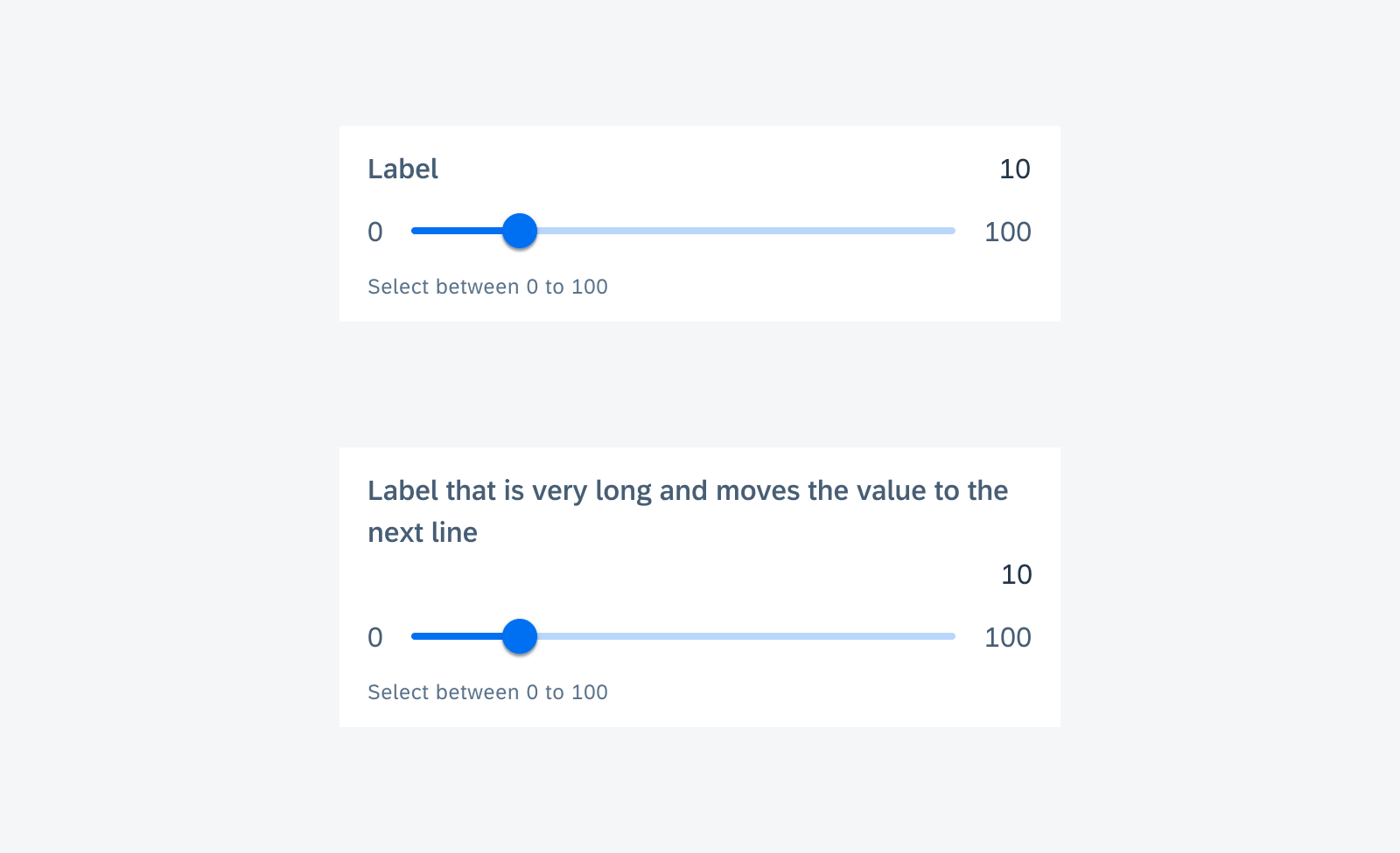
Non-editable slider form cell with short label (top) and with long label (bottom)
Editable Slider Form Cell
This variation allows users to set the slider to an exact value by typing in addition to dragging the slider thumb. The selected value text becomes an input field at the right side of the slider control, replacing the maximum value. This variation is useful when users want to select a specific value. We recommend adding the minimum and maximum values to the slider label so that users know the exact range they can choose from.
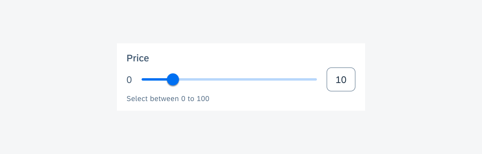
Editable slider form cell
Slider Form Cell with Icons
In this use case, the actual value of selection is not important for users to see. Therefore, the value text can be removed. This is also an example of using icons instead of minimum and maximum value.
Slider form cell with icons
Grouped Sliders
In general, each slider cell is stand-alone. Group sliders together only when all of them contribute to one attribute, for example, when red, green, and blue define one color. You can use an icon or short to label each row. Text labels should be as concise as possible. Within one group, use the row with the longest label or shortest slider as a reference and vertically align the other rows to it.
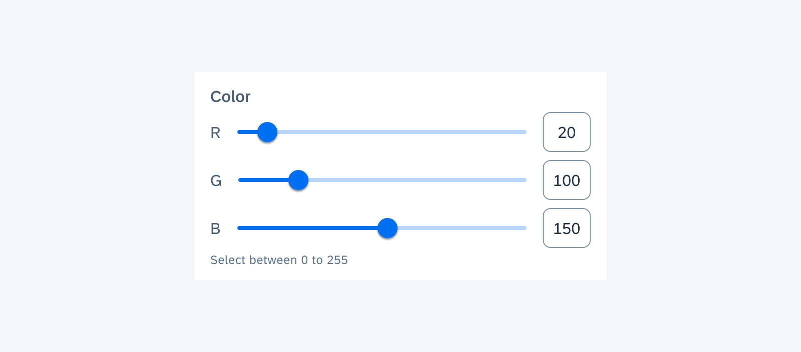
Three grouped slider form cells
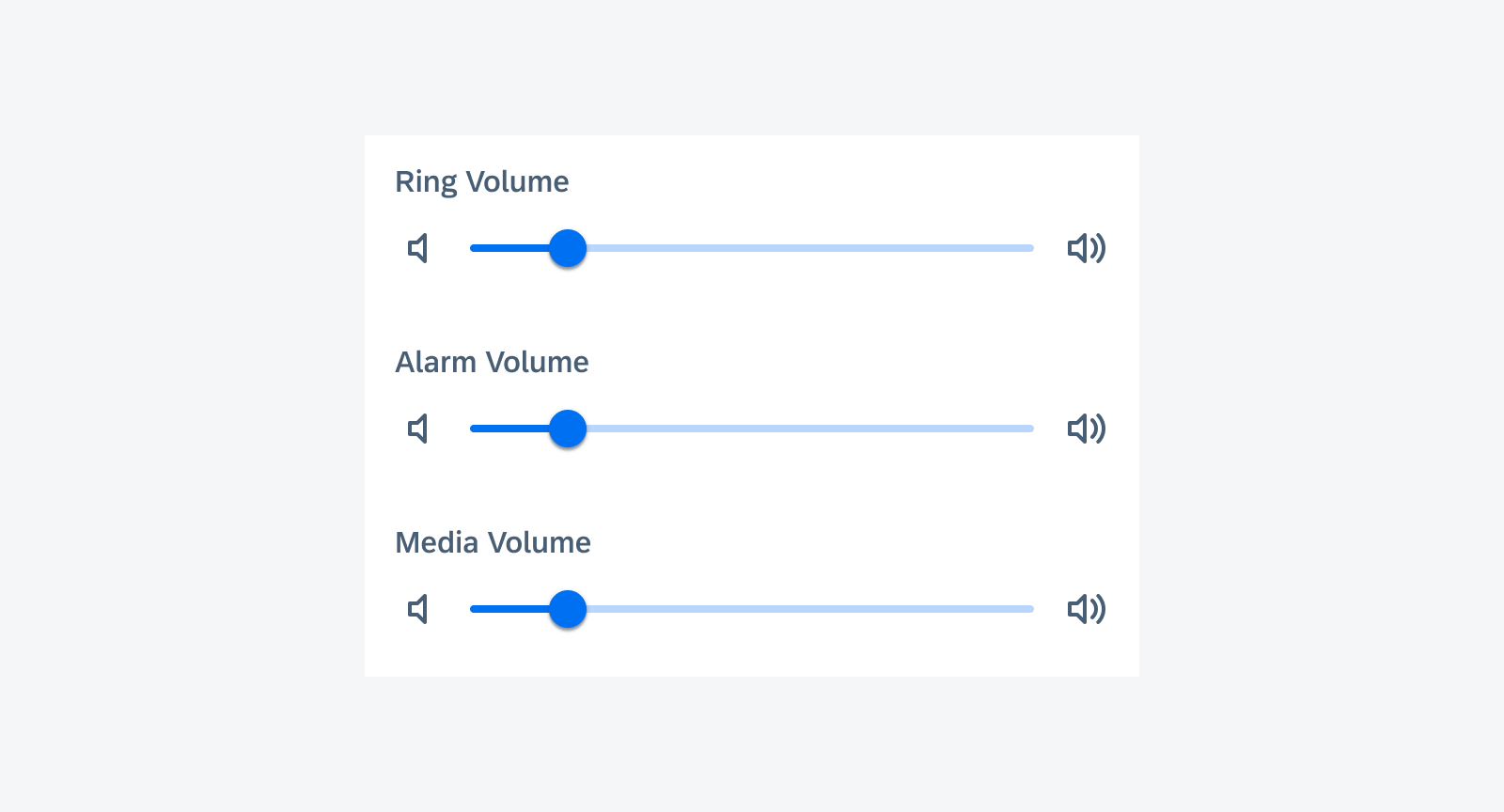
Three ungrouped slider form cells controlling different types of volume
Behavior and Interaction
States
Error State
Use validation messages only if necessary, for example, to show error messages or direct feedback for this control. Do not distract users with unimportant information. For page level feedback, use a snackbar instead.
The validation message should be concise. One line of text is recommended for the validation message.
By default, there is no validation message. When the validation message is triggered, insert the message with padding below the 48dp slider control area before the divider line if used. The content under the slider form cell will be pushed down.
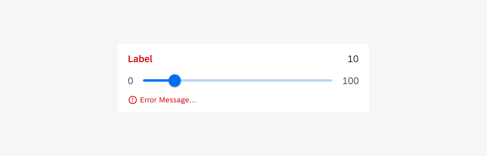
Slider form cell with error message
Adaptive Design
The full width of slider form cells adapts to different screen sizes.

Slider on mobile (top) and on tablet (bottom)
Resources
Development: FioriSlider, SliderFormCell
SAP Fiori for iOS: Slider Form Cell
Material Design: Sliders
 Your feedback has been sent to the SAP Fiori design team.