
- Latest SAPUI Version 1.124
- SAPUI5 Version 1.122
- SAPUI5 Version 1.120
- SAPUI5 Version 1.118
- SAPUI5 Version 1.116
- SAPUI5 Version 1.114
- SAPUI5 Version 1.112
- SAPUI5 Version 1.110
- SAPUI5 Version 1.108
- SAPUI5 Version 1.106
- SAPUI5 Version 1.104
- SAPUI5 Version 1.102
- SAPUI5 Version 1.100
- SAPUI5 Version 1.96
- SAPUI5 Version 1.94
- SAPUI5 Version 1.92
- SAPUI5 Version 1.90
- SAPUI5 Version 1.88
- SAPUI5 Version 1.86
- SAPUI5 Version 1.84
- SAPUI5 Version 1.82
- SAPUI5 Version 1.80
- SAPUI5 Version 1.78
- SAPUI5 Version 1.76
- SAPUI5 Version 1.74
- SAPUI5 Version 1.72
- SAPUI5 Version 1.70
- SAPUI5 Version 1.68
- SAPUI5 Version 1.66
- SAPUI5 Version 1.64
- SAPUI5 Version 1.62
- SAPUI5 Version 1.60
- SAPUI5 Version 1.58
- SAPUI5 Version 1.56
- SAPUI5 Version 1.54
- SAPUI5 Version 1.52
- SAPUI5 Version 1.50
- SAPUI5 Version 1.48
- SAPUI5 Version 1.46
- SAPUI5 Version 1.44
- SAPUI5 Version 1.42
- SAPUI5 Version 1.40
- SAPUI5 Version 1.38
- SAPUI5 Version 1.36
- SAPUI5 Version 1.34
- SAPUI5 Version 1.32
- SAPUI5 Version 1.30
- SAPUI5 Version 1.28
- SAPUI5 Version 1.26
- Latest SAPUI Version 1.124
- SAPUI5 Version 1.122
- SAPUI5 Version 1.120
- SAPUI5 Version 1.118
- SAPUI5 Version 1.116
- SAPUI5 Version 1.114
- SAPUI5 Version 1.112
- SAPUI5 Version 1.110
- SAPUI5 Version 1.108
- SAPUI5 Version 1.106
- SAPUI5 Version 1.104
- SAPUI5 Version 1.102
- SAPUI5 Version 1.100
- SAPUI5 Version 1.98
- SAPUI5 Version 1.96
- SAPUI5 Version 1.94
- SAPUI5 Version 1.92
- SAPUI5 Version 1.90
- SAPUI5 Version 1.88
- SAPUI5 Version 1.86
- SAPUI5 Version 1.84
- SAPUI5 Version 1.82
- SAPUI5 Version 1.80
- SAPUI5 Version 1.78
- SAPUI5 Version 1.76
- SAPUI5 Version 1.74
- SAPUI5 Version 1.72
- SAPUI5 Version 1.70
- SAPUI5 Version 1.68
- SAPUI5 Version 1.66
- SAPUI5 Version 1.64
- SAPUI5 Version 1.62
- SAPUI5 Version 1.60
- SAPUI5 Version 1.58
- SAPUI5 Version 1.56
- SAPUI5 Version 1.54
- SAPUI5 Version 1.52
- SAPUI5 Version 1.50
- SAPUI5 Version 1.48
- SAPUI5 Version 1.46
- SAPUI5 Version 1.44
- SAPUI5 Version 1.42
- SAPUI5 Version 1.40
- SAPUI5 Version 1.38
- SAPUI5 Version 1.36
- SAPUI5 Version 1.34
- SAPUI5 Version 1.32
- SAPUI5 Version 1.30
- SAPUI5 Version 1.28
- SAPUI5 Version 1.26
Message Popover
sap.m.messagePopover
Intro
The message popover control can display multiple messages of different types in one list. For example, it might show several messages related to entries in a form, or messages triggered by a finalizing action, such as Save.
The message popover is used in conjunction with a technical message manager, which populates the message list. If an error occurs at a validation point, the corresponding message is added to message popover automatically, without interrupting the user.
Users can browse messages by type and navigate to the message details. In some cases, they can also jump directly from the message to the affected field on the UI.
Message popover
When to Use
Use the message popover if:
- You want to display multiple messages to the user.
- You do not want to interrupt users while they are performing an action.
Do not use the message popover if:
- You need to interrupt the user. In this case, use a message box.
(Typically, interrupting the user is only necessary for technical problems, such as network errors and connection issues.)
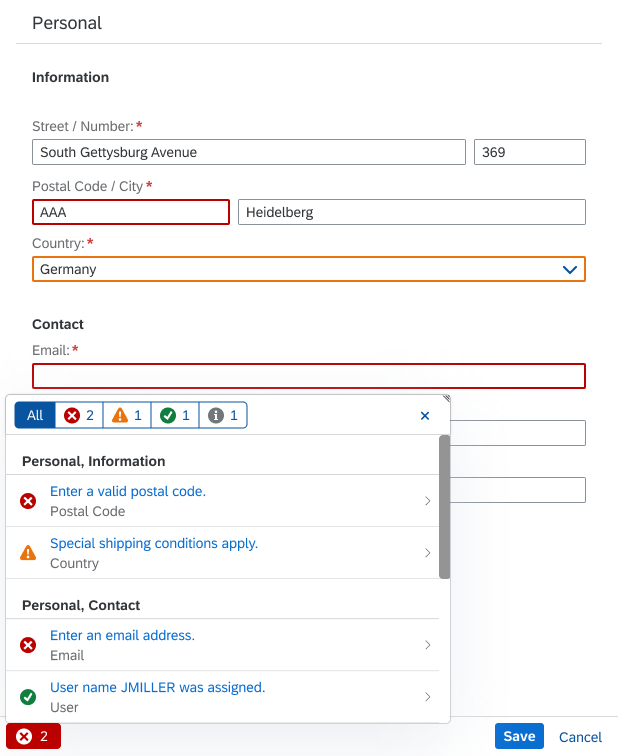
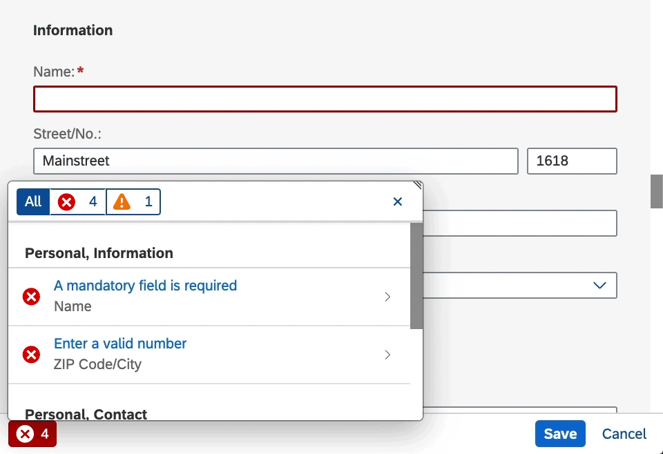
Components
(1) Filter bar
(2) Short description
(3) Subtitle
(4) Section/subsection on the UI
(5) Message button
(6) Navigation to message details
(7) Counter for aggregated messages
Components of the message popover
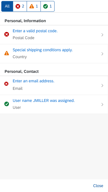
Filter Bar
Initially, the filter bar shows all the different message types in the list (1).
Segmented buttons at the top of the message popover allow the user to filter the messages by type (error, warning, success, and information).
List
Short Description (2)
A simple and helpful short message text. It’s the same message as the one attached to the UI control where the issue occurred.
Subtitle (3)
You can use the subtitle to give your message an identifier. If the message relates to a specific field, show the label of the field where the error occurred. Based on the subtitle, the user should be able to identify the corresponding UI control on the UI (for example, the input field in a form).
Section/Subsection (4)
Messages in the list are grouped by the section and subsection on the UI. This helps the user to find the part of the UI that triggered the message.
Usually, the grouping reflects the hierarchy of the page. However, some messages relate to issues that do not belong to a particular field on a page, but result from an action. In this case, the group title is as follows:
- Last Action: <Action Label> (Example: Last Action: Save)
- Last Action (fallback solution)
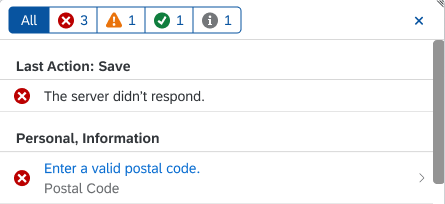
'Last Action' group in the message list
Navigation to Message Details (6)
If message details are provided, the message popover automatically provides a chevron on the right-hand side for navigating to the message details page.
If the popover contains only one message that also has message details, the message details page is displayed by default (see Behavior and Interaction).
Aggregated Messages (7)
If you want to aggregate messages, you can use the counter property of each list item.
- The message popover only provides the counter property. The aggregation itself must be implemented by the app team.
- When 2 or more messages are aggregated, the message short text cannot be a link because there would be multiple targets.
Message Button
If there are messages to display, the message button indicates the most critical message status in the list (5).
For example, if the list contains error messages, the message button inherits the error icon and semantic color. If the most critical message in the list is a warning, the message button shows the warning icon and corresponding semantic color, and so on.
In addition, the error button contains a count indicating the number of errors.

Message button types - Error with counter, warning, success, information
If there are no messages to display, there is no message button. In this case, the footer toolbar contains only the “normal” actions for the task.
Message Details
The message details page shows:
- The message short text (1).
- A more detailed message text to explain the issue and propose a solution (2).
- An optional link to more information, such as app documentation (3).
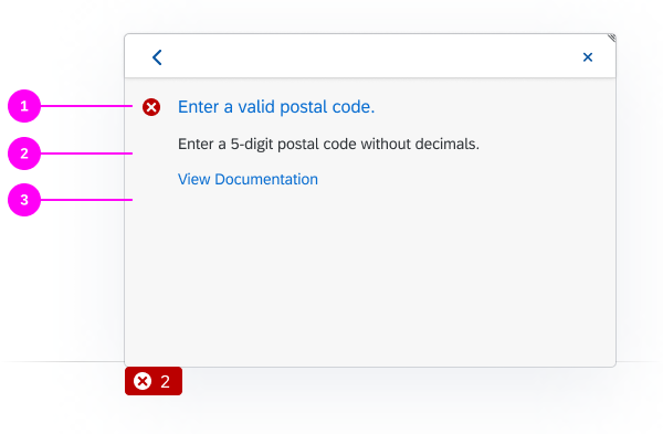
Details page of the message popover
Behavior and Interaction
When Does the Message Popover Open?
Form Field Validation
If one or more errors occur when the user fills out a form, the message button appears, indicating the message type of the most critical message. The message popover does not open automatically. For more information on the different validation points, see Form Field Validation.
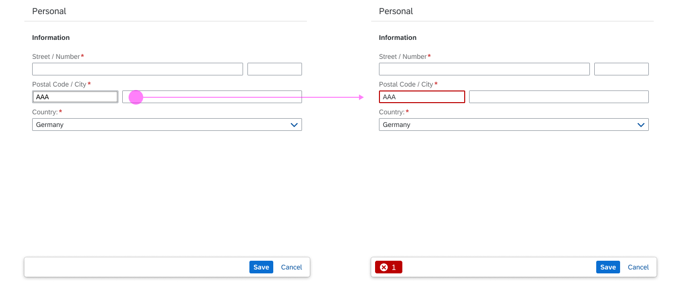
Form field validation behavior
Finalizing Actions
If the user activates a finalizing action (such as Create, Save, or Submit), the message popover opens automatically to inform the user about the errors on the UI that need to be resolved first.
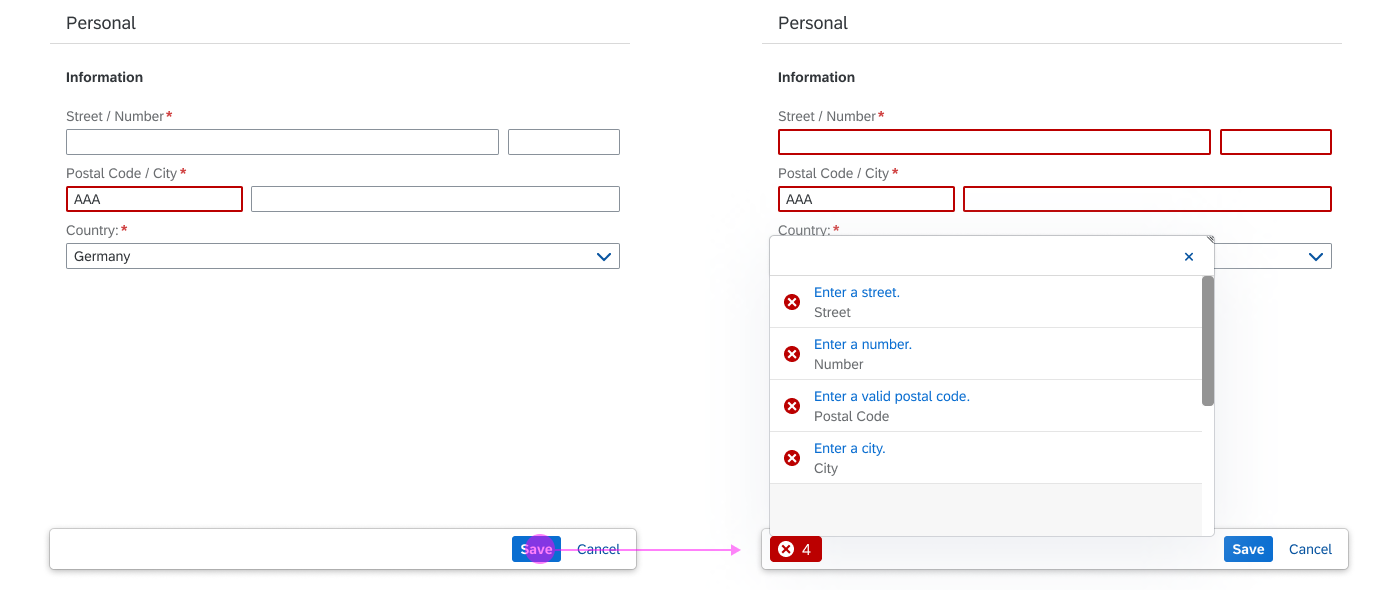
Message popover triggered by a finalizing 'Save' action
If the popover contains only one message that also has message details, the message details page is displayed by default.
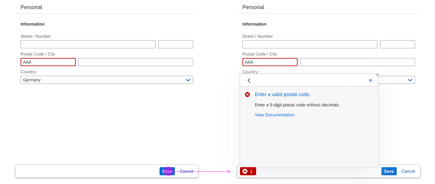
Message popover detailed view triggered by a finalizing 'Save' action
Navigation to Message Details
If the message provides a long text from the back-end system, the user can navigate to the message details. There, the user will typically find more information and help.
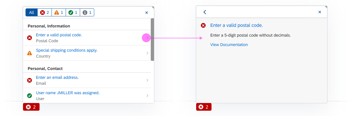
Navigation to message details
Navigation to the Relevant Field
The navigation link takes users directly to the field on the UI that triggered the message. This can be a field in the visible area, a field somewhere else on the same page, or a field on another tab or screen.
Navigation from the message text to a field on the UI
Responsiveness
Size S (Smartphone)
On smartphones, the message popover is automatically shown in full screen mode.
Full screen message popover on a smartphone
Top Tips
- Whenever possible, provide a navigation link from the message to the relevant field on the UI.
- Use the message subtitle to indicate the field label.
- In forms, also highlight the individual fields, and change their value state according to the type of message. For more information, see Form Field Validation.
Related Topics
Elements and Controls
- Message Handling (guidelines)
- Message Box (guidelines)
- Form Field Validation (guidelines)
 Your feedback has been sent to the SAP Fiori design team.