
Attachments Form Cell
FUIAttachmentsFormCell
Intro
An attachments control allows users to upload files such as image, audio, video, and text files as well as PDF, CSV, and presentation files. Tapping on the “Add (+)” button allows users to upload files from the photo library or other supported apps.
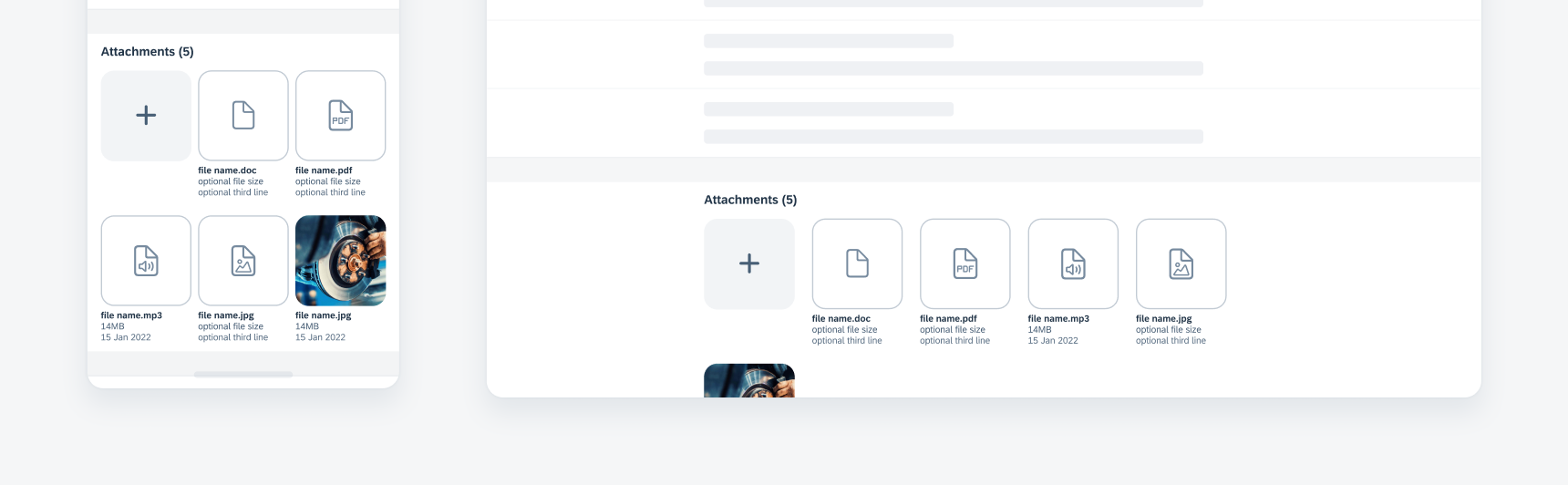
Attachment grid on compact (left) and on regular (right)
- Place an attachments form cell at the bottom of a create modal, object page, or object detail page.
- Use an attachments form cell as the last piece of information needed for the create screen or edit mode workflow.
Don’t use an attachments form cell for uploading profile images.
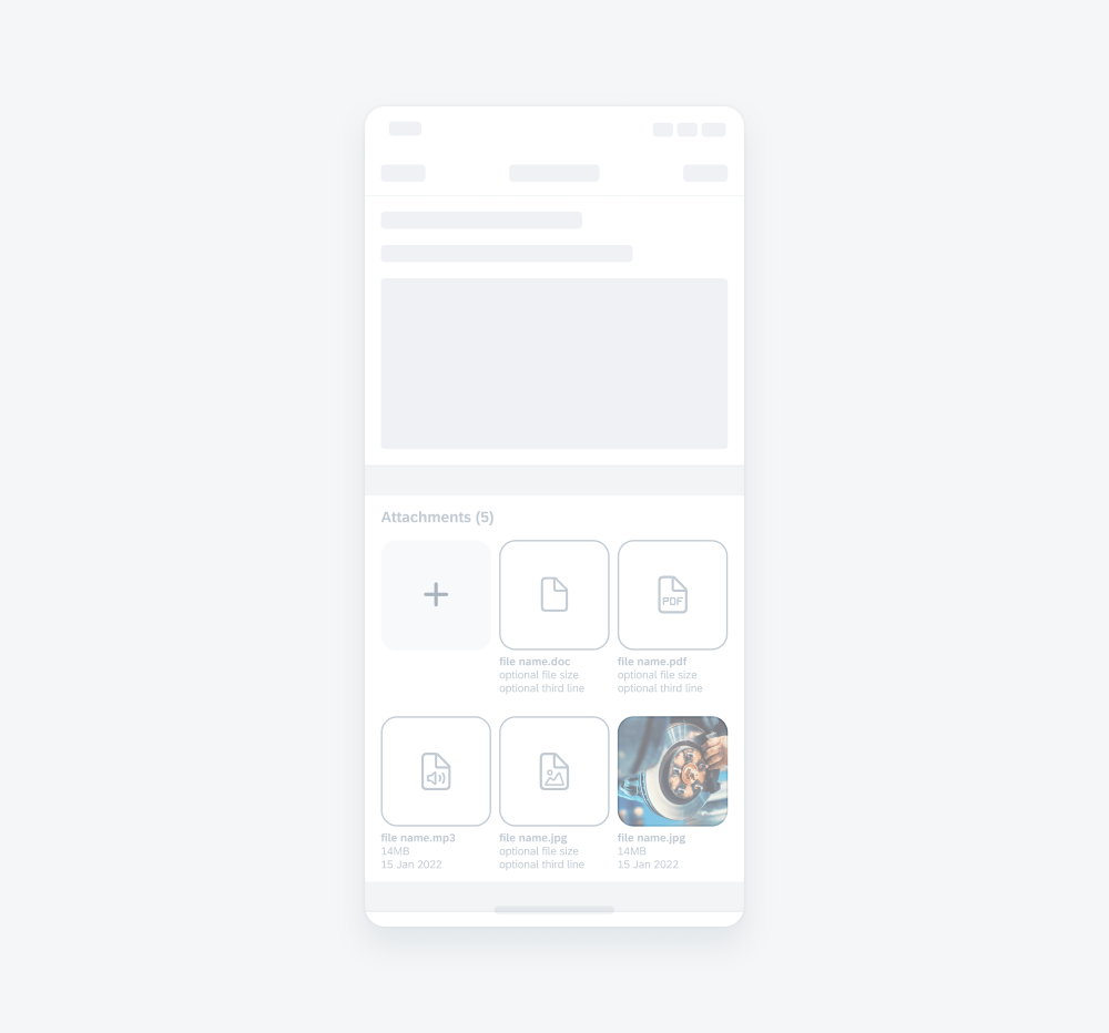
A. Label
Indicates at a glance the number of attachments that have been added to the attachments container.
B. “Add (+)” Button
Allows the user to add images, video, audio, and documents to the attachments container.
When the attachments form cell is active, the “Add (+)” button is visible to the user.
When the attachments form cell is in read-only mode, the “Add (+)” button is hidden.
C. Attachment Item
Provides a preview of the image, video, or document. If a preview is not available, a doctype icon with the document name should be displayed. When tapped, the item goes into a modal previewer where the user can view or delete the item.
D. Attachment Text Content
Provides additional information about the attachment item. The first line is the mandatory attachment item name. The second and third line are optional fields and may be populated by information such as file size and date uploaded.
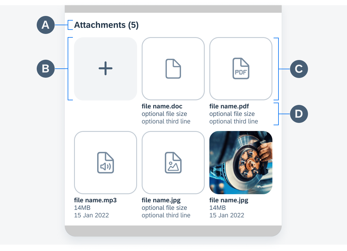
Compact attachment form cell anatomy
There are three states for the attachments form cell.
Active State
In active state, the user can add, view, and delete attachment items.
Adding Attachments
The “Add (+)” button is the main control that allows a user to add attachments. It remains in place as the user adds more attachments. Subsequent attachments are displayed to the right of the “Add (+)” button and, if the number of attachments exceeds its limit, the attachment container overflows to an additional row.
To add attachments, a user taps on the “Add Attachment” button (+). This initiates an action sheet that provides attachment source options for the user.
Tapping on an option in the action sheet triggers a modal view where a user can drill down into a folder to select a document.
Once the attachment is selected, the modal view moves down and the attachments form cell displays the document as an attachment item.
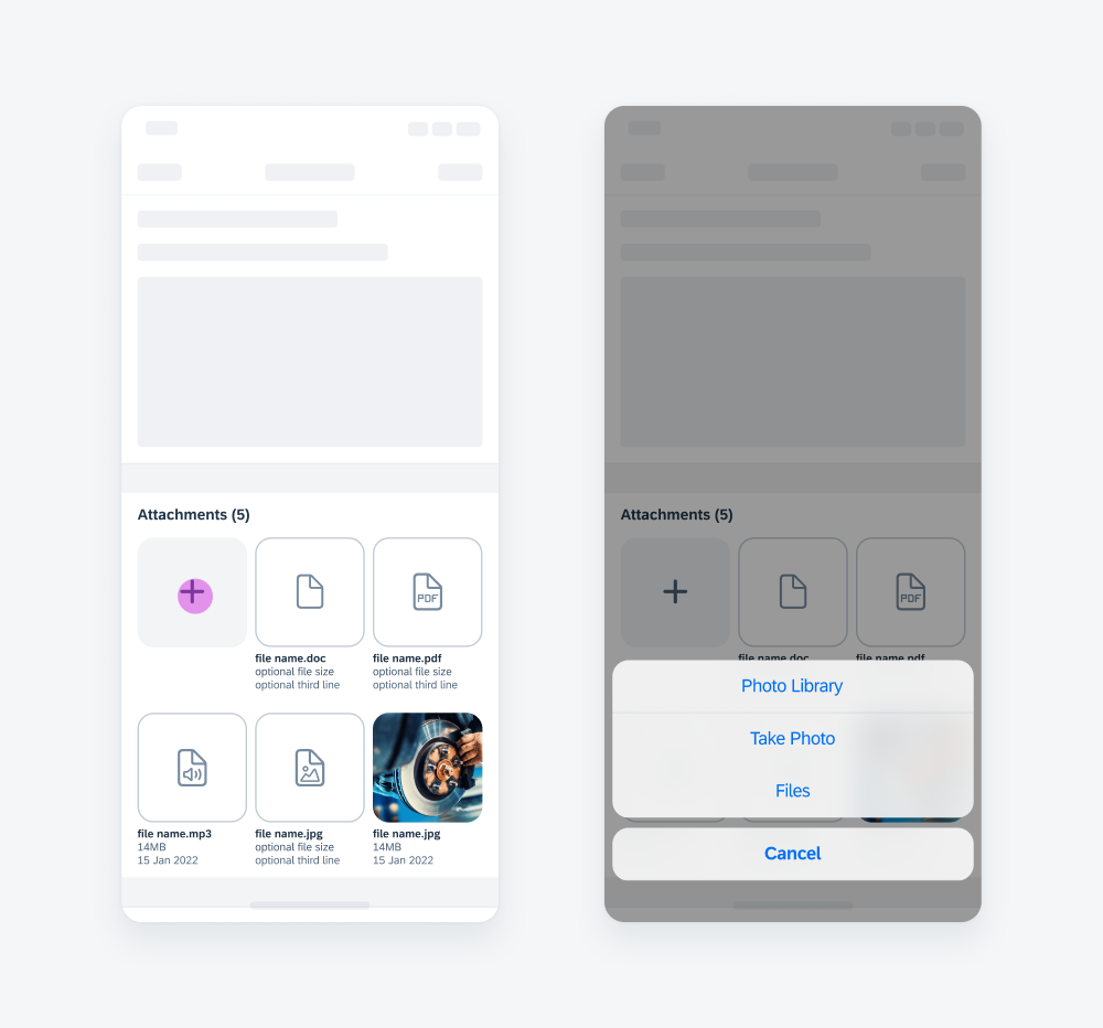
Adding attachments in active state
Viewing Attachments
Tapping on an attachment item opens the previewer, where the user can view the attachment in detail and swipe through each attachment item.

Viewing attachments in active state
Deleting Attachments
In the previewer, the user may delete the attachment item by tapping on the “Delete” icon in the top right corner.
After the attachment is deleted, the changes are reflected on the attachment container and the form cell label.

Deleting attachments in active state
Error Handling
If there is an error, the error message is displayed in red, with a red error icon, underneath the attachments form cell.
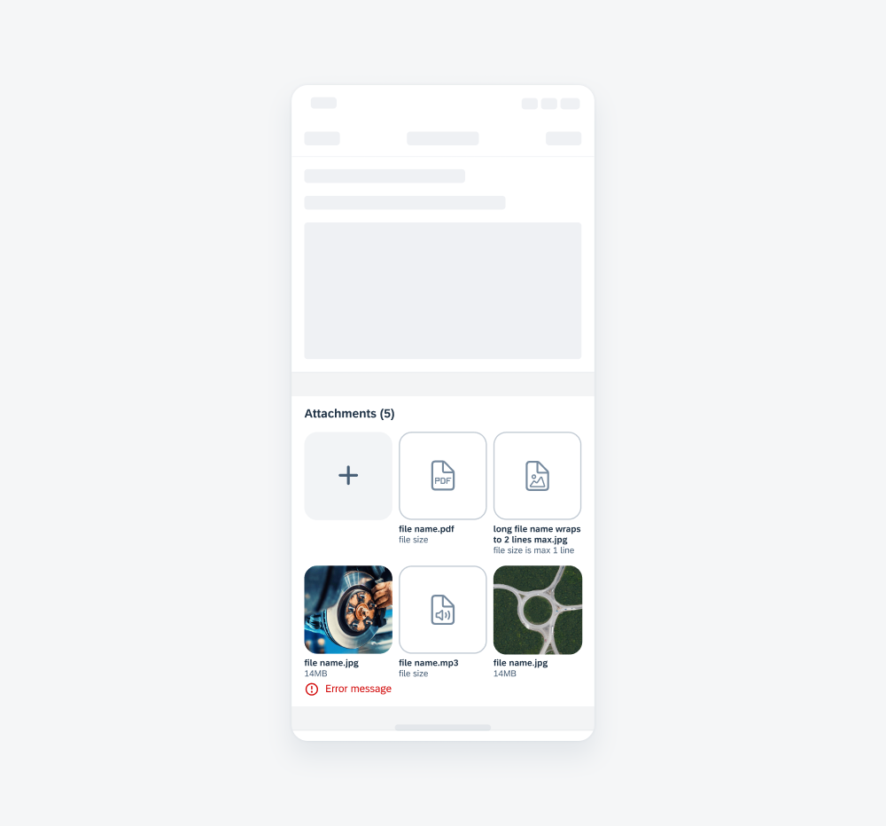
Attachments form cell error
Read-Only State
In read-only state, the “Add (+)” button is hidden from the user’s view. The user is unable to add or delete attachments, but may still view the already attached items.
Viewing Attachments
The user may still tap on the attachment items to view them in the previewer.

Viewing attachments in read-only state
Deleting Attachments
The user may not delete attachments in read-only mode. The “Delete” icon is disabled in the previewer.

Deleting attachments in read-only state
Disabled State
In disabled state, the user can’t interact with the attachments form cell.
Attachments form cell in disabled state

Development: FUIAttachmentsFormCell
SAP Fiori for Android: Attachment Form Cell
 Your feedback has been sent to the SAP Fiori design team.