
Menus
DropdownMenu
Intro
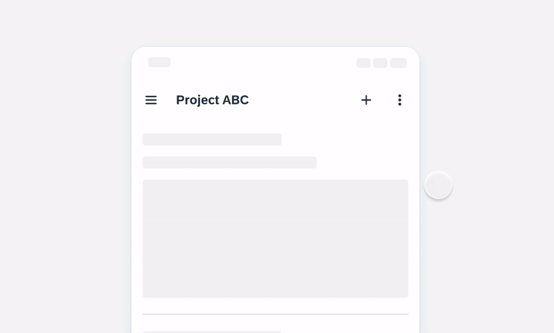
A menu displays a list of relevant options for the user that can be triggered from buttons, icons, or actions.
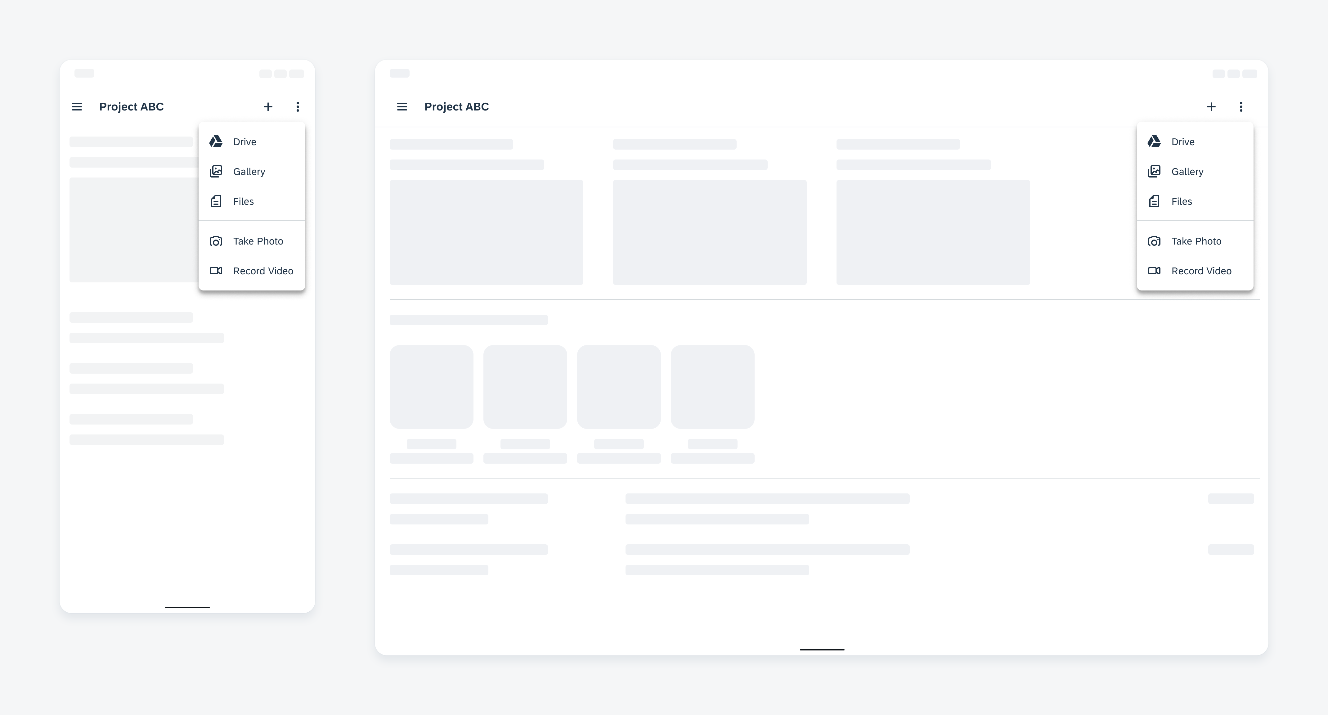
Example of a menu on a compact device (left) and a medium/expanded device (right)
Usage
A menu enables users to view and select from a group of choices. A menu container is opened by the user tapping on an interactive element, for example, an overflow icon.
- Use a menu when the number of actions exceeds the component’s action limit.
- Ensure it is simple for users to open, close, and select from the menu, with the most prominent actions shown first.
- Ensure the menu is placed on the screen where the content is fully visible to users.
- Don’t use a menu for a single action.
- Don’t hide important actions.
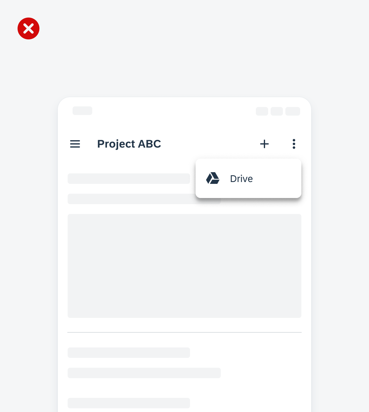
- Don’t place the menu in a position where it will be cut off by the screen. Instead, set the menu above, left, or right of the interactive element.
An example of a top app bar that makes all additional actions available in a dropdown menu
An example of a top app bar that only has one action available in the dropdown menu
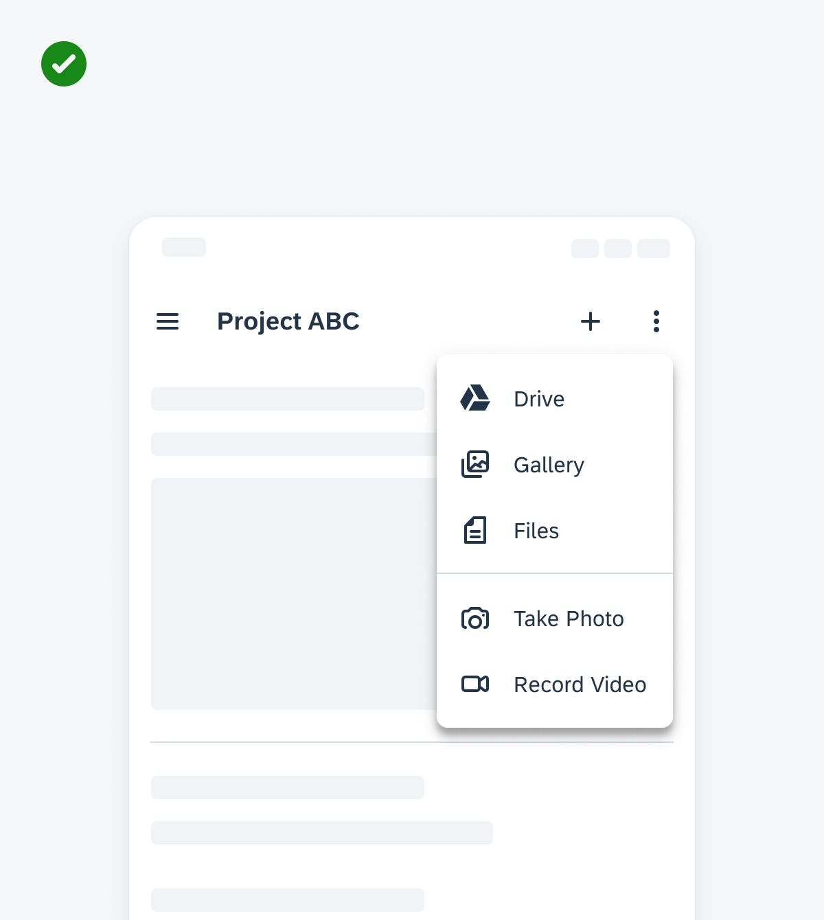
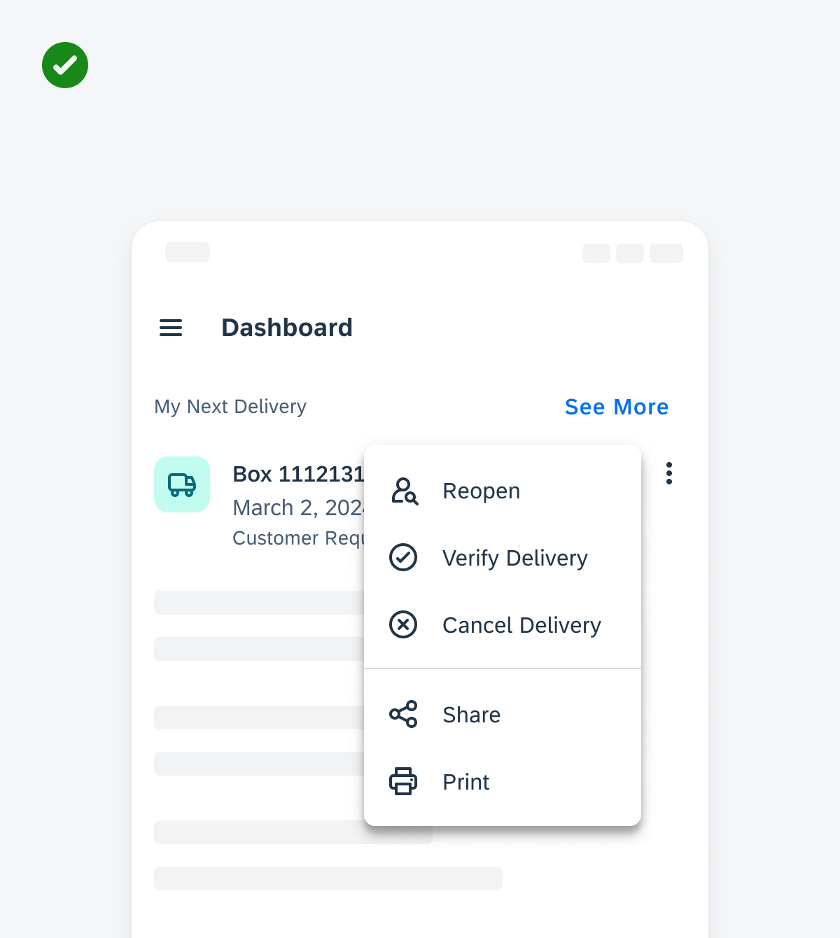
An example of a menu that has a clear entry point and shows the highest priority actions first
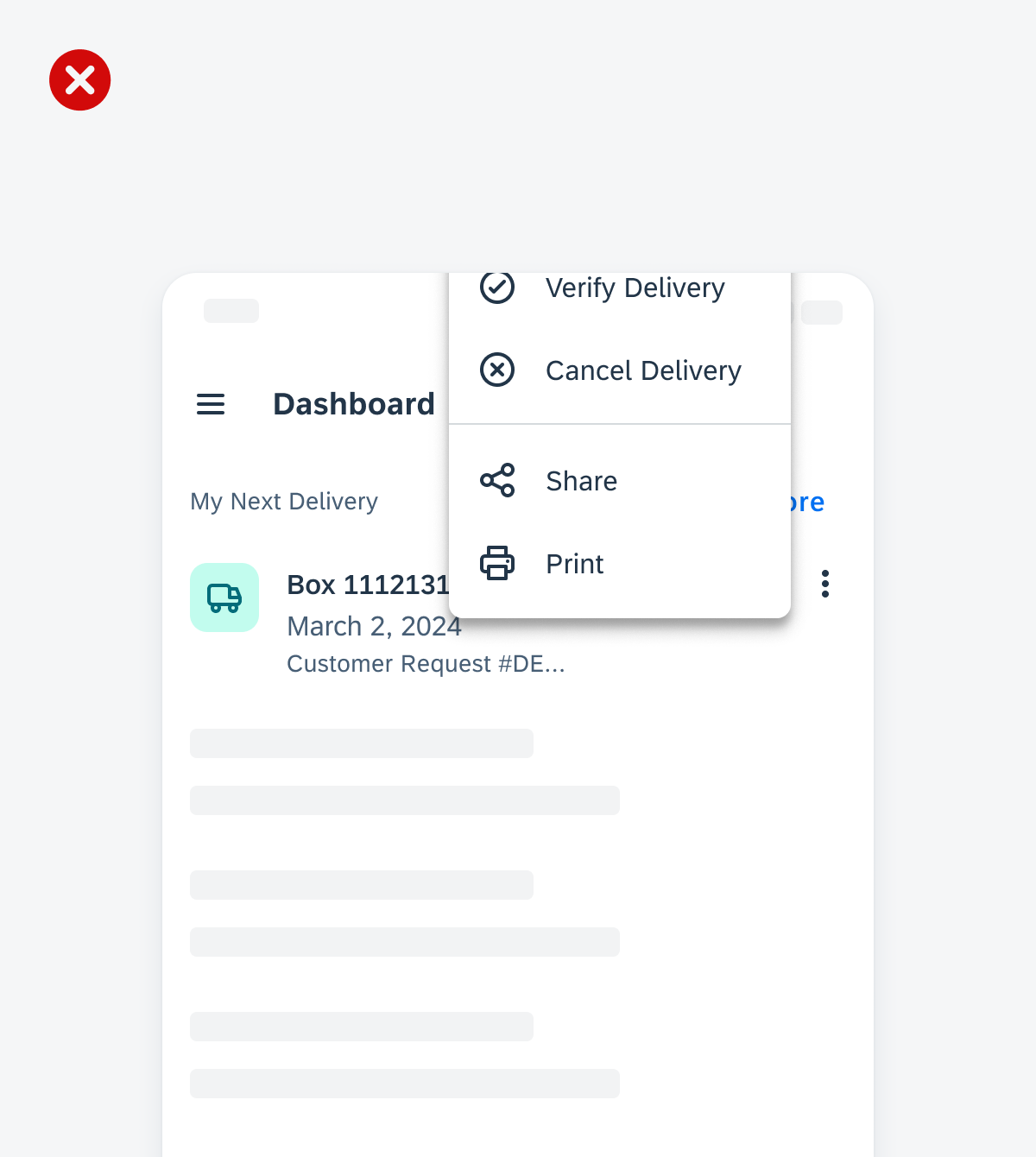
An example of a menu that displays the highest priority actions last and makes the user scroll to find those actions
An example of a menu that is placed next to the interactive element that populates it and is fully visible on the screen
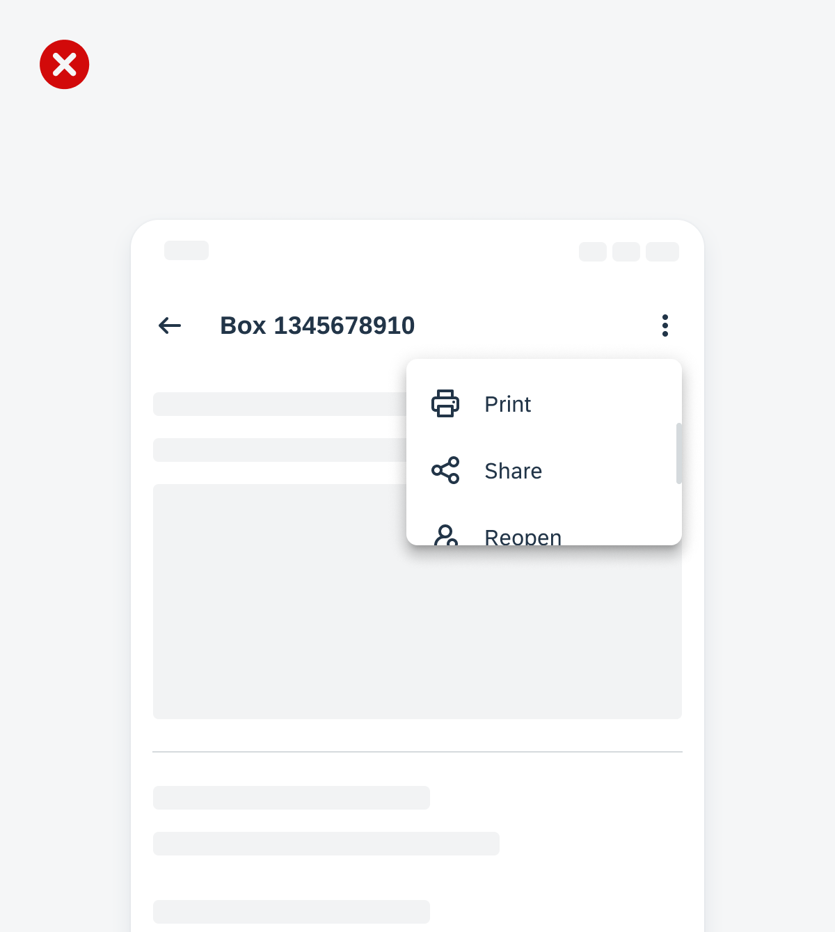
An example of a menu that is placed near the interactive element but cuts off some of the list options with the higher container placement
Anatomy
A. Menu Container
A menu container holds all of the menu items available for a user to choose from.
B. List Item
A list item includes a required label, in addition to an optional leading or trailing icon.
C. Divider (Optional)
A menu can optionally contain a divider to visually group list items together.
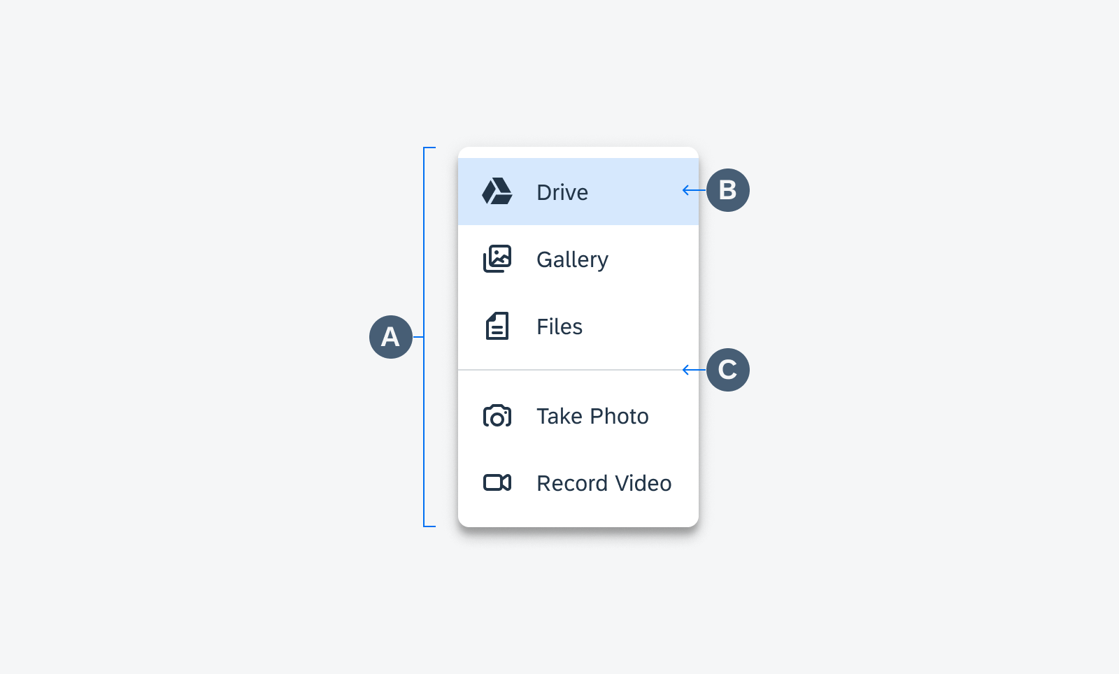
Menu anatomy
Behavior and Interaction
Dropdown Menu
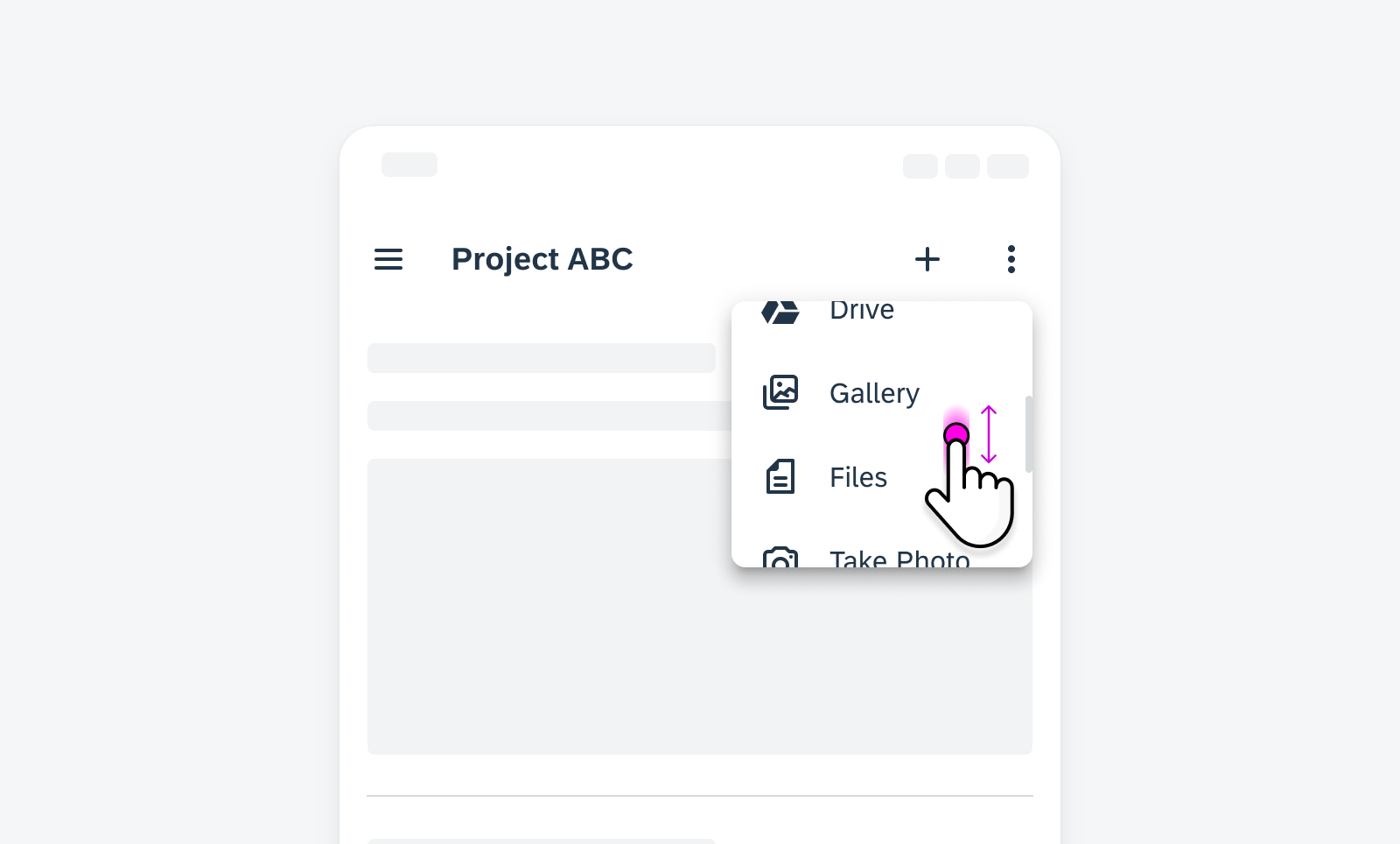
A dropdown menu is a list of options that a user can act on. It appears after a user taps on an icon or a button or performs a specific action.
A dropdown menu normally appears below the element that generates it.
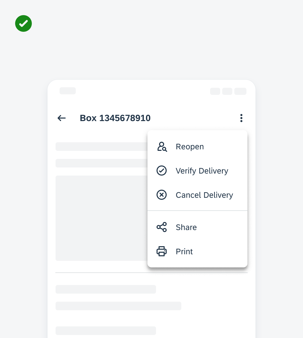
A dropdown menu triggered by an overflow icon button
Scrolling
A menu can scroll if the number of list items exceed the max height of the menu container.
A menu shorter in height that allows the user to scroll through all the list items available
Adaptive Design
There are situations where it is beneficial to replace a bottom sheet with a menu on medium and expanded size classes.
Replace the bottom sheet with a menu when the list of options needs to be closer in proximity to the element the choices affect. This helps the user draw a direct relationship between the list items and the primary content where they are populated. Continue using the bottom sheet on medium and expanded size classes when the inputs affect the overall page’s view versus a single element on the page.
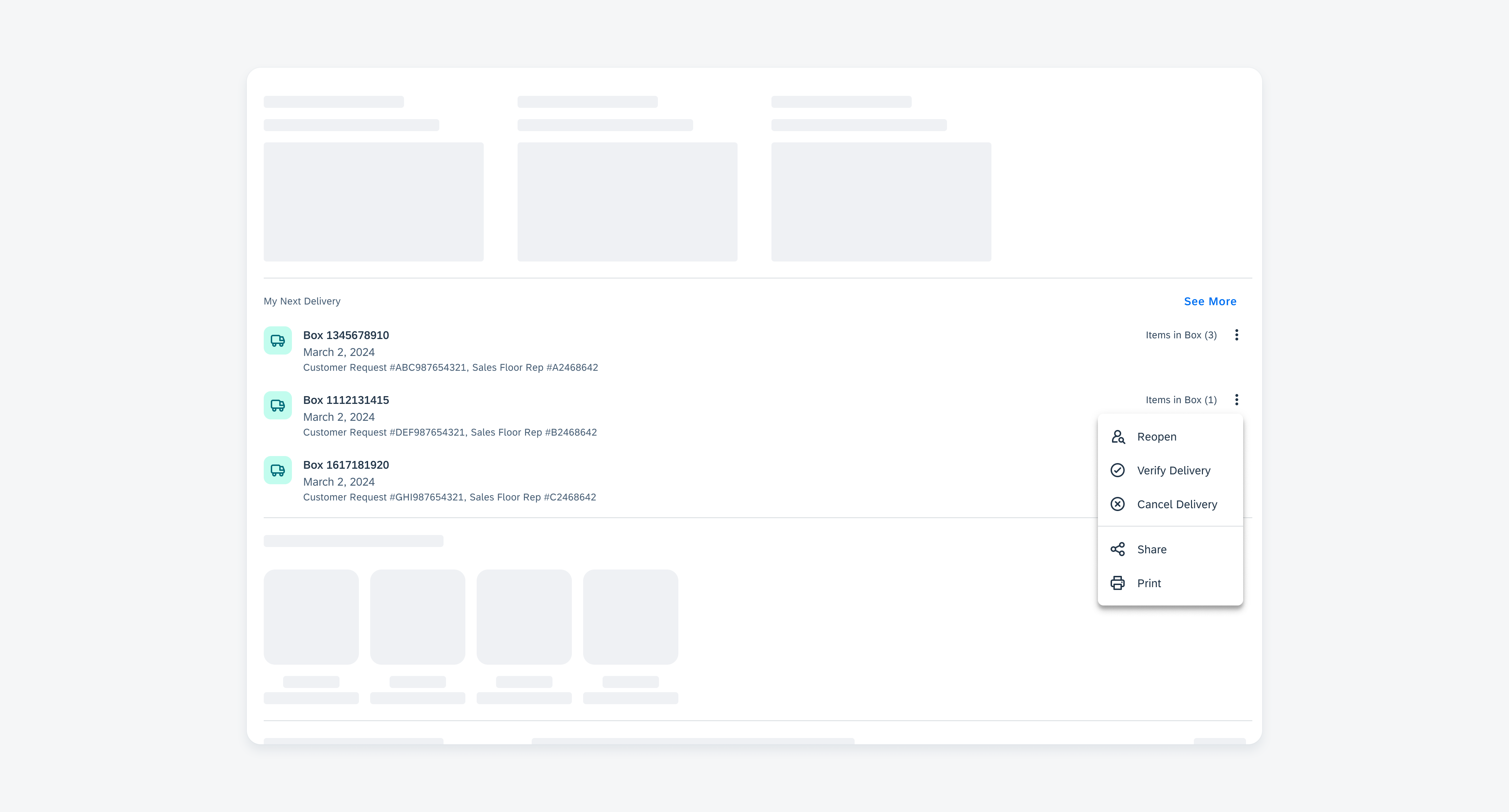
A menu on a medium/expanded device that visually connects the list options and the affected object by placing the menu close to the overflow icon.
Variations
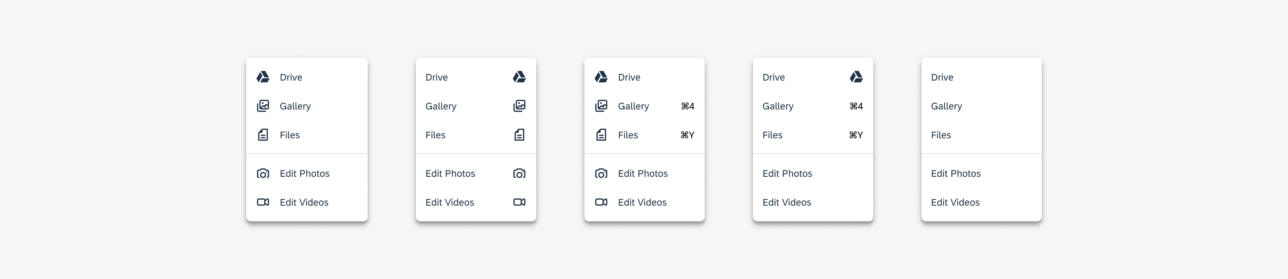
A menu item can contain a leading or trailing icon, extending the menu’s flexibility to support various use cases.
 Your feedback has been sent to the SAP Fiori design team.