
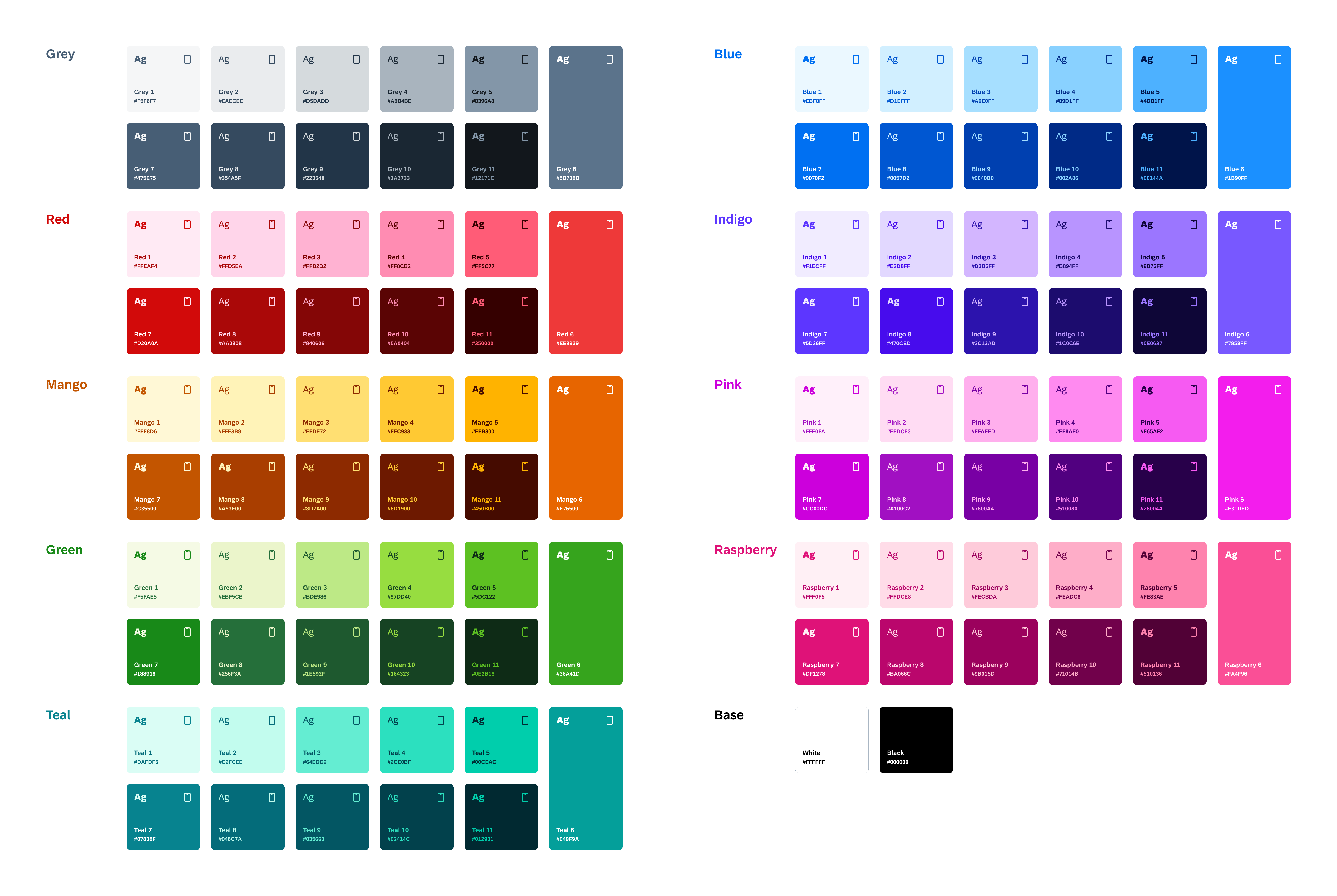
Colors
FUIColorStyle
Intro
Color plays a significant role by setting the visual balance for iOS apps. Color is used to define the visual hierarchy of UI elements and to direct the user’s attention to the most important tasks.
Our color system builds on a unified color palette that aligns with our brand and helps to create cohesive experiences across SAP touchpoints. The Horizon theme color palette is designed to provide flexibility to our design system while remaining accessible in instances of complex UIs. Its vibrant hues enable a flexible yet consistent color system for all SAP products.
Horizon theme UI reference colors
UI Colors
UI colors serve as an intermediate layer within the user interface, categorized by their specific roles or purposes. SAP Fiori for iOS follows the iOS standard from the Human Interface Guidelines (HIG) to ensure a structured approach to maintain consistency and accessibility across different contexts and interfaces. These dynamic colors adapt seamlessly to system appearance changes, such as light and dark modes.
- Background Colors
- Tint Colors
- Label Colors
- Fill Colors
- Separator Colors
- Semantic Colors
- Accent Colors
- Materials
Background Colors
The iOS design system defines two sets of dynamic background colors — Background and Grouped Background — each of which contains primary, secondary, and tertiary variants that help to convey a hierarchy of information. They are made up of neutral colors including shades of grey, all the way from white to black, depending on the color mode. Use these variants to indicate hierarchy in the following ways:
- Primary for the overall view
- Secondary for grouping content or elements within the overall view
- Tertiary for grouping content or elements within secondary elements
In Dark mode, the system adds an additional set of background colors — Elevated and Grouped Elevated — to enhance the perception of depth when one dark interface is layered above another. Elevated colors are brighter than Background and Grouped Background colors, making foreground interfaces appear to advance. These colors are applied automatically to the UI in modal sheets, form sheets, and other overlay panels.
See also Surface Colors on Android.
Background Colors
When the page structure is flat and most information is on the same level, use Background colors (e.g. standard table views and designs that have a white primary background in a light mode).
| Light Mode | Dark Mode | Name | Usage | ||
|
Base White #FFFFFF |
Base / Black
#000000 |
Primary Background | For the overall view such as table views, collection views, and general content areas | ||
|
Grey 1
#F5F6F7 |
Grey 6, 24% on Black
#161C21 |
Secondary Background | For grouping elements within the overall view / to provide a subtle visual distinction from the primary background | ||
|
Base White #FFFFFF |
Grey 6, 40% on Black
#242E38 |
Tertiary Background | For grouping content within secondary elements or less prominent background areas, such as minor interface elements or subtle dividers | ||
| N/A |
Grey 6, 25% on Black
#171D23 |
Primary Background (Elevated) | For the overall view in modal sheets, form sheets, or overlay panels to enhance the perception of depth when one dark interface is layered above another | ||
| N/A |
Grey 6, 39.5% on Black
#242D37 |
Secondary Background (Elevated) | For grouping elements within the overall view of modal sheets, form sheets, and overlay panels / to provide a subtle visual distinction from the primary background | ||
| N/A |
Grey 6, 52% on Black
#2F3C48 |
Tertiary Background (Elevated) | For grouping content within secondary elements or less prominent background areas in modal sheets, form sheets, or overlay panels | ||
Grouped Background Colors
When the view has grouped content, including grouped table views and platter-based designs, use Grouped Background colors.
| Light Mode | Dark Mode | Name | Usage | ||
|
Grey 1
#F5F6F7 |
Base Black
#000000 |
Primary Grouped Background | For the main background of a grouped interface | ||
|
Base White
#FFFFFF |
Grey 6, 24% on Black
#161C21 |
Secondary Grouped Background | For content layered on top of the main background of a grouped interface | ||
|
Grey 1
#F5F6F7 |
Grey 6, 40% on Black
#242E38 |
Tertiary Grouped Background | For content layered on top of secondary backgrounds of a grouped interface / less prominent background elements, where appropriate | ||
| N/A |
Grey 6, 25% on Black
#171D23 |
Primary Grouped Background (Elevated) | For the main background of a grouped interface in modal sheets, form sheets, or overlay panels | ||
| N/A |
Grey 6, 39.5% on Black
#242D37 |
Secondary Grouped Background (Elevated) | For content layered on top of the main background of a grouped interface in modal sheets, form sheets, or overlay panels | ||
| N/A |
Grey 6, 52% on Black
#2F3C48 |
Tertiary Grouped Background (Elevated) | For content layered on top of secondary backgrounds of a grouped interface / less prominent background elements, where appropriate, in in modal sheets, form sheets, or overlay panels | ||
Tint Colors
Tint colors are used to indicate that certain elements are interactive, for example, interactive text, icons and primary buttons. Also used for branded areas of the UI. There are four variants: Tint, Tint 2, Tint 3 and Tint Tap State colors.
| Light Mode | Dark Mode | Name | Usage | ||
|
Blue 7
#0070F2 |
Blue 5
#4DB1FF |
Tint | Tappable elements (e.g. primary button, icon & text buttons, text links) | ||
|
Blue 8
#0057D2 |
Blue 5
#4DB1FF |
Tint 2 | Tappable elements on less contrast backgrounds (e.g. secondary tint button label) | ||
|
Blue 7
#0070F2, 8% |
Blue 5
#4DB1FF, 16% |
Tint 3 | Tappable elements (e.g. secondary tint button background) | ||
|
Blue 9
#0040B0 |
Blue 6
#1B90FF |
Tint Tap State | Tap state of tappable elements using Tint or Tint 2 | ||
Label Colors
Label colors are used for all text elements in a view, available in five variants to provide a hierarchy of information. They are made up of neutral colors including white, black and shades of grey.
| Light Mode | Dark Mode | Name | Usage | ||
|
Grey 9
#223548 |
Grey 1
#F5F6F7 |
Primary Label | Text labels that contain primary content (e.g. titles / primary texts / tertiary button label) | ||
|
Grey 7
#475E75 |
Grey 3
#D5DADD |
Secondary Label | Text labels that contain secondary content (e.g. subtitles / secondary texts / section header texts, secondary button label) | ||
|
Grey 6
#5B738B |
Grey 4
#A9B4BE |
Tertiary Label | Text labels that contain tertiary content (e.g. footnotes / statuses / tertiary texts / placeholder texts) |
||
|
Grey 5
#8396A8, 46% |
Grey 4 #A9B4BE, 30% |
Quaternary Label | Disabled state text elements | ||
|
Base White #FFFFFF |
Base Black #000000 |
Quinary Label | Primary button labels & icons | ||
Fill Colors
Fill colors incorporate transparency to allow the background color to show through. They are used for items situated on top of an existing background color. Available in four variants to provide a hierarchy of information.
| Light Mode | Dark Mode | Name | Usage | ||
|
Grey 5 #8396A8, 24% |
Grey 5
#8396A8, 30% |
Primary Fill | Use as an overlay for fill thin or small shapes on top of an existing background color | ||
|
Grey 5
#8396A8, 20% |
Grey 5
#8396A8, 28% |
Secondary Fill | Use as an overlay fill for medium-size shapes on top of an existing background color, (e.g. button tap states) | ||
|
Grey 5
#8396A8, 15% |
Grey 5
#8396A8, 20% |
Tertiary Fill | Use as an overlay fill for large shapes on top of an existing background color (e.g. secondary button) | ||
|
Grey 5
#8396A8, 9% |
Grey 5
#8396A8, 16% |
Quaternary Fill | Use as an overlay fill for large shapes on top of an existing background color (e.g. disabled state fills / search bar) | ||
Separator Colors
Separator colors are applied to thin borders or divider lines used for adding visual breaks to content areas and for defining interactive areas like the text input field. They are available in two variants: partially transparent and opaque.
| Light Mode | Dark Mode | Name | Usage | ||
|
Grey 6
#5B738B, 37% |
Grey 5
#8396A8, 37% |
Separator | Non-interactive elements allowing some underlying content to be visible (e.g. decorative elements / separators / hairlines) | ||
|
Grey 6
#5B738B, 83% |
Grey 5
#8396A8, 83% |
Separator (Opaque) | Non-interactive elements hiding any underlying content (e.g. higher contrast borders that are more opaque) | ||
Semantic Colors
Semantic colors are applied to any UI element that conveys an important status, state, or level of priority. Semantic colors can be identified by the following naming: negative, critical, positive, informative, and neutral.
| Light Mode | Dark Mode | Name | Usage | ||
|
Red 8
#AA0808 |
Red 5
#FF5C77 |
Negative Label | High priority elements / negative actions | ||
|
Mango 8
#A93E00 |
Mango 5
#FFB300 |
Critical Label | Medium priority elements / attention needed elements | ||
|
Green 8
#188918 |
Green 5
#5DC122 |
Positive Label | Positive elements | ||
|
Blue 8
#0057D2 |
Blue 5
#4DB1FF |
Informative Label | Informative priority elements | ||
|
Grey 8
#354A5F |
Grey 5
#8396A8 |
Neutral Label | Neutral priority elements | ||
|
Red 6
#EE3939, 8% |
Red 6
#EE3939, 12% |
Negative Background | Background of the area for presenting negative content | ||
|
Mango 6
#E76500, 8% |
Mango 6
#E76500, 12% |
Critical Background | Background of the area for presenting critical information | ||
|
Green 6
#BDDE54, 8% |
Green 6
#36A41D, 12% |
Positive Background | Background of the area for presenting positive information | ||
|
Blue 6
#85D4FF, 8% |
Blue 6
#1B90FF, 12% |
Informative Background | Background of the area for presenting general information | ||
|
Grey 6
#5B738B, 8% |
Grey 6
#5B738B, 12% |
Neutral Background | Background of the area for presenting neutral information | ||
Accent Colors
Accent colors provide an additional level of color luminance and are used to enhance areas of the UI such as avatars, icons, and data visualizations. These colors are bright in hue and provide visual variety to the UI. Accent colors are identified by the word “Accent” followed by a number sequence (e.g., Accent 1, Accent 2, Accent 3). These color pairs comply with the accessibility standard.
| Light Mode | Dark Mode | Name | |||
|
Mango 8
#A93E00 |
Mango 3
#FFDF72 |
Accent Label 1 | |||
|
Red 8
#AA0808 |
Red 3
#FFB2D2 |
Accent Label 2 | |||
|
Raspberry 8
#BA066C |
Raspberry 3
#FECBDA |
Accent Label 3 | |||
|
Pink 8
#A100C2 |
Pink 3
#FFAFED |
Accent Label 4 | |||
|
Indigo 8
#470CED |
Indigo 3
#D3B6FF |
Accent Label 5 | |||
|
Blue 8
#0057D2 |
Blue 3
#A6E0FF |
Accent Label 6 | |||
|
Teal 8
#046C7A |
Teal 3
#64EDD2 |
Accent Label 7 | |||
|
Green 8
#256F3A |
Green 3
#BDE986 |
Accent Label 8 | |||
|
Grey 8
#354A5F |
Grey 3
#D5DADD |
Accent Label 9 | |||
|
Mango 2
#FFF3B8 |
Mango 9
#8D2A00 |
Accent Background 1 | |||
|
Red 2
#FFD5EA |
Red 9
#840606 |
Accent Background 2 | |||
|
Raspberry 2
#FFDCE8 |
Raspberry 9
#9B015D |
Accent Background 3 | |||
|
Pink 2
#FFDCF3 |
Pink 9
#7800A4 |
Accent Background 4 | |||
|
Indigo 2
#E2D8FF |
Indigo 9
#2C13AD |
Accent Background 5 | |||
|
Blue 2
#D1EFFF |
Blue 9
#0040B0 |
Accent Background 6 | |||
|
Teal 2
#C2FCEE |
Teal 9
#035663 |
Accent Background 7 | |||
|
Green 2
#EBF5CB |
Green 9
#1E592F |
Accent Background 8 | |||
|
Grey 2
#EAECEE |
Grey 9
#223548 |
Accent Background 9 | |||
Materials Colors
Apple Materials are a set of colors and effects that impart translucency by blurring and modifying the color values of the underlying visual content. They are used to convey a sense of depth and hierarchical structure without distracting from content. As of release 24.4 of the SAP BTP SDK for SAP Fiori for iOS, Materials Chrome is introduced. Materials Chrome is an adaptable blur effect that creates the appearance of the system chrome, available in two variants to provide flexibility on various view and modal based surfaces.
| Light Mode | Dark Mode | Dark Elevated Mode | Name | Usage | |||
|
Base White
#FFFFFF, 85% |
Base Black
#000000, 75% |
Primary Elevated Background, 75%
#171D23, 75% |
Chrome | Chrome is paired with a Materials blur effect to provide translucency when scrolling content under navigation bar, toolbar, tab bar, or sibling navigation | |||
|
Base White
#FFFFFF, 85% |
Secondary Background #161C21, 75% |
Secondary Elevated Background, 75%
#171D23, 75% |
Chrome Secondary | Chrome Secondary is paired with a Materials blur effect to provide translucency when scrolling content under navigation bar, toolbar, tab bar, or sibling navigation for page or modal views with secondary backgrounds | |||
The Horizon theme color palette offers color mapping logic that is easy to understand. It introduces eleven tonal values across nine color hues of vibrant and bold color. To ensure that color combinations comply with WCAG accessibility standards, we have developed a “pairing” system that enables you to easily create WCAG-compliant UIs and products.
For more information, see Accessibility.
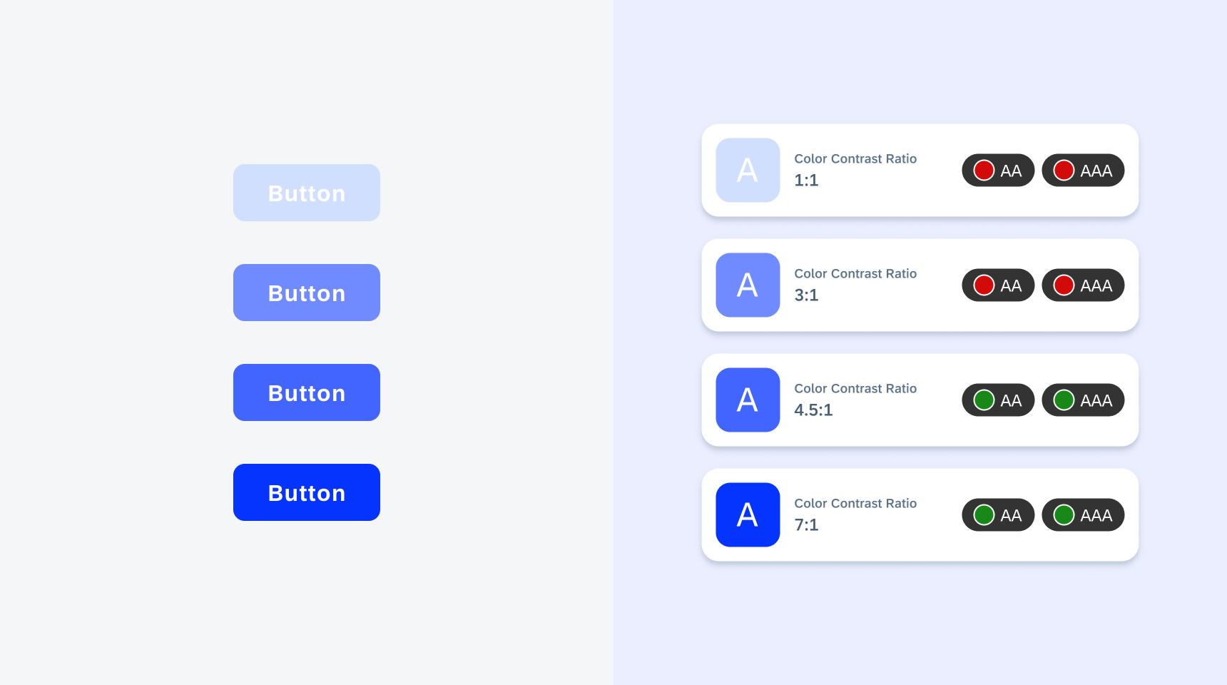
Color contrast ratio scale
Elevation
In iOS apps, elevation plays a key role in both light and dark modes. Shadow effects are used to suggest elevation — the perceived distance between an object and the surface behind it using shadows and light. UI elements can use shadow effects to create visual cues, aid scannability, and convey levels of importance. Generally, components closer to the base layer have sharper shadows, while components that are elevated have softer shadows.
There are five layers of container views, each with its own elevation level: level 0, level 1, level 2, level 3, and level 4. This layer-level treatment gives a hierarchy to page content.
| Light Mode | Dark Mode | Shadow Details | Name | Usage |
|
Box-shadow (#000000, 13%): x-axis 0pt, y-axis 0pt, blur 2pt |
Level 0 | Banners / headers / preview table views | ||
|
Box-shadow (#000000, 13%): x-axis 0pt, y-axis 0pt, blur 2pt Box-shadow (#000000, 4%): x-axis 0px, y-axis 1pt, blur 4pt |
Level 1 | N/A | ||
|
Box-shadow (#000000, 13%): x-axis 0pt, y-axis 0pt, blur 2pt Box-shadow (#000000, 4%): x-axis 0pt, y-axis 2pt, blur 8pt |
Level 2 | Cards / modal views (singular) | ||
|
Box-shadow (#000000, 13%): x-axis 0pt, y-axis 0pt, blur 2pt Box-shadow (#000000, 4%): x-axis 0pt, y-axis 2pt, blur 8pt Box-shadow (#000000, 4%): x-axis 0pt, y-axis 16pt, blur 32pt |
Level 3 | Toast messages / quick sort menus | ||
|
Box-shadow (#000000, 4%): x-axis 0pt, y-axis 0pt, blur 2pt Box-shadow (#000000, 4%): x-axis 0pt, y-axis 8pt, blur 16pt Box-shadow (#000000, 20%): x-axis 0pt, y-axis 10pt, blur 100pt |
Level 4 | Popovers |
Light Mode
Light mode is the default theme for the iOS design system. Touches of color are used to call attention to important information or show the relationship between parts of the interface.
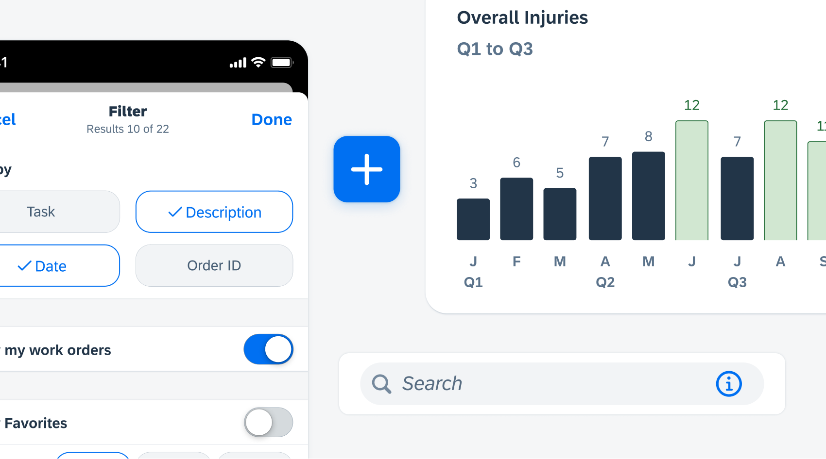
Light mode example
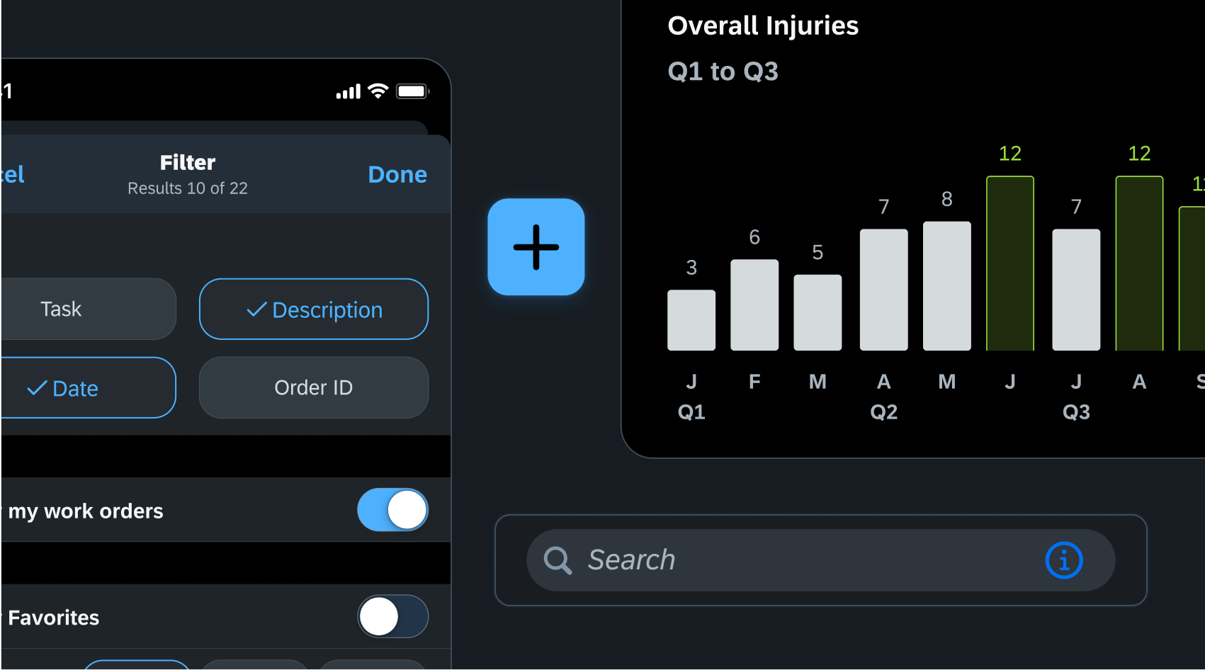
Dark Mode
The dark color palette was created to provide a comfortable viewing experience tailored for low-light environments, which includes dimmer background colors and brighter foreground colors.
In dark mode, the system uses a dark color palette for all screens, views, menus, and controls, and may also use greater perceptual contrast to make foreground content stand out against the darker backgrounds.
iOS uses two sets of background colors — base and elevated — to enhance the perception of depth when one dark interface is layered above another. The base colors are dimmer, making background interfaces appear to recede, and the elevated colors are brighter, making foreground interfaces appear to advance. Dark mode also helps preserve battery life which is very useful for use cases where the user is mobile and needs to preserve battery life.
 Your feedback has been sent to the SAP Fiori design team.