
- Latest SAPUI Version 1.124
- SAPUI5 Version 1.122
- SAPUI5 Version 1.120
- SAPUI5 Version 1.118
- SAPUI5 Version 1.116
- SAPUI5 Version 1.114
- SAPUI5 Version 1.112
- SAPUI5 Version 1.110
- SAPUI5 Version 1.108
- SAPUI5 Version 1.106
- SAPUI5 Version 1.104
- SAPUI5 Version 1.102
- SAPUI5 Version 1.100
- SAPUI5 Version 1.96
- SAPUI5 Version 1.94
- SAPUI5 Version 1.92
- SAPUI5 Version 1.90
- SAPUI5 Version 1.88
- SAPUI5 Version 1.86
- SAPUI5 Version 1.84
- SAPUI5 Version 1.82
- SAPUI5 Version 1.80
- SAPUI5 Version 1.78
- SAPUI5 Version 1.76
- SAPUI5 Version 1.74
- SAPUI5 Version 1.72
- SAPUI5 Version 1.70
- SAPUI5 Version 1.68
- SAPUI5 Version 1.66
- SAPUI5 Version 1.64
- SAPUI5 Version 1.62
- SAPUI5 Version 1.60
- SAPUI5 Version 1.58
- SAPUI5 Version 1.56
- SAPUI5 Version 1.54
- SAPUI5 Version 1.52
- SAPUI5 Version 1.50
- SAPUI5 Version 1.48
- SAPUI5 Version 1.46
- SAPUI5 Version 1.44
- SAPUI5 Version 1.42
- SAPUI5 Version 1.40
- SAPUI5 Version 1.38
- SAPUI5 Version 1.36
- SAPUI5 Version 1.34
- SAPUI5 Version 1.32
- SAPUI5 Version 1.30
- SAPUI5 Version 1.28
- SAPUI5 Version 1.26
- Latest SAPUI Version 1.124
- SAPUI5 Version 1.122
- SAPUI5 Version 1.120
- SAPUI5 Version 1.118
- SAPUI5 Version 1.116
- SAPUI5 Version 1.114
- SAPUI5 Version 1.112
- SAPUI5 Version 1.110
- SAPUI5 Version 1.108
- SAPUI5 Version 1.106
- SAPUI5 Version 1.104
- SAPUI5 Version 1.102
- SAPUI5 Version 1.100
- SAPUI5 Version 1.98
- SAPUI5 Version 1.96
- SAPUI5 Version 1.94
- SAPUI5 Version 1.92
- SAPUI5 Version 1.90
- SAPUI5 Version 1.88
- SAPUI5 Version 1.86
- SAPUI5 Version 1.84
- SAPUI5 Version 1.82
- SAPUI5 Version 1.80
- SAPUI5 Version 1.78
- SAPUI5 Version 1.76
- SAPUI5 Version 1.74
- SAPUI5 Version 1.72
- SAPUI5 Version 1.70
- SAPUI5 Version 1.68
- SAPUI5 Version 1.66
- SAPUI5 Version 1.64
- SAPUI5 Version 1.62
- SAPUI5 Version 1.60
- SAPUI5 Version 1.58
- SAPUI5 Version 1.56
- SAPUI5 Version 1.54
- SAPUI5 Version 1.52
- SAPUI5 Version 1.50
- SAPUI5 Version 1.48
- SAPUI5 Version 1.46
- SAPUI5 Version 1.44
- SAPUI5 Version 1.42
- SAPUI5 Version 1.40
- SAPUI5 Version 1.38
- SAPUI5 Version 1.36
- SAPUI5 Version 1.34
- SAPUI5 Version 1.32
- SAPUI5 Version 1.30
- SAPUI5 Version 1.28
- SAPUI5 Version 1.26
Calendar Card
Intro
The calendar card is an interactive calendar for a single entity, such as a person. It shows a chronological list of appointments for the selected date.
The calendar card is an integration card that uses the generic structure of the sap.f.card control.
When to Use
You can use the calendar card to show a calendar for one person, based on the single planning calendar.
Do not use it to show multiple appointments/calendars. Use the planning calendar instead.
Components
- Header: Basic information about the calendar card, including the title, subtitle, and appointment counter.
You can define a navigation target for the header area (recommended). This is typically the underlying application containing the full calendar.
- Calendar title: Title set by the application team. Use a title that reflects the use of the calendar in your application context.
- Calendar subtitle: Subtitle set by the application team to further qualify the focus of the calendar.
- Counter: Indicates how many appointments are displayed on the card and how many exist for the selected day overall.
- Calendar navigation: Users can navigate to the previous/next period (for example previous/next month) or use the picker to select the month and year directly.
- Calendar with interactive days: Interactive calendar, showing the selected day, current day, and special days.
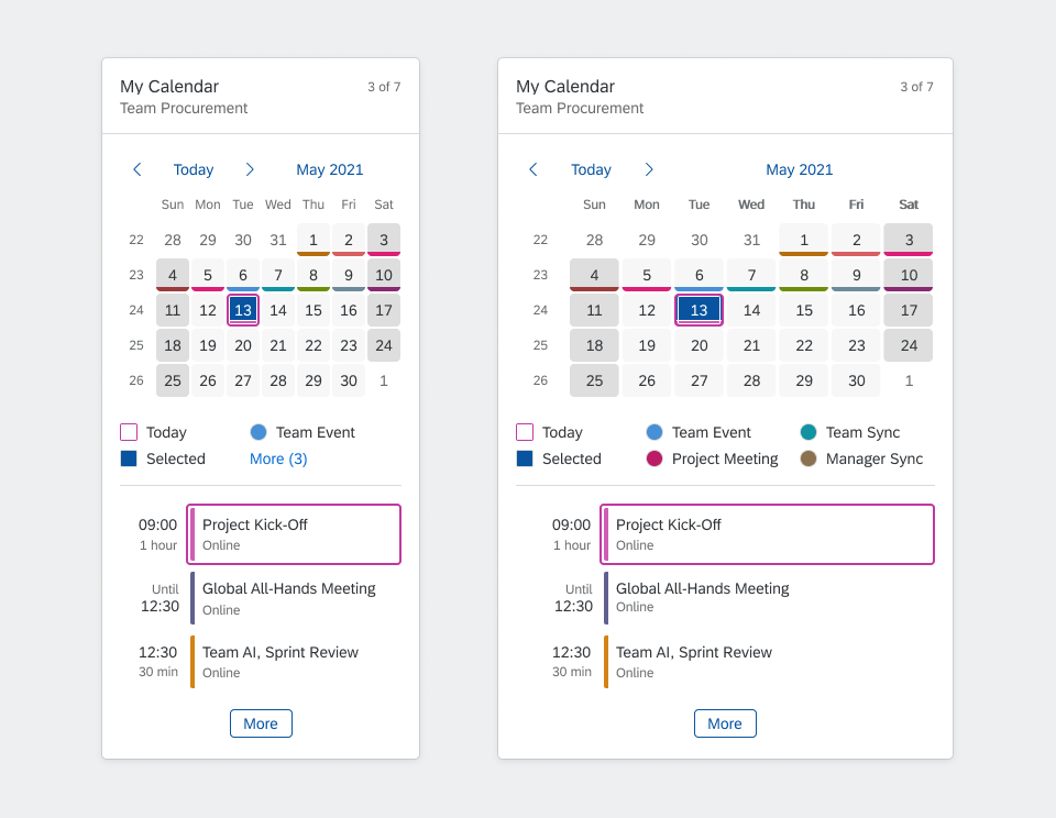
- Legend: In-place legend. You can specify the number of items that are shown. The More (x) text indicates how many legend items are hidden.
The different types of legend items are indicated by different shapes: Squares refer to highlighted days, circles refer to types of appointment.
Group titles from the planning calendar legend are not shown in the calendar card.
- Appointment list: Shows appointments for the selected day. You can define the number of visible appointments.
- Appointment duration: Indicates the duration using a dynamic combination of start date, duration, and end date. The format is determined automatically based on the user’s locale.
- Appointment: The appointment can have an icon, a title, and a subtitle.
The appointment title and subtitle do not wrap. If there is insufficient space on the card, the text is truncated.
- Indicator for more appointments: The More button indicates that additional appointments exist for the selected day.
You can define a navigation target for the button (recommended). This is typically the detail app containing all the appointments.
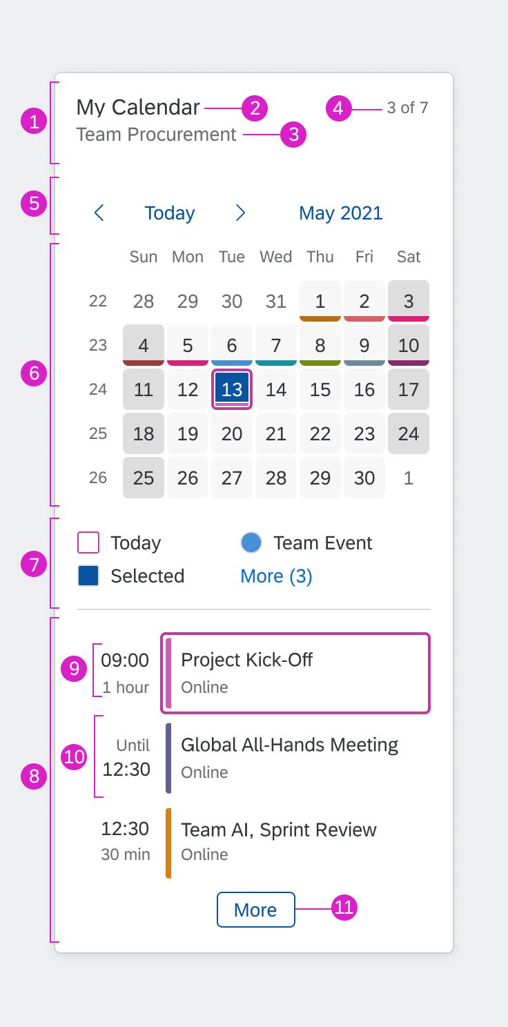
Components of a calendar card
Behavior and Interaction
Calendar Card Header
When a day is selected, the counter adapts to show the number of appointments for that day (visible appointments/total appointments).
If a navigation target has been defined, clicking the navigation header opens the corresponding application.
Selecting a Date
Instead of offering a date picker in a popover, the calendar card changes views in place and allows the user to drill in.
At each level, the user can select the relevant period, navigate back and forth using the Previous and Next arrows, or drill down to the next level using the date picker.
| Drill- down Level |
View | Selection | Previous/Next Arrows | Date Picker Display | View Opened by Date Picker Link |
| 1 | Days in the month | Day | Previous month, next month | Selected month and year | Months in the selected year |
| 2 | Months in the year | Month | Previous year, next year | Selected year | Years in a year interval |
| 3 | Years in a year interval | Year | Previous year interval, next year interval | Selected year interval | Set of year intervals |
| 4 | Set of year intervals | Year interval | Previous set of year intervals, next set of year intervals | n/a | n/a |
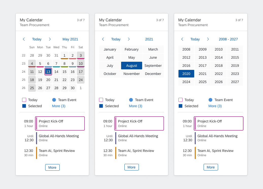
Calendar card - Picker views
Appointment List
When a day is selected, the appointment list adapts to show the appointments for that day.
If a navigation target has been set for the appointment, clicking the appointment navigates to the corresponding application (one click area).
If additional appointments exist, and a navigation target has been defined, clicking More opens the corresponding application.
Responsiveness
The responsive behavior of the calendar card depends on the container control of the host environment (for example, SAP Fiori launchpad). The size of the card adapts dynamically to the size of the container.
Width
Calendar cards adapt to the available width. If the width exceeds 589 px, the card switches automatically from a 1-column layout to a 2-column layout.
| Width | Layout |
| 295 px (minimum width) | 1 column |
| 295 – 589 px | 1 column |
| > 589 px | 2 columns |
You configure the width of the calendar card by specifying the number of grid columns. The width of the card (and thus the breakpoint for the 2-column layout) is then determined by the grid.
1-column layout - wider card shows more legend items

1-column layout and corresponding 2-column layout showing more appointments
Height
The height of the calendar card is determined by the content (no scrolling possible). It depends on the number of appointments that exist for the selected day and the maximum number of visible appointments you have defined.
When the width exceeds 589px and the card rearranges into two columns, and the height of the card shrinks. The minimum number of rows is determined by the number of visible appointments.
Note: If the calendar card snaps to the grid row (depending on overall card snapping behavior), this will sometimes result in blank space in the card.
Top Tips
- Keep the legend as simple as possible.
- Consider the height of the card when you define the number of visible appointments.
 Your feedback has been sent to the SAP Fiori design team.