
- Latest SAPUI Version 1.124
- SAPUI5 Version 1.122
- SAPUI5 Version 1.120
- SAPUI5 Version 1.118
- SAPUI5 Version 1.116
- SAPUI5 Version 1.114
- SAPUI5 Version 1.112
- SAPUI5 Version 1.110
- SAPUI5 Version 1.108
- SAPUI5 Version 1.106
- SAPUI5 Version 1.104
- SAPUI5 Version 1.102
- SAPUI5 Version 1.100
- SAPUI5 Version 1.96
- SAPUI5 Version 1.94
- SAPUI5 Version 1.92
- SAPUI5 Version 1.90
- SAPUI5 Version 1.88
- SAPUI5 Version 1.86
- SAPUI5 Version 1.84
- SAPUI5 Version 1.82
- SAPUI5 Version 1.80
- SAPUI5 Version 1.78
- SAPUI5 Version 1.76
- SAPUI5 Version 1.74
- SAPUI5 Version 1.72
- SAPUI5 Version 1.70
- SAPUI5 Version 1.68
- SAPUI5 Version 1.66
- SAPUI5 Version 1.64
- SAPUI5 Version 1.62
- SAPUI5 Version 1.60
- SAPUI5 Version 1.58
- SAPUI5 Version 1.56
- SAPUI5 Version 1.54
- SAPUI5 Version 1.52
- SAPUI5 Version 1.50
- SAPUI5 Version 1.48
- SAPUI5 Version 1.46
- SAPUI5 Version 1.44
- SAPUI5 Version 1.42
- SAPUI5 Version 1.40
- SAPUI5 Version 1.38
- SAPUI5 Version 1.36
- SAPUI5 Version 1.34
- SAPUI5 Version 1.32
- SAPUI5 Version 1.30
- SAPUI5 Version 1.28
- SAPUI5 Version 1.26
- Latest SAPUI Version 1.124
- SAPUI5 Version 1.122
- SAPUI5 Version 1.120
- SAPUI5 Version 1.118
- SAPUI5 Version 1.116
- SAPUI5 Version 1.114
- SAPUI5 Version 1.112
- SAPUI5 Version 1.110
- SAPUI5 Version 1.108
- SAPUI5 Version 1.106
- SAPUI5 Version 1.104
- SAPUI5 Version 1.102
- SAPUI5 Version 1.100
- SAPUI5 Version 1.98
- SAPUI5 Version 1.96
- SAPUI5 Version 1.94
- SAPUI5 Version 1.92
- SAPUI5 Version 1.90
- SAPUI5 Version 1.88
- SAPUI5 Version 1.86
- SAPUI5 Version 1.84
- SAPUI5 Version 1.82
- SAPUI5 Version 1.80
- SAPUI5 Version 1.78
- SAPUI5 Version 1.76
- SAPUI5 Version 1.74
- SAPUI5 Version 1.72
- SAPUI5 Version 1.70
- SAPUI5 Version 1.68
- SAPUI5 Version 1.66
- SAPUI5 Version 1.64
- SAPUI5 Version 1.62
- SAPUI5 Version 1.60
- SAPUI5 Version 1.58
- SAPUI5 Version 1.56
- SAPUI5 Version 1.54
- SAPUI5 Version 1.52
- SAPUI5 Version 1.50
- SAPUI5 Version 1.48
- SAPUI5 Version 1.46
- SAPUI5 Version 1.44
- SAPUI5 Version 1.42
- SAPUI5 Version 1.40
- SAPUI5 Version 1.38
- SAPUI5 Version 1.36
- SAPUI5 Version 1.34
- SAPUI5 Version 1.32
- SAPUI5 Version 1.30
- SAPUI5 Version 1.28
- SAPUI5 Version 1.26
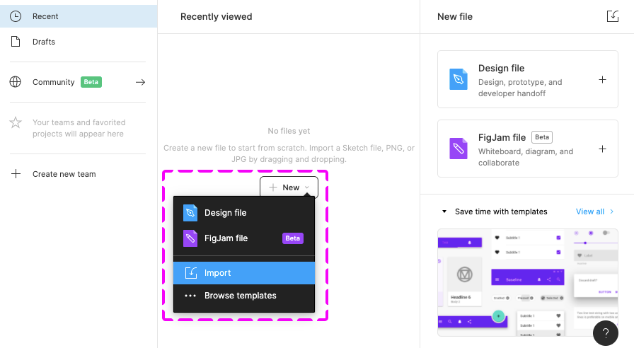
Design Stencils for Figma (Mac and Windows)
Intro
You can use this stencil set to create high-fidelity SAP Fiori designs using Figma.
For more information about SAP Fiori design stencils in general, see Design Stencils.
For information on how to use the Figma stencils with Sketch, Axure RP, or Adobe XD, see Using Figma Stencils with Other Design Tools.
Prerequisites
To use the SAP Fiori stencils, you need to install SAP’s 72 font family and the SAP icon font on your machine.
Download and Installation
- Install the Figma software here: www.figma.com
- Download the latest Figma SAP Fiori Design Stencils.
- Install font 72*.
- Choose the folder Font 72 / 72_Desktop.
- Double-click each .ttf file and click Install.
- Install the SAP icon font.
- Remove any former versions of the SAP icon font.
- Choose the folder Icon Fonts / …final icon package / Fonts
- Double-click the SAP-icons.ttf file and click Install.
- Optional: Install the SAP Business Suite icon font.
- Remove any former versions of the SAP Business Suite icon font.
- Choose the folder Icon Fonts / …final icon package / Fonts
- Double-click the BusinessSuiteInAppSymbols.ttf file and click Install.
*The 72 font download is made available under the Apache 2.0 license.
Activating the Figma Library
The procedure for using the Figma library depends your Figma license plan. Follow the link for your license plan below.
Option A: With a Figma Professional Plan
- Import the two .fig files Fiori Web Stencils Compact and Fiori Web Stencils Cozy as well as the .fig file Quartz Light Colors MASTER into Figma and publish them as libraries.
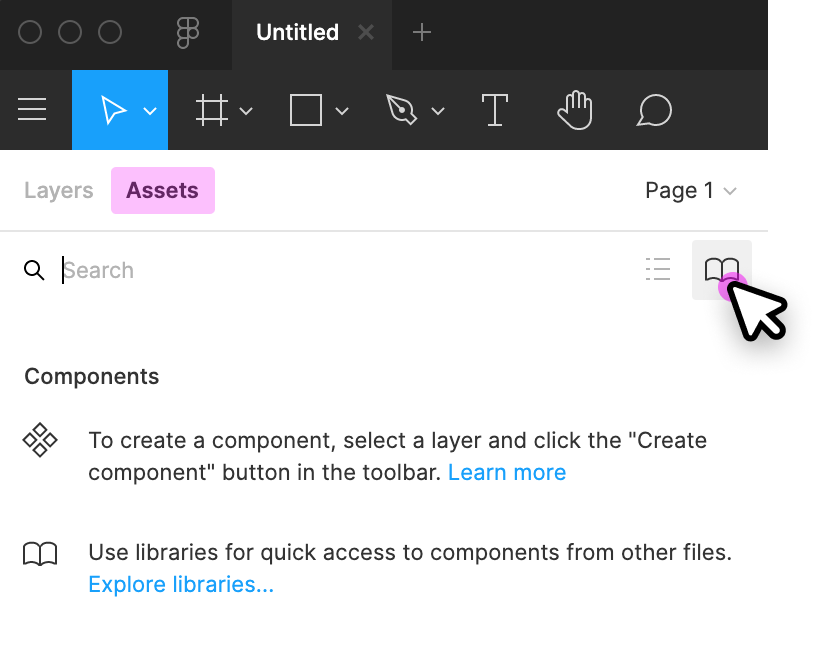
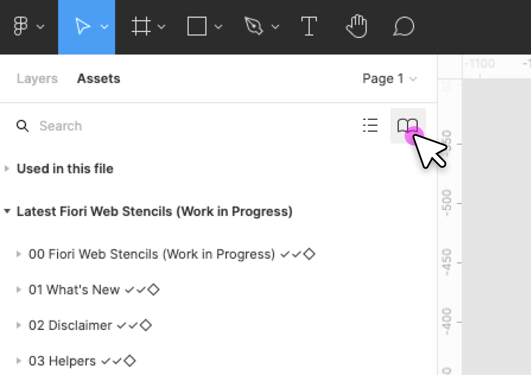
- Create a new design file and activate the published Fiori Web Stencil libraries and Quartz Light Colors library in the asset panel on the left. To do this, click the library icon on the top right of the asset panel and activate the libraries using the switch in the dialog.
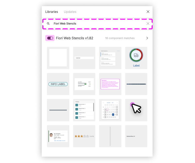
- After activating a library, you’ll see all the activated libraries as a list within the asset panel on the left. From there, you can easily drag and drop the stencil you need to your canvas.

Option B: Without a Figma Professional Plan
- Import the two .fig files Fiori Web Stencils Compact and Fiori Web Stencils Cozy as well as the .fig file Quartz Light Colors MASTER [Resource] into Figma and publish the styles of the Quartz Light Colors MASTER [Resource].
- Create a new design file and activate the published Quartz Light Color library in the asset panel on the left. To do this, click the library icon on the top right of the left side panel and activate the library using the switch in the dialog.
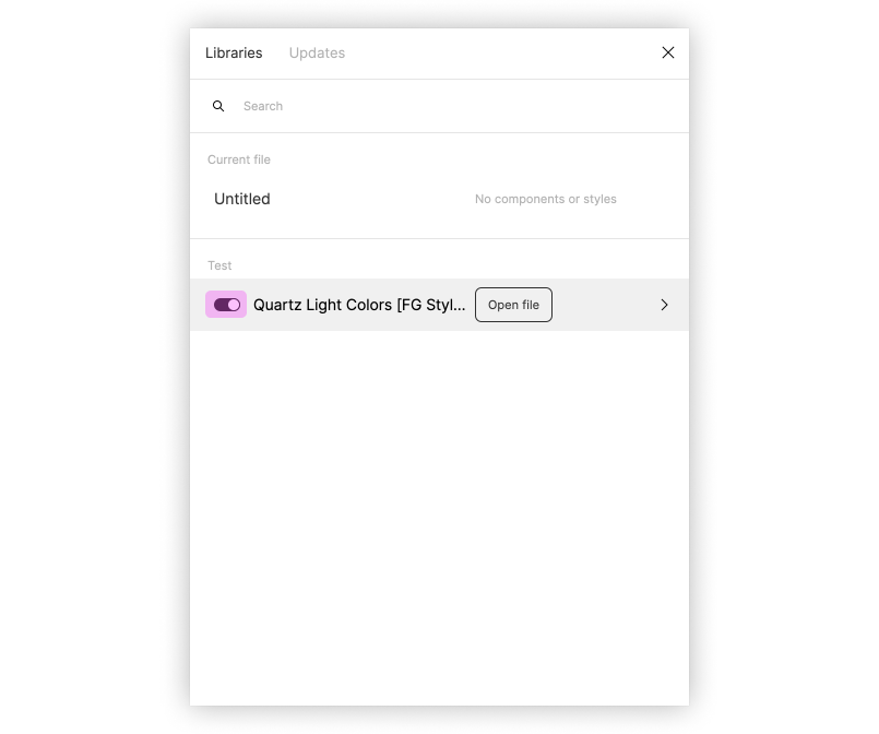
- You are now able to copy and paste the stencil you need from the two Fiori Web Stencil files into your project file and change the styles of your own elements to the Figma Quartz Light Color Styles via the design panel on the right.
Top Tips
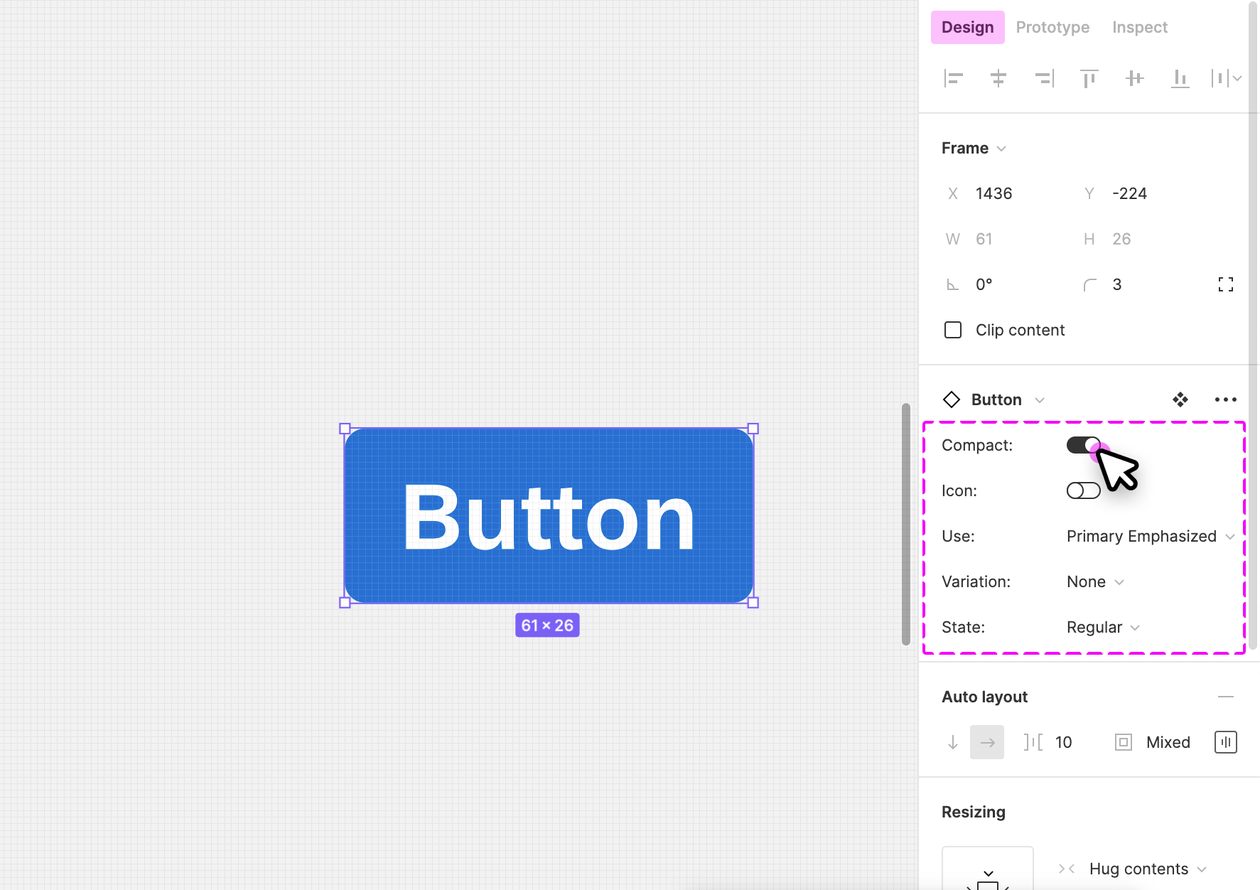
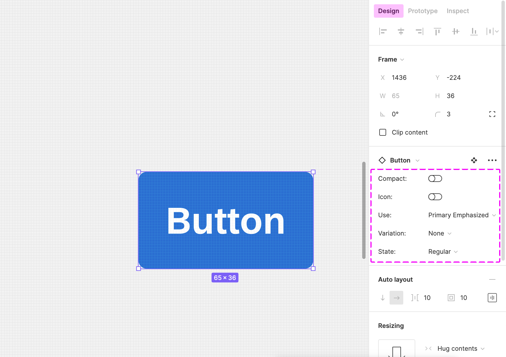
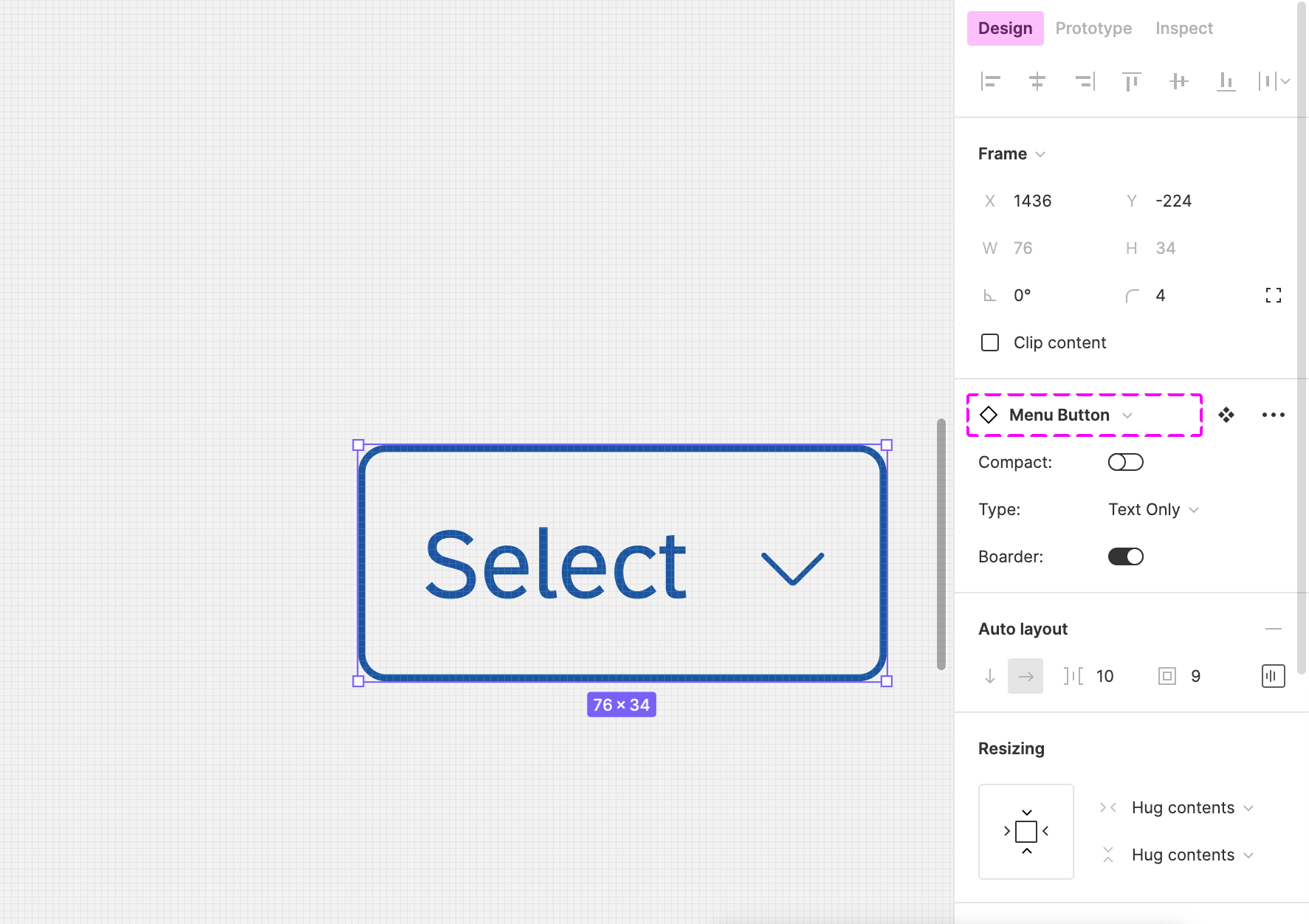
Variants
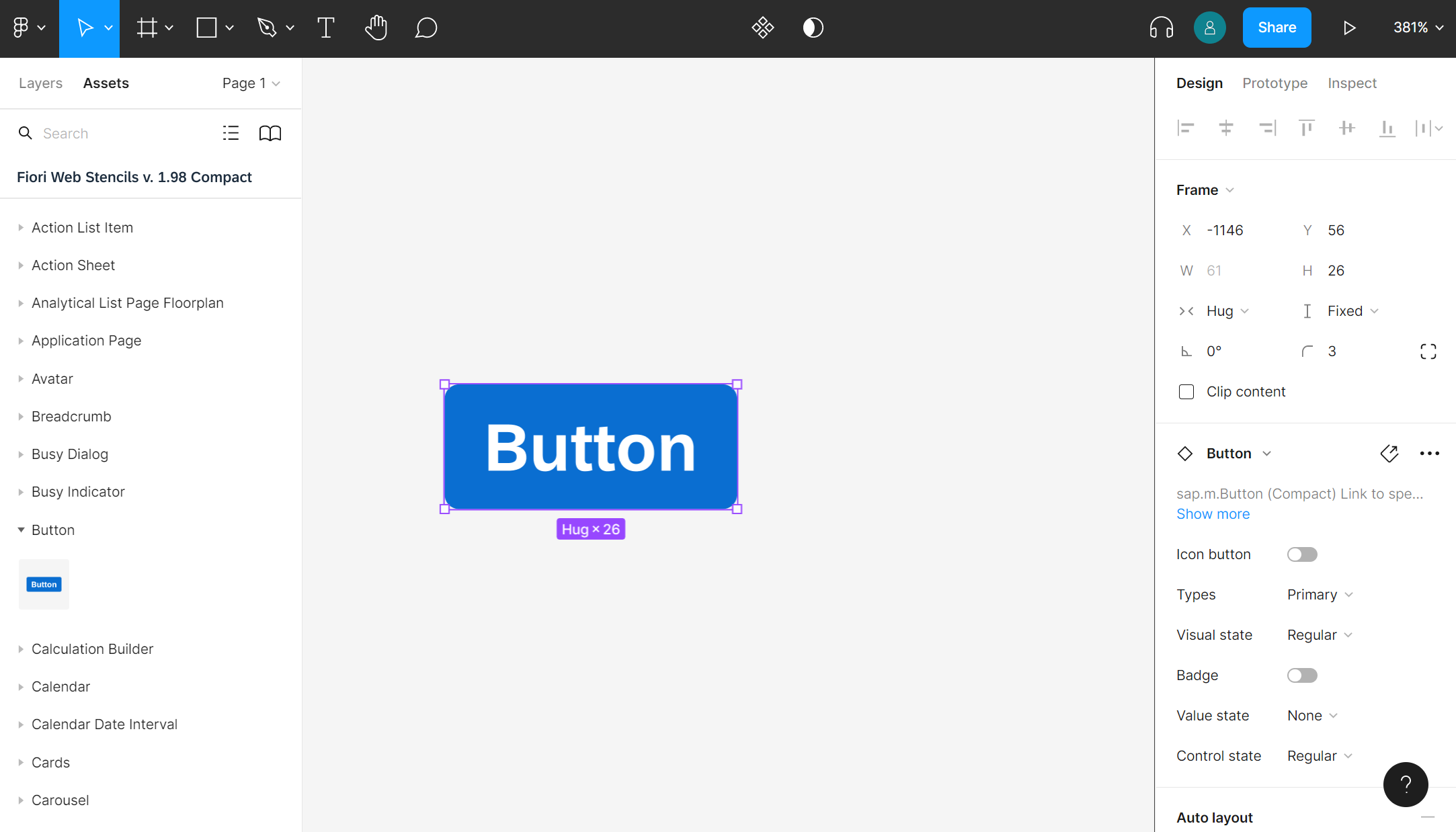
Check out the variants section within the design panel on the right to adapt the stencil as needed. Possible settings include:
- Content Density
- Size
- Visual State
- Value State
- Actions
- …
For more information, see Create and use variants on the Figma website.
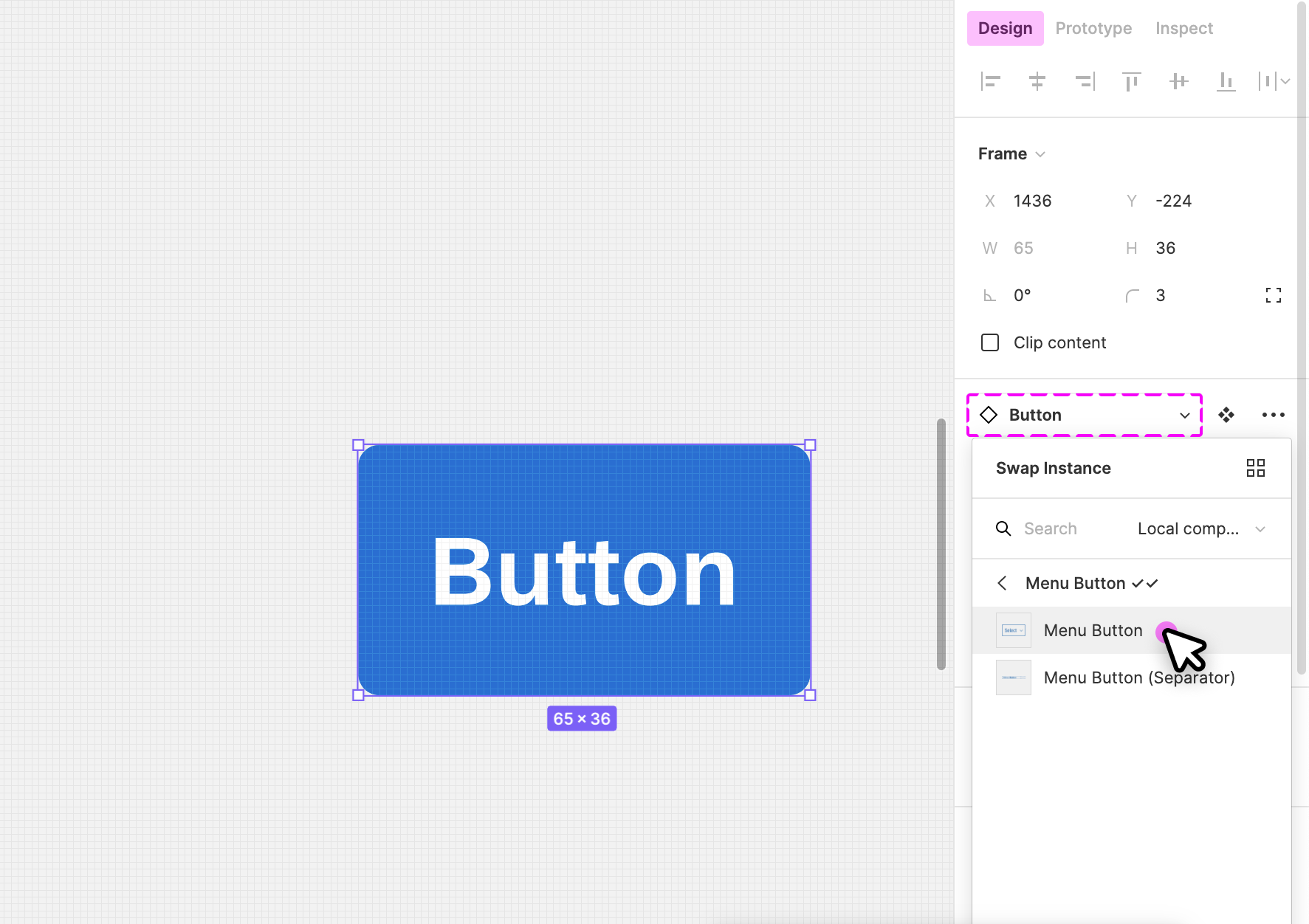
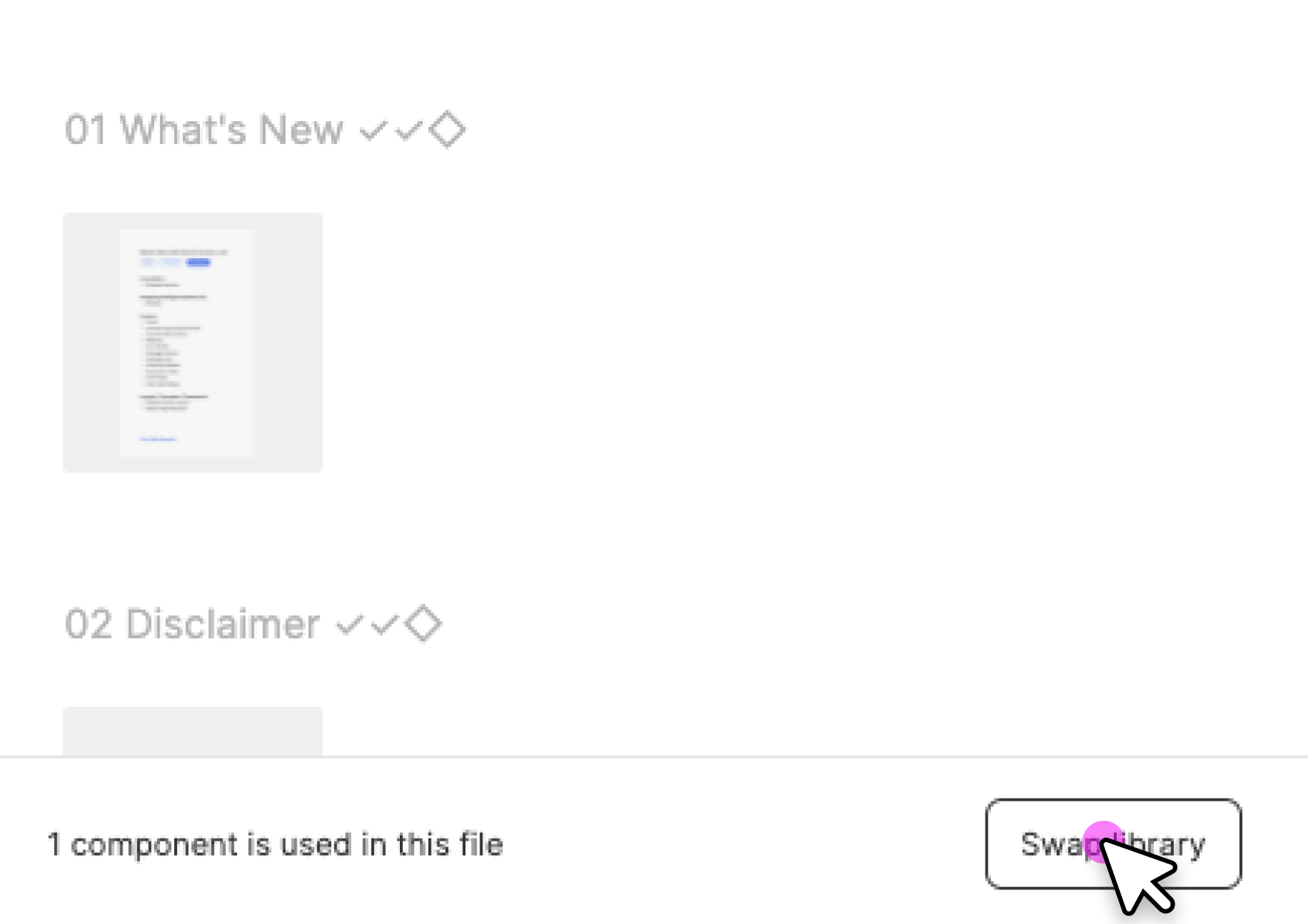
Swap Instances (Figma Professional Plan Only)
You can easily switch between instances of a component (for example, to switch a “button” component to a “menu button” component). You do this via the instance menu in the design panel on the right.
Map Components to Other Libraries (Figma Professional Plan Only)
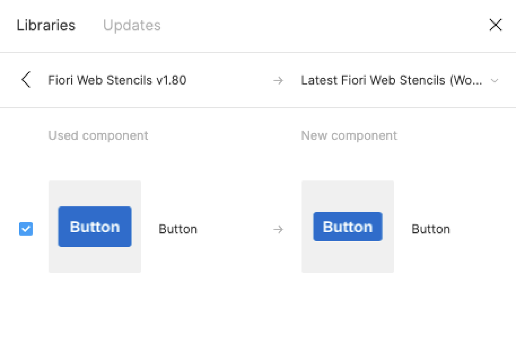
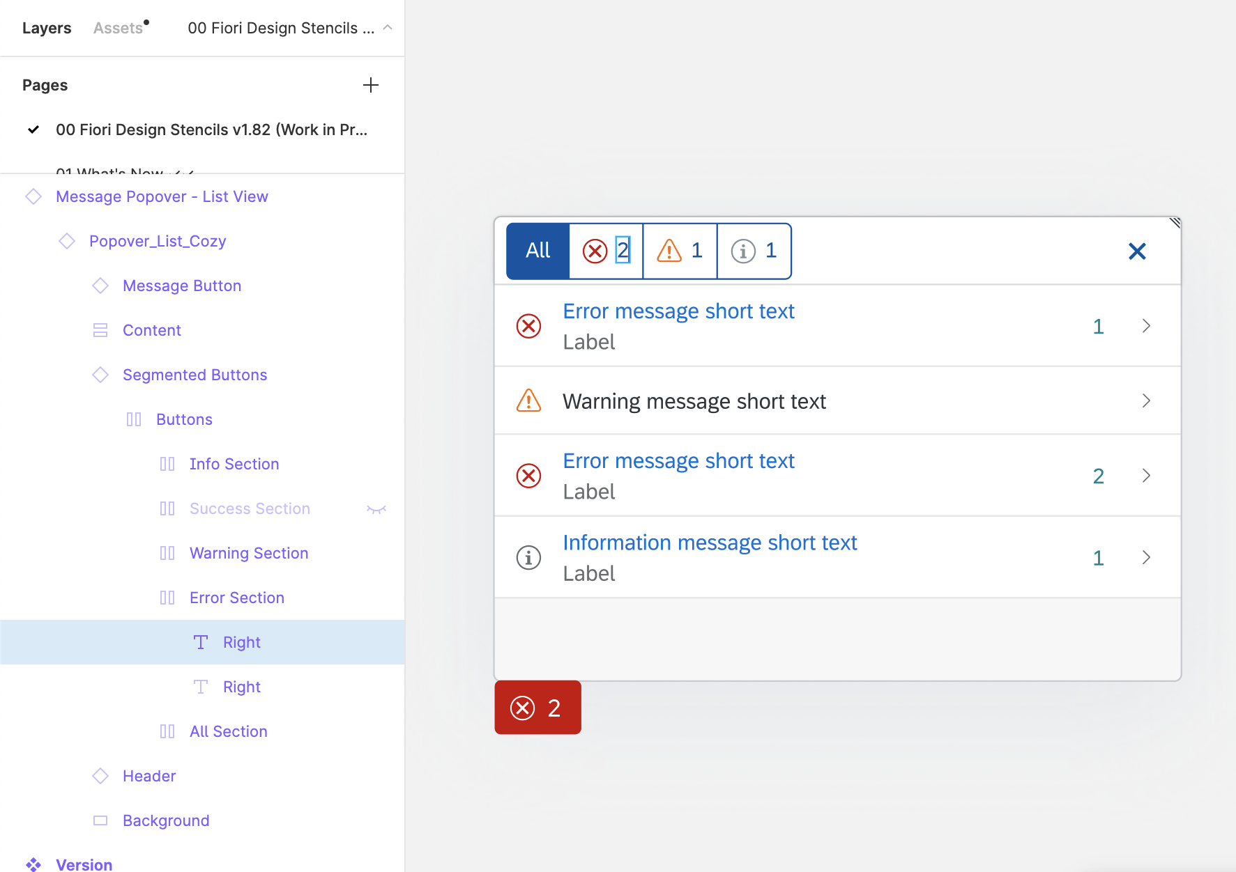
If a component has the same name in different libraries, you can swap instances manually (in other words, map components to the components of a different library). For example, you can swap a button from an unavailable library (e.g. “Fiori Web Stencils v1.96”) to a button from the library “Fiori Web Stencils v1.98 Compact“. Simply choose the component you want to swap and search for the same component name within the Swap Instance popup.
Important: If the component doesn’t seem to be available any more, please do not click on “Restore Component”.
For more information, see Swap between component instances in a file on the Figma website.
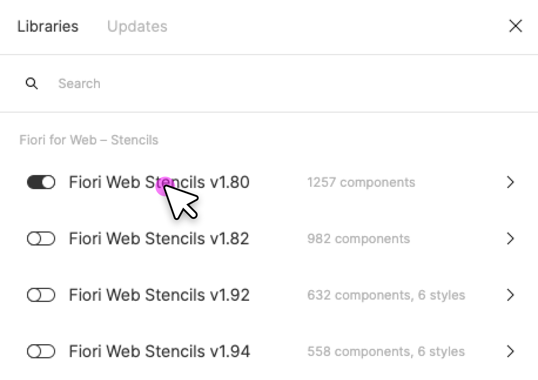
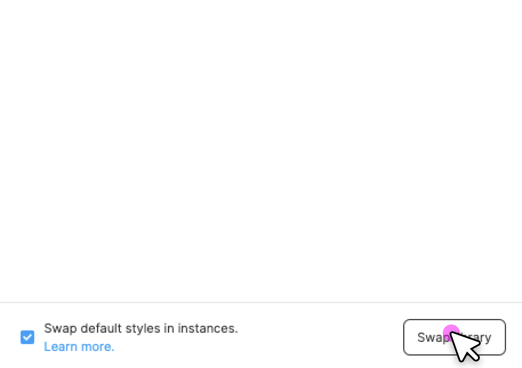
Swap Library (Figma Professional Plan Only)
You can use the “Swap library” function to update all instances in your file (for example, to update your components from an older stencil version to the latest version).
Procedure:
- In the asset pane, open the team library dialog.
- Choose the library you activated for the file by clicking on the line item.
- Click the Swap library button.
- Choose the library you want to use to update your components.
- Confirm by clicking the Swap library button again.
Whenever the selected target library matches the style and component naming, it is applied automatically.
Figma doesn’t swap unmatched assets. These stay connected to the original library. If needed, you can swap individual instances manually using the swap instances function.
For more information, see Swap style and component libraries on the Figma website.

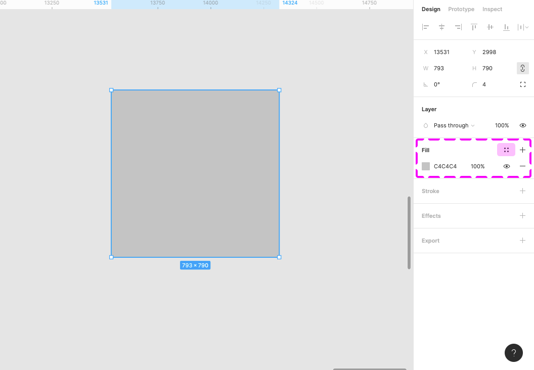
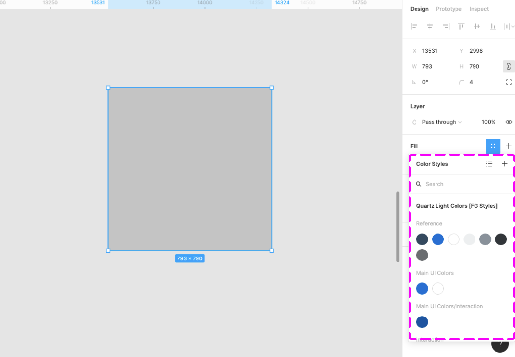
Using the Style Library
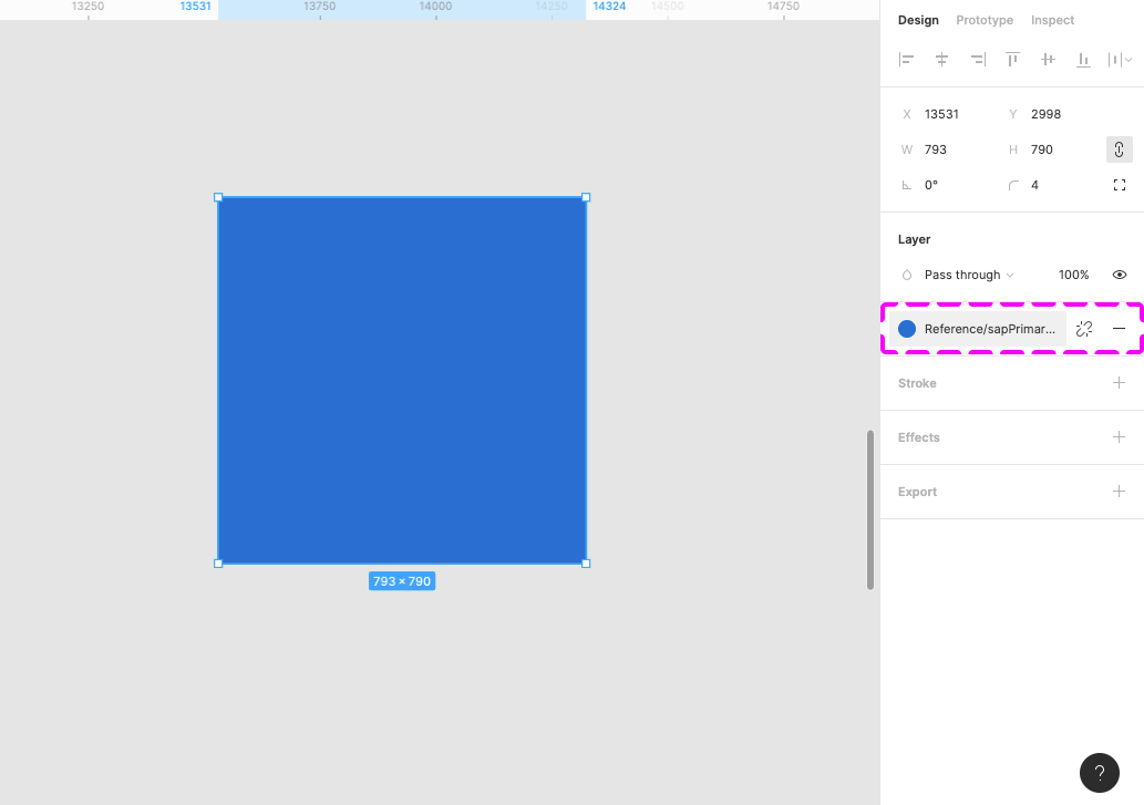
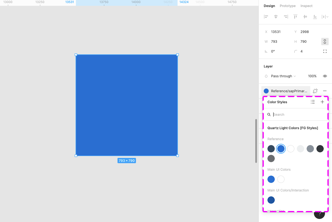
You can use the Quartz Light Colors by activating the Quartz Light Colors MASTER [Resource] library. You’ll find the menu in the right-hand panel within the “Fill”, “Stroke”, and “Effects” sections. The styles are structured in groups, such as “Reference”, “Main UI Colors”, and many more.
Auto Layout
Auto layout is a feature that enables a container to adapt dynamically to the elements inside it.
- Everything adjusts automatically when an element within the component is shown or hidden.
- If a text is changed within the component, everything adjusts automatically to the new text length.
- The padding is managed dynamically and always remains correct.
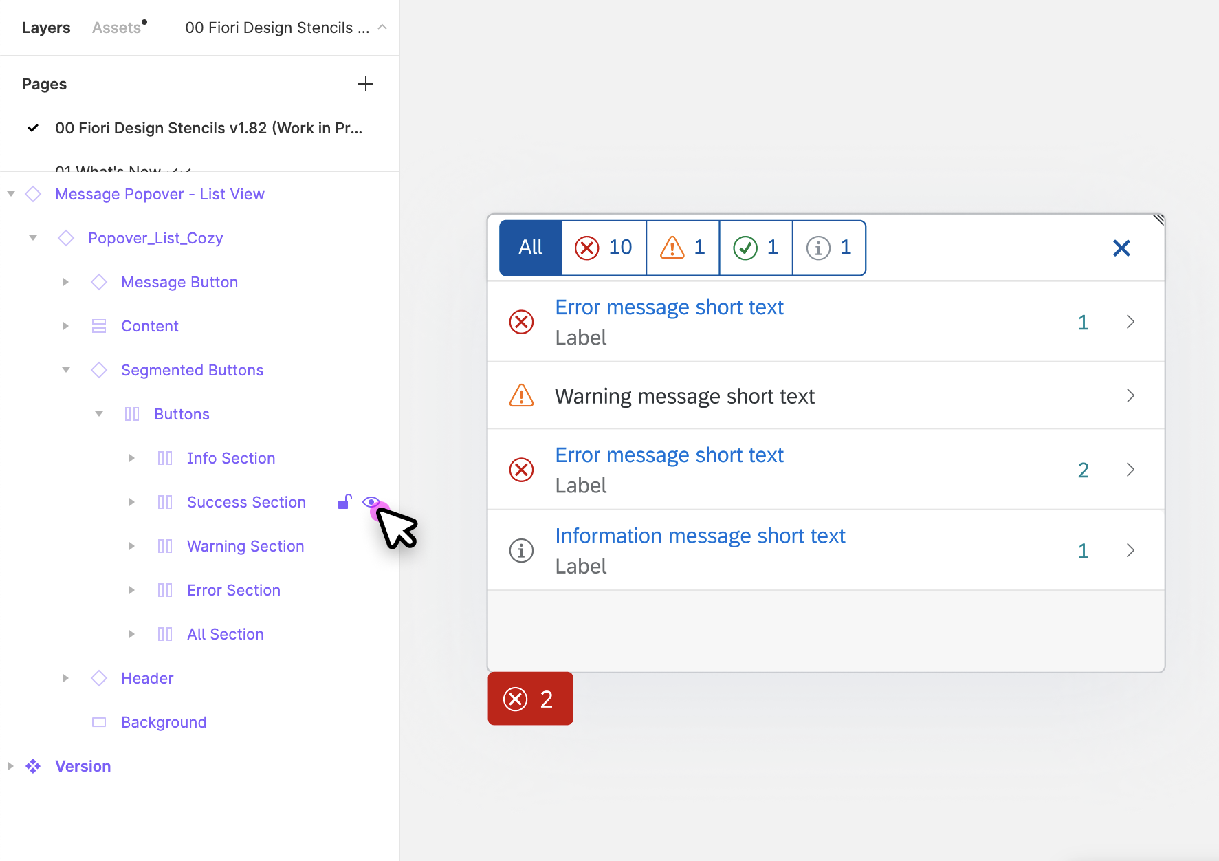
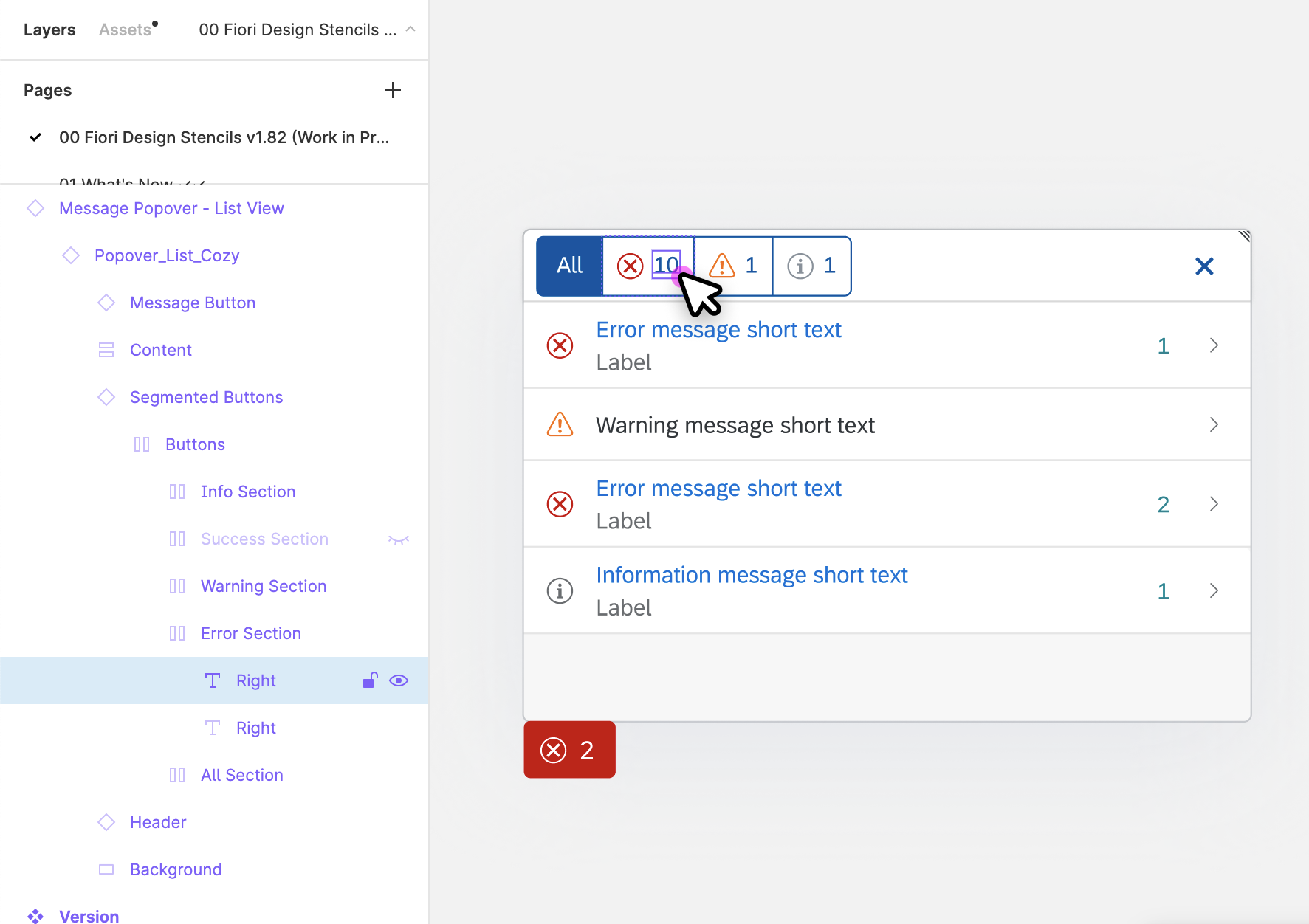
You can show/hide elements within components easily using the layer panel on the left.
For more information, see Create dynamic designs with Auto layout on the Figma website.
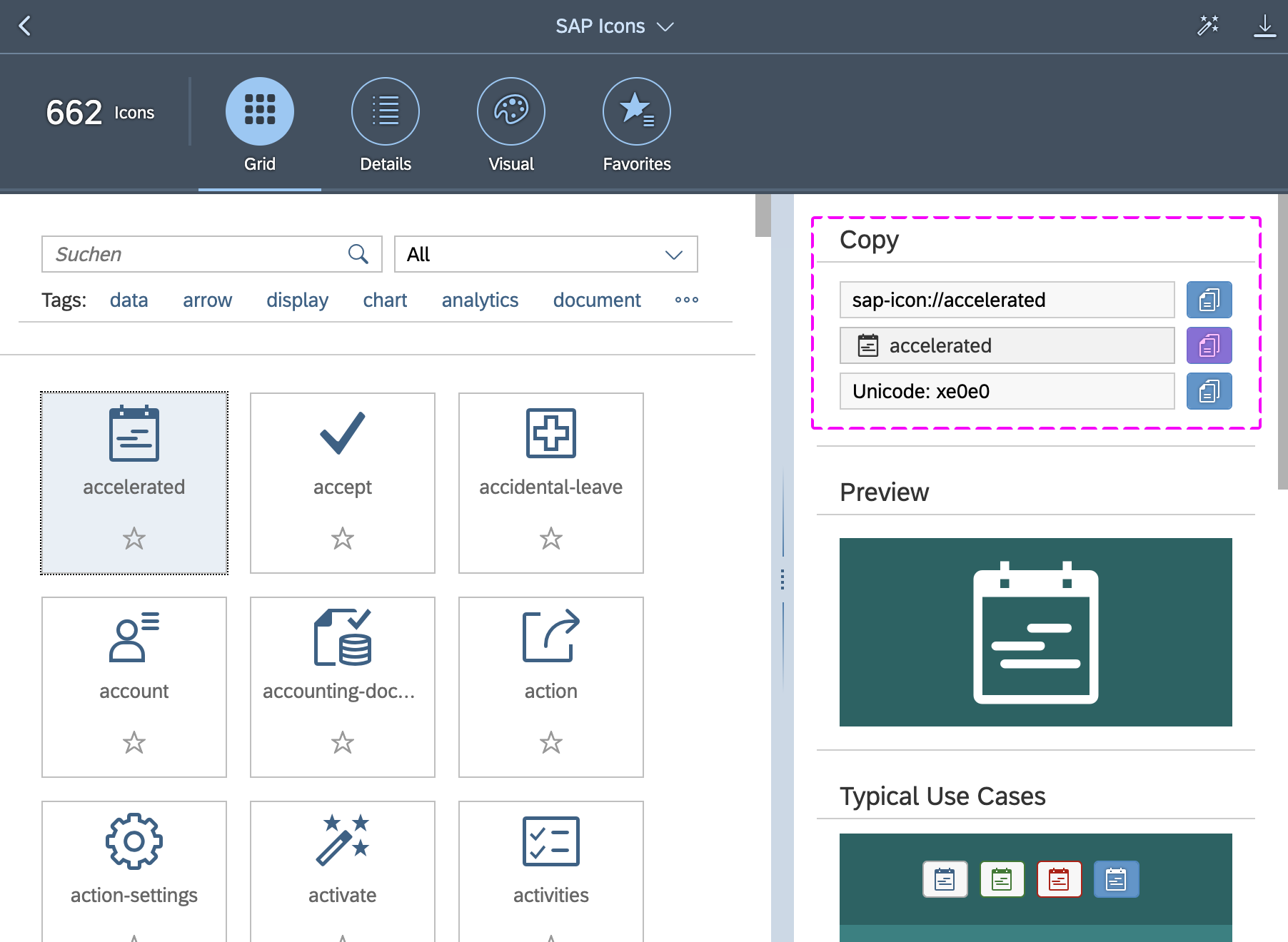
How to Use SAP Icons
You can copy and paste any SAP icon from the Icon Explorer to Figma:
- Make sure that you have installed the icon font you want to use properly. For more information, see Download Icon Font.
- In the Icon Explorer, select the icon you want to use.
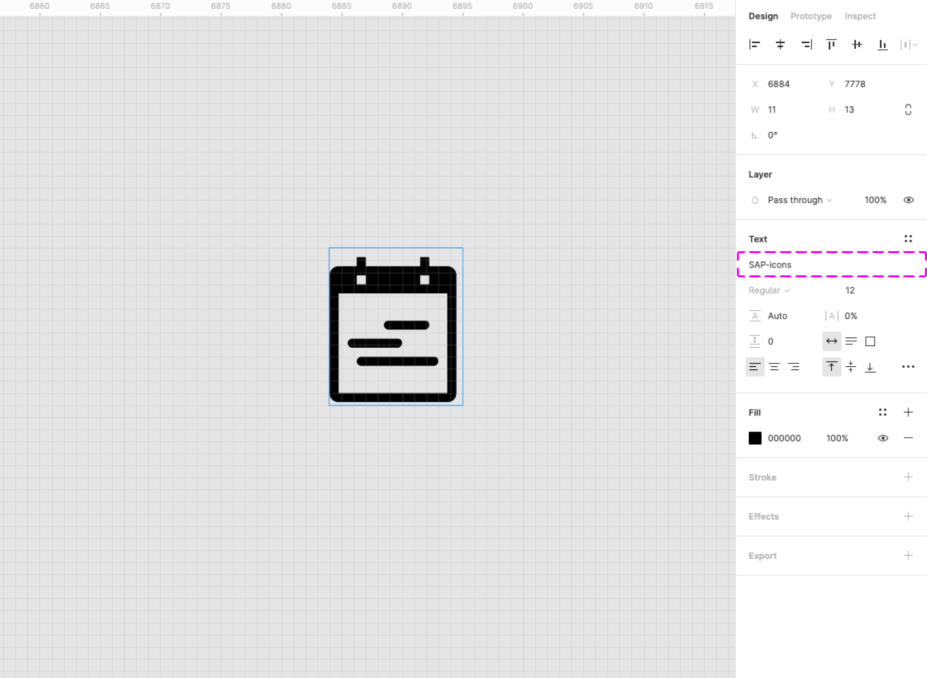
- Select the relevant icon font in the Figma Text element (for example, SAP-icons).
- In the Copy section at the top of the right-hand panel, copy the icon to the clipboard (copy the second item with the icon and icon name).
- In Figma, simply paste the icon from the clipboard.
Note: If you switch between different icon fonts, you may need to restart Figma for the new setting in the Text element to take effect.
Related Links
External Links
- Figma’s YouTube Channel
- Figma Help Center
- Figma Best Practices
- Figma Tips & Tricks
- Tutorials
- Prototyping
- LinkedIn Figma Essential Training: The Basics
(subscription required) - LinkedIn Figma Essential Training: Collaboration
(subscription required)
 Your feedback has been sent to the SAP Fiori design team.