
- Latest SAPUI Version 1.124
- SAPUI5 Version 1.122
- SAPUI5 Version 1.120
- SAPUI5 Version 1.118
- SAPUI5 Version 1.116
- SAPUI5 Version 1.114
- SAPUI5 Version 1.112
- SAPUI5 Version 1.110
- SAPUI5 Version 1.108
- SAPUI5 Version 1.106
- SAPUI5 Version 1.104
- SAPUI5 Version 1.102
- SAPUI5 Version 1.100
- SAPUI5 Version 1.96
- SAPUI5 Version 1.94
- SAPUI5 Version 1.92
- SAPUI5 Version 1.90
- SAPUI5 Version 1.88
- SAPUI5 Version 1.86
- SAPUI5 Version 1.84
- SAPUI5 Version 1.82
- SAPUI5 Version 1.80
- SAPUI5 Version 1.78
- SAPUI5 Version 1.76
- SAPUI5 Version 1.74
- SAPUI5 Version 1.72
- SAPUI5 Version 1.70
- SAPUI5 Version 1.68
- SAPUI5 Version 1.66
- SAPUI5 Version 1.64
- SAPUI5 Version 1.62
- SAPUI5 Version 1.60
- SAPUI5 Version 1.58
- SAPUI5 Version 1.56
- SAPUI5 Version 1.54
- SAPUI5 Version 1.52
- SAPUI5 Version 1.50
- SAPUI5 Version 1.48
- SAPUI5 Version 1.46
- SAPUI5 Version 1.44
- SAPUI5 Version 1.42
- SAPUI5 Version 1.40
- SAPUI5 Version 1.38
- SAPUI5 Version 1.36
- SAPUI5 Version 1.34
- SAPUI5 Version 1.32
- SAPUI5 Version 1.30
- SAPUI5 Version 1.28
- SAPUI5 Version 1.26
- Latest SAPUI Version 1.124
- SAPUI5 Version 1.122
- SAPUI5 Version 1.120
- SAPUI5 Version 1.118
- SAPUI5 Version 1.116
- SAPUI5 Version 1.114
- SAPUI5 Version 1.112
- SAPUI5 Version 1.110
- SAPUI5 Version 1.108
- SAPUI5 Version 1.106
- SAPUI5 Version 1.104
- SAPUI5 Version 1.102
- SAPUI5 Version 1.100
- SAPUI5 Version 1.98
- SAPUI5 Version 1.96
- SAPUI5 Version 1.94
- SAPUI5 Version 1.92
- SAPUI5 Version 1.90
- SAPUI5 Version 1.88
- SAPUI5 Version 1.86
- SAPUI5 Version 1.84
- SAPUI5 Version 1.82
- SAPUI5 Version 1.80
- SAPUI5 Version 1.78
- SAPUI5 Version 1.76
- SAPUI5 Version 1.74
- SAPUI5 Version 1.72
- SAPUI5 Version 1.70
- SAPUI5 Version 1.68
- SAPUI5 Version 1.66
- SAPUI5 Version 1.64
- SAPUI5 Version 1.62
- SAPUI5 Version 1.60
- SAPUI5 Version 1.58
- SAPUI5 Version 1.56
- SAPUI5 Version 1.54
- SAPUI5 Version 1.52
- SAPUI5 Version 1.50
- SAPUI5 Version 1.48
- SAPUI5 Version 1.46
- SAPUI5 Version 1.44
- SAPUI5 Version 1.42
- SAPUI5 Version 1.40
- SAPUI5 Version 1.38
- SAPUI5 Version 1.36
- SAPUI5 Version 1.34
- SAPUI5 Version 1.32
- SAPUI5 Version 1.30
- SAPUI5 Version 1.28
- SAPUI5 Version 1.26
Smart Field
sap.ui.comp.smartfield.Smartfield
Intro
The smart field creates different user input controls and their read-only equivalents based on an OData (Open Data Protocol) service and its annotations. It comes with additional built-in features, such as autocomplete and suggestions, value help dialog, recently used and recommended values, validation, and message handling.
When to Use
Use the smart field if:
- You use an OData service for your app (OData version 2 only).
- The feature set of the smart field fits your app. In this case, the smart field is faster to implement.
- You use the smart table and your app is not performance-critical. The smart field offers more flexibility than the controls provided directly by the smart table, especially for editing.
- You use a smart form.
Do not use the smart field if:
- You use a different technology to OData version 2. Use the corresponding controls directly.
- You need a different control for entering or displaying data, such as multi input, a multi combo box, step input, a radio button, or a title. In this case, use the corresponding control directly.
- You need a different dialog for offering value help, such as the select dialog or table select dialog.
- You use the smart table and your app is performance-critical. In this case, the controls offered directly by the smart table offer less flexibility but better performance.
Components
The smart field consists of a basic UI element and an optional label. The following UI elements are available:
Edit mode:
- One or two input fields (with or without a value help dialog)
- Select
- Combo box
- Text area
- Checkbox
- Date picker
- Date/time picker
- Time picker
Display mode:
For details, see the corresponding guideline topics.
User Input Control
The smart field chooses the control automatically based on the data type (Edm type) and annotations of the OData service and additional properties. The following controls are used:
| Read-Only | Edit | Edm Types / Annotations / Properties | Comment | |
| Single-line text | Text | Input field | Edm.String
Configuration: controlType, value: input |
|
| Combo box | Edm.String
Configuration: controlType, value: dropDownList |
|||
| Select | Edm.String
Configuration: controlType, value: selection |
|||
| Multi-line text | Text | Text area | Edm.String
MultiLineText |
|
| Decimal numbers | Text | One or two input fields (for number and unit) |
Edm.Int16, Edm.Int32, Edm.Int64, Edm.SByte, Edm.Byte, Edm.Single, Edm.Float, Edm.Double, Edm.Decimal Precision, Scale |
|
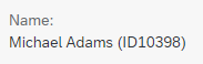
| Status information | Object status | Edm.String
criticality, criticalityRepresentationType |
||
| Text and ID | Text | Input field | TextArrangement
controlProposal displayBehavior textInEditModeSource, sap:text, |
The following patterns can be selected via displayBehavior:
|
| Links (with/without quick view) |
Link | Edm.String
IsURL, url semanticObjectController |
||
| Dates | Text | Date picker | Edm.DateTime
sap:display-format=”Date” IsCalendarDate Configuration: controlType |
|
| Dates and times | Text | Date/time picker | Edm.DateTime
Edm.DateTimeOffset |
|
| Times | Text | Time picker | Edm.Time | |
| Fiscal periods | Text | Input field | IsFiscalYear, IsFiscalPeriod, IsFiscalYearPeriod, IsFiscalQuarter, IsFiscalYearQuarter, IsFiscalWeek, IsFiscalYearWeek, IsDayOfFiscalYear |
|
| Amounts with currencies | Text | One or two input fields | ISOCurrency or sap:unit with sap:semantics=”currency-code” | |
| Phone numbers | Text | Input field | IsPhoneNumber | |
| Text | Input field | IsEmailAddress | ||
| Boolean | Checkbox | Checkbox | Edm.Boolean | |
| Text | Combo box | Edm.Boolean
valueList displayBehavior |
The text in display mode can be influenced via displayBehavior:
|
Behavior and Interaction
Context
Switching Between Edit and Display Mode
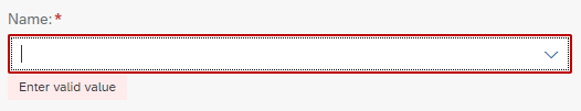
Switching between edit and display mode can be controlled manually (annotation: FieldControl, property: editable) or automatically by the containing smart form or smart table (property: contextEditable).
Smart field as a select with 'required' indicator in edit mode
The same smart field in display mode
Suggestions and Value Help
You can enable suggestions for controls that offer this feature (property: showSuggestions). The list of suggestible values must be provided (annotation: ValueList or ValueListWithFixedValues only for Edm.String, property: entitySet). This list can contain several attributes and is also used for the value help dialog. You can restrict the number of attributes from this list to be shown as suggestions, while all attributes are shown within the value help dialog.
Autocomplete is enabled automatically.
For input fields, the value help dialog is also created automatically. Hide it if it is not needed (property: showValueHelp). The table in the value help dialog can be filled with initial content (annotation: ValueList, property: fetchValues, sap.ui.comp.smartfield.Configuration, property: preventInitialDataFetchInValueHelpDialog)
Both the value help dialog and the suggestion list can be prefiltered (annotation: ValueList, property: valueListParameterIn). The selected items can be used to prefilter other fields (annotation: ValueList, property: ValueListParameterOut). The corresponding filter settings are visible. “Invisible” prefiltering is also supported. To use this option, provide the exact matching filter value (Common.ValueListParameterConstant).
If a value has been entered in the smart field, this value is transferred to the search field of the value help dialog automatically. In the value help dialog, individual values can be valid, deprecated, or revoked. Revoked values are hidden from the value help (annotation: IsConfigurationDeprecationCode).
The following controls are used to offer suggestions or value help:
- A fixed value list leads to a combo box or select, depending on the control configuration.
- A non-fixed value list leads to an input field with a value help dialog.
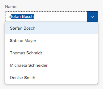
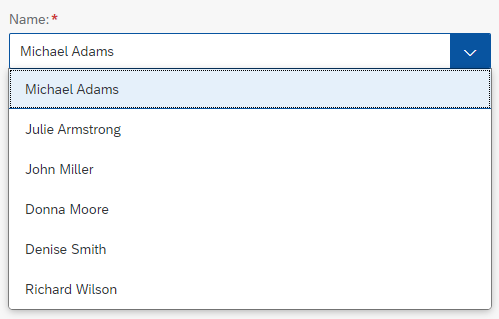
Smart field as a combo box
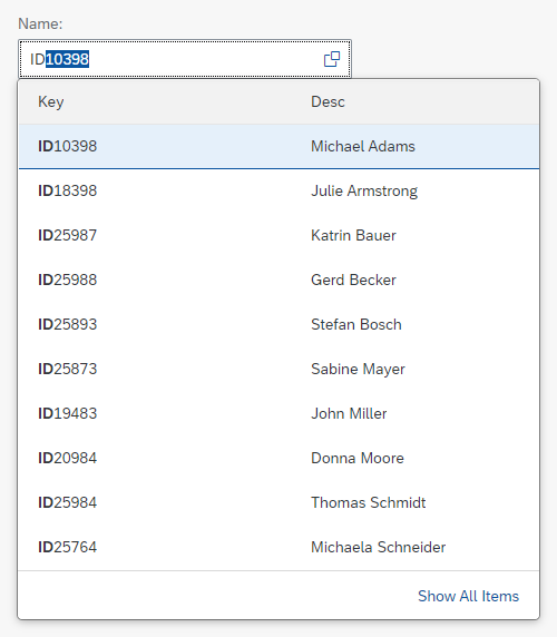
Smart field as an input field with suggestions, auto complete, and a value help button
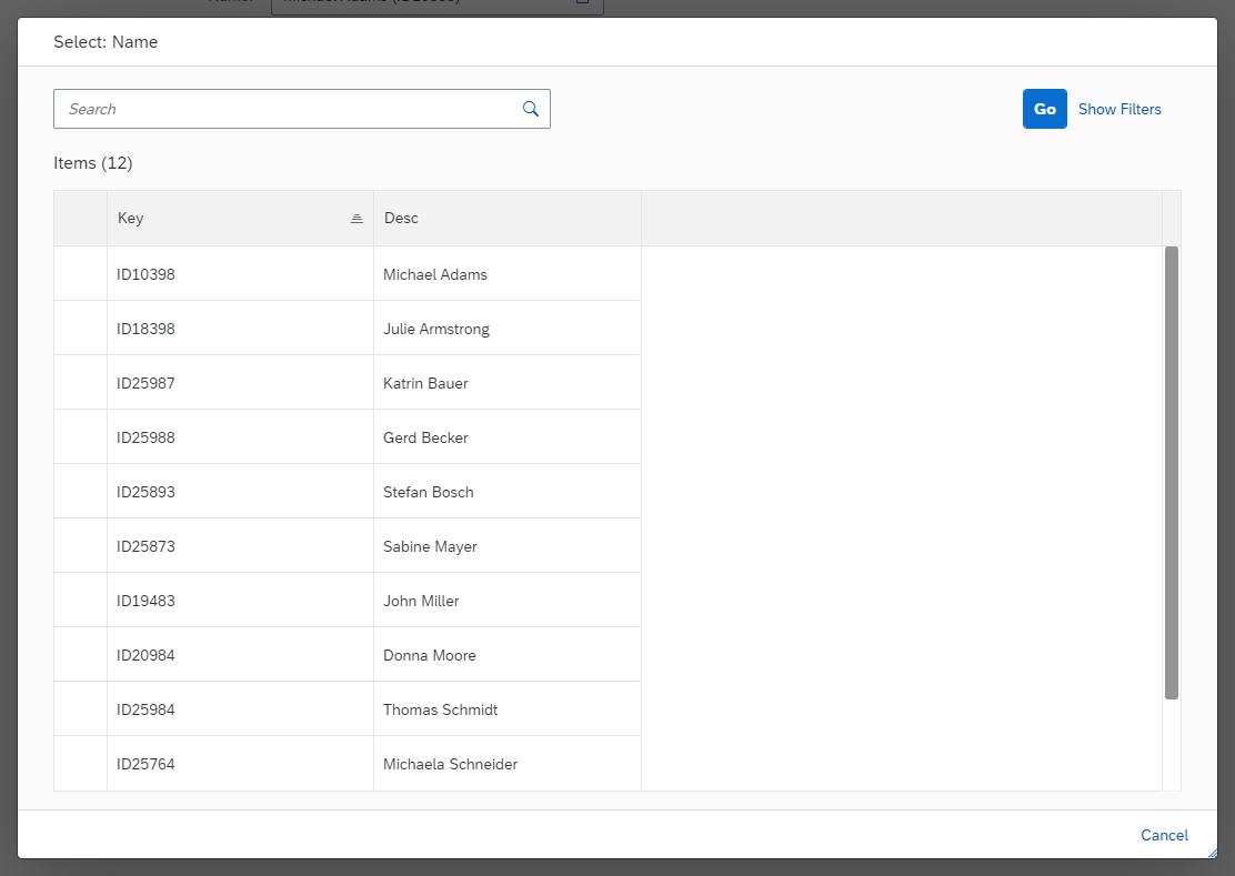
The automatically generated value help dialog for the same smart field
Recently Used Values
Input fields, combo boxes, and selects can provide up to five recently used values automatically on focus if suggestions or value help are available. This can be turned on or off per field (property: historyEnabled). Recently used values are shown by default for input fields, but not for combo boxes and selects.
Recommended Values
In addition to recently used values, a smart field can show recommended values (annotation: RecommendationState).
The corresponding smart field is highlighted and/or prefilled:
- If no recommendation is available or the current user input matches the recommendation, the smart field is shown in the default state.
- If a recommendation is available and there is no user input, the smart field is shown in the information state.
- If a recommendation is available and it differs from the current user input, the smart field is displayed in the warning state.
The recommended values are shown as soon as the user focuses on the smart field.
Validation
The smart field offers the following validations automatically:
- Validation for required fields: This can be done on the client or server side (property:
clientSideMandatoryCheck, annotation:Nullable). - Validation for a group of fields: Validation is triggered when the focus moves outside a group of fields, rather than when a single field loses the focus. A group is defined by all smart fields that share the same field group ID (property:
fieldGroupIds). - Validation for the maximum length of user input: Validation is triggered when a field loses the focus or the ENTER key is pressed (property:
maxLength). - Validation for combo boxes: Checks if the value entered is available in the dropdown list (property:
fixedValueListValidationEnabled).
The validation result is indicated by a value state (property: showValueStateMessage).
When the user edits a smart field showing a text and ID, you can allow any kind of input to avoid unnecessary validation issues (annotation: ValueListNoValidation).
Examples:
- Allowing the user to enter additional values (which are not in the suggestion list)
- Typing a text instead of an ID to filter down the suggestion list
- Using the smart field in a draft
Automatic validation
IDs
The smart field offers automatic validation for number-only ID fields (annotations: IsDigitSequence or sap:display-format="NonNegative"):
- It checks for non-negative numbers.
- It shows values containing only “0” digits as empty.
- It does not show leading zeros.
Units
For decimal number fields and for fields that show an amount with a currency, you can add a unit of measure (annotations: unit, sap-unit with sap:semantics="unit-of-measure" or sap:semantics="currency-code", property: uomVisible). In display mode, the unit is added to the corresponding number. In edit mode, the unit is shown either as text or, if editable, as a second input field (properties: uomEditable, uomEnabled).
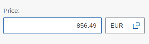
Smart field showing an amount with a currency in display mode

The same smart field in display mode
Sensitive Data
Sensitive data, such as passwords, can be masked. The text is then replaced with asterisks (annotations: IsPotentiallySensitive, masked).
Capitalizing Text Input
Text input can be capitalized automatically (property: IsUpperCase).
States
Smart fields support the following states (annotation: fieldControl):
- Editable or display only (additional annotations:
updateable,creatable,updatable-path,InsertRestrictions,UpdateRestrictions, property:editable) - Enabled or disabled
- Visible or hidden (additional annotations: property:
visible, annotation:sap:visible) - Required: If set, the smart field must contain a value when validated. This is indicated by an asterisk next to the corresponding label (additional annotation:
Nullable, property:mandatory).
The following states for a unit of measurement can be set independently of the corresponding field:
Dependencies between Smart Fields
If the content of a smart field is changed, you can trigger additional changes to other fields on the UI (annotation: SideEffects).
Content Alignment
You can change the horizontal alignment of the text within any kind of input field (property: textAlign).
Responsiveness
The smart field acts exactly like the embedded controls. For details see:
Top Tips
- Always label a smart field if it is not inside a table context.
- Use suggestions with autocomplete whenever possible and meaningful.
- Do not show suggestions if there are only a few choices.
- Use recently used values as appropriate.
- Reduce the number of attributes shown in the suggestion list to a maximum of 4 or 5.
- Make use of validation features.
Properties
The following properties, aggregations, and associations are available for sap.ui.comp.smartfield.SmartField:
- The property:
expandNavigationPropertiesis experimental. Do not use it. - The property:
importancehides the field if the smart field is placed in a smart form, depending on the importance setting of the smart form. End users have no possibility to show the corresponding fields again. Do not use this property. - The property:
jsontypeis deprecated. Do not use it. - The property:
nameis used in HTML forms that send data to the server via “Submit”. - The property:
uomEditStateis for internal use only. Do not use it. - The property:
proposedControlis deprecated. Do not use it. - The property:
textDirectionprovides support for reading directions in different locales. - The aggregation:
controlProposalis deprecated. Do not use it. - The association:
ariaLabelledBycan be used for linking additional labels to the smart field.
Related Links
Elements and Controls
- Text (guidelines)
- Object Display Components (guidelines)
- Link (guidelines)
- Input Field (guidelines)
- Select (guidelines)
- Combo Box (guidelines)
- Date Picker (guidelines)
- Date/Time Picker (guidelines)
- Time Picker (guidelines)
- Text Area (guidelines)
- Checkbox (guidelines)
- Smart Link (guidelines)
Implementation
- Smart Field (SAPUI5 API reference)
- Smart Field (Developer Guide)
- Smart Field (SAPUI5 samples)
- Smart Controls (SAPUI5 samples)
- Side Effects (Developer Guide)
 Your feedback has been sent to the SAP Fiori design team.