
- Latest SAPUI Version 1.124
- SAPUI5 Version 1.122
- SAPUI5 Version 1.120
- SAPUI5 Version 1.118
- SAPUI5 Version 1.116
- SAPUI5 Version 1.114
- SAPUI5 Version 1.112
- SAPUI5 Version 1.110
- SAPUI5 Version 1.108
- SAPUI5 Version 1.106
- SAPUI5 Version 1.104
- SAPUI5 Version 1.102
- SAPUI5 Version 1.100
- SAPUI5 Version 1.96
- SAPUI5 Version 1.94
- SAPUI5 Version 1.92
- SAPUI5 Version 1.90
- SAPUI5 Version 1.88
- SAPUI5 Version 1.86
- SAPUI5 Version 1.84
- SAPUI5 Version 1.82
- SAPUI5 Version 1.80
- SAPUI5 Version 1.78
- SAPUI5 Version 1.76
- SAPUI5 Version 1.74
- SAPUI5 Version 1.72
- SAPUI5 Version 1.70
- SAPUI5 Version 1.68
- SAPUI5 Version 1.66
- SAPUI5 Version 1.64
- SAPUI5 Version 1.62
- SAPUI5 Version 1.60
- SAPUI5 Version 1.58
- SAPUI5 Version 1.56
- SAPUI5 Version 1.54
- SAPUI5 Version 1.52
- SAPUI5 Version 1.50
- SAPUI5 Version 1.48
- SAPUI5 Version 1.46
- SAPUI5 Version 1.44
- SAPUI5 Version 1.42
- SAPUI5 Version 1.40
- SAPUI5 Version 1.38
- SAPUI5 Version 1.36
- SAPUI5 Version 1.34
- SAPUI5 Version 1.32
- SAPUI5 Version 1.30
- SAPUI5 Version 1.28
- SAPUI5 Version 1.26
- Latest SAPUI Version 1.124
- SAPUI5 Version 1.122
- SAPUI5 Version 1.120
- SAPUI5 Version 1.118
- SAPUI5 Version 1.116
- SAPUI5 Version 1.114
- SAPUI5 Version 1.112
- SAPUI5 Version 1.110
- SAPUI5 Version 1.108
- SAPUI5 Version 1.106
- SAPUI5 Version 1.104
- SAPUI5 Version 1.102
- SAPUI5 Version 1.100
- SAPUI5 Version 1.98
- SAPUI5 Version 1.96
- SAPUI5 Version 1.94
- SAPUI5 Version 1.92
- SAPUI5 Version 1.90
- SAPUI5 Version 1.88
- SAPUI5 Version 1.86
- SAPUI5 Version 1.84
- SAPUI5 Version 1.82
- SAPUI5 Version 1.80
- SAPUI5 Version 1.78
- SAPUI5 Version 1.76
- SAPUI5 Version 1.74
- SAPUI5 Version 1.72
- SAPUI5 Version 1.70
- SAPUI5 Version 1.68
- SAPUI5 Version 1.66
- SAPUI5 Version 1.64
- SAPUI5 Version 1.62
- SAPUI5 Version 1.60
- SAPUI5 Version 1.58
- SAPUI5 Version 1.56
- SAPUI5 Version 1.54
- SAPUI5 Version 1.52
- SAPUI5 Version 1.50
- SAPUI5 Version 1.48
- SAPUI5 Version 1.46
- SAPUI5 Version 1.44
- SAPUI5 Version 1.42
- SAPUI5 Version 1.40
- SAPUI5 Version 1.38
- SAPUI5 Version 1.36
- SAPUI5 Version 1.34
- SAPUI5 Version 1.32
- SAPUI5 Version 1.30
- SAPUI5 Version 1.28
- SAPUI5 Version 1.26
Upload Set
sap.m.UploadSet
Intro
The upload set control allows users to upload single or multiple files from a device (desktop, tablet, or phone) to an SAP Fiori app.
Despite its name, the upload set is not limited to plain upload scenarios. Depending on the context or the access rights, some users may only be allowed to download the files uploaded by others. You can use the upload set control for both cases.
When to Use
Use the upload set control if:
- You want to show a list of uploaded files that can be modified.
- You want to allow users to add or remove several files, and to change the file names.
- You are still using one of the older upload controls:
sap.ca.ui.FileUploadsap.m.UploadCollection(deprecated since SAPUI5 version 1.88)
Do not use the upload set control if:
- The user can upload only one file to the app. In this case, use the
sap.ui.unified.FileUploadercontrol instead.
Layout
Default Layout and Actions
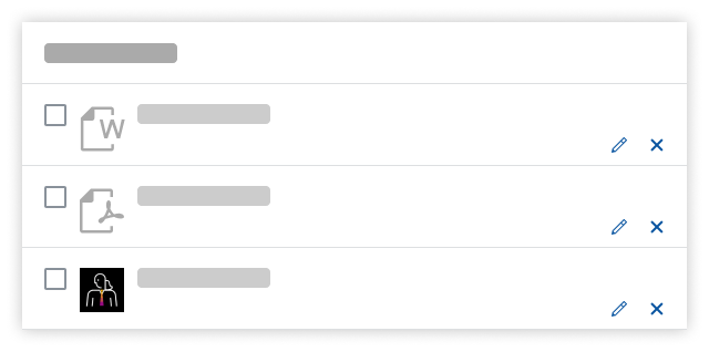
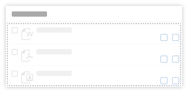
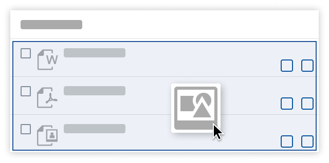
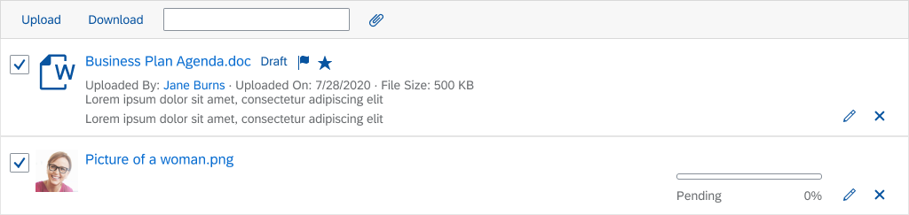
Files are listed vertically. By default, each item has an Edit and a Remove button.
While most file types have generic icons (for example documents, spreadsheets, or presentations), image files have a small thumbnail preview.
You can control the visibility and the active state for all actions at item level.
Layout – Items
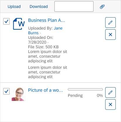
Attributes and Statuses
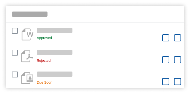
You can display additional attributes and statuses below the file name. Attributes can include the name of the person who uploaded the file, the upload date, the version number, file size, and so on.
You can also define your own statuses. These usually refer to the object state in a workflow (such as Approved or Overdue). Statuses can be shown in different colors in accordance with the visual guideline for semantic colors.
If multiple attributes or statuses are displayed, they are separated by a bullet.
Layout – Attributes and statuses
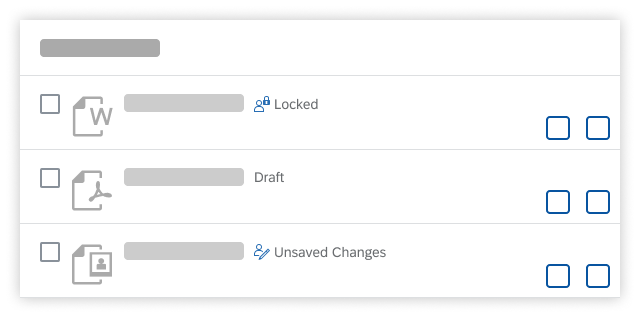
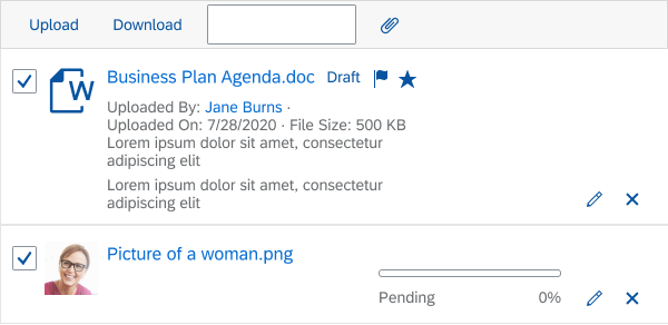
Technical Statuses
Unlike the statuses mentioned above, technical statuses are not bound to a workflow or business process. They are mainly used to show the current editing status of an object (Draft, Locked, Unsaved Changes). For further uses and more details, see Object Display Components and Draft Handling.
Layout – Technical statuses
Behavior and Interaction
Uploading Files
The upload set offers two basic working modes:
- Instant upload (default): Files are uploaded as soon as they are dropped onto the control or the OK button in the file selection dialog is clicked.
- Manual upload: All added files are first collected in the front-end list, where the user needs to trigger the upload.
If some users are only allowed to download the files uploaded by others, you can disable the upload option.
Unlike the deprecated Upload Collection control, the Upload Set control allows you to use a custom uploader.
Empty State
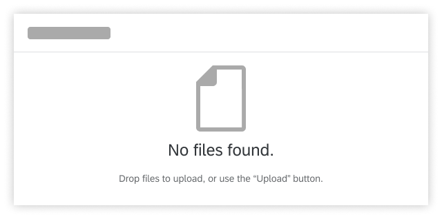
If empty, the upload set provides a hint to use the Upload button or drag and drop to upload files. This hint already provides a large enough zone for users to drop their files.
Interaction - No files found
Drag and Drop
Users can easily select one or multiple files from their computer and drag them onto the upload set to start the upload.
As soon as a user starts to drag a file over the application, the hint changes into a drop zone, indicating where to place the file.
Interaction - Drag and drop (1)
As the user hovers over the drop zone, the color changes again to indicate that the file can be released.
The upload process itself is the same as if a file had been added via the Upload button.
Interaction - Drag and drop (2)
Opening Files
Files are opened by clicking the file name of the attachment. How the files open depends on the operating system and browser settings.
On desktop devices, clicking the file name opens the program that has been assigned to this file type. In some cases, the files are opened directly in the browser if they are among the supported file types, like jpg, png or pdf. However, this also depends on the individual browser and its settings.
Mobile devices usually open a dialog in which the user can select an app that supports this file type.
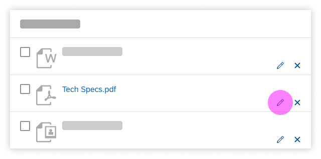
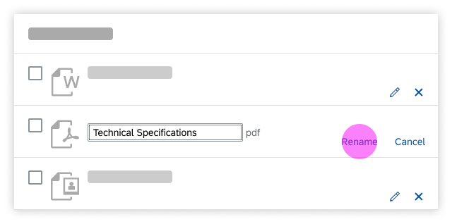
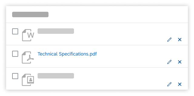
Renaming Files
The Edit function works identically on desktop and mobile devices.
- The user clicks the Edit ( ) button.
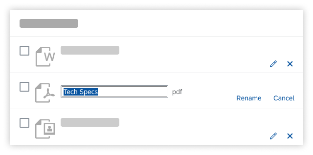
- The file name becomes an input field in which the existing name is highlighted. The icon buttons Edit ( ) and Remove ( ) are replaced by two text buttons: Rename and Cancel.
- When the user starts typing, the highlighted text is overwritten. Alternatively, the user can use the mouse or keyboard to change the selected text.
- The new file name can be validated in two ways:
- The user clicks Rename.
- The user presses Enter.
Removing Files
The Remove function works identically on desktop and mobile devices.
After clicking the Remove ( ) button for a file, the user is prompted to confirm the removal of the respective file.
Remove confirms the deletion and the file is removed from the list. Cancel aborts the process, closes the dialog, and brings the user back to the file list without making any changes.
Clickable Attributes
Object attributes can be made clickable. This can be very helpful to provide users with a direct way to access certain information, such as a person’s profile and contact data, or the version history of a file.
Examples:
- Uploaded By: John Miller
- Last Edited By: Donna Moore
- Version 1.1
Responsiveness
The upload set control offers full responsive behavior from small phones to large desktop screens. Uploading, downloading, renaming, and deleting works on all screen sizes. Texts that no longer fit into the available space are truncated.
Size S
Size M
Size L
Example
You can use the upload set control in different contexts, whenever users need to be able to upload multiple files. The example below shows the object page of a product, in this case a machine, with an Attachments tab containing several documents about its documents for assembly, service, and warranty.

Upload set in object page
Other possible scenarios:
- Warranty claim: Users need to upload images of a damaged item.
- Product details: Editors can upload product pictures that will be shown in the online shop.
- Service history: Whenever maintenance measures are performed, the service worker attaches a document to the object.
Top Tips
When to Show, Disable, and Hide Actions
The Edit and Remove buttons are visible and enabled by default. If you don’t want to allow users to edit or remove uploaded files, hide the corresponding buttons.
Don’t leave buttons enabled and then show an error message when the function isn’t available.
Vertically align all actions
Don't position buttons differently. Place identical actions directly underneath one another.

If users aren't allowed to use a certain function, hide the corresponding button.

Don't disable all actions. If users aren't allowed to use a certain action, don't show the corresponding button.

 Your feedback has been sent to the SAP Fiori design team.