
- Latest SAPUI Version 1.124
- SAPUI5 Version 1.122
- SAPUI5 Version 1.120
- SAPUI5 Version 1.118
- SAPUI5 Version 1.116
- SAPUI5 Version 1.114
- SAPUI5 Version 1.112
- SAPUI5 Version 1.110
- SAPUI5 Version 1.108
- SAPUI5 Version 1.106
- SAPUI5 Version 1.104
- SAPUI5 Version 1.102
- SAPUI5 Version 1.100
- SAPUI5 Version 1.96
- SAPUI5 Version 1.94
- SAPUI5 Version 1.92
- SAPUI5 Version 1.90
- SAPUI5 Version 1.88
- SAPUI5 Version 1.86
- SAPUI5 Version 1.84
- SAPUI5 Version 1.82
- SAPUI5 Version 1.80
- SAPUI5 Version 1.78
- SAPUI5 Version 1.76
- SAPUI5 Version 1.74
- SAPUI5 Version 1.72
- SAPUI5 Version 1.70
- SAPUI5 Version 1.68
- SAPUI5 Version 1.66
- SAPUI5 Version 1.64
- SAPUI5 Version 1.62
- SAPUI5 Version 1.60
- SAPUI5 Version 1.58
- SAPUI5 Version 1.56
- SAPUI5 Version 1.54
- SAPUI5 Version 1.52
- SAPUI5 Version 1.50
- SAPUI5 Version 1.48
- SAPUI5 Version 1.46
- SAPUI5 Version 1.44
- SAPUI5 Version 1.42
- SAPUI5 Version 1.40
- SAPUI5 Version 1.38
- SAPUI5 Version 1.36
- SAPUI5 Version 1.34
- SAPUI5 Version 1.32
- SAPUI5 Version 1.30
- SAPUI5 Version 1.28
- SAPUI5 Version 1.26
- Latest SAPUI Version 1.124
- SAPUI5 Version 1.122
- SAPUI5 Version 1.120
- SAPUI5 Version 1.118
- SAPUI5 Version 1.116
- SAPUI5 Version 1.114
- SAPUI5 Version 1.112
- SAPUI5 Version 1.110
- SAPUI5 Version 1.108
- SAPUI5 Version 1.106
- SAPUI5 Version 1.104
- SAPUI5 Version 1.102
- SAPUI5 Version 1.100
- SAPUI5 Version 1.98
- SAPUI5 Version 1.96
- SAPUI5 Version 1.94
- SAPUI5 Version 1.92
- SAPUI5 Version 1.90
- SAPUI5 Version 1.88
- SAPUI5 Version 1.86
- SAPUI5 Version 1.84
- SAPUI5 Version 1.82
- SAPUI5 Version 1.80
- SAPUI5 Version 1.78
- SAPUI5 Version 1.76
- SAPUI5 Version 1.74
- SAPUI5 Version 1.72
- SAPUI5 Version 1.70
- SAPUI5 Version 1.68
- SAPUI5 Version 1.66
- SAPUI5 Version 1.64
- SAPUI5 Version 1.62
- SAPUI5 Version 1.60
- SAPUI5 Version 1.58
- SAPUI5 Version 1.56
- SAPUI5 Version 1.54
- SAPUI5 Version 1.52
- SAPUI5 Version 1.50
- SAPUI5 Version 1.48
- SAPUI5 Version 1.46
- SAPUI5 Version 1.44
- SAPUI5 Version 1.42
- SAPUI5 Version 1.40
- SAPUI5 Version 1.38
- SAPUI5 Version 1.36
- SAPUI5 Version 1.34
- SAPUI5 Version 1.32
- SAPUI5 Version 1.30
- SAPUI5 Version 1.28
- SAPUI5 Version 1.26
Smart Form
sap.ui.comp.smartform.SmartForm
Intro
The smart form control creates a form. If used with smart fields, the smart form provides both read-only and editable views, and OData annotations for the smart fields are taken into account. The smart form also provides a toolbar with a title.
When to Use
Use the smart form if:
- You use an OData service for your app (OData version 2 only).
- You are using only (or primarily) smart fields inside your form. In this case, the smart form is faster to implement.
Do not use the smart form if:
- You use a different technology to OData version 2. Use the form or simple form.
- You need several other controls in your form that are not provided by the smart field, such as buttons, progress indicators, or sliders. In this case, use the form or simple form.
- You just want to display a few fields within a very strict layout (such as in the object page header facets). In this case, use layout containers for placing the controls.
- You want to place several input fields in one column of the responsive table. In this case, use layout containers for placing the controls.
Components
Toolbar
The following options are provided:
- Expand/collapse button
- Title
- App-specific actions
Expand/Collapse Button

Title
The title is optional (property: title).
App-Specific Actions
App-specific actions can only be added using a custom toolbar (aggregation: customToolbar).
Form
The form consists of form groups (sap.ui.comp.smartform.Group) and a layout.
Form Groups
Each form group comes with:
- A title
- One or several form elements and/or semantic form elements
Form elements (sap.ui.comp.smartform.GroupElement) consist of a label and one or several UI elements. If smart fields are used, the label is automatically provided by the corresponding metadata. If more than one smart field is used, define which label to display (GroupElement, property: elementForLabel).
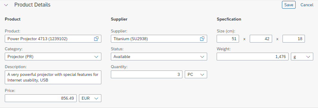
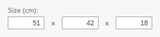
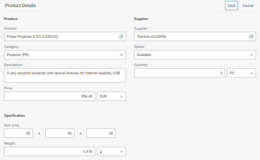
The semantic form element (sap.ui.comp.smartform.SemanticGroupSlement) provides additional support when more than one control is attached to a single label. In display mode, the corresponding texts are displayed as a single value and therefore use less space. You can define a delimiter, which is shown between the fields.
A semantic form element in edit mode
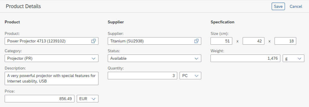
The same semantic form element in display mode
Layout
The layout defines how the form groups and form elements are placed on the screen, depending on the available width (aggregation: layout). There are two layout options: column layout and responsive grid layout.
Behavior and Interaction
Display and Edit Mode
In display mode, the line height for each row is reduced (property: editable). This results in less white space between two lines of text. This setting is passed to all smart fields inside the smart form, which then also switch automatically.
Validation
The smart form offers two validation modes: standard and asynchronous (property: validationMode). The standard validation mode works only for smart fields and only with synchronous validation.
Responsiveness
The smart form acts exactly like the embedded controls. For details, see:
Size S
Size M
Size L
Size XL
Example
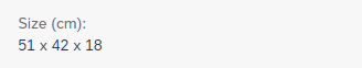
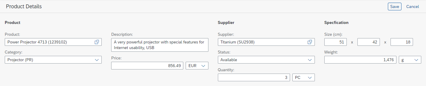
Smart form in edit mode

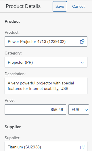
The same smart form in display mode
Top Tips
- Use smart fields wherever it makes sense.
- Use the column layout.
- When using one label for several controls, consider the semantic form element.
Properties
The following properties are available for sap.ui.comp.smartform.SmartForm:
- The property:
checkButtonadds a button labeled Check to the toolbar. The button triggers front-end validation on available smart fields. Do not use it. Follow the guidelines for form field validation instead. - The property:
editToggableadds an icon-only button to the toolbar, which switches theeditableproperty. Do not use it. Follow the guidelines for object handling instead. - The property:
entityTypeis used for key user adaptations. - The property:
flexEnabledis used for key user adaptations. - The property:
horizontalLayoutGroupElementMinWidthonly works with the horizontal layout, which is deprecated. Do not use it. Use the column layout instead. - The property:
ignoredFieldsis used for key user adaptations. - The property:
importancehides all smart fields with lower importance. Do not use it. - The property:
useHorizontalLayoutonly works with the horizontal layout, which is deprecated. Use the column layout instead.
The following properties are available for sap.ui.comp.smartform.Group:
- The property:
horizontalLayoutGroupElementMinWidthonly works with the horizontal layout, which is deprecated. Use the column layout instead. - The property:
labelis deprecated. Use the aggregation:titleinstead. - The property:
useHorizontalLayoutonly works with the horizontal layout, which is deprecated. Use the column layout instead. - The aggregation:
layoutis deprecated. Use the aggregation:layoutDatainstead.
Related Links
Elements and Controls
- Form / Simple Form (guidelines)
- Smart Field (guidelines)
- Toolbar Overview (guidelines)
- Object Handling (guidelines)
- Object Page Floorplan (guidelines)
Implementation
- Smart Form (SAPUI5 samples)
- Smart Form (SAPUI5 API reference)
- Smart Form (Developer Guide)
 Your feedback has been sent to the SAP Fiori design team.