
- Latest SAPUI Version 1.124
- SAPUI5 Version 1.122
- SAPUI5 Version 1.120
- SAPUI5 Version 1.118
- SAPUI5 Version 1.116
- SAPUI5 Version 1.114
- SAPUI5 Version 1.112
- SAPUI5 Version 1.110
- SAPUI5 Version 1.108
- SAPUI5 Version 1.106
- SAPUI5 Version 1.104
- SAPUI5 Version 1.102
- SAPUI5 Version 1.100
- SAPUI5 Version 1.96
- SAPUI5 Version 1.94
- SAPUI5 Version 1.92
- SAPUI5 Version 1.90
- SAPUI5 Version 1.88
- SAPUI5 Version 1.86
- SAPUI5 Version 1.84
- SAPUI5 Version 1.82
- SAPUI5 Version 1.80
- SAPUI5 Version 1.78
- SAPUI5 Version 1.76
- SAPUI5 Version 1.74
- SAPUI5 Version 1.72
- SAPUI5 Version 1.70
- SAPUI5 Version 1.68
- SAPUI5 Version 1.66
- SAPUI5 Version 1.64
- SAPUI5 Version 1.62
- SAPUI5 Version 1.60
- SAPUI5 Version 1.58
- SAPUI5 Version 1.56
- SAPUI5 Version 1.54
- SAPUI5 Version 1.52
- SAPUI5 Version 1.50
- SAPUI5 Version 1.48
- SAPUI5 Version 1.46
- SAPUI5 Version 1.44
- SAPUI5 Version 1.42
- SAPUI5 Version 1.40
- SAPUI5 Version 1.38
- SAPUI5 Version 1.36
- SAPUI5 Version 1.34
- SAPUI5 Version 1.32
- SAPUI5 Version 1.30
- SAPUI5 Version 1.28
- SAPUI5 Version 1.26
- Latest SAPUI Version 1.124
- SAPUI5 Version 1.122
- SAPUI5 Version 1.120
- SAPUI5 Version 1.118
- SAPUI5 Version 1.116
- SAPUI5 Version 1.114
- SAPUI5 Version 1.112
- SAPUI5 Version 1.110
- SAPUI5 Version 1.108
- SAPUI5 Version 1.106
- SAPUI5 Version 1.104
- SAPUI5 Version 1.102
- SAPUI5 Version 1.100
- SAPUI5 Version 1.98
- SAPUI5 Version 1.96
- SAPUI5 Version 1.94
- SAPUI5 Version 1.92
- SAPUI5 Version 1.90
- SAPUI5 Version 1.88
- SAPUI5 Version 1.86
- SAPUI5 Version 1.84
- SAPUI5 Version 1.82
- SAPUI5 Version 1.80
- SAPUI5 Version 1.78
- SAPUI5 Version 1.76
- SAPUI5 Version 1.74
- SAPUI5 Version 1.72
- SAPUI5 Version 1.70
- SAPUI5 Version 1.68
- SAPUI5 Version 1.66
- SAPUI5 Version 1.64
- SAPUI5 Version 1.62
- SAPUI5 Version 1.60
- SAPUI5 Version 1.58
- SAPUI5 Version 1.56
- SAPUI5 Version 1.54
- SAPUI5 Version 1.52
- SAPUI5 Version 1.50
- SAPUI5 Version 1.48
- SAPUI5 Version 1.46
- SAPUI5 Version 1.44
- SAPUI5 Version 1.42
- SAPUI5 Version 1.40
- SAPUI5 Version 1.38
- SAPUI5 Version 1.36
- SAPUI5 Version 1.34
- SAPUI5 Version 1.32
- SAPUI5 Version 1.30
- SAPUI5 Version 1.28
- SAPUI5 Version 1.26
UX Illustrations
Intro
UX Illustrations are visual elements that can be paired with written messages. You can use UX illustrations to:
- Help users to understand a concept more quickly
- Make complex ideas more relatable and understandable
- Add more personality to the product and create an emotional connection between users and the product
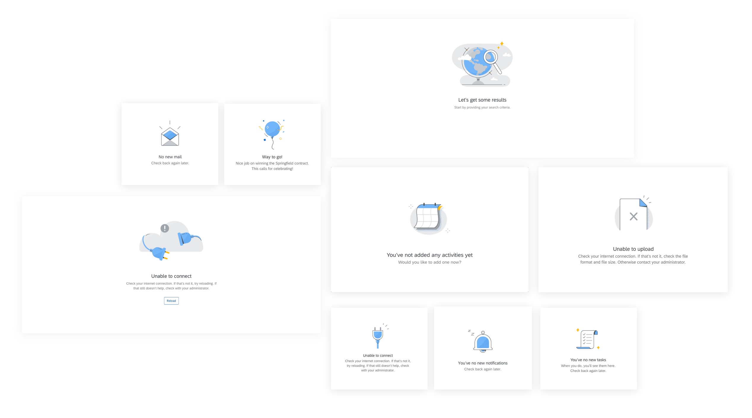
Examples of UX illustrations
When to Use
UX illustrations are always paired with written messages and should never take the leading role in the user experience. The illustrations should remain supportive and noticeable, but not obstruct the flow of the user’s path.
Do not use UX illustrations should as decoration or to fill an empty space. Use them purposefully as a method for communicating with users.
UX Illustrations for Empty States
UX illustrations for SAP Fiori are recommended combinations of a solution-oriented message and illustration that better communicate an empty state than just a message alone. The current UX illustration library targets the most common empty states across SAP Fiori products. UX illustrations come in three sizes to work responsively and within a variety of UI elements. The illustrated message control is available for this purpose.
Illustration Sizes
Small (Spot Illustrations)
Spot illustrations are the smallest and most simple illustration size. They are designed to fit within smaller UI elements. The smallest UI element recommended is a medium-sized card.
They are one size at 128px (8rem) square.
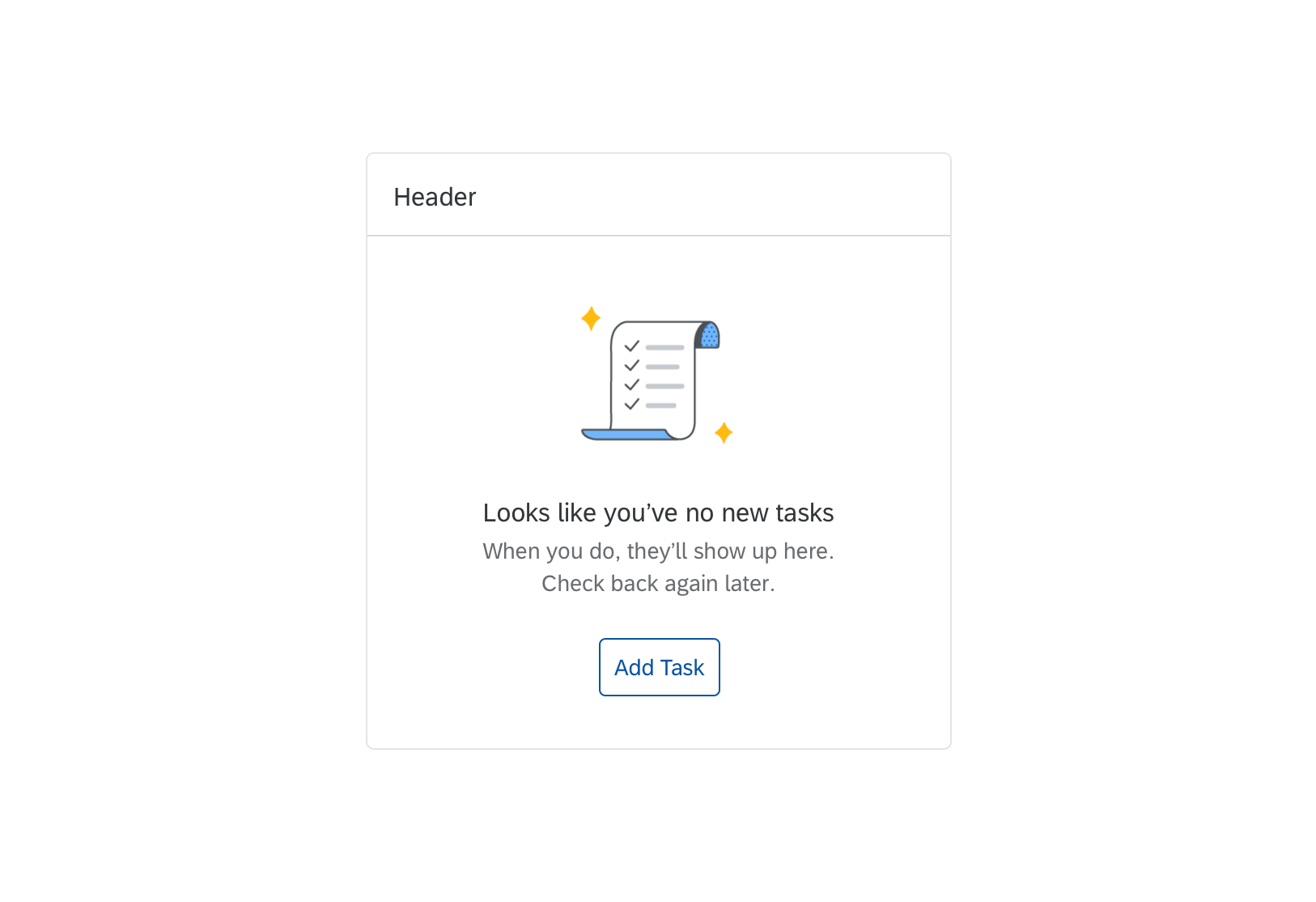
Spot illustration example
Medium (Dialog Illustrations)
Dialog illustrations are larger than spot illustrations and are typically used within dialogs. These illustrations have a bit more detail.
They are one size at 160px (10rem) square.
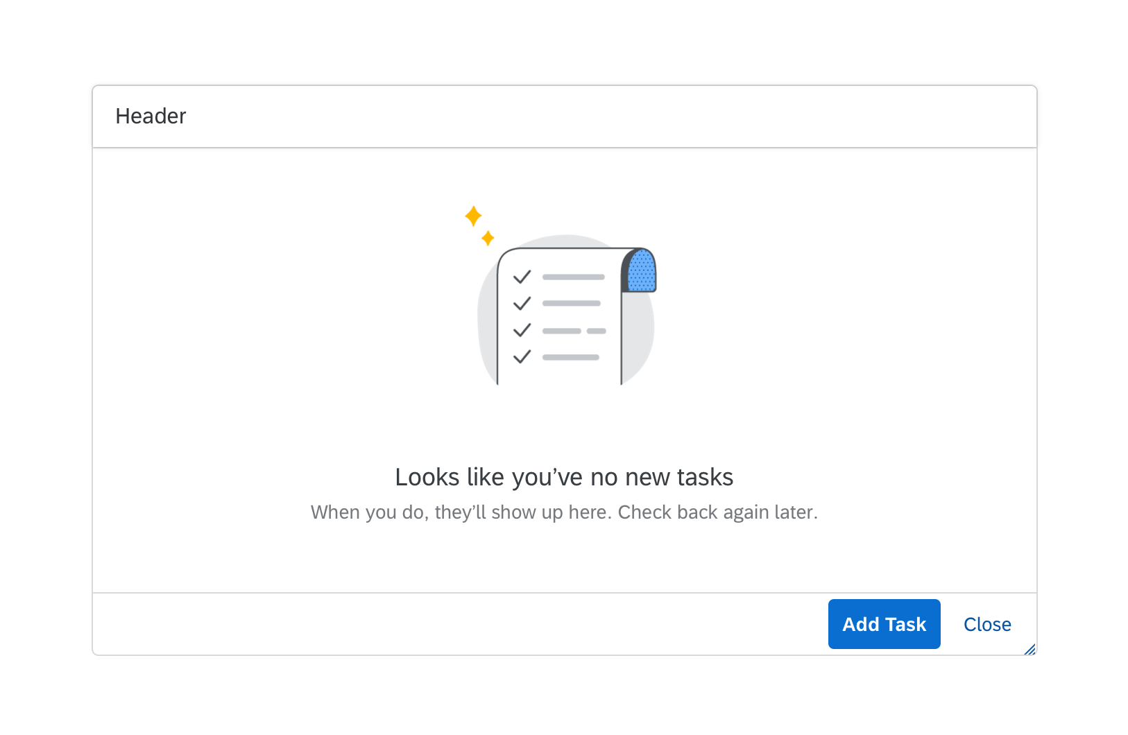
Dialog illustration example
Scene Illustrations
The largest illustration is mainly used to support full screen scenarios. These illustrations are designed to scale to a maximum-minimum width for responsive behavior across form factors.
- Maximum size: 320px (20rem) width x 240px (15rem) height
- Minimum size: 240px (15rem) width x 180px (11.25rem) height
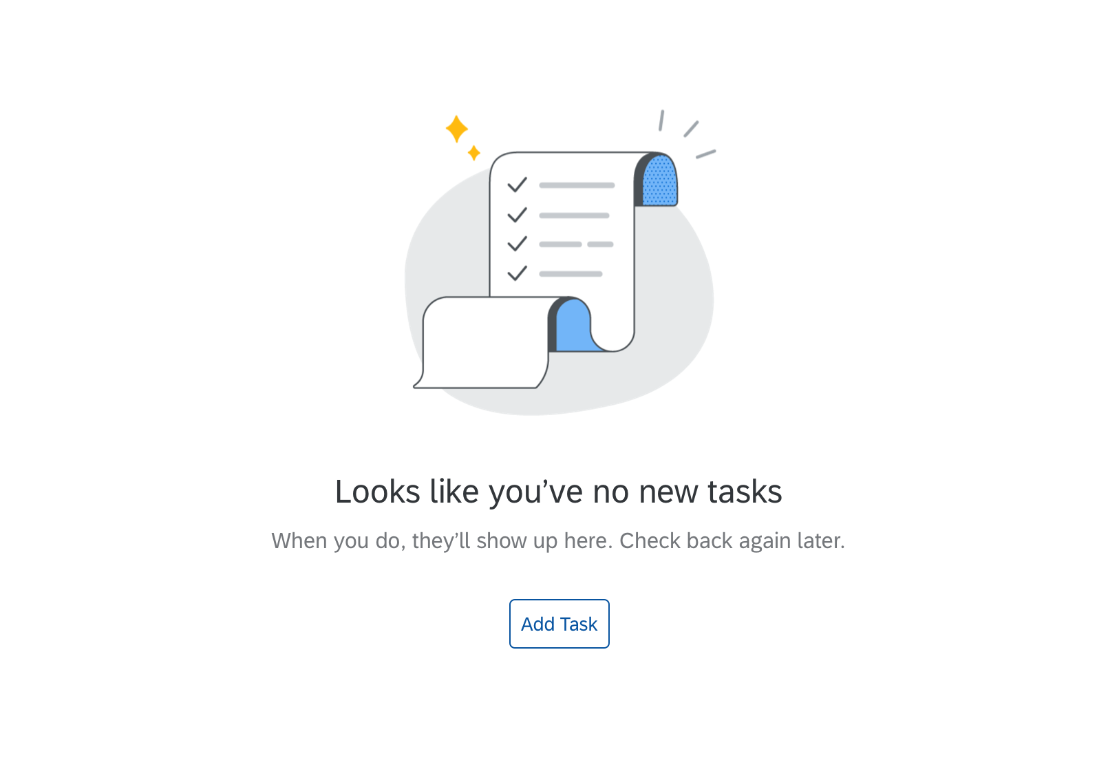
Scene illustration example
Best Practices
Illustration Choice
A UX illustration must be paired with a message that clarifies a situation and communicates the next steps. Use the right size illustration for the context and size of the UI element. Don’t hack the illustration or scale it unnecessarily.
- Be aware of the cultural differences among users. Keep the design minimal to avoid elements that have different meanings in different cultures.
- Never use text in the illustration. Pair the illustration with a supportive message.
- If an illustration does not add value to or clarify the situation, don’t use it.
Message Pairing
- Make sure the illustration, message, and call to action work together as one.
- Adapt the message to fit your specific use case, as needed.
- See Empty States and Illustrated Message for more information
Illustration Implementation
The UX Illustrations for SAP Fiori are provided as coded, themeable SVGs and made available through the illustrated message control.
 Your feedback has been sent to the SAP Fiori design team.