
- Latest SAPUI Version 1.124
- SAPUI5 Version 1.122
- SAPUI5 Version 1.120
- SAPUI5 Version 1.118
- SAPUI5 Version 1.116
- SAPUI5 Version 1.114
- SAPUI5 Version 1.112
- SAPUI5 Version 1.110
- SAPUI5 Version 1.108
- SAPUI5 Version 1.106
- SAPUI5 Version 1.104
- SAPUI5 Version 1.102
- SAPUI5 Version 1.100
- SAPUI5 Version 1.96
- SAPUI5 Version 1.94
- SAPUI5 Version 1.92
- SAPUI5 Version 1.90
- SAPUI5 Version 1.88
- SAPUI5 Version 1.86
- SAPUI5 Version 1.84
- SAPUI5 Version 1.82
- SAPUI5 Version 1.80
- SAPUI5 Version 1.78
- SAPUI5 Version 1.76
- SAPUI5 Version 1.74
- SAPUI5 Version 1.72
- SAPUI5 Version 1.70
- SAPUI5 Version 1.68
- SAPUI5 Version 1.66
- SAPUI5 Version 1.64
- SAPUI5 Version 1.62
- SAPUI5 Version 1.60
- SAPUI5 Version 1.58
- SAPUI5 Version 1.56
- SAPUI5 Version 1.54
- SAPUI5 Version 1.52
- SAPUI5 Version 1.50
- SAPUI5 Version 1.48
- SAPUI5 Version 1.46
- SAPUI5 Version 1.44
- SAPUI5 Version 1.42
- SAPUI5 Version 1.40
- SAPUI5 Version 1.38
- SAPUI5 Version 1.36
- SAPUI5 Version 1.34
- SAPUI5 Version 1.32
- SAPUI5 Version 1.30
- SAPUI5 Version 1.28
- SAPUI5 Version 1.26
- Latest SAPUI Version 1.124
- SAPUI5 Version 1.122
- SAPUI5 Version 1.120
- SAPUI5 Version 1.118
- SAPUI5 Version 1.116
- SAPUI5 Version 1.114
- SAPUI5 Version 1.112
- SAPUI5 Version 1.110
- SAPUI5 Version 1.108
- SAPUI5 Version 1.106
- SAPUI5 Version 1.104
- SAPUI5 Version 1.102
- SAPUI5 Version 1.100
- SAPUI5 Version 1.98
- SAPUI5 Version 1.96
- SAPUI5 Version 1.94
- SAPUI5 Version 1.92
- SAPUI5 Version 1.90
- SAPUI5 Version 1.88
- SAPUI5 Version 1.86
- SAPUI5 Version 1.84
- SAPUI5 Version 1.82
- SAPUI5 Version 1.80
- SAPUI5 Version 1.78
- SAPUI5 Version 1.76
- SAPUI5 Version 1.74
- SAPUI5 Version 1.72
- SAPUI5 Version 1.70
- SAPUI5 Version 1.68
- SAPUI5 Version 1.66
- SAPUI5 Version 1.64
- SAPUI5 Version 1.62
- SAPUI5 Version 1.60
- SAPUI5 Version 1.58
- SAPUI5 Version 1.56
- SAPUI5 Version 1.54
- SAPUI5 Version 1.52
- SAPUI5 Version 1.50
- SAPUI5 Version 1.48
- SAPUI5 Version 1.46
- SAPUI5 Version 1.44
- SAPUI5 Version 1.42
- SAPUI5 Version 1.40
- SAPUI5 Version 1.38
- SAPUI5 Version 1.36
- SAPUI5 Version 1.34
- SAPUI5 Version 1.32
- SAPUI5 Version 1.30
- SAPUI5 Version 1.28
- SAPUI5 Version 1.26
Header Toolbar
sap.m.Toolbar
Intro
The header toolbar always appears in the header of the page. One main advantage of the header bar is that this bar is always visible and will not scroll away. It contains actions that are relevant for the entire page.
Our general guideline is to use only icon buttons or text buttons. Icon and text should not be combined into one button. Buttons are always right-aligned.
Buttons are sorted from frequently-used to seldom-used. This ensures that the most important buttons go into the overflow last.
Usage
Use the header toolbar if:
- Your page contains several controls, and the actions are valid for the entire page.
Do not use the header toolbar if:
- You have closing or finalizing actions for the whole page. Place them in the footer toolbar instead.
- You have actions that belong to a specific UI element. Place them as close as possible to the corresponding object (for example, in a table or chart toolbar).
Responsiveness
To enable responsiveness, use the OverflowToolbar control. For more information, see the corresponding section in the Toolbar Overview article.
The height of the toolbar changes on desktops (compact mode), tablets, and smartphones (cozy mode). For more information about cozy and compact modes, see Content Density.

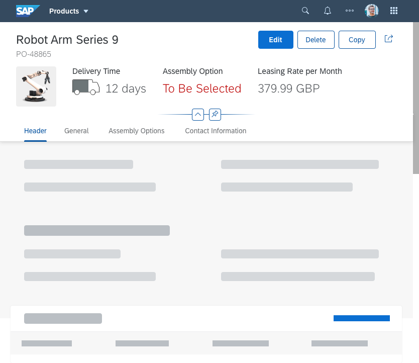
Header toolbar – Size S
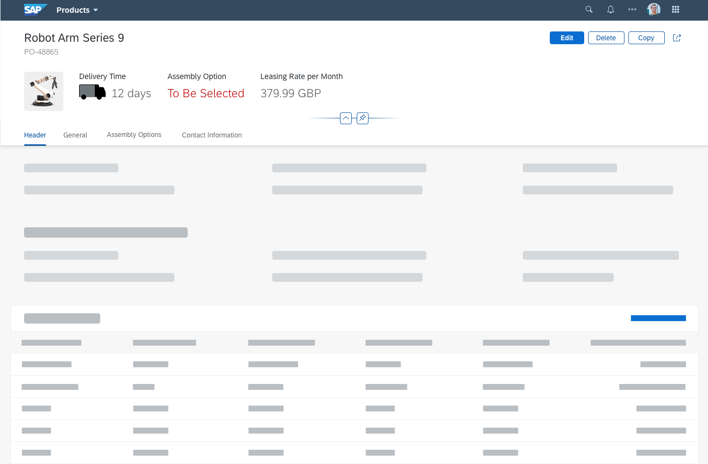
Header toolbar – Size M
Header toolbar – Size XL
Components
The header toolbar can contain the following components:
- App-specific business actions
- Generic actions
The following actions count as generic:
- Flag and Favorite
- Share menu
- Overflow
- Paging
Behavior and Interaction
Business Actions
If needed, the app team can define their own actions for the app. In this case, the text buttons should contain a short, unambiguous text that explains what action the button performs. A button text is usually a single-word verb (for example, Synchronize). Note that translated UIs may increase the length of the text string.
Text vs. Icon Buttons
Use text-only buttons for all business actions (such as Edit and Create).
Use icon buttons only for generic actions (such as for Share). For icons, always provide a suitable text label as a tooltip.
Business action with icon button in header toolbar
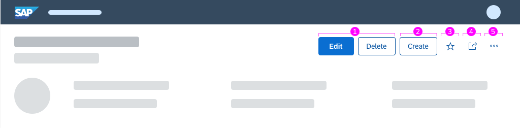
Actions in the header toolbar
Edit and Delete (1)
If you want to perform a global edit action, use the Edit button.
If you want to perform a global delete action, use the Delete button.
Add / Create (2)
Place the Add or Create (item or row) action as close to the content as possible.
If the Add or Create action is a main function, don’t move the action into the overflow.
For more information on when to use add or create, see UI Text Guidelines.
Favorite and Flag (Generic) (3)
Users can mark objects as a favorite or flag objects for quick subsequent retrieval. The user does this by clicking the relevant generic Favorite or Flag button in the header toolbar. For more information, see Flag and Favorite.
Share (Generic) (4)
The Share menu allows users to work with content outside the app they are currently using. It can include a variety of actions. All the buttons contain either text only or a combination of an icon and text. The following actions can be used and complemented by each app:
- Send Email (icon: email )
- Discuss in SAP Jam (icon: discussion-2 )
- Share in SAP Jam (icon: share-2 )
- Send Message (icon: post )
- Save as Tile (icon: add favorite )
- Print (icon: print )
- Export as Excel (icon: Excel attachment )
- Export as PDF (icon: pdf attachment )
- Export As…
- Open In…
If you expect the user to use the Open In… functionality frequently, place it directly in the header toolbar.
The Share action can appear on the full screen or the details screen, and is never moved into the overflow menu. It is always right-aligned. The overflow starts to the right side of the Share icon.
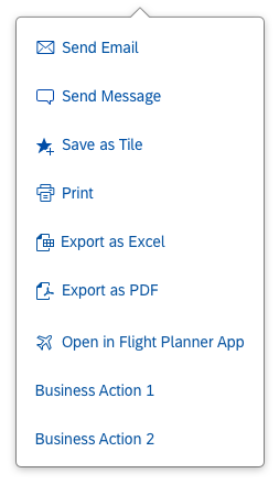
Possible actions in the 'Share' menu
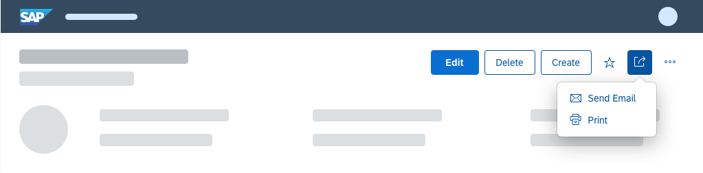
Open share popover in header toolbar
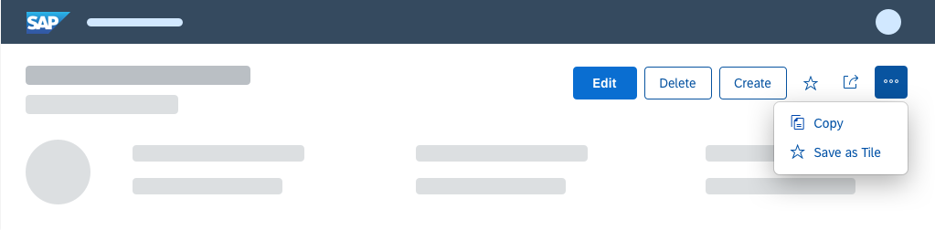
Overflow (Generic) (5)
If apps use the overflow toolbar, the overflow is generated automatically. The overflow is activated if there is not enough space for all the actions on the toolbar, or if some actions are considered less important than others. In this case, the app team decides that only certain actions appear in the overflow.
The app team also decides whether some actions are so important that they should never move into the overflow.
The “…” (overflow) button can be used to toggle the overflow menu on and off.
The user clicks the overflow button to open a popover. In this action sheet, all icon buttons are labeled with text and the user can overflow the following controls:
- sap.m.SegmentedButton – when in the overflow, the segmented button is in select mode and looks like a select button, although it is technically still a segmented button
- sap.m.Select – when in the overflow, it is always in default mode to take advantage of the extra space, even if it was set to icon-only mode in the toolbar
- sap.m.ToggleButton
- sap.m.Checkbox
- sap.m.Input
- sap.m.SearchField
- sap.m.ComboBox
- sap.m.DateTimeInput
Split-screen layouts have their own overflow menus.
All buttons go into the overflow from right to left. This ensures that the most important buttons are the last to be moved into the overflow menu.
Header toolbar with open overflow
Paging (Layout)
Use the paging buttons if you want to navigate to the previous or next object.
Use the following tooltip labels:
- Icon: Up arrow
Tooltip label: Previous [Object]
Example: Previous Purchase Order Item - Icon: Down arrow
Tooltip label: Next [Object]
Example: Next Purchase Order Item
To avoid translation issues, never use “Next” and “Previous” as standalone labels. Always state the object you are navigating to.
If you are using the Share button, place paging buttons to the right of the Share button.
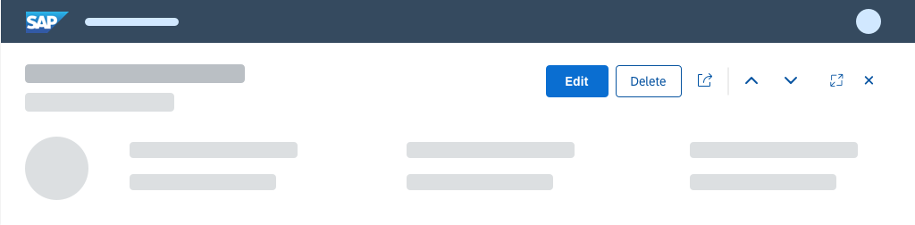
Paging buttons in header toolbar
Styles
- Use button styles only if they help the user, and not for decoration.
- Use them for primary actions, such as Edit and Create.
- Use a positive/negative style (property:
type=acceptorreject) or an emphasized style (property:type=emphasized). - Use only one emphasized button per toolbar and never mix emphasized and semantic buttons.
Exception 1: Messaging button appears
Exception 2: Object has been flagged or marked as a favorite
For more information, see Button.
Guidelines
For more information, see the Guidelines section in the toolbar overview article.
Resources
Want to dive deeper? Follow the links below to find out more about related controls, the SAPUI5 implementation, and the visual design.
Elements and Controls
- Button (guidelines)
- Action Placement (guidelines)
- Action Sheet (guidelines)
- Flag and Favorite (guidelines)
- Forward (guidelines)
Implementation
- Overflow Toolbar (SAPUI5 samples)
- Footer Toolbar (SAPUI5 API reference)
- Action Sheet (SAPUI5 API reference)
 Your feedback has been sent to the SAP Fiori design team.