
- Latest SAPUI Version 1.124
- SAPUI5 Version 1.122
- SAPUI5 Version 1.120
- SAPUI5 Version 1.118
- SAPUI5 Version 1.116
- SAPUI5 Version 1.114
- SAPUI5 Version 1.112
- SAPUI5 Version 1.110
- SAPUI5 Version 1.108
- SAPUI5 Version 1.106
- SAPUI5 Version 1.104
- SAPUI5 Version 1.102
- SAPUI5 Version 1.100
- SAPUI5 Version 1.96
- SAPUI5 Version 1.94
- SAPUI5 Version 1.92
- SAPUI5 Version 1.90
- SAPUI5 Version 1.88
- SAPUI5 Version 1.86
- SAPUI5 Version 1.84
- SAPUI5 Version 1.82
- SAPUI5 Version 1.80
- SAPUI5 Version 1.78
- SAPUI5 Version 1.76
- SAPUI5 Version 1.74
- SAPUI5 Version 1.72
- SAPUI5 Version 1.70
- SAPUI5 Version 1.68
- SAPUI5 Version 1.66
- SAPUI5 Version 1.64
- SAPUI5 Version 1.62
- SAPUI5 Version 1.60
- SAPUI5 Version 1.58
- SAPUI5 Version 1.56
- SAPUI5 Version 1.54
- SAPUI5 Version 1.52
- SAPUI5 Version 1.50
- SAPUI5 Version 1.48
- SAPUI5 Version 1.46
- SAPUI5 Version 1.44
- SAPUI5 Version 1.42
- SAPUI5 Version 1.40
- SAPUI5 Version 1.38
- SAPUI5 Version 1.36
- SAPUI5 Version 1.34
- SAPUI5 Version 1.32
- SAPUI5 Version 1.30
- SAPUI5 Version 1.28
- SAPUI5 Version 1.26
- Latest SAPUI Version 1.124
- SAPUI5 Version 1.122
- SAPUI5 Version 1.120
- SAPUI5 Version 1.118
- SAPUI5 Version 1.116
- SAPUI5 Version 1.114
- SAPUI5 Version 1.112
- SAPUI5 Version 1.110
- SAPUI5 Version 1.108
- SAPUI5 Version 1.106
- SAPUI5 Version 1.104
- SAPUI5 Version 1.102
- SAPUI5 Version 1.100
- SAPUI5 Version 1.98
- SAPUI5 Version 1.96
- SAPUI5 Version 1.94
- SAPUI5 Version 1.92
- SAPUI5 Version 1.90
- SAPUI5 Version 1.88
- SAPUI5 Version 1.86
- SAPUI5 Version 1.84
- SAPUI5 Version 1.82
- SAPUI5 Version 1.80
- SAPUI5 Version 1.78
- SAPUI5 Version 1.76
- SAPUI5 Version 1.74
- SAPUI5 Version 1.72
- SAPUI5 Version 1.70
- SAPUI5 Version 1.68
- SAPUI5 Version 1.66
- SAPUI5 Version 1.64
- SAPUI5 Version 1.62
- SAPUI5 Version 1.60
- SAPUI5 Version 1.58
- SAPUI5 Version 1.56
- SAPUI5 Version 1.54
- SAPUI5 Version 1.52
- SAPUI5 Version 1.50
- SAPUI5 Version 1.48
- SAPUI5 Version 1.46
- SAPUI5 Version 1.44
- SAPUI5 Version 1.42
- SAPUI5 Version 1.40
- SAPUI5 Version 1.38
- SAPUI5 Version 1.36
- SAPUI5 Version 1.34
- SAPUI5 Version 1.32
- SAPUI5 Version 1.30
- SAPUI5 Version 1.28
- SAPUI5 Version 1.26
Icon Tab Bar
sap.m.IconTabBar
Intro
The icon tab bar comprises a series of tabs that each link to a different content area or view. You can use it for navigation within an object, or as a filter.
There are two key use cases:
- You want to let users navigate between different object facets in the object details area.
- You want to let users filter lists, and give them the option of calling up the entire list, or only items with a specific attribute.
In both cases, the user switches between tab pages by clicking the respective tab.
Usage
Use the icon tab bar if:
- Your business objects need to show multiple facets at the same time.
- You want to allow the user to browse through these facets.
- You need a prominent or very visual filter on top of a list.
- You have clear-cut process steps that need to be visualized.
Do not use the icon tab bar if:
- You plan to use only one single tab.
Responsiveness
The icon tab bar stretches horizontally, which often exceeds the available width on small screens. It responds to limited space by offering a scrolling mechanism.

Responsiveness – Text tabs
Responsiveness – Icon tabs
In addition to the responsive overflow behavior, the icon tab bar can be forced into compact mode or even react dynamically to the application’s global density setting. See the Tab Density section for details.
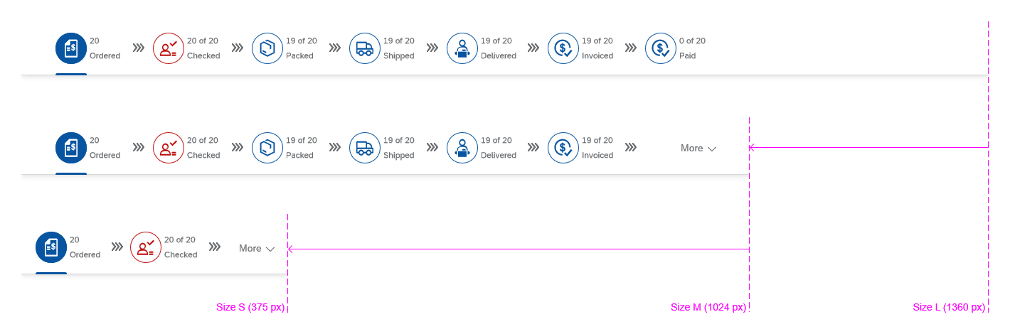
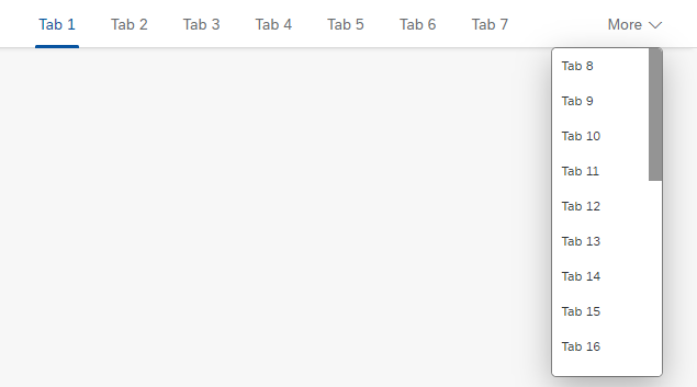
If there is not enough space to show all the tabs on the main tab bar, an overflow menu appears, containing all the remaining tabs that do not fit on the screen. By default, the overflow menu appears on the far right (see image “Responsiveness – Overflow on the far right”).
Another option is to display an overflow menu on both sides of the icon tab bar. The use of this overflow behavior depends on whether the order of the tabs is fixed or can be rearranged:
- For processes with a fixed order or in the anchor bar of an object page, display an overflow menu on both sides (property:
TabsOverflowMode, value:StartAndEnd). - For tabs that can be rearranged, display only one overflow menu on the far right (property:
TabsOverflowMode, value:End).
Responsiveness – Overflow on the far right
Layout
The horizontal layout of the icon tab bar never changes. The tabs always appear side by side. However, there are several types of tab bar to choose from. These are described in detail below.
Types
You can use the icon tab bar control to build the following types of tab bars:
- Text only
- Icon tabs
- Tabs as filters
- Tabs as process steps
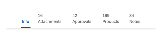
Text Only
The text-only variant is one of the most common types. It allows longer labels, and can also display counters next to the text to indicate the number of items on the tab page.
Unlike all other tab variants, the labels do not get truncated. The full text is always shown. As a result, you need to ensure that your labels do not become too long. They should still be easy to read on smaller screens.
If you use text-only tabs, make sure that the UpperCase property is disabled and that you enter the labels in title case (for example: Approval Flow).
Types – Text-only without counters
Types – Text-only with inline counters
Counters and Text Tabs
If counters are used, set the property HeaderMode to “Inline” so the counters appear in brackets after the labels.
Do not use the old layout that shows the counters on top of the labels (Headermode = “Standard”).
Counters – Inline layout ('HeaderMode' set to 'Inline')
Counters – Old layout ('HeaderMode' set to 'Standard')
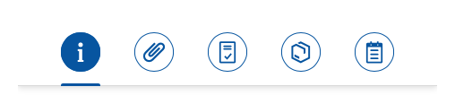
Icon Tabs
Icon tabs are also common tab types. These round tabs can be populated with any icon from the SAP icon font.
Labels are optional. If you decide to use labels, use them for all tabs. You can use counters as needed.
Types – Icons with counters
Please note that starting with SAPUI5 version 1.40, you should only use the horizontal type of label (icon and label side by side).
If your labels get truncated, consider using shorter labels or text tabs (without icons), since text tabs cannot get truncated.
Types – Icons with counters and labels
Types – Icon-only
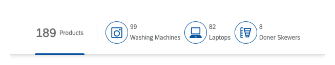
Tabs as Filters
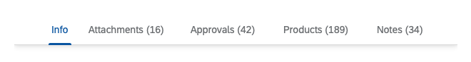
If you build the tab bar as a filter, it can comprise two parts:
- An “all” tab on the left (optional)
This tab shows the total number of items, and describes the type of item (for example, 189 Products). - Tabs for specific filters
Use the tab text to indicate the filter attribute.
We strongly recommend showing a counter on every tab.
Types – Filter
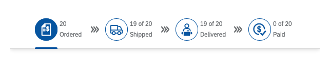
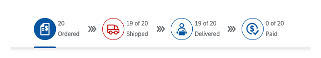
Tabs as Process Steps
You can also use the tab bar to depict a process. In this case, each tab stands for one step.
To connect the process steps, you can use the triple-chevron icon ( ) from the SAP icon font (technical name: process). Do not use the triple-chevron icon in the anchor bar of an object page.
If the process steps have a fixed order, set the property TabsOverflowMode to “StartAndEnd” to show an overflow menu on both sides and to keep the order of the tabs intact.
Types – Process
Hierarchies
The tab bar supports hierarchies, allowing multiple tabs underneath one main tab. This way, you can group several tabs together, with the main tab acting as a headline.
Subtabs
The example on the right shows the main tab Notes with two subtabs, Internal and External, with no specific hierarchy except for their order.
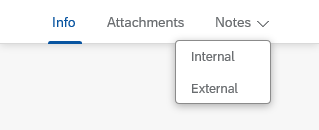
Types – Subtabs
Nested Tabs
Nesting allows deeper hierarchies with indentations to indicate the level of each tab.
By default, the property maxNestingLevel is “0” (zero). To enable nesting, adjust this value to the highest level of nesting that your app allows.
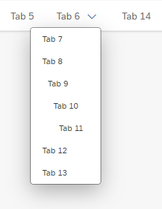
Types – Nested tabs
Behavior and Interaction
Clicking a Tab
To navigate through the views, the user clicks the tabs.
Optional behavior: If the user clicks a tab that is already open, the container collapses. It opens again when the user clicks any tab.
Use the expandable property to specify whether users can collapse the tab container (default = “true”):
- Let users collapse the container if there is additional content below the container, and the information inside the container is not always needed.
- If there is no content below the tab container, set the
expandableproperty to “false”.
The expandable property controls the initial state of the container. Do not change the default state (“true”).
Changing the Order of Tabs
You can allow users to rearrange the tab order in a desktop environment (property: enableTabReordering). If this feature is enabled, users can drag and drop tabs to reorder them, either directly on the tab bar or inside the overflow menu.
It is also possible to drag and drop tabs from the tab bar to the overflow menu and vice versa.
If nesting is enabled (property maxNestingLevel > 0), users can choose the level at which they want to drop a tab.
Dragging a tab activates a visual indicator for positioning the tab. For example, dragging tab 8 on top of tab 5 makes tab 8 the child of the now highlighted tab 5 (see image 1).
If the user drags a tab between two other tabs, the indicator shows the level at which level the tab will be nested (see image 2).
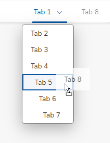
Interaction - Tab nesting using drag and drop (1 of 2)
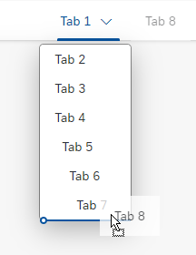
Interaction - Tab nesting using drag and drop (2 of 2)
Styles
Tab Density
The default responsive design of the icon tab bar applies to both compact and cozy modes. However, in addition to this responsive behavior, the control can be forced into a compact mode, or even react dynamically to the application’s global density setting. This feature can be used to:
- Save vertical space on the page (applies to both text and icon tabs)
- Save horizontal space (icon tabs only; this is especially helpful when there are many tabs)
- Generally use less space on mobile devices
- Reduce noise when there are already more important visual elements on the screen (primarily icon tabs)
The property for the override is called tabDensityMode, which can be set to “Cozy”, “Compact”, or “Inherit”. “Cozy” is the default setting that renders the control in its regular dimensions. “Compact” reduces the control’s height and icon sizes (if applicable), even if there would be enough space for the cozy design. “Inherit” instructs the control to follow the global density mode defined for the application. For backward compatibility, the default setting is “Cozy”.
The following image shows some types of tabs with their default style (cozy, left) and the reduced density mode (compact, right).
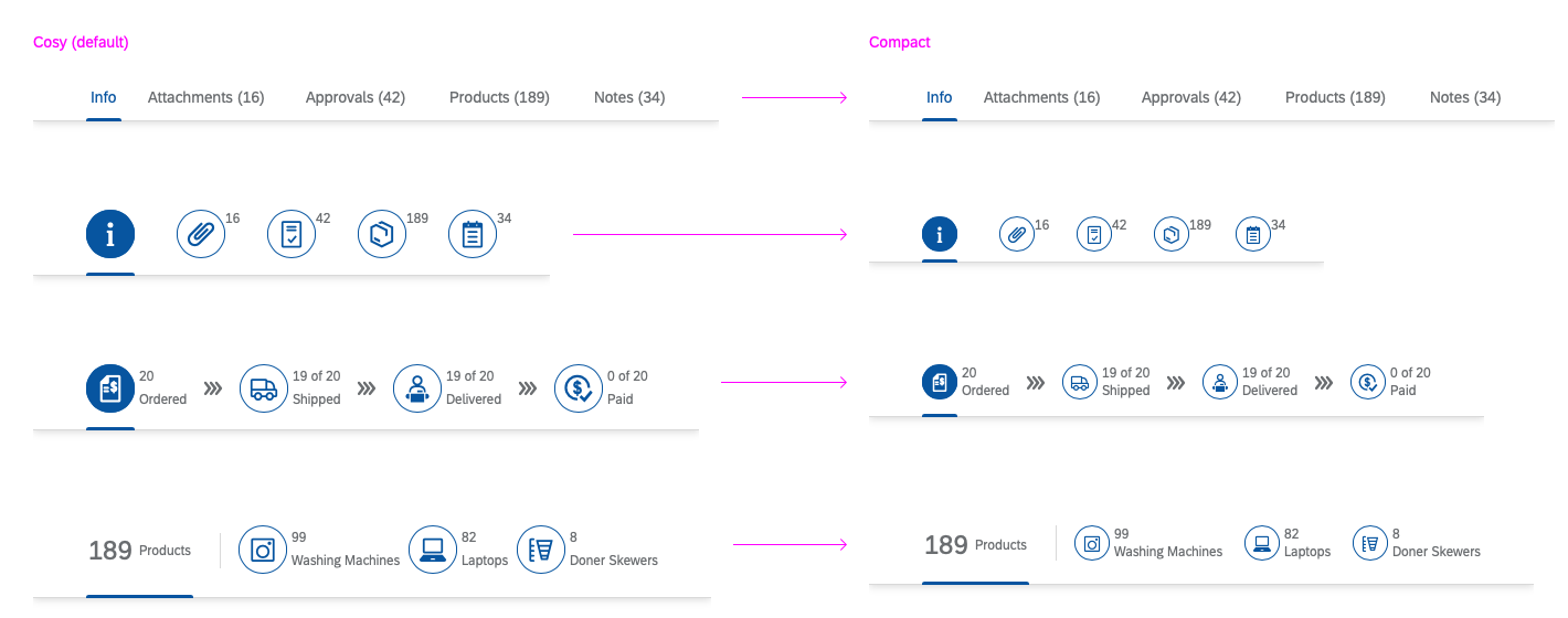
Style – Tab density
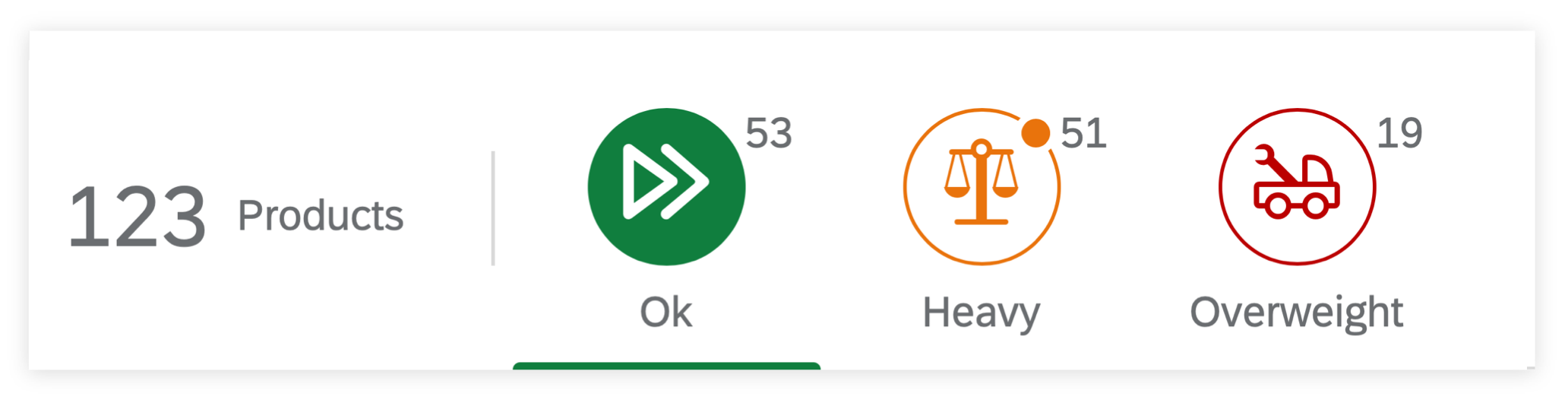
Colors
The two different styles (round tabs and text only) are discussed in the Types section. In both cases, you can use semantic colors to give users additional orientation.
Only use semantic colors if it is important for users to know that they need to take action (for example, to indicate errors or critical situations requiring action). Otherwise, use the neutral default colors. For more information, see How to Use Semantic Colors.
Example
In the example below, one step in the process is indicating an error. Since the other tabs have neutral colors, it is clear that they do not contain errors. Coloring them green to show that they are OK is unnecessary, and would reduce the severity of the red tab.
Styles – Colors
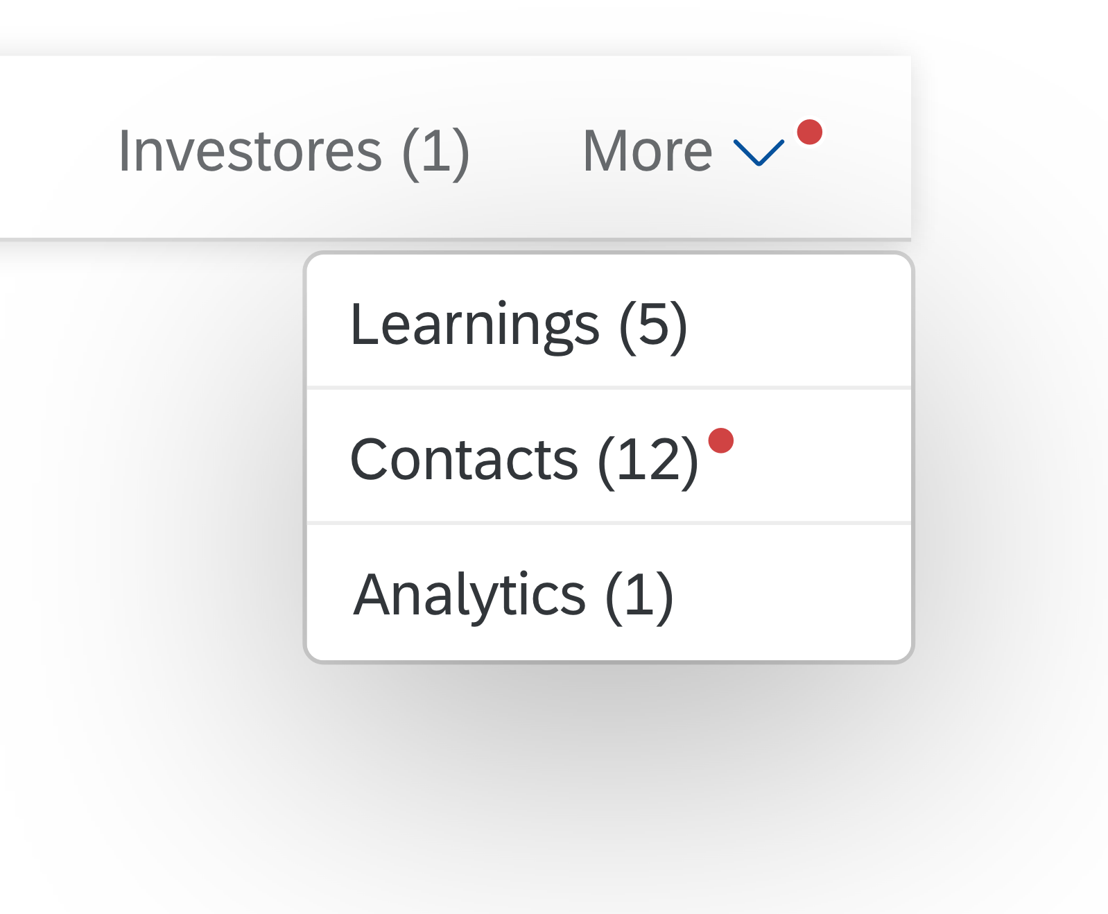
Badge
A tab can have an attention badge to indicate that new items were added to that tab. Only display a badge if new items are triggered from outside the app. Do not display a badge when users add new items themselves.

Icon tab with an attention badge
Badge in Default or Semantic State
You can add a badge to all types of icon tab bar.
The badge inherits the state of its tab (default state or semantic state):
- For the default tab state, the default red badge is displayed.
- If the tab has a semantic state, the badge inherits the semantic color for the current state.
Don’t mix tabs in the default state with tabs that have a semantic state.
Badge for the default state / semantic state

Badge Interaction
The badge becomes part of the tab. When the user selects a tab with a badge, the badge disappears. If a new item is added to the tab that is currently open, no badge is shown.
In addition, the badge inherits the interaction of its tab. For example, if a tab is moved using drag and drop, the attention badge moves with it.
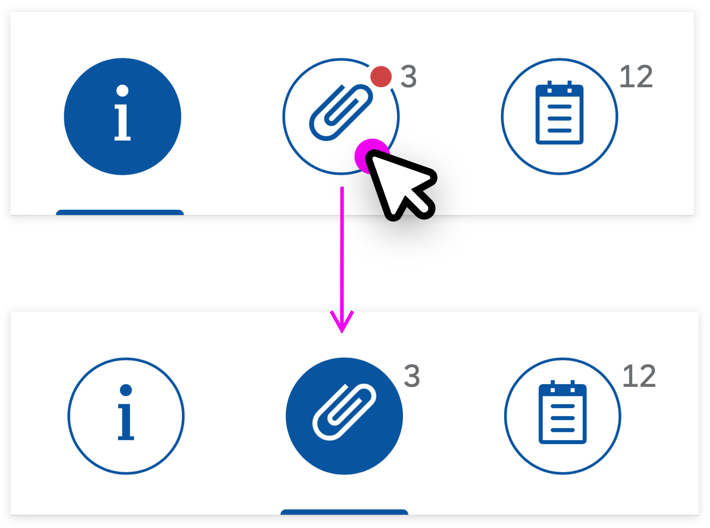
Selecting a tab with a badge
Overflow Menu
If there isn’t enough space to show all the tabs on the main bar, an overflow menu appears on the right by default, containing all the remaining tabs. Depending on the use case, an overflow menu can also appear on both sides (for example, for process steps or anchor bar navigation).
A badge on the chevron icon indicates that a tab within the overflow menu has received new items. The tab in question is indicated by a second badge on the item in the overflow menu.
Badge within overflow menu
Guidelines
Apply the styles as follows:
- Icons only: Use this option if you have only 4-5 tabs that can be very clearly identified by their icon. If a short description is needed, use icons and labels.
- Text only: Use this option if you have more than 4-5 tabs, or if there are no clear icons to represent the content. The text-only style also allows for longer labels. Set the property
HeaderModeto “Inline”.
Counters – Inline layout ('HeaderMode' set to 'Inline')
Counters – Old layout ('HeaderMode' set to 'Standard')
If you use icon tabs, ensure the following:
- The icons clearly identify the content on the tab pages.
- Each tab has a unique icon. Do not use the same icon more than once.
- The icons are easily distinguishable.
- Any icons between tabs (for example, as separators or connectors) are visually very different from the icons on the tabs.
- Either all or none of the icons have labels.
Implement the focus as follows:
- By default, show the first tab as open. This is the initial setting provided by the control.
Note: Technically, you can also override the initial selection. However, this is not recommended. - Later on, you can show the tab last selected by the user.
Additional guidelines:
- Do not display a loading indicator above the tab while the number for the item count is loading.
- Handle empty tabs as follows:
- Hide tabs that do not contain any information, and do not allow the user to create content..
- Show empty tabs that allow users to create content, such as notes or attachments.
- Only use the tab bars to navigate between tabs. Do not use any other navigation links. For example, do not let users click an item in tab A that takes them to tab B. This type of cross-navigation inside a container is confusing, and cannot be handled by the back navigation.
Resources
Want to dive deeper? Follow the links below to find out more about related controls, the SAPUI5 implementation, and the visual design.
Implementation
- Icon Tab Bar (SAPUI5 Samples)
- Icon Tab Bar (SAPUI5 API reference)
- Icon Tab Bar – Badges (SAPUI5 Samples)
 Your feedback has been sent to the SAP Fiori design team.