
- Latest SAPUI Version 1.124
- SAPUI5 Version 1.122
- SAPUI5 Version 1.120
- SAPUI5 Version 1.118
- SAPUI5 Version 1.116
- SAPUI5 Version 1.114
- SAPUI5 Version 1.112
- SAPUI5 Version 1.110
- SAPUI5 Version 1.108
- SAPUI5 Version 1.106
- SAPUI5 Version 1.104
- SAPUI5 Version 1.102
- SAPUI5 Version 1.100
- SAPUI5 Version 1.96
- SAPUI5 Version 1.94
- SAPUI5 Version 1.92
- SAPUI5 Version 1.90
- SAPUI5 Version 1.88
- SAPUI5 Version 1.86
- SAPUI5 Version 1.84
- SAPUI5 Version 1.82
- SAPUI5 Version 1.80
- SAPUI5 Version 1.78
- SAPUI5 Version 1.76
- SAPUI5 Version 1.74
- SAPUI5 Version 1.72
- SAPUI5 Version 1.70
- SAPUI5 Version 1.68
- SAPUI5 Version 1.66
- SAPUI5 Version 1.64
- SAPUI5 Version 1.62
- SAPUI5 Version 1.60
- SAPUI5 Version 1.58
- SAPUI5 Version 1.56
- SAPUI5 Version 1.54
- SAPUI5 Version 1.52
- SAPUI5 Version 1.50
- SAPUI5 Version 1.48
- SAPUI5 Version 1.46
- SAPUI5 Version 1.44
- SAPUI5 Version 1.42
- SAPUI5 Version 1.40
- SAPUI5 Version 1.38
- SAPUI5 Version 1.36
- SAPUI5 Version 1.34
- SAPUI5 Version 1.32
- SAPUI5 Version 1.30
- SAPUI5 Version 1.28
- SAPUI5 Version 1.26
- Latest SAPUI Version 1.124
- SAPUI5 Version 1.122
- SAPUI5 Version 1.120
- SAPUI5 Version 1.118
- SAPUI5 Version 1.116
- SAPUI5 Version 1.114
- SAPUI5 Version 1.112
- SAPUI5 Version 1.110
- SAPUI5 Version 1.108
- SAPUI5 Version 1.106
- SAPUI5 Version 1.104
- SAPUI5 Version 1.102
- SAPUI5 Version 1.100
- SAPUI5 Version 1.98
- SAPUI5 Version 1.96
- SAPUI5 Version 1.94
- SAPUI5 Version 1.92
- SAPUI5 Version 1.90
- SAPUI5 Version 1.88
- SAPUI5 Version 1.86
- SAPUI5 Version 1.84
- SAPUI5 Version 1.82
- SAPUI5 Version 1.80
- SAPUI5 Version 1.78
- SAPUI5 Version 1.76
- SAPUI5 Version 1.74
- SAPUI5 Version 1.72
- SAPUI5 Version 1.70
- SAPUI5 Version 1.68
- SAPUI5 Version 1.66
- SAPUI5 Version 1.64
- SAPUI5 Version 1.62
- SAPUI5 Version 1.60
- SAPUI5 Version 1.58
- SAPUI5 Version 1.56
- SAPUI5 Version 1.54
- SAPUI5 Version 1.52
- SAPUI5 Version 1.50
- SAPUI5 Version 1.48
- SAPUI5 Version 1.46
- SAPUI5 Version 1.44
- SAPUI5 Version 1.42
- SAPUI5 Version 1.40
- SAPUI5 Version 1.38
- SAPUI5 Version 1.36
- SAPUI5 Version 1.34
- SAPUI5 Version 1.32
- SAPUI5 Version 1.30
- SAPUI5 Version 1.28
- SAPUI5 Version 1.26
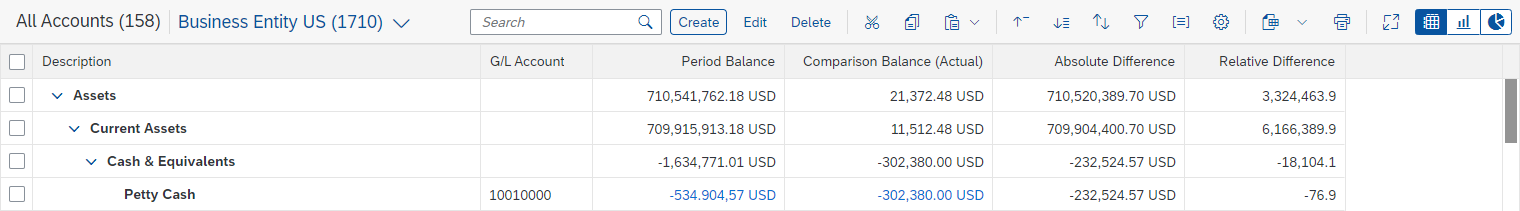
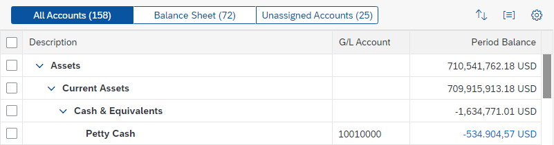
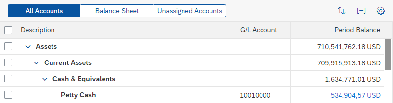
Tree Toolbar
Intro
The tree toolbar always appears above a tree or tree table. The control is used for key actions that impact the entire tree.
Usage
Use the tree toolbar if:
Don’t use the tree toolbar if:
- You are using single selection and only one or two actions. In this case, place the actions on each line.
Responsiveness
To enable responsiveness, use the overflow toolbar control. For more information, see Toolbar Overview – Responsiveness.
Components
The tree toolbar can contain several components, including a title and several types of button. Actions are grouped by the following action types:
- Finalizing actions, such as Save or Cancel. Finalizing actions are app-specific, and are used only if the tree is editable.
- Business actions, such as Edit or Create. Business actions can be app-specific or general object management actions. They also include actions for organizing the tree.
- Actions for managing the content, such as Sort or Filter. These settings are also known as “view settings”.
- Actions for managing the layout, such as Maximize or Minimize.
- Generic actions, such as Export to Spreadsheet.
Between the groups, add a separator line.
The following content can be part of the tree toolbar. Use only the content your users really need. For the remaining content, keep the order shown below:
- Title
- Variant management or content switch (for example, as used to switch between multiple views in a list report)
- Search
- Finalizing actions:
- Save
- Cancel
- Business actions: Use this action type for app-specific actions. This group contains:
- App-specific business actions
- Actions for object management
- Create (for new items) or Add (for existing items)
- Edit
- Delete (if the object itself is deleted) or Remove (if the reference to an item is removed)
The order of actions in this group is not “fixed”. Place the most important action first, followed by the second most important action, and so on. Try to keep Create/Add, Edit, and Delete/Remove together, but only if this is meaningful in your app.
- Actions for organizing the tree:
- Cut
- Copy
- Paste and / or Paste from Spreadsheet
- Actions for content management (view settings):
- Collapse All / Expand All
- Sort
- Filter
- Group
- Column Settings
- Actions for managing the layout:
- Maximize / Minimize
- Generic actions:
- Export to Spreadsheet
- View switch (for example, to switch between tree and chart view)
- Overflow
All mentioned components in the correct order
Behavior and Interaction
App-Specific Business Actions
If needed, you can define your own actions for the app. In this case, use text-only buttons with a short, unambiguous text for the action that the button performs. A button text is usually a single-word verb (for example, Share). Note that text strings can be longer in other languages.

Tree toolbar with app-specific buttons
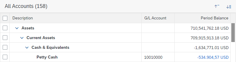
Title
A title provides a short, meaningful summary of the content, mostly in a single word. To display a title, use the title control.
In addition, the title can be followed by an item counter (the number of items in parentheses).
Use a title if you need the table toolbar, and if the title of the table is not indicated in the surrounding area. To avoid repeating text, you can use a generic text for the table title, such as Items. Note that the title is truncated if there is not enough space.
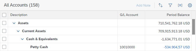
Title with item counter in the tree toolbar
Variant Management
In trees, a variant stores all the settings that define the table view, such as the column layout, column visibility, sorting, filter settings, and grouping. The variant management control enables users to load, save, and change variants. In most cases, variant management replaces the title.
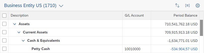
Variant management in the tree toolbar
Title and Variant Management
If you need both a title and variant management, place the variant management control directly after the title. Use a separator between the title and variant management.
However, since displaying both the title and variant often results in truncated texts, this pattern is not recommended.
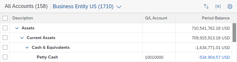
Title with variant management
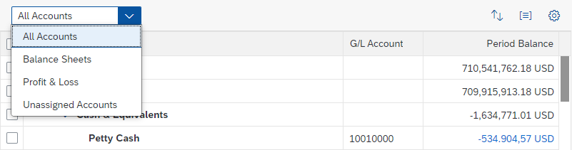
Content Switch
To switch between different predefined views, use a select control or a segmented button. The content switch replaces the title and the variant management control. In the rare case that the content switch is shown together with a title, the content switch follows the title.
A predefined view contains settings for sorting, filtering, grouping, column layout, and column visibility. However, in most cases, the content switch is just used for different filter settings like All, Mine, and Others. In this case, make sure that the content switch doesn’t interfere with other filter settings. For example, remove the corresponding filter from the filter bar. If possible, include an item counter per view.
Another common pattern for content switches are views like By X, and By Y, which are usually defined using group settings.
Use the segmented button and the select control as follows:
- For a limited set of views (2-3), use the segmented button for desktop and tablet devices. Replace it with a select control if there is not enough screen space.
- If the number of views can change or is larger than 3, use the select control.
For more information, see multiple views for list reports.
Segmented button with a counter
Segmented text button to switch content
Select control to switch content
Search
For trees with a large number of items, consider adding a search field. Use a search field only if there is no other way to search within the tree (for example, if there is no additional filter bar).
Place the search field on the right side of the toolbar. Since the search field cannot be moved into the overflow menu, always provide a minimum width.
Ideally, search for results in all columns. As a minimum, search in all currently visible columns.
For more information, see Search.
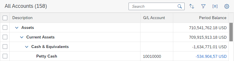
Search in the tree toolbar
Create / Add
Use a text button for Create or Add actions. If the Create or Add action is a main function, never move it into the overflow.
Insert the new item at the following position:
- If a single node is selected, insert it as a child item to this node
- If a single leaf is selected, insert it as a sibling to this leaf (within the same node)
- If no item is selected, insert it into the visible “root” node
If multiple items are selected, disable the Create / Add button.
More information: Object Handling (Create, Edit, Delete)
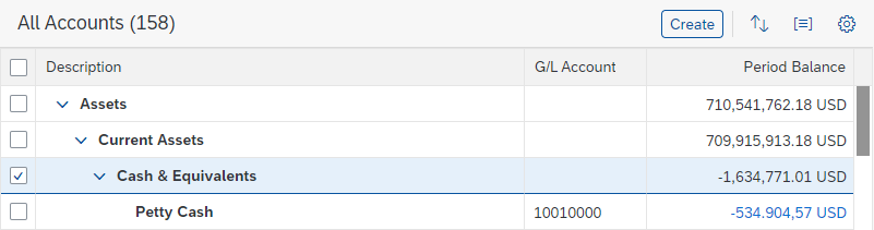
Tree toolbar with 'Create' button
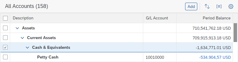
Tree toolbar with 'Add' button
Edit
There are several options for editing a tree:
Edit a Single Item
To allow the user to edit a single item, show an icon-only Edit button at the end of the item (depending on the tree control, use sap.m.TreeItemBase, property: type, value: sap.m.ListType.Detail or sap.m.ListType.DetailAndActive; or row actions). The user can click the button to trigger the edit event. Use this event to make the item editable.
Editing a single item
Mass Editing
See: Mass Editing
Edit the Whole Tree
To let the user edit a whole tree, use a text-only Edit button. When the user triggers the edit action, switch the table to edit mode. In edit mode, don’t show the Edit button and add the finalizing actions Save and Cancel instead. Remove any actions that are meaningless in edit mode. Keep the view settings available.
More information: Object Handling (Create, Edit, Delete)

Tree toolbar in display mode with 'Edit' as the most important action

Tree toolbar in edit mode
Delete / Remove
Use a text button for Delete or Remove actions. In most cases, Delete is used together with Create, while Remove is used together with Add.
If the Delete or Remove action is a main function, never move it into the overflow.
More information: Object Handling (Create, Edit, Delete)

Tree toolbar with 'Delete' button
Tree toolbar with 'Remove' button
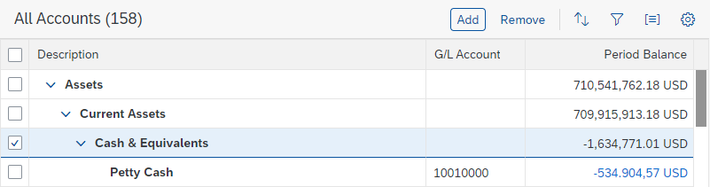
Cut, Copy, Paste
Use icon-only buttons for Cut and for Copy. Offer these actions if the tree structure is editable. Always pair them with drag and drop.
For Paste, use either an icon-only button or an icon-only menu button. In the menu, offer:
- Paste: to paste cut/copied rows
- Paste from Spreadsheet: to create new rows with data from the clipboard. Since the clipboard can’t be accessed directly, use this button to show a hint on how to paste via shortcut (Ctrl+V) or browser context menu.
When pasting, insert the item(s) in the following position:
- If a single node is selected, insert it as a child item to this node
- If a single leaf is selected, insert it as a sibling to this leaf (within the same node)
- If no item is selected, insert it into the visible “root” node
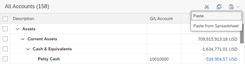
Tree toolbar with 'Cut' button, 'Copy' button, and 'Paste' menu button
Collapse All, Expand All
Use icon-only buttons for Collapse All and Expand All.
Collapse All closes all nodes up to the visible root level: only items on the first visible level are shown. Expand All opens all nodes down to the lowest level: all items are visible.
Tree toolbar with 'Collapse All' and 'Expand All' buttons
Sort, Filter, Group
When the user chooses one of these actions, open the view settings dialog or the P13n Dialog with only the corresponding settings.
- If sorting, filtering, and/or grouping is a common use case in your app, offer one, two, or all three of the corresponding features. Don’t provide these features if the tree is expected to have only a small number of entries (up to 20 in most cases).
- If filtering is a main use case, don’t offer filtering on the tree toolbar; use the filter bar instead.
Only use the view settings you really need. For example, don’t offer grouping if it doesn’t support your use case.
Ensure a consistent user experience. When a user reopens the app and variant management is not used, show the tree with the same view settings last defined by this user.
For more information, see Table Personalization.

Triggers for the different view settings (sort, filter, and group)
Column Settings
Use the table personalization dialog or the P13n Dialog for adding, removing, and rearranging columns.
Offer column settings if you need more columns than those that fit on a tablet screen (which is usually five) to fulfill 80% of your main use cases.
Ensure a consistent user experience. When a user reopens the app and if variant management is not used, show the tree with the same column settings last defined by this user.
For more information, see Table Personalization.

Tree toolbar with 'Column Settings' button
Maximize / Minimize
Use an icon-only button for Maximize or Minimize. Offer the Maximize button to open the same tree sized to fit the full screen. When maximized, offer the Minimize button to go back to the standard view.
Export to Spreadsheet
The Export to Spreadsheet action allows the user to export table rows. It is represented by an icon-only menu button.
Tree toolbar with the 'Export to Spreadsheet' menu button
The action for printing tree items is represented by an icon-only button.
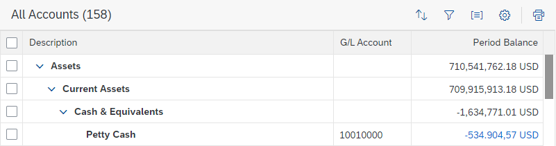
Tree toolbar with 'Print' button
View Switch
View switches are right-aligned in the toolbar and allow the user to switch between different chart types and different controls for displaying items (for example list, grid list, tree, tree table). Provide the view switch if a chart relies on subtle color differences or gradients of color. In these cases, users with visual impairments can switch to the tree view.
Switches are optional: they don’t have to be provided if there is no need to switch between different charts or trees.
Define the number of chart types and switches with care. Offer only chart types that help to visualize the respective data and that best assist the user. Ideally, offer no more than three types of visualization.
The sequence of chart type switches is not fixed. Sort them in order of importance.
The chart type currently in use is highlighted. To show this, use a segmented button with icons.
For more information about the icons and the chart types they represent, see Chart Toolbar.
Overflow
More information: Toolbar Overview – Overflow.
Styles
On the tree toolbar, use the following button styles:
- If the single primary action for the whole page is on the tree toolbar, use the emphasized button style.
- if the single primary action for the whole page is not on the tree toolbar, you can still highlight the most important button by using the ghost button style.
- For secondary actions and negative path actions, use the transparent button style.
- For split buttons and menu buttons, use the transparent button style.
- Don’t use semantic button styles on the tree toolbar.
For more information, see Button and Action Placement.
Guidelines
To indicate if an action can be applied to the current selection:
- Enable the action if it always works, regardless of whether or not items are selected.
- Enable the action if it can be applied to all selected items.
- Enable the action if it can be applied to some of the selected items. If the action is triggered, show a message that informs the user how many items are affected. Let the user choose whether to apply the action anyway or cancel it.
- Only disable the action if it can be applied to none of the selected items.
For more information, see UI Element States.
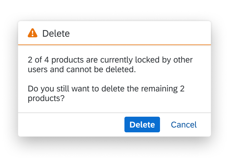
Message for an action that applies to a part of a selection
If the items are still available after the action was applied, keep them selected.
For further guidelines, see Toolbar Overview – Guidelines.
Resources
Want to dive deeper? Follow the links below to find out more about related controls, the SAPUI5 implementation, and the visual design.
Implementation
- Overflow Toolbar (SAPUI5 samples)
- Action Sheet (SAPUI5 samples)
- Toolbar (SAPUI5 samples)
- Overflow Toolbar (SAPUI5 API reference)
- Action Sheet (SAPUI5 API reference)
- Footer Toolbar (SAPUI5 API reference)
- Table Personalization Dialog (SAPUI5 API reference)
- Toolbar Separator (SAPUI5 API reference)
- Toolbar Spacer (SAPUI5 API reference)
 Your feedback has been sent to the SAP Fiori design team.