
- Latest SAPUI Version 1.124
- SAPUI5 Version 1.122
- SAPUI5 Version 1.120
- SAPUI5 Version 1.118
- SAPUI5 Version 1.116
- SAPUI5 Version 1.114
- SAPUI5 Version 1.112
- SAPUI5 Version 1.110
- SAPUI5 Version 1.108
- SAPUI5 Version 1.104
- SAPUI5 Version 1.102
- SAPUI5 Version 1.100
- SAPUI5 Version 1.98
- SAPUI5 Version 1.96
- SAPUI5 Version 1.94
- SAPUI5 Version 1.92
- SAPUI5 Version 1.90
- SAPUI5 Version 1.88
- SAPUI5 Version 1.86
- SAPUI5 Version 1.84
- SAPUI5 Version 1.82
- SAPUI5 Version 1.80
- SAPUI5 Version 1.78
- SAPUI5 Version 1.76
- SAPUI5 Version 1.74
- SAPUI5 Version 1.72
- SAPUI5 Version 1.70
- SAPUI5 Version 1.68
- SAPUI5 Version 1.66
- SAPUI5 Version 1.64
- SAPUI5 Version 1.62
- SAPUI5 Version 1.60
- SAPUI5 Version 1.58
- SAPUI5 Version 1.56
- SAPUI5 Version 1.54
- SAPUI5 Version 1.52
- SAPUI5 Version 1.50
- SAPUI5 Version 1.48
- SAPUI5 Version 1.46
- SAPUI5 Version 1.44
- SAPUI5 Version 1.42
- SAPUI5 Version 1.40
- SAPUI5 Version 1.38
- SAPUI5 Version 1.36
- SAPUI5 Version 1.34
- SAPUI5 Version 1.32
- SAPUI5 Version 1.30
- SAPUI5 Version 1.28
- SAPUI5 Version 1.26
- Latest SAPUI Version 1.124
- SAPUI5 Version 1.122
- SAPUI5 Version 1.120
- SAPUI5 Version 1.118
- SAPUI5 Version 1.116
- SAPUI5 Version 1.114
- SAPUI5 Version 1.112
- SAPUI5 Version 1.110
- SAPUI5 Version 1.108
- SAPUI5 Version 1.106
- SAPUI5 Version 1.104
- SAPUI5 Version 1.102
- SAPUI5 Version 1.100
- SAPUI5 Version 1.98
- SAPUI5 Version 1.96
- SAPUI5 Version 1.94
- SAPUI5 Version 1.92
- SAPUI5 Version 1.90
- SAPUI5 Version 1.88
- SAPUI5 Version 1.86
- SAPUI5 Version 1.84
- SAPUI5 Version 1.82
- SAPUI5 Version 1.80
- SAPUI5 Version 1.78
- SAPUI5 Version 1.76
- SAPUI5 Version 1.74
- SAPUI5 Version 1.72
- SAPUI5 Version 1.70
- SAPUI5 Version 1.68
- SAPUI5 Version 1.66
- SAPUI5 Version 1.64
- SAPUI5 Version 1.62
- SAPUI5 Version 1.60
- SAPUI5 Version 1.58
- SAPUI5 Version 1.56
- SAPUI5 Version 1.54
- SAPUI5 Version 1.52
- SAPUI5 Version 1.50
- SAPUI5 Version 1.48
- SAPUI5 Version 1.46
- SAPUI5 Version 1.44
- SAPUI5 Version 1.42
- SAPUI5 Version 1.40
- SAPUI5 Version 1.38
- SAPUI5 Version 1.36
- SAPUI5 Version 1.34
- SAPUI5 Version 1.32
- SAPUI5 Version 1.30
- SAPUI5 Version 1.28
- SAPUI5 Version 1.26
Color Palette Popover
sap.m.ColorPalettePopover
Intro
The color palette popover encapsulates the color palette and the color picker within a popover. You can use it to offer color selectors on toolbars (for example, triggered by a button). The popover allows users to select one of up to predefined 15 colors, or define any other color in a second step if none of the predefined colors fit.
The color palette popover is also used inside the rich text editor for changing text and background colors.
Color palette popover
Usage
Use the color palette popover if:
- Selecting a color from a predefined palette is the typical case.
- Users may sometimes need to define their own colors, but in most cases a predefined color or default color is sufficient.
- Selecting a color is needed as a toolbar action. In this case, use a button or menu button to trigger the color palette popover.
Do not use the color palette popover if:
- You want to let users select a color directly on the page (for example, inside a form). Use the color palette or the color picker instead.
- Users will nearly always define a color of their own, and rarely use the predefined palette. In this case, use the color picker popover instead.
Responsiveness
The color palette popover supports cozy and compact content densities. On a phone, the color palette popover turns into a full-screen dialog.
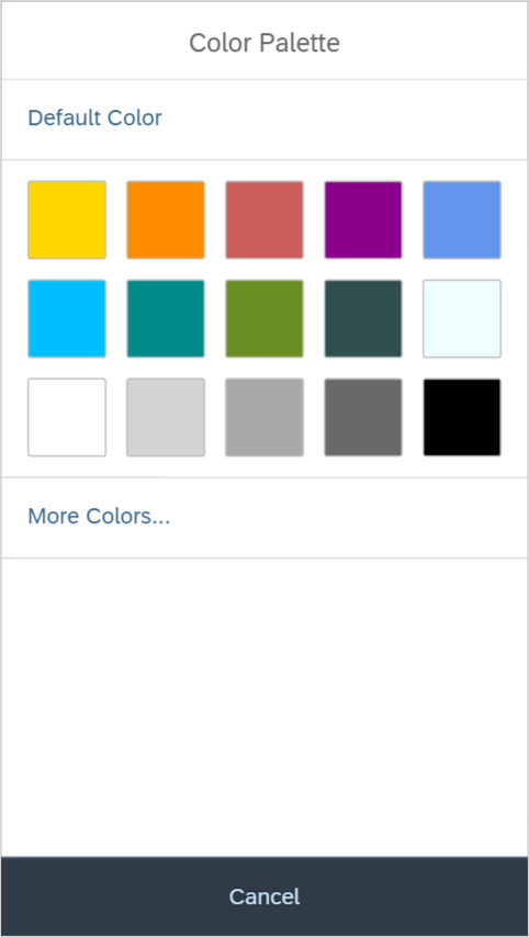
Size S
Size M
Size L
Components
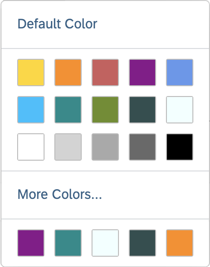
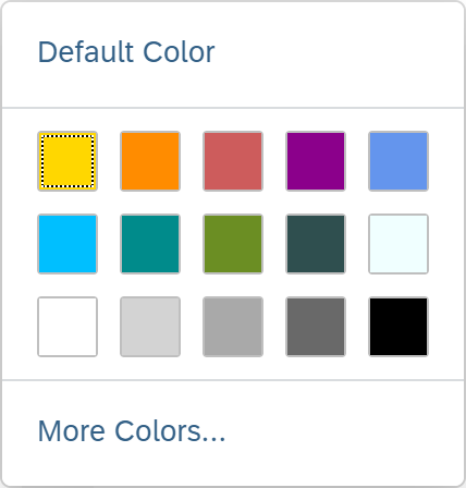
The color palette popover consists of:
- A link to select the default color (optional)
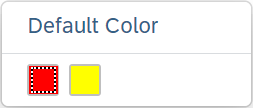
Color palette popover with default color selection
Color palette popover containing only a color palette
- A link that opens a color picker in a dialog (optional). The color picker popover comes in three flavors: simplified, default, and large (property: displayMode). For more information on the three display options, see color picker popover types.
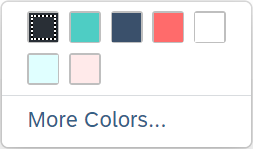
Color palette popover with the option to set any color
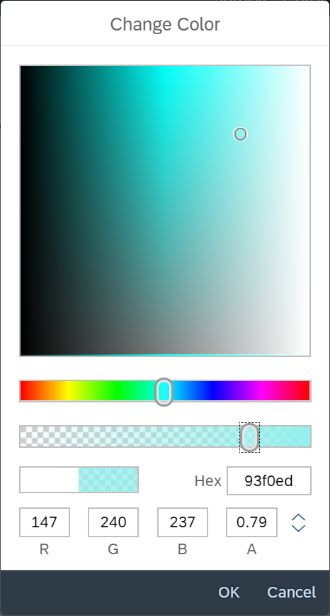
'More Colors...' opens a color picker dialog
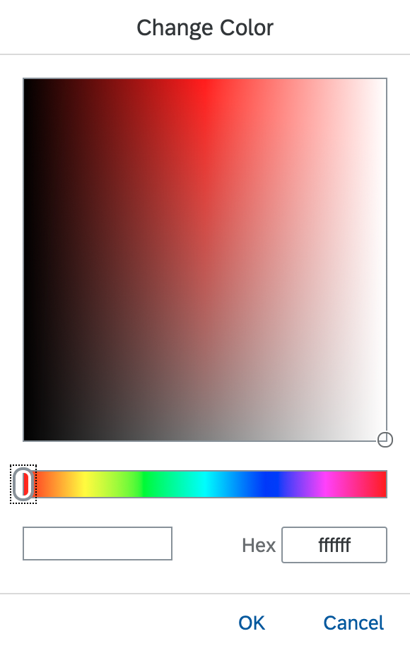
You can also display a simplified version of the color picker.
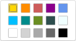
- Recent colors (optional). Users can see the last 5 colors they have recently picked. This function helps users to select colors that they have already chosen from the color picker. By default, this feature is visible.
Color palette popover with 5 recent colors
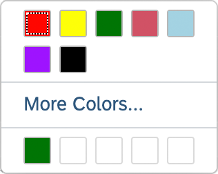
Color palette popover with just one recent color
Behavior and Interaction
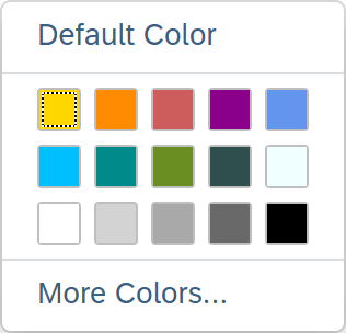
To select a color, users can:
- Click the Default Color link.
- Select a color in the predefined color palette or from the recent colors.
- Click More Colors… to select any other color. This opens the color picker.
- With the
liveChangeevent, the color change can have an immediate effect and allows app developers to be aware of real-time color changes before they close the popover that contains it.
On a keyboard, users can navigate within the color palette popover using the arrow keys. Pressing SPACE or ENTER selects a color or triggers a link.
As soon as a color has been selected, the color palette popover closes automatically.
Guidelines
- To trigger the color palette popover, use a button or a value help icon from an input field.
- Show the selected color in another place (for example, as a color value inside the triggering input field). The color palette popover closes as soon as a color is selected.
Resources
Want to dive deeper? Follow the links below to find out more about related controls, the SAPUI5 implementation, and the visual design.
Elements and Controls
- Color Palette (guidelines)
- Color Picker (guidelines)
- Color Picker Popover (guidelines)
- Rich Text Editor (guidelines)
 Your feedback has been sent to the SAP Fiori design team.