
- Latest SAPUI Version 1.124
- SAPUI5 Version 1.122
- SAPUI5 Version 1.120
- SAPUI5 Version 1.118
- SAPUI5 Version 1.116
- SAPUI5 Version 1.114
- SAPUI5 Version 1.112
- SAPUI5 Version 1.110
- SAPUI5 Version 1.108
- SAPUI5 Version 1.104
- SAPUI5 Version 1.102
- SAPUI5 Version 1.100
- SAPUI5 Version 1.98
- SAPUI5 Version 1.96
- SAPUI5 Version 1.94
- SAPUI5 Version 1.92
- SAPUI5 Version 1.90
- SAPUI5 Version 1.88
- SAPUI5 Version 1.86
- SAPUI5 Version 1.84
- SAPUI5 Version 1.82
- SAPUI5 Version 1.80
- SAPUI5 Version 1.78
- SAPUI5 Version 1.76
- SAPUI5 Version 1.74
- SAPUI5 Version 1.72
- SAPUI5 Version 1.70
- SAPUI5 Version 1.68
- SAPUI5 Version 1.66
- SAPUI5 Version 1.64
- SAPUI5 Version 1.62
- SAPUI5 Version 1.60
- SAPUI5 Version 1.58
- SAPUI5 Version 1.56
- SAPUI5 Version 1.54
- SAPUI5 Version 1.52
- SAPUI5 Version 1.50
- SAPUI5 Version 1.48
- SAPUI5 Version 1.46
- SAPUI5 Version 1.44
- SAPUI5 Version 1.42
- SAPUI5 Version 1.40
- SAPUI5 Version 1.38
- SAPUI5 Version 1.36
- SAPUI5 Version 1.34
- SAPUI5 Version 1.32
- SAPUI5 Version 1.30
- SAPUI5 Version 1.28
- SAPUI5 Version 1.26
- Latest SAPUI Version 1.124
- SAPUI5 Version 1.122
- SAPUI5 Version 1.120
- SAPUI5 Version 1.118
- SAPUI5 Version 1.116
- SAPUI5 Version 1.114
- SAPUI5 Version 1.112
- SAPUI5 Version 1.110
- SAPUI5 Version 1.108
- SAPUI5 Version 1.106
- SAPUI5 Version 1.104
- SAPUI5 Version 1.102
- SAPUI5 Version 1.100
- SAPUI5 Version 1.98
- SAPUI5 Version 1.96
- SAPUI5 Version 1.94
- SAPUI5 Version 1.92
- SAPUI5 Version 1.90
- SAPUI5 Version 1.88
- SAPUI5 Version 1.86
- SAPUI5 Version 1.84
- SAPUI5 Version 1.82
- SAPUI5 Version 1.80
- SAPUI5 Version 1.78
- SAPUI5 Version 1.76
- SAPUI5 Version 1.74
- SAPUI5 Version 1.72
- SAPUI5 Version 1.70
- SAPUI5 Version 1.68
- SAPUI5 Version 1.66
- SAPUI5 Version 1.64
- SAPUI5 Version 1.62
- SAPUI5 Version 1.60
- SAPUI5 Version 1.58
- SAPUI5 Version 1.56
- SAPUI5 Version 1.54
- SAPUI5 Version 1.52
- SAPUI5 Version 1.50
- SAPUI5 Version 1.48
- SAPUI5 Version 1.46
- SAPUI5 Version 1.44
- SAPUI5 Version 1.42
- SAPUI5 Version 1.40
- SAPUI5 Version 1.38
- SAPUI5 Version 1.36
- SAPUI5 Version 1.34
- SAPUI5 Version 1.32
- SAPUI5 Version 1.30
- SAPUI5 Version 1.28
- SAPUI5 Version 1.26
Object Page – Header
Intro
The SAP Fiori elements object page template supports the features and settings for the object page header detailed below.
For design information, see the Object Page Floorplan guidelines and the links below.
Feature Availability
Behavior and Interaction |
Availability |
| Expanded State | Default on initial load |
| Collapsed State | Default on scroll
With SAP Fiori elements for OData V2, on mobile phone screens, the object page displays a summary line instead of the collapsed header. |
| Header Content Display in Display Mode | In the header content area |
| Header Content Display in Edit and Create Modes | When the header is editable:
|
| Header Content Visible | Default, you can hide it. |
| Header Content Hidden | Available |
| Header Field Editability | By default, in edit mode the header is:
You can change the default. |
| Highlighting Values Based on Criticality | Available |
Components |
Availability |
| Dynamic Page Header | Mandatory, it must be configured. |
| Title | Mandatory, you must define it. |
| Menu for Saved Version / Draft | Default for draft-enabled applications |
| Breadcrumbs | Default |
| Subtitle | Available, you define the text. |
| Object Marker | Default in draft-enabled applications |
| Image | Available |
| Paging Buttons on the First Object Page | Available with SAP Fiori elements for OData V2 only |
| Paging Buttons on the First Subobject Page | Default under certain conditions |
| Toolbar | Available |
Toolbar Actions |
Availability |
| Edit and Delete | Default, when the data allows these actions.
You can turn one or both actions off. |
| Copy | Available with SAP Fiori elements for OData V2 |
| Related Apps Menu Button | Available
With SAP Fiori elements for OData V4, you can change the button name to Open in… |
| Generic Actions | Default: Share is turned on for saved objects and turned off for drafts. |
| Application-Specific Actions | Available, they must be configured. |
| Conditional Enablement of Navigation Buttons | Available with SAP Fiori elements for OData V4
Requires an extension with SAP Fiori elements for OData V2 |
| Order of Toolbar Actions | Default
You can change the default order. |
Additional Content (Optional) |
Availability |
| Simple Header Facets | Available with SAP Fiori elements for OData V2 only |
| Plain Text Facets | Available |
| Contact Facets | Available |
| Micro Chart Facets | Available |
| Form Facets | Available |
| Address Facets | Available |
| Header Field Group | Available |
| Rating Indicator Facets | Available |
| Progress Indicator Facet | Available |
| Key Value Facet | Available |
| Link | Available
With SAP Fiori elements for OData V2:
|
Behavior and Interaction
Collapsed/Expanded State
When the object page header contains at least one facet:
- On the initial load of the object page, the header is expanded.
- When the user scrolls down the page, the header collapses.
- The Expand/Collapse button and the Pin/Unpin button are displayed.
When the object page header contains only a title and a subtitle, the Expand/Collapse button and the Pin/Unpin button are not displayed.
With SAP Fiori elements for OData V2, when users scroll on a mobile phone screen, the object page optimizes the screen space by displaying a summary line instead of the collapsed header.
Next to the title, an arrow button lets the users expand the header.
For more information, see:
Summary Line for Object Page Header on Small Screens
Display of Header Content
In display mode, the header content area displays all the header content.
In edit and create modes, when the header is:
- Editable
- The first dynamic section in the content area, the header section, displays all the fields in the header that can be rendered in a form — both editable and uneditable fields.
The header section is only present in the edit and create modes.
-
- UI elements in the header that cannot be rendered in a form, such as micro charts, are not shown.
- Not Editable, the header is hidden.
Note that, by default, the header is
- Editable with SAP Fiori elements for OData V4
- Not editable with SAP Fiori elements for OData V2
You can ask the application developers to change the default.
For more information, see Dynamic Page Header (Mandatory).
Header Content Visibility
By default, header content is visible.
You can set the following header components or selected content, fields, or actions in them to be displayed or hidden, according to the object’s state:
- Entire header facets
- Content, such as fields, in a header facet
- Content in quick views
With Fiori elements for OData V2, you can set:
- The header to be displayed in edit mode.
- Header facets to be visible in edit mode.
Header Field Editability
By default, in edit mode the header is:
- Not editable with SAP Fiori elements for OData V2
- Editable with SAP Fiori elements for OData V4
You can change the default.
Even when the header is editable, certain fields or facets in the header may not be editable, for example, micro chart facets or text fields marked as ReadOnly.
Highlighting Values Based on Criticality
You can assign colors and icons to text to indicate the criticality of a field value.
With SAP Fiori elements for OData V4, you can add a quick view to text that’s been set to display in a color to indicate the criticality of its value. The text is displayed underlined as a link so users know the quick view is available.
You can display the following microcharts in the header:
- Area micro chart
- Bullet chart
- Radial chart
- Column chart
- Line micro chart
- Harvey ball chart
- Stacked bar chart
Components
Title
By default, with:
- SAP Fiori elements for OData V2, the title area is empty.
- SAP Fiori elements for OData V4, the title area displays the text: (Unnamed Object).
Menu for Saved Version / Draft
With this menu next to the object page title, users can navigate between the saved version of an object and the draft version that they’ve created. This is a default feature in applications with draft-handling,
Breadcrumbs
Breadcrumbs are displayed above the object title.
Object Marker
The object marker indicates the object is locked by another user in draft-enabled applications.
Image
The image is an avatar control. By default, it has a square shape.
You can set:
- An image to display instead of the avatar.
- The avatar to a have a circular shape.
When no image is set or found for the avatar, the avatar initials are displayed.
If those are not set or found either, an icon for the avatar is displayed:
- A square avatar for a product
- A circular avatar for a person.
For more information on the logic used for displaying an object, consult the development team and see Using Images, Initials, and Icons.
Paging Buttons
By default, with both SAP Fiori elements for OData V2 and V4, the paging buttons appear in the subobject page of applications that use the dynamic page layout in the following conditions:
- The user has navigated from a table in the object page to the subobject.
- The table in the object page contains at least two items.
With SAP Fiori elements for OData V2, you can:
- Enable the paging buttons to show on the first object page opened from a list report.
- Disable the default display of the paging buttons on the subobject page.
Toolbar Actions
Edit and Delete
By default, these actions are displayed when the data in the object page allows them.
You can:
- Set each enabled action to be displayed or hidden based on certain conditions in the back end. For example, you can hide the actions for a sales order that has already been paid.
- Disable the actions.
For more information, see:
Copy
You can place a copy action button in the header to let the user to create a new object with the same data as the current object with SAP Fiori elements for OData V2.
You set the label for the button according to your use case. Otherwise, the default label is Copy.
In the object page, the Copy button is displayed after the Delete button.
Related Apps Menu Button
You can enable the Related Apps menu button. It displays the actions available on the same object in different applications. Users select the action to open the same object in another application.
You can also:
- Hide specific actions in the menu.
- Change the button name to Open In… with SAP Fiori elements for OData V4.
Generic Actions
By default, the Share button is displayed for saved objects and hidden for drafts.
For more information, see Share (Generic).
Application-Specific Actions
You can include the actions required for your use case.
The header toolbar displays application-specific actions to the left of the generic actions.
You can also define custom shortcuts for application-defined action buttons and navigation buttons.
Conditional Enablement of Navigation Buttons
With SAP Fiori elements for OData V4, you can enable buttons that navigate the user to another page or application based on the value of a specific field.
With SAP Fiori elements for OData V2, this feature requires extensions.
For example, you can enable the Generate Purchase Order button only for sales orders with the completed status.
Order of Toolbar Actions
The default order — left to right — for actions in the object page toolbar is below:
- Edit
- Delete
- Copy with SAP Fiori elements for OData V2
- Application-specific action buttons
- Related Apps menu button
- Share
You can rearrange the order, for example, by setting an application-specific action that’s the primary action to the leftmost position on the toolbar.
For more information, see:
Additional Content
Simple Header Facets
With SAP Fiori elements for OData V2:
- You can use a simple header facet to show simple data points that align horizontally across the header.
- When form fields contain no value, they display the empty state indicator (–).
Plain Text Facets
You can use the plain text facet to display a continuous text in the header.
For more information, see Plain Text Facet.
Contact Facets
You can enable a quick view for a contact.
With SAP Fiori elements for OData V4:
- When a quick view detail contains no value, the empty state indicator (–) is displayed.
- You can add a quick view to text that’s been set to display in a color to indicate the criticality of its value. The text is displayed underlined as a link, so users know the quick view is available.
For more information, see Quick View.
Micro Chart Facets
For more information, see Micro Charts.
Form Facets
You can add a quick view to the form facet.
For more information, see Form Facet (Dataset).
Address Facets
You can display an address such as a shipping address.
Header Field Groups
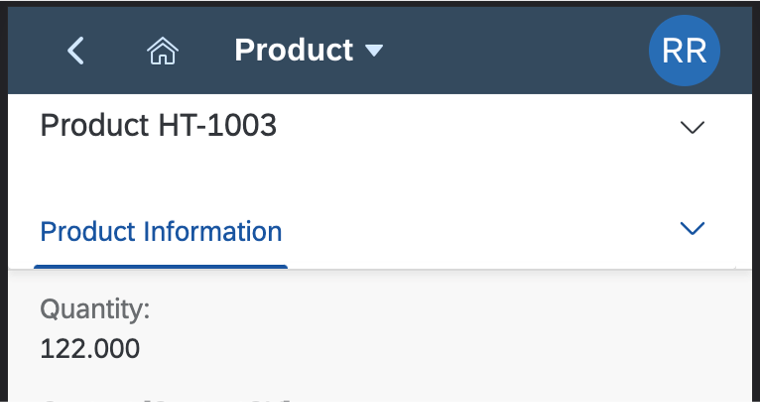
You can define fields to display together in a facet. For example, for the product object, in the General Information section, you can include the fields quantity, weight, and supplier.
Rating Indicator Facets
You can add a rating indicator to the header. It is read-only in both display and edit modes.
By default, the maximum rating is five stars.
You can:
- Change the maximum rating.
- Specify more descriptive text for the subtitle.
With extensions, you can make the rating editable.
Display Mode
The rating indicator shows with the:
- Title
- Subtitle with the total number of ratings
- Rating shown with stars: Both the aggregated and non-aggregated single rating types are supported.
Edit Mode
The rating indicator moves into the header facet and appears with only the title in edit mode.
For an aggregated rating, the number of ratings is shown in parentheses after the stars.
For more information, see:
Progress Indicator Facets
You can add a progress indicator facet to the object header.
For more information, see:
Key Value Facets
You can add a key value facet to highlight important data or KPIs.
For more information, see Key Value Facet.
Related Links
Elements and Controls
- Object Page Floorplan (guidelines)
- Object Handling (Create, Edit, Delete) (guidelines)
- Page Title and Navigation Menu (guidelines)
- Action Placement (guidelines)
 Your feedback has been sent to the SAP Fiori design team.