
- Latest SAPUI Version 1.124
- SAPUI5 Version 1.122
- SAPUI5 Version 1.120
- SAPUI5 Version 1.118
- SAPUI5 Version 1.116
- SAPUI5 Version 1.114
- SAPUI5 Version 1.112
- SAPUI5 Version 1.110
- SAPUI5 Version 1.108
- SAPUI5 Version 1.104
- SAPUI5 Version 1.102
- SAPUI5 Version 1.100
- SAPUI5 Version 1.98
- SAPUI5 Version 1.96
- SAPUI5 Version 1.94
- SAPUI5 Version 1.92
- SAPUI5 Version 1.90
- SAPUI5 Version 1.88
- SAPUI5 Version 1.86
- SAPUI5 Version 1.84
- SAPUI5 Version 1.82
- SAPUI5 Version 1.80
- SAPUI5 Version 1.78
- SAPUI5 Version 1.76
- SAPUI5 Version 1.74
- SAPUI5 Version 1.72
- SAPUI5 Version 1.70
- SAPUI5 Version 1.68
- SAPUI5 Version 1.66
- SAPUI5 Version 1.64
- SAPUI5 Version 1.62
- SAPUI5 Version 1.60
- SAPUI5 Version 1.58
- SAPUI5 Version 1.56
- SAPUI5 Version 1.54
- SAPUI5 Version 1.52
- SAPUI5 Version 1.50
- SAPUI5 Version 1.48
- SAPUI5 Version 1.46
- SAPUI5 Version 1.44
- SAPUI5 Version 1.42
- SAPUI5 Version 1.40
- SAPUI5 Version 1.38
- SAPUI5 Version 1.36
- SAPUI5 Version 1.34
- SAPUI5 Version 1.32
- SAPUI5 Version 1.30
- SAPUI5 Version 1.28
- SAPUI5 Version 1.26
- Latest SAPUI Version 1.124
- SAPUI5 Version 1.122
- SAPUI5 Version 1.120
- SAPUI5 Version 1.118
- SAPUI5 Version 1.116
- SAPUI5 Version 1.114
- SAPUI5 Version 1.112
- SAPUI5 Version 1.110
- SAPUI5 Version 1.108
- SAPUI5 Version 1.106
- SAPUI5 Version 1.104
- SAPUI5 Version 1.102
- SAPUI5 Version 1.100
- SAPUI5 Version 1.98
- SAPUI5 Version 1.96
- SAPUI5 Version 1.94
- SAPUI5 Version 1.92
- SAPUI5 Version 1.90
- SAPUI5 Version 1.88
- SAPUI5 Version 1.86
- SAPUI5 Version 1.84
- SAPUI5 Version 1.82
- SAPUI5 Version 1.80
- SAPUI5 Version 1.78
- SAPUI5 Version 1.76
- SAPUI5 Version 1.74
- SAPUI5 Version 1.72
- SAPUI5 Version 1.70
- SAPUI5 Version 1.68
- SAPUI5 Version 1.66
- SAPUI5 Version 1.64
- SAPUI5 Version 1.62
- SAPUI5 Version 1.60
- SAPUI5 Version 1.58
- SAPUI5 Version 1.56
- SAPUI5 Version 1.54
- SAPUI5 Version 1.52
- SAPUI5 Version 1.50
- SAPUI5 Version 1.48
- SAPUI5 Version 1.46
- SAPUI5 Version 1.44
- SAPUI5 Version 1.42
- SAPUI5 Version 1.40
- SAPUI5 Version 1.38
- SAPUI5 Version 1.36
- SAPUI5 Version 1.34
- SAPUI5 Version 1.32
- SAPUI5 Version 1.30
- SAPUI5 Version 1.28
- SAPUI5 Version 1.26
Date Picker
sap.m.DatePicker
Intro
The date picker lets users select a localized date using touch, mouse, or keyboard input. It consists of two parts: the date input field and the date picker.
Use this control if the user needs to enter a single date or a date range. The control also allows users to navigate directly from one month or year to another.
Usage
Use the date picker if:
- You need a range and know that your user is a power user who has to input lots of data. If the keyboard is the primary device used for navigating the app, use two input fields. This allows the user to quickly jump from field to field. By selecting a date in one of the fields, the other field should know what is selected and jump to the same selection.
Responsiveness
The date picker provides responsive behavior that allows for simple operation on all devices. It is smaller in compact mode and provides a touch-friendly size in cozy mode.
Clicking the date picker button opens the popover in full screen. To close it, the user can select a date (which triggers the close event), or click Cancel without selecting a date. Clicking the date input field allows the user to type and does not open the date picker popover.
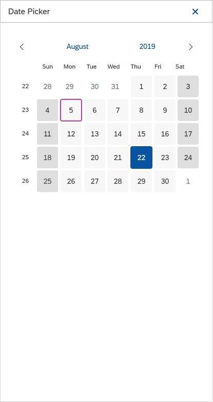
Date picker on a smartphone
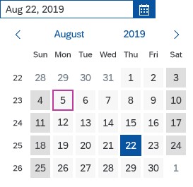
Date picker on a desktop device
Components
The date picker has two components: the date input field (1) and the date picker button (2). On all devices users can either use the input field to type a date or use the date picker button to open the date picker calendar.
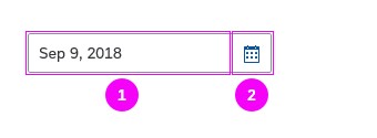
Date picker with input field and button
Date Input Field
In the input field, the user can enter a date directly or select it using the date picker. The system validates the entry and provides the user with feedback. You can also show placeholder text in the field.
It is possible to add additional descriptive texts to the input field (a unit of measurement, for example) by using a new association in the sap.m.InputBase control called ariaDescribedBy. The association is responsible for referencing the elements that describe the control.
Date Picker
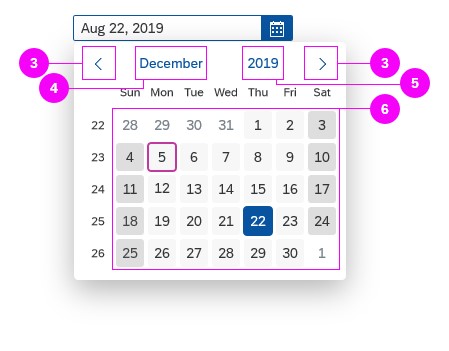
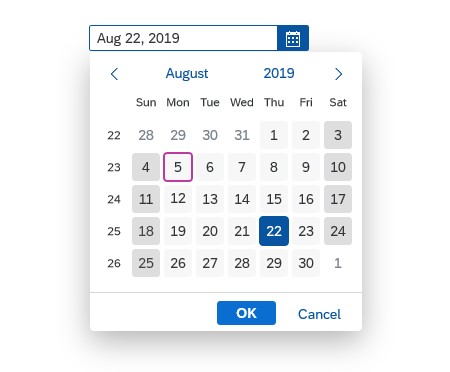
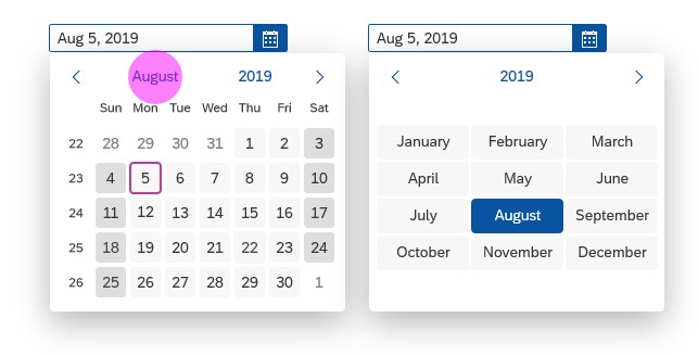
With the date picker, the user can see a day view, month view, year view, or year ranges.
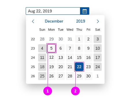
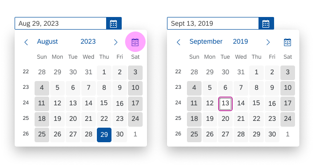
The current day (1) and the selected date (2) are highlighted. The calendar week is also visible in the day view. The calendar closes when a final day is selected. The user can click the arrows to navigate to the previous and the next day (3), month (4), or year view (5), depending on the current view. To select a date the use can use the calendar (6).
The selected date is shown with a blue background. The current day is indicated with a purple border and owns the focus.
The date picker can also show special days, which are highlighted with a colored line at the bottom of the date cell. For more information about the colors and legend, see Legend for Highlighted Days.
Date picker with a selected date and the current date
Clickable areas of the date picker

Date picker with highlighted days
You can change the default focus “today” to another date. This can save users several clicks when they create events. For an event end date, for example, the focus should propose a date in the future (after the start date).
Use case-specific focus date
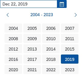
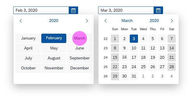
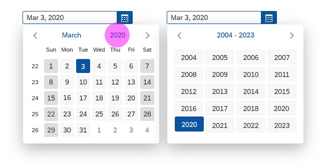
Month and Year Views
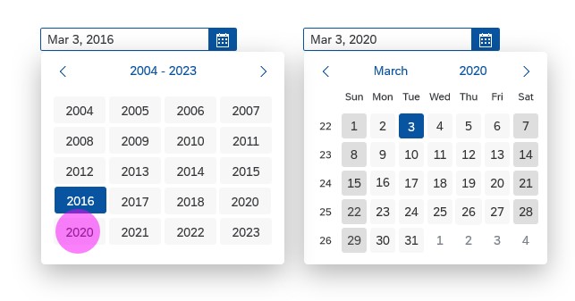
The month and year views can be used separately in a month or year picker. The year ranges are related to the year view and are not used separately. Selecting a year range navigates back to the year view, not the day view.
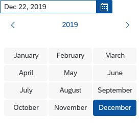
Month view in the date picker
Year view in the date picker
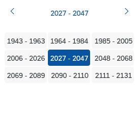
Year ranges in the date picker
Footer
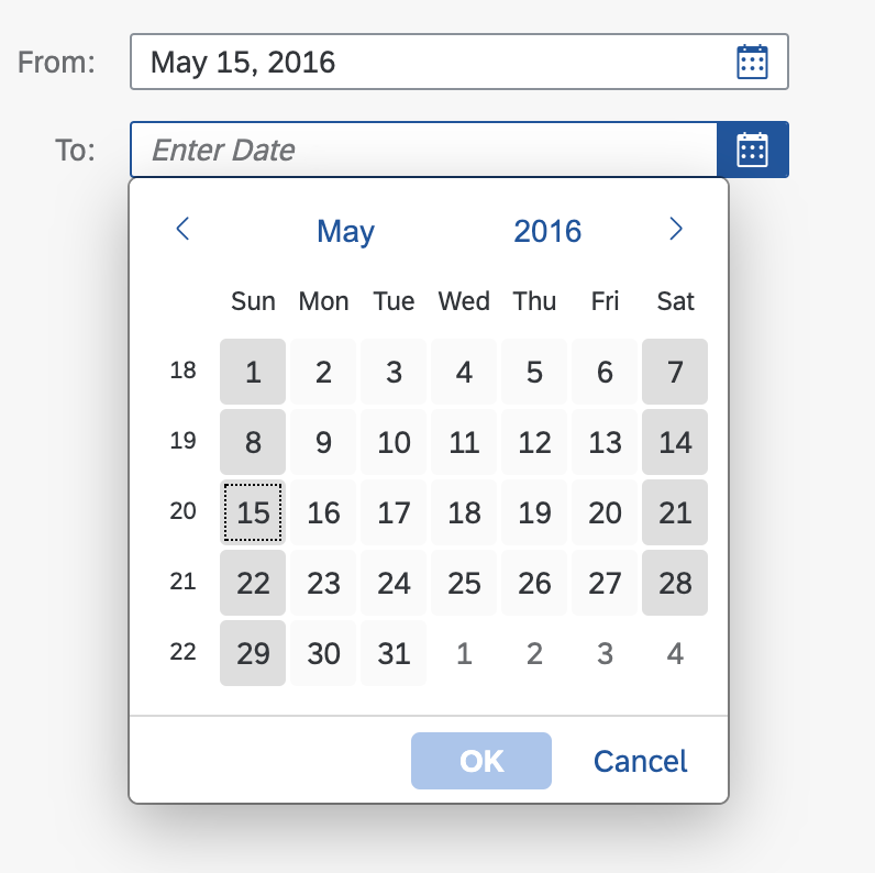
You can add a footer with OK and Cancel buttons to the date picker popover. However, we advise against this unless it’s very important that the user can pick multiple values (day, month, year) without closing the popover.
The default and recommended behavior is to close the date picker popover upon selection of the day (or month/year for the month and year pickers).
Date picker with footer
Behavior and Interaction
Selecting a Date
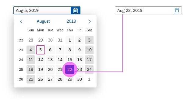
The user selects a date by clicking it. After the user selects a day, the calendar closes and the date appears in the date input field.
Date selection
Clicking the arrow shows the next day, month, or year view.
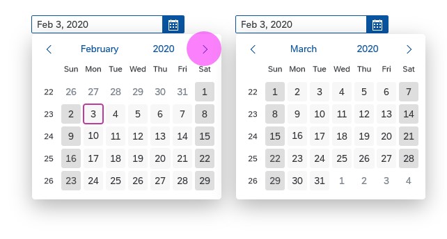
Navigating to the next month
If the current month is clicked, the view changes to the month view and the user can change the month.
Switching to month view
By clicking on a month, the user changes the month and the view changes to the day view.
Selecting another month
The user can similarly change the year. By clicking the current year, the view changes to the year view. After the user selects a year, the view changes back to the day view.
Switching to year view
After the user selects a year, the view changes back to the day view. The date in the date input field stays the same until the user selects a new date.
Selecting another year
“Today” Button
You can offer a shortcut for navigating to the current date (sap.m.DatePicker, property: showCurrentDateButton). This displays an additional Today icon button ( ) in the navigation part of the calendar. Pressing this button sets the focus to the current date.
This feature is available for pickers that enable selection of individual days. For the others, the property has no effect.
Selecting the current date with the 'Today' button
Styles
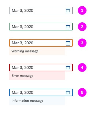
Value States
The date picker supports the following value states:
- Regular
- Positive
- Warning
- Error
- Information
You can display a value state text for error, warning, and information states to provide hints for the user.
For more information on how to use the different semantic states, see How to Use Semantic Colors.
For more information about different value states, see UI Element States.
Date picker value states
Guidelines
Date Formats
Long Date Format
Use the long date format for a list in a list-detail layout / object list item / title and object header / title. Here are some examples:
- English (US): January 16, 2022
- German (DE): 16. Januar 2022
- Danish (DK): 16. Jan. 2022
Short Date Format
Use the short date format for a list in a list-detail layout / object list item / list of object attributes if space is a concern. For example, you might need to save space if there is a label with the date. Here are some examples of the short date format:
- English (US): 1/16/22
- German (DE): 16.01.22
- Japanese (JP): 22/01/16
Relative and Medium Date Format
If appropriate, use a relative format for a list in a list-detail layout / object list item / list of object status. For example: today, 1 day ago, 2 days ago, and so on up to 6 days ago. After 6 days, use an absolute date with the medium format.
Use the absolute date with medium format in the corresponding object header in the details area. Do not use the relative format here.
Responsive Table
If screen space is at a premium (for example, if there are too many columns), use the short date format in table cells. Otherwise use the medium format.
If you need to display the weekday, use the full format. For example:
- English (US): Sunday, January 16, 2022
- German (DE): Sonntag, 16. Januar 2022
- French (FR): dimanche 16 janvier 2022
Resources
Want to dive deeper? Follow the links below to find out more about related controls, the SAPUI5 implementation, and the visual design.
Elements and Controls
- Responsive Table (guidelines)
- Date Range Selection (guidelines)
- Time Picker (guidelines)
- Date/Time Picker (guidelines)
 Your feedback has been sent to the SAP Fiori design team.