
- Latest SAPUI Version 1.124
- SAPUI5 Version 1.122
- SAPUI5 Version 1.120
- SAPUI5 Version 1.118
- SAPUI5 Version 1.116
- SAPUI5 Version 1.114
- SAPUI5 Version 1.112
- SAPUI5 Version 1.110
- SAPUI5 Version 1.108
- SAPUI5 Version 1.104
- SAPUI5 Version 1.102
- SAPUI5 Version 1.100
- SAPUI5 Version 1.98
- SAPUI5 Version 1.96
- SAPUI5 Version 1.94
- SAPUI5 Version 1.92
- SAPUI5 Version 1.90
- SAPUI5 Version 1.88
- SAPUI5 Version 1.86
- SAPUI5 Version 1.84
- SAPUI5 Version 1.82
- SAPUI5 Version 1.80
- SAPUI5 Version 1.78
- SAPUI5 Version 1.76
- SAPUI5 Version 1.74
- SAPUI5 Version 1.72
- SAPUI5 Version 1.70
- SAPUI5 Version 1.68
- SAPUI5 Version 1.66
- SAPUI5 Version 1.64
- SAPUI5 Version 1.62
- SAPUI5 Version 1.60
- SAPUI5 Version 1.58
- SAPUI5 Version 1.56
- SAPUI5 Version 1.54
- SAPUI5 Version 1.52
- SAPUI5 Version 1.50
- SAPUI5 Version 1.48
- SAPUI5 Version 1.46
- SAPUI5 Version 1.44
- SAPUI5 Version 1.42
- SAPUI5 Version 1.40
- SAPUI5 Version 1.38
- SAPUI5 Version 1.36
- SAPUI5 Version 1.34
- SAPUI5 Version 1.32
- SAPUI5 Version 1.30
- SAPUI5 Version 1.28
- SAPUI5 Version 1.26
- Latest SAPUI Version 1.124
- SAPUI5 Version 1.122
- SAPUI5 Version 1.120
- SAPUI5 Version 1.118
- SAPUI5 Version 1.116
- SAPUI5 Version 1.114
- SAPUI5 Version 1.112
- SAPUI5 Version 1.110
- SAPUI5 Version 1.108
- SAPUI5 Version 1.106
- SAPUI5 Version 1.104
- SAPUI5 Version 1.102
- SAPUI5 Version 1.100
- SAPUI5 Version 1.98
- SAPUI5 Version 1.96
- SAPUI5 Version 1.94
- SAPUI5 Version 1.92
- SAPUI5 Version 1.90
- SAPUI5 Version 1.88
- SAPUI5 Version 1.86
- SAPUI5 Version 1.84
- SAPUI5 Version 1.82
- SAPUI5 Version 1.80
- SAPUI5 Version 1.78
- SAPUI5 Version 1.76
- SAPUI5 Version 1.74
- SAPUI5 Version 1.72
- SAPUI5 Version 1.70
- SAPUI5 Version 1.68
- SAPUI5 Version 1.66
- SAPUI5 Version 1.64
- SAPUI5 Version 1.62
- SAPUI5 Version 1.60
- SAPUI5 Version 1.58
- SAPUI5 Version 1.56
- SAPUI5 Version 1.54
- SAPUI5 Version 1.52
- SAPUI5 Version 1.50
- SAPUI5 Version 1.48
- SAPUI5 Version 1.46
- SAPUI5 Version 1.44
- SAPUI5 Version 1.42
- SAPUI5 Version 1.40
- SAPUI5 Version 1.38
- SAPUI5 Version 1.36
- SAPUI5 Version 1.34
- SAPUI5 Version 1.32
- SAPUI5 Version 1.30
- SAPUI5 Version 1.28
- SAPUI5 Version 1.26
Mass Edit
Intro
Mass editing allows users to simultaneously change multiple objects that share the same editable properties.
Usage
Use mass editing if:
- Users need to change one or more values for multiple objects.
- The objects share the same editable properties, such as Product Category and Status.
Do not use mass editing if:
- The objects do not share any of the same editable properties.
Components
Mass editing is done in a dialog containing combo boxes and select controls.
The select control restricts the user to a predefined set of values. Additionally, the combo box allows the user to enter a custom value.
Behavior and Interaction
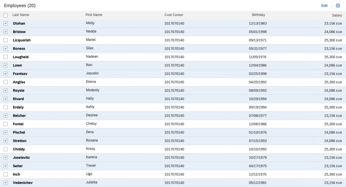
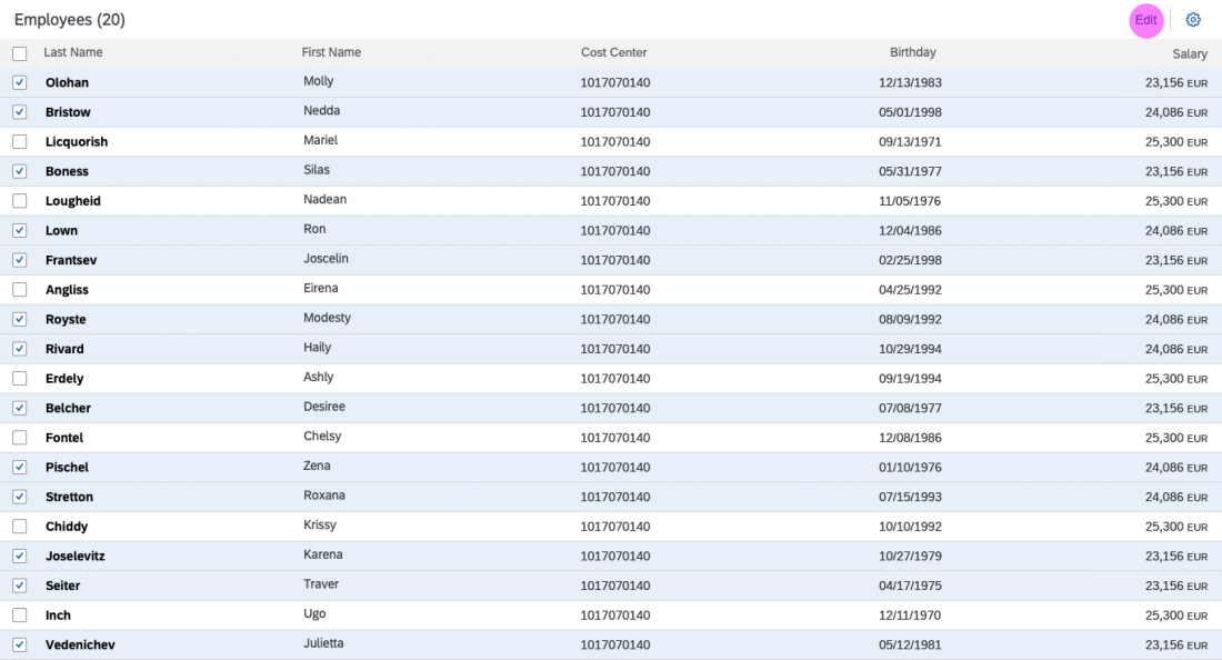
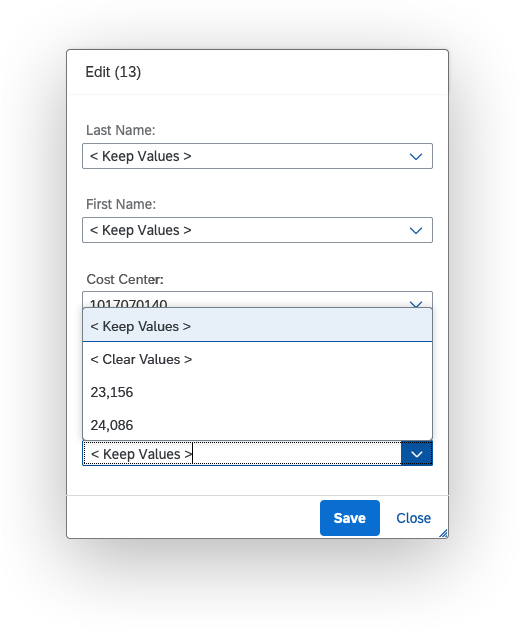
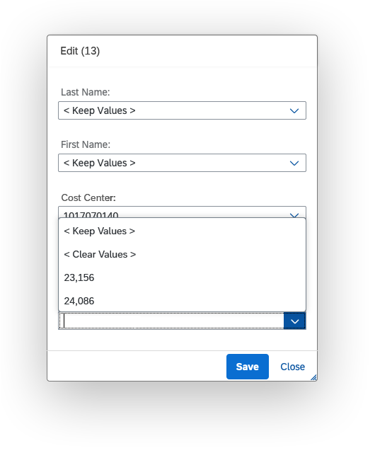
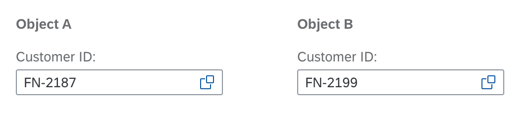
Users will typically select multiple objects from a list or table and press the Edit button. This triggers a modal view dialog containing a select control or combo box for each visible column in the table.
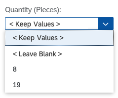
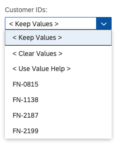
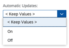
All the existing values are listed alphabetically in the dropdown menu without duplicates. Selecting a value or entering a new one overwrites all the existing values.
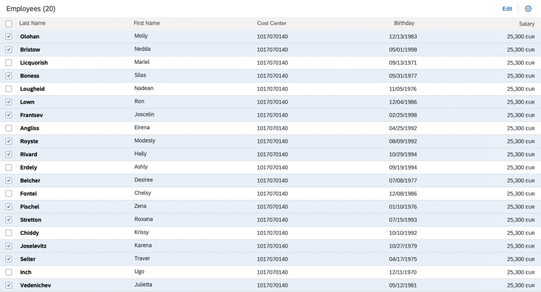
In the example below, the user’s task is to make everyone’s salary the same.
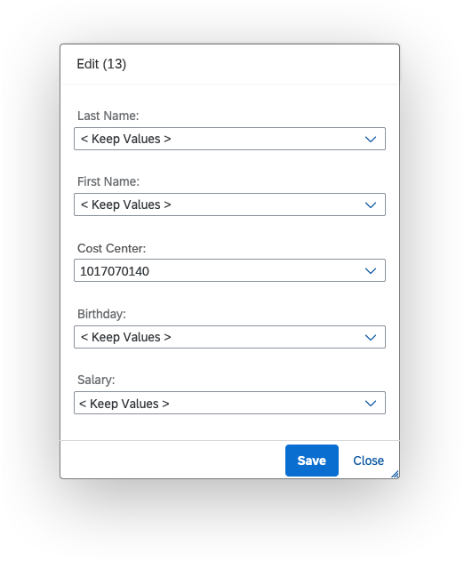
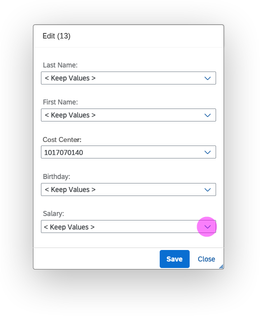

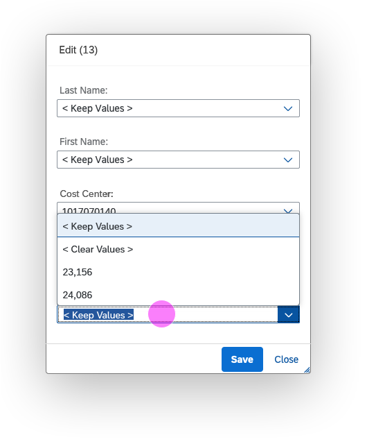
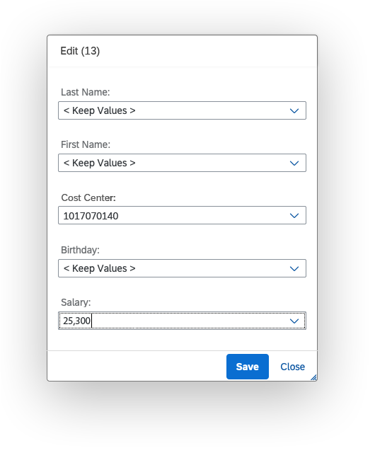
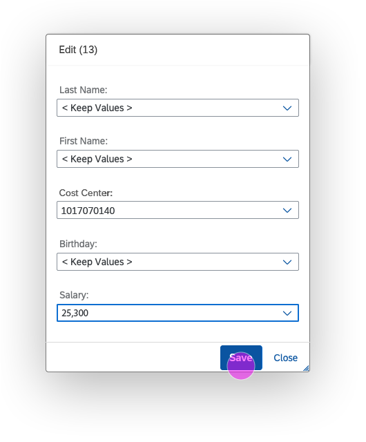
The preselected option in the select control or combo field depends on the existing values in the table column:
- If the values are different, < Keep Values >.
- If the values are all identical, that specific value is preselected.
- If a column contains no existing values, the option < Leave Blank > is preselected.
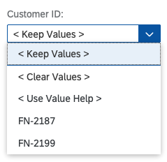
If it’s technically possible, the option < Clear Values > is available in the dropdown list to remove all the values in a column.
If a dialog can be used to enter a new value, the option < Use Value Help > or < Use Select Dialog > will be displayed in the dropdown list.
Guidelines
The examples below illustrate how to “translate” controls into their mass editing equivalent.
Checkbox
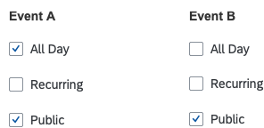
Checkboxes
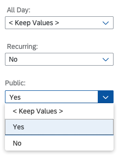
Checkboxes – Editing
Control
Select
Preset Entries
Mixed choices: < Keep Values >
All checked: Yes
All unchecked: No
Composite Fields
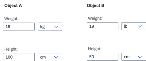
Composite fields
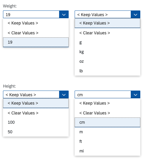
Composite fields – Editing
Control
Combo box/Select (depending on use case)
Preset Entries
See respective control in the list above.
Date Picker
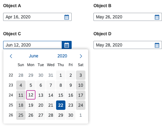
Date picker
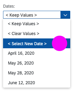
Date picker – Editing (1)
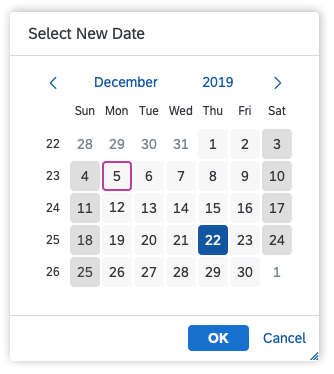
Date picker – Editing (2)
Control
- A) Select (if users are only allowed to pick a date from a predefined list)
List all allowed dates beneath the standard actions.
- B) Combo box (if users are allowed to pick any date)
Right above the list of dates from the object, offer another selection
< Select New Date >. - Dialog with calendar control inside
Selecting a date and clicking OK closes the dialog and populates the combo box with that date.
Preset Entries
Mixed choices: < Keep Values >
Identical choices: Use this choice as preset.
No values: < Leave Blank >
Input (any characters allowed)
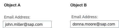
Input (all characters)
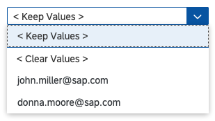
Input (all characters) – Editing
Control
Combo box
Preset Entries
Mixed choices: < Keep Values >
Identical choices: Use this choice as preset.
No values: < Leave Blank >
Input (restricted to specific characters, such as numbers)
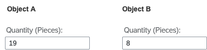
Input (restricted characters)
Input (restricted characters) – Editing
Control
Combo box
Preset Entries
Mixed choices: < Keep Values >
Identical choices: Use this choice as preset.
No values: < Leave Blank >
Input (with value help or select dialog)
Input (value help)
Input (value help) – Editing
Control
Combo box (Add < Use Value Help > or < Use Select Dialog > entry to trigger the respective dialog.)
Preset Entries
Mixed choices: < Keep Values >
Identical choices: Use this choice as preset.
No values: < Leave Blank >
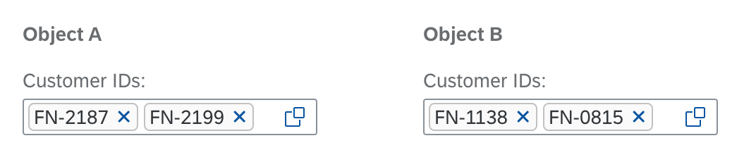
Input (multi input)
Input (multi input) – Editing
Radio Buttons
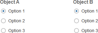
Radio buttons
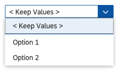
Radio buttons – Editing
Control
Select
Preset Entries
Mixed choices: < Keep Values >
Identical choices: Use this choice as preset.
No values: < Leave Blank >
Rating Indicator
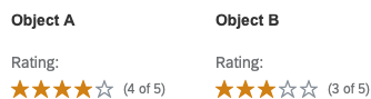
Rating indicator
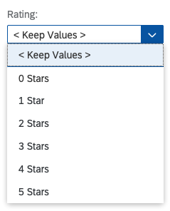
Rating indicator – Editing
Control
Select
Preset Entries
Mixed choices: < Keep Values >
Identical choices: Use this choice as preset.
No values: < Leave Blank >
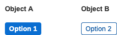
Segmented Button
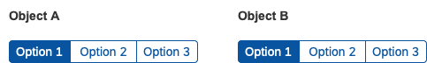
Segmented buttons
Segmented buttons – Editing
Control
Select
Preset Entries
Mixed choices: < Keep Values >
Identical choices: Use this choice as preset.
Slider
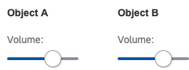
Slider
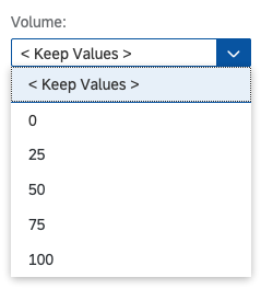
Slider – Editing
Control
Combo box / Select
Preset Entries
Mixed choices: < Keep Values >
Identical choices: Use this choice as preset.
Switch
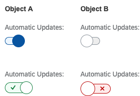
Switch
Switch – Editing
Control
Select
Preset Entries
Mixed choices: < Keep Values >
Identical choices: Use this choice as preset.
If you use the semantic switch, make sure you provide suitably worded options for mass editing, like On/Off or Yes/No.
Toggle Buttons
Toggle buttons
Toggle buttons – Editing
Control
Select
Preset Entries
Mixed choices: < Keep Values >
Identical choices: Use this choice as preset.
No values: < Leave Blank >
General Guidelines
- Provide mass editing in a dialog after the user selects multiple items from a list or table and presses the Edit button.
- Ensure that the option < Keep Values > is listed before the existing values in the dropdown menu.
- Ensure that the option < Leave Blank > is preselected if a column doesn’t contain any values.
- If it’s technically possible, you can provide the< Clear Values > option in the dropdown list to clear all the values in a column. However, do not make this option available if entering a value is mandatory.
- Include the option < Use Value Help > or < Use Select Dialog > if a dialog or value help can be used to pick a new value – just ensure that the previously selected value (or choice) is restored to the input field if the user presses Cancel in the value help dialog.
- If your application also allows the creation of objects, try to structure the create and mass edit screens similarly. This reduces the cognitive load for the end users. The same rule applies if your users have an additional SAP Fiori application for creating the object.
- If certain fields belong together semantically (such as First Name/Last Name or City/ZIP Code), arrange them in such a way that the user can recognize the connection.
Special Characters (“<” and “>”)
Always use the entries < Keep Values > and < Leave Blank > as described in this guideline: They must start with “<” followed by a blank space, and end with a blank space followed by “>”.
These two characters have been chosen because they are not usually used in text form in objects.
In the unlikely event that these characters are already used by a customer, replace them with another set of unlikely special characters that are not used by this customer. However, you must still ensure that < Keep Values > and < Leave Blank > stay at the top as the first two entries.
Related Links
Implementation
- Combo Box (SAPUI5 samples)
- Select (SAPUI5 samples)
- Smart Multi Edit Container (SAPUI5 samples)
- Smart Multi Input (SAPUI5 samples)
 Your feedback has been sent to the SAP Fiori design team.