
- Latest SAPUI Version 1.124
- SAPUI5 Version 1.122
- SAPUI5 Version 1.120
- SAPUI5 Version 1.118
- SAPUI5 Version 1.116
- SAPUI5 Version 1.114
- SAPUI5 Version 1.112
- SAPUI5 Version 1.110
- SAPUI5 Version 1.108
- SAPUI5 Version 1.104
- SAPUI5 Version 1.102
- SAPUI5 Version 1.100
- SAPUI5 Version 1.98
- SAPUI5 Version 1.96
- SAPUI5 Version 1.94
- SAPUI5 Version 1.92
- SAPUI5 Version 1.90
- SAPUI5 Version 1.88
- SAPUI5 Version 1.86
- SAPUI5 Version 1.84
- SAPUI5 Version 1.82
- SAPUI5 Version 1.80
- SAPUI5 Version 1.78
- SAPUI5 Version 1.76
- SAPUI5 Version 1.74
- SAPUI5 Version 1.72
- SAPUI5 Version 1.70
- SAPUI5 Version 1.68
- SAPUI5 Version 1.66
- SAPUI5 Version 1.64
- SAPUI5 Version 1.62
- SAPUI5 Version 1.60
- SAPUI5 Version 1.58
- SAPUI5 Version 1.56
- SAPUI5 Version 1.54
- SAPUI5 Version 1.52
- SAPUI5 Version 1.50
- SAPUI5 Version 1.48
- SAPUI5 Version 1.46
- SAPUI5 Version 1.44
- SAPUI5 Version 1.42
- SAPUI5 Version 1.40
- SAPUI5 Version 1.38
- SAPUI5 Version 1.36
- SAPUI5 Version 1.34
- SAPUI5 Version 1.32
- SAPUI5 Version 1.30
- SAPUI5 Version 1.28
- SAPUI5 Version 1.26
- Latest SAPUI Version 1.124
- SAPUI5 Version 1.122
- SAPUI5 Version 1.120
- SAPUI5 Version 1.118
- SAPUI5 Version 1.116
- SAPUI5 Version 1.114
- SAPUI5 Version 1.112
- SAPUI5 Version 1.110
- SAPUI5 Version 1.108
- SAPUI5 Version 1.106
- SAPUI5 Version 1.104
- SAPUI5 Version 1.102
- SAPUI5 Version 1.100
- SAPUI5 Version 1.98
- SAPUI5 Version 1.96
- SAPUI5 Version 1.94
- SAPUI5 Version 1.92
- SAPUI5 Version 1.90
- SAPUI5 Version 1.88
- SAPUI5 Version 1.86
- SAPUI5 Version 1.84
- SAPUI5 Version 1.82
- SAPUI5 Version 1.80
- SAPUI5 Version 1.78
- SAPUI5 Version 1.76
- SAPUI5 Version 1.74
- SAPUI5 Version 1.72
- SAPUI5 Version 1.70
- SAPUI5 Version 1.68
- SAPUI5 Version 1.66
- SAPUI5 Version 1.64
- SAPUI5 Version 1.62
- SAPUI5 Version 1.60
- SAPUI5 Version 1.58
- SAPUI5 Version 1.56
- SAPUI5 Version 1.54
- SAPUI5 Version 1.52
- SAPUI5 Version 1.50
- SAPUI5 Version 1.48
- SAPUI5 Version 1.46
- SAPUI5 Version 1.44
- SAPUI5 Version 1.42
- SAPUI5 Version 1.40
- SAPUI5 Version 1.38
- SAPUI5 Version 1.36
- SAPUI5 Version 1.34
- SAPUI5 Version 1.32
- SAPUI5 Version 1.30
- SAPUI5 Version 1.28
- SAPUI5 Version 1.26
Iconography – Horizon
Intro
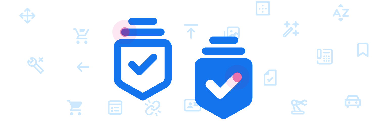
SAP icons have been redesigned for the Horizon visual themes with a fresh, friendly, yet bolder style that is consistent in terms of size, stroke, and balance. The icons are tailored for simple and direct user interaction, using metaphors that are easy to understand. Each icon has been hand-crafted and aligned in several formats used by SAP applications. The icons are essentially vector graphics that can be resized easily without compromising their appearance.
New SAP icon design for the Horizon visual theme
Design Language
The design language for Horizon-themed icons used within SAP products is created to work across all supported browsers, devices, and operating systems. The style can be described as:
- Bold
- Fresh
- Simple
- Friendly
This approach is meant to communicate simplicity and integrity with a modern, bold design to enhance SAP solutions. The style integrates basic geometric shapes in order to give a more prominent appearance.
Icon Formats
Icons can be supported in multiple file formats. However, SAP delivers icons in a font format by default. The SAP icon font contains multiple icons in one file with a small file size, making it convenient to deliver updates with each SAP product release. Custom icons can even replace the SAP icon font if an alternative format or style is desired. Additional icon font files can also be added to the SAPUI5 icon pool.
For more information on custom icons, see the development documentation.
SAP icons are also part of the theming base content, which is available for all technologies supported by SAP.
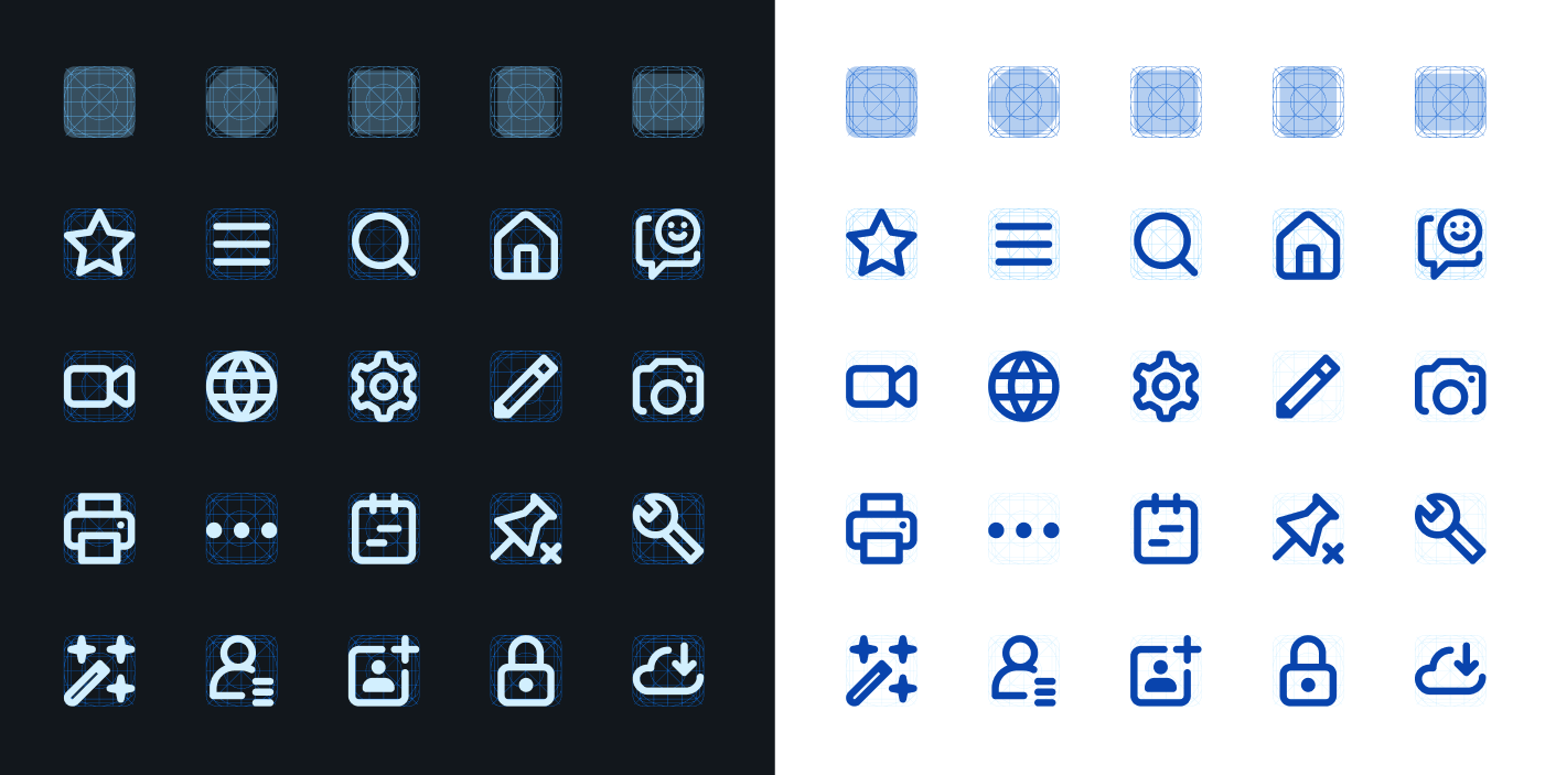
Vector based icons drawn with a flexible geometric grid system
Icon Semantics
Icon semantics are used to define a set of visual elements that indicate functions, objects, and states for iconographic communication.
Finding the right visual semantic to convey a consistent meaning to the user is based on the following essentials:
- Take inspiration from the real world.
An icon should be easily recognized by a user. (Note that this does not imply skeuomorphism.) - Make use of context.
The context of an icon contributes to its meaning.
A semantic element can have different meanings for the user depending on where it’s located (for example, within different labels). - Use clear, simple, and recognizable shapes.
For accessibility reasons, visual elements should be drawn as clear shapes and should not rely upon colors or other means in order to be recognized. - Adhere to interaction design standards throughout the graphical user interface.
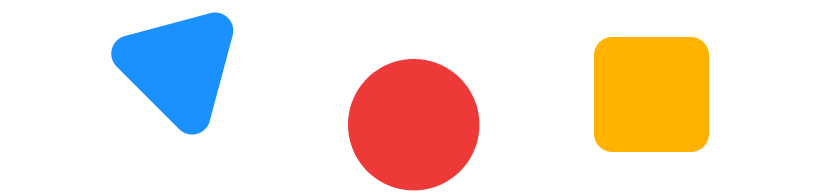
Simple geometric shapes
Simple and recognizable metaphor
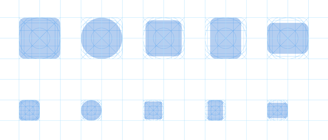
The Geometric Icon Grid System
The simple geometric icon grid was created as the foundational anatomy of the icons. This ensures visual balance for circles and squares and brings the necessary consistency and stability to the shapes that form the structure of the icon metaphors.
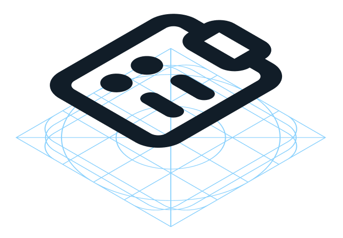
SAP icon grid system preview
The anatomy of the geometric icon grid system
A Closer Look at 16px Icons
At 16px, the icons should still maintain a strong and bold look. To achieve this, the lines of the icons must always be perfectly pixel aligned on at least one side, similar to how a text font is pixel aligned. Each icon must be manually pixel aligned to the pixel grid to avoid any issues with blurriness on lower resolution screens.
Here is a closer look at how icons are designed using the grid system:
- Circles: 16x16px.
- Squares: 14x14px within a 16px grid.
- Vertical rectangles: 16x12px within a 16px grid.
- Horizontal rectangles: 12x16px within a 16px grid.
Details of 16px icons based on the icon grid system
Line Thickness and Border Radius
Line Thickness
In general, the base vector size created for SAP icons is 16px for icons used in most UI controls. Other listed sizes depend on individual control specifications. Icons can be constructed with the bolder line thickness of 1.6px within a 16px grid and, if necessary, scaled up proportionally (for example, to 20px with 2px line thickness). Similar to a text font, all lines are manually pixel aligned to ensure a crisp appearance.
Example of supported sizes
Corner Radius
The consistent regular corner radius is 2px for rounded shapes to match the line thickness. If the icon is scaled proportionally, the values used for the corner radius may vary depending on the intended shape and size. There may be details that require only a minimal radius or no radius value at all. Small details will require smaller values and larger details may require larger values to be consistent.
Recommended corner radius values for 16px icons:
- Regular: 2px
- Small: 1px
- Large: 5px
Left to right: Regular, small, and large corner radius examples
SAP Icon Font
To ensure the availability of SAP icons for all technologies supported by SAP, the icons are part of the theming base content and also part of OpenUI5. SAP icons are made available under the Apache 2.0 license.
Related Links
Follow the links below to find out more about iconography.
OpenUI5 Icon Explorer
Explore icons in SAP Fiori with OpenUI5.
OpenUI5 Icons and Icon Pool
Find out more about using icons, adding icons, or replacing them with custom icons in OpenUI5 documentation.
 Your feedback has been sent to the SAP Fiori design team.