
- Latest SAPUI Version 1.124
- SAPUI5 Version 1.122
- SAPUI5 Version 1.120
- SAPUI5 Version 1.118
- SAPUI5 Version 1.116
- SAPUI5 Version 1.114
- SAPUI5 Version 1.112
- SAPUI5 Version 1.110
- SAPUI5 Version 1.108
- SAPUI5 Version 1.104
- SAPUI5 Version 1.102
- SAPUI5 Version 1.100
- SAPUI5 Version 1.98
- SAPUI5 Version 1.96
- SAPUI5 Version 1.94
- SAPUI5 Version 1.92
- SAPUI5 Version 1.90
- SAPUI5 Version 1.88
- SAPUI5 Version 1.86
- SAPUI5 Version 1.84
- SAPUI5 Version 1.82
- SAPUI5 Version 1.80
- SAPUI5 Version 1.78
- SAPUI5 Version 1.76
- SAPUI5 Version 1.74
- SAPUI5 Version 1.72
- SAPUI5 Version 1.70
- SAPUI5 Version 1.68
- SAPUI5 Version 1.66
- SAPUI5 Version 1.64
- SAPUI5 Version 1.62
- SAPUI5 Version 1.60
- SAPUI5 Version 1.58
- SAPUI5 Version 1.56
- SAPUI5 Version 1.54
- SAPUI5 Version 1.52
- SAPUI5 Version 1.50
- SAPUI5 Version 1.48
- SAPUI5 Version 1.46
- SAPUI5 Version 1.44
- SAPUI5 Version 1.42
- SAPUI5 Version 1.40
- SAPUI5 Version 1.38
- SAPUI5 Version 1.36
- SAPUI5 Version 1.34
- SAPUI5 Version 1.32
- SAPUI5 Version 1.30
- SAPUI5 Version 1.28
- SAPUI5 Version 1.26
- Latest SAPUI Version 1.124
- SAPUI5 Version 1.122
- SAPUI5 Version 1.120
- SAPUI5 Version 1.118
- SAPUI5 Version 1.116
- SAPUI5 Version 1.114
- SAPUI5 Version 1.112
- SAPUI5 Version 1.110
- SAPUI5 Version 1.108
- SAPUI5 Version 1.106
- SAPUI5 Version 1.104
- SAPUI5 Version 1.102
- SAPUI5 Version 1.100
- SAPUI5 Version 1.98
- SAPUI5 Version 1.96
- SAPUI5 Version 1.94
- SAPUI5 Version 1.92
- SAPUI5 Version 1.90
- SAPUI5 Version 1.88
- SAPUI5 Version 1.86
- SAPUI5 Version 1.84
- SAPUI5 Version 1.82
- SAPUI5 Version 1.80
- SAPUI5 Version 1.78
- SAPUI5 Version 1.76
- SAPUI5 Version 1.74
- SAPUI5 Version 1.72
- SAPUI5 Version 1.70
- SAPUI5 Version 1.68
- SAPUI5 Version 1.66
- SAPUI5 Version 1.64
- SAPUI5 Version 1.62
- SAPUI5 Version 1.60
- SAPUI5 Version 1.58
- SAPUI5 Version 1.56
- SAPUI5 Version 1.54
- SAPUI5 Version 1.52
- SAPUI5 Version 1.50
- SAPUI5 Version 1.48
- SAPUI5 Version 1.46
- SAPUI5 Version 1.44
- SAPUI5 Version 1.42
- SAPUI5 Version 1.40
- SAPUI5 Version 1.38
- SAPUI5 Version 1.36
- SAPUI5 Version 1.34
- SAPUI5 Version 1.32
- SAPUI5 Version 1.30
- SAPUI5 Version 1.28
- SAPUI5 Version 1.26
Step Input
sap.m.StepInput
Intro
The step input control allows the user to change the input values in predefined increments (steps).
Usage
Use the step input if:
- The user needs to adjust amounts, quantities, or other values quickly.
- The user needs to adjust values for a specific step (for example, in a shopping cart).
Do not use the step input if:
- The user needs to enter a static number (for example, postal code, phone number, or ID). In this case, use the regular input field control instead.
- You want to display a value that rarely needs to be adjusted and does not pertain to a particular step. In this case, use the regular input field control instead.
- You want the user to enter dates and times. In this case, use the date picker, date range selection, time picker, or date/time picker instead.
Responsiveness
Size S and M (Smartphone and Tablet)
On smartphones and tablets, the step input is shown in cozy mode. When the focus is in the input field, the keyboard layout for numeric input is displayed.
Size L (Desktop)
On desktop devices, the step input is shown in compact mode.
For more information on the cozy and compact modes, see content density.

Step input - size S/M

Step input - size L
Components
The step input consists of:
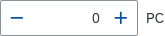
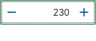
(A) Input field
(B) Button to decrease the value
(C) Button to increase the value

Step input areas
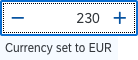
You can show a descriptive reference or unit of measurement after the field (property: description). Depending on your use case, you may need to adjust how the space is distributed between the input field and the descriptive text (property: fieldWidth).
Step input with description
Behavior and Interaction
Default Value
The step input always contains a value. When no value is set, the default value is generally 0. However, app developers can set a different default value (property: value).
If the minimum value is larger than 0, the generic value is the minimum value set by the app team.
Changing the Value
The user changes the value:
- By pressing the increase/decrease buttons
- By typing a number
- With keyboard shortcuts (up/down, page up/down)
- With the mouse scroll wheel
On desktop devices, clicking the input field places the cursor in the input field. On mobile devices, tapping the input field displays the numeric keyboard.
Clicking the buttons changes the value by a step and does not place the caret in the input field.
When the user clears the value and leaves the input field, the value in the field becomes 0 or the minimum if the minimum is larger than 0.
If the user enters an invalid value, the invalid value remains in the input field. An error state is displayed.
Increasing the Step
To allow the user to change values by a larger step with keyboard shortcuts, app developers can set a multiple of the step (property: largerStep). The default value is two times the set step.
If your use case requires more complex step increments (for example, if you want the step increment to be the closest number that is divisible by the defined step) you can use the stepMode property. For details, please refer to the API reference.
Maximum and Minimum Values
App developers can set a maximum and minimum value for the step input.
When the maximum/minimum values are reached, the Increase/Decrease button and up/down keyboard navigation are disabled.
Display Value
The step input control allows decimal values and can control the number of digits shown after the decimal point (property: displayValuePrecision). When the property is set to a specific value – from 0 (default) to 20 – the control restricts users accordingly as they type or paste a value. Trying to type more digits triggers an error state.

Step input at maximum value (max = 100)

Step input at minimum value (min = -100)
Styles
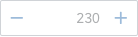
Editable and Enabled States
Editable
Property settings: editable = true, enabled = true
The step input control is enabled and editable by default. Set the control to editable to allow the user to enter a value.
Not Editable
Property settings: editable = false, enabled = true
Use this state, for example, to display data only.
Disabled
Property settings: editable = not relevant, enabled = false
Set the control to disabled in an edit scenario to indicate that the user cannot change the control, for example, due to missing access rights or previous conditions not having been fulfilled or selected.

Read-only state
Disabled state
Value States
The step input control offers the four value states listed below. For the error, warning, and information states, you can show an additional value state text when the focus is on the input field. If the text gets too long, it wraps.
- Warning
- Error
- Success: No value state message is shown
- Information: Value state message can show additional information, such as recommendations.
For more information on how to use the different semantic states, see How to Use Semantic Colors.
For more information on showing value states in a form, see Form Field Validation.

Error state

Warning state

Success state

Information state
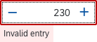
Error state – With value state text
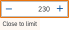
Warning state – With value state text
Success state – No value state text
Information state – With value state text
Guidelines
Always provide a meaningful label for the step input.
Width
By default the width of the step input is set to 100% of the container. Avoid setting a fixed width, but rather embed the control in a proper layout such as a form, simple form, or grid layout, and use the layout data property where the width is defined by the 12-column approach to define the responsive behavior for sizes S, M, and L.
When used in forms, the width of the step input control comes from the label:field ratio of the form. The app development team should be able to restrict the width to a proper number of columns (12-grid responsive layout) so that the step input is not too wide.
Ensure an appropriate width for the range of values to be entered for all the sizes S, M, and L. Avoid a larger width than necessary.
Keep in mind the varying lengths of decimals. Limit the number of digits after the floating point if possible in your use case. For more information, have a look at the article on formatting numbers.
Resources
Want to dive deeper? Follow the links below to find out more about related controls, the SAPUI5 implementation, and the visual design.
Elements and Controls
- Input Field (guidelines)
- Button (guidelines)
- How To Use Semantic Colors (guidelines)
 Your feedback has been sent to the SAP Fiori design team.