
- Latest SAPUI Version 1.124
- SAPUI5 Version 1.122
- SAPUI5 Version 1.120
- SAPUI5 Version 1.118
- SAPUI5 Version 1.116
- SAPUI5 Version 1.114
- SAPUI5 Version 1.112
- SAPUI5 Version 1.110
- SAPUI5 Version 1.108
- SAPUI5 Version 1.104
- SAPUI5 Version 1.102
- SAPUI5 Version 1.100
- SAPUI5 Version 1.98
- SAPUI5 Version 1.96
- SAPUI5 Version 1.94
- SAPUI5 Version 1.92
- SAPUI5 Version 1.90
- SAPUI5 Version 1.88
- SAPUI5 Version 1.86
- SAPUI5 Version 1.84
- SAPUI5 Version 1.82
- SAPUI5 Version 1.80
- SAPUI5 Version 1.78
- SAPUI5 Version 1.76
- SAPUI5 Version 1.74
- SAPUI5 Version 1.72
- SAPUI5 Version 1.70
- SAPUI5 Version 1.68
- SAPUI5 Version 1.66
- SAPUI5 Version 1.64
- SAPUI5 Version 1.62
- SAPUI5 Version 1.60
- SAPUI5 Version 1.58
- SAPUI5 Version 1.56
- SAPUI5 Version 1.54
- SAPUI5 Version 1.52
- SAPUI5 Version 1.50
- SAPUI5 Version 1.48
- SAPUI5 Version 1.46
- SAPUI5 Version 1.44
- SAPUI5 Version 1.42
- SAPUI5 Version 1.40
- SAPUI5 Version 1.38
- SAPUI5 Version 1.36
- SAPUI5 Version 1.34
- SAPUI5 Version 1.32
- SAPUI5 Version 1.30
- SAPUI5 Version 1.28
- SAPUI5 Version 1.26
- Latest SAPUI Version 1.124
- SAPUI5 Version 1.122
- SAPUI5 Version 1.120
- SAPUI5 Version 1.118
- SAPUI5 Version 1.116
- SAPUI5 Version 1.114
- SAPUI5 Version 1.112
- SAPUI5 Version 1.110
- SAPUI5 Version 1.108
- SAPUI5 Version 1.106
- SAPUI5 Version 1.104
- SAPUI5 Version 1.102
- SAPUI5 Version 1.100
- SAPUI5 Version 1.98
- SAPUI5 Version 1.96
- SAPUI5 Version 1.94
- SAPUI5 Version 1.92
- SAPUI5 Version 1.90
- SAPUI5 Version 1.88
- SAPUI5 Version 1.86
- SAPUI5 Version 1.84
- SAPUI5 Version 1.82
- SAPUI5 Version 1.80
- SAPUI5 Version 1.78
- SAPUI5 Version 1.76
- SAPUI5 Version 1.74
- SAPUI5 Version 1.72
- SAPUI5 Version 1.70
- SAPUI5 Version 1.68
- SAPUI5 Version 1.66
- SAPUI5 Version 1.64
- SAPUI5 Version 1.62
- SAPUI5 Version 1.60
- SAPUI5 Version 1.58
- SAPUI5 Version 1.56
- SAPUI5 Version 1.54
- SAPUI5 Version 1.52
- SAPUI5 Version 1.50
- SAPUI5 Version 1.48
- SAPUI5 Version 1.46
- SAPUI5 Version 1.44
- SAPUI5 Version 1.42
- SAPUI5 Version 1.40
- SAPUI5 Version 1.38
- SAPUI5 Version 1.36
- SAPUI5 Version 1.34
- SAPUI5 Version 1.32
- SAPUI5 Version 1.30
- SAPUI5 Version 1.28
- SAPUI5 Version 1.26
Recommendations
Intro
Intelligent systems can help users by recommending appropriate content or suggesting an action or input the user may “prefer”. In this case, we speak of a recommendation pattern and its impact on the UI.
In SAP Fiori, we differentiate between three types of recommendations: content recommendations, input assistance, and solution proposals.
Content recommendations - Structure
Input assistance - Structure

Solution proposals - Structure
Content Recommendations
The system filters the parts of the available content that may be interesting for the user, based on the user’s behavior or the content characteristics. Outside examples of typical “recommender” systems are Amazon or Netflix.
Input Assistance
The system assists the user by entering or filtering data. Typical examples might be a search phrase suggestion, an appropriate form template, or a set of suggested default values for certain fields, based on the user input and interaction history.
Solution Proposals
The system supports users working on complex problems by recommending specific actions or proposed solutions. In some use cases, this might be combined with a simulation of the possible outcome. Typically, solution proposals involve various decision support systems (DSS), which might also be integrated in a situation concept. Example use cases include payment and invoice matching, or material shortage scenarios.
Content Recommendations
Recommendation systems are intelligent services that provide a personalized and customer-centric experience. “Content” is any type of digital artifact (documents, files, links, videos, and so on). This can be internal content (such as a recommended training program or app) or third-party content (such as a market analysis or product video from an integrated provider). Content is recommended to users according to their current needs and context.
Visualization
The representation and placement of personalized content depends on the following factors:
- Criticality: How important is the content? Do users need it to make key decisions around their primary goals?
- Relevance: Where in the application or process does the content provide the most value?
- Purpose: What can users do or achieve with the given content?
- Value added: What can users achieve with the content that wouldn’t be possible without it?
Content recommendations are very individual and depend strongly on the use case. You can utilize all the controls offered by SAP Fiori to present the required content in the best way possible. However, you must ensure that the content adds value and is explained appropriately.
| Design Rationale |
| High–stakes decisions are more common in a professional software environment than in everyday consumer apps, where the consequences of an action are usually easy to anticipate and revert.
While the implications of recommending unsuitable educational content to an employee are likely to be minimal, recommendations around critical business decisions can potentially cause irreversible damage (for example, recommending an unreliable supplier or business partner, leading to the failure or premature termination of a project or contract). It’s therefore vital to enable users to take an informed decision. |
Input Assistance
System recommendations for the user input can be provided on two levels:
- Form level: A recommendation for the complete form (“form variant”).
- Form element level: A recommendation for a single form element.
In both cases, we need to design the following micro interactions:
- Detect: As a user, I need to see which values were suggested by the system.
- Explain: As a user, I want to understand the reasoning behind the system recommendation.
- Compare: As a user, I need to be able to compare existing human input with the system recommendation.
- Act: As user, I want to accept or reject system recommendations.
“Human First” Principle
Human input always wins against machine input.
The following rules can be derived from this principle:
- The system can prefill empty fields with recommendations.
- A user’s input cannot be overwritten by a system recommendation without the user’s approval.
- Active approval of the system recommendation by the user turns it into user input.
Assistance at Field Level
We plan to extend the concept of form validation to design for the interaction rules listed above.
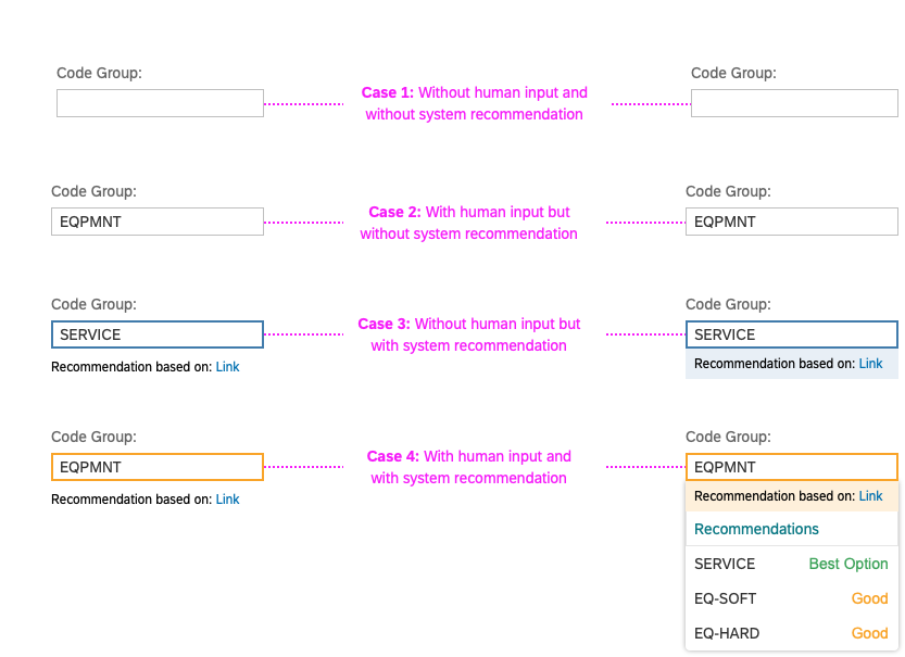
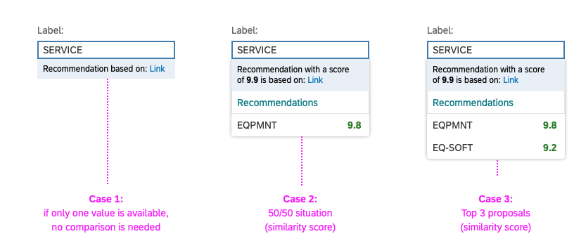
Different constellations of human input and system proposals, with confidence levels
Detection
Use the “information” value state (blue color) to highlight the fields with proposals from the system.
Use the “warning” value state (yellow color) to highlight the fields that already contain user input (or default input), but for which an alternative system suggestion is available.
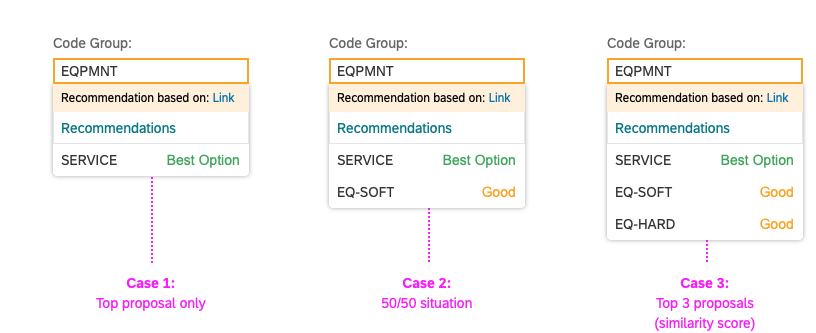
Comparison
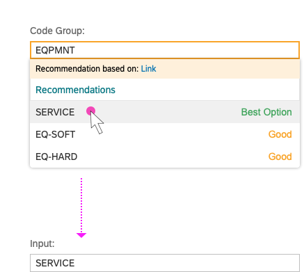
For input and multi-input fields, you can use autocomplete suggestions to display the alternatives recommended by the system, which are shown on focus. You can also show the level of confidence / prediction quality as a part of an autocomplete suggestion.
Input Assistance - Confidence Levels
Action: Approve or Reject
Users can accept the system recommendation in two ways:
- Implicitly, by submitting the whole form.
- Explicitly, by selecting an alternative in case of conflict.
Users can explicitly reject a system recommendation by starting to edit it in the input field.
Explicit acceptance of a system recommendation
General Guidelines / Open Issues:
- Confidence level: First validate with users if/how the confidence level will improve their experience. Is there a reason to show the suggestions, even if you are not confident? How valuable is it for the user to know that a proposal has a confidence level of 99.4% and not 99.3%? Is there a reasonable aggregation (high / medium / low) that can be applied instead?
- Explanations: You may need to explain system recommendations in more detail, rather than just providing the confidence level. Check the guiding principles for explanations to determine your own scope.
- Assistance at form level: In the first iteration, input assistance at field level does not support multiple recommendations.
- Edge cases: The current concept covers the use cases that are based on direct input controls (input and multi-input). We plan to explore input assistance for other controls (such as radio buttons, checkboxes, or sliders) in the next iteration, depending on emerging use case requirements.
Solution Proposals
In most of the use cases, the solutions are presented as a list of recommendation items, which are grouped in a recommendation block.
Recommendation Item
As a minimum, a recommendation item must have a meaningful title that links to an action. Depending on the use case, you can expand the presentation of your recommendation by using custom variant of the list Item control. The example below shows the anatomy of the most complex case with all optional elements.
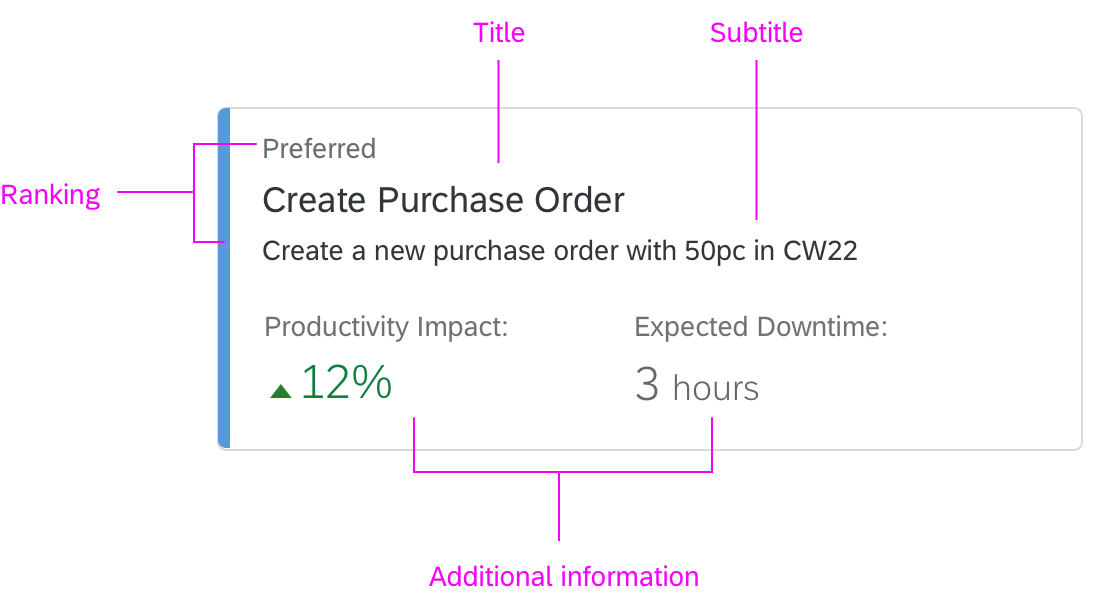
Recommendation item anatomy
Title and description: Give the recommendation a short and meaningful title that describes the proposed action. You can expose more information by using an additional description. Longer texts can be truncated after the second line, but we recommend avoiding truncation altogether. If you do opt to use truncation, offer a More Info button for showing the rest of the text.
Action: To apply a recommendation, the user executes an associated action. Depending on the form of the recommendation item, the action can be triggered by clicking the entire list item, or by clicking a dedicated button.
Selection: Depending on the use case, users might need to see a preview of the results first. In this case, the triggers for the “preview” and “final action” must be separated.
Preferred proposal: Depending on your use case, you can highlight a recommendation item as a preferred proposal. For details, see Ranked recommendations in the Recommendation Block section below.
Recommendation Block
Several recommendation items form a recommendation block. The example below shows the anatomy of a horizontal recommendation block based on a grid list.
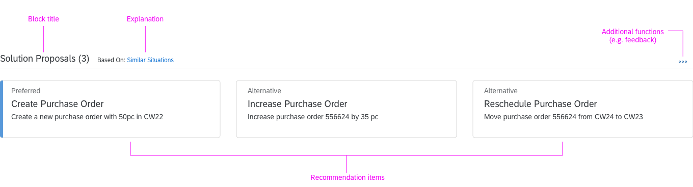
Recommendation block anatomy
Recommendation block header: The block toolbar contains a meaningful and short block title, which describes the set of proposed solutions. It can also offer additional functionality that applies to the whole recommendation block, such as an additional explanation of the model behind the recommendations, or an option to provide explicit user feedback to reinforce the underlying model.
Recommendation block items: Recommendation items are the main content of the recommendation block. Depending on the use case and space constraints they can be organized horizontally, vertically, or as a grid.
Ranked recommendations: You can highlight the first item of the recommendation block to indicate the preferred proposal. We recommend highlighting only one (the preferred) item in the list, and placing it at the top. You can use the semantic colors for highlighting if this is required by your use case.
Guidelines
- Explanation: Provide the user with at least with a basic explanation of how the recommendations are generated (for example, “App recommendations based on your interactions during the last week”). Ideally, the system should be able to explain each recommendation.
- Feedback: Give users an option to provide explicit feedback for each recommendation. In addition, you should gather implicit feedback (signals) from the user. Think about all the possible signals and their relevance (importance) upfront during the UI design.
- Fallback scenario: Define the system behavior for cases where recommendations are missing or “less relevant”. Think about what is better for your users: to see a non-relevant recommendation or to see nothing. In most cases, silence is golden. Design your UI in a way that allows you to hide the recommendation block if there are no recommendations. Users should still be able to accomplish the task manually, or at least be informed about possible workarounds.
- Ranking recommendations: Depending on your use case, you may want to rank one or all recommendations. Explain the ranking logic to the user. Use list item highlighting and text labels for ranking. Avoid showing scoring explicitly unless it is relevant for the user decision.
- Less is more: Do not recommend because you can. Recommend only what makes sense.
 Your feedback has been sent to the SAP Fiori design team.