
- Latest SAPUI Version 1.124
- SAPUI5 Version 1.122
- SAPUI5 Version 1.120
- SAPUI5 Version 1.118
- SAPUI5 Version 1.116
- SAPUI5 Version 1.114
- SAPUI5 Version 1.112
- SAPUI5 Version 1.110
- SAPUI5 Version 1.108
- SAPUI5 Version 1.104
- SAPUI5 Version 1.102
- SAPUI5 Version 1.100
- SAPUI5 Version 1.98
- SAPUI5 Version 1.96
- SAPUI5 Version 1.94
- SAPUI5 Version 1.92
- SAPUI5 Version 1.90
- SAPUI5 Version 1.88
- SAPUI5 Version 1.86
- SAPUI5 Version 1.84
- SAPUI5 Version 1.82
- SAPUI5 Version 1.80
- SAPUI5 Version 1.78
- SAPUI5 Version 1.76
- SAPUI5 Version 1.74
- SAPUI5 Version 1.72
- SAPUI5 Version 1.70
- SAPUI5 Version 1.68
- SAPUI5 Version 1.66
- SAPUI5 Version 1.64
- SAPUI5 Version 1.62
- SAPUI5 Version 1.60
- SAPUI5 Version 1.58
- SAPUI5 Version 1.56
- SAPUI5 Version 1.54
- SAPUI5 Version 1.52
- SAPUI5 Version 1.50
- SAPUI5 Version 1.48
- SAPUI5 Version 1.46
- SAPUI5 Version 1.44
- SAPUI5 Version 1.42
- SAPUI5 Version 1.40
- SAPUI5 Version 1.38
- SAPUI5 Version 1.36
- SAPUI5 Version 1.34
- SAPUI5 Version 1.32
- SAPUI5 Version 1.30
- SAPUI5 Version 1.28
- SAPUI5 Version 1.26
- Latest SAPUI Version 1.124
- SAPUI5 Version 1.122
- SAPUI5 Version 1.120
- SAPUI5 Version 1.118
- SAPUI5 Version 1.116
- SAPUI5 Version 1.114
- SAPUI5 Version 1.112
- SAPUI5 Version 1.110
- SAPUI5 Version 1.108
- SAPUI5 Version 1.106
- SAPUI5 Version 1.104
- SAPUI5 Version 1.102
- SAPUI5 Version 1.100
- SAPUI5 Version 1.98
- SAPUI5 Version 1.96
- SAPUI5 Version 1.94
- SAPUI5 Version 1.92
- SAPUI5 Version 1.90
- SAPUI5 Version 1.88
- SAPUI5 Version 1.86
- SAPUI5 Version 1.84
- SAPUI5 Version 1.82
- SAPUI5 Version 1.80
- SAPUI5 Version 1.78
- SAPUI5 Version 1.76
- SAPUI5 Version 1.74
- SAPUI5 Version 1.72
- SAPUI5 Version 1.70
- SAPUI5 Version 1.68
- SAPUI5 Version 1.66
- SAPUI5 Version 1.64
- SAPUI5 Version 1.62
- SAPUI5 Version 1.60
- SAPUI5 Version 1.58
- SAPUI5 Version 1.56
- SAPUI5 Version 1.54
- SAPUI5 Version 1.52
- SAPUI5 Version 1.50
- SAPUI5 Version 1.48
- SAPUI5 Version 1.46
- SAPUI5 Version 1.44
- SAPUI5 Version 1.42
- SAPUI5 Version 1.40
- SAPUI5 Version 1.38
- SAPUI5 Version 1.36
- SAPUI5 Version 1.34
- SAPUI5 Version 1.32
- SAPUI5 Version 1.30
- SAPUI5 Version 1.28
- SAPUI5 Version 1.26
Empty States
Intro
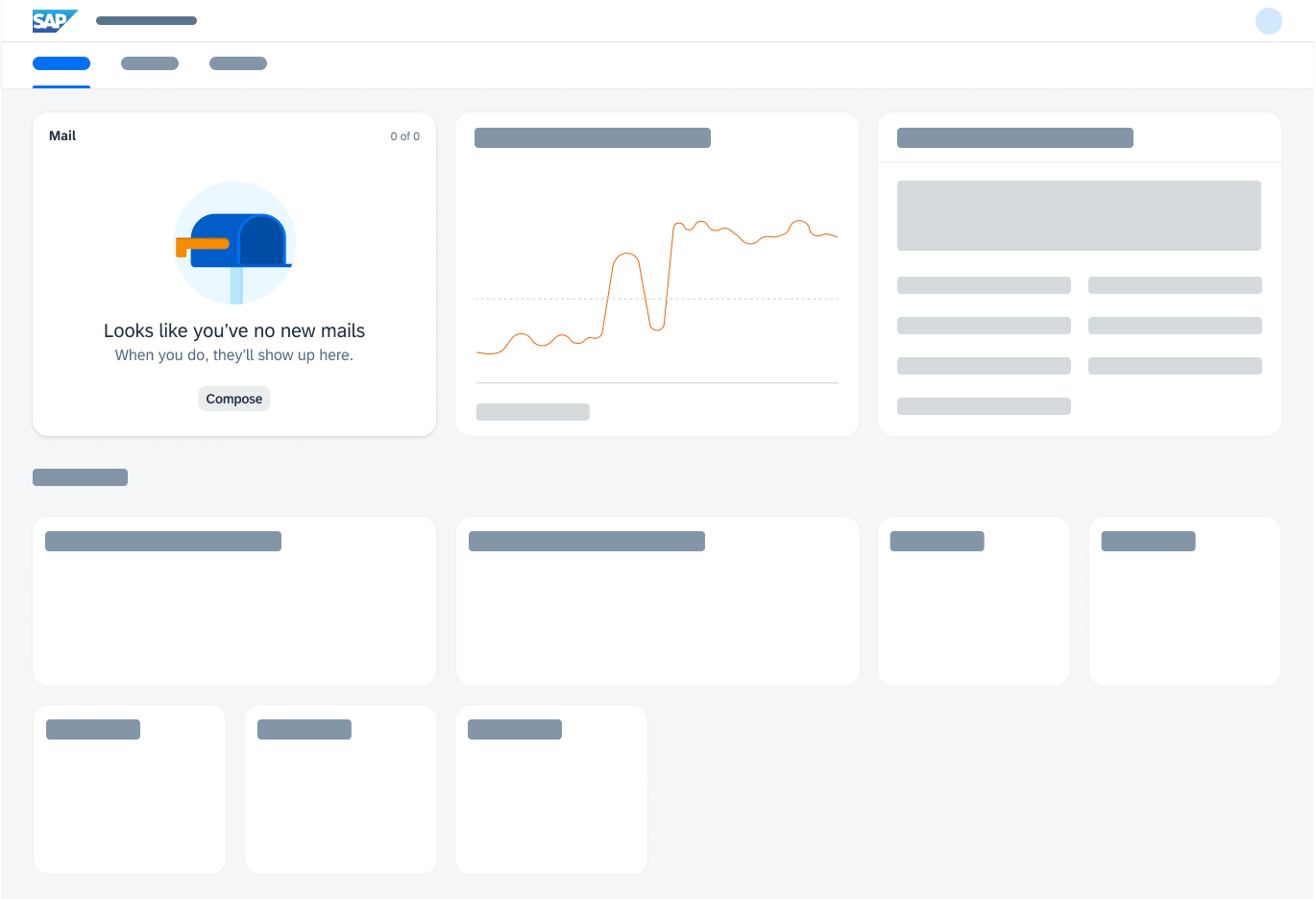
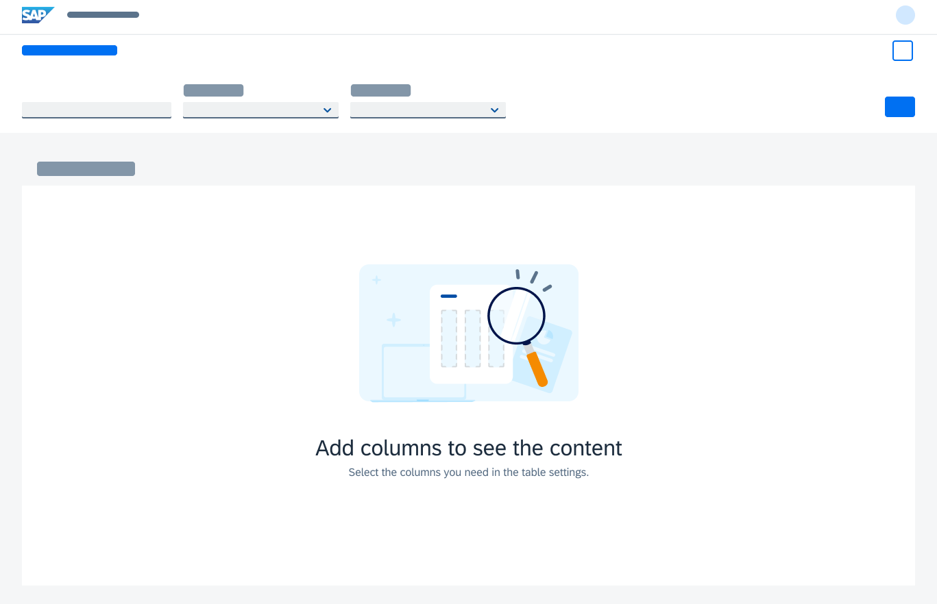
Empty states are moments in the user experience when there is no content to display. They can appear anywhere within an application and occur most commonly when a user:
- Interacts with an application or feature for the first time
- Performs a search or filters data
- Encounters an error due to permissions, systems, or configuration issues
Empty states should never feel empty or negative, especially when things aren’t working as expected. It is important to tell the user what the empty state is for, why the user is seeing it, and what the user can do next. When designed appropriately through relatable, encouraging content, empty states can enhance the user experience, add value, and be a quick UX win.
This article provides an overview of empty states and their design recommendations.
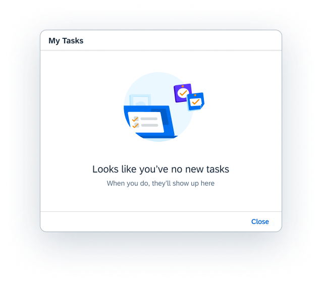
Empty state in a dialog
Handling Empty States
Empty states occur for a variety of reasons and can require different treatments. The design should focus on the information you want to convey to the user. It’s a simple way to keep users informed and supported within an application. If possible, communicate what’s happening, while providing constructive guidance for the next steps.
An empty state can occur anywhere in the UI. The design layout for the empty state depends on the context of the situation and what is most suitable for the page layout.
Empty states can be handled by the illustrated message control.
Types
The list below suggests different approaches for common types of empty states to address the needs of the user in different situations.
| Type | When to use | Example | Recommendation |
| No data | There is no data for the user to see or the system has nothing to display.
First-time use of an app or feature. |
The “no data” state can be initiated by a user, system, or another user:
– Before beginning a search – No activities – No mail – Application account setup |
Let users know what will be available when data has been added.
If possible, provide information on how users can add data themselves or what to do next. If the user is using a feature or app for the first time, guide them through the initial actions. |
| User action | Provide feedback to the user based on some user action or interaction.
User has completed an action. |
A user action empty state is created by the user:
– No search results – No filter results – Completion of a process or task |
Help users understand the situation and let them know if a next step is needed.
For success states: Indicate that the user has successfully completed a process or task. |
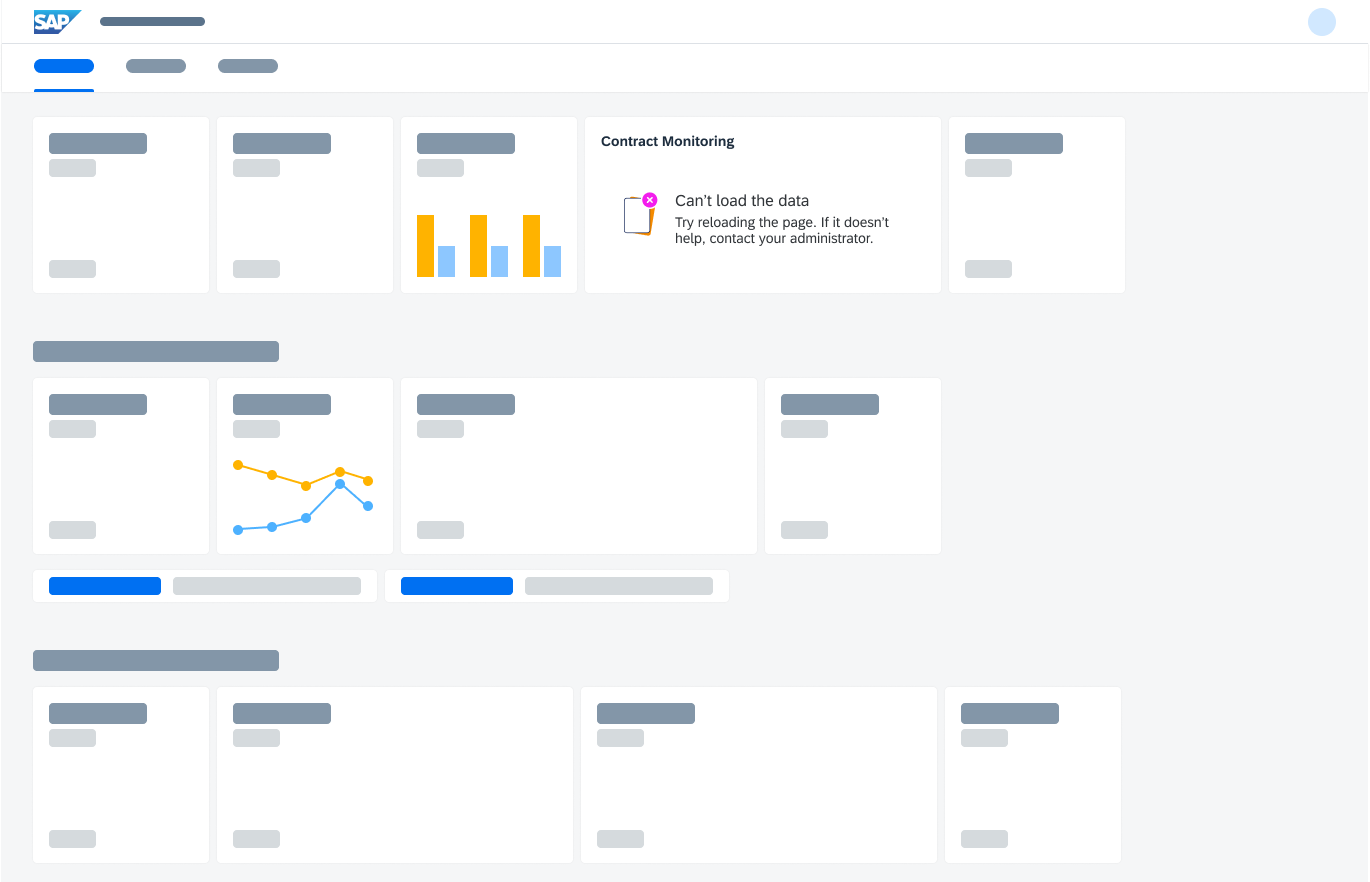
| Errors | The system or application is unable to display information due to an error. | An error state is caused by missing permissions, incorrect configuration, or a system issue:
– Unable to load – Unable to upload – Account isn’t available |
Help users understand the problem and, if possible, what corrective actions to take.
Provide a sufficient level of detail to help users resolve the issue. |
Best Practices
Message Writing
Provide a primary message (headline) and a description.
- Primary message: Explain the reason for the empty state, preferably in a single line. Keep the text short to make it quick to read and understand.
- Description: Provide context and tell the user what to do next, in three lines or less.
Note: Consider how translations to other languages may increase the amount of text.
More Information:
Call to Action
Give the user direct access to a relevant action, where appropriate. It can turn an empty state into a situation that is helpful to the user.
- If there is a clear next step, include an action, ideally in the form of a secondary button or text link. Be sure that the user has permission for the next step.
- Do not use the primary action button for empty states.
More information:
Illustration Choice
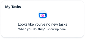
When appropriate, support the message with an illustration. It’s a great way to convey the meaning of the message more immediately and show personality through the distinctive visual language used for SAP Fiori UX illustrations.
Before adding an illustration, ask yourself these questions:
- Does the illustration enhance the communication of the message you want to deliver to the user?
- Is the illustration relevant and appropriate in other cultures or geographic locations?
- Do the illustration, message, and call to action work as one clarify the situation?
Only add an illustration if the empty state has enough space for it. Otherwise, use text messages only.
Do not use a UX illustration for UI elements that are smaller than a medium size card, such as tiles, message toasts, message strips, or other smaller UI elements. Use a headline and supporting message only.
More information:
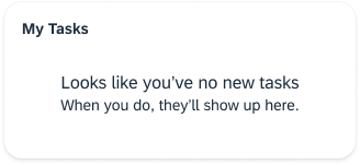
When space is limited, use text only.
Don't use UX illustrations for small UI elements, such as tiles or message toasts.
Multiple Empty States
When designing for a screen, consider how multiple empty states may impact the user experience. Attempt to mitigate scenarios where multiple empty state illustrations occur simultaneously on a screen. Think about which messages to prioritize first.
Top Tips
- An empty state should never feel empty or negative, especially when things aren’t working as expected.
- Keep the user informed, supported, and on a productive path through relatable messaging that communicates what the user would see if they had data.
- If possible, provide the user with guidance for a next step – either in the message or through a button or text link. In a situation without solutions, explain what is going on so the user can attempt to troubleshoot.
- Empty states must have a message (headline with supporting description). An illustration and call-to-action are optional.
- Carefully consider the context and layout when using illustrations and calls to action.
- Check out the Illustrated Message guidelines.
Reference Examples
Here are some examples of how empty states occur in different containers.
 Your feedback has been sent to the SAP Fiori design team.