- Latest Version 1.128
- Version 1.126
- SAPUI Version 1.124
- SAPUI5 Version 1.122
- SAPUI5 Version 1.120
- SAPUI5 Version 1.118
- SAPUI5 Version 1.116
- SAPUI5 Version 1.114
- SAPUI5 Version 1.112
- SAPUI5 Version 1.110
- SAPUI5 Version 1.108
- SAPUI5 Version 1.104
- SAPUI5 Version 1.102
- SAPUI5 Version 1.100
- SAPUI5 Version 1.98
- SAPUI5 Version 1.96
- SAPUI5 Version 1.94
- SAPUI5 Version 1.92
- SAPUI5 Version 1.90
- SAPUI5 Version 1.88
- SAPUI5 Version 1.86
- SAPUI5 Version 1.84
- SAPUI5 Version 1.82
- SAPUI5 Version 1.80
- SAPUI5 Version 1.78
- SAPUI5 Version 1.76
- SAPUI5 Version 1.74
- SAPUI5 Version 1.72
- SAPUI5 Version 1.70
- SAPUI5 Version 1.68
- SAPUI5 Version 1.66
- SAPUI5 Version 1.64
- SAPUI5 Version 1.62
- SAPUI5 Version 1.60
- SAPUI5 Version 1.58
- SAPUI5 Version 1.56
- SAPUI5 Version 1.54
- SAPUI5 Version 1.52
- SAPUI5 Version 1.50
- SAPUI5 Version 1.48
- SAPUI5 Version 1.46
- SAPUI5 Version 1.44
- SAPUI5 Version 1.42
- SAPUI5 Version 1.40
- SAPUI5 Version 1.38
- SAPUI5 Version 1.36
- SAPUI5 Version 1.34
- SAPUI5 Version 1.32
- SAPUI5 Version 1.30
- SAPUI5 Version 1.28
- SAPUI5 Version 1.26
- Latest Version 1.128
- Version 1.126
- SAPUI Version 1.124
- SAPUI5 Version 1.122
- SAPUI5 Version 1.120
- SAPUI5 Version 1.118
- SAPUI5 Version 1.116
- SAPUI5 Version 1.114
- SAPUI5 Version 1.112
- SAPUI5 Version 1.110
- SAPUI5 Version 1.108
- SAPUI5 Version 1.106
- SAPUI5 Version 1.104
- SAPUI5 Version 1.102
- SAPUI5 Version 1.100
- SAPUI5 Version 1.98
- SAPUI5 Version 1.96
- SAPUI5 Version 1.94
- SAPUI5 Version 1.92
- SAPUI5 Version 1.90
- SAPUI5 Version 1.88
- SAPUI5 Version 1.86
- SAPUI5 Version 1.84
- SAPUI5 Version 1.82
- SAPUI5 Version 1.80
- SAPUI5 Version 1.78
- SAPUI5 Version 1.76
- SAPUI5 Version 1.74
- SAPUI5 Version 1.72
- SAPUI5 Version 1.70
- SAPUI5 Version 1.68
- SAPUI5 Version 1.66
- SAPUI5 Version 1.64
- SAPUI5 Version 1.62
- SAPUI5 Version 1.60
- SAPUI5 Version 1.58
- SAPUI5 Version 1.56
- SAPUI5 Version 1.54
- SAPUI5 Version 1.52
- SAPUI5 Version 1.50
- SAPUI5 Version 1.48
- SAPUI5 Version 1.46
- SAPUI5 Version 1.44
- SAPUI5 Version 1.42
- SAPUI5 Version 1.40
- SAPUI5 Version 1.38
- SAPUI5 Version 1.36
- SAPUI5 Version 1.34
- SAPUI5 Version 1.32
- SAPUI5 Version 1.30
- SAPUI5 Version 1.28
- SAPUI5 Version 1.26
Message Page
sap.m.MessagePage
Intro
The message page gives feedback to the user when an empty state occurs at page level, such as an empty app or list. The message page explains what information would normally appear on the page and how the user can proceed.
When To Use
Use the message page if:
You need to give feedback on an empty state at page level. You can use the message page in the following situations:
- Searching and/or filtering with no results
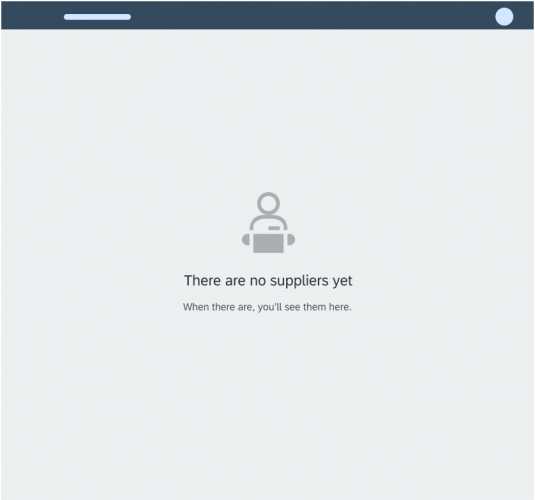
- Empty app
- Too many items (search or filtering required)
- Item saved as a tile that is no longer available
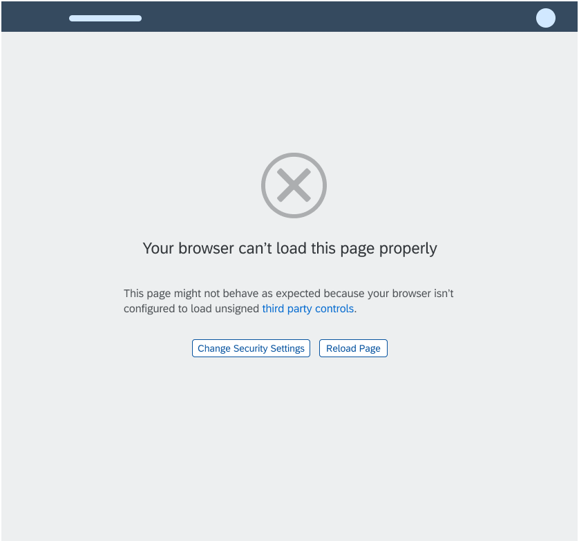
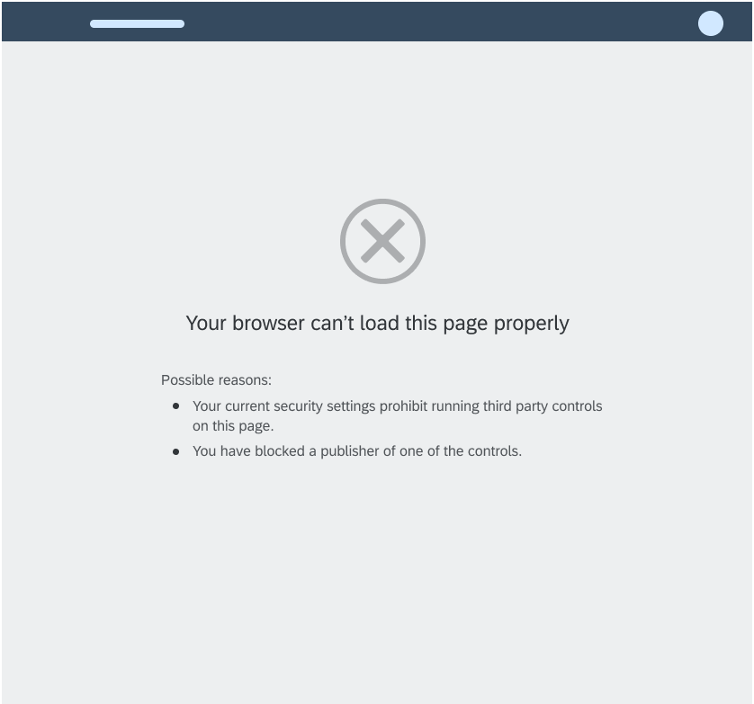
- Error
Do not use the message page if:
- You want to give feedback on empty states within UI elements, such as dialogs or tables. Use an illustrated message instead.
- The app is simply loading. In this case, use the busy state without an explanatory text.
Components
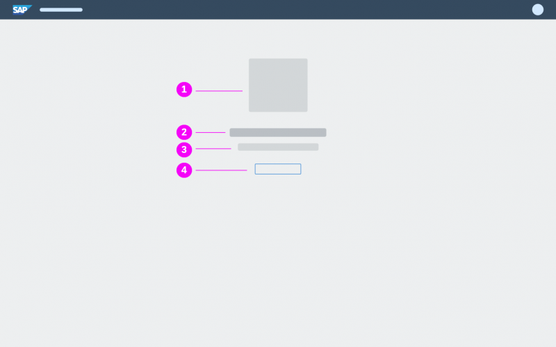
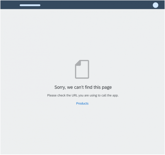
The message page follows the general message pattern for empty states. It contains an icon, a message headline, a message description, and an optional call to action.
(1) Icon
The icon in the message page is mandatory.
Exception: If you can’t find a suitable icon for your message, leave out the icon.
(2) Message Headline
The headline explains the reason for the empty state, preferably in a single line. Use the headline to convey the essence of your message in simple, engaging language.
Write the headline in sentence case without an ending period (.)
(3) Message Description
The description adds details and tells the user what to do next, in three sentences or less. Write the description in sentence case with proper punctuation. You can also set links in the description and use formatted text (such as bold, italic, underline, and bullet points).
(4) Call to Action (Optional)
Responsiveness
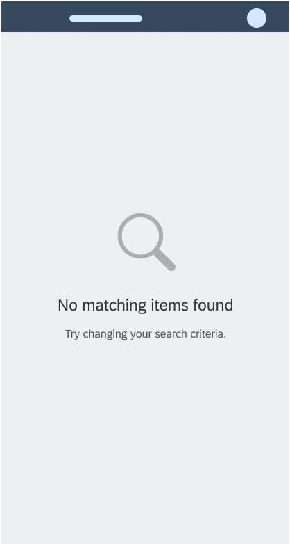
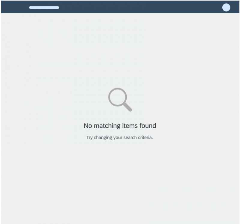
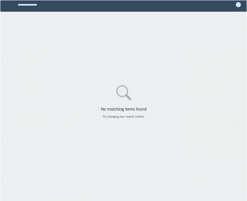
The size of the message page adjusts to fit the available space.
Examples
Top Tips
- Always include an icon, a message headline and a description with further details.
- Do not show only the state of the message (like error or warning), but rather try to describe the problem. Help the user to recognize, diagnose, and resolve the issue.
- Keep your message as concise as possible.
- Do not show the No data message, which could mislead users.
Related Links
Elements and Controls
- Link (guidelines)
- Text (guidelines)
- Button (guidelines)
- Busy state (guidelines)
- Illustrated Message (guidelines)
- Empty States (guidelines)

 Your feedback has been sent to the SAP Fiori design team.