Window Size Classes
Intro
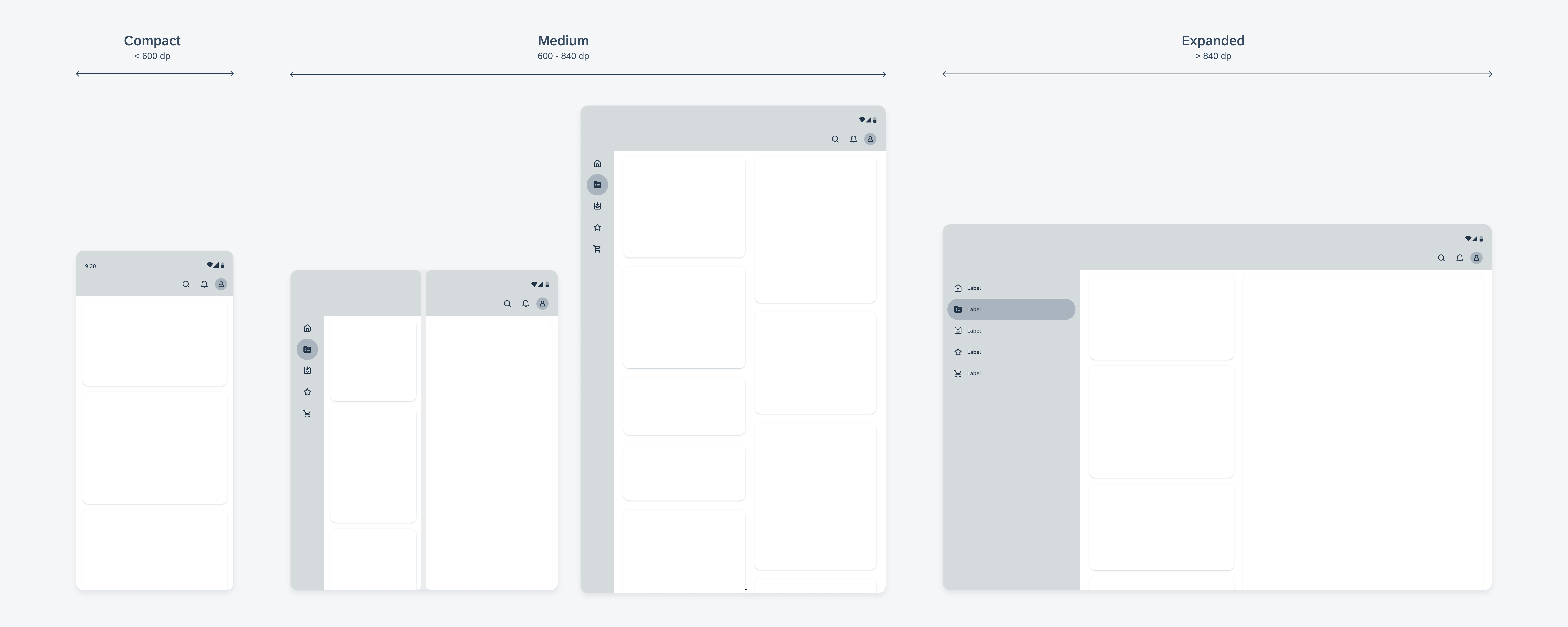
Each window size class corresponds to a specific breakpoint where the layout needs to adjust to fit the available space, device conventions, and ergonomics. The three primary window size classes are compact, medium, and expanded. These size classes provide the basis for designing adaptable layouts that work across various devices and orientations. Material 3 also supports large and extra-large window size classes, which are best suited for creating content designed for extra-large tablets or external displays. These window size classes offer multiple pane layouts and start at a screen width of 1200dp.
The Importance of Designing with Window Size Classes
When designing applications, it’s important to use window size classes rather than focusing on specific devices because the available window space is dynamic and can vary based on user behavior, such as using multi-window modes or unfolding a foldable device. Additionally, devices can be categorized into various window size classes depending on their orientation.
Width and Height Window Size Classes
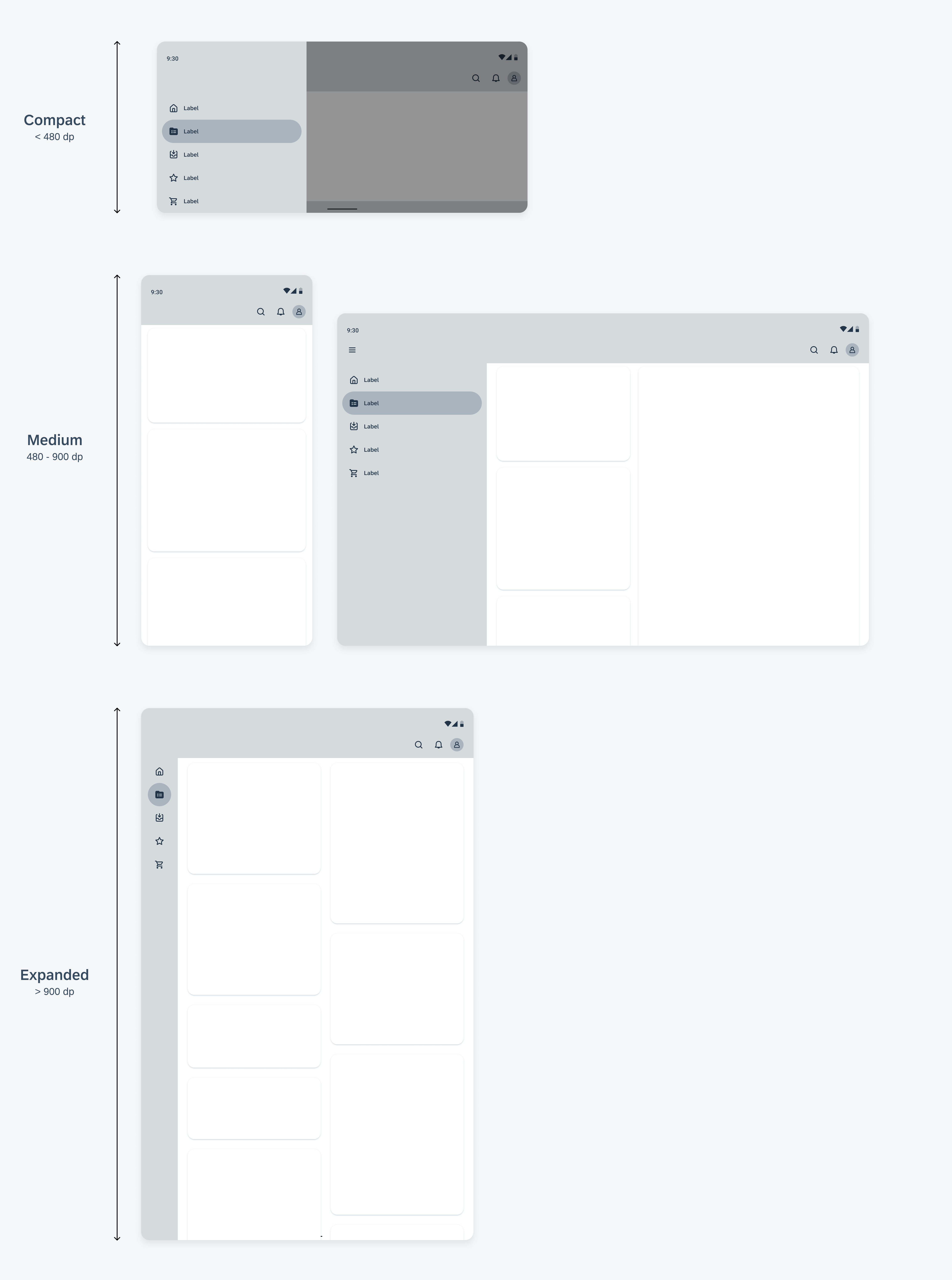
Available width and height are classified separately, so your app always has two window size classes – one for width and one for height. Typically, available width holds more significance than available height because vertical scrolling is more common. Therefore, the window size class related to the available width is likely more relevant to your app’s UI.

Schematics illustrating width-based window size classes


 Your feedback has been sent to the SAP Fiori design team.